


AI Post Apocalyptic Text Effect Generator
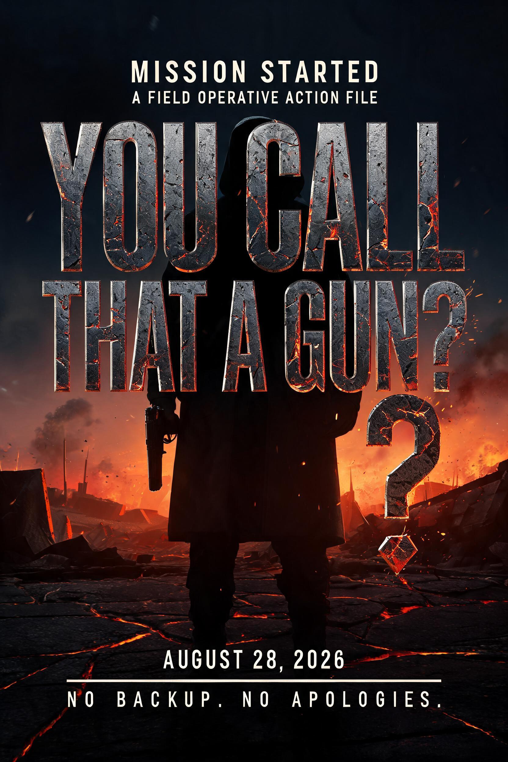
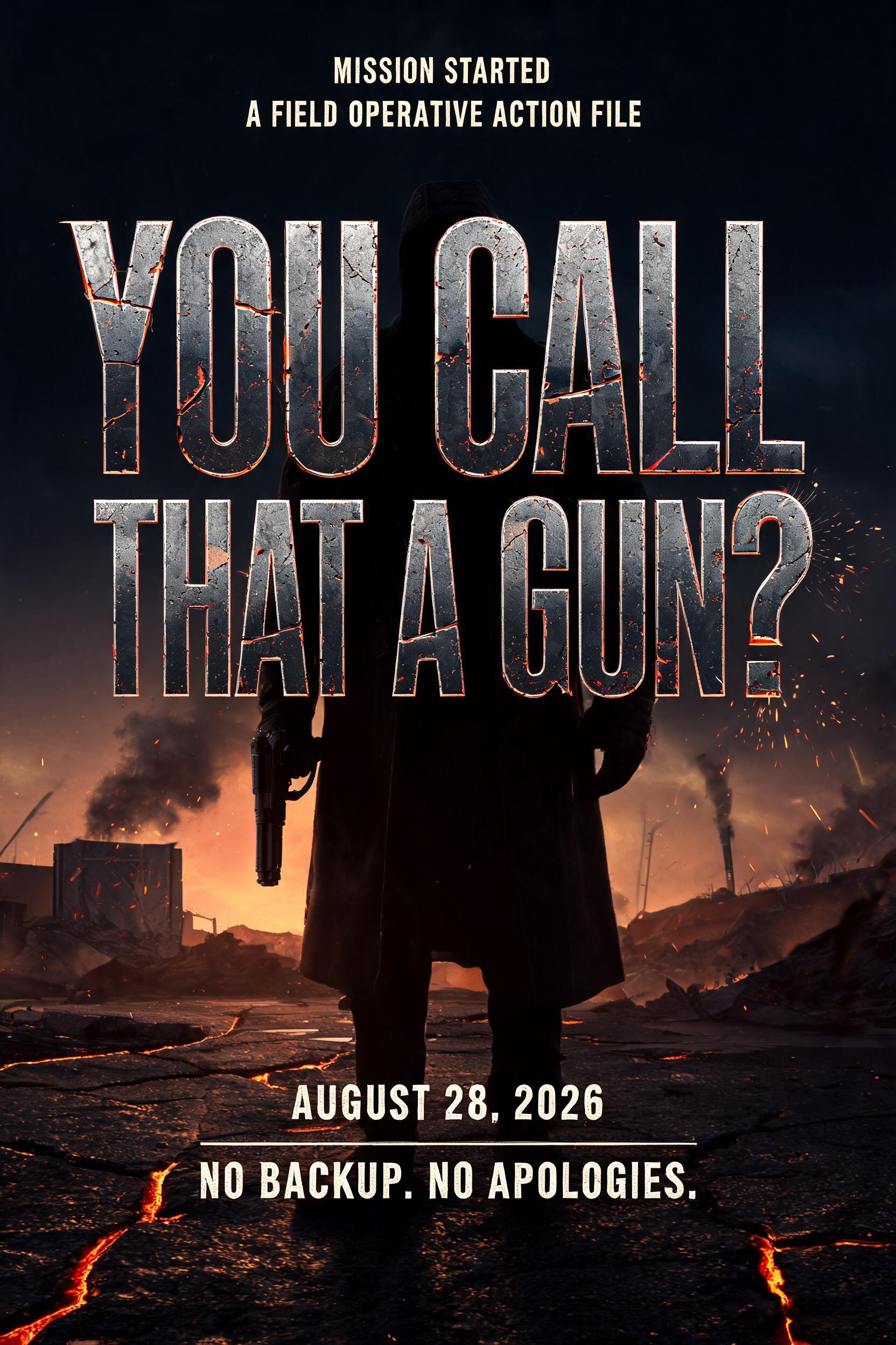
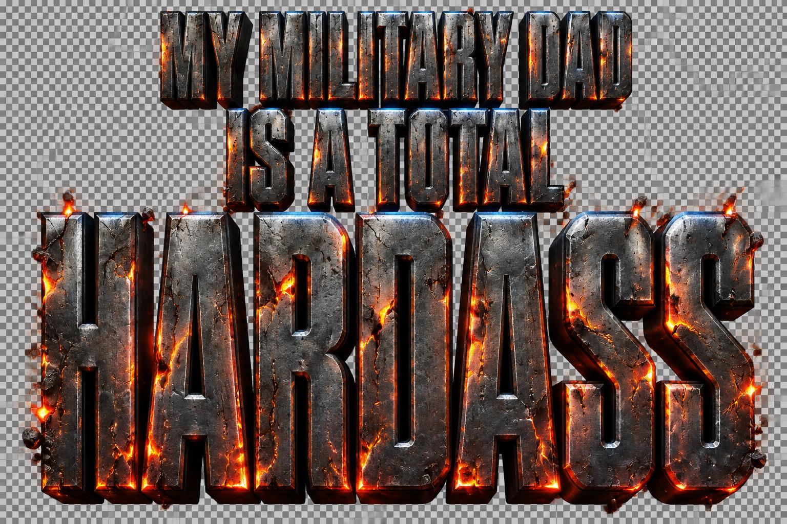
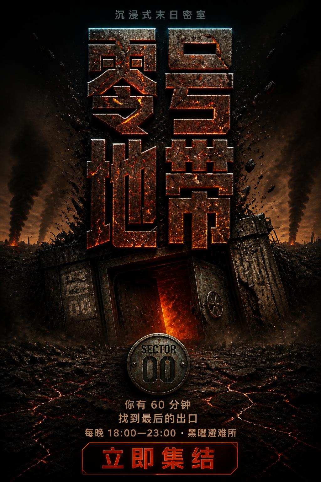
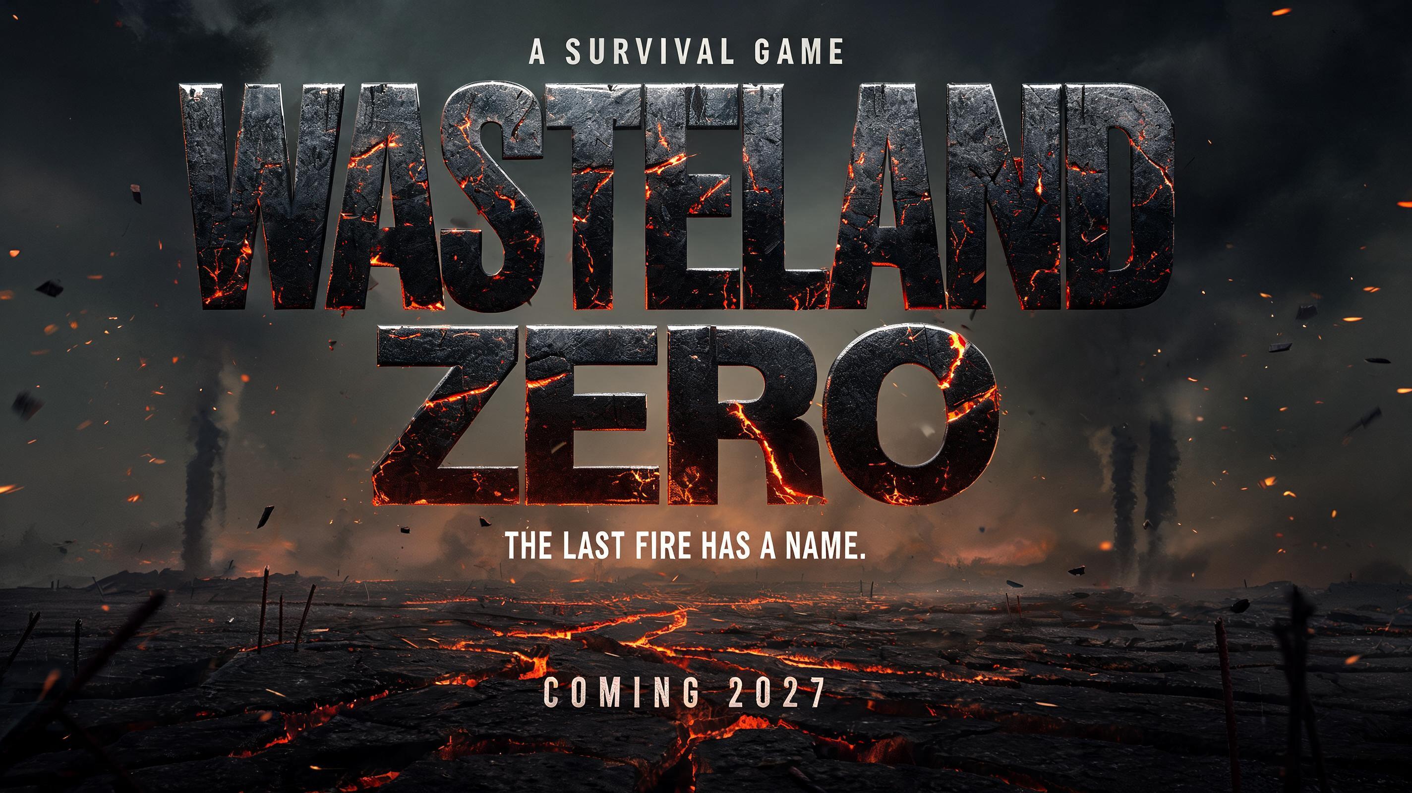
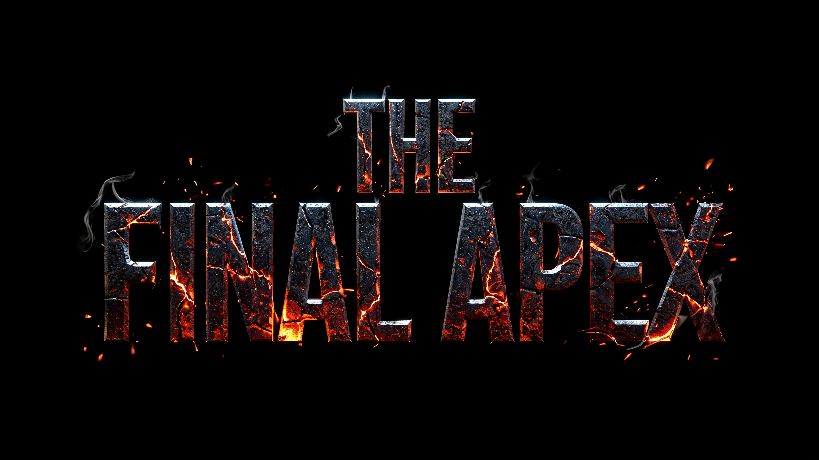
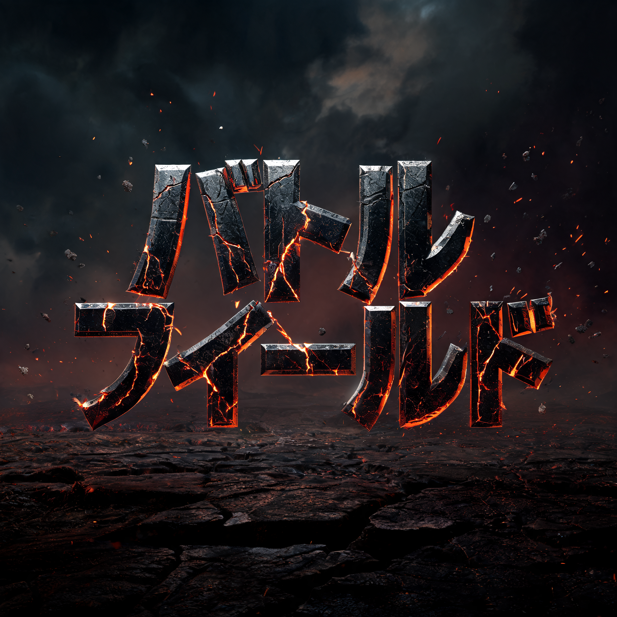
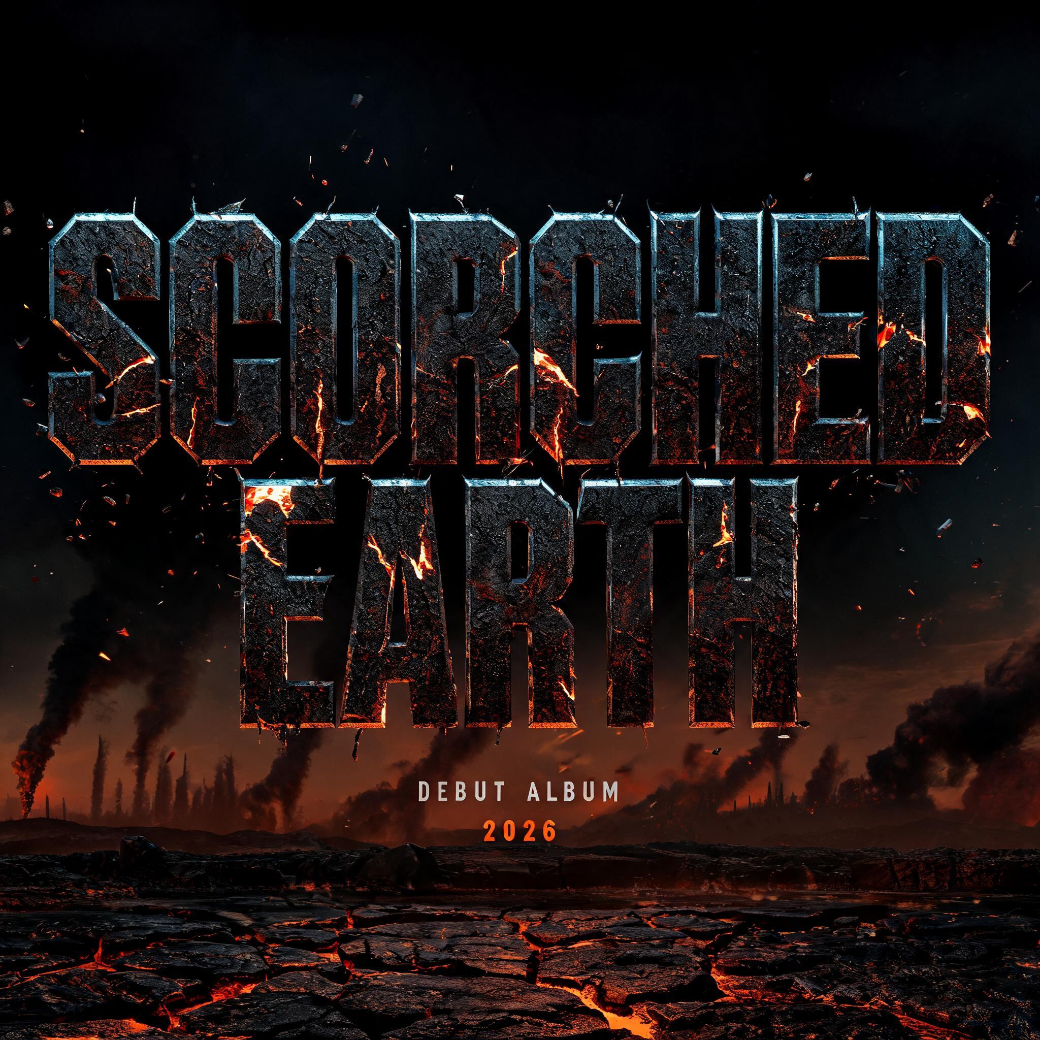
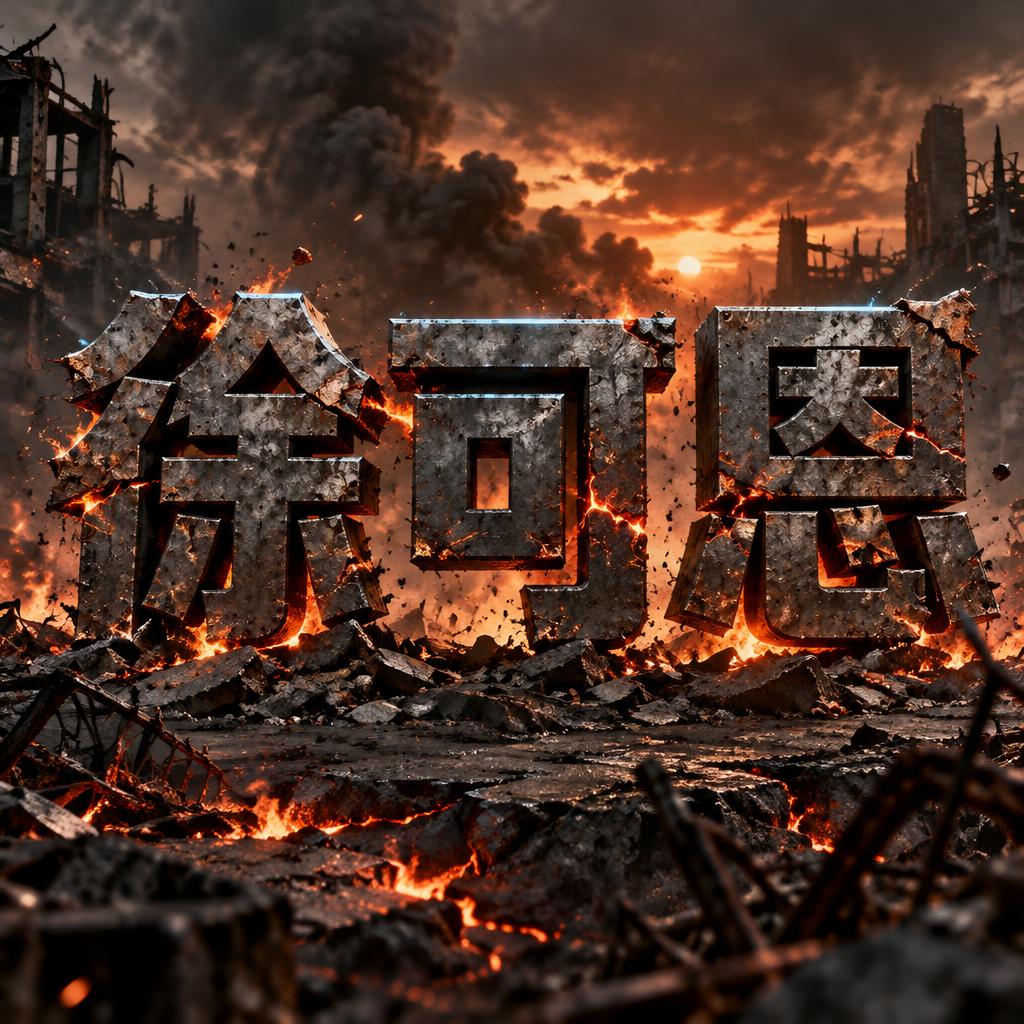
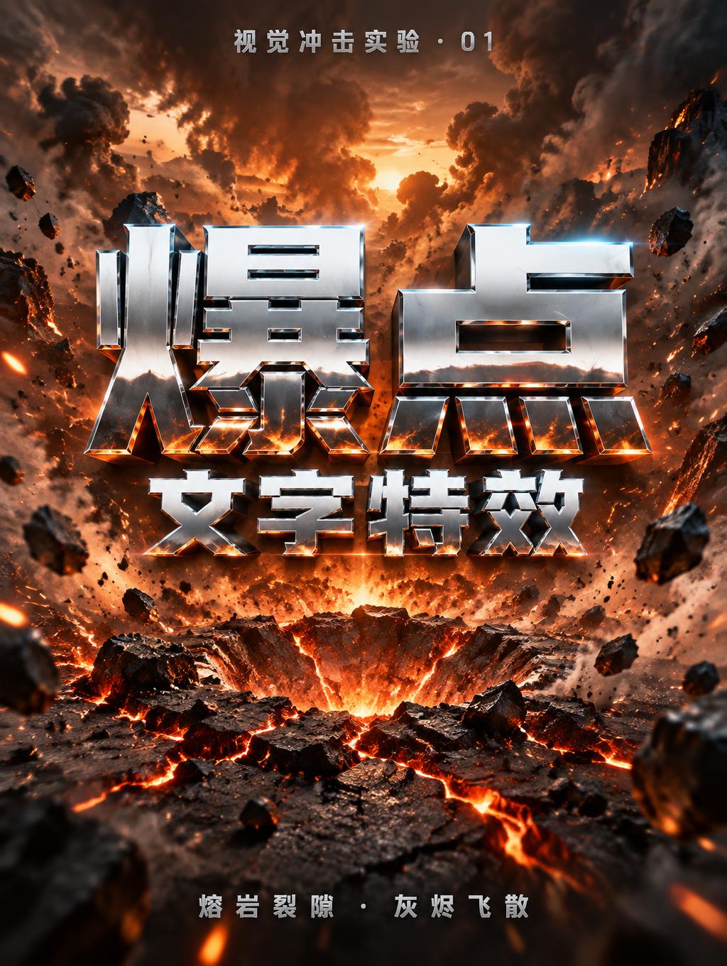
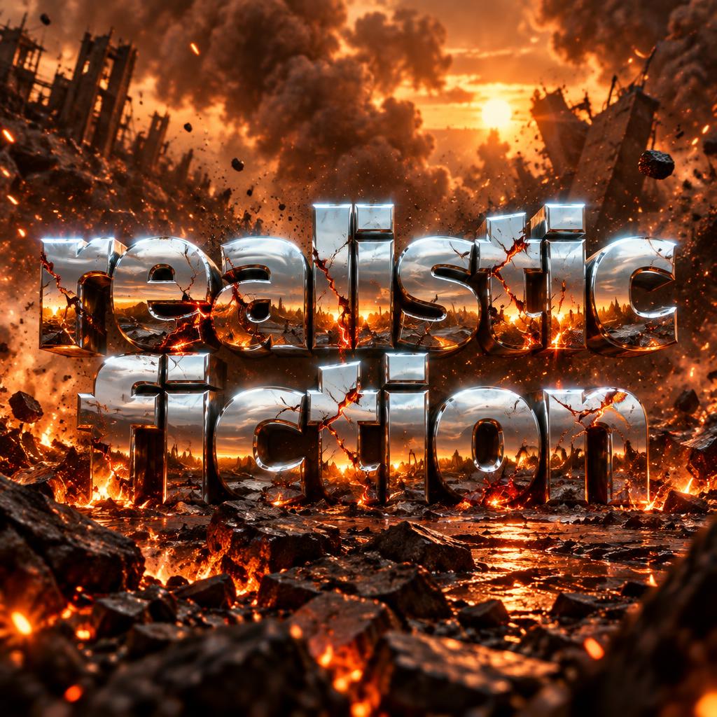
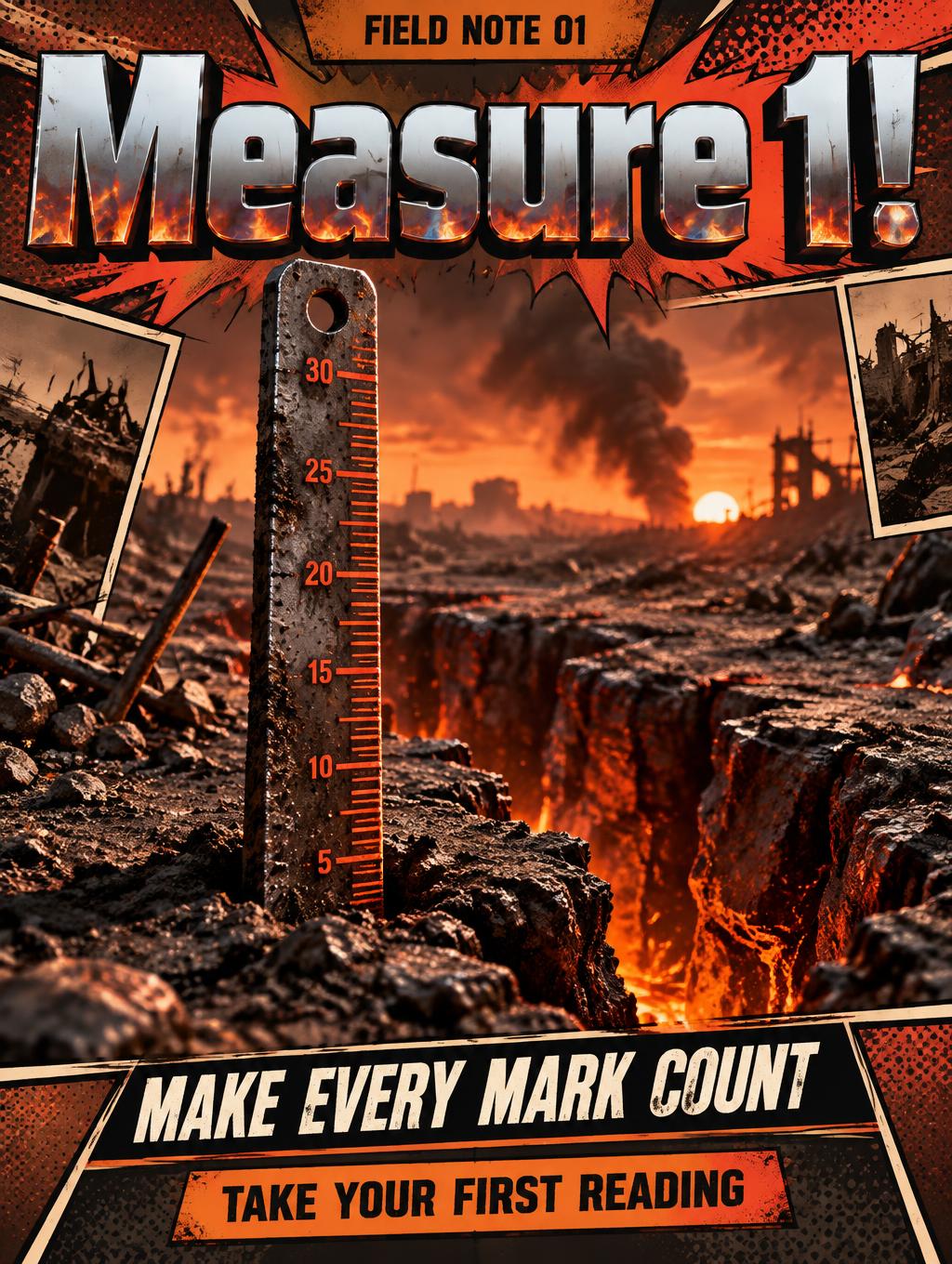
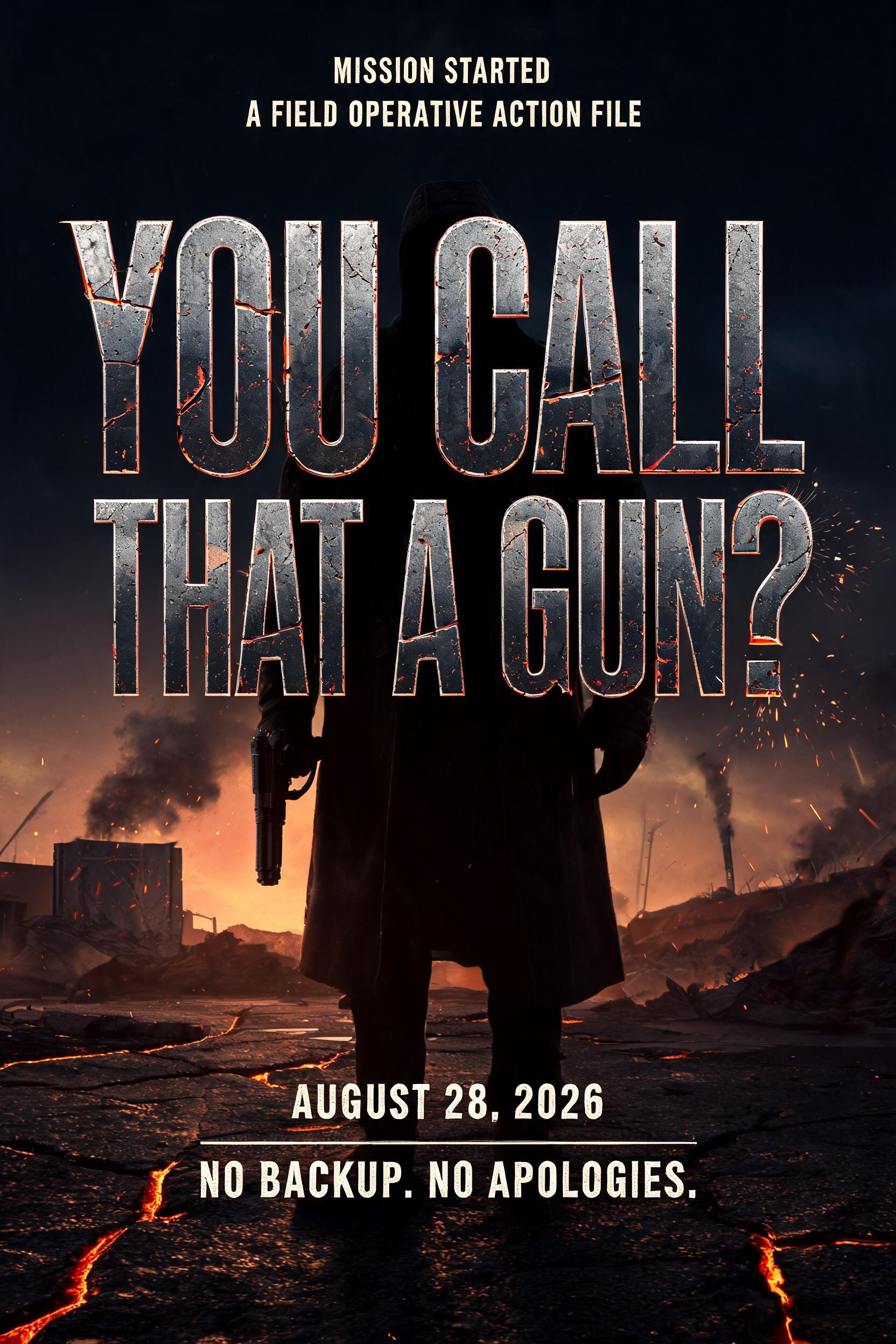
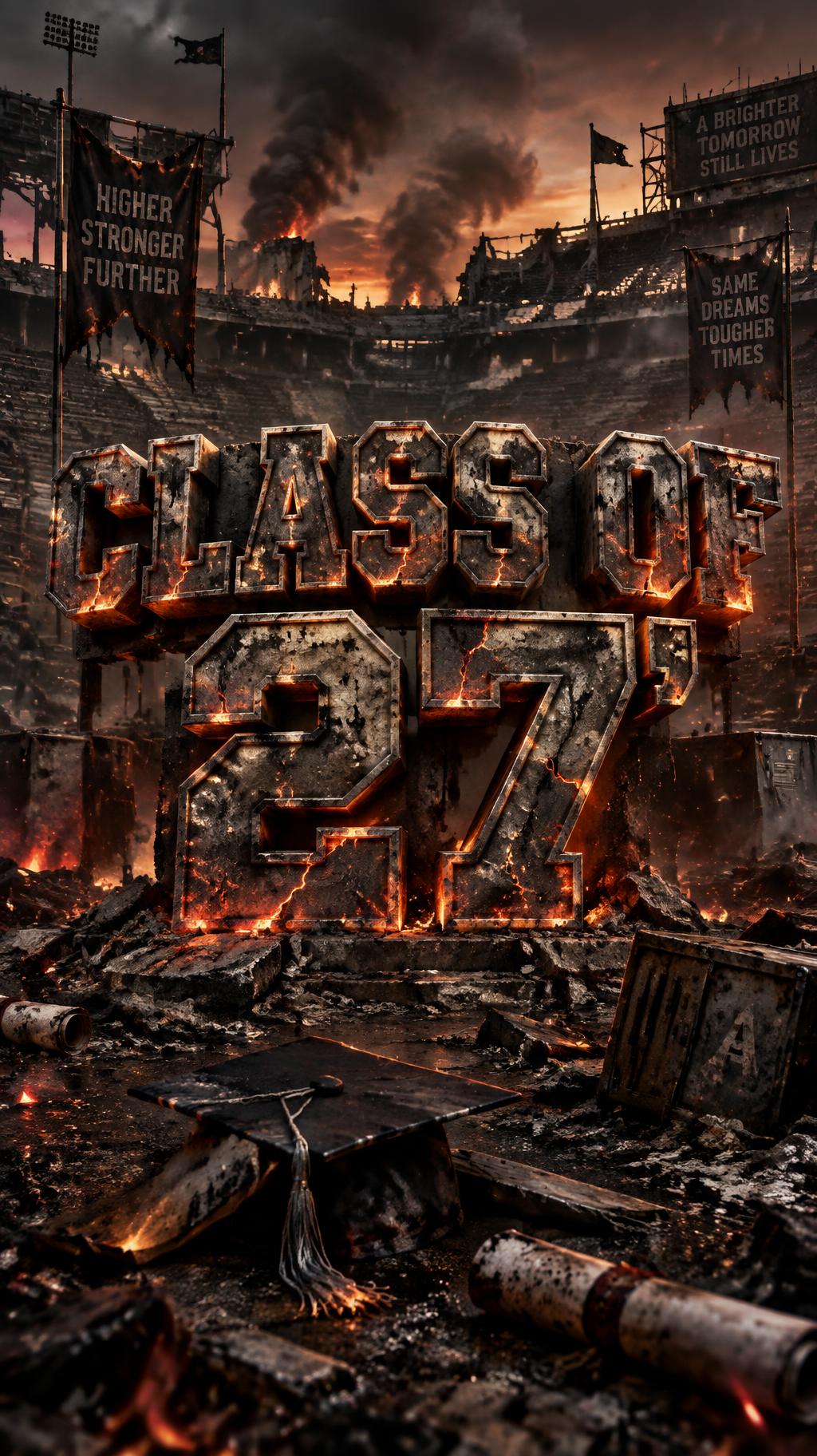
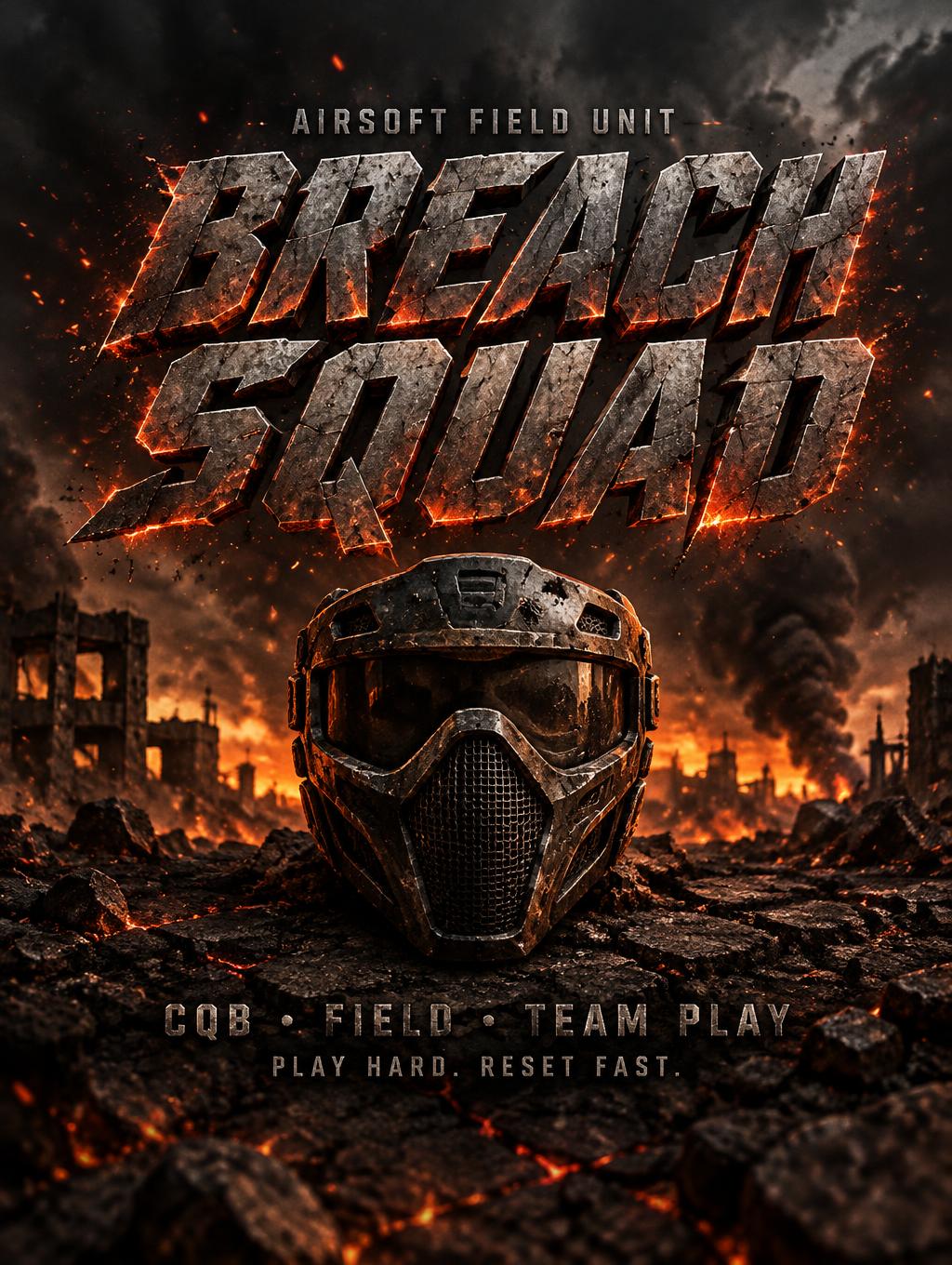
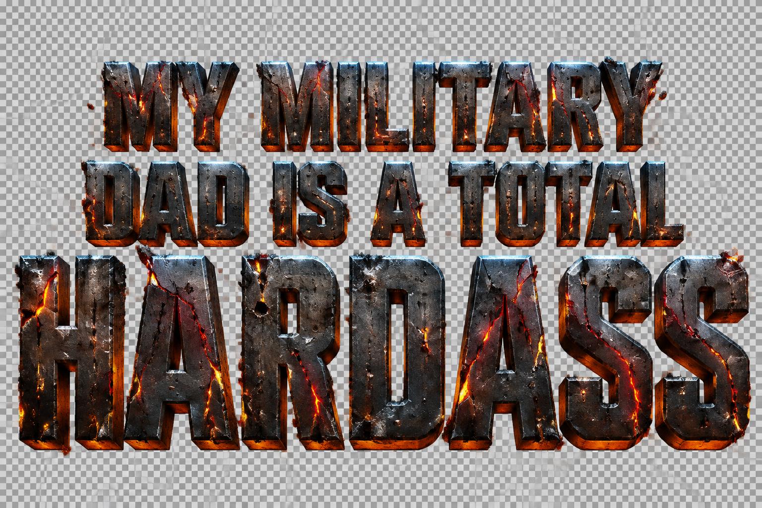
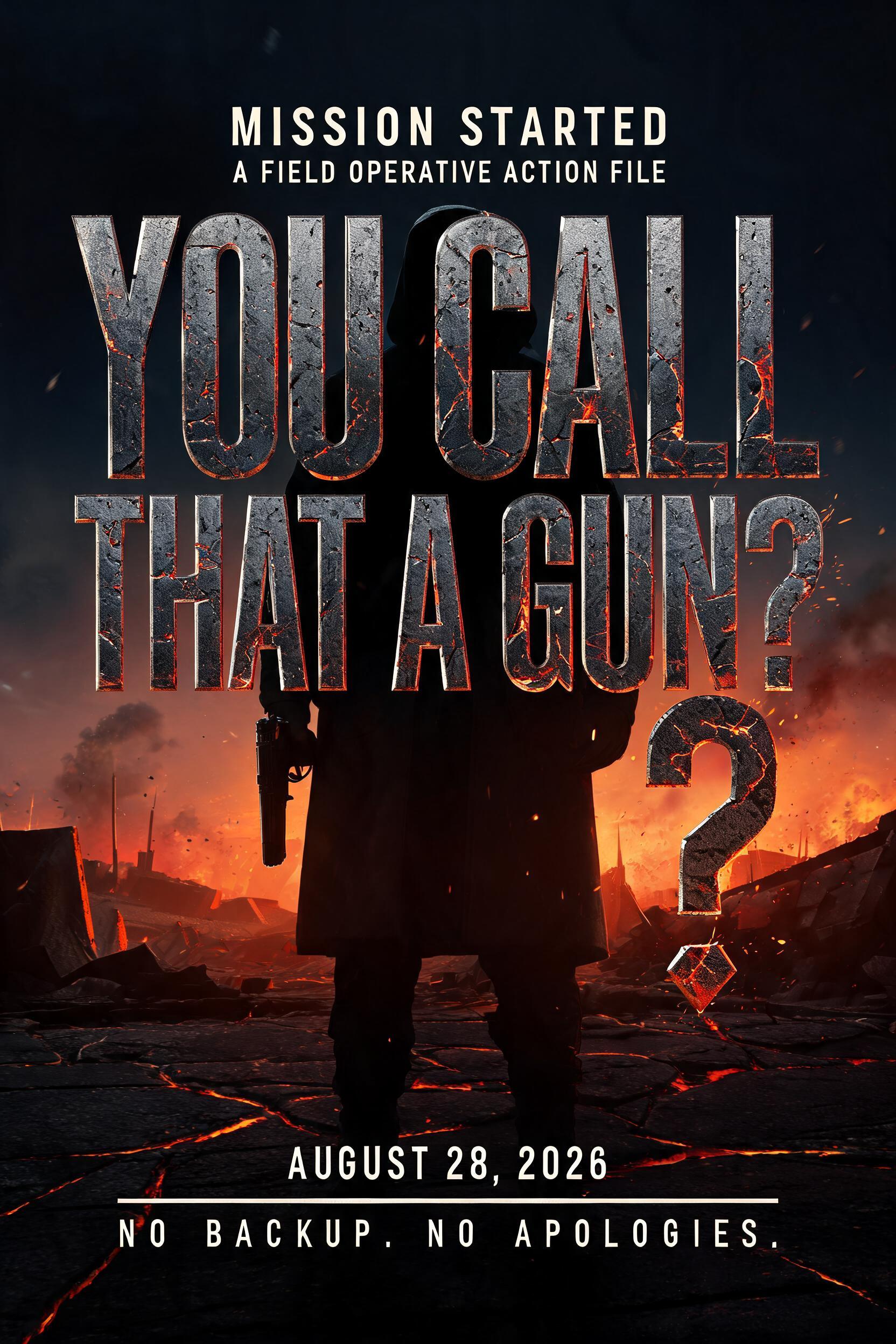
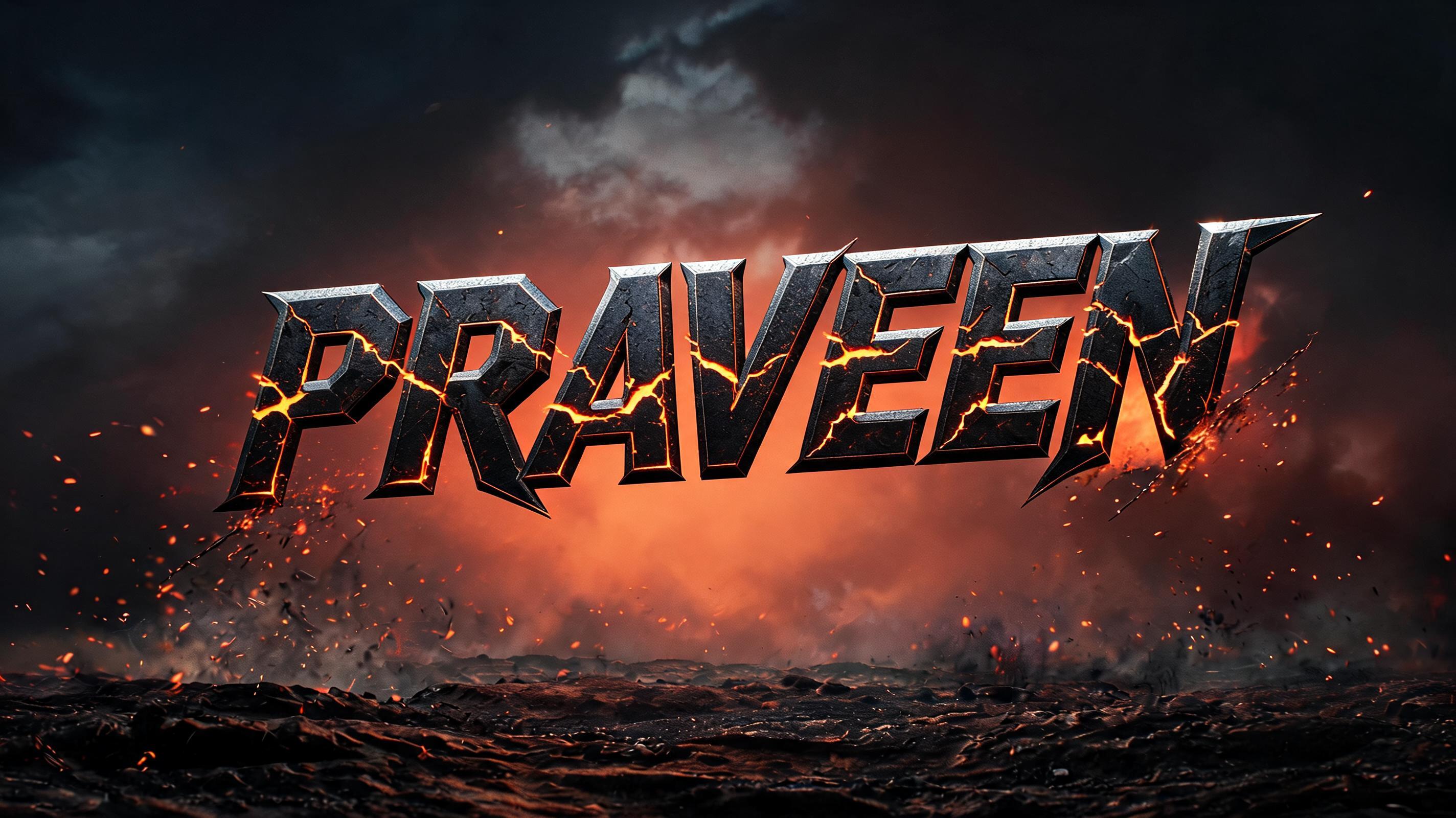
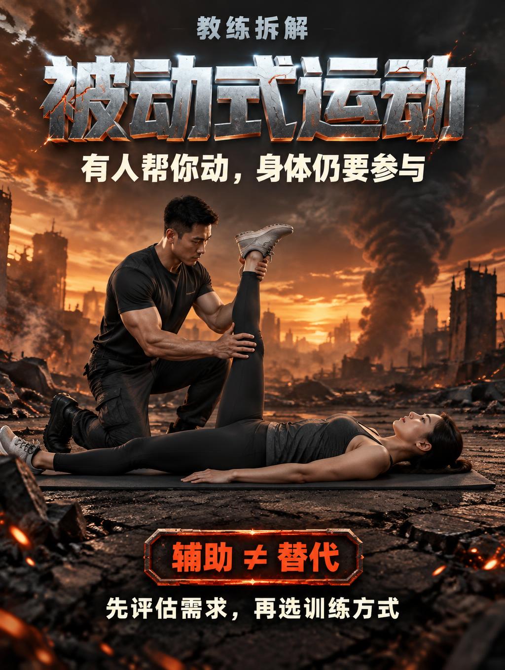
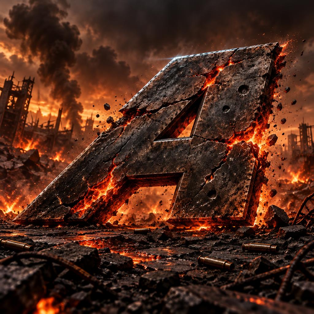
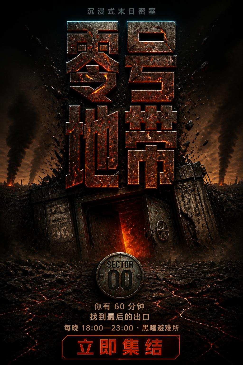
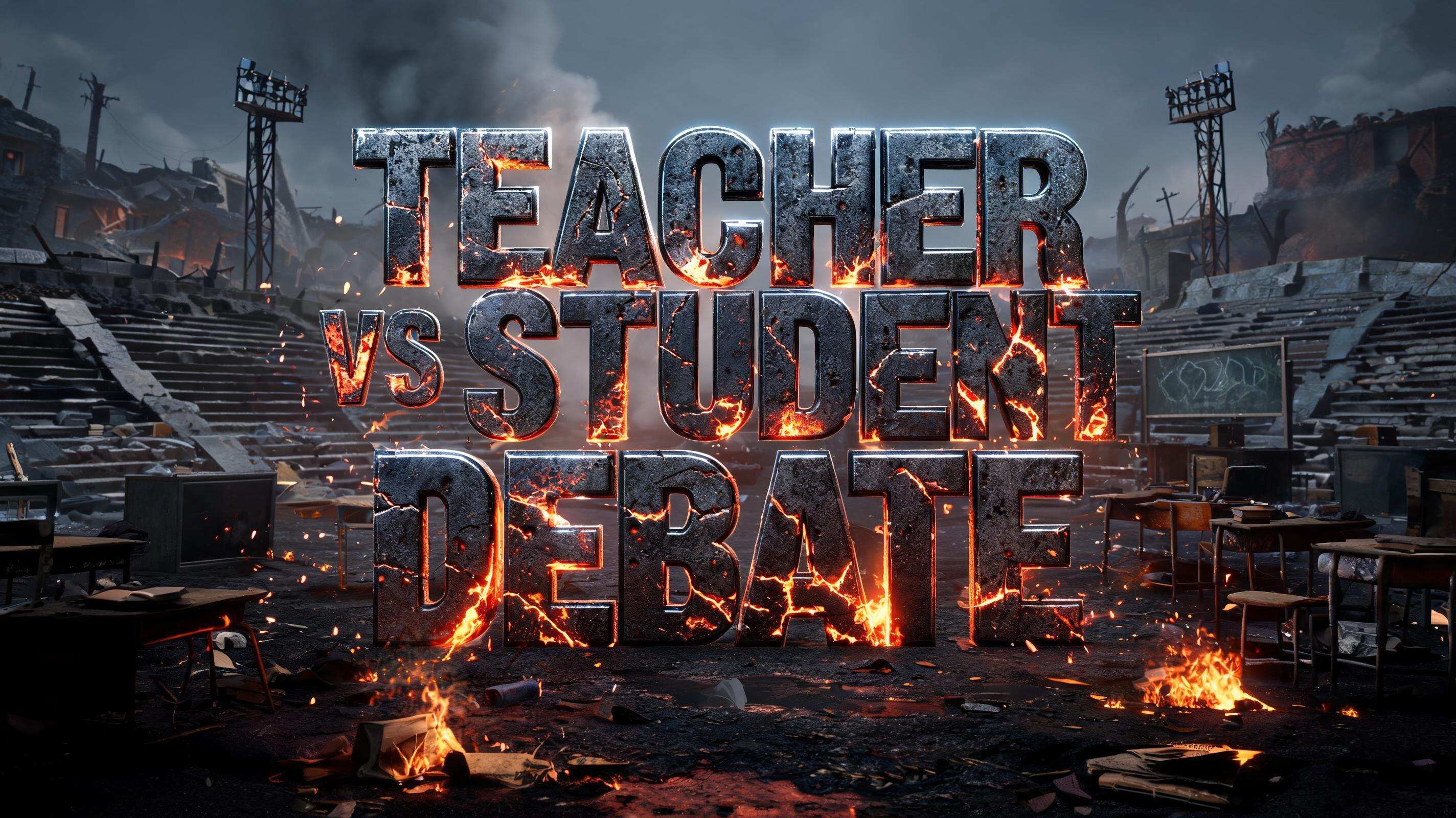
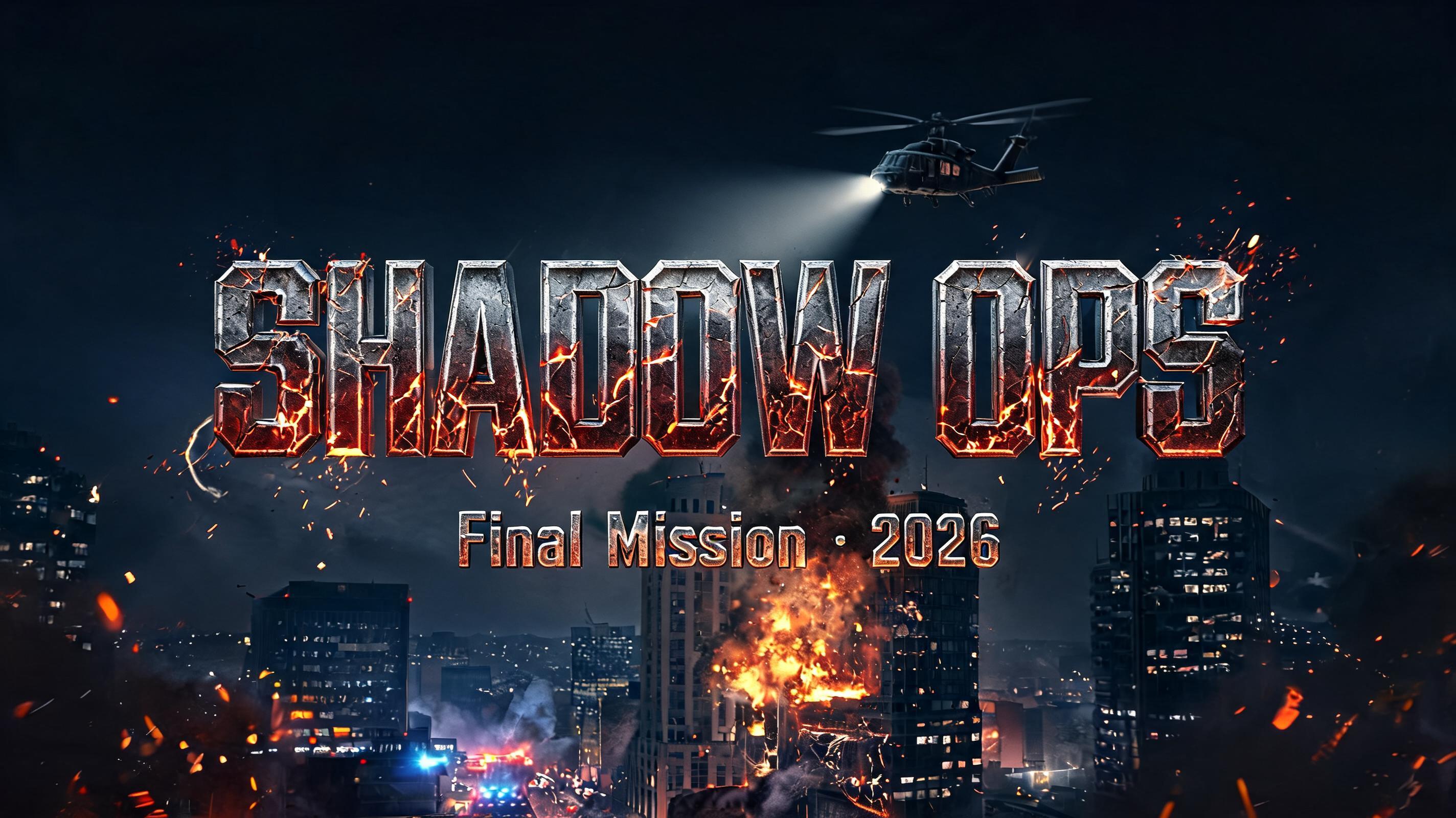
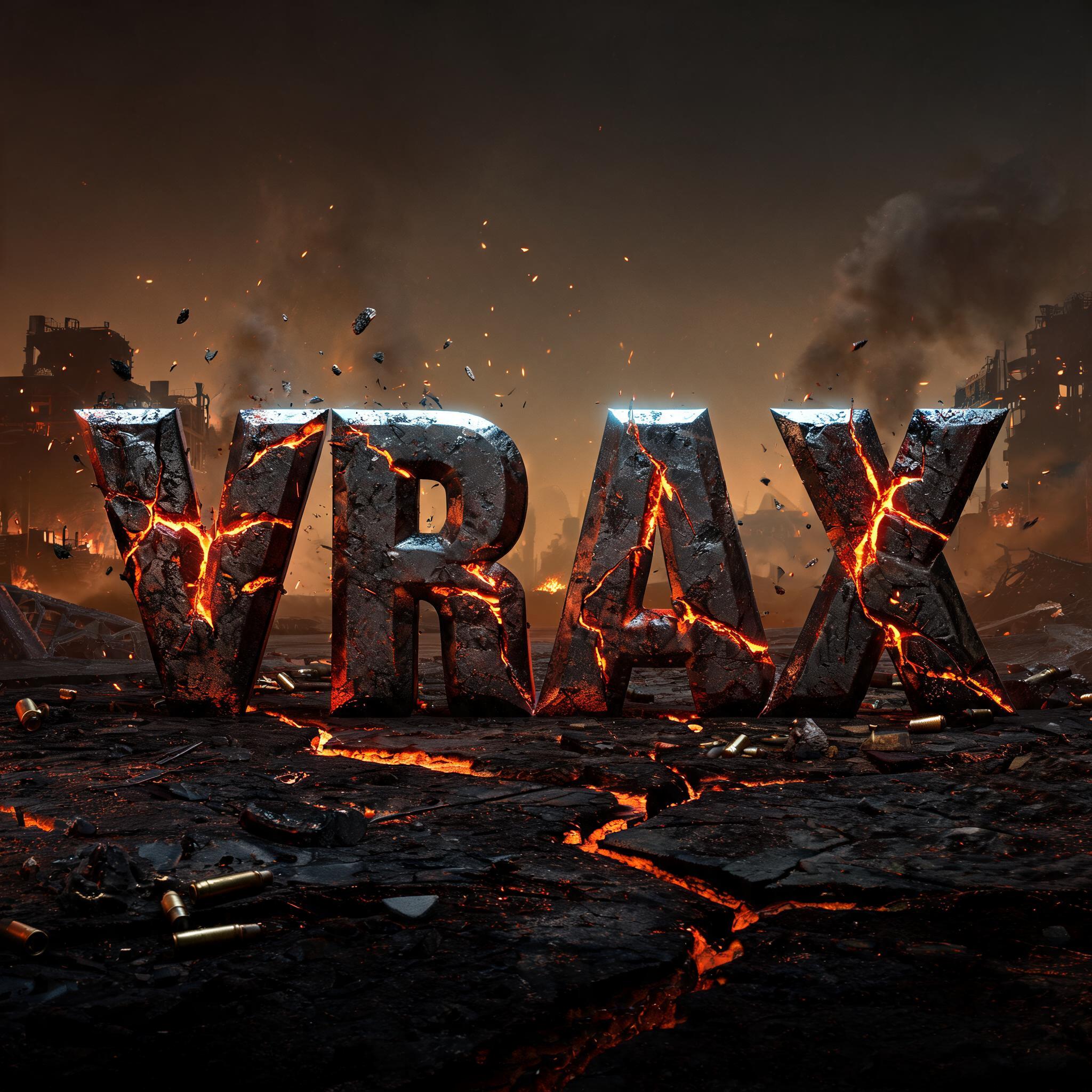
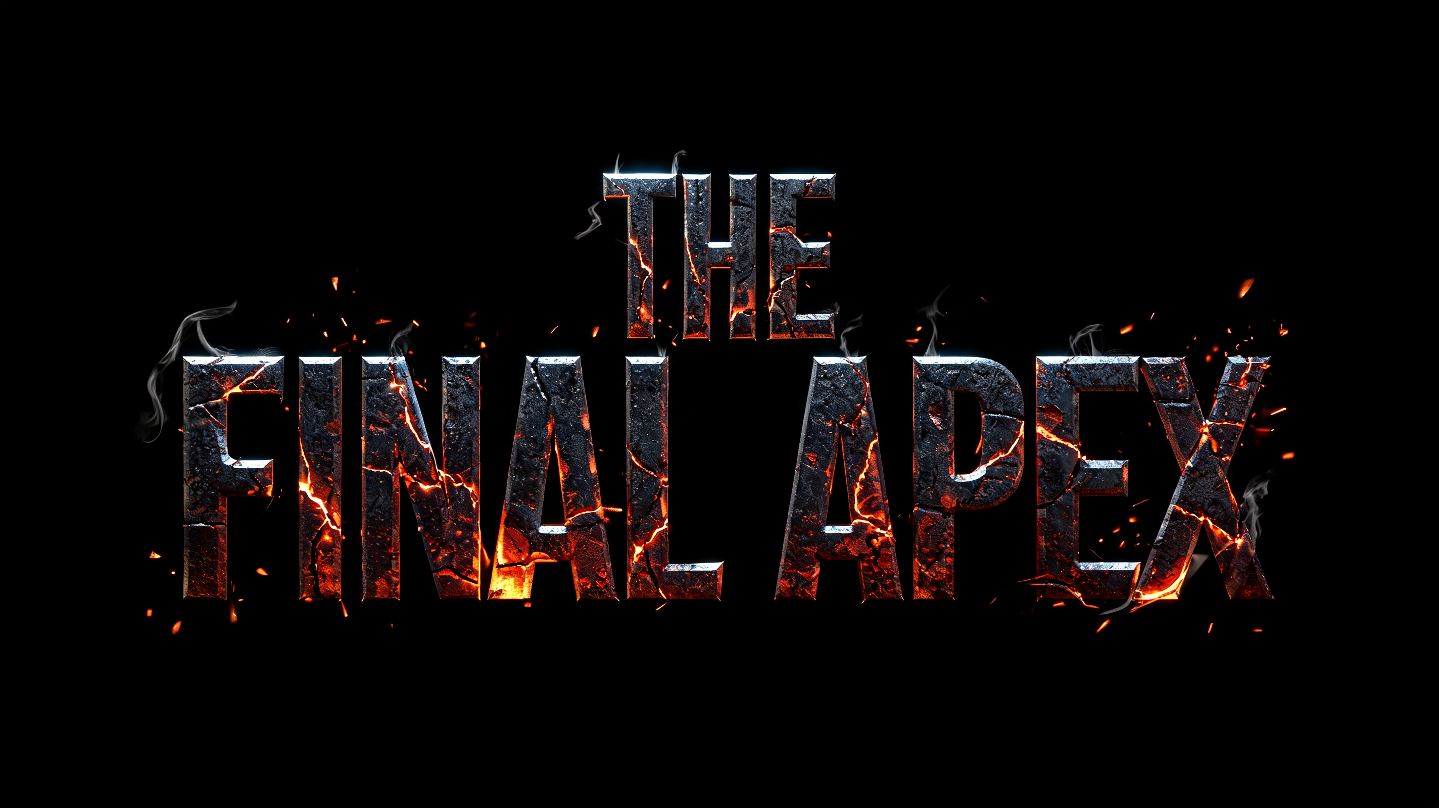
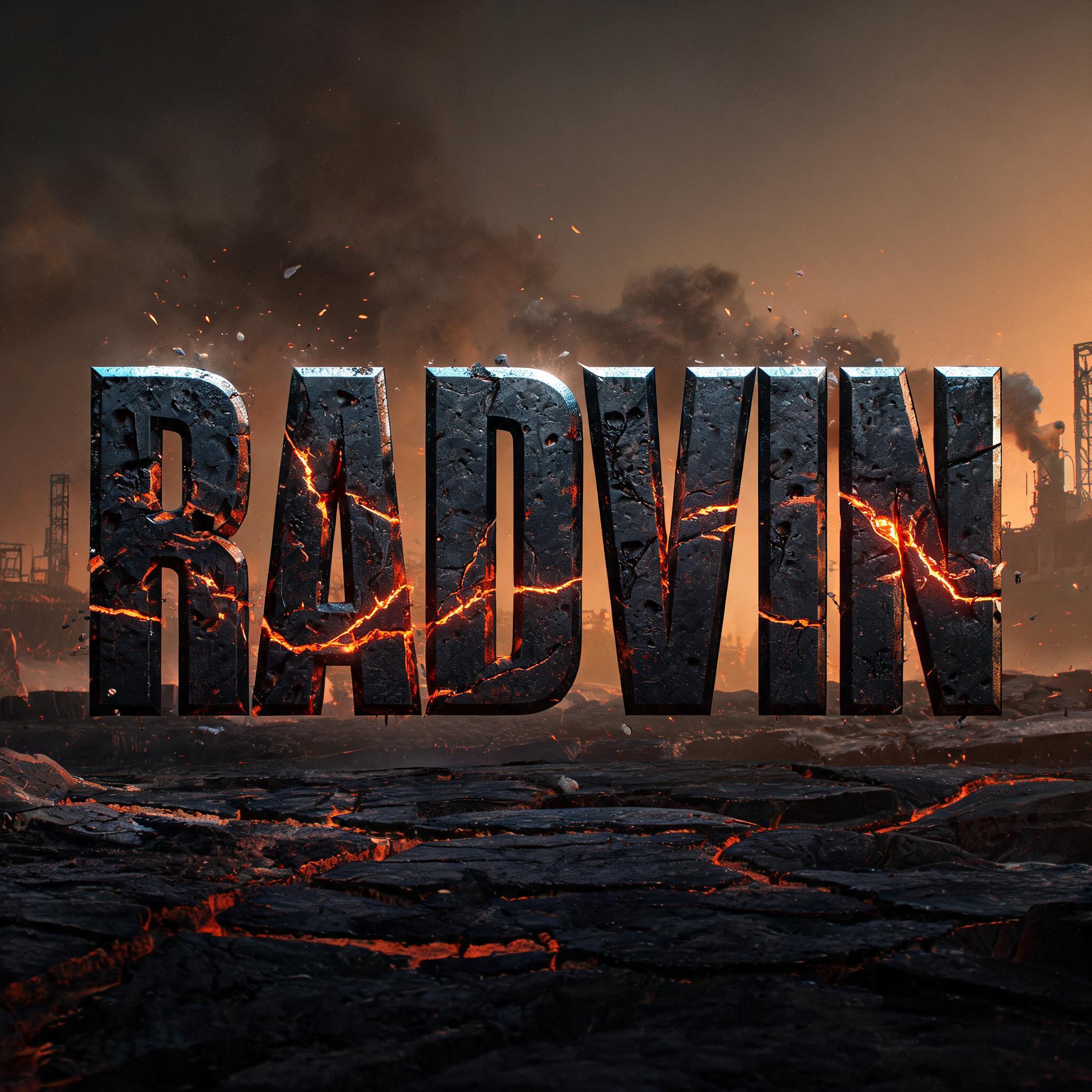
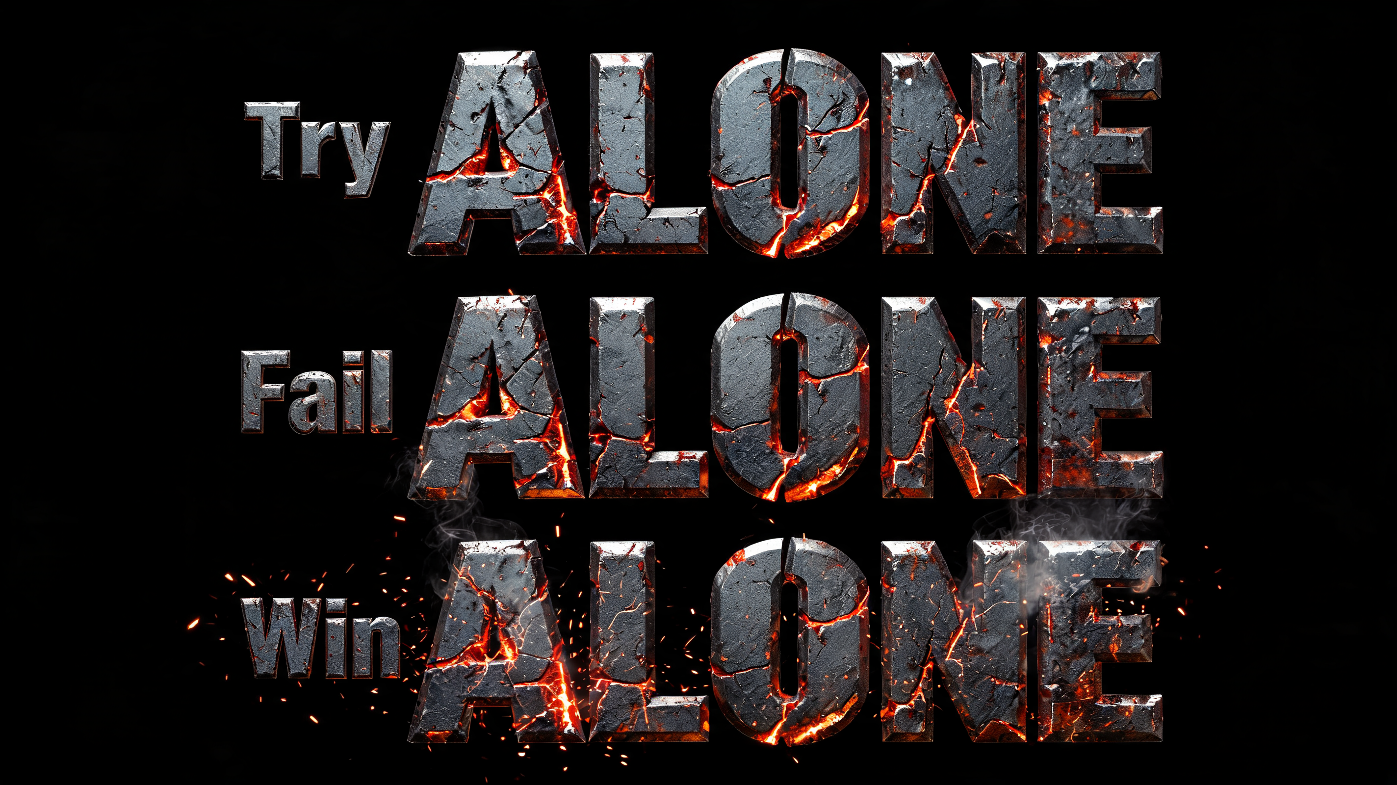
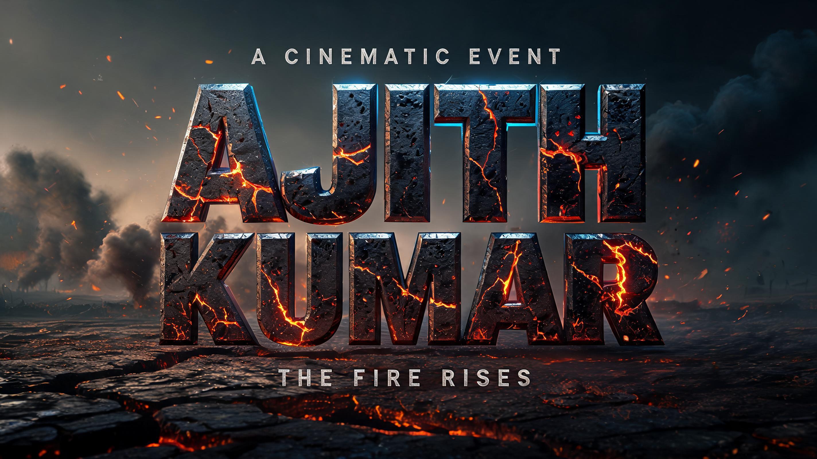
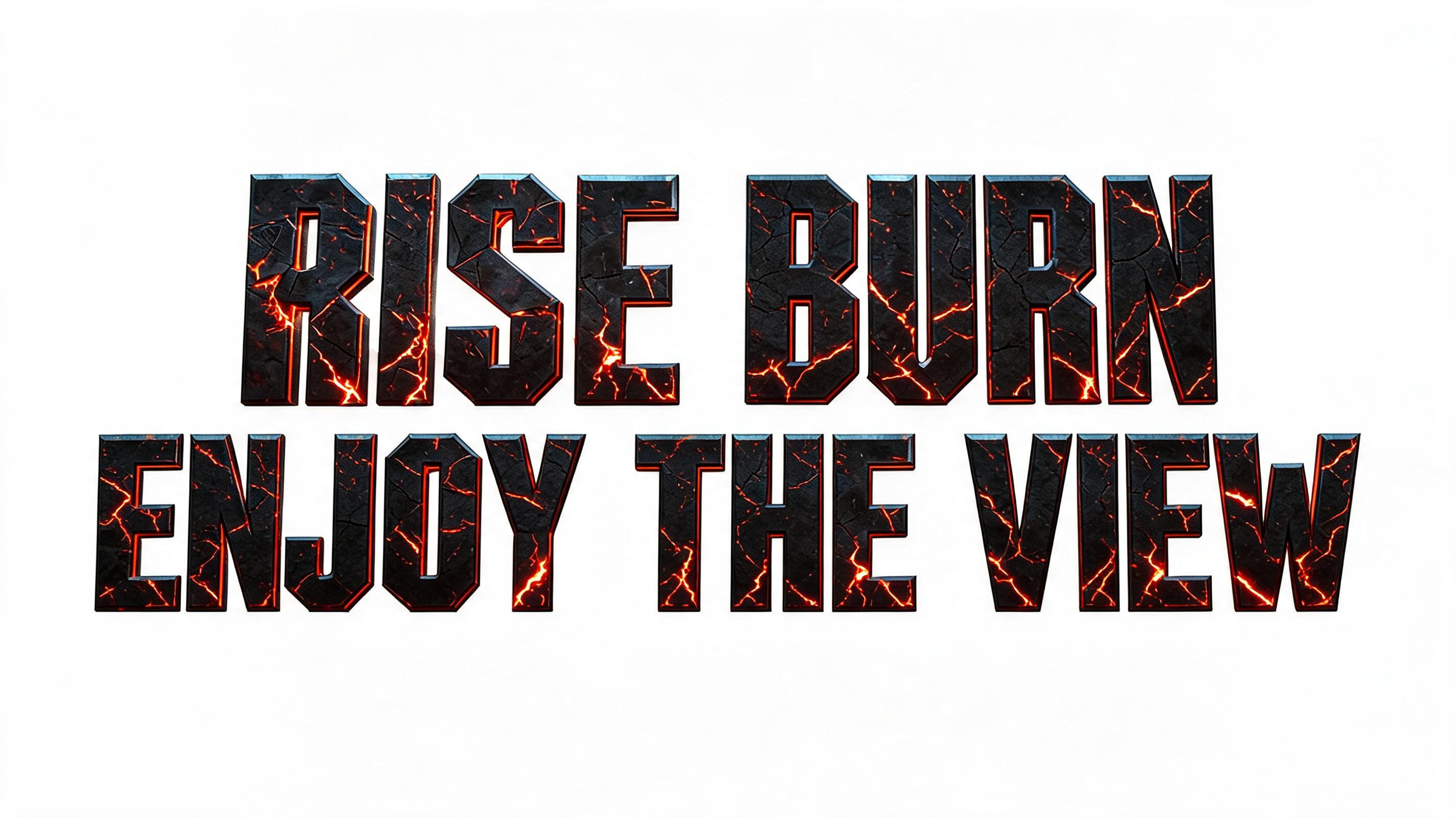
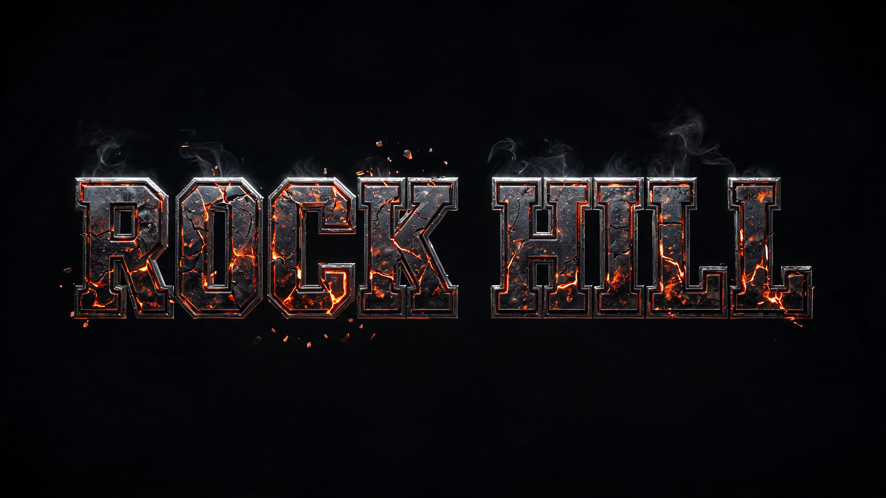
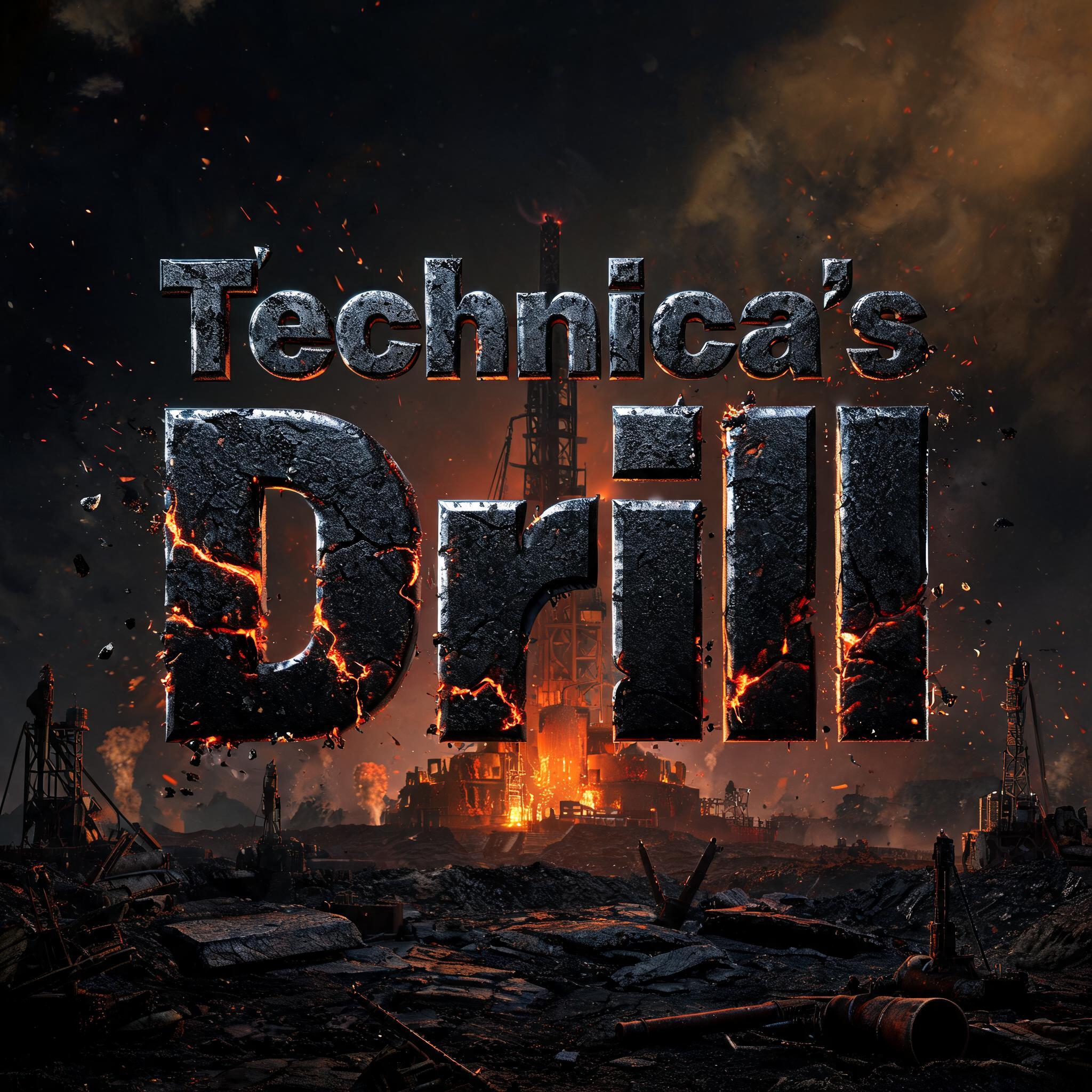
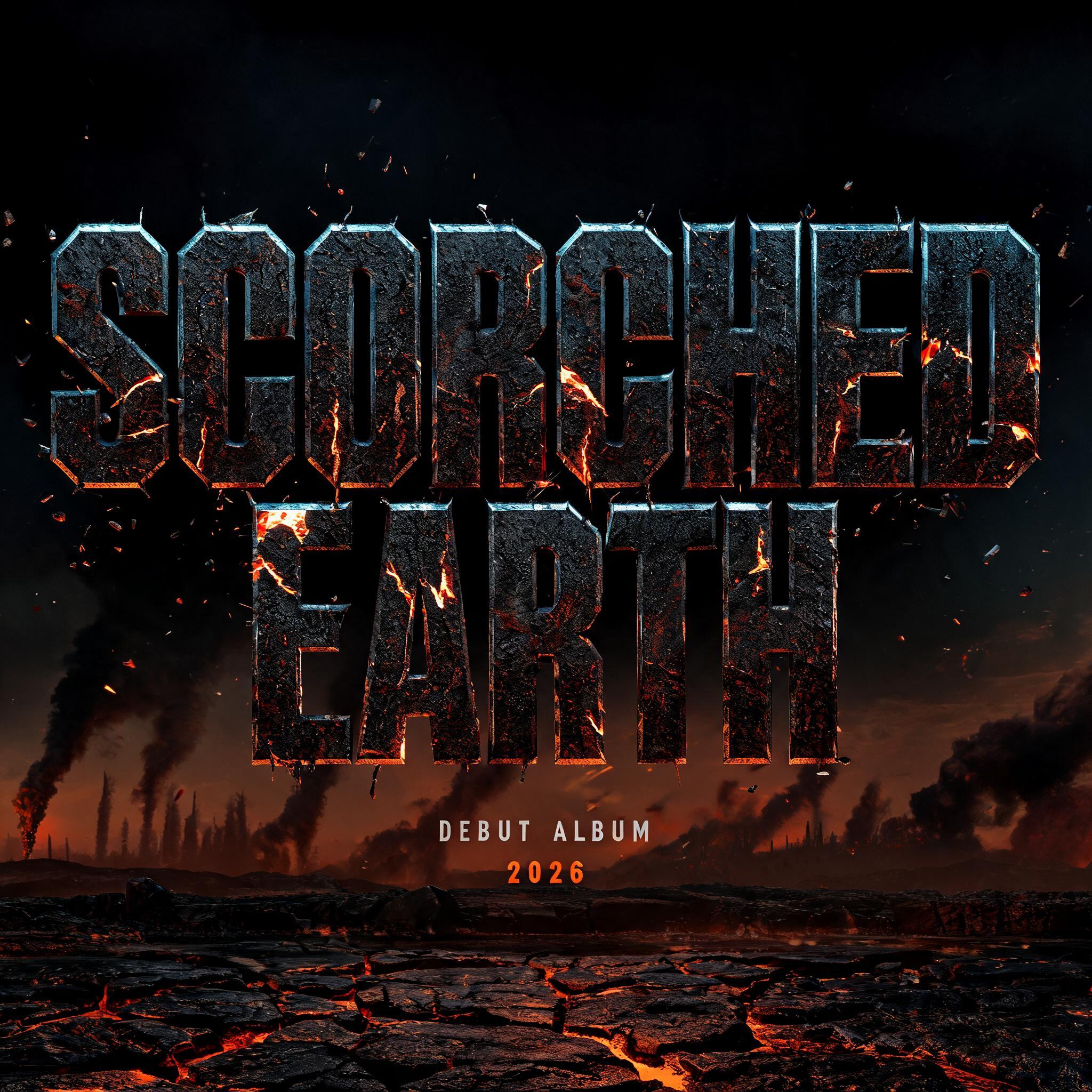
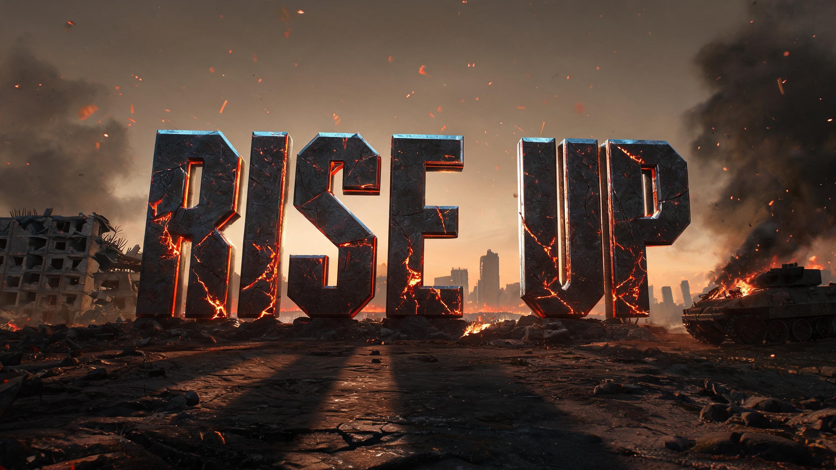
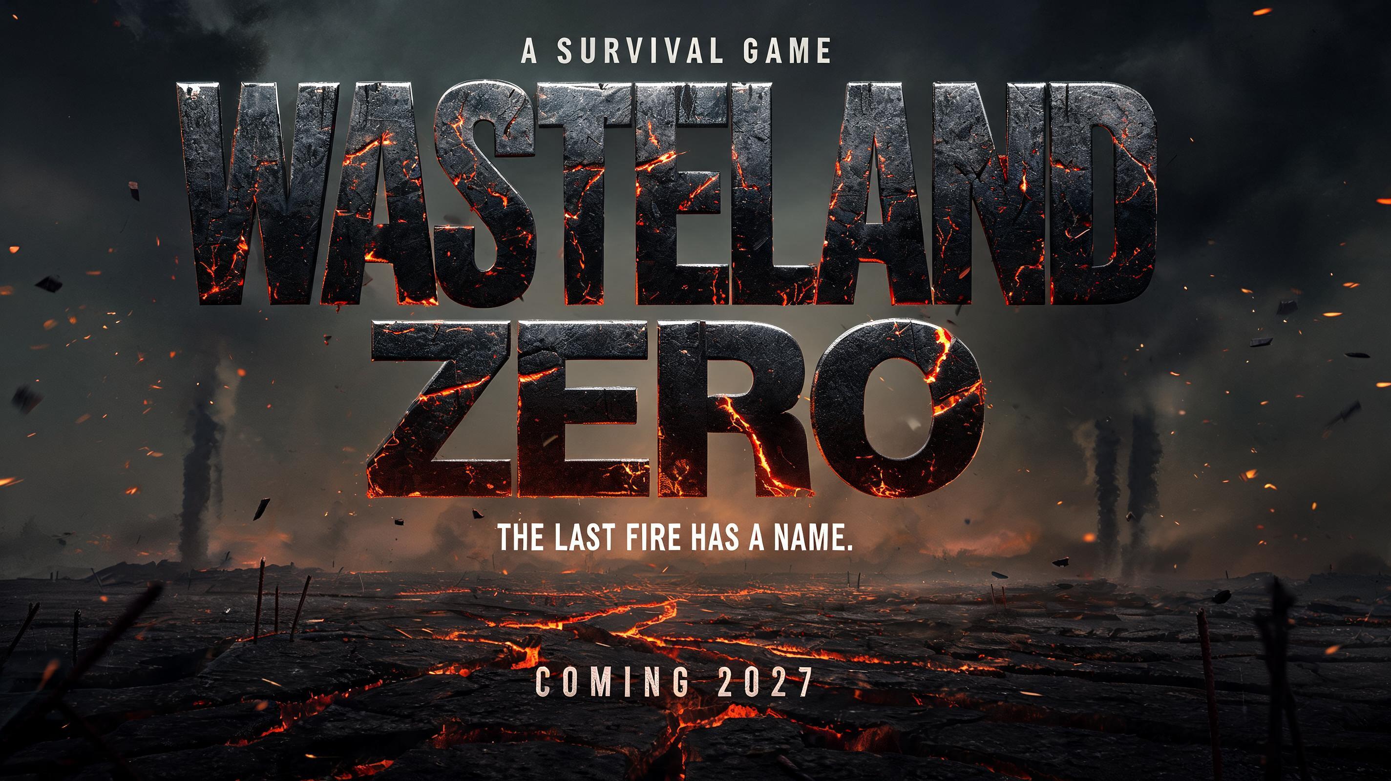
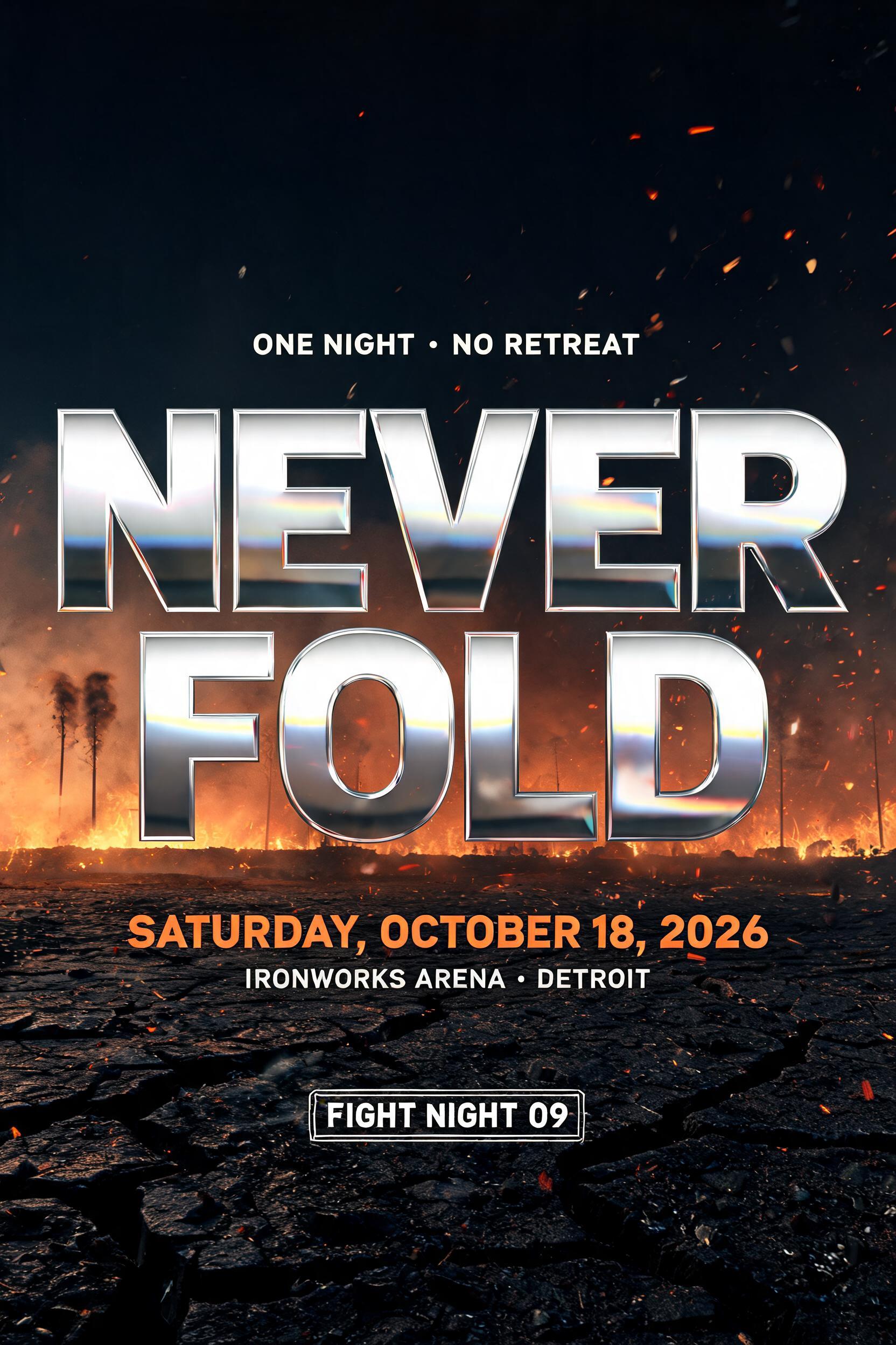
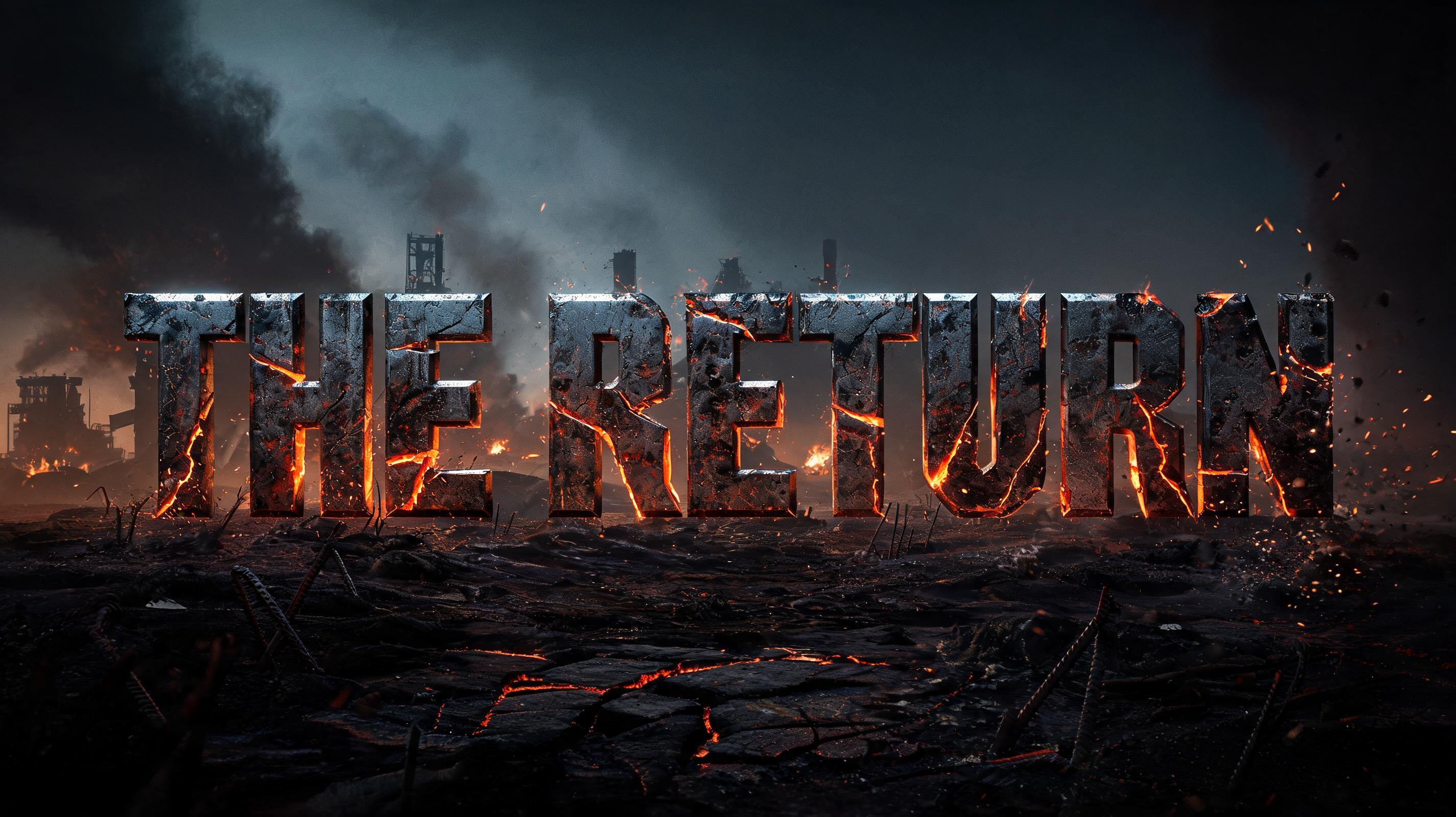
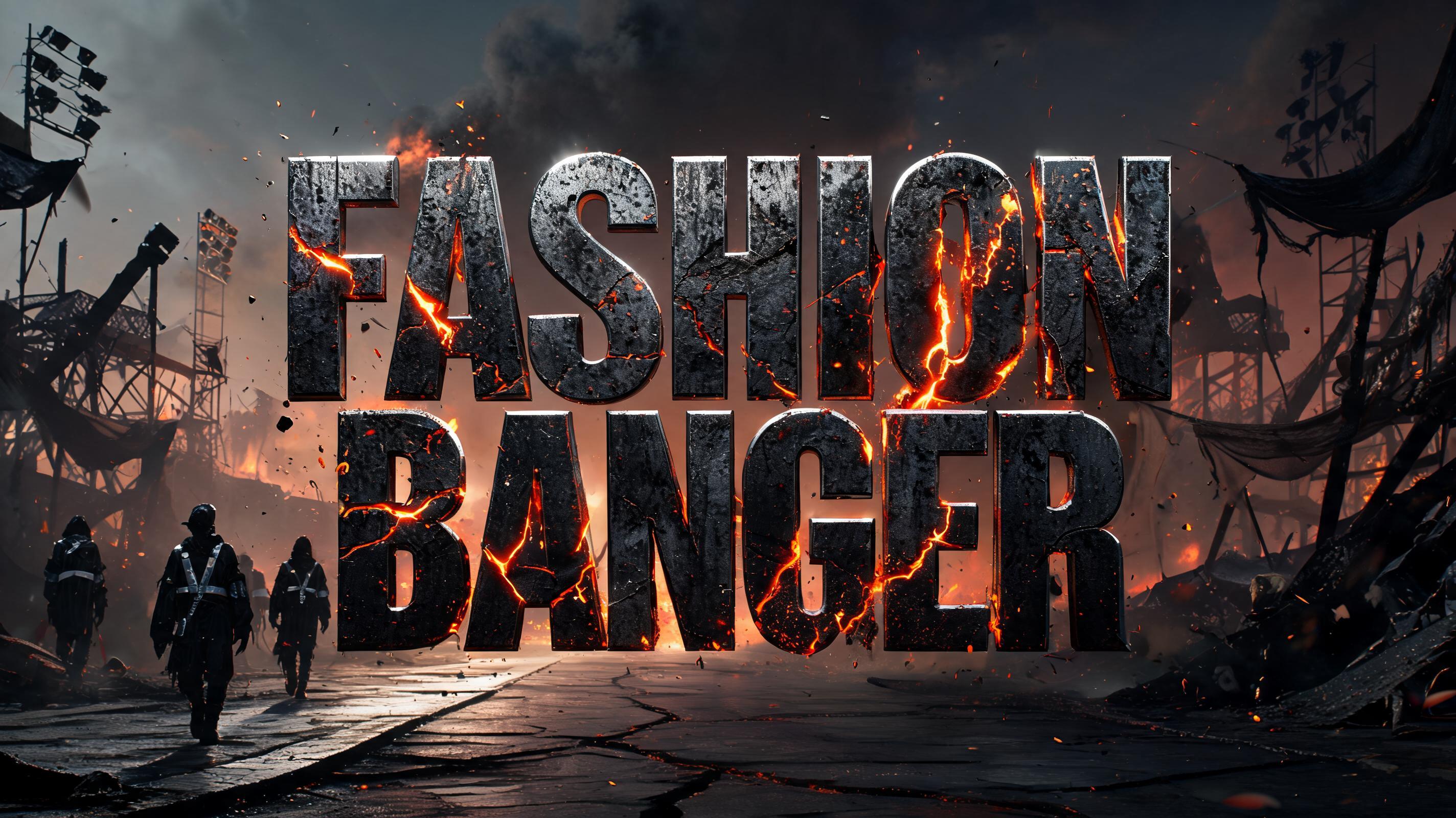
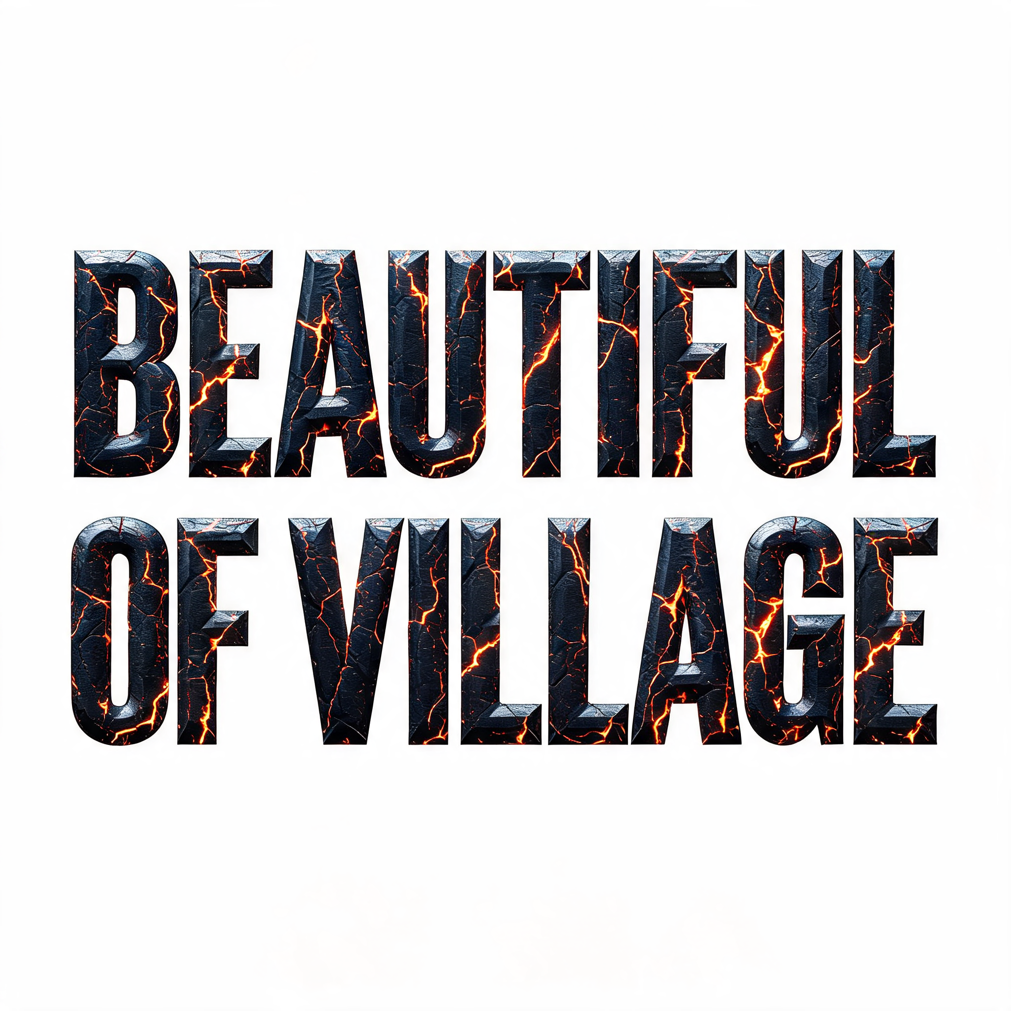
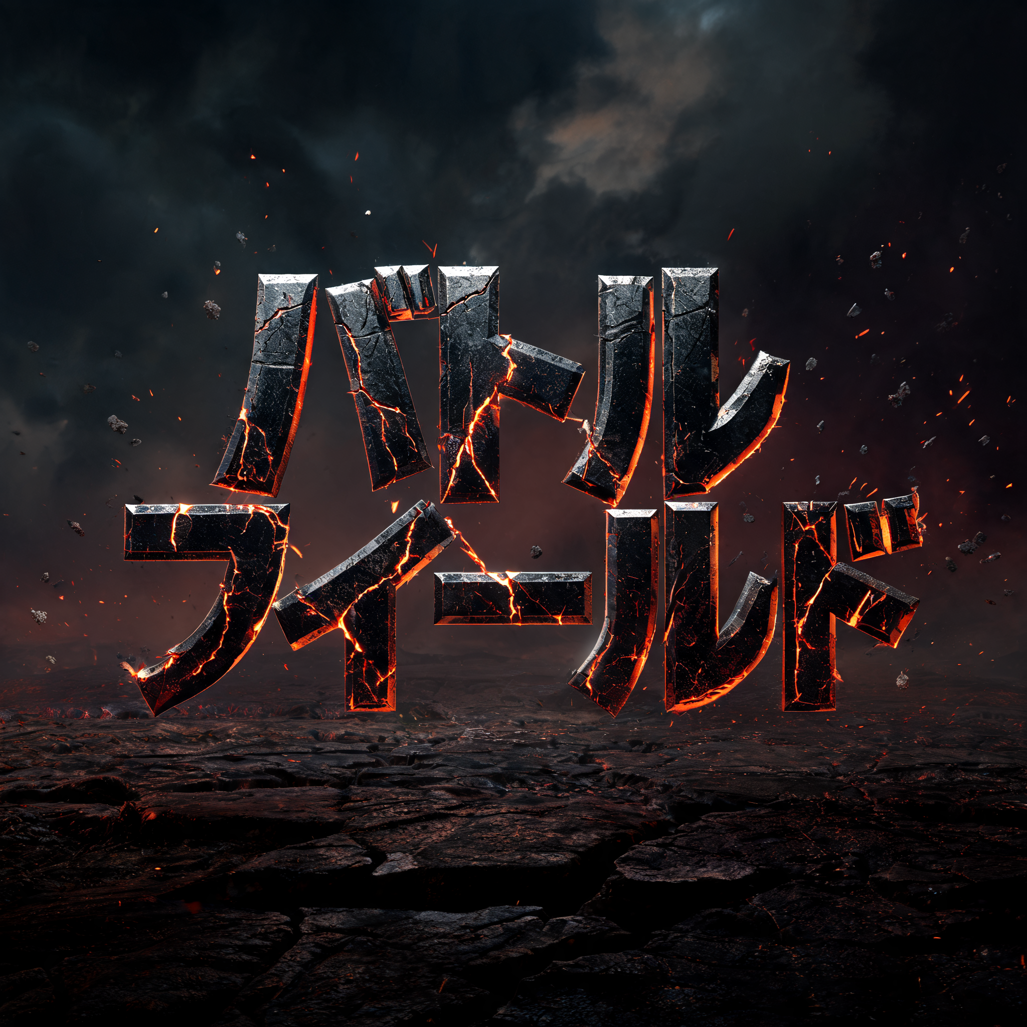
Tall condensed capitals of battle-worn dark metal, split by cracks glowing with molten orange lava, with embers and ash over scorched ground. — no font license needed.
Post Apocalyptic in different AI fonts
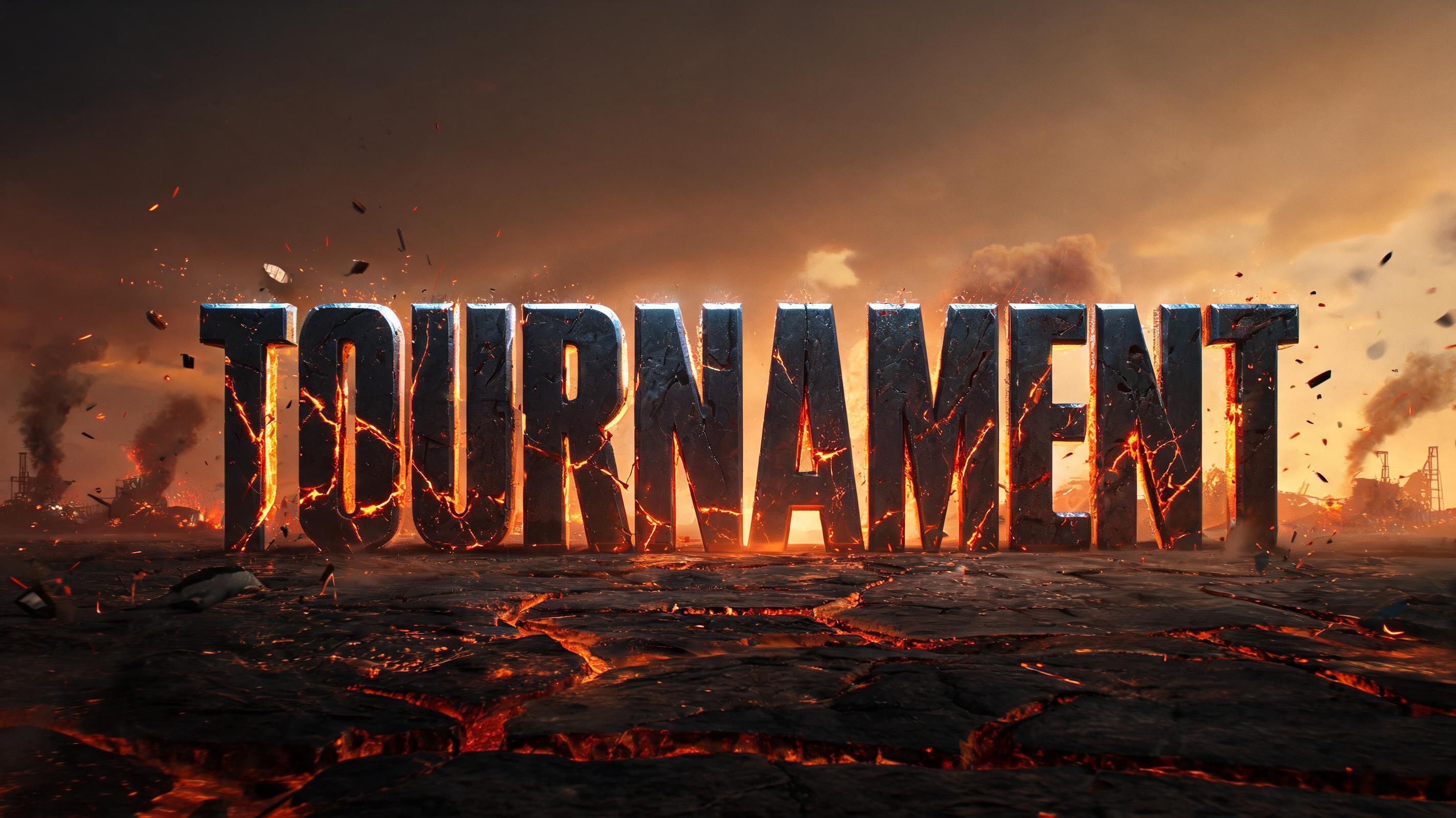


Post Apocalyptic Gallery
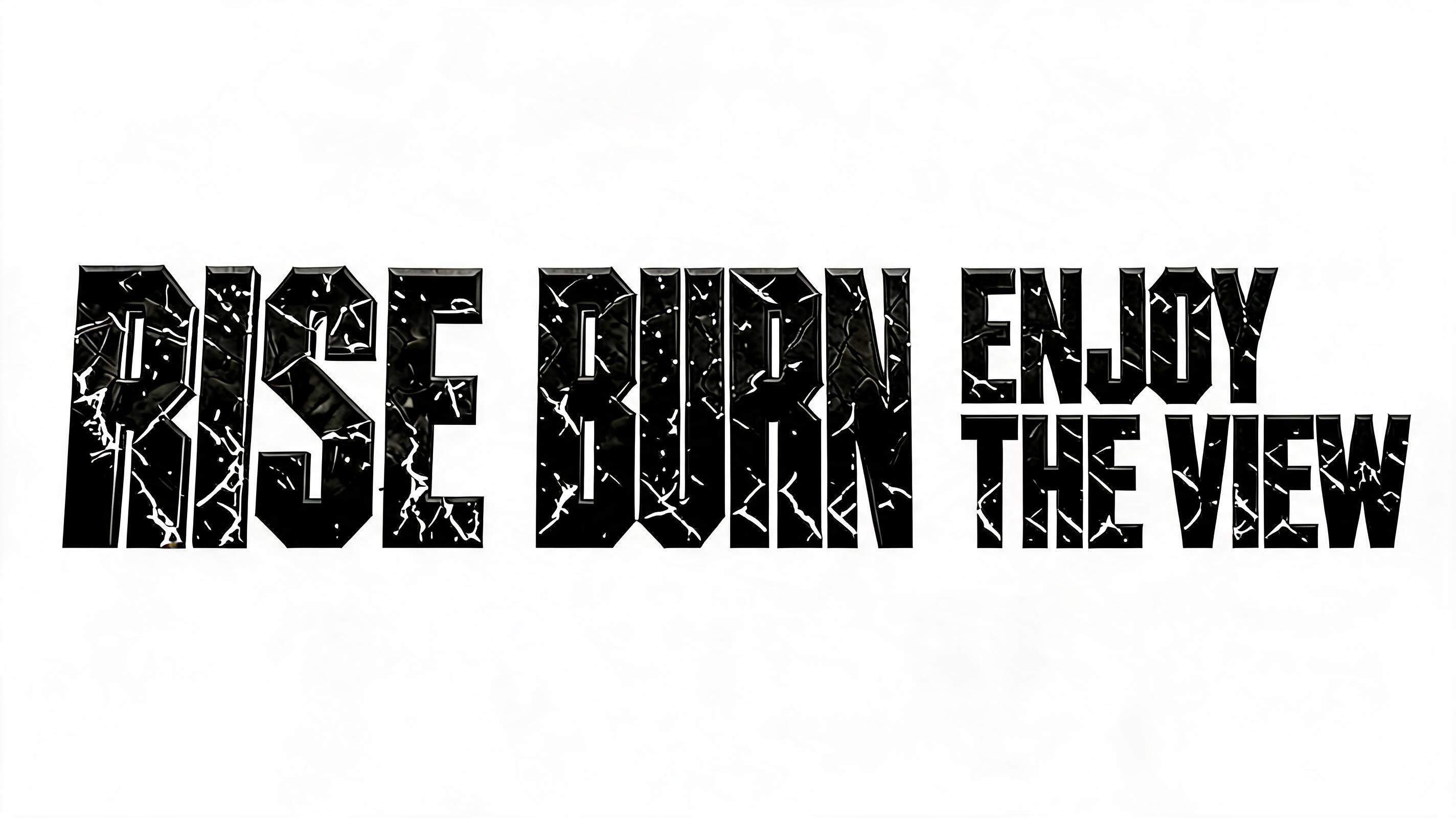
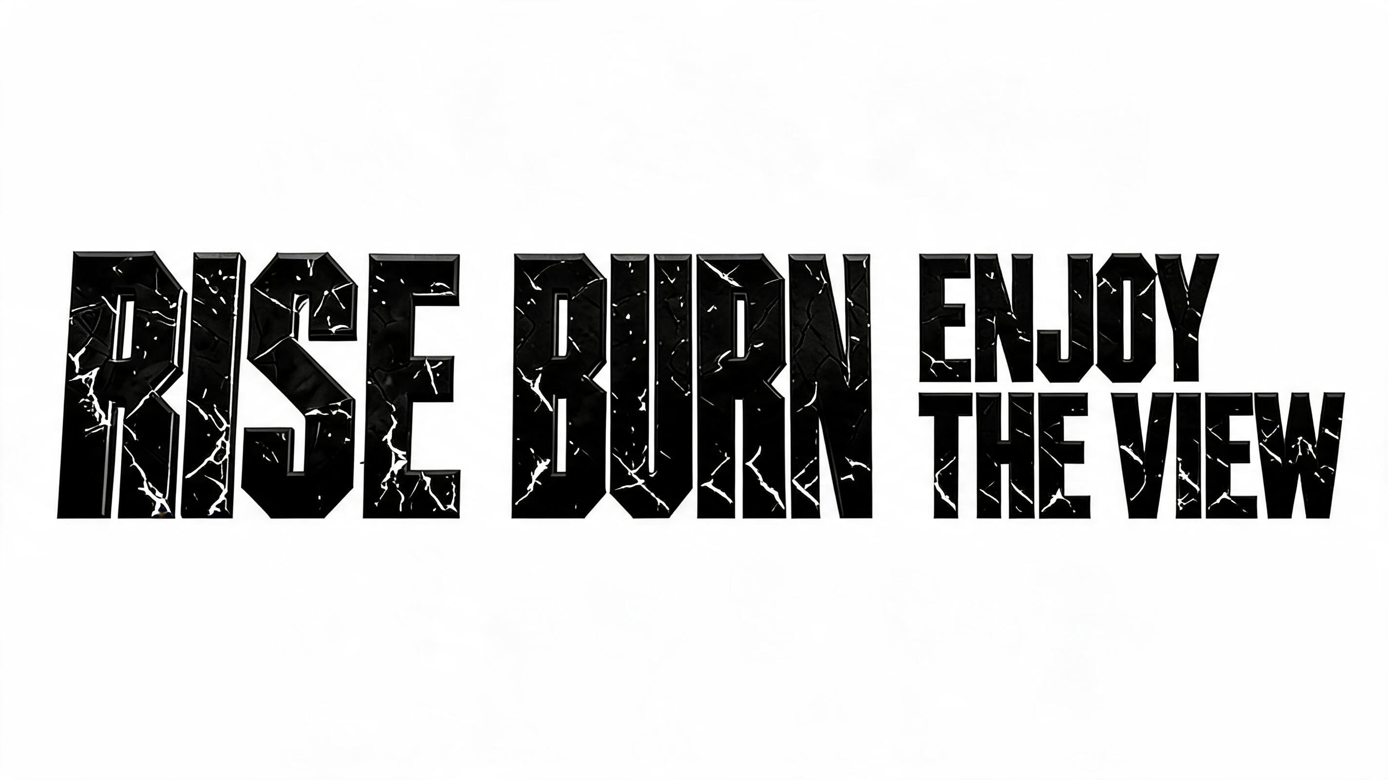
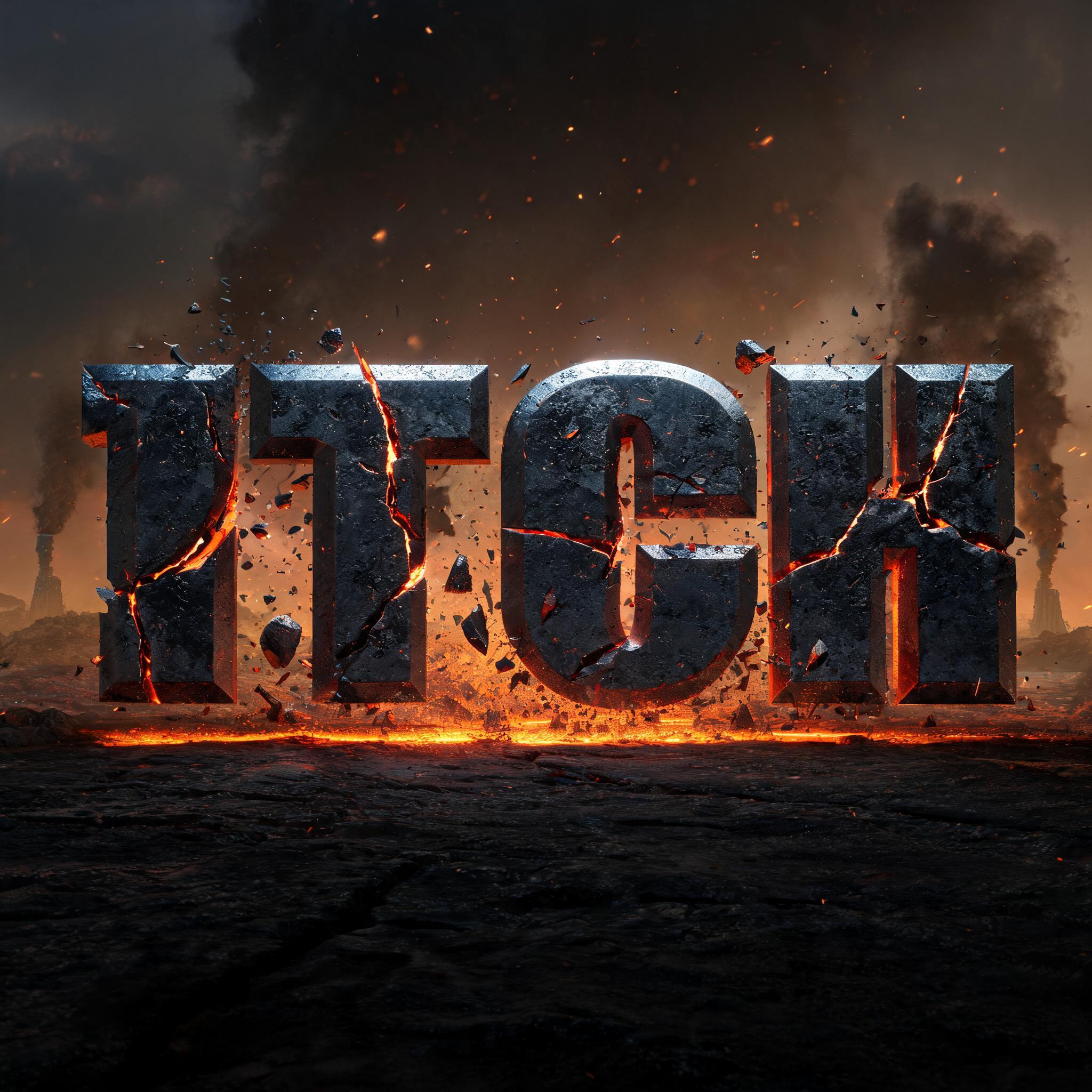
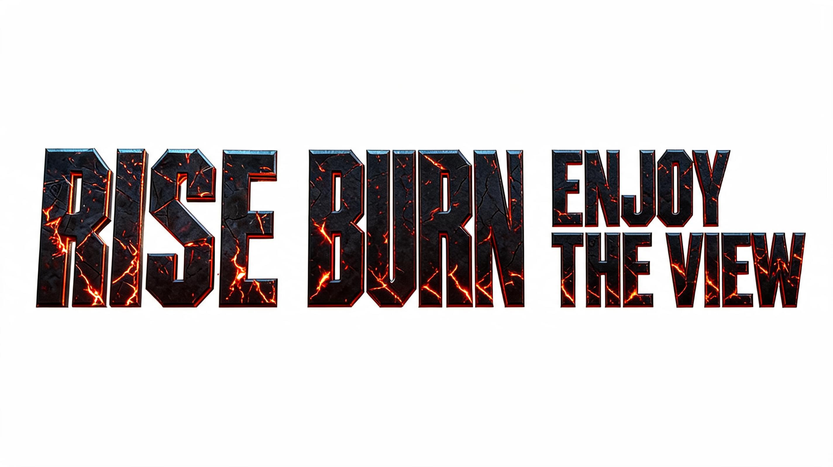
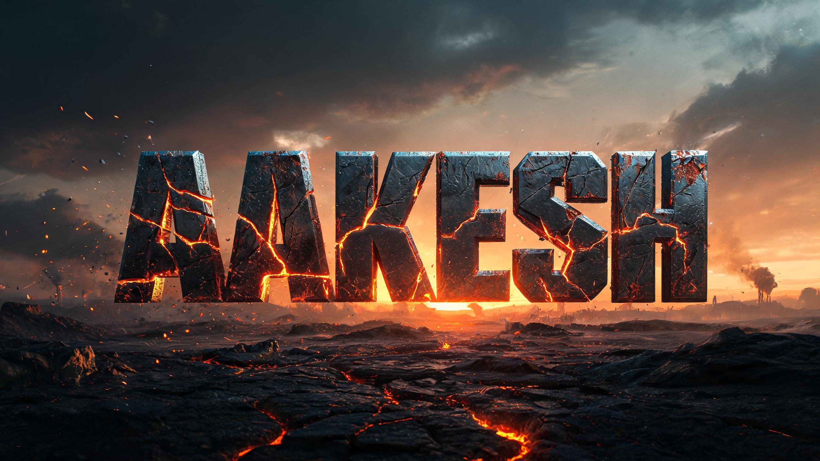
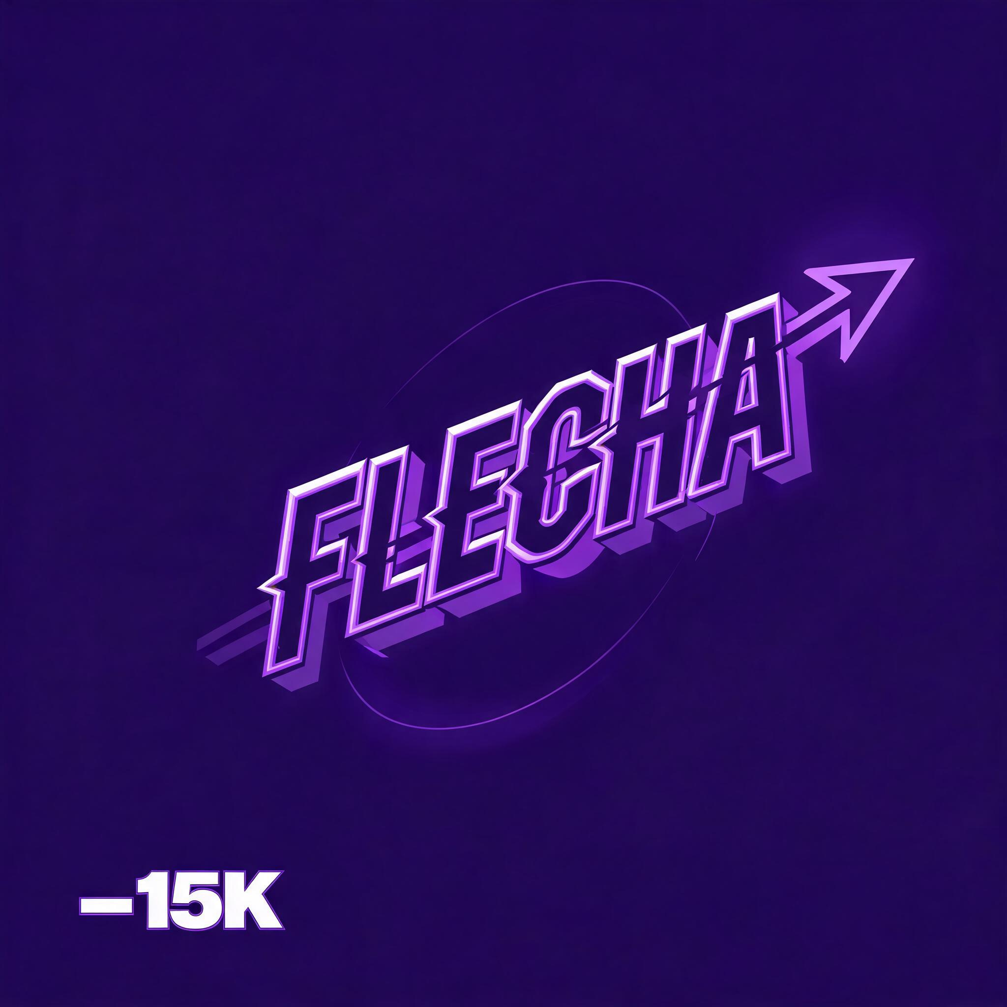
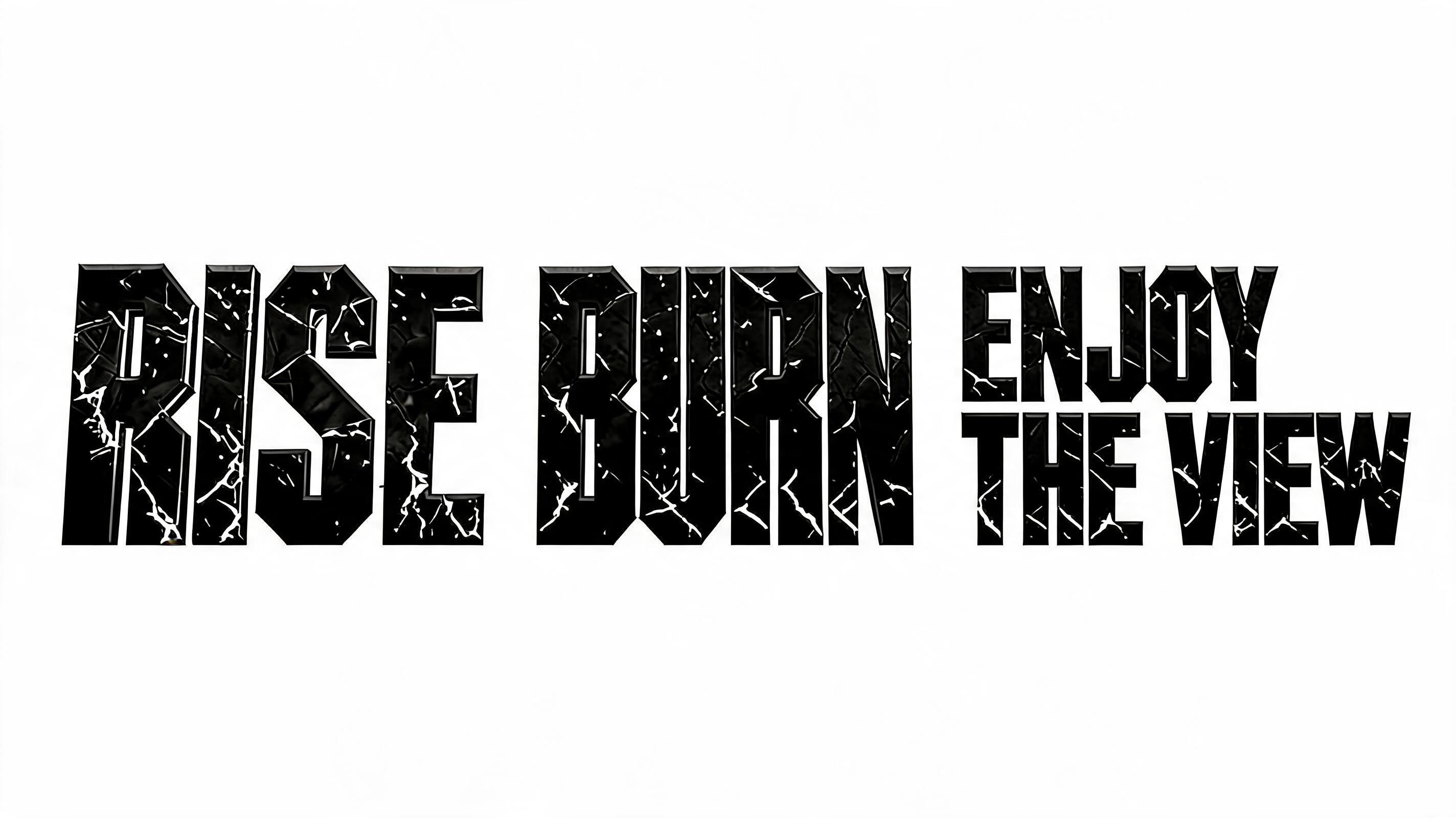
Real outputs from the Post Apocalyptic style. Click any image to see details.
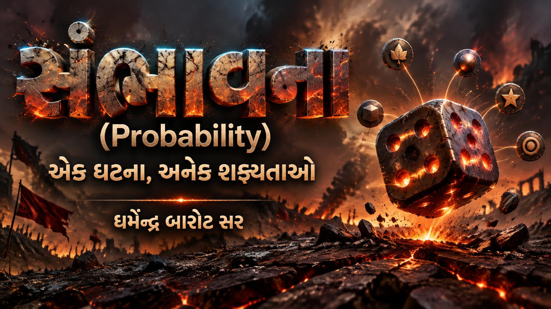
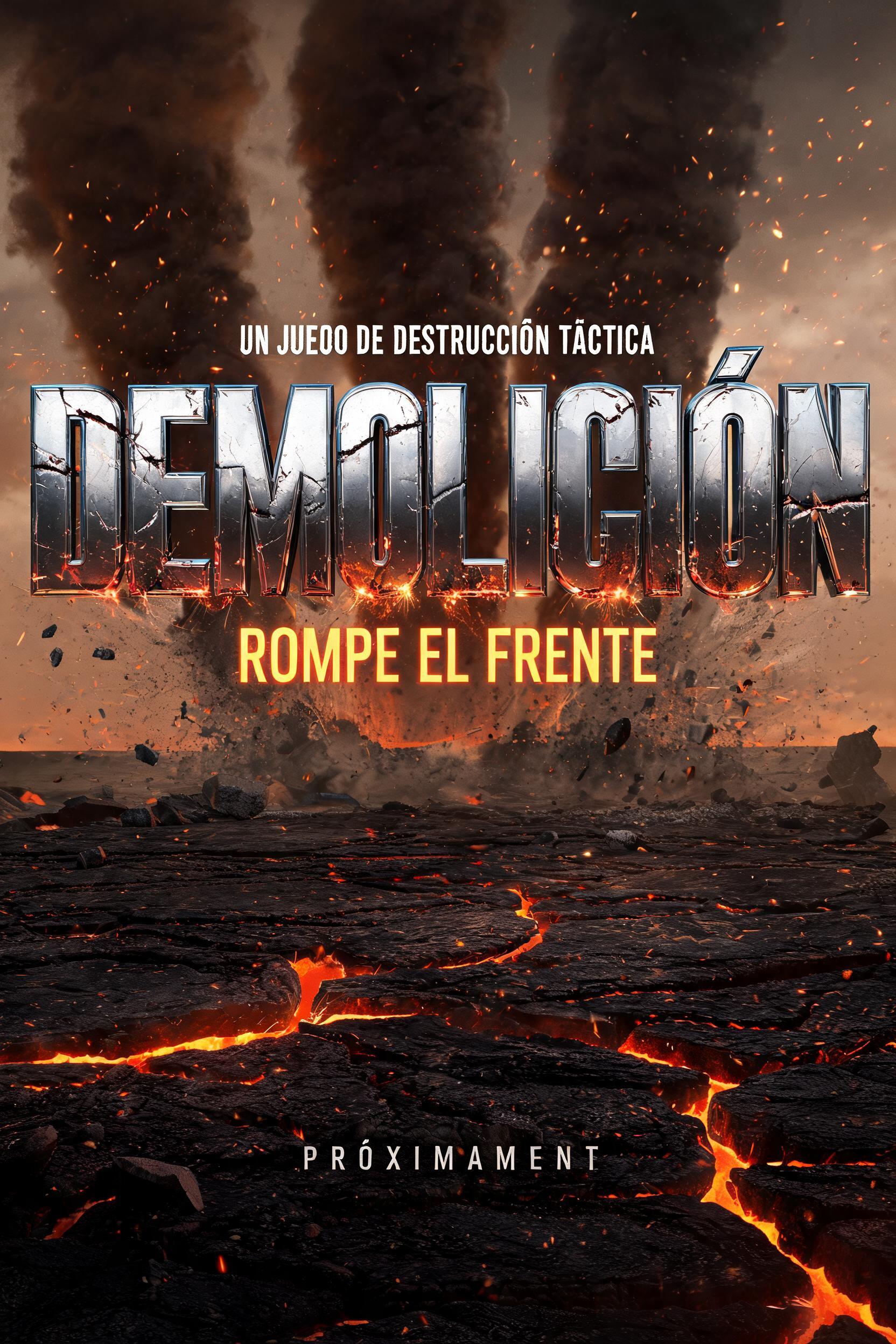
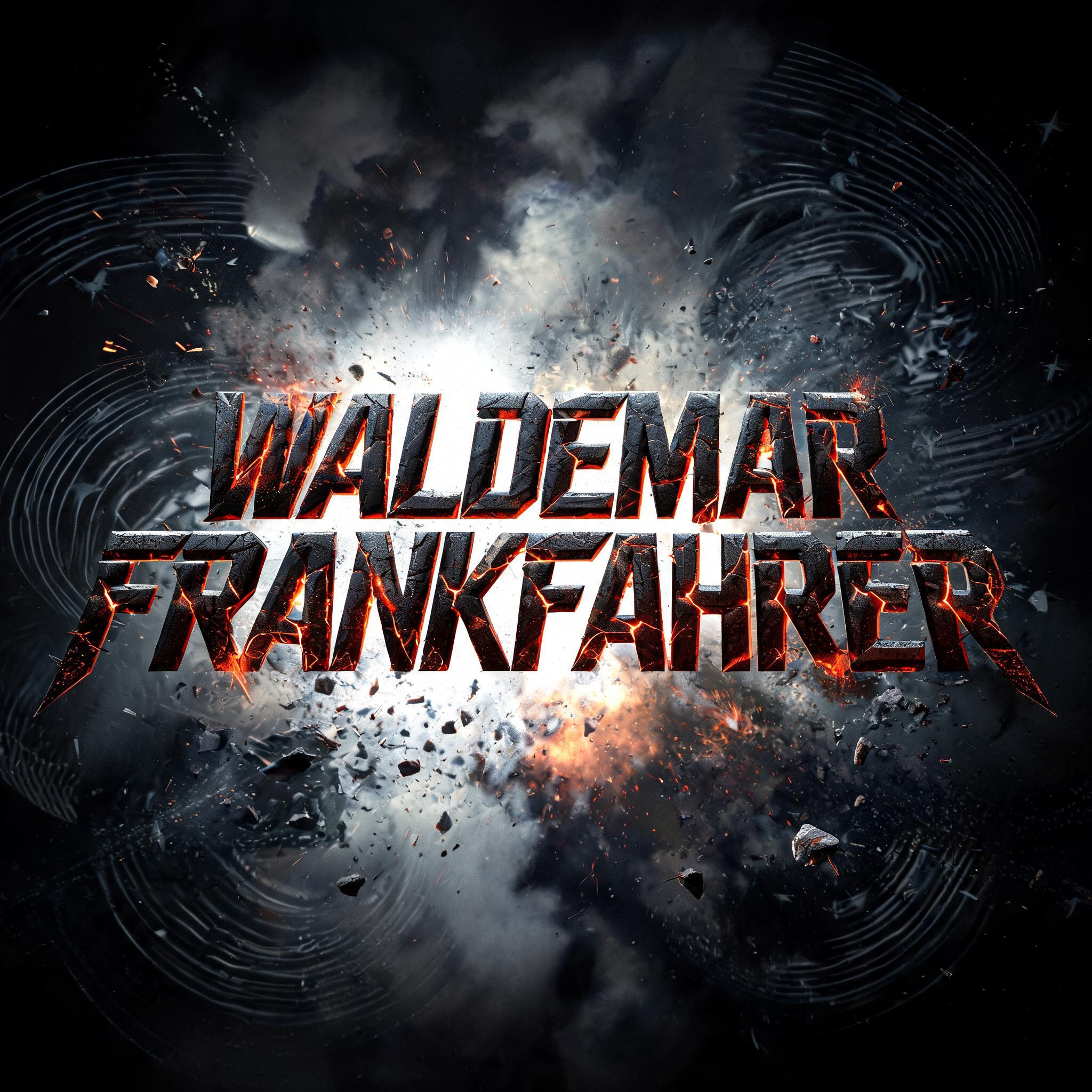




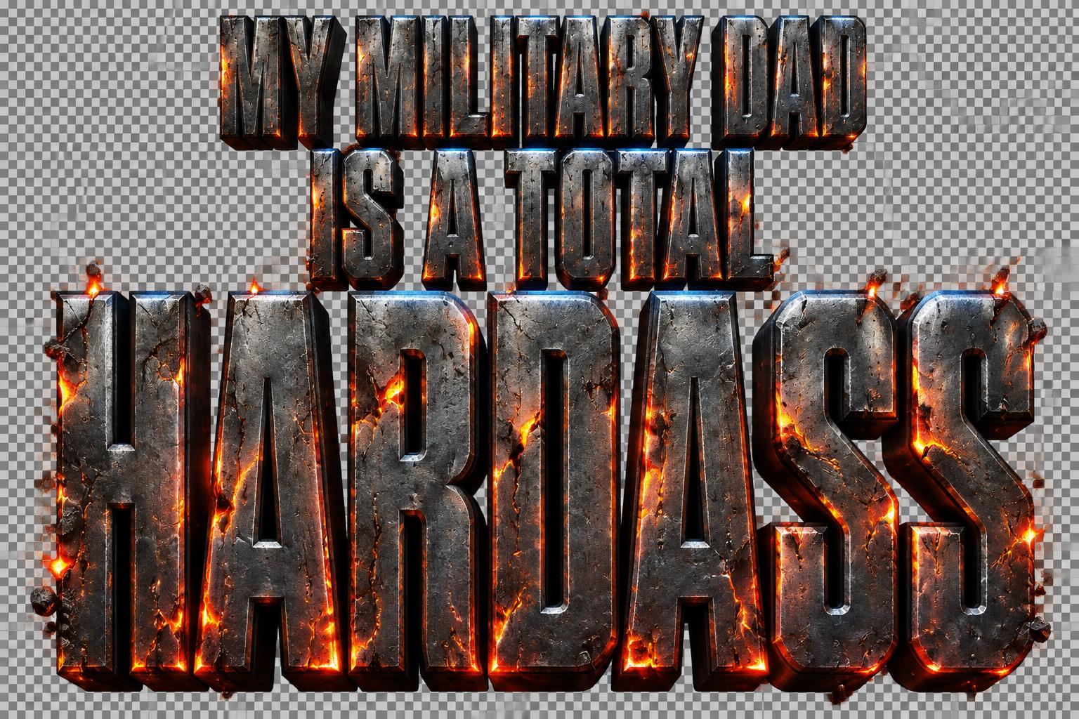


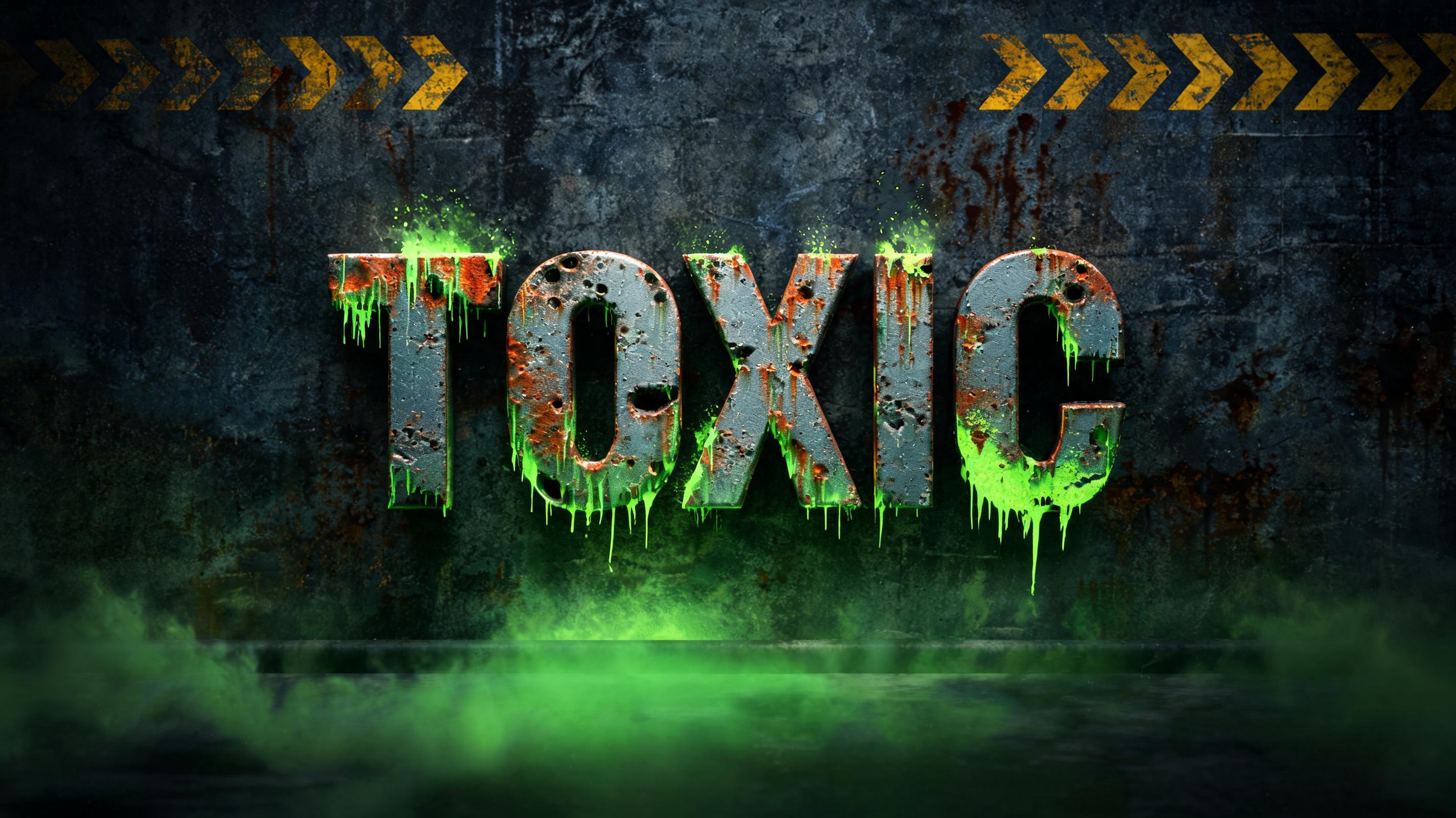


Looking for copy-paste fancy text? Try our free Font Generator Tools — cursive, gothic, bubble & 30+ styles.
Perfect for These Projects
Post Apocalyptic Text Effect — FAQ
What is the Post Apocalyptic Font Style?
The Post Apocalyptic font style is a distinctive AI-generated typography effect. Tall condensed capitals of battle-worn dark metal, split by cracks glowing with molten orange lava, with embers and ash over scorched ground. Using FontVibe's AI post apocalyptic generator you can create stunning text effects in seconds — no Photoshop, no font licensing, no design experience needed.
Explore the Post Apocalyptic gallery for inspiration, or browse all 126+ AI text effect styles available on FontVibe.
How to Create Post Apocalyptic Typography in FontVibe Studio
The Story Behind Post Apocalyptic
History, visual DNA, and cultural context.
Where It Came From
Post-apocalyptic typography has a precise cultural origin: the nuclear anxiety of the Cold War filtered through 1980s science fiction. Before Fallout, before Mad Max, there were the pulp paperback covers of the 1950s — heavy slab-serifs stamped over atomic mushroom clouds, conveying the specific dread of civilization ending on a Tuesday afternoon.
The visual language crystallized in two directions. The first was industrial decay: rust, oxidized metal, cracked concrete, surviving infrastructure that barely survived. The second was fire and heat: molten metal, lava glow, the aftermath of an impact rather than the impact itself. Fallout (1997) fused both into a game aesthetic so distinctive that its Pip-Boy iconography and scorched-earth palette became the permanent reference point for the genre.
The typography of this aesthetic follows the same logic: letters that look like they were forged before the war and survived through it. Heavy, worn, cracked — but still standing.
The Visual DNA
Cultural Landmarks
In Typography
Post-apocalyptic typography follows a strict visual logic: weight signals survival. Thin letterforms suggest fragility — elegance that has no place in a wasteland. Heavy, condensed letterforms signal mass, endurance, and industrial origin. The genre defaults to ultra-bold slab-serifs and condensed display faces — letterforms that read as stamped or cast rather than drawn.
The surface treatment is everything. The same heavy letterform reads as corporate on a clean background and post-apocalyptic with oxidized metal and lava cracks. The typographic effect is doing the heavy lifting — the letterform is just the vessel for the destruction to live inside.
For designers building in this aesthetic, the key is specificity of damage. Generic 'grunge' looks accidental. Post-apocalyptic damage looks intentional and directional — cracks from impact, heat stress following structural lines, ember scatter with consistent light sources. The AI handles this logic automatically: every FontVibe render applies physically consistent damage based on the selected style.
Create Your Post Apocalyptic Typography in Studio
Free to start. No design skills needed. Your artwork, your copyright.
AI Post Apocalyptic Text Effect Generator
Tall condensed capitals of battle-worn dark metal, split by cracks glowing with molten orange lava, with embers and ash over scorched ground. — no font license needed.
Post Apocalyptic in different AI fonts
Generate Your Post Apocalyptic Text Effect
Type any word — see it transformed in seconds. No sign-up required.
Post Apocalyptic Style Gallery
Real outputs from the Post Apocalyptic style. Click any image to see details.
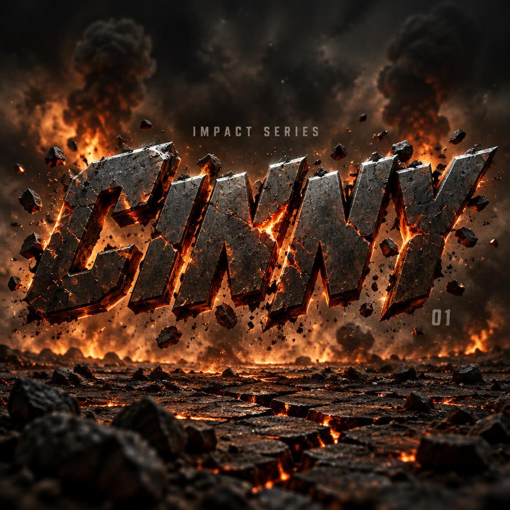
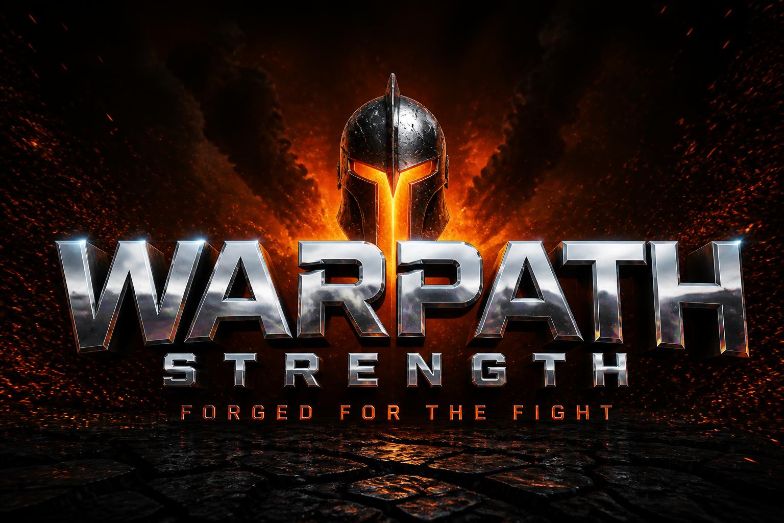


Similar Text Effect Styles
Try these styles and create your own AI-generated text effects.
Looking for copy-paste fancy text? Try our free Font Generator Tools — cursive, gothic, bubble & 30+ styles.
Perfect for These Projects
Post Apocalyptic text effects are popular for creative projects where visual impact matters.
What is the Post Apocalyptic Font Style?
The Post Apocalyptic font style is a distinctive AI-generated typography effect. Tall condensed capitals of battle-worn dark metal, split by cracks glowing with molten orange lava, with embers and ash over scorched ground.
Using FontVibe's AI post apocalyptic generator you can create stunning text effects in seconds — no Photoshop, no font licensing, no design experience needed.
Explore the Post Apocalyptic gallery for inspiration, or browse all 126+ AI text effect styles available on FontVibe.
How to Create Post Apocalyptic Typography in FontVibe Studio
1. Enter your text — Any word, phrase, or brand name. Works best with short, punchy text.
2. Select Post Apocalyptic — From the style library. Optionally describe a mood in the custom prompt.
3. Generate and download. Your Post Apocalyptic font artwork is ready in seconds. PNG, JPG, or transparent PNG.
Looking for something different? Browse the full font style library for more AI typography options.
Post Apocalyptic Text Effect — FAQ
The Story Behind Post Apocalyptic
History, visual DNA, and cultural context — everything that makes this style what it is.
Where It Came From
Post-apocalyptic typography has a precise cultural origin: the nuclear anxiety of the Cold War filtered through 1980s science fiction. Before Fallout, before Mad Max, there were the pulp paperback covers of the 1950s — heavy slab-serifs stamped over atomic mushroom clouds, conveying the specific dread of civilization ending on a Tuesday afternoon.
The visual language crystallized in two directions. The first was industrial decay: rust, oxidized metal, cracked concrete, surviving infrastructure that barely survived. The second was fire and heat: molten metal, lava glow, the aftermath of an impact rather than the impact itself. Fallout (1997) fused both into a game aesthetic so distinctive that its Pip-Boy iconography and scorched-earth palette became the permanent reference point for the genre.
The typography of this aesthetic follows the same logic: letters that look like they were forged before the war and survived through it. Heavy, worn, cracked — but still standing.
The Visual DNA
Cultural Landmarks
In Typography
Post-apocalyptic typography follows a strict visual logic: weight signals survival. Thin letterforms suggest fragility — elegance that has no place in a wasteland. Heavy, condensed letterforms signal mass, endurance, and industrial origin. The genre defaults to ultra-bold slab-serifs and condensed display faces — letterforms that read as stamped or cast rather than drawn.
The surface treatment is everything. The same heavy letterform reads as corporate on a clean background and post-apocalyptic with oxidized metal and lava cracks. The typographic effect is doing the heavy lifting — the letterform is just the vessel for the destruction to live inside.
For designers building in this aesthetic, the key is specificity of damage. Generic 'grunge' looks accidental. Post-apocalyptic damage looks intentional and directional — cracks from impact, heat stress following structural lines, ember scatter with consistent light sources. The AI handles this logic automatically: every FontVibe render applies physically consistent damage based on the selected style.