


AI Movie & Film Action Movie Text Effect Generator
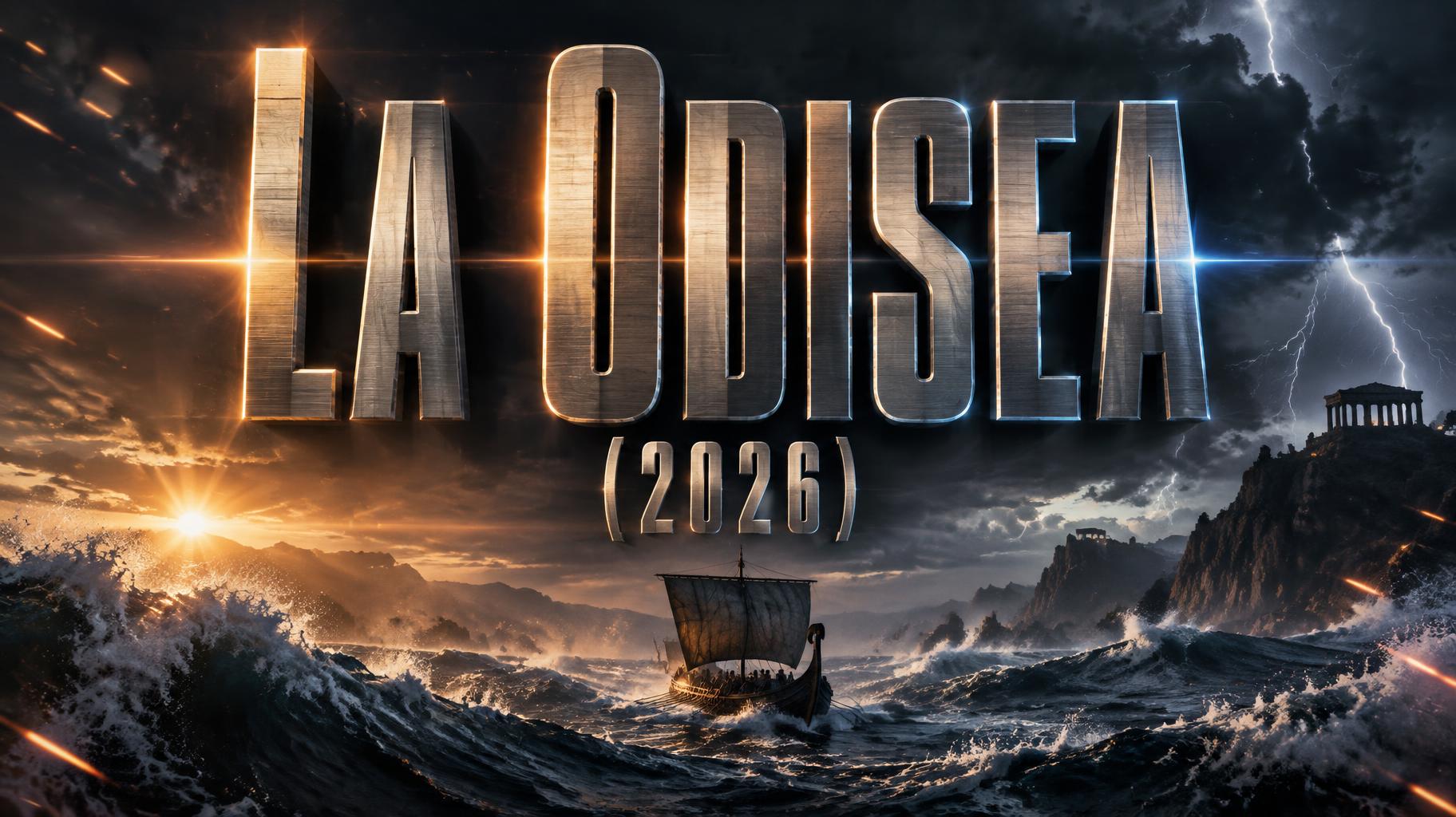
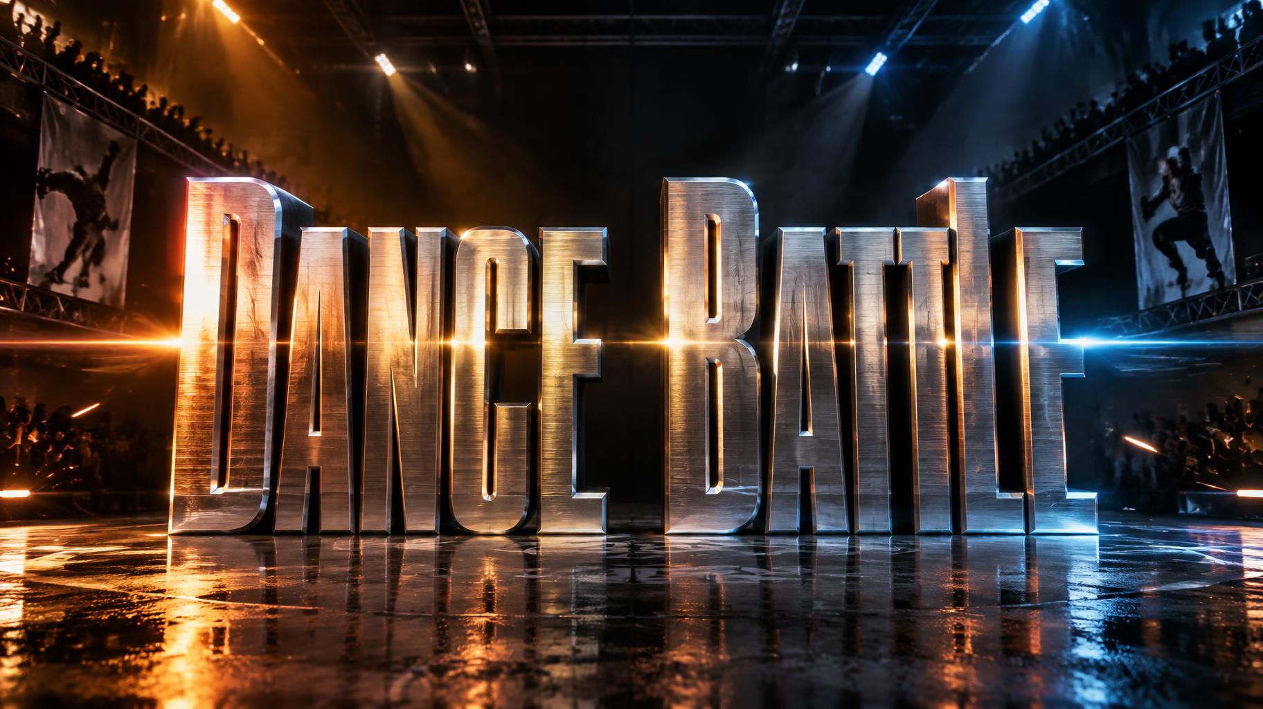
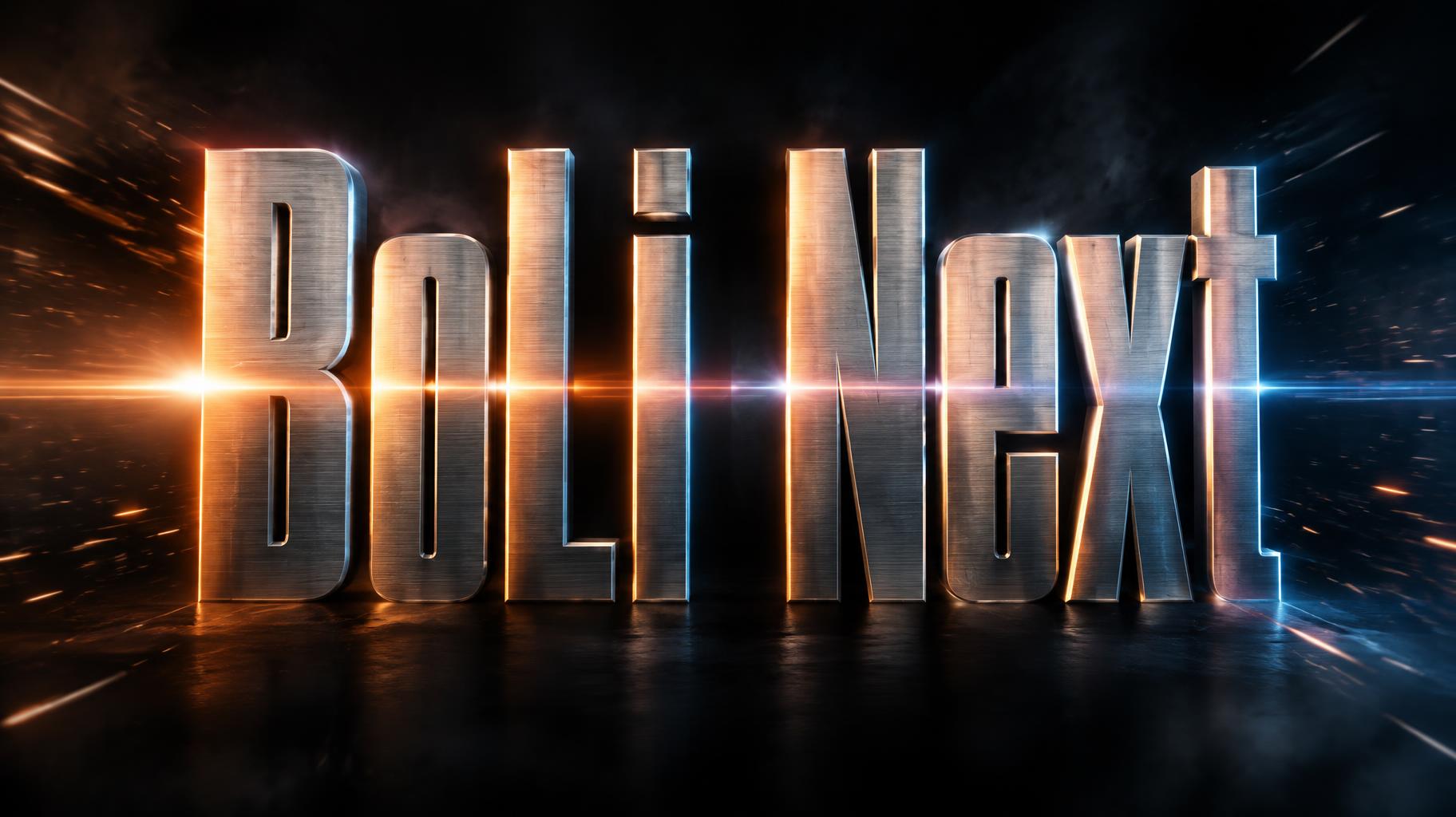
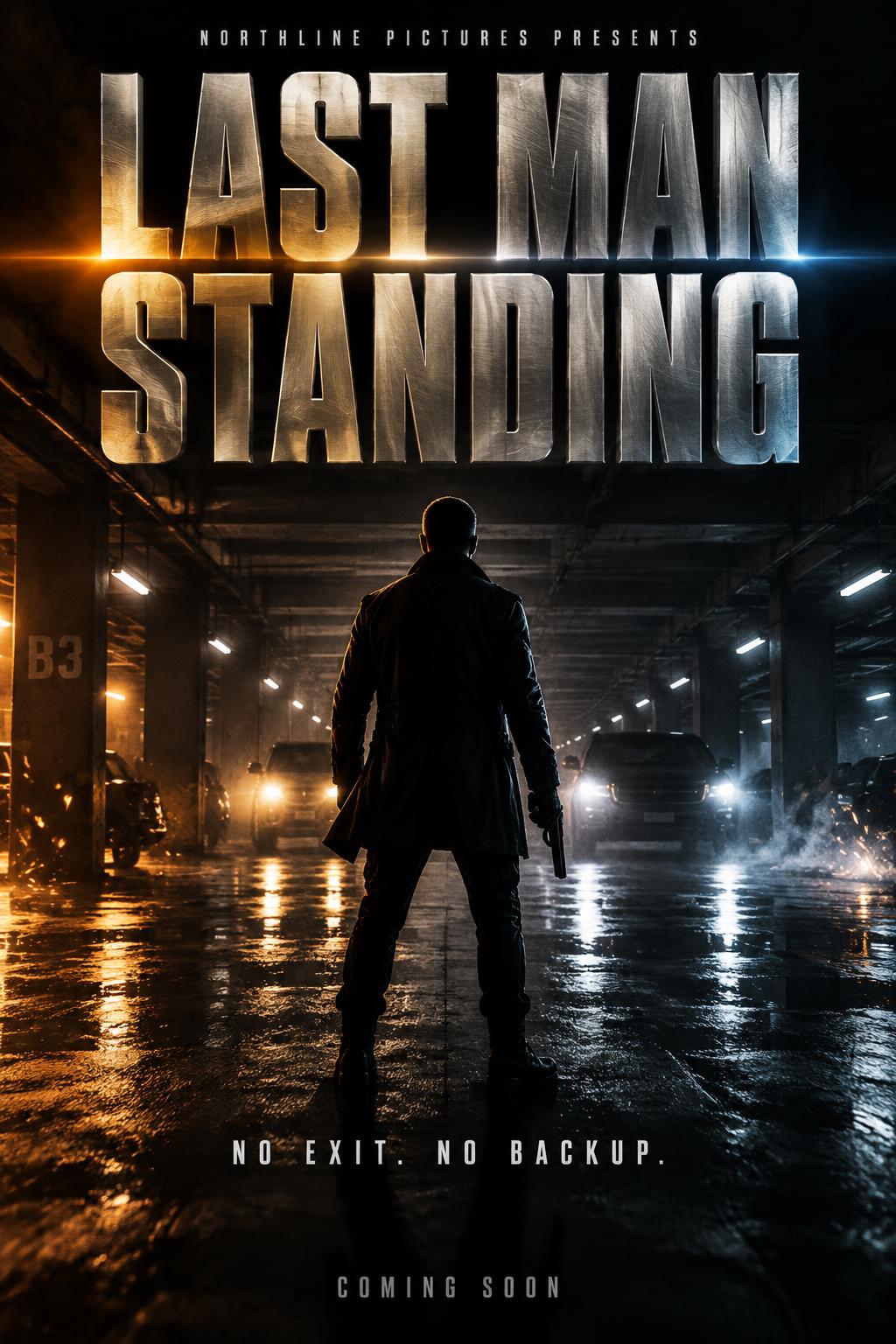
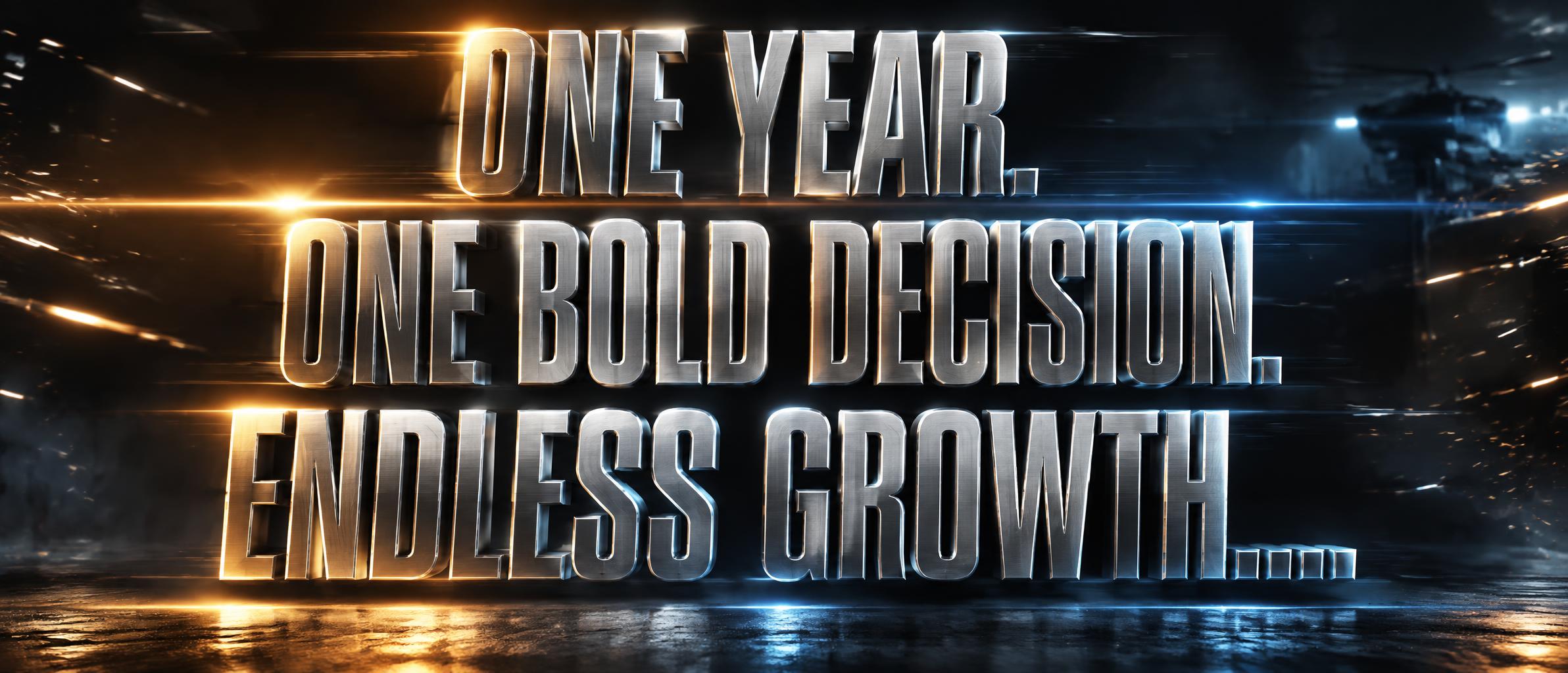
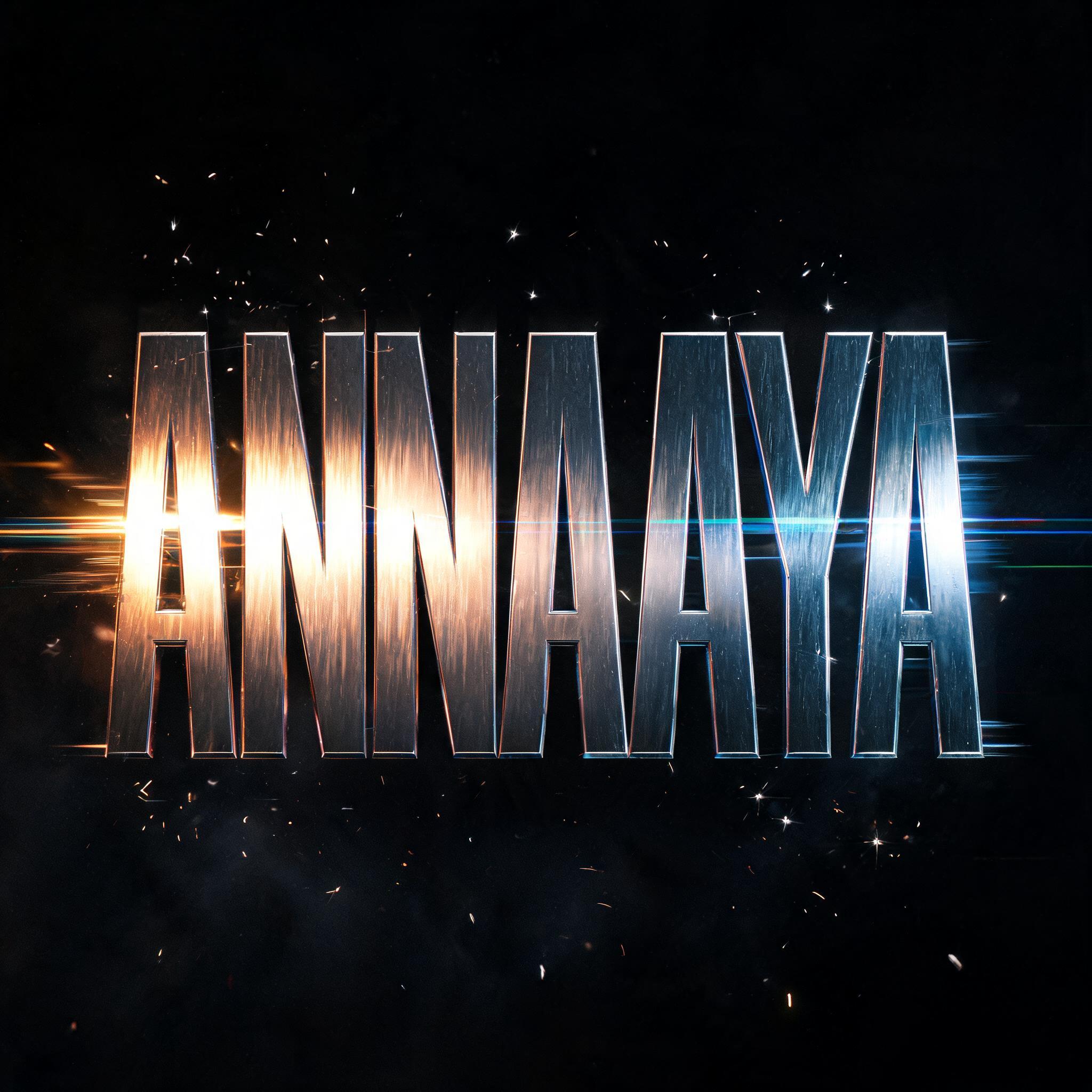
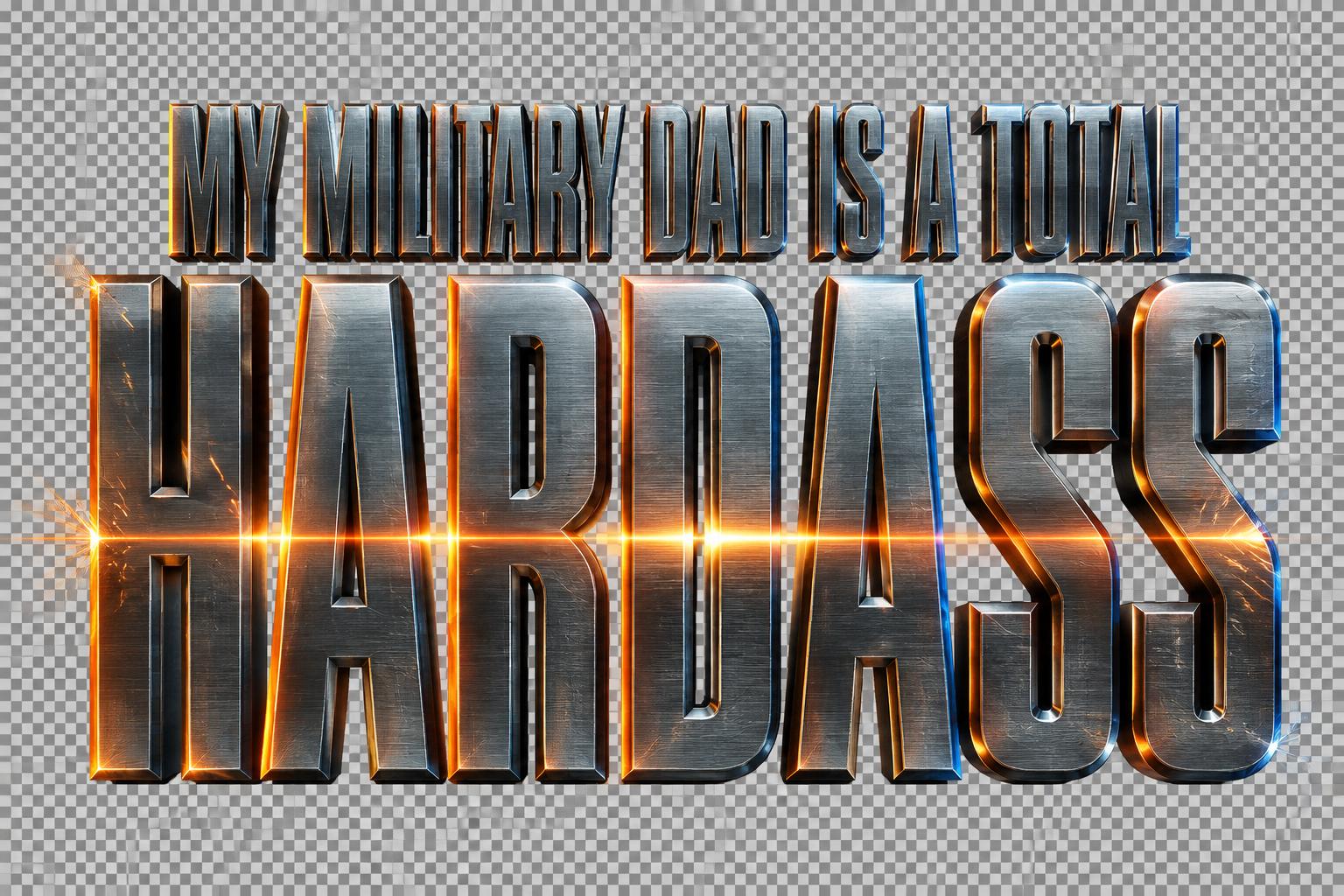
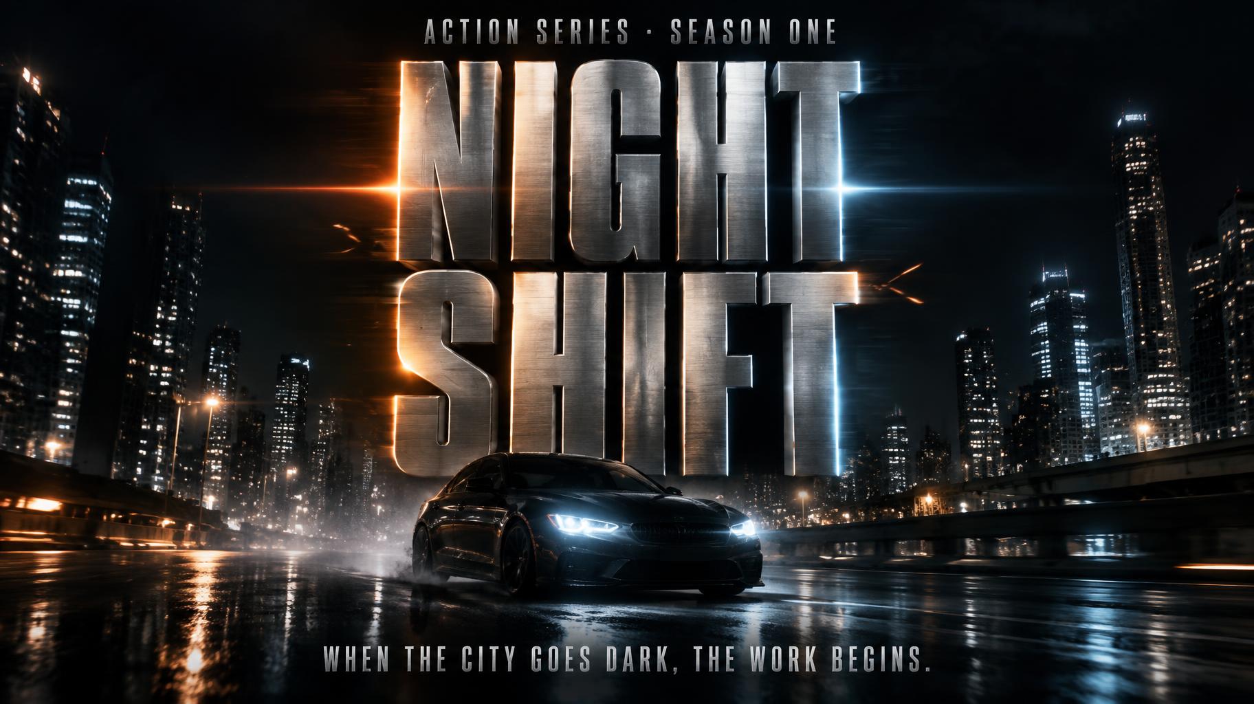
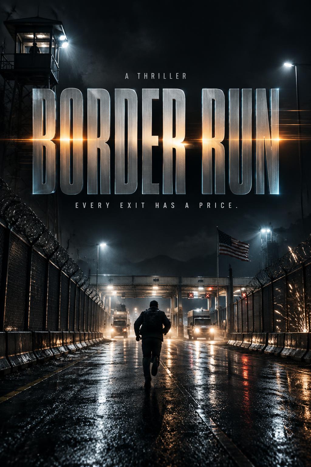
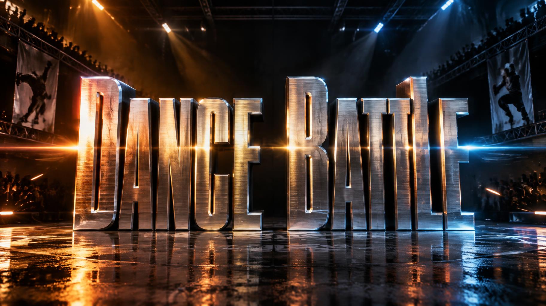
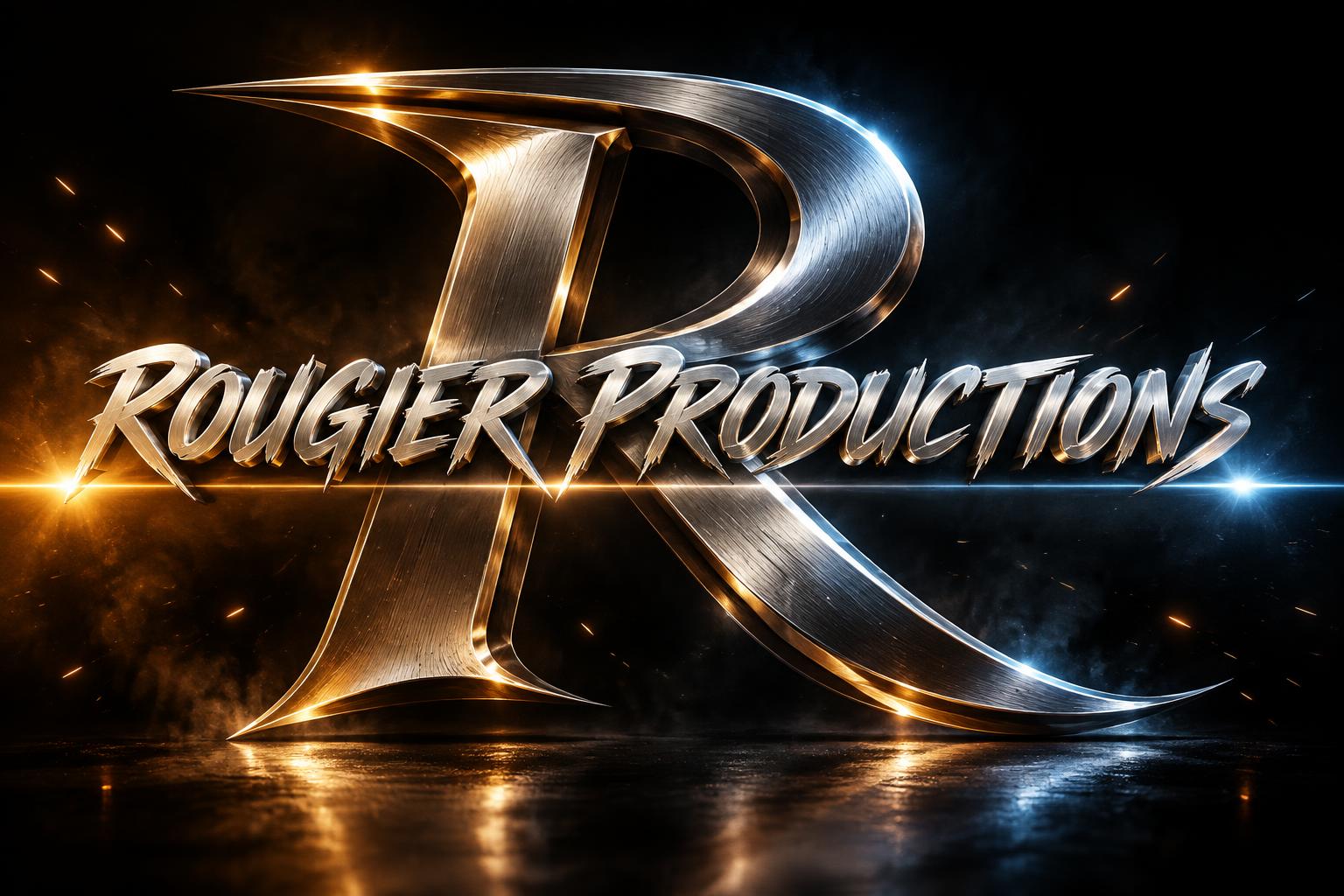
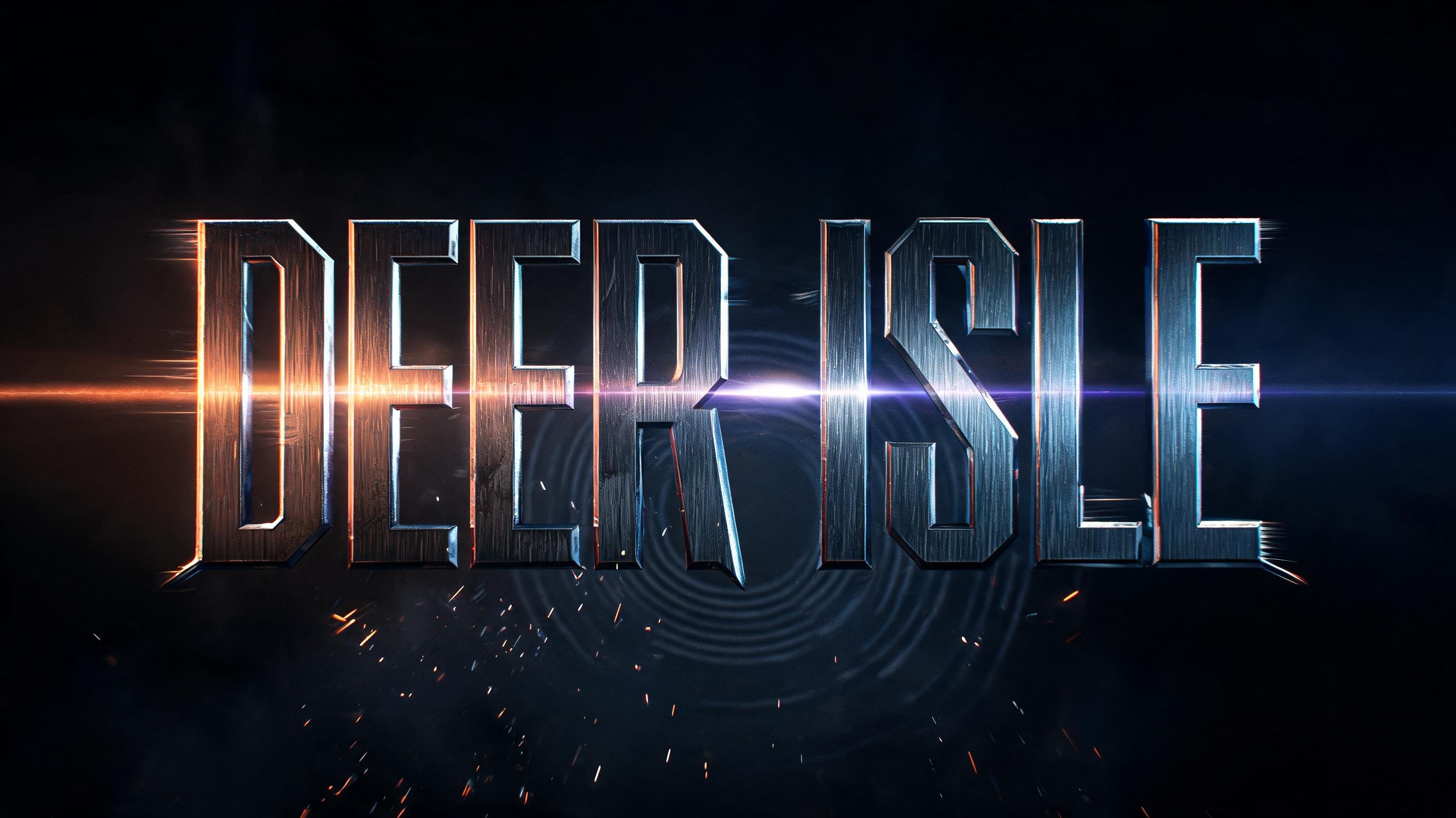
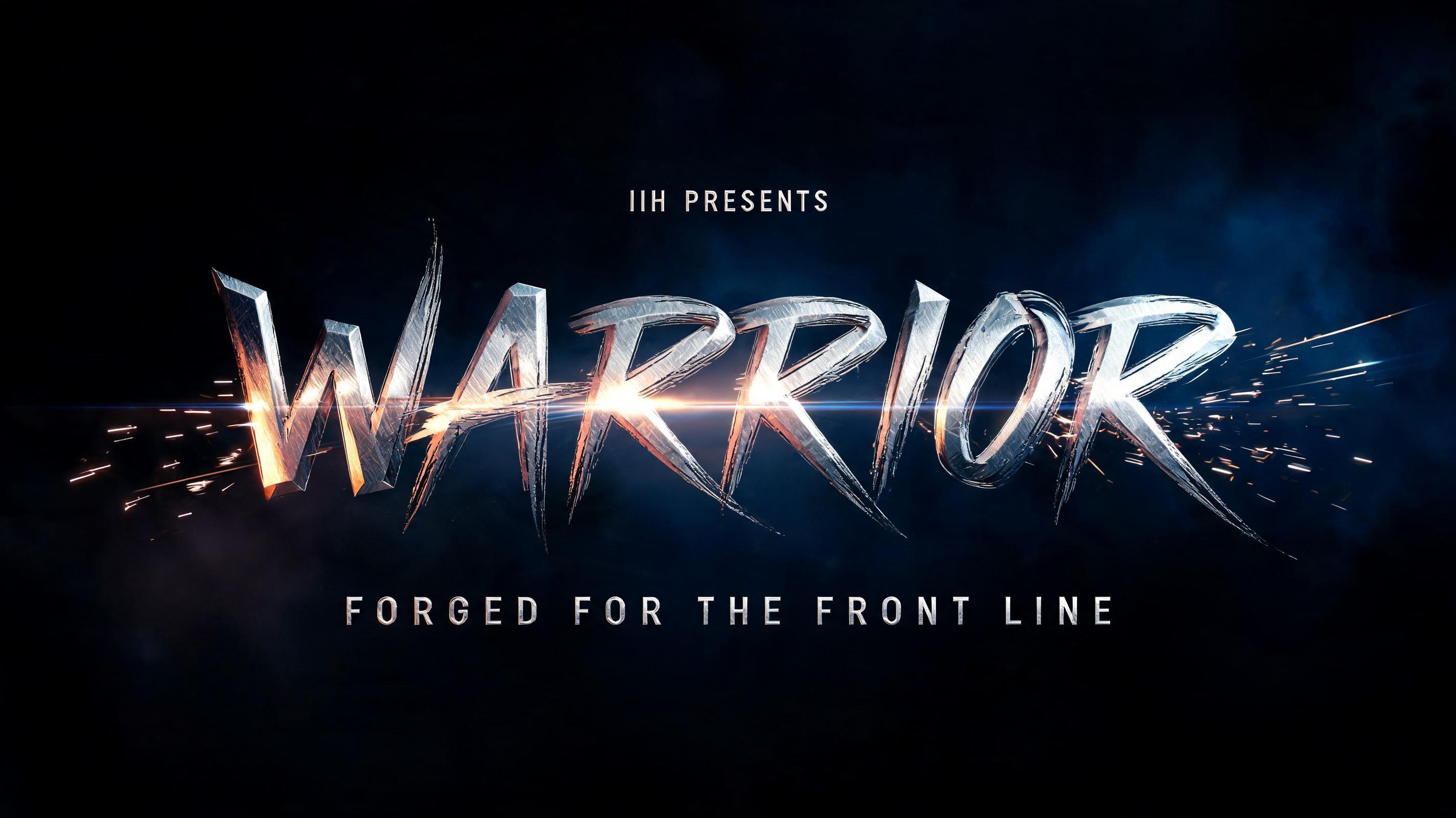
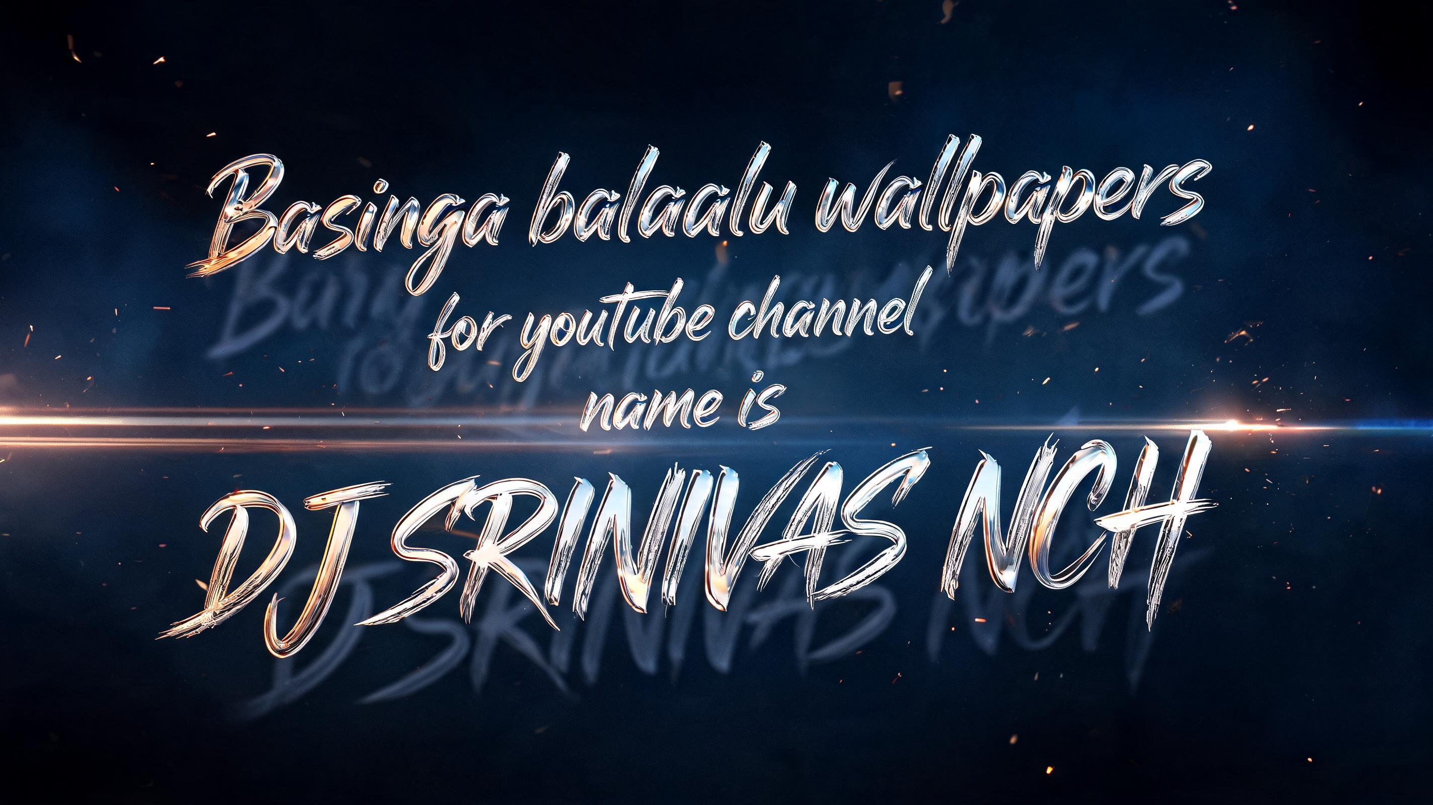
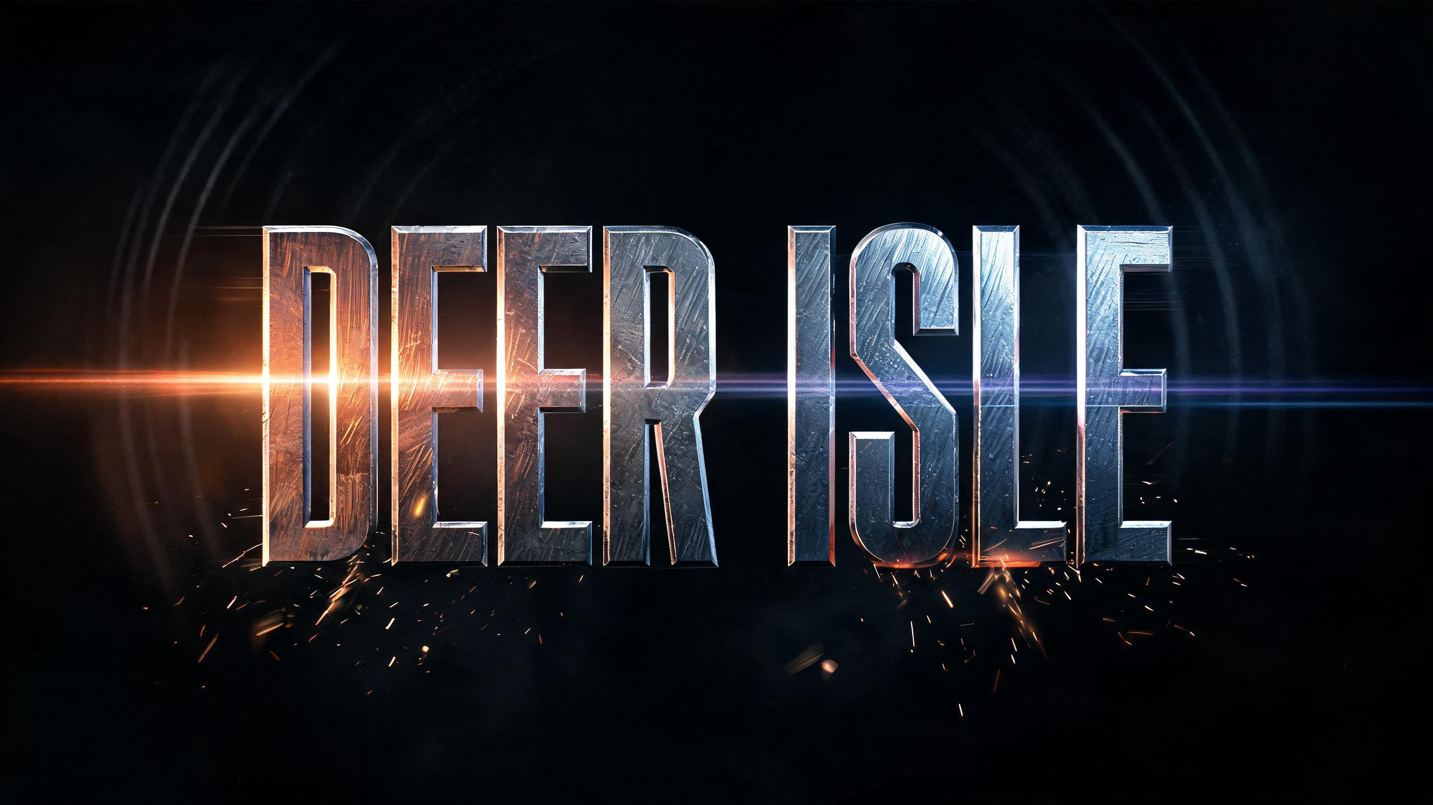
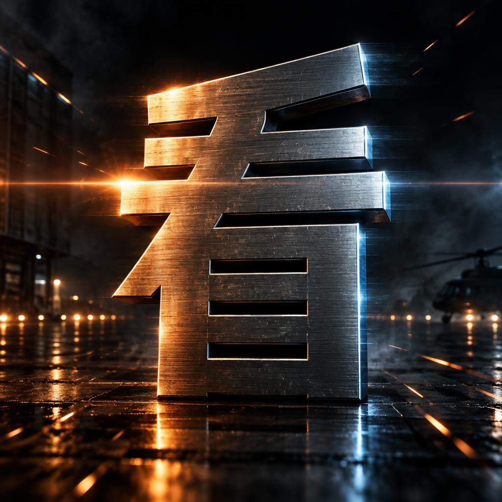
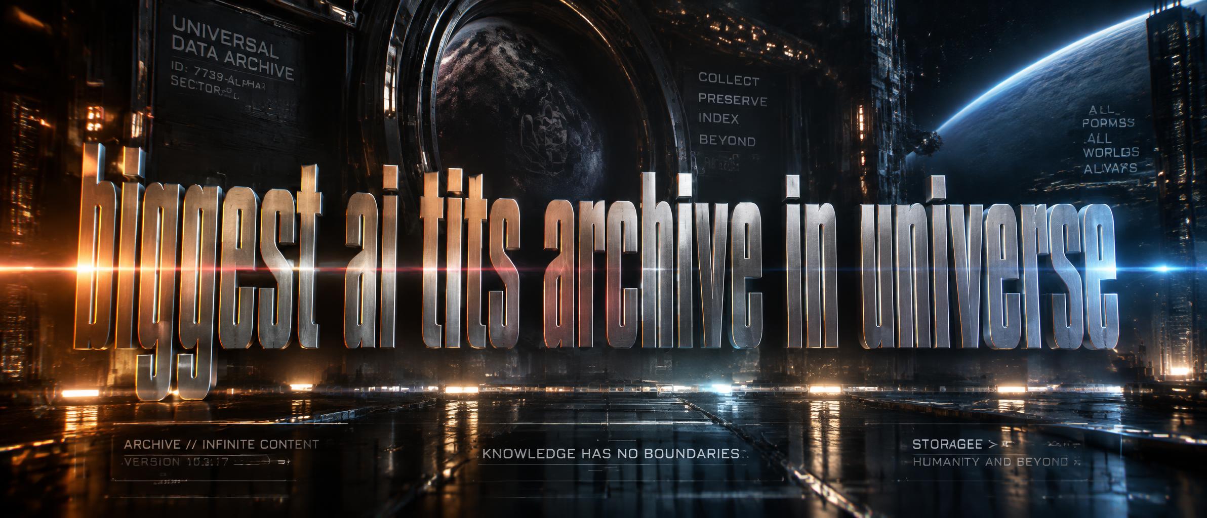
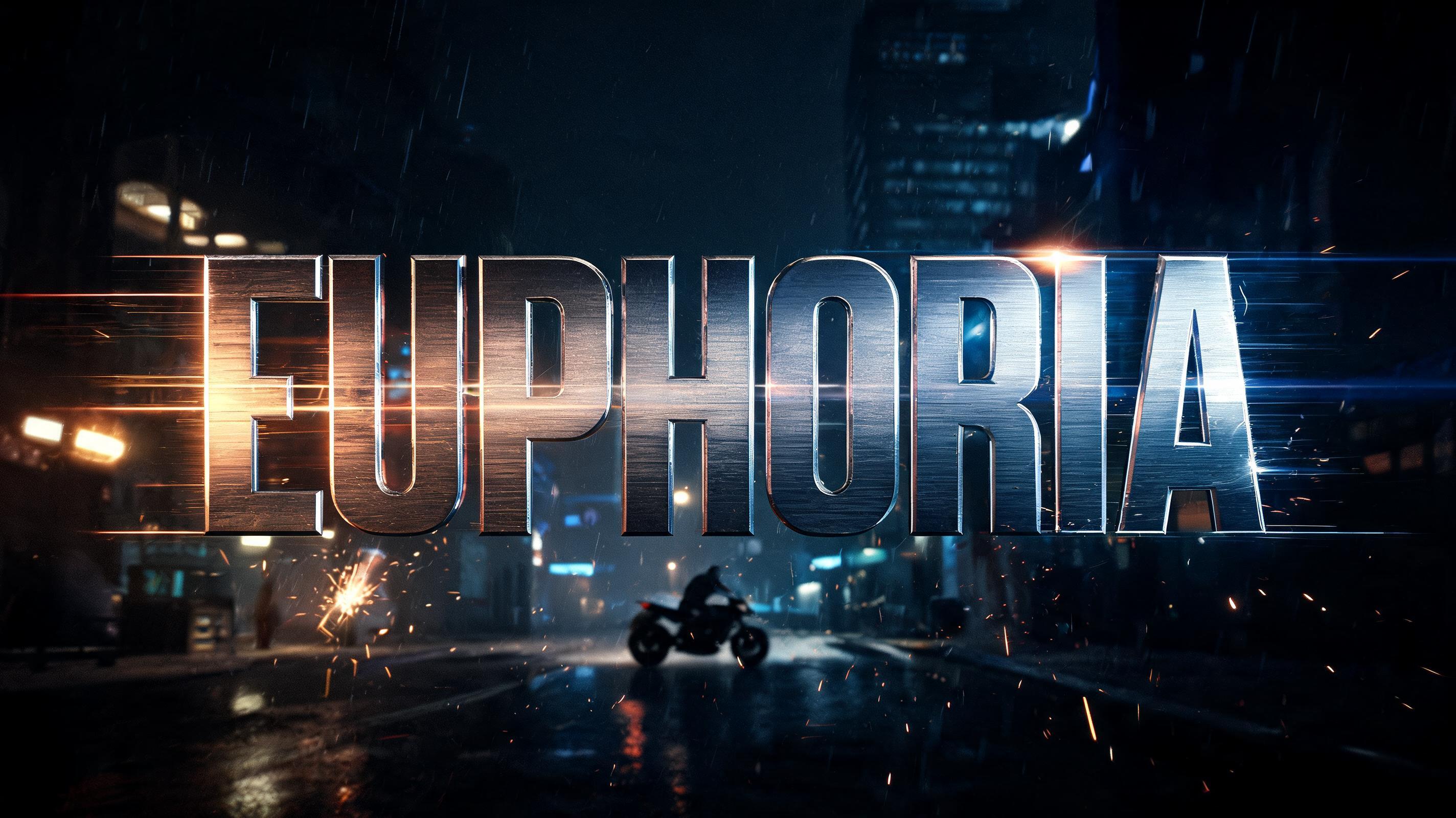
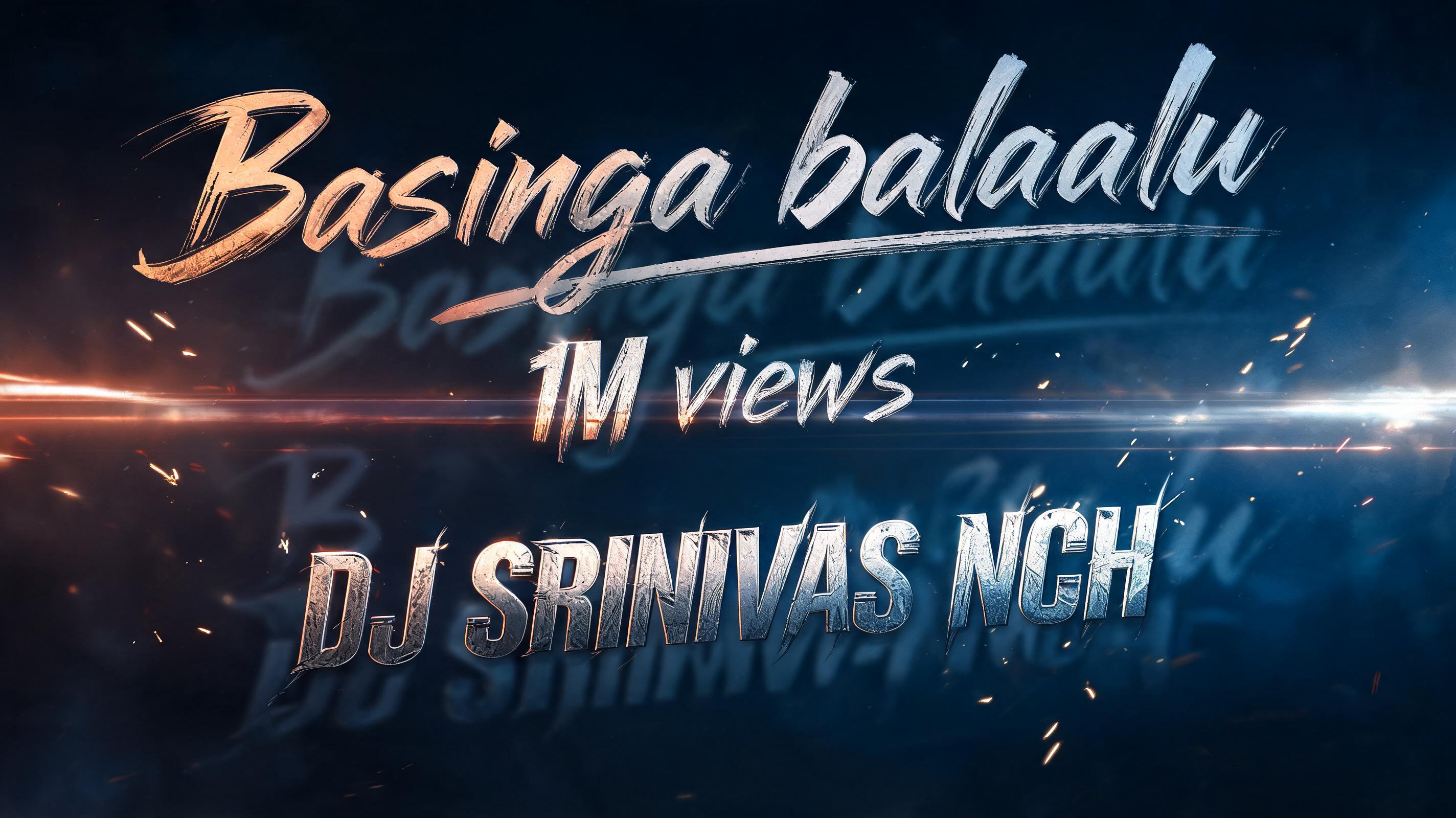
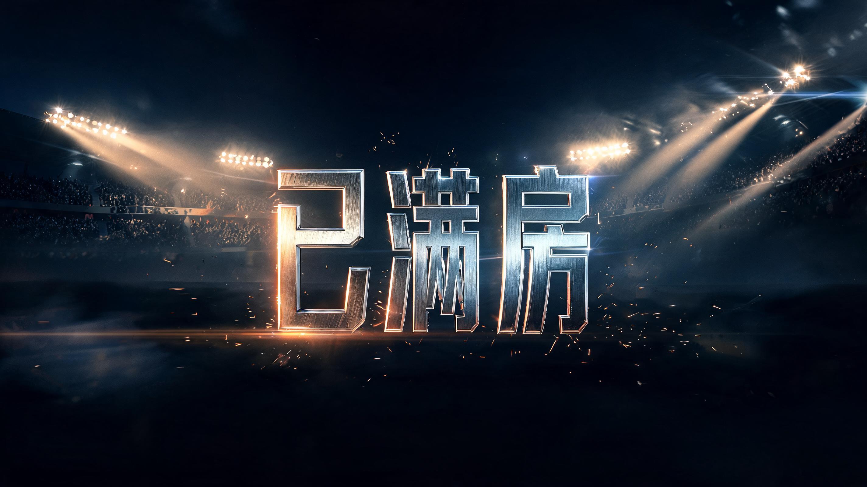
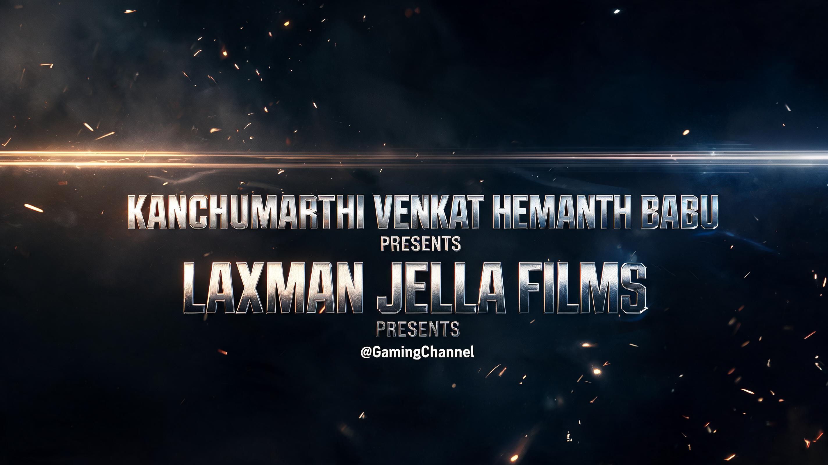
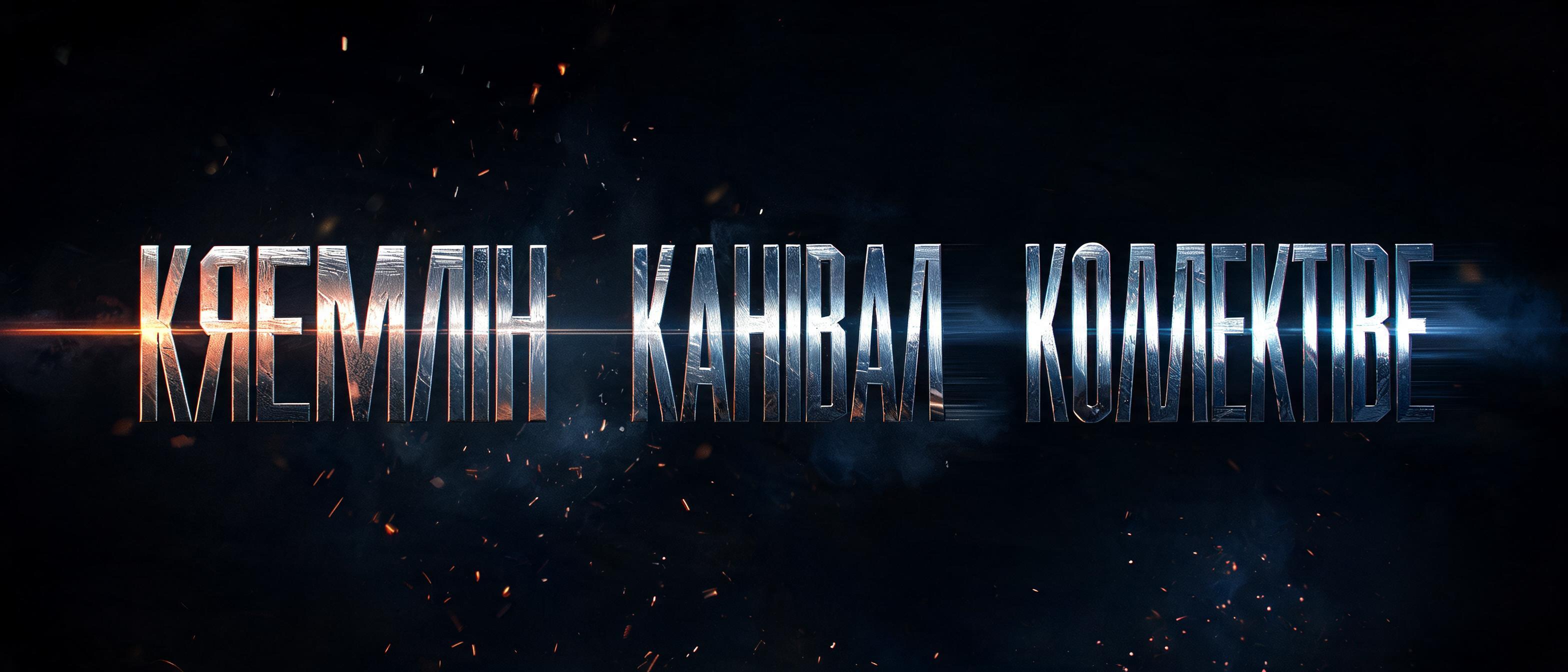
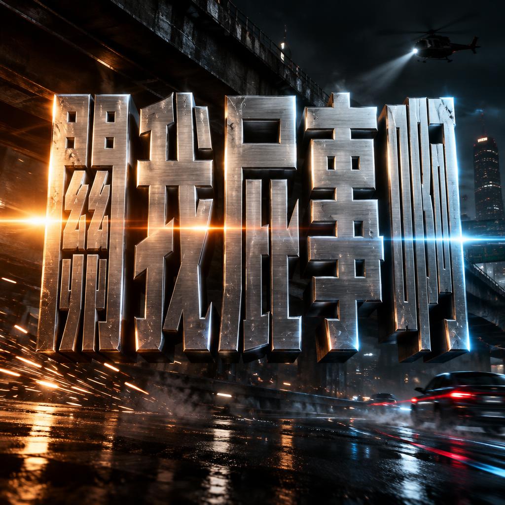
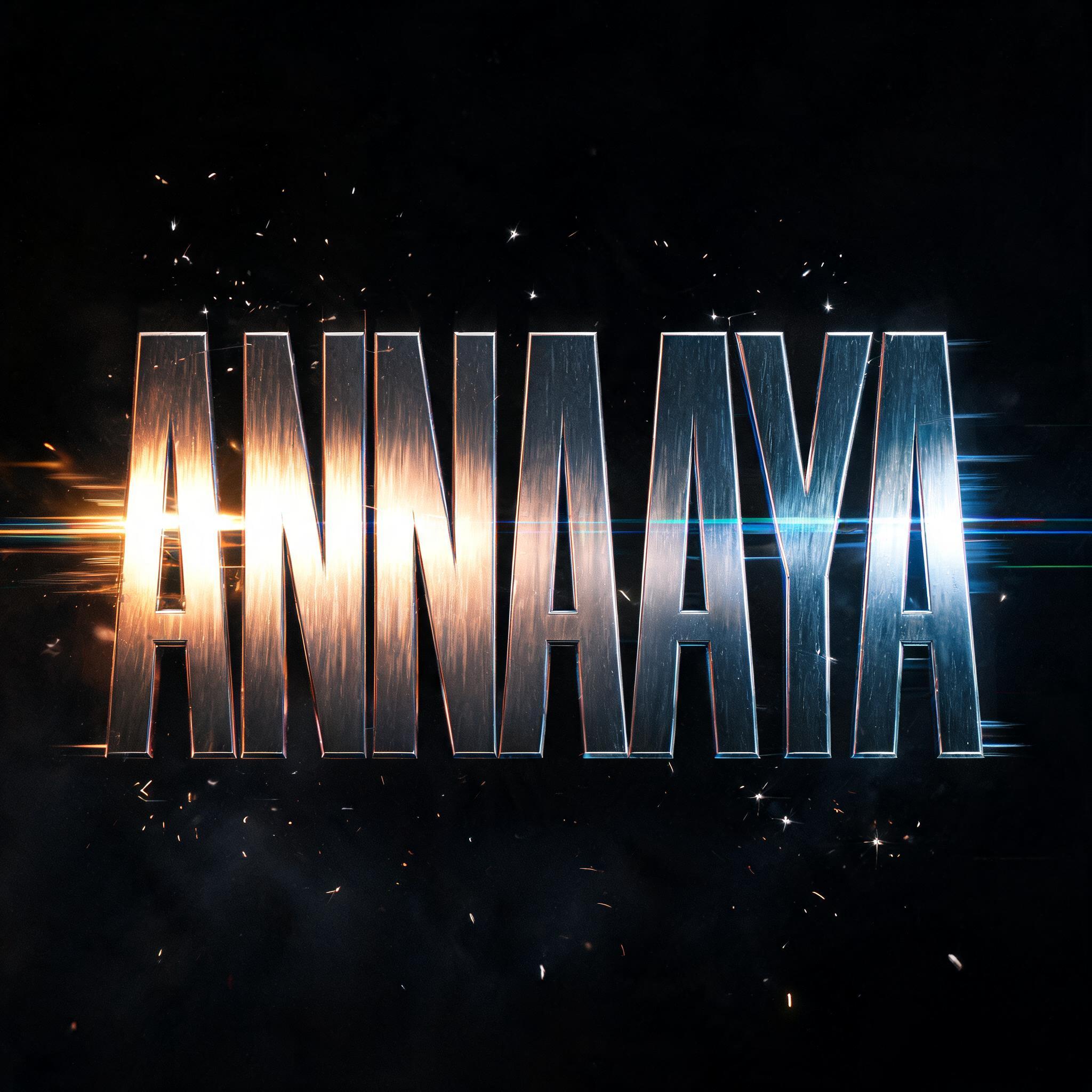
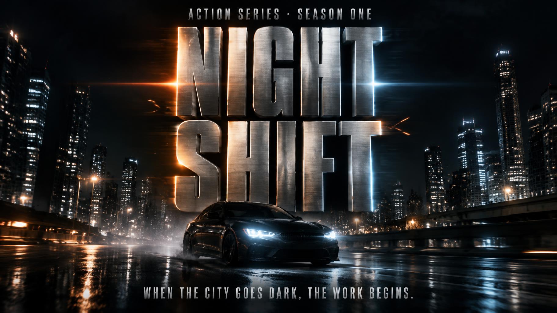
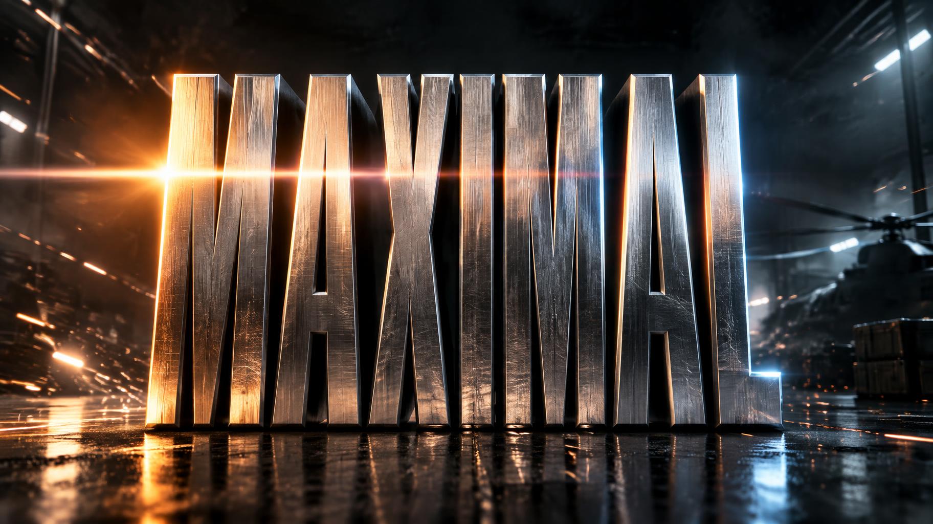
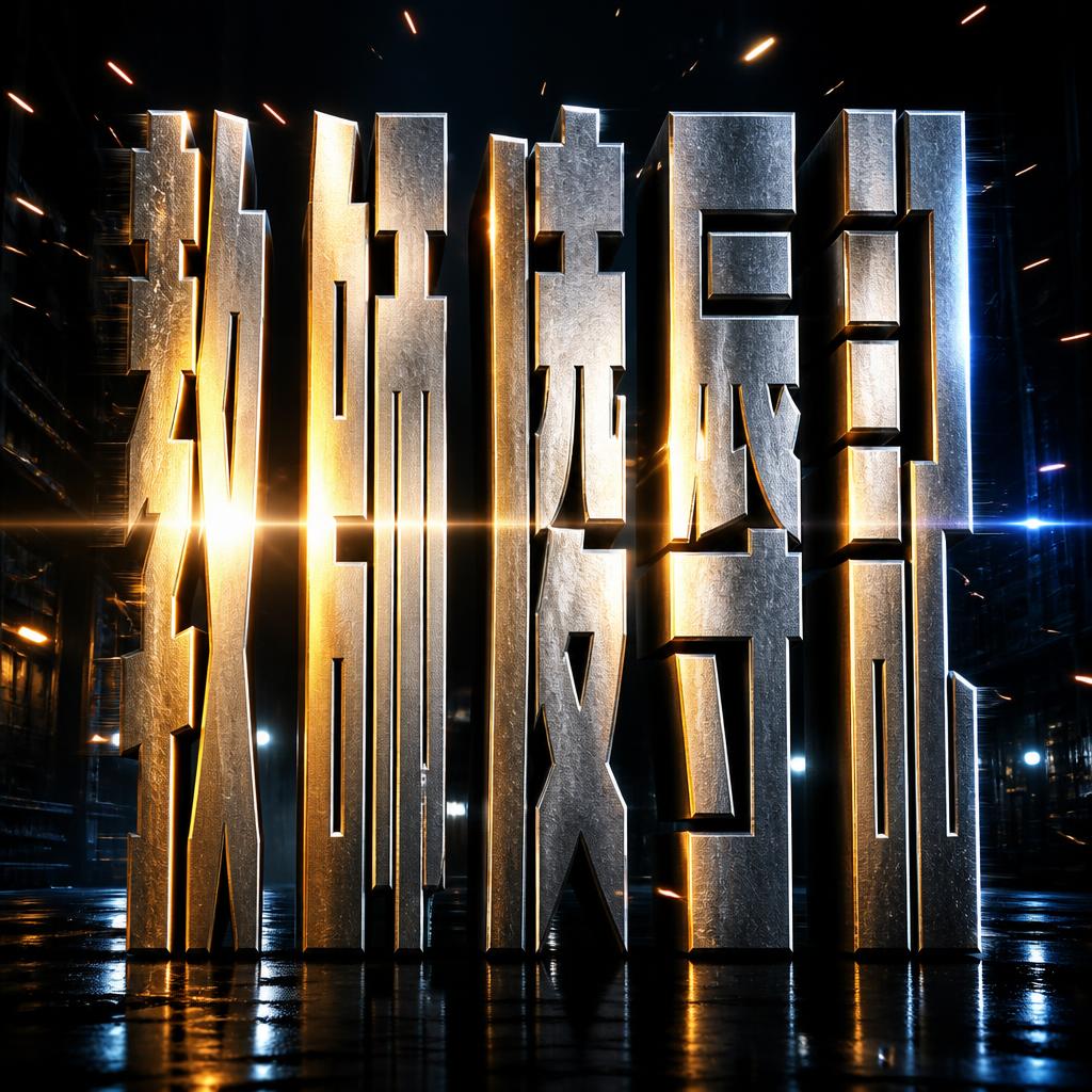
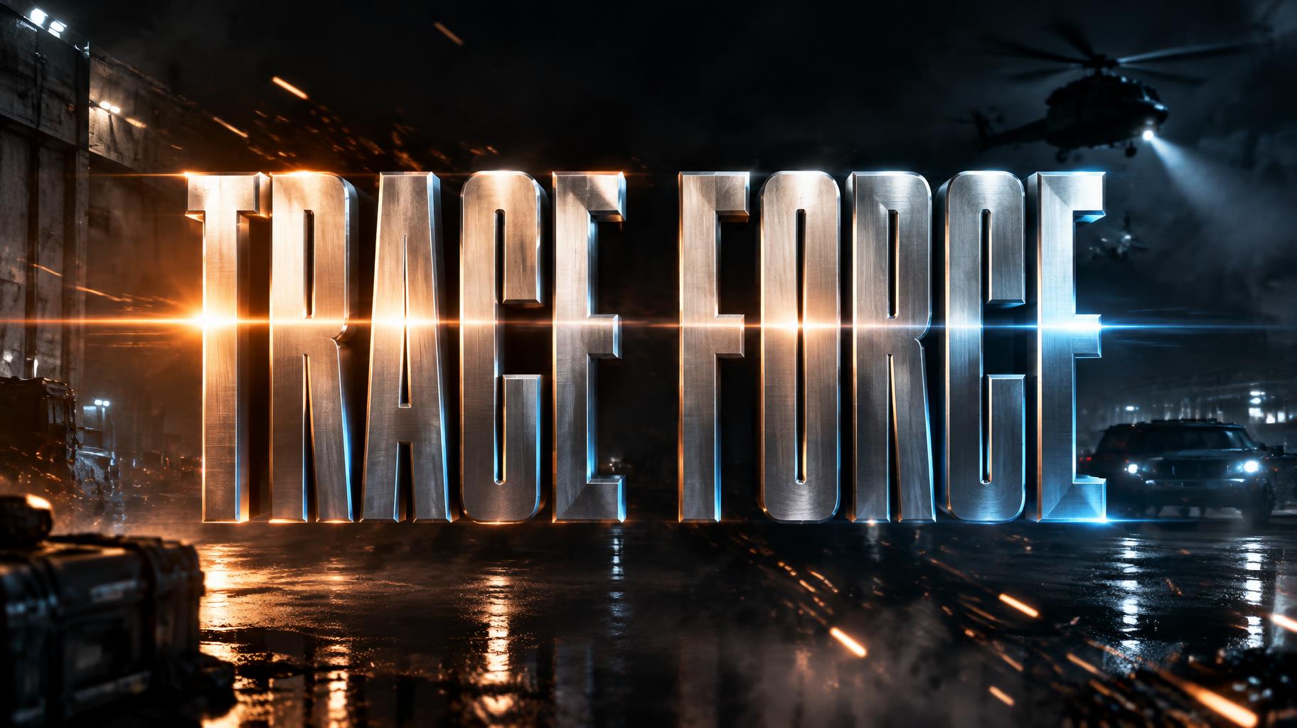
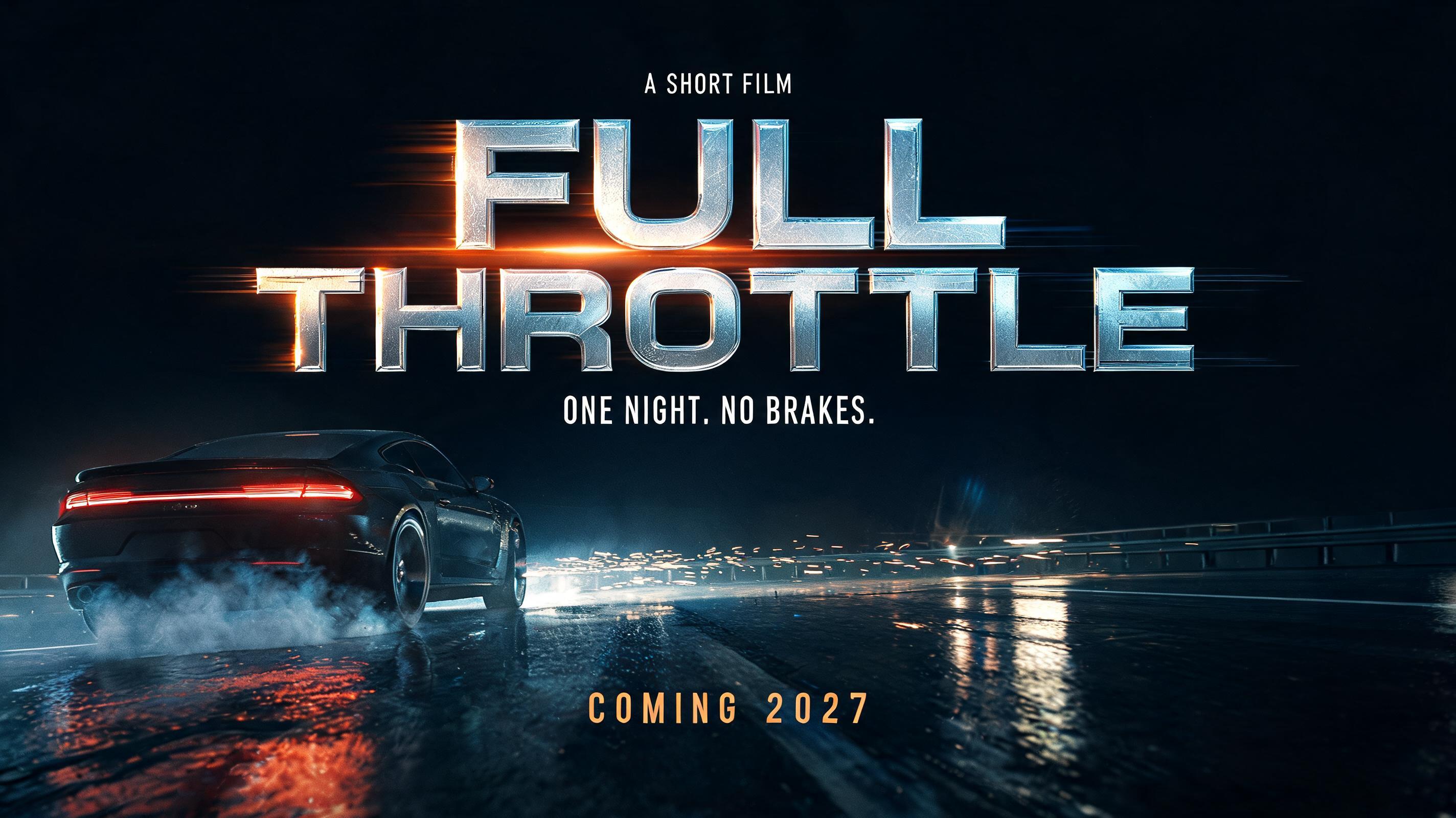
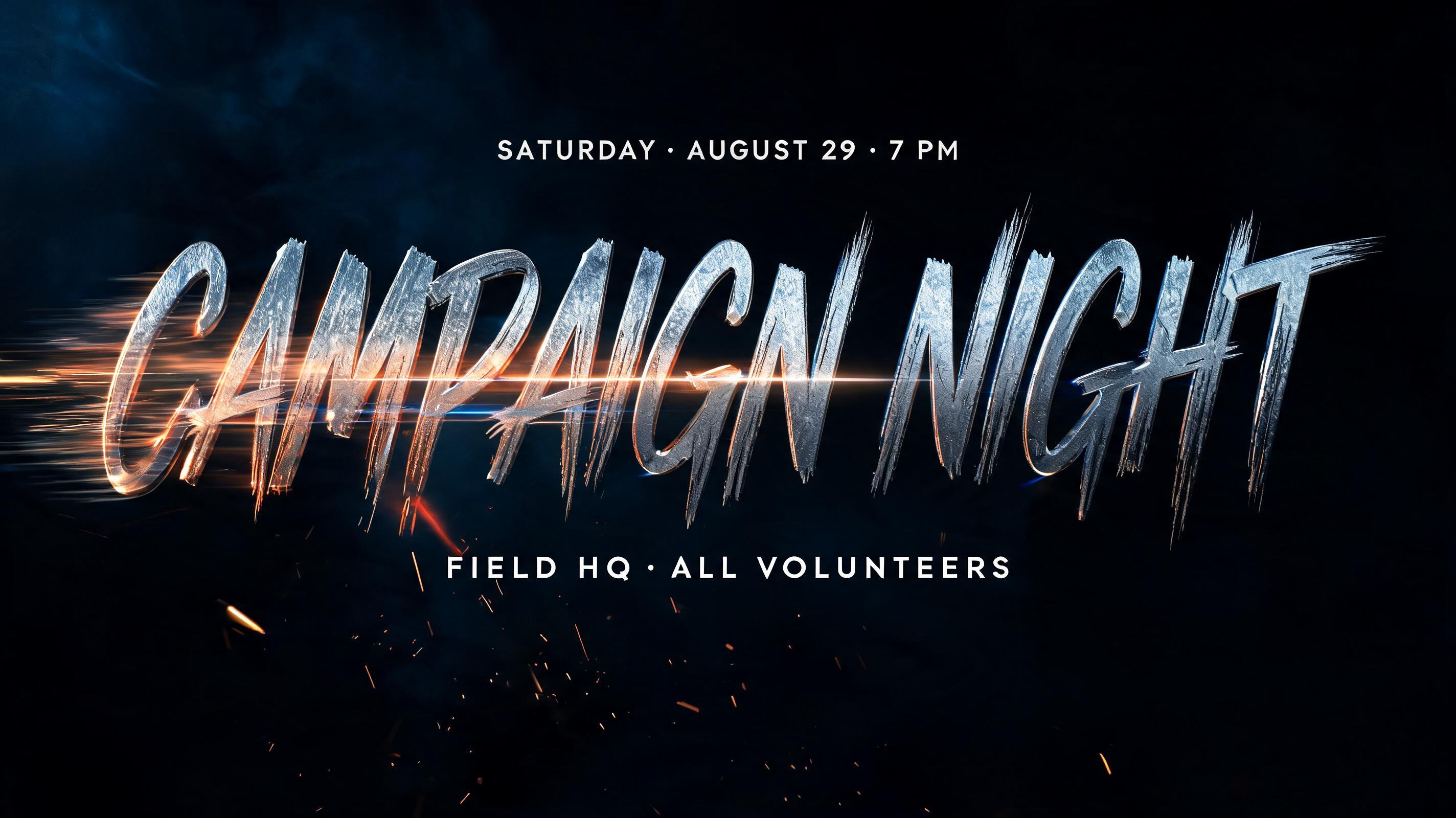
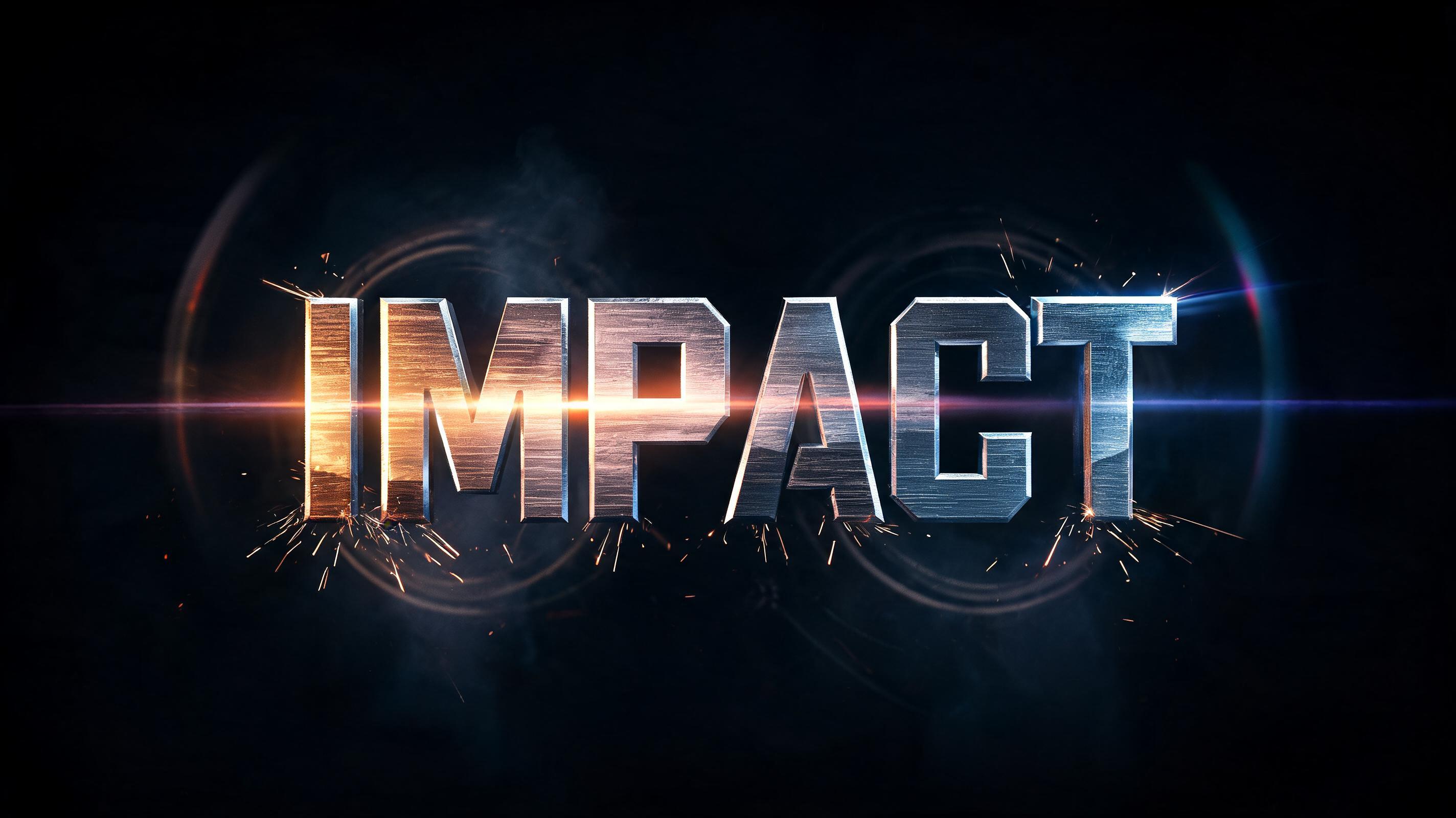
Condensed chrome-steel capitals with fine brushed grain, split warm-orange and cold-blue side light, anamorphic flare and rain-soaked city streets behind. — no font license needed.
Action Movie in different AI fonts




Action Movie Gallery
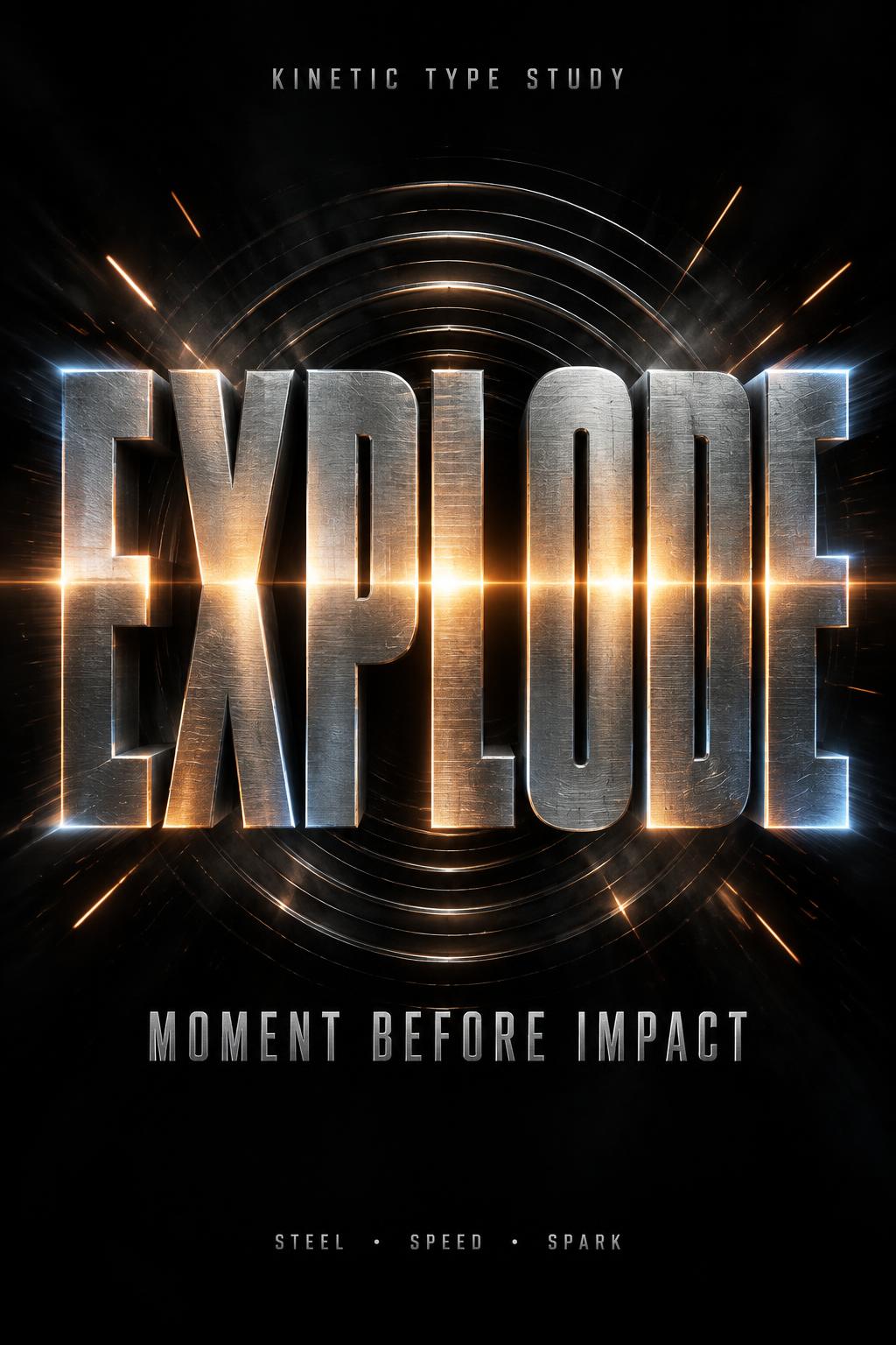
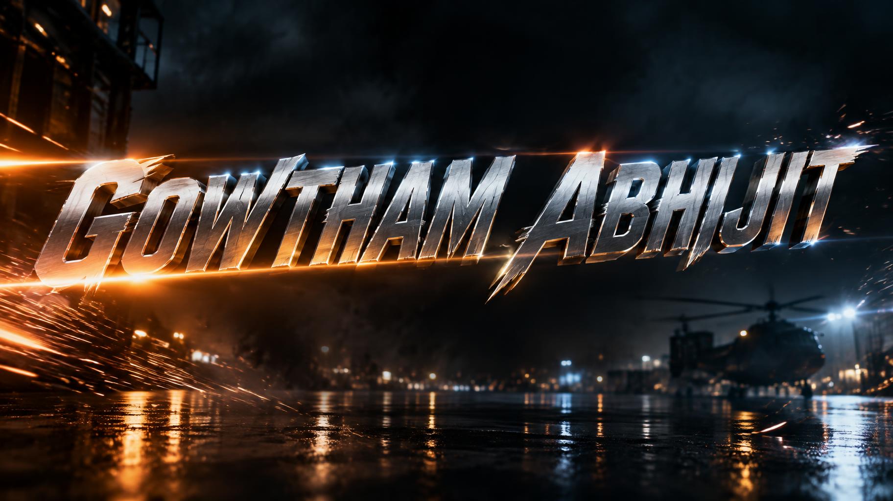
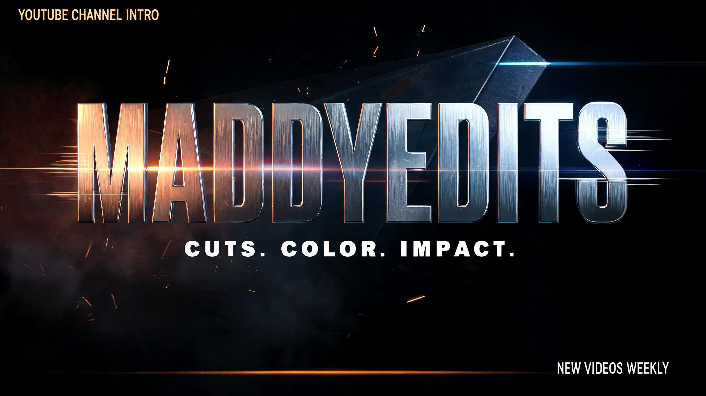
Real outputs from the Action Movie style. Click any image to see details.


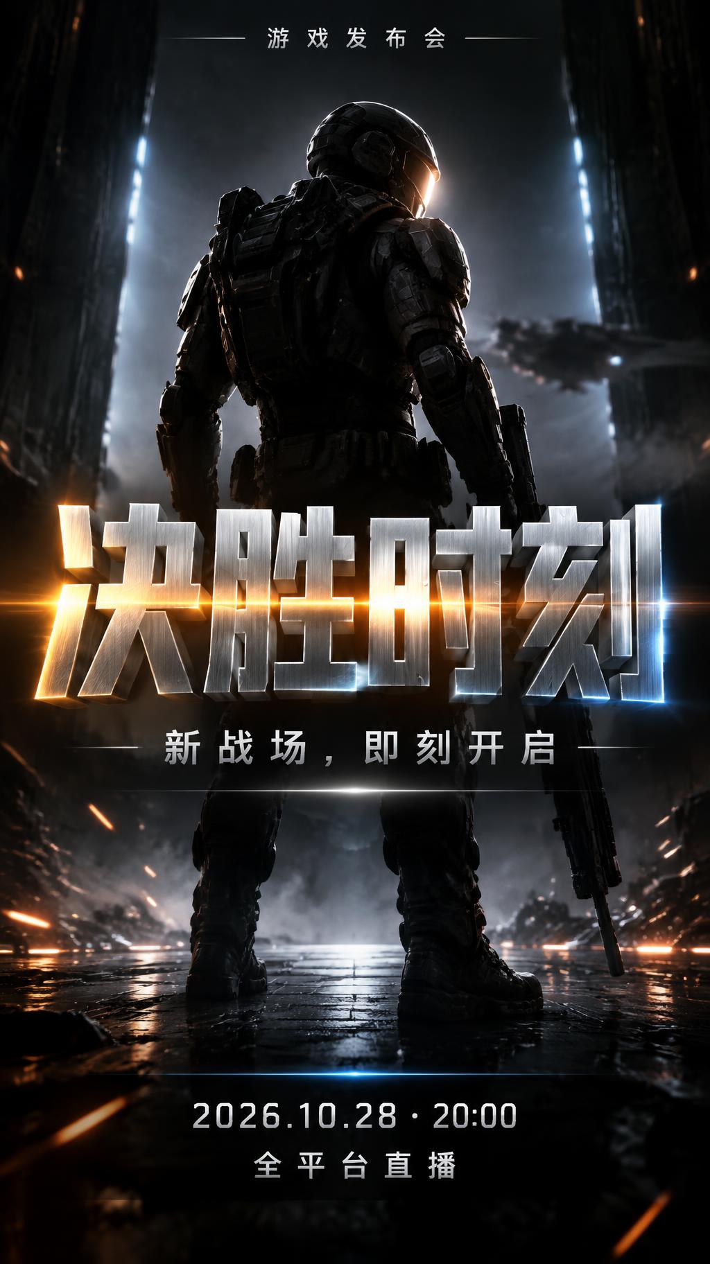
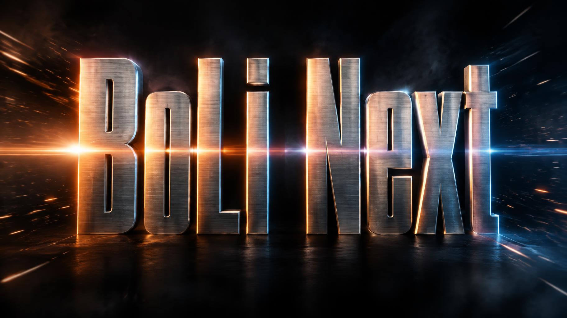



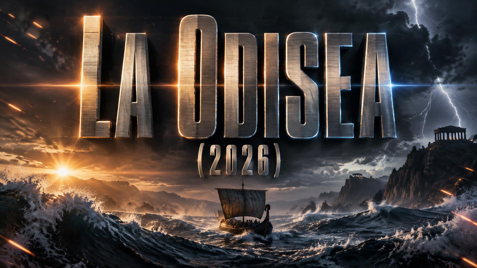
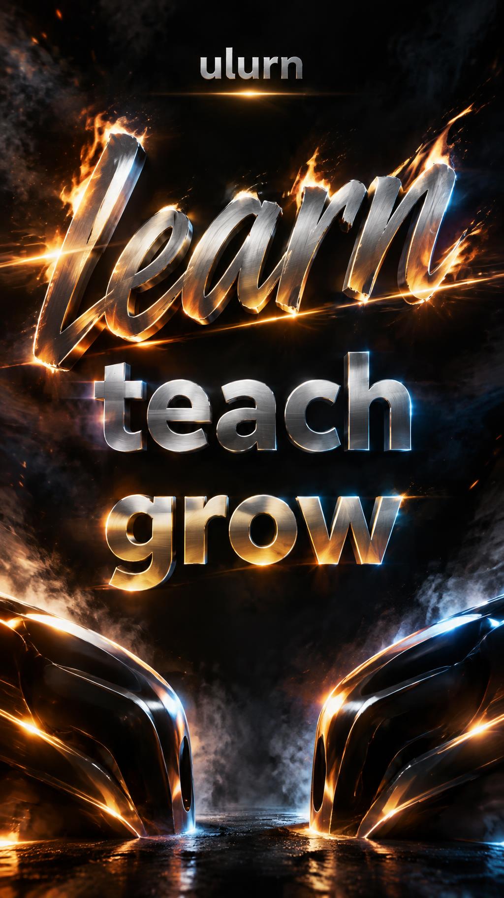




Looking for copy-paste fancy text? Try our free Font Generator Tools — cursive, gothic, bubble & 30+ styles.
Perfect for These Projects
Action Movie Text Effect — FAQ
What is the Action Movie Font Style?
The Action Movie font style is a distinctive AI-generated typography effect. Condensed chrome-steel capitals with fine brushed grain, split warm-orange and cold-blue side light, anamorphic flare and rain-soaked city streets behind. Using FontVibe's AI action movie generator you can create stunning text effects in seconds — no Photoshop, no font licensing, no design experience needed.
Explore the Action Movie gallery for inspiration, or browse all 138+ AI text effect styles available on FontVibe.
How to Create Action Movie Typography in FontVibe Studio
The Story Behind Action Movie
History, visual DNA, and cultural context.
Where It Came From
The visual language of the modern action movie title was forged in the 1980s and refined over four decades of blockbuster competition. It began with practical chrome — physical metallic lettering photographed under directional theatrical lighting, then enhanced with optical printing effects. The key innovation was asymmetric lighting: one warm key light defining letter surfaces, one cold rim light separating edges from dark backgrounds. This dual-light formula created depth that felt physically three-dimensional in a single still frame.
By the 2000s, CG allowed every element to be pushed further. Anamorphic lens flares — originally an artifact of Panavision anamorphic cinema lenses — became a deliberate design choice, signaling cinematic scale. Motion blur on static titles created the sensation of impact without movement. The result is a typography system that doesn't just label a film — it delivers a physical sensation before the first frame.
Sources: Wikipedia — Anamorphic format
The Visual DNA
Cultural Landmarks
In Typography
Action movie typography operates on one axis above all others: kinetic weight. The letterforms must feel like they are already moving, even in a static frame. Ultra-bold condensed sans-serifs and heavy slab-serifs dominate — their flat horizontal surfaces catch directional light cleanly, their vertical mass implies physical force.
The critical difference between action typography and simply bold typography is the light direction. Action titles use asymmetric single-source lighting — everything illuminated from one angle, creating hard shadows and high contrast that plain bold text never achieves. Combined with anamorphic artifacts and motion-blur trails, the result is typography that occupies physical space rather than sitting on a surface.
For designers: weight alone is not enough. The lighting is the effect. FontVibe's Action Movie style bakes the lighting system directly into the AI generation — every render uses the asymmetric warm-cold split that defines the genre.
Create Your Action Movie Typography in Studio
Free to start. No design skills needed. Your artwork, your copyright.
AI Movie & Film Action Movie Text Effect Generator
Condensed chrome-steel capitals with fine brushed grain, split warm-orange and cold-blue side light, anamorphic flare and rain-soaked city streets behind. — no font license needed.
Action Movie in different AI fonts
Generate Your Action Movie Text Effect
Type any word — see it transformed in seconds. No sign-up required.
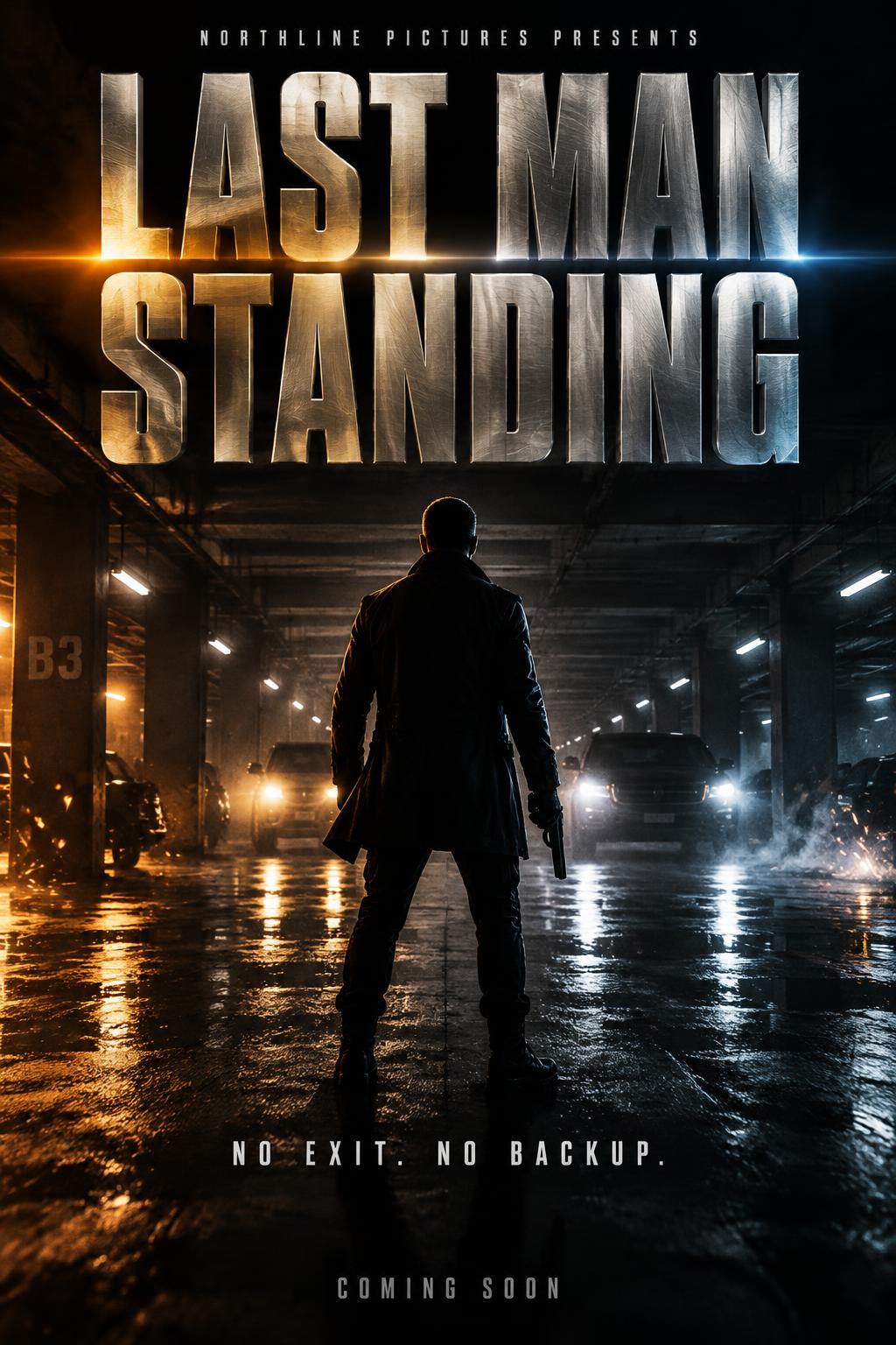
Action Movie Style Gallery
Real outputs from the Action Movie style. Click any image to see details.
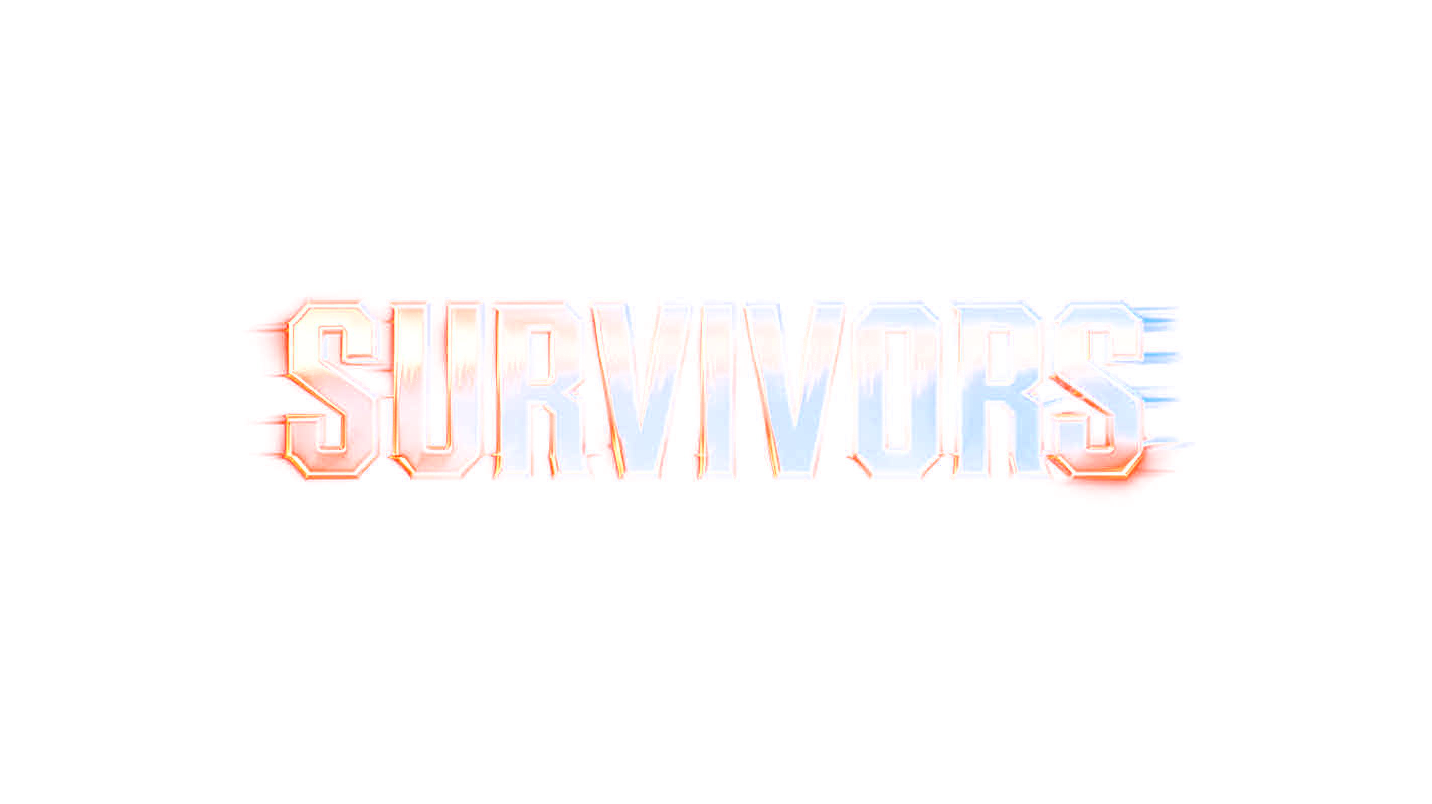
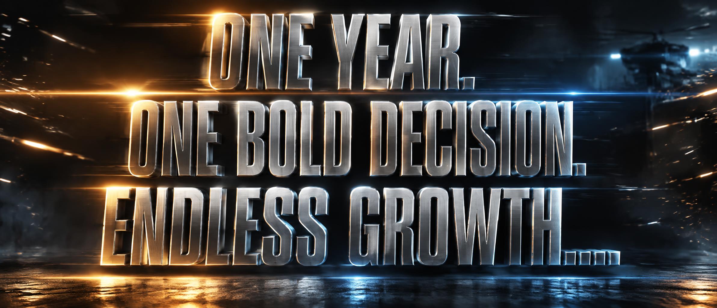
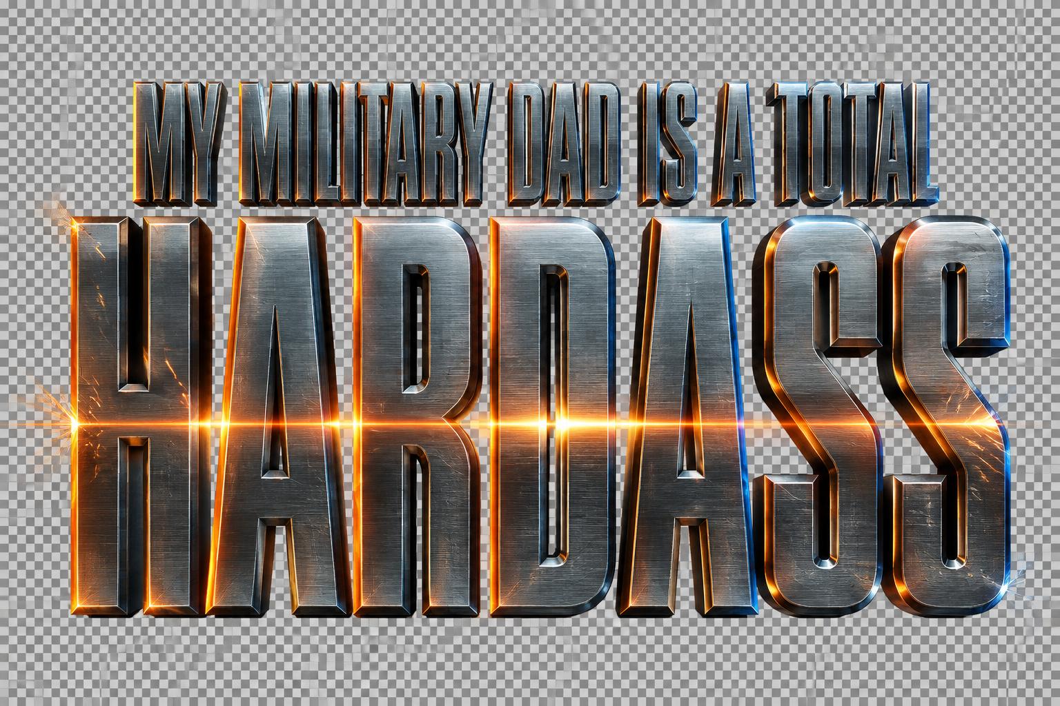
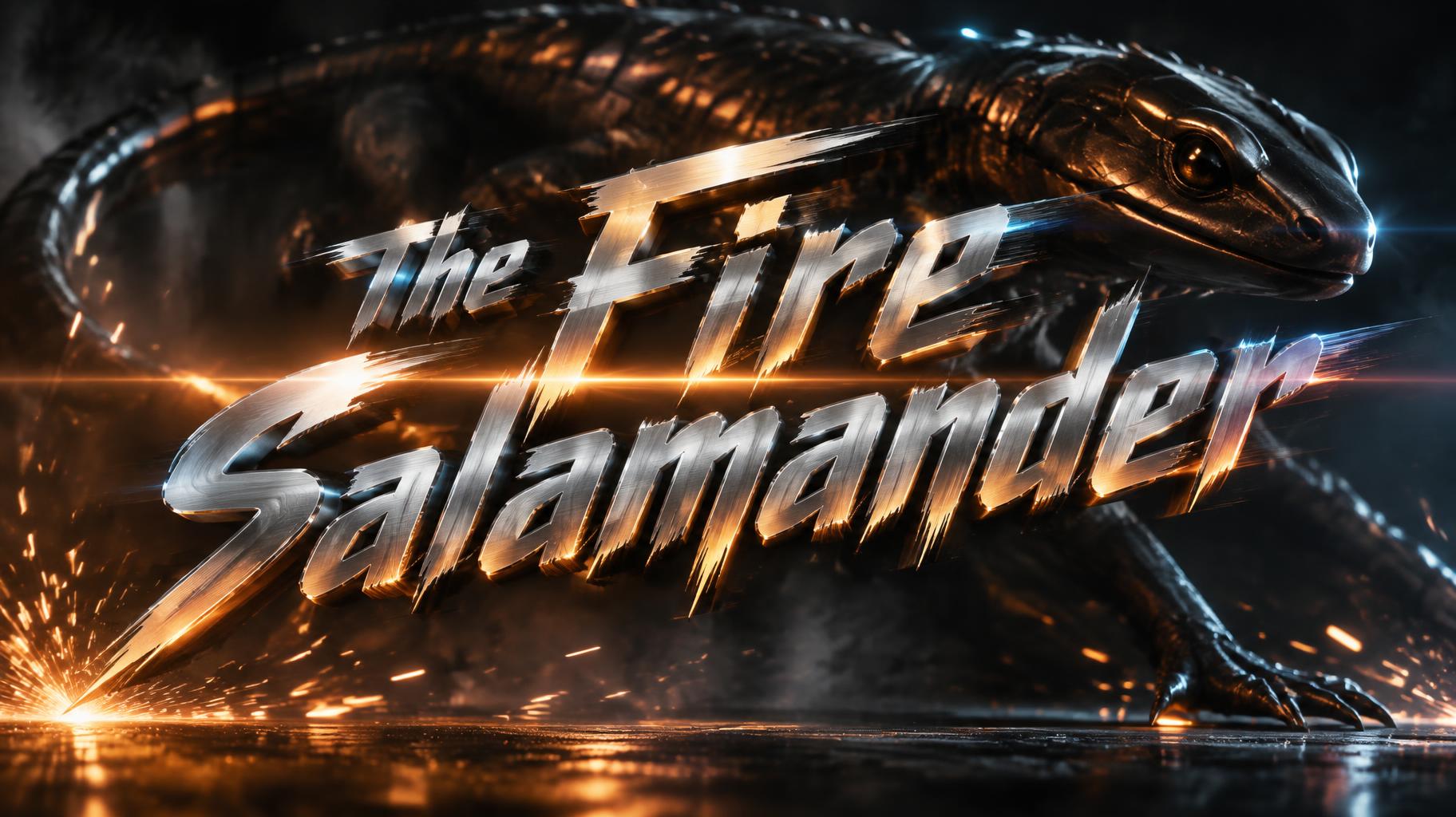

Similar Text Effect Styles
Try these styles and create your own AI-generated text effects.
Looking for copy-paste fancy text? Try our free Font Generator Tools — cursive, gothic, bubble & 30+ styles.
Perfect for These Projects
Action Movie text effects are popular for creative projects where visual impact matters.
What is the Action Movie Font Style?
The Action Movie font style is a distinctive AI-generated typography effect. Condensed chrome-steel capitals with fine brushed grain, split warm-orange and cold-blue side light, anamorphic flare and rain-soaked city streets behind.
Using FontVibe's AI action movie generator you can create stunning text effects in seconds — no Photoshop, no font licensing, no design experience needed.
Explore the Action Movie gallery for inspiration, or browse all 138+ AI text effect styles available on FontVibe.
How to Create Action Movie Typography in FontVibe Studio
1. Enter your text — Any word, phrase, or brand name. Works best with short, punchy text.
2. Select Action Movie — From the style library. Optionally describe a mood in the custom prompt.
3. Generate and download. Your Action Movie font artwork is ready in seconds. PNG, JPG, or transparent PNG.
Looking for something different? Browse the full font style library for more AI typography options.
Action Movie Text Effect — FAQ
The Story Behind Action Movie
History, visual DNA, and cultural context — everything that makes this style what it is.
Where It Came From
The visual language of the modern action movie title was forged in the 1980s and refined over four decades of blockbuster competition. It began with practical chrome — physical metallic lettering photographed under directional theatrical lighting, then enhanced with optical printing effects. The key innovation was asymmetric lighting: one warm key light defining letter surfaces, one cold rim light separating edges from dark backgrounds. This dual-light formula created depth that felt physically three-dimensional in a single still frame.
By the 2000s, CG allowed every element to be pushed further. Anamorphic lens flares — originally an artifact of Panavision anamorphic cinema lenses — became a deliberate design choice, signaling cinematic scale. Motion blur on static titles created the sensation of impact without movement. The result is a typography system that doesn't just label a film — it delivers a physical sensation before the first frame.
Sources: Wikipedia — Anamorphic format
The Visual DNA
Cultural Landmarks
In Typography
Action movie typography operates on one axis above all others: kinetic weight. The letterforms must feel like they are already moving, even in a static frame. Ultra-bold condensed sans-serifs and heavy slab-serifs dominate — their flat horizontal surfaces catch directional light cleanly, their vertical mass implies physical force.
The critical difference between action typography and simply bold typography is the light direction. Action titles use asymmetric single-source lighting — everything illuminated from one angle, creating hard shadows and high contrast that plain bold text never achieves. Combined with anamorphic artifacts and motion-blur trails, the result is typography that occupies physical space rather than sitting on a surface.
For designers: weight alone is not enough. The lighting is the effect. FontVibe's Action Movie style bakes the lighting system directly into the AI generation — every render uses the asymmetric warm-cold split that defines the genre.