


AI Cinematic Netflix & Streaming Text Effect Generator
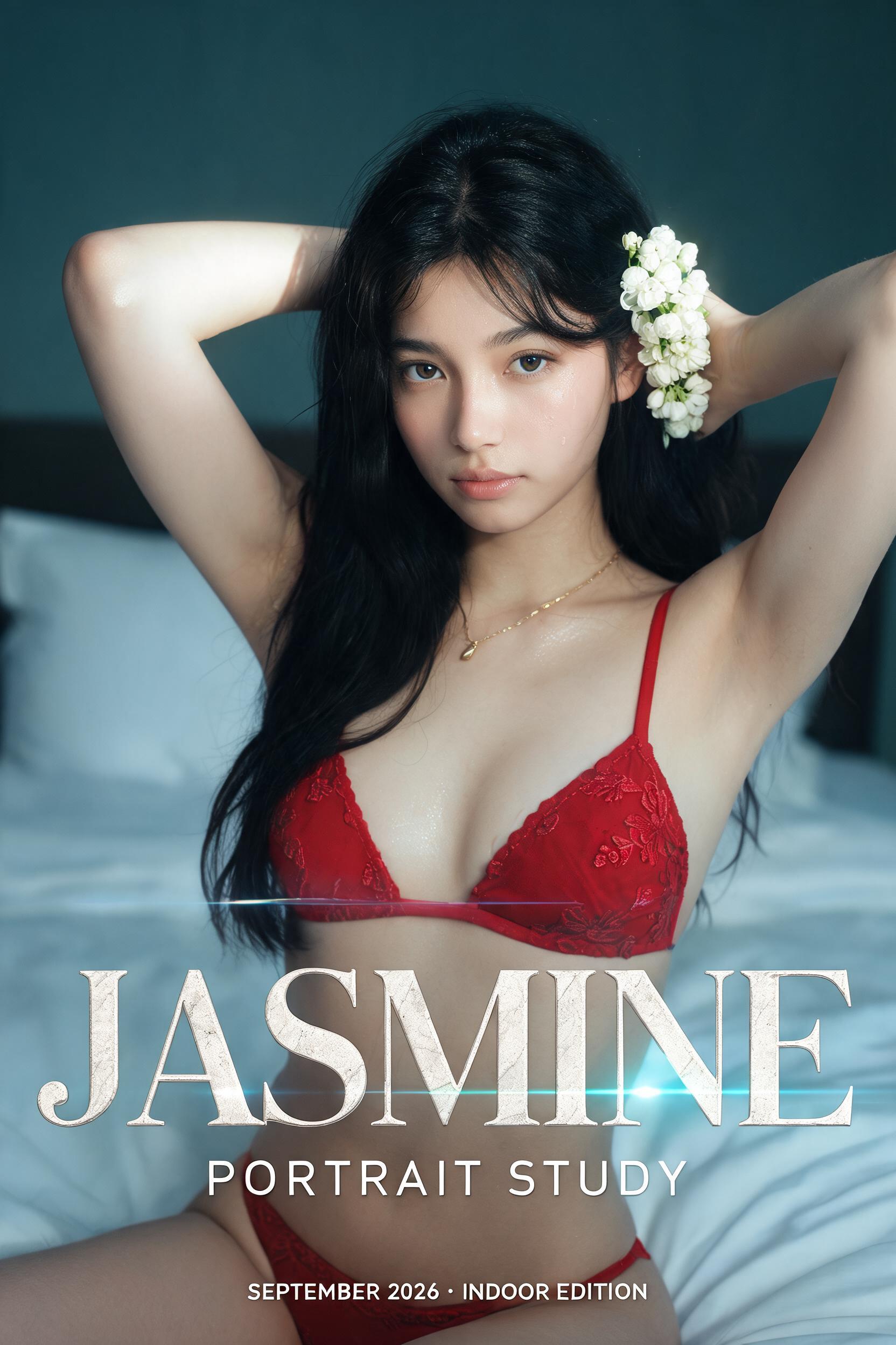
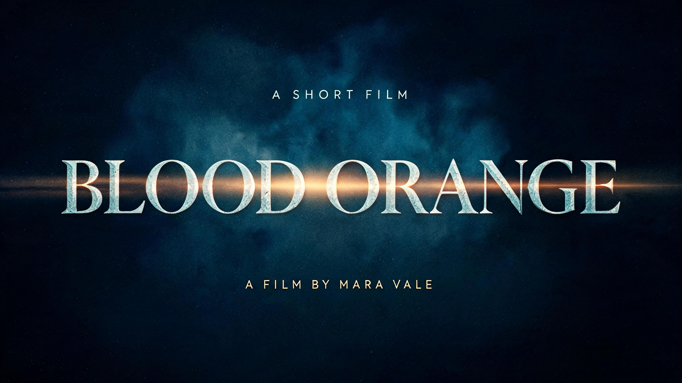
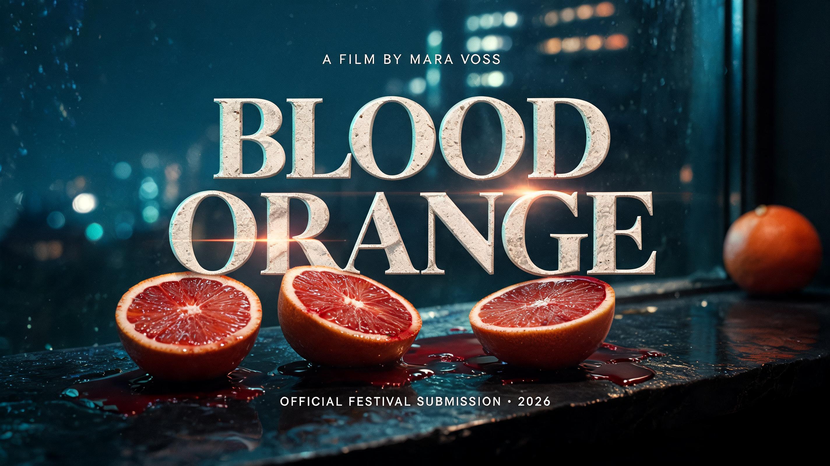
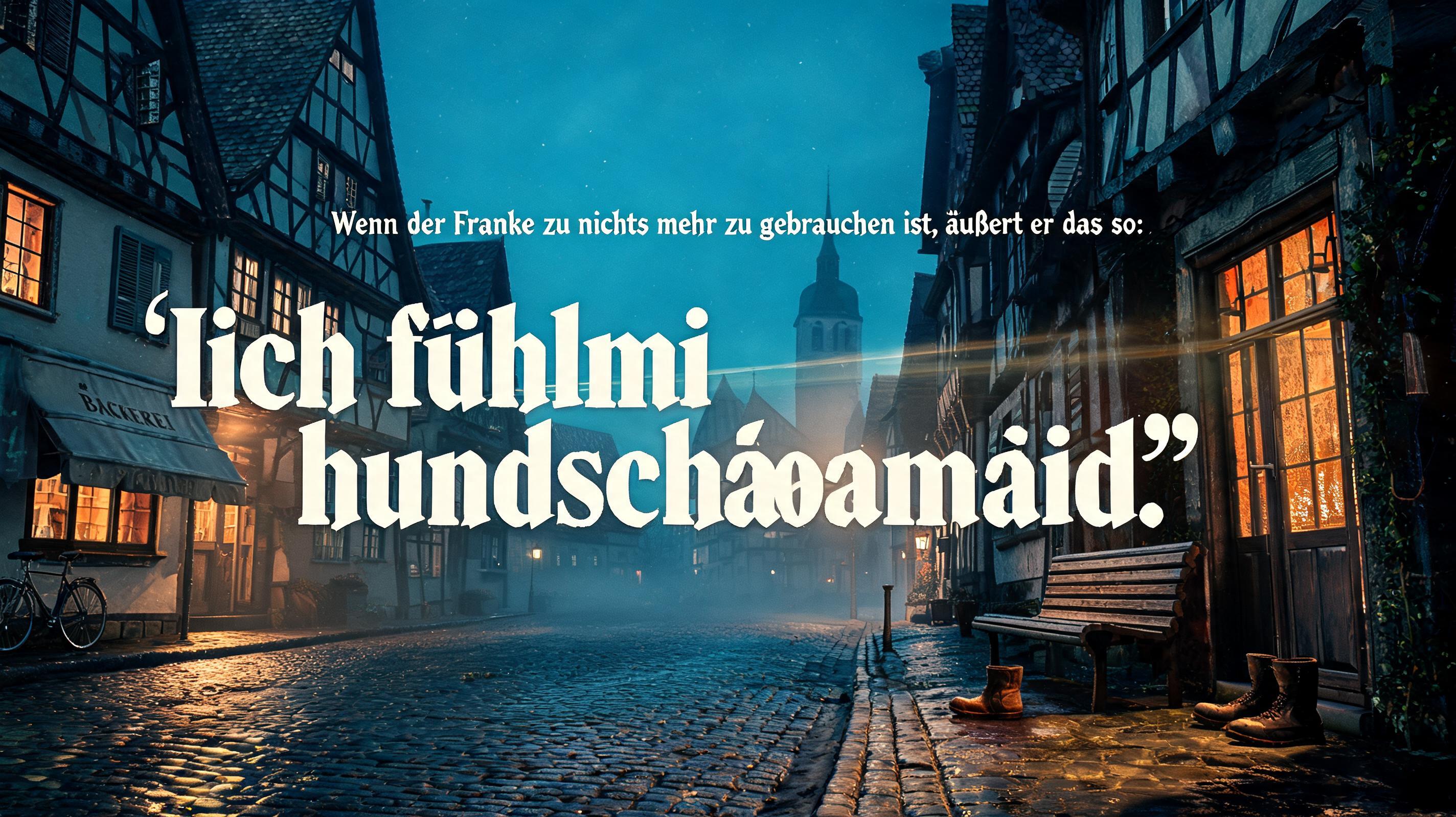
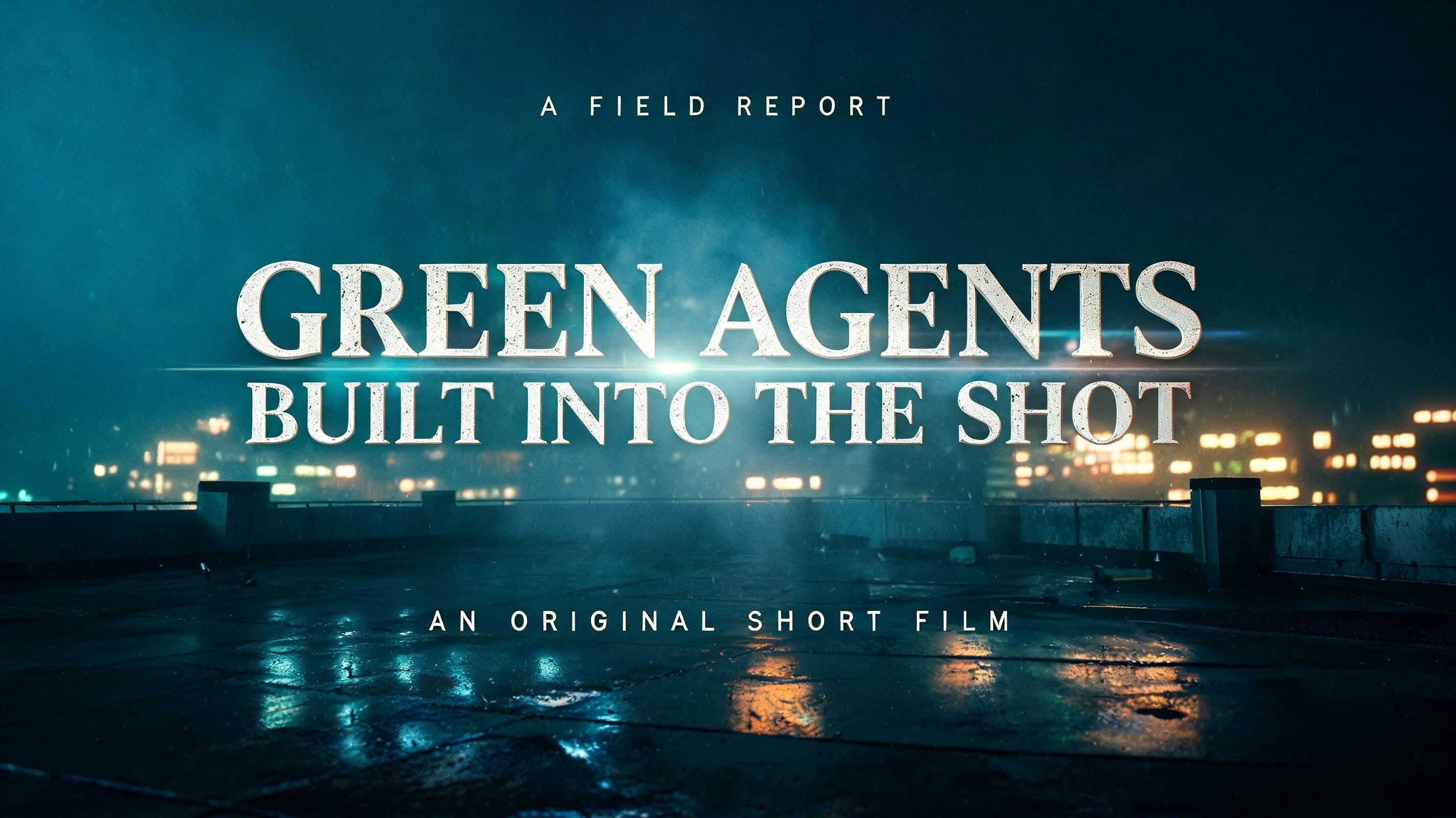
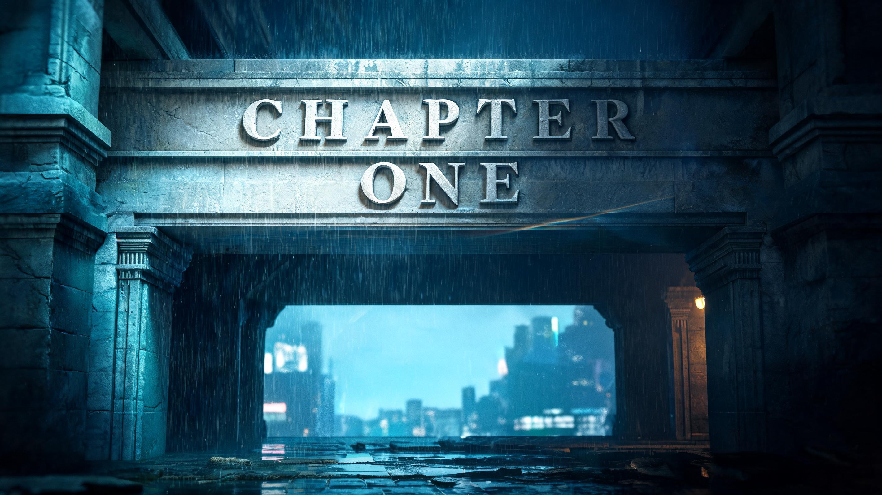
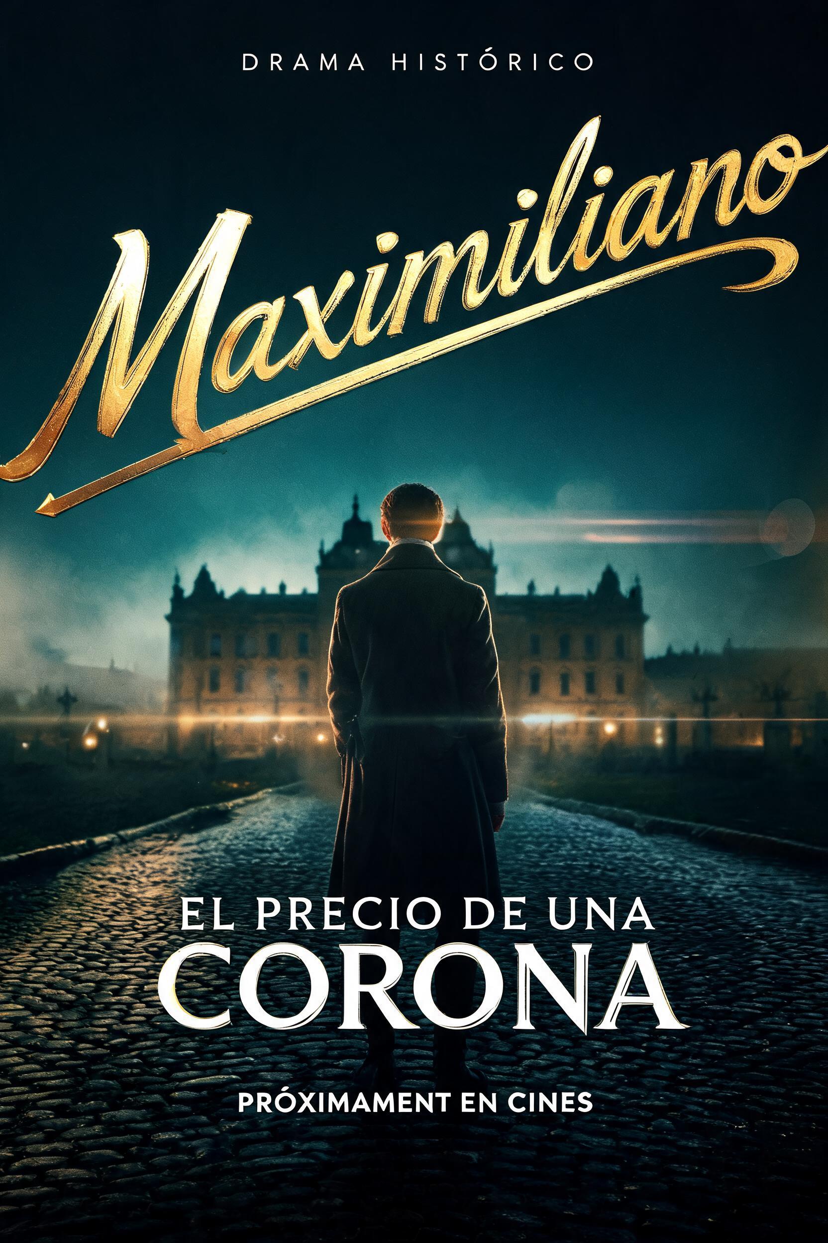
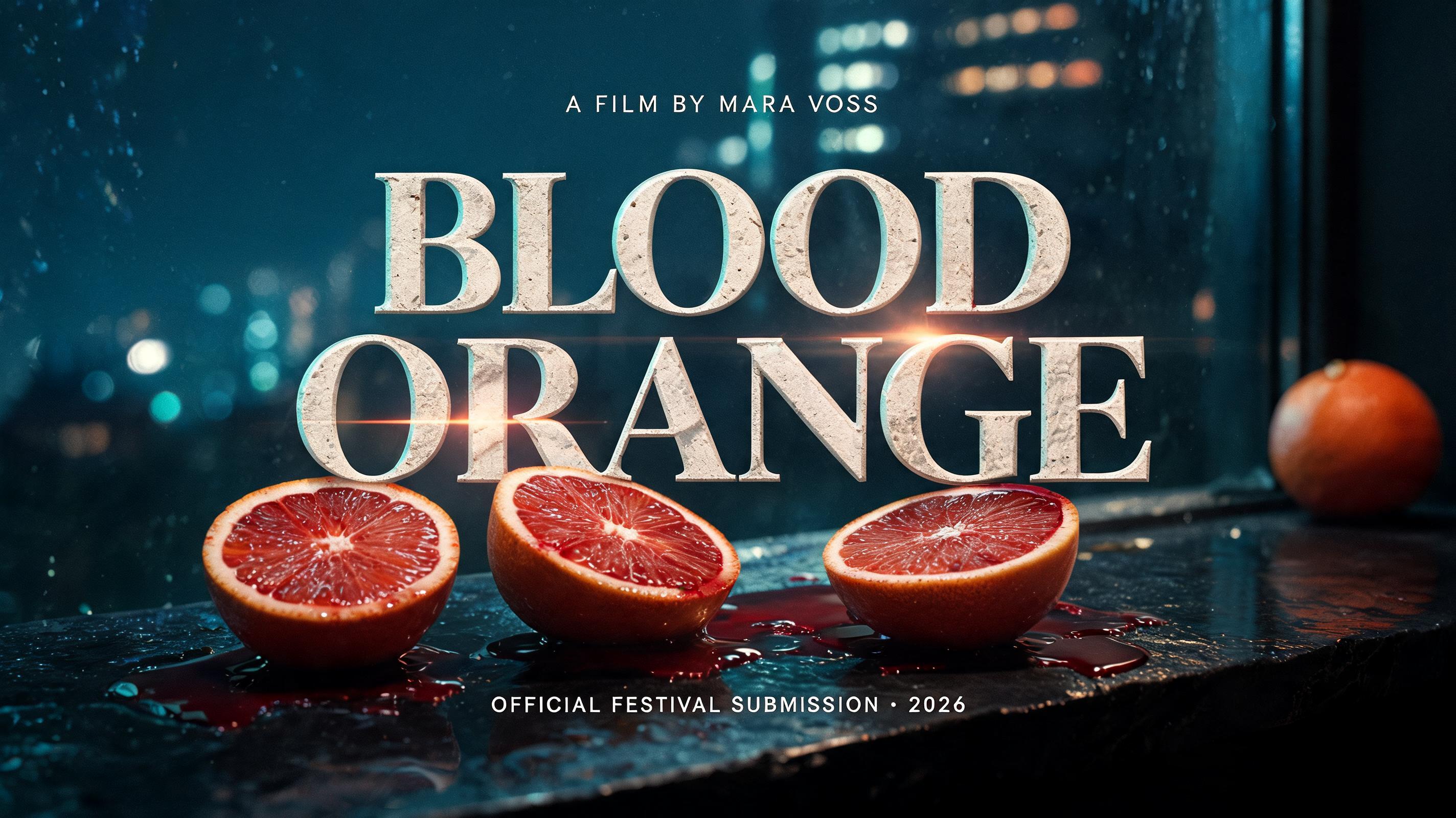
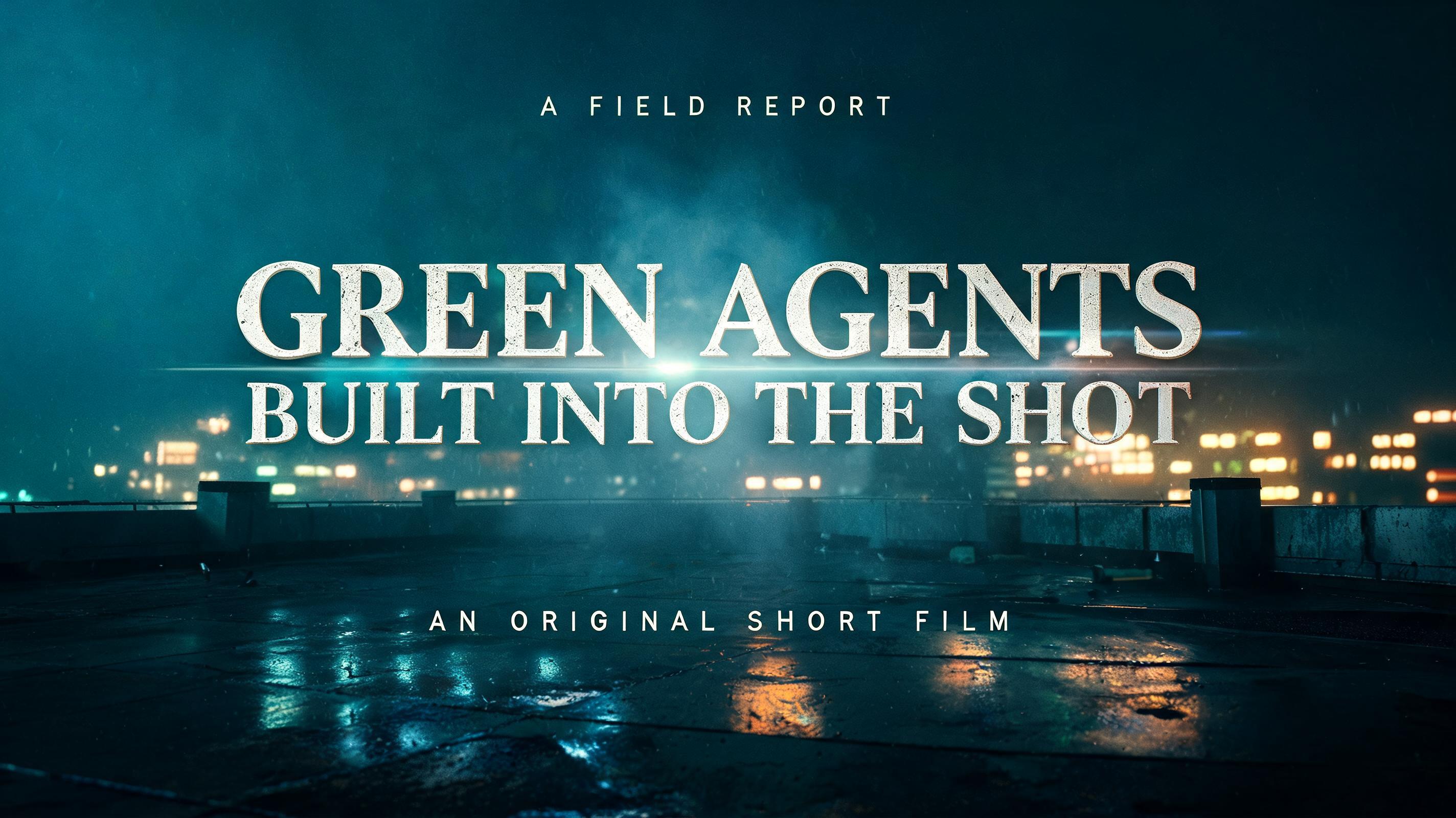
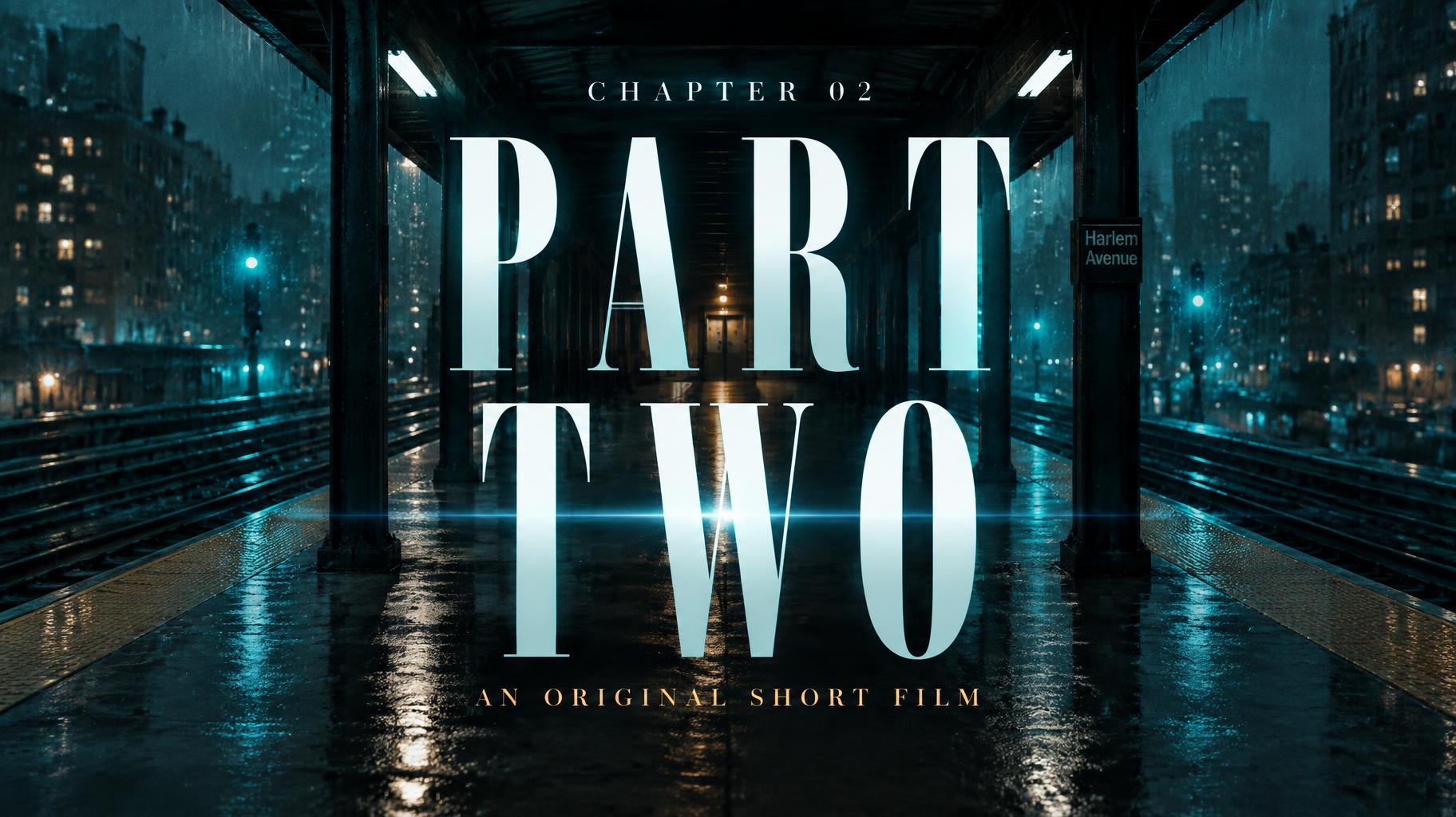
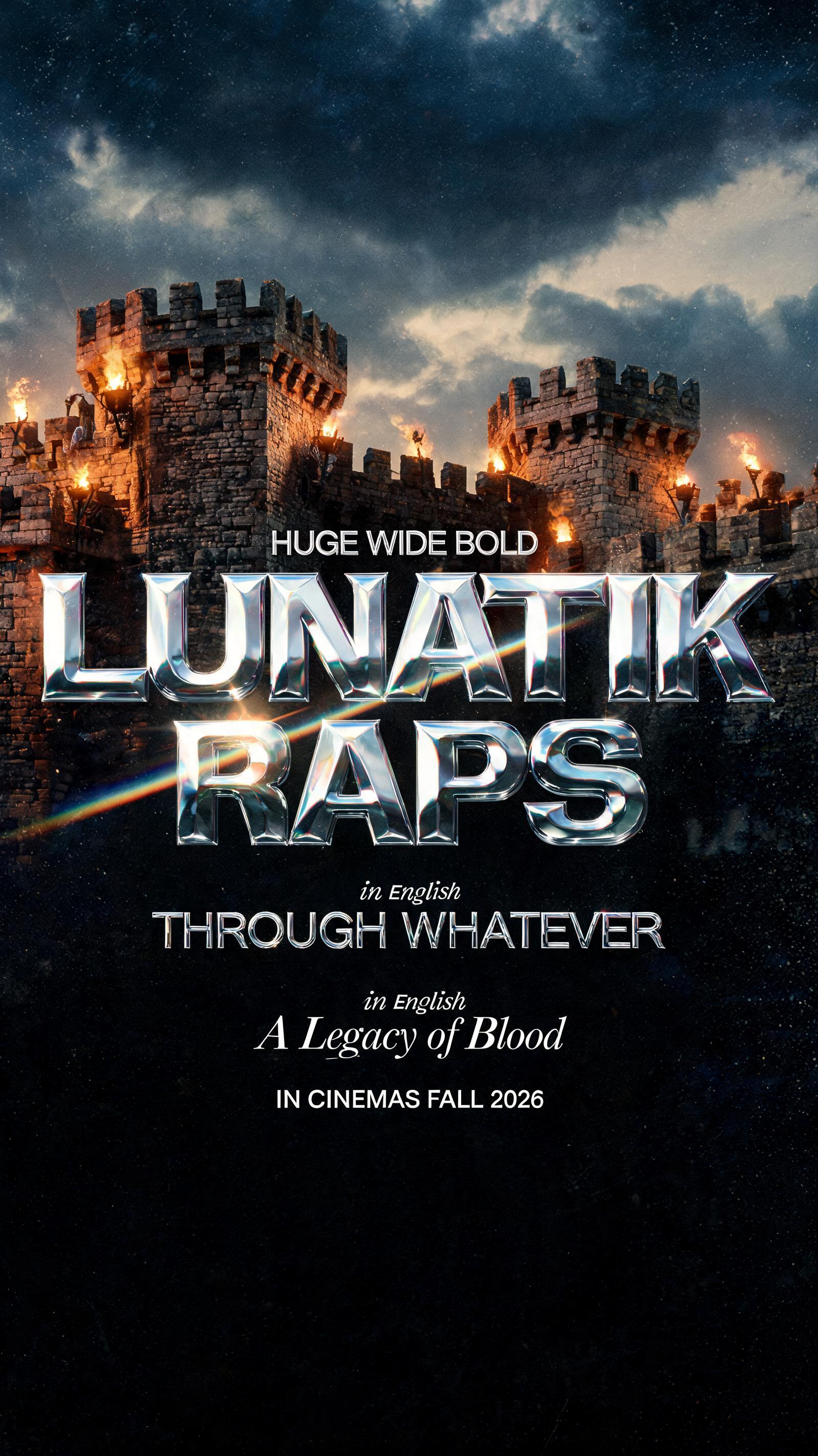
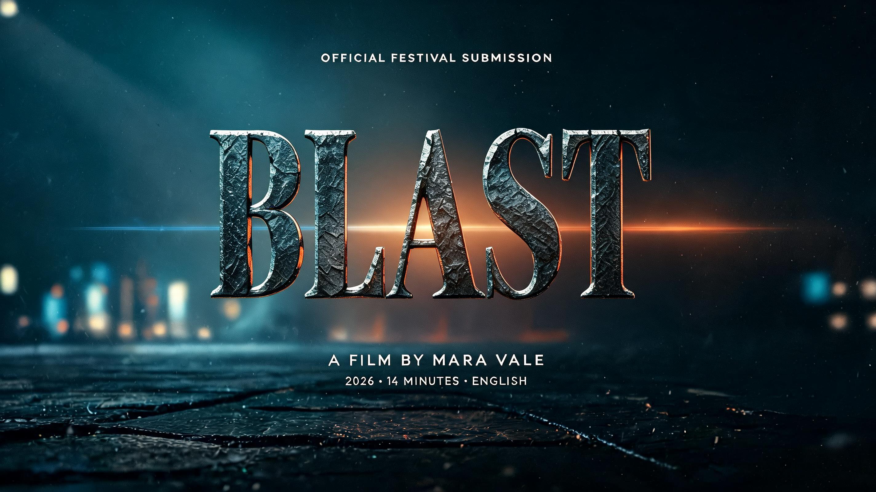
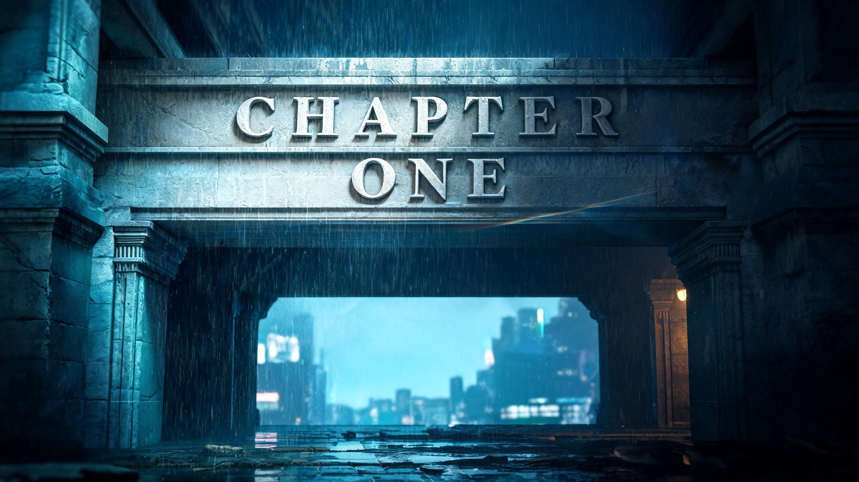
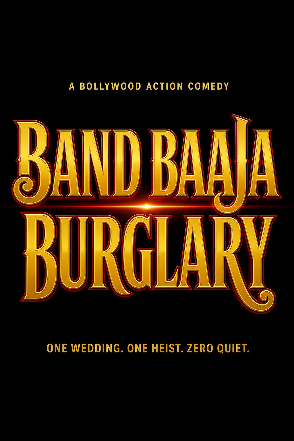
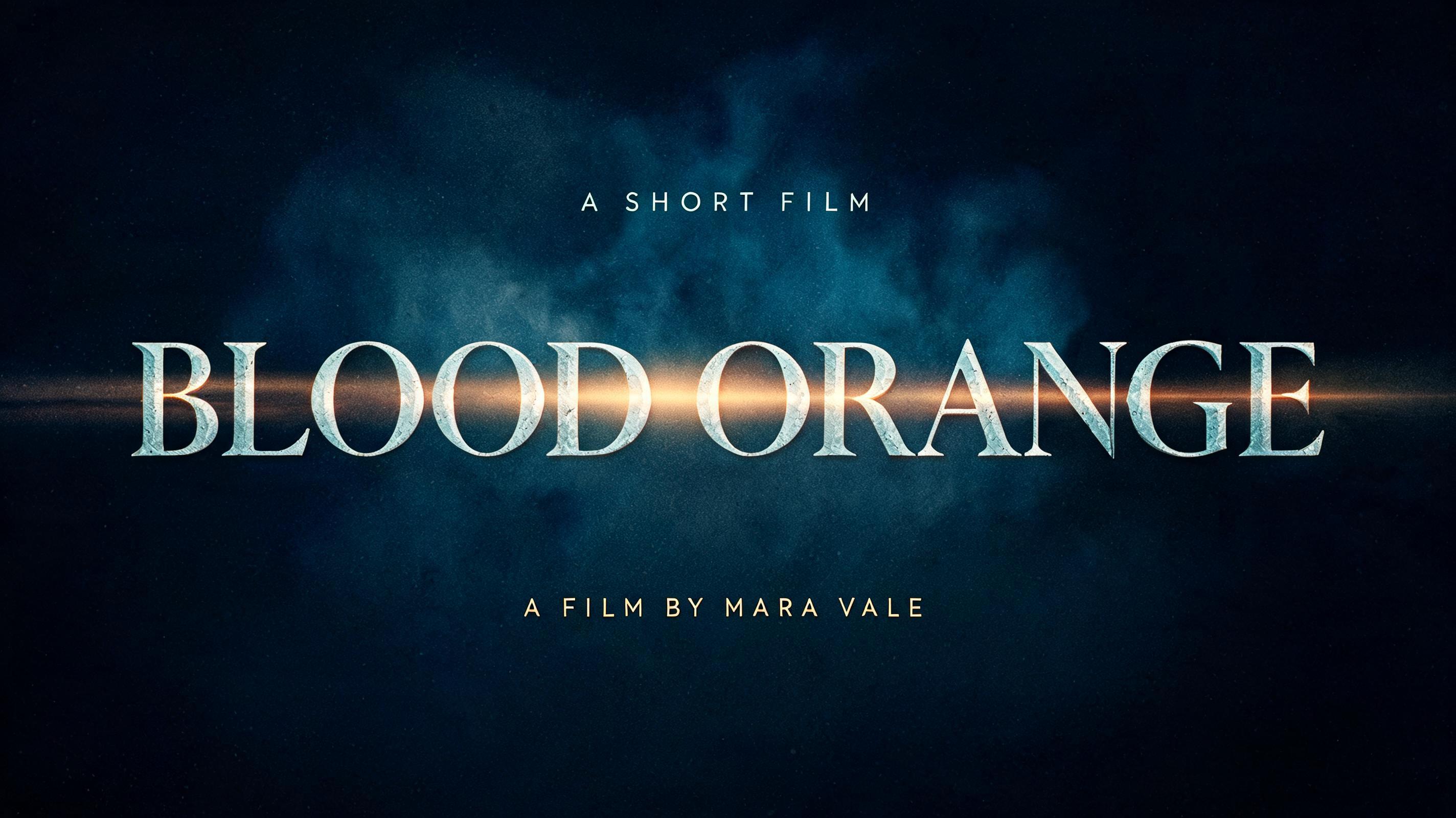
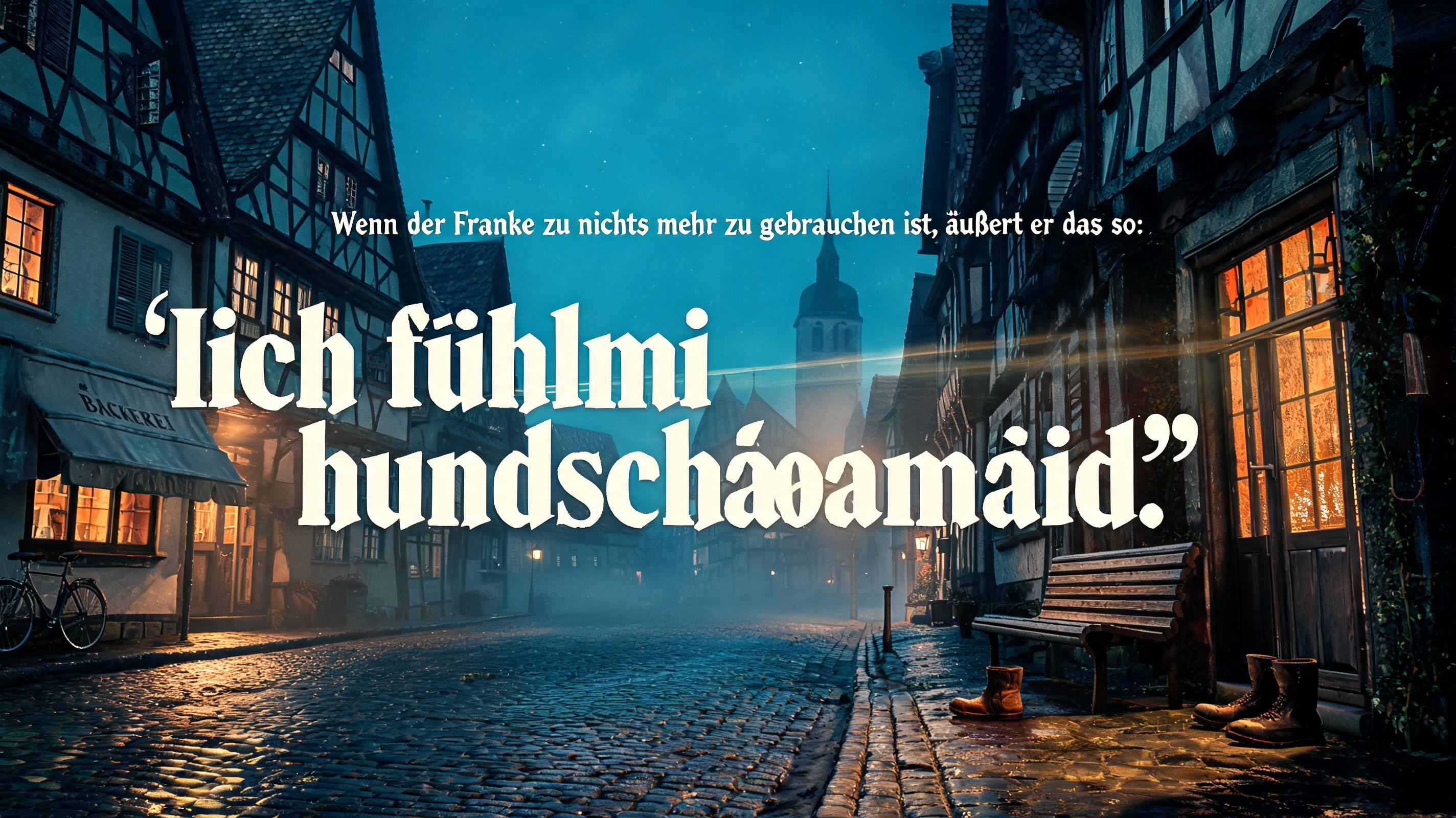
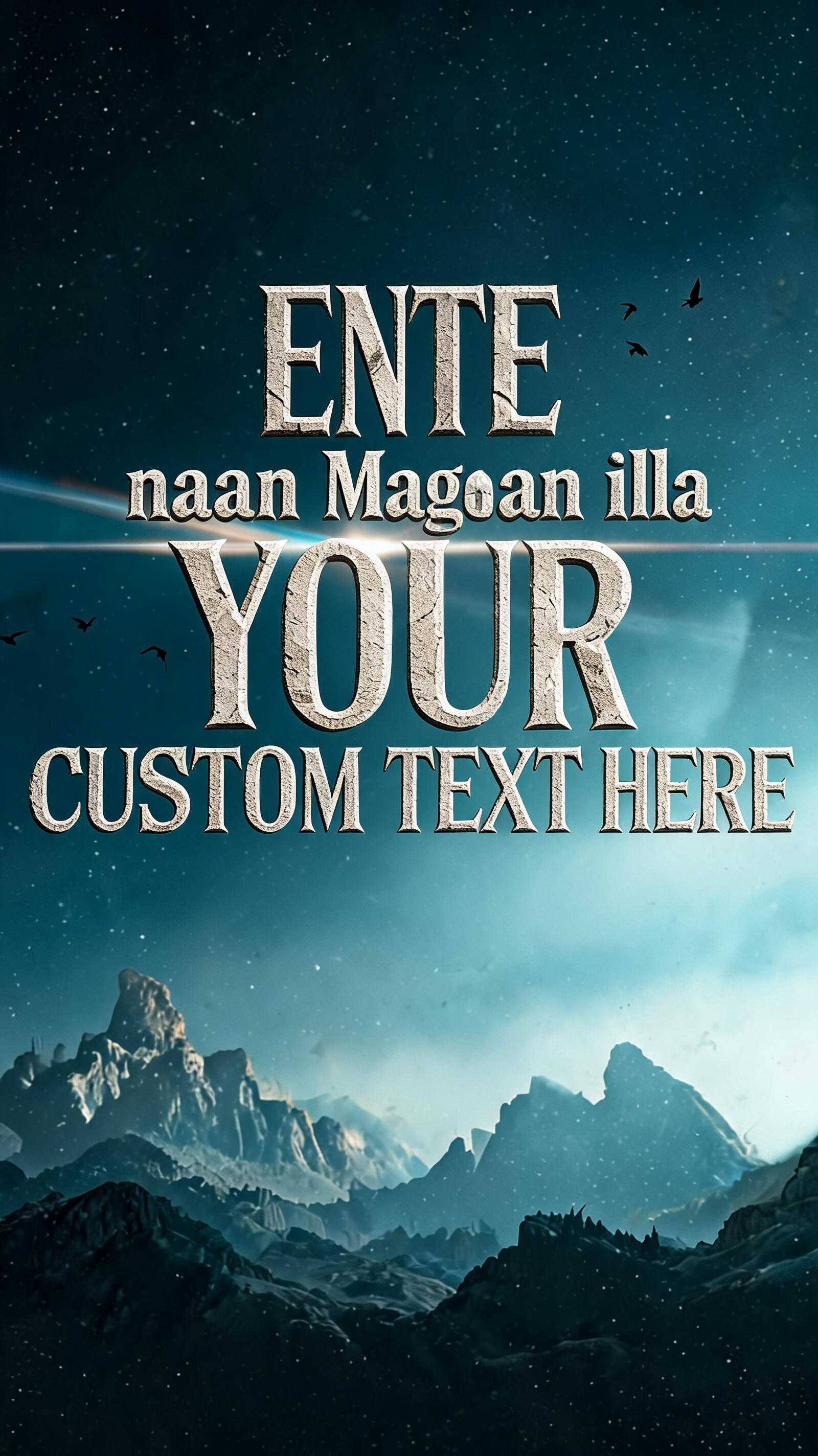
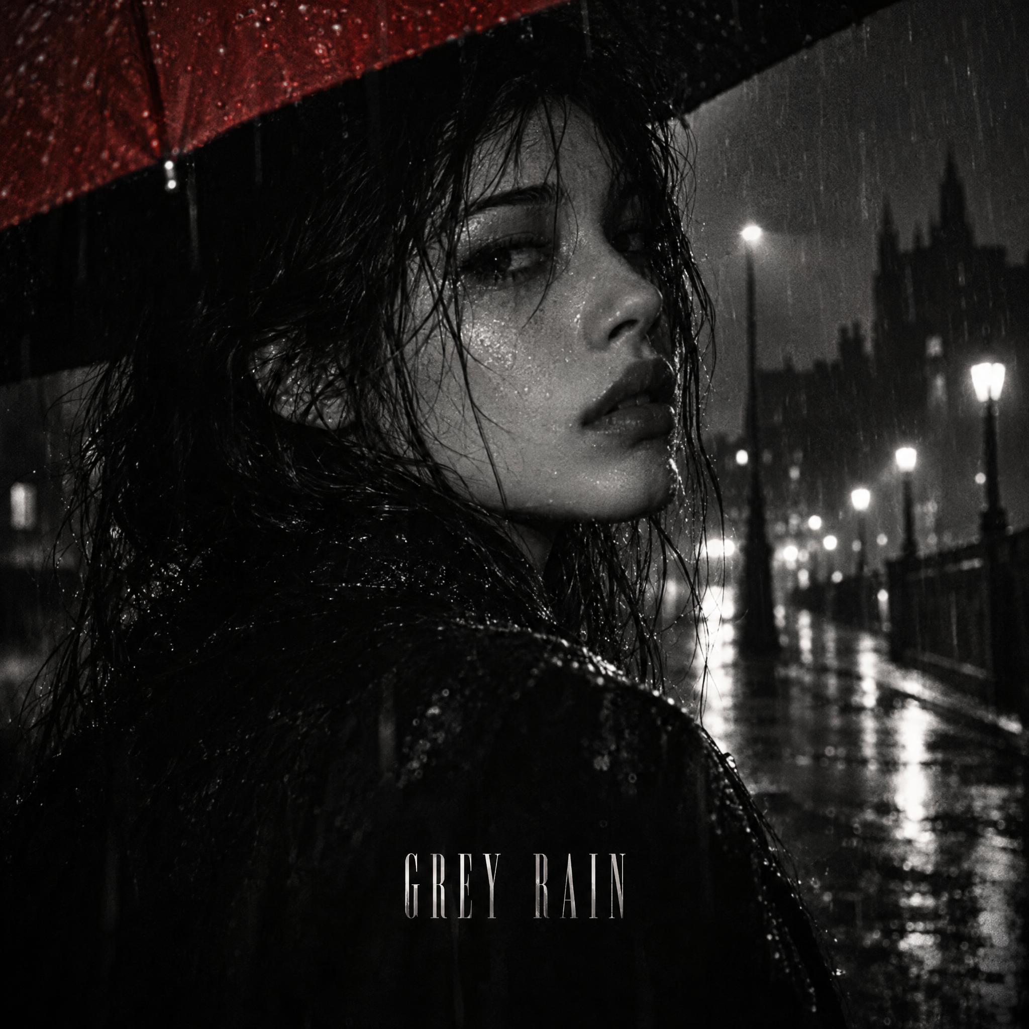
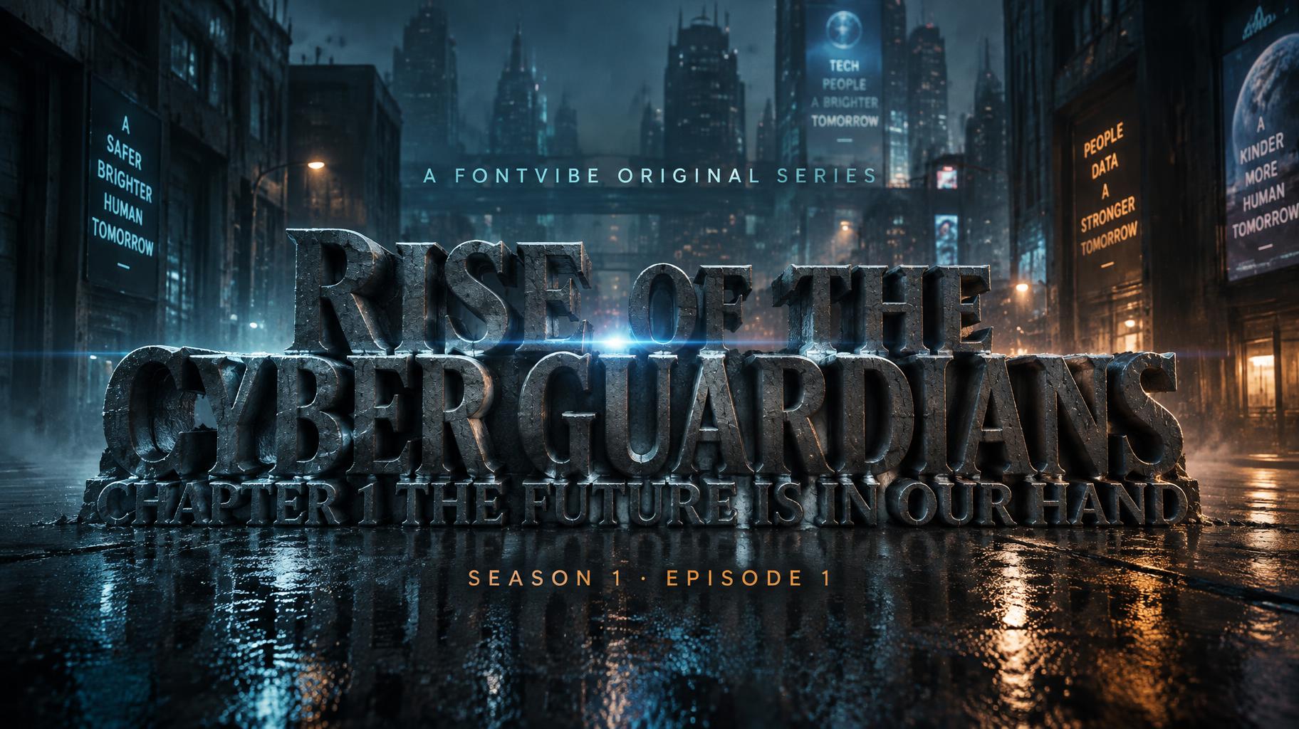
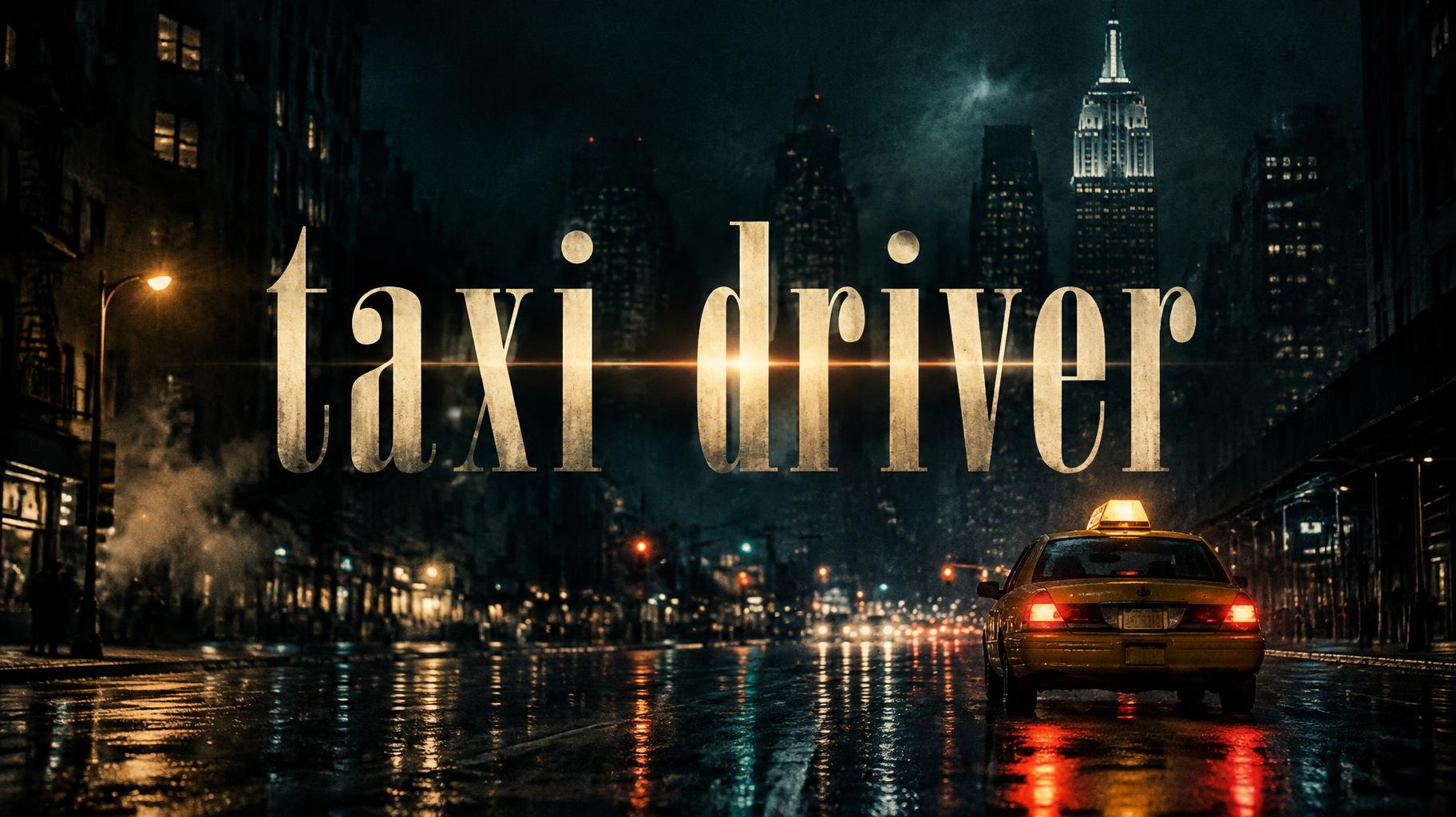
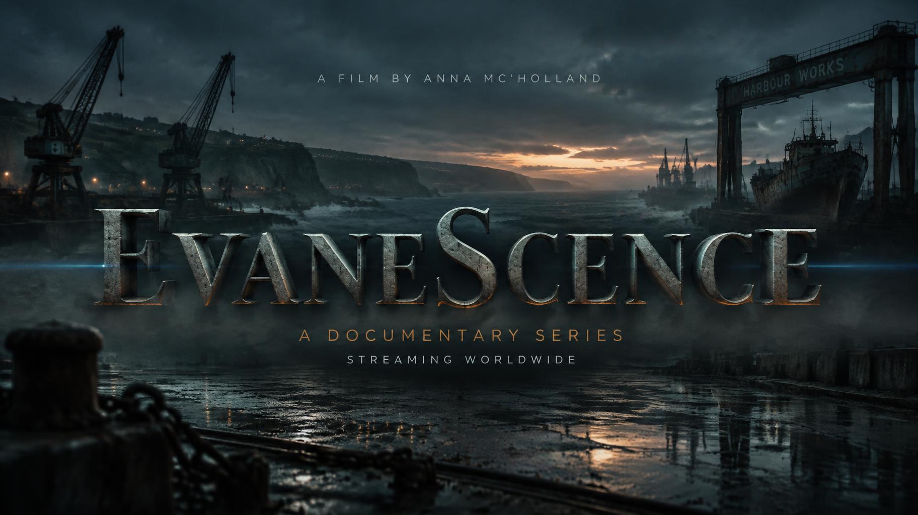
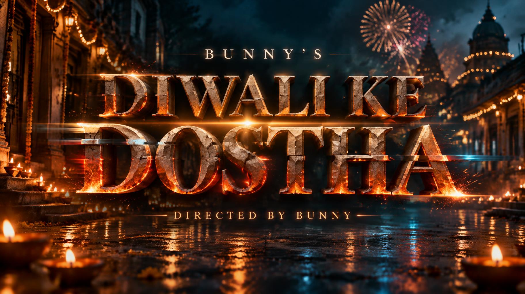
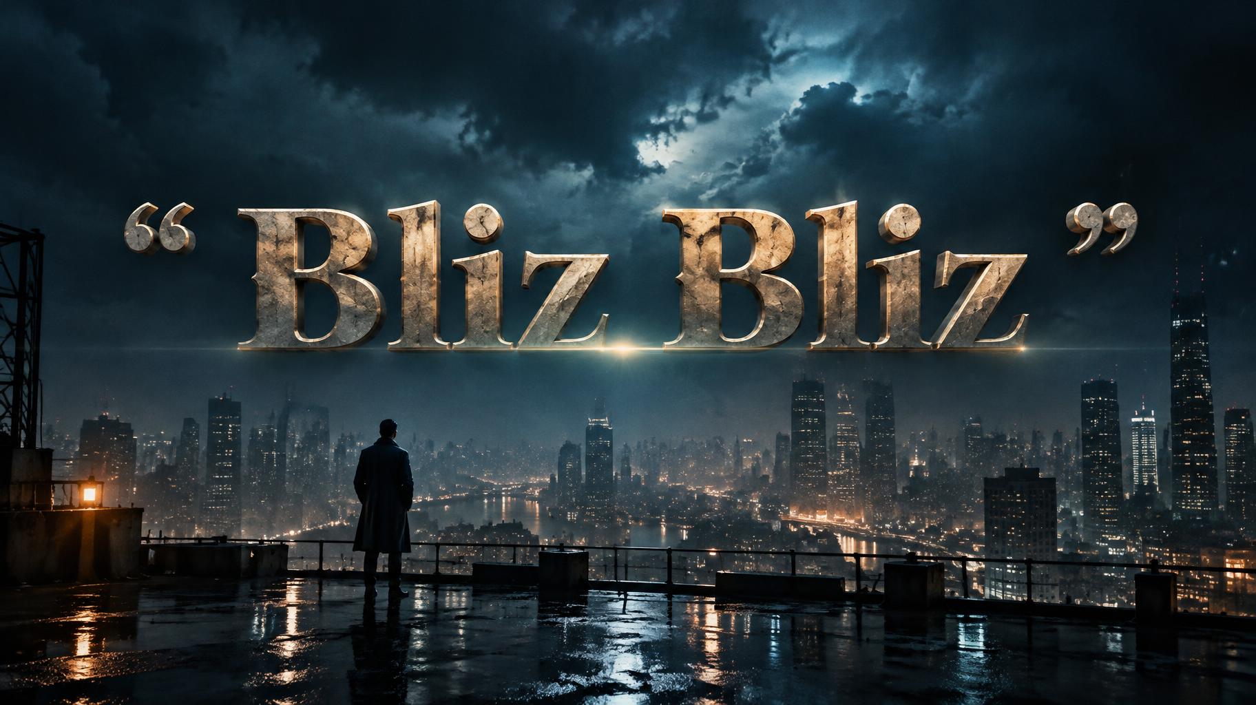
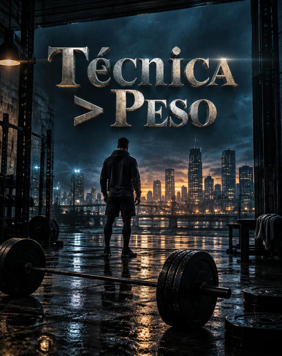
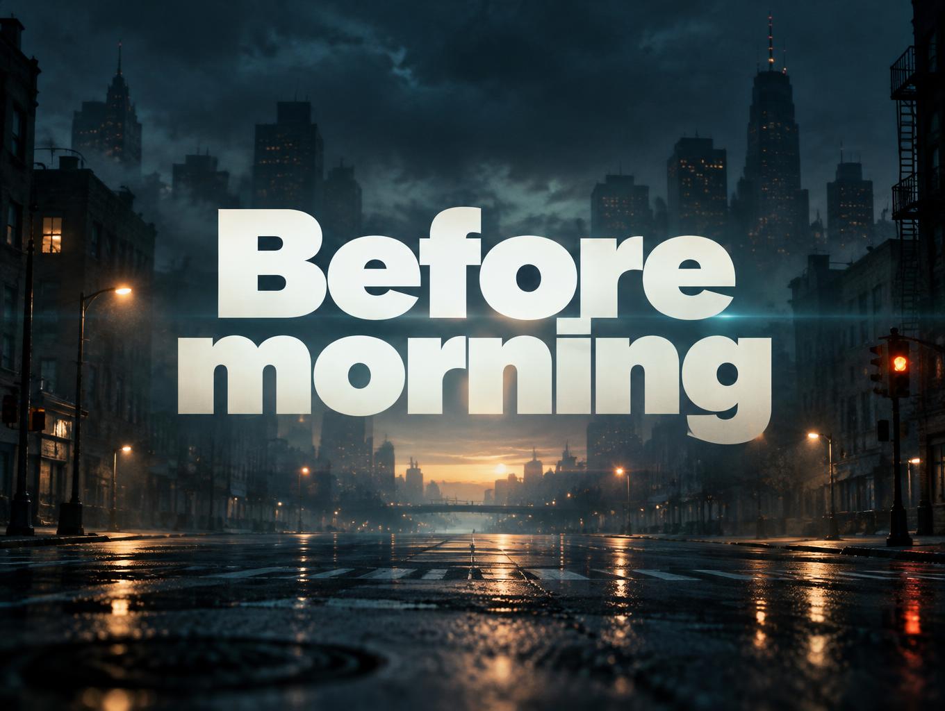
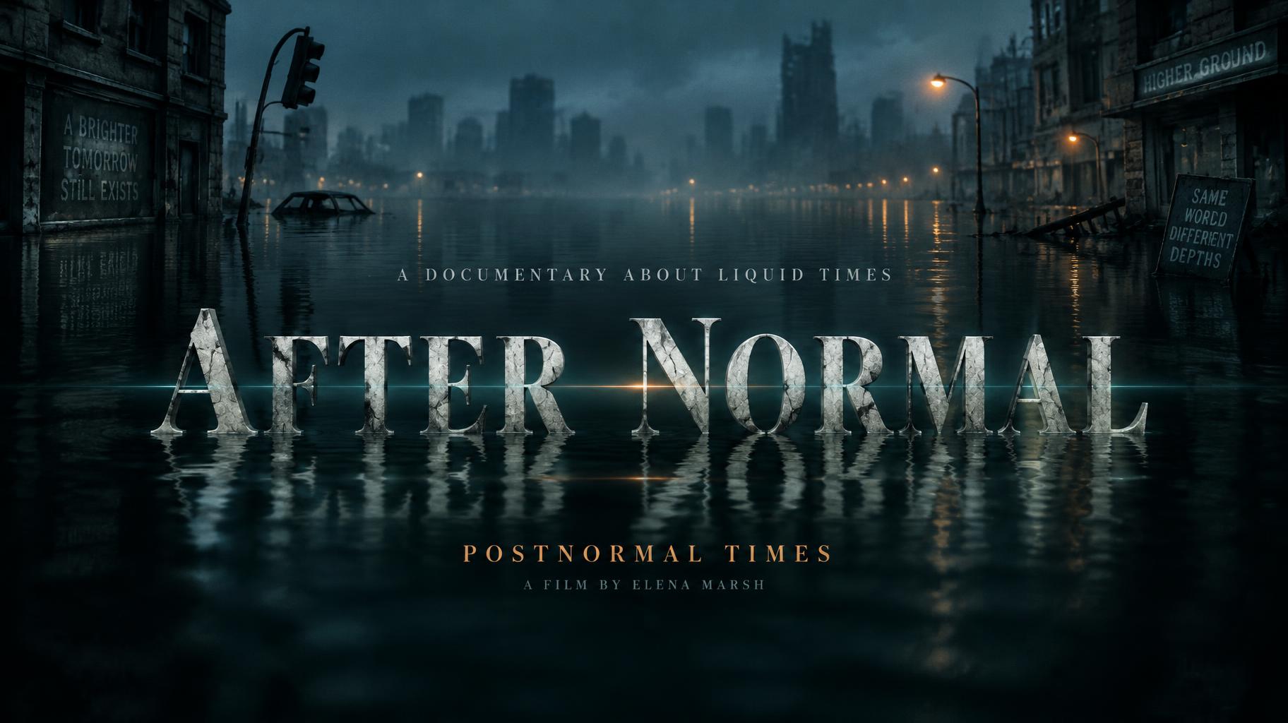
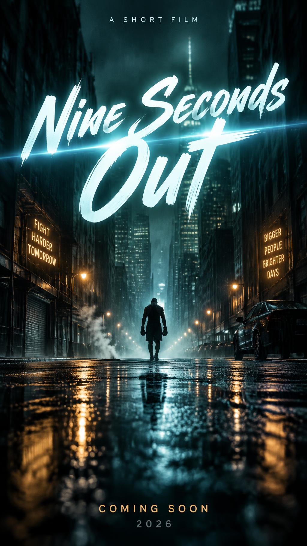
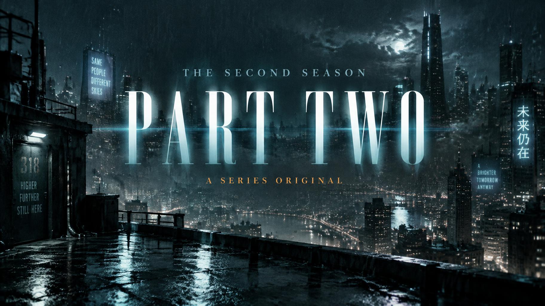
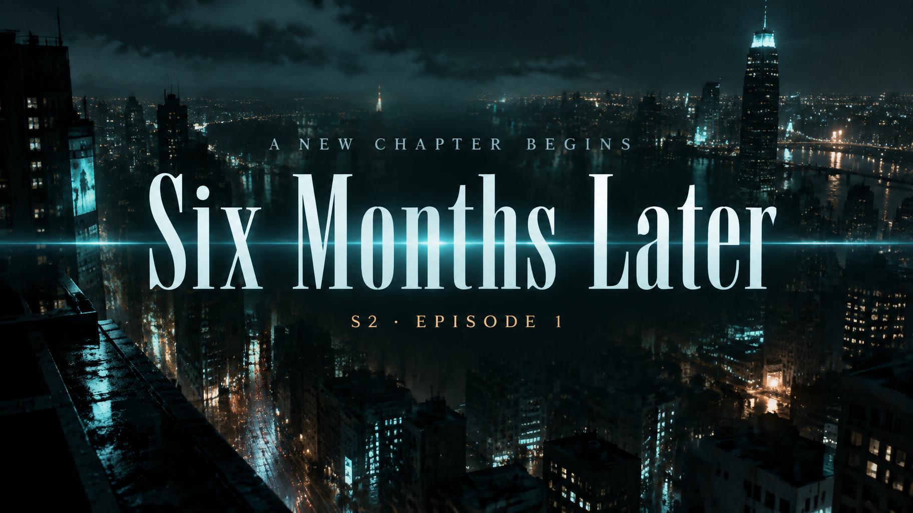
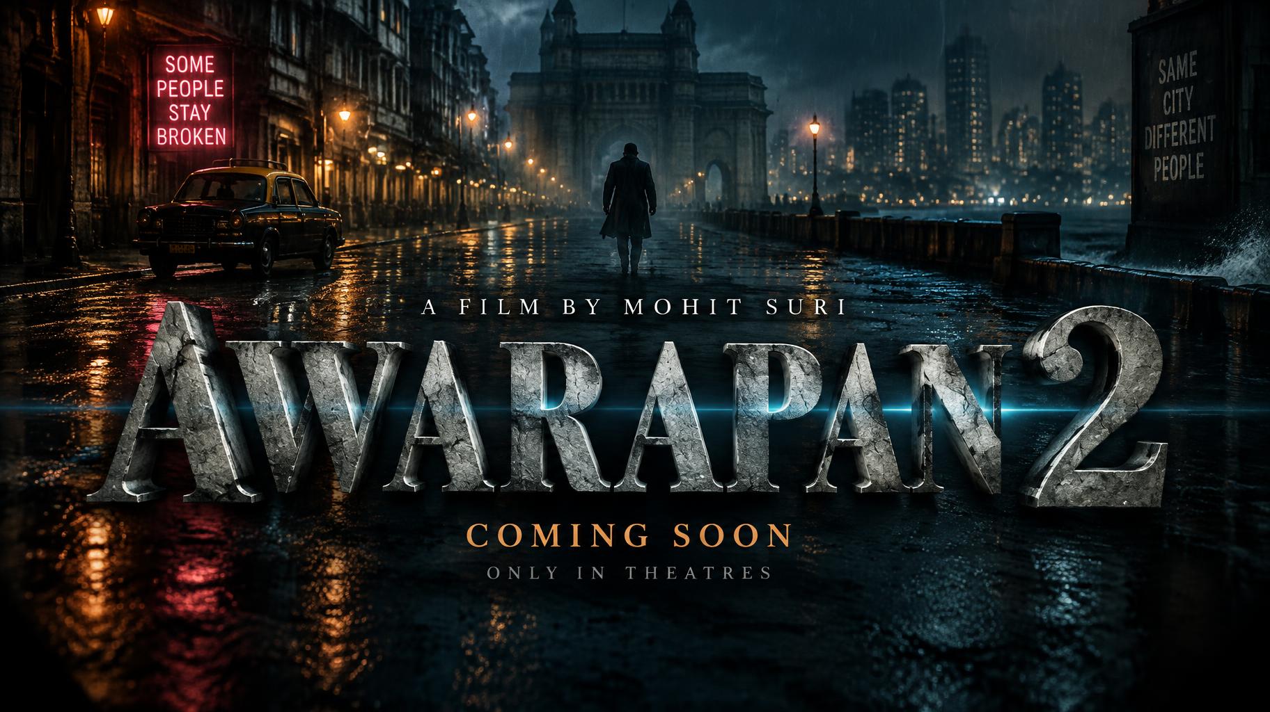
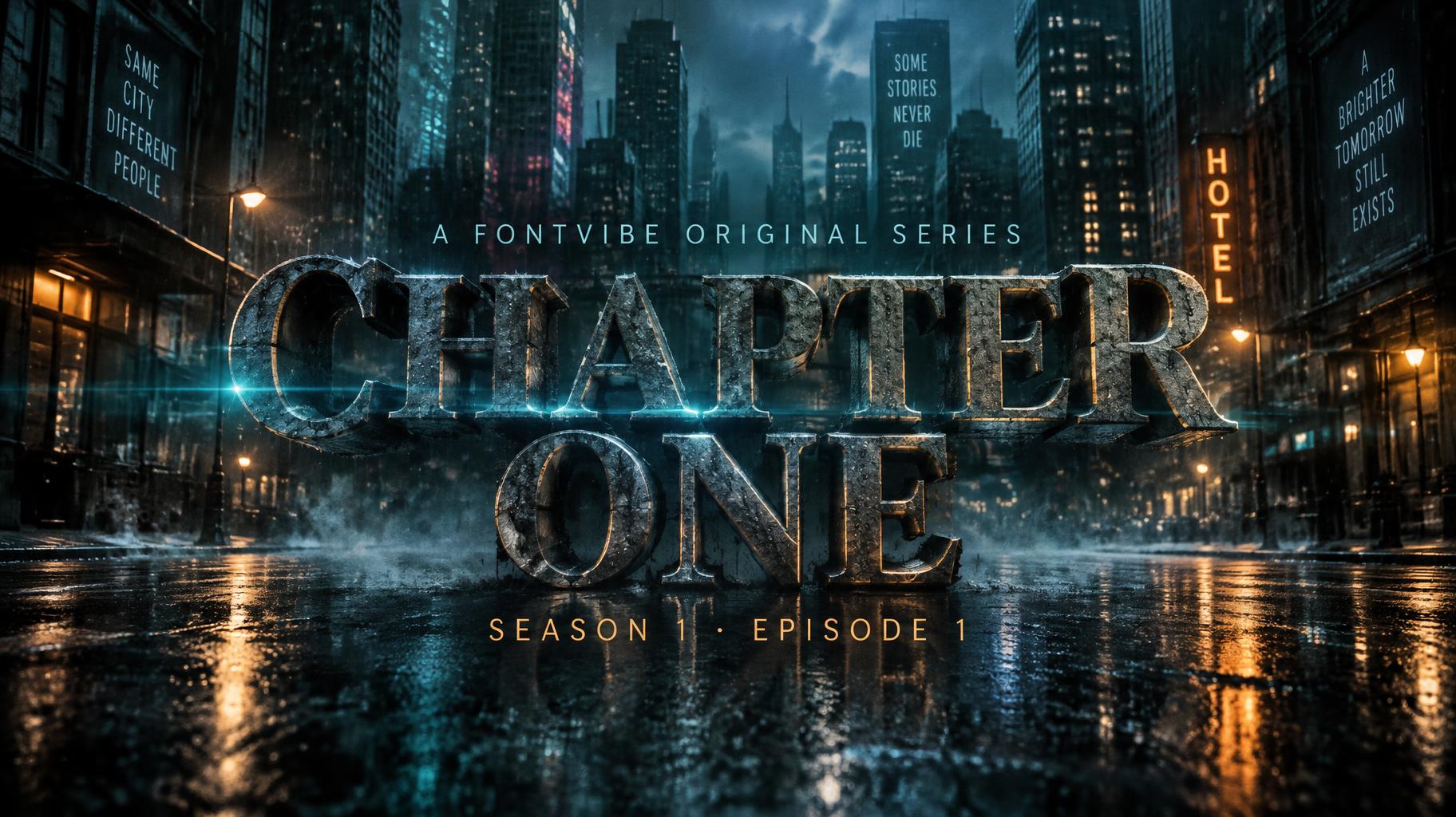
Bold sans-serif series titles with a cold teal glow and anamorphic flare, set over a rain-slicked night city with small tagline and season text. — no font license needed.
Netflix & Streaming in different AI fonts


What you can make with Netflix & Streaming
Netflix & Streaming Gallery
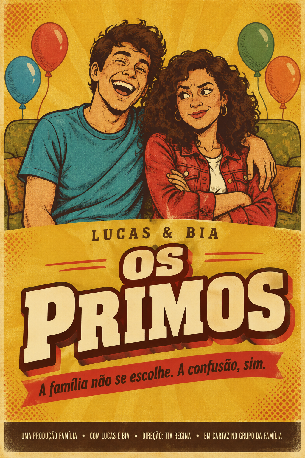
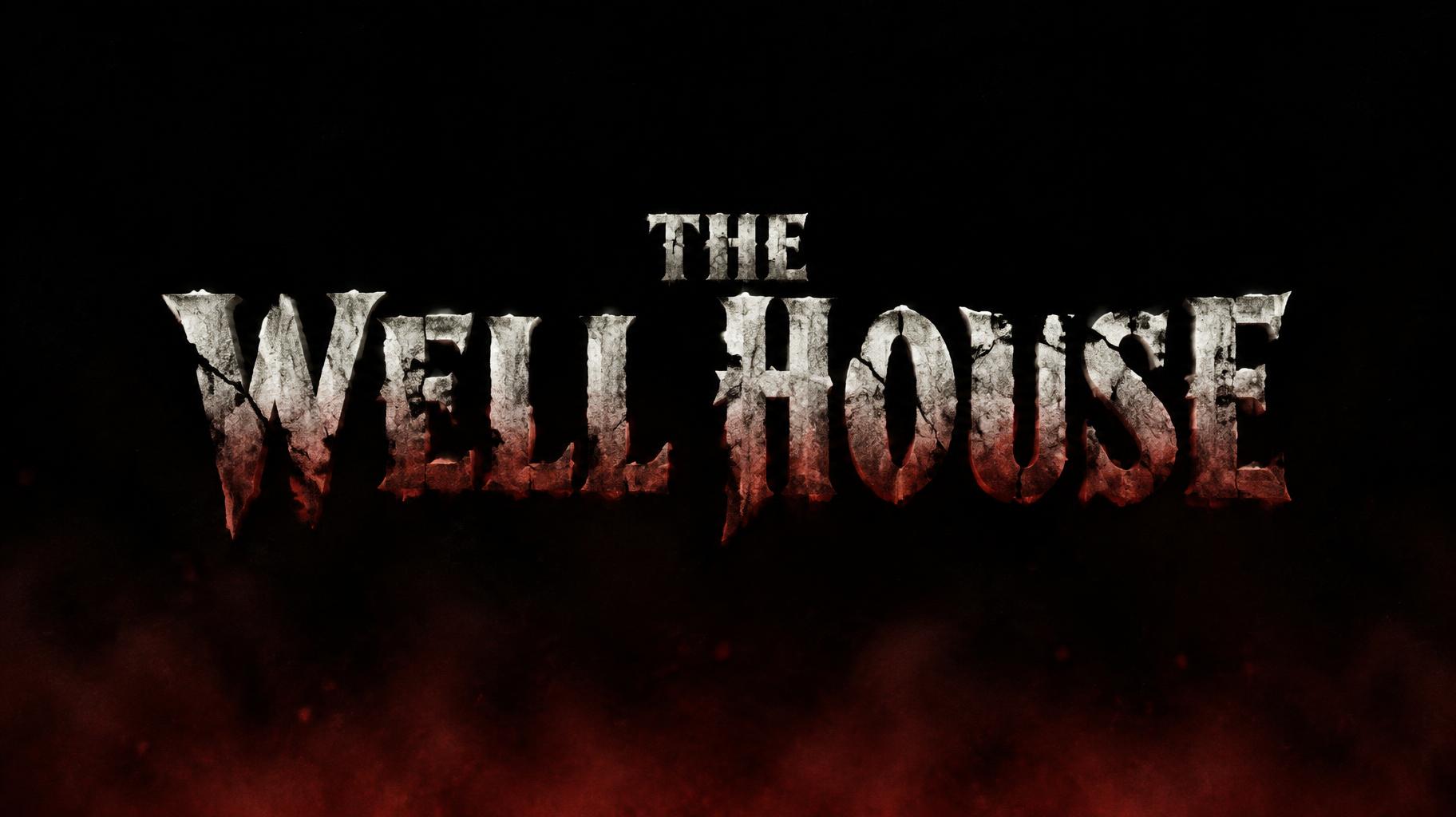
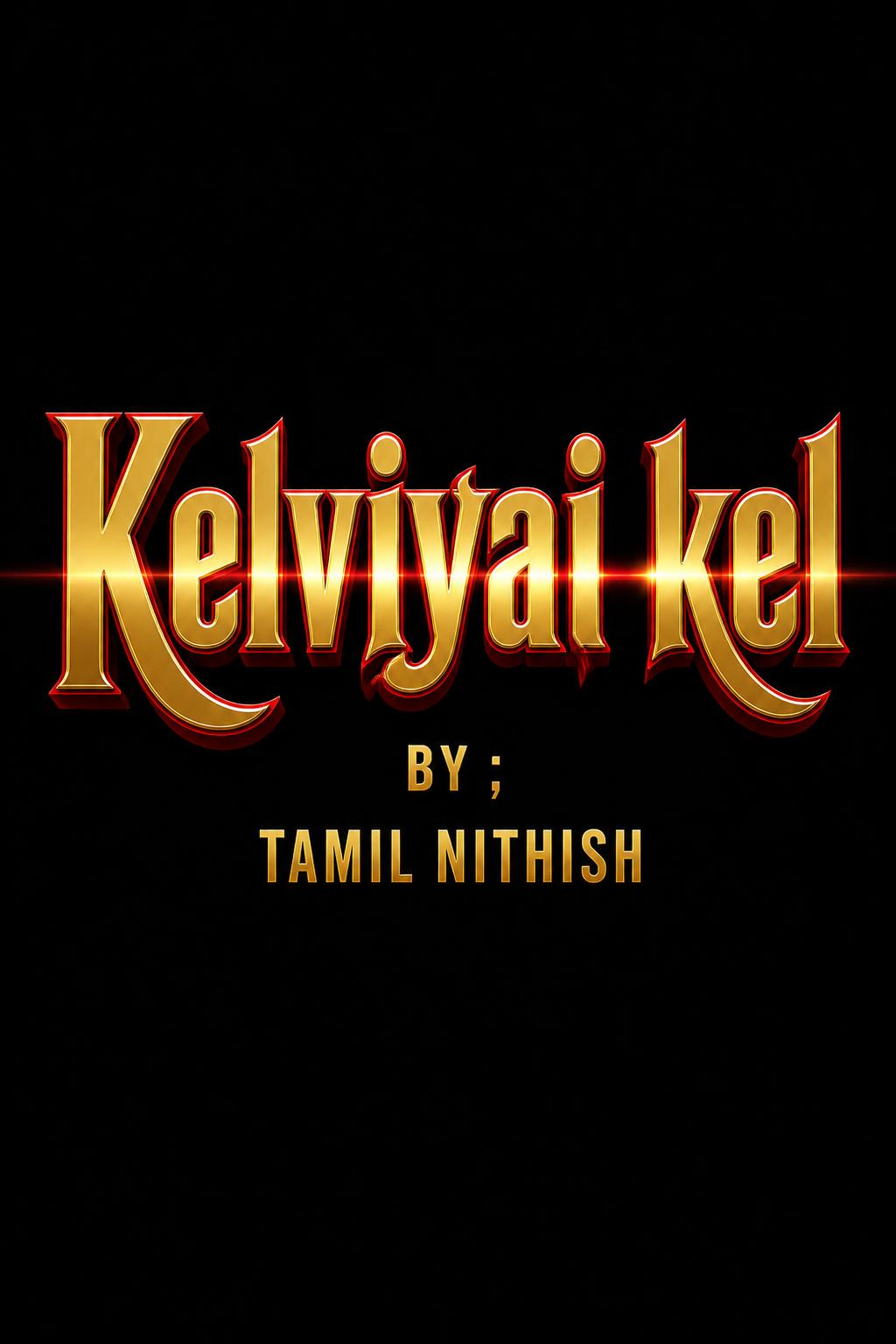
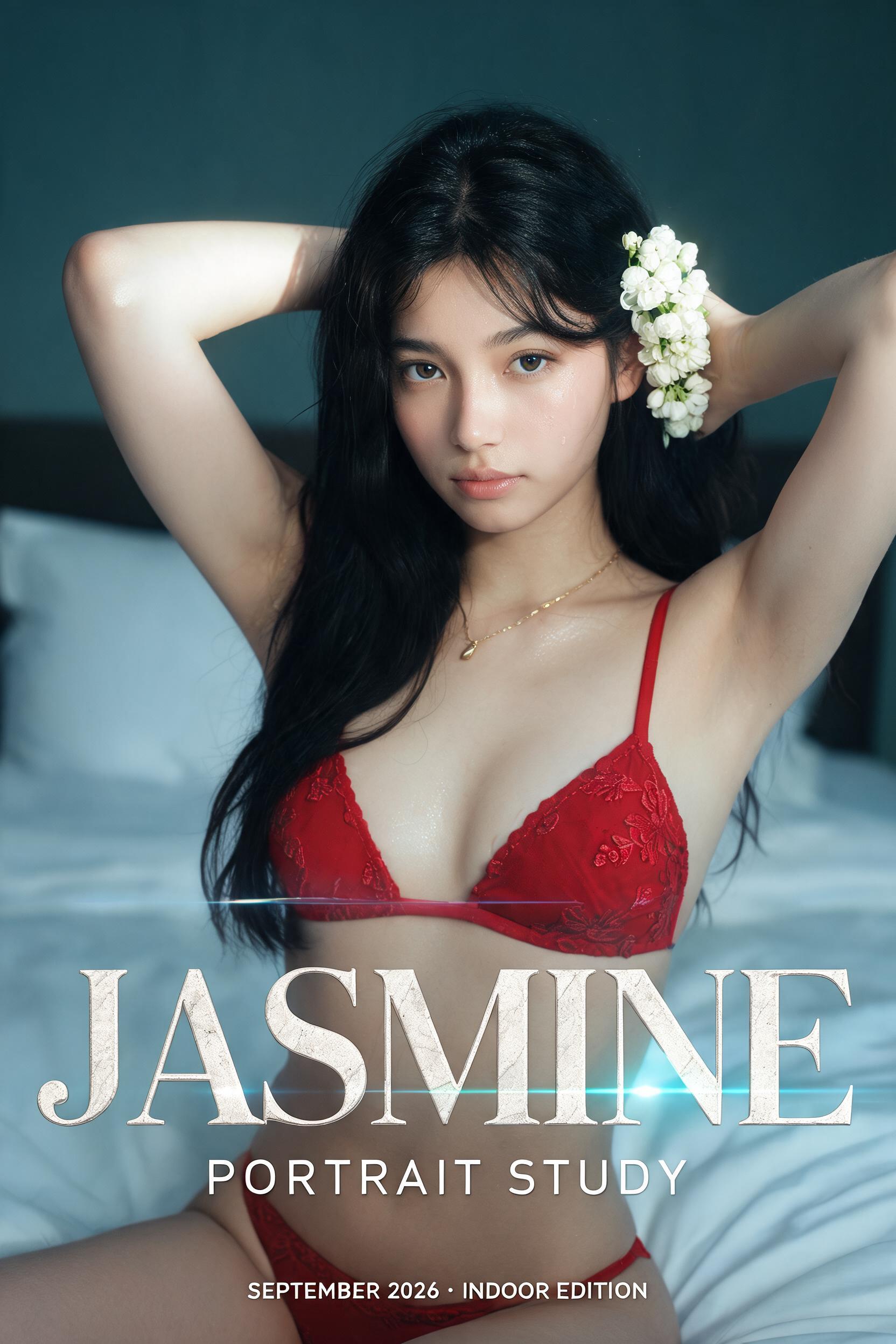
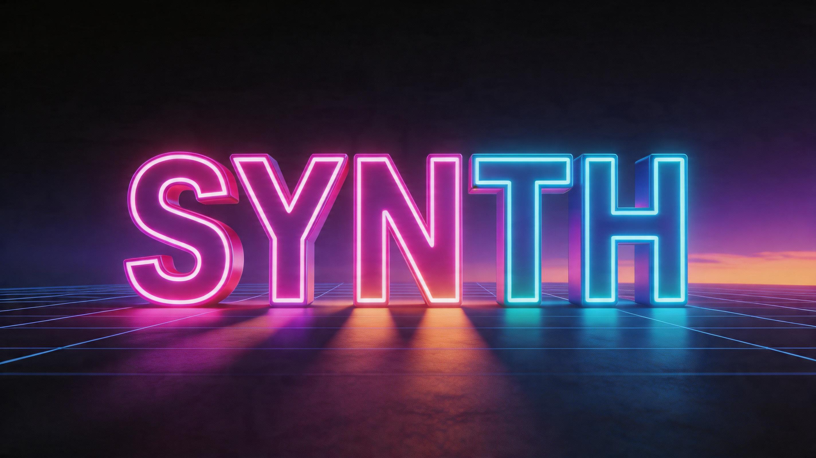
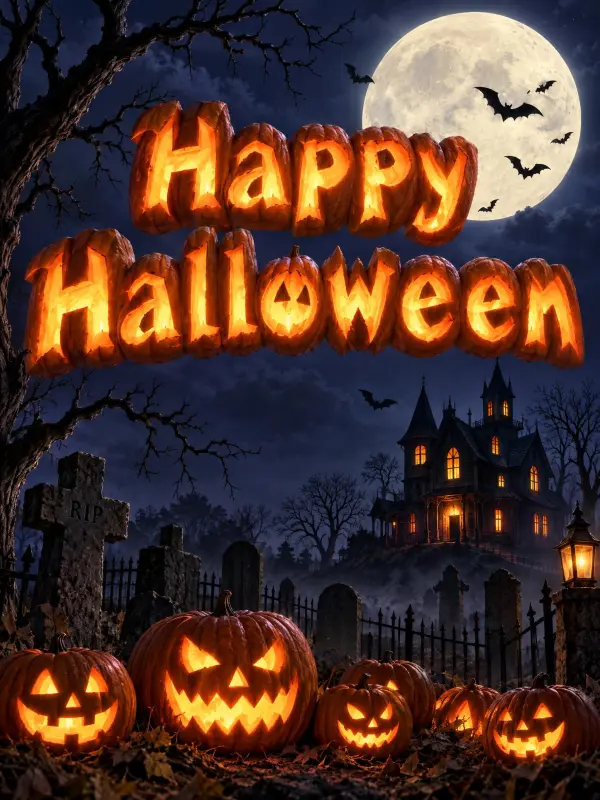
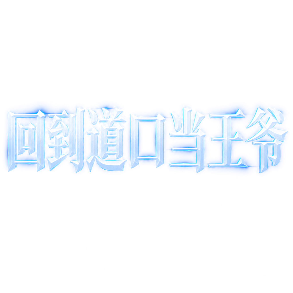
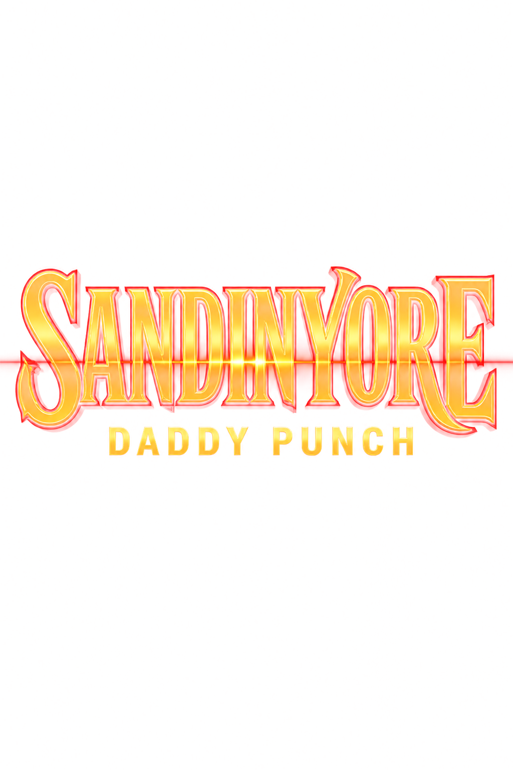
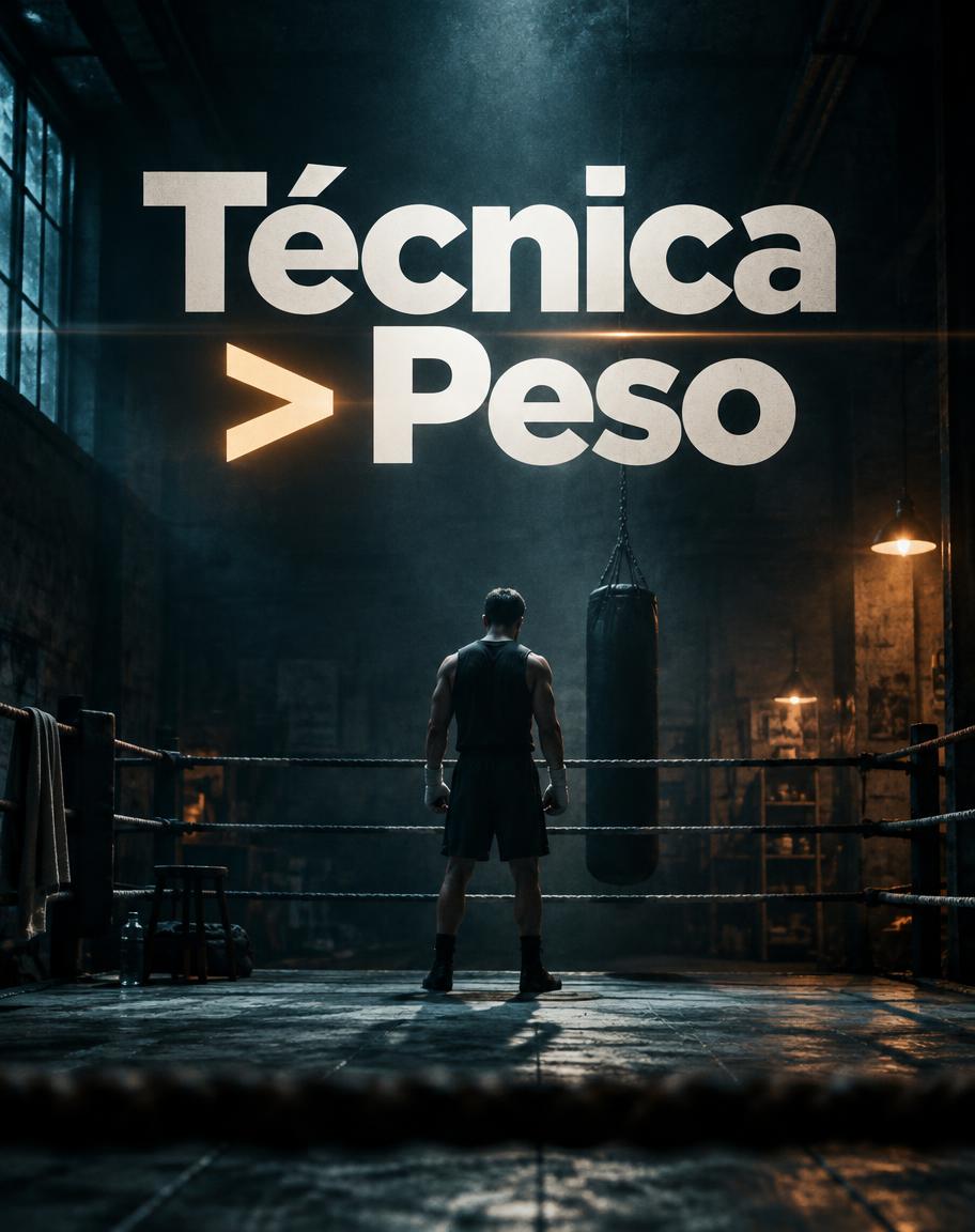
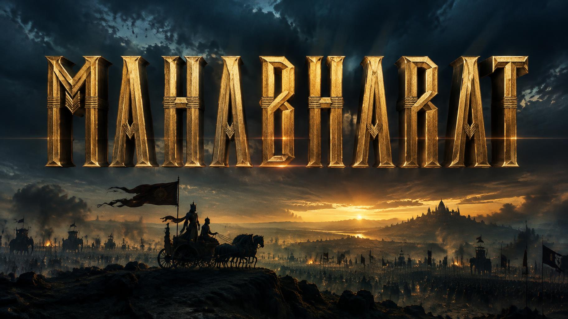
Real outputs from the Netflix & Streaming style. Click any image to see details.











Looking for copy-paste fancy text? Try our free Font Generator Tools — cursive, gothic, bubble & 30+ styles.
Perfect for These Projects
Netflix & Streaming Text Effect — FAQ
What is the Netflix & Streaming Font Style?
The Netflix & Streaming font style is a distinctive AI-generated typography effect. Bold sans-serif series titles with a cold teal glow and anamorphic flare, set over a rain-slicked night city with small tagline and season text. Using FontVibe's AI netflix & streaming generator you can create stunning text effects in seconds — no Photoshop, no font licensing, no design experience needed.
Explore the Netflix & Streaming gallery for inspiration, or browse all 142+ AI text effect styles available on FontVibe.
How to Create Netflix & Streaming Typography in FontVibe Studio
The Story Behind Netflix & Streaming
History, visual DNA, and cultural context.
The Title Card as Art Form
Cinema typography has its own distinct tradition, separate from book design and advertising: the title card, the opening sequence, the end credit crawl. These are the moments when typography is not in service of content but is itself the spectacle — when the audience is asked to read before they are shown.
The history of film title design runs from the hand-lettered intertitles of silent cinema through the hand-painted studio title cards of Hollywood's Golden Age to the revolutionary work of Saul Bass, who beginning with Carmen Jones (1954) and reaching its peak with Vertigo (1958) and North by Northwest (1959) invented the modern film title sequence as an art form. Bass argued that the title sequence was not pre-show — it was the beginning of the film. The audience's experience of the film started with the first title frame.
Contemporary film title design — studios such as Imaginary Forces (Stranger Things) and designers such as Kyle Cooper (Se7en, 1995, made at R/GA) — continues this tradition: the title sequence as a compressed argument about the film's tone, world, and visual grammar.
Sources: Wikipedia — Saul Bass · BFI — Celebrating Saul Bass's centenary: 10 essential title sequences · Wikipedia — Title sequence · Wikipedia — Stranger Things
The Visual DNA
Did You Know?
Saul Bass designed the title sequences for three Alfred Hitchcock films: Vertigo, North by Northwest and Psycho. For Vertigo (1958), animator John Whitney generated the spirals with a converted World War II anti-aircraft gun director, an analog mechanical computer — often cited as a pioneering use of computer-driven imagery in film. Source ↗
The Stranger Things title sequence was designed by the studio Imaginary Forces, inspired by 1980s Stephen King paperback covers that the show's creators sent to the studio; the producers wanted the lettering in ITC Benguiat, the typeface on many of those covers. Source ↗
Create Your Netflix & Streaming Typography in Studio
Free to start. No design skills needed. Your artwork, your copyright.
AI Cinematic Netflix & Streaming Text Effect Generator
Bold sans-serif series titles with a cold teal glow and anamorphic flare, set over a rain-slicked night city with small tagline and season text. — no font license needed.
Netflix & Streaming in different AI fonts
What you can make with Netflix & Streaming
Generate Your Netflix & Streaming Text Effect
Type any word — see it transformed in seconds. No sign-up required.
Netflix & Streaming Style Gallery
Real outputs from the Netflix & Streaming style. Click any image to see details.




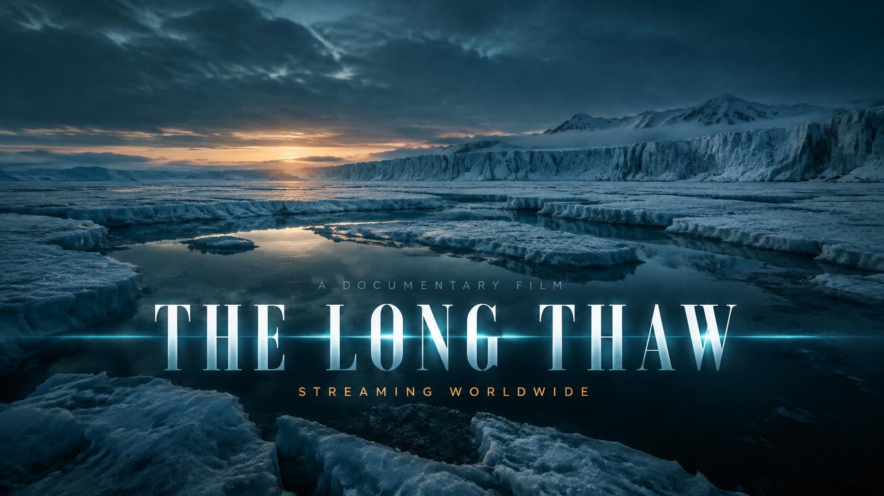
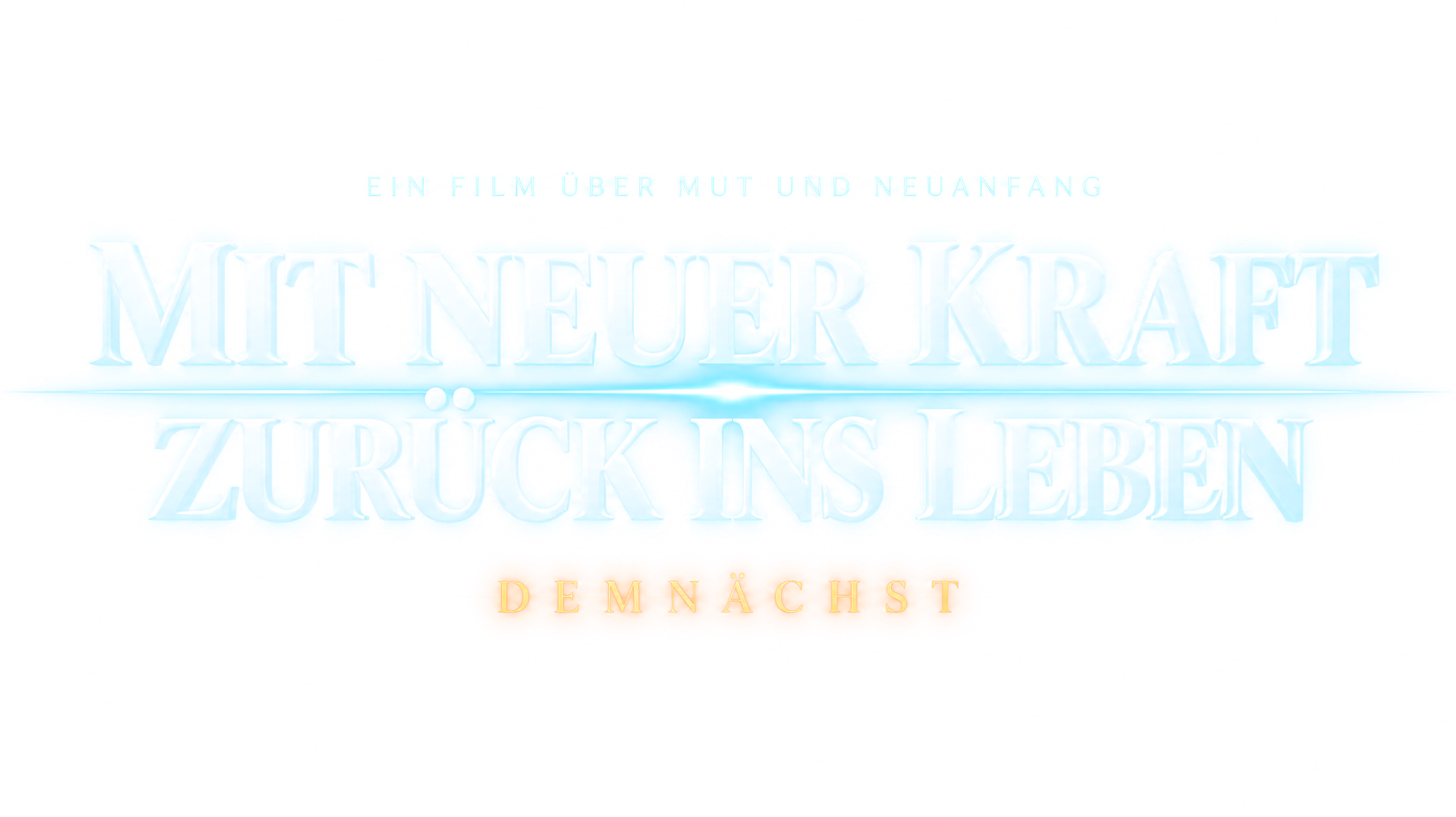


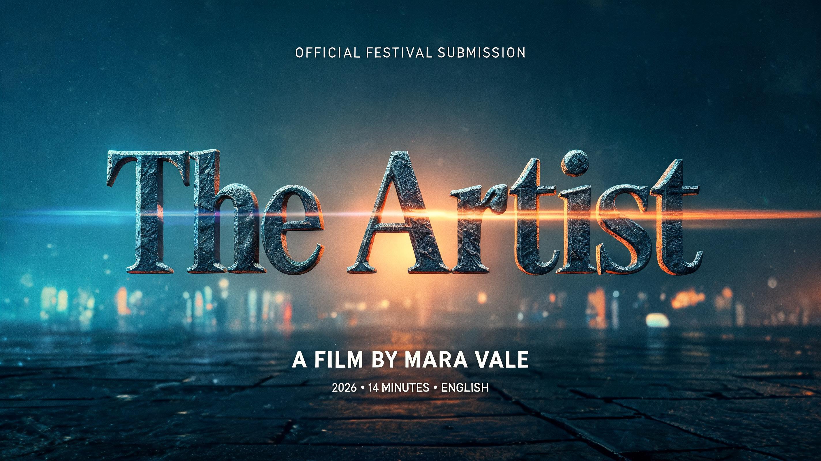
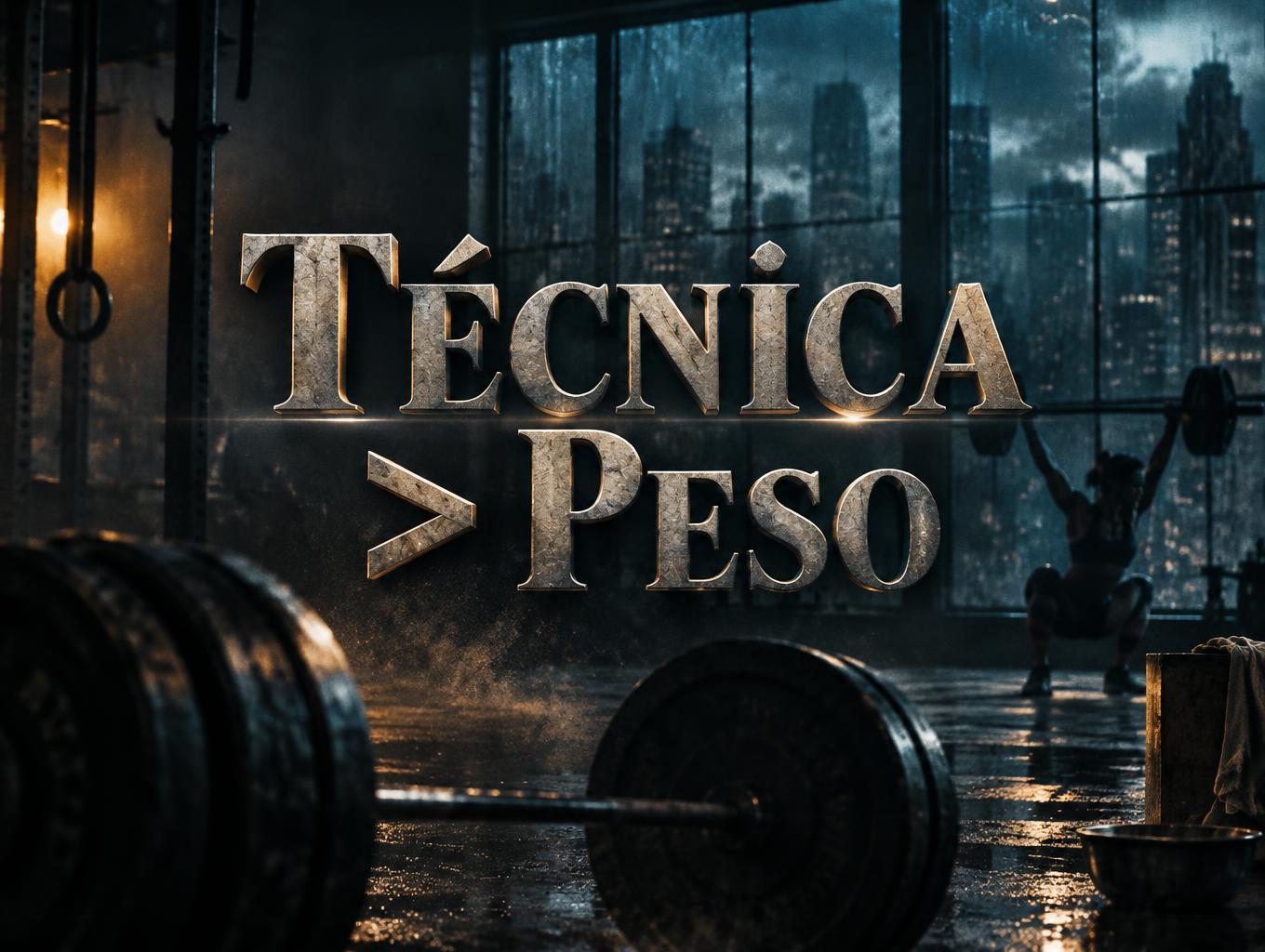
Similar Text Effect Styles
Try these styles and create your own AI-generated text effects.
Looking for copy-paste fancy text? Try our free Font Generator Tools — cursive, gothic, bubble & 30+ styles.
Perfect for These Projects
Netflix & Streaming text effects are popular for creative projects where visual impact matters.
What is the Netflix & Streaming Font Style?
The Netflix & Streaming font style is a distinctive AI-generated typography effect. Bold sans-serif series titles with a cold teal glow and anamorphic flare, set over a rain-slicked night city with small tagline and season text.
Using FontVibe's AI netflix & streaming generator you can create stunning text effects in seconds — no Photoshop, no font licensing, no design experience needed.
Explore the Netflix & Streaming gallery for inspiration, or browse all 142+ AI text effect styles available on FontVibe.
How to Create Netflix & Streaming Typography in FontVibe Studio
1. Enter your text — Any word, phrase, or brand name. Works best with short, punchy text.
2. Select Netflix & Streaming — From the style library. Optionally describe a mood in the custom prompt.
3. Generate and download. Your Netflix & Streaming font artwork is ready in seconds. PNG, JPG, or transparent PNG.
Looking for something different? Browse the full font style library for more AI typography options.
Netflix & Streaming Text Effect — FAQ
The Story Behind Netflix & Streaming
History, visual DNA, and cultural context — everything that makes this style what it is.
The Title Card as Art Form
Cinema typography has its own distinct tradition, separate from book design and advertising: the title card, the opening sequence, the end credit crawl. These are the moments when typography is not in service of content but is itself the spectacle — when the audience is asked to read before they are shown.
The history of film title design runs from the hand-lettered intertitles of silent cinema through the hand-painted studio title cards of Hollywood's Golden Age to the revolutionary work of Saul Bass, who beginning with Carmen Jones (1954) and reaching its peak with Vertigo (1958) and North by Northwest (1959) invented the modern film title sequence as an art form. Bass argued that the title sequence was not pre-show — it was the beginning of the film. The audience's experience of the film started with the first title frame.
Contemporary film title design — studios such as Imaginary Forces (Stranger Things) and designers such as Kyle Cooper (Se7en, 1995, made at R/GA) — continues this tradition: the title sequence as a compressed argument about the film's tone, world, and visual grammar.
Sources: Wikipedia — Saul Bass · BFI — Celebrating Saul Bass's centenary: 10 essential title sequences · Wikipedia — Title sequence · Wikipedia — Stranger Things
The Visual DNA
Did You Know?
Saul Bass designed the title sequences for three Alfred Hitchcock films: Vertigo, North by Northwest and Psycho. For Vertigo (1958), animator John Whitney generated the spirals with a converted World War II anti-aircraft gun director, an analog mechanical computer — often cited as a pioneering use of computer-driven imagery in film. Source ↗
The Stranger Things title sequence was designed by the studio Imaginary Forces, inspired by 1980s Stephen King paperback covers that the show's creators sent to the studio; the producers wanted the lettering in ITC Benguiat, the typeface on many of those covers. Source ↗