The dark aesthetic: shadow, hard light, monochrome and grain
Every black and white aesthetic piece here is built from the same four parts. The style draws the shadow, light, tones and grain of the whole picture; the letters come from the AI font you pick.
Dark aesthetic PFPs, matching pairs, wallpapers, posters and album covers
Every format here is one moody black-and-white picture with your name or words set small in the dark. Pick a format to see designs made in it, or describe your own.
Black and White Album Covers
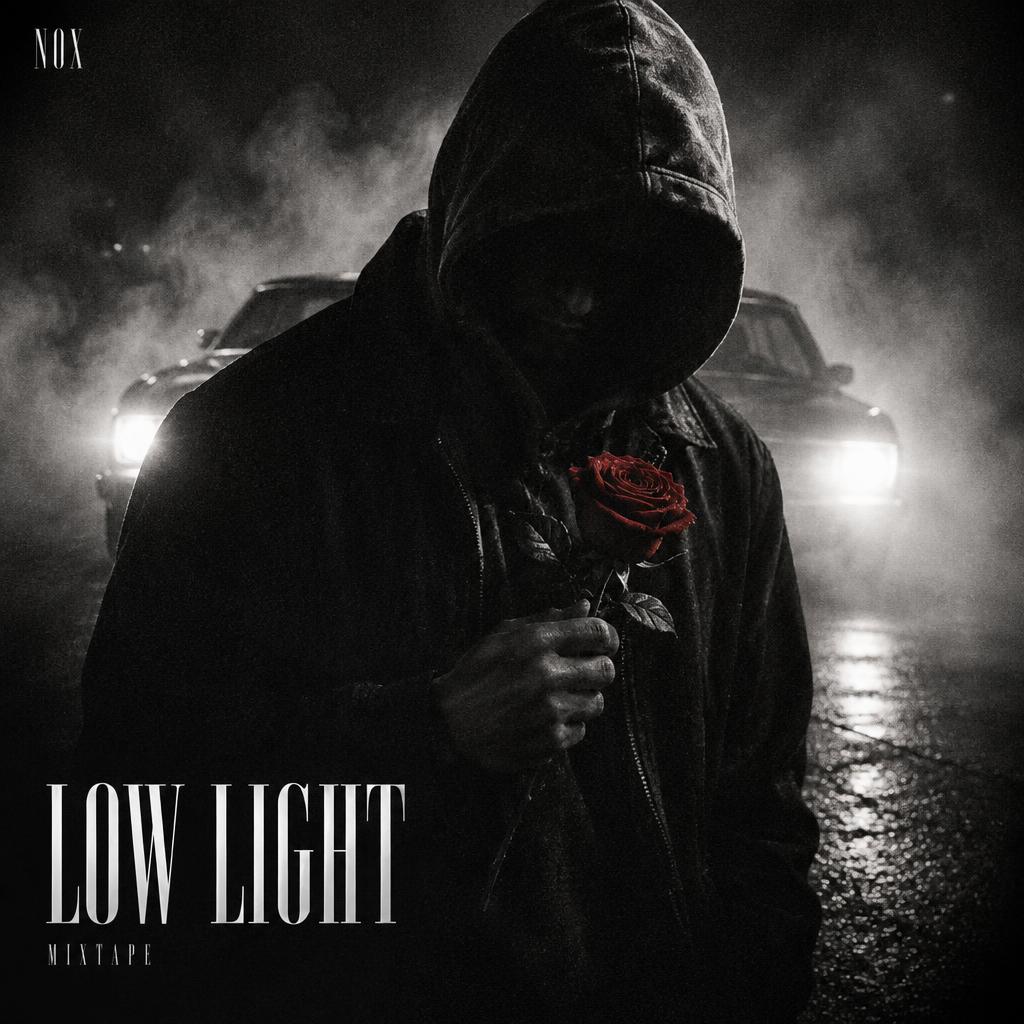
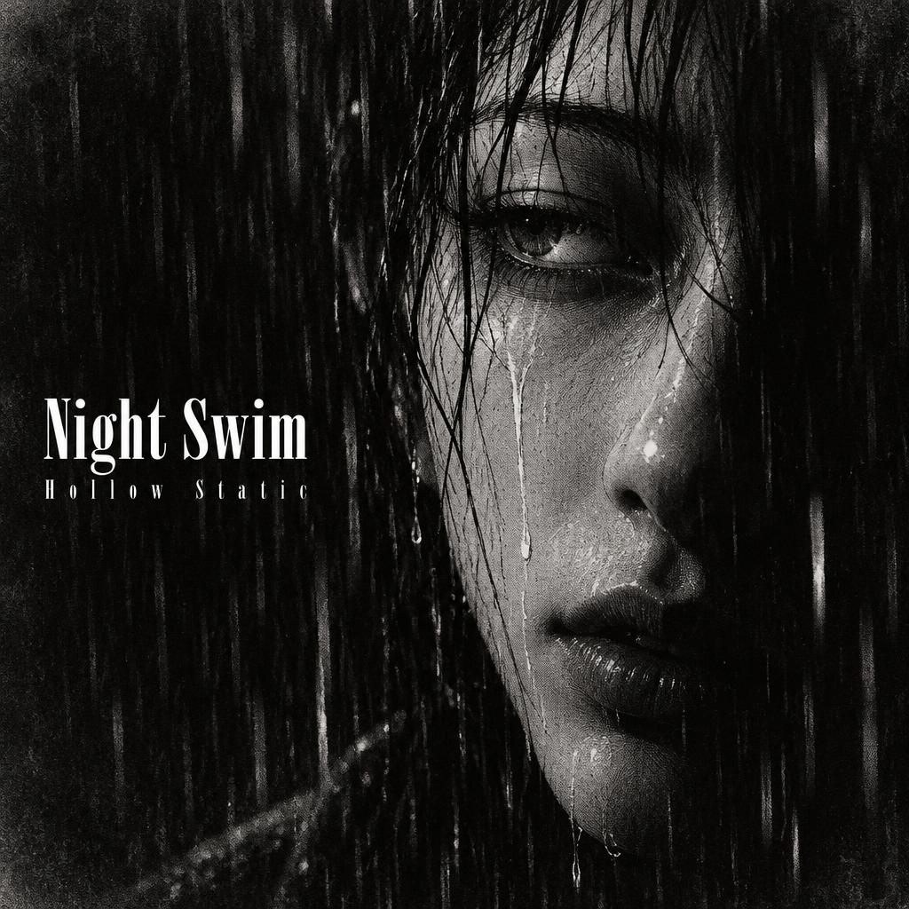
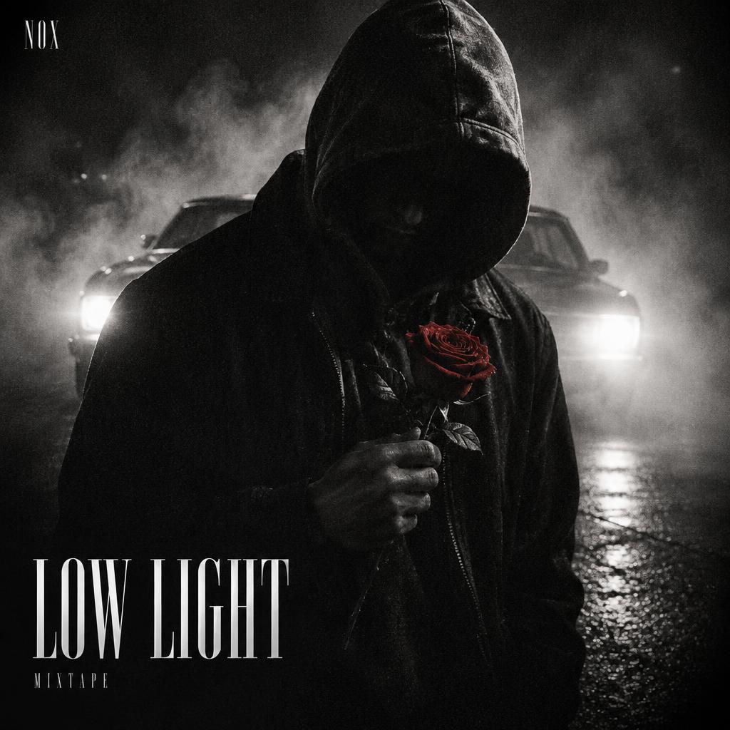
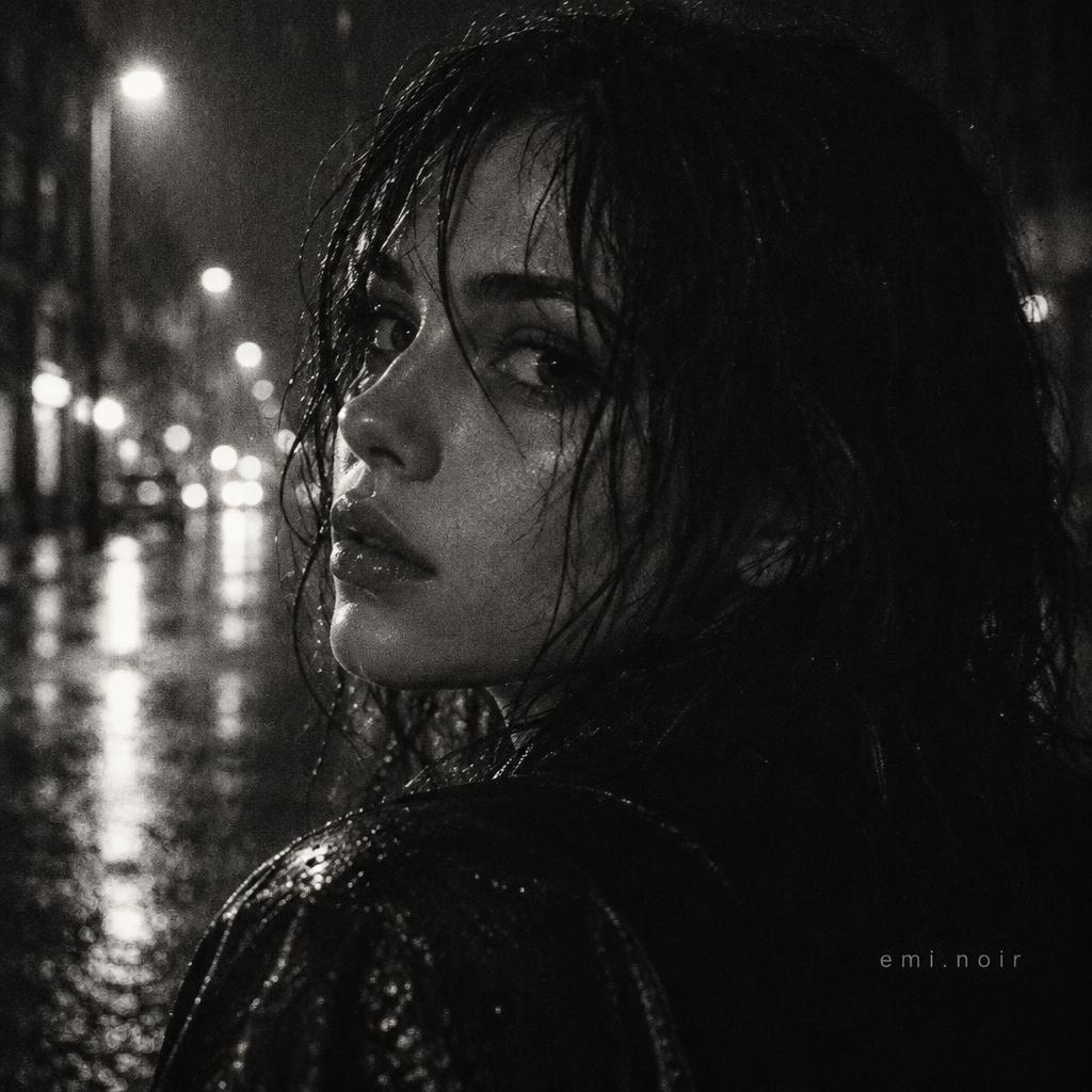
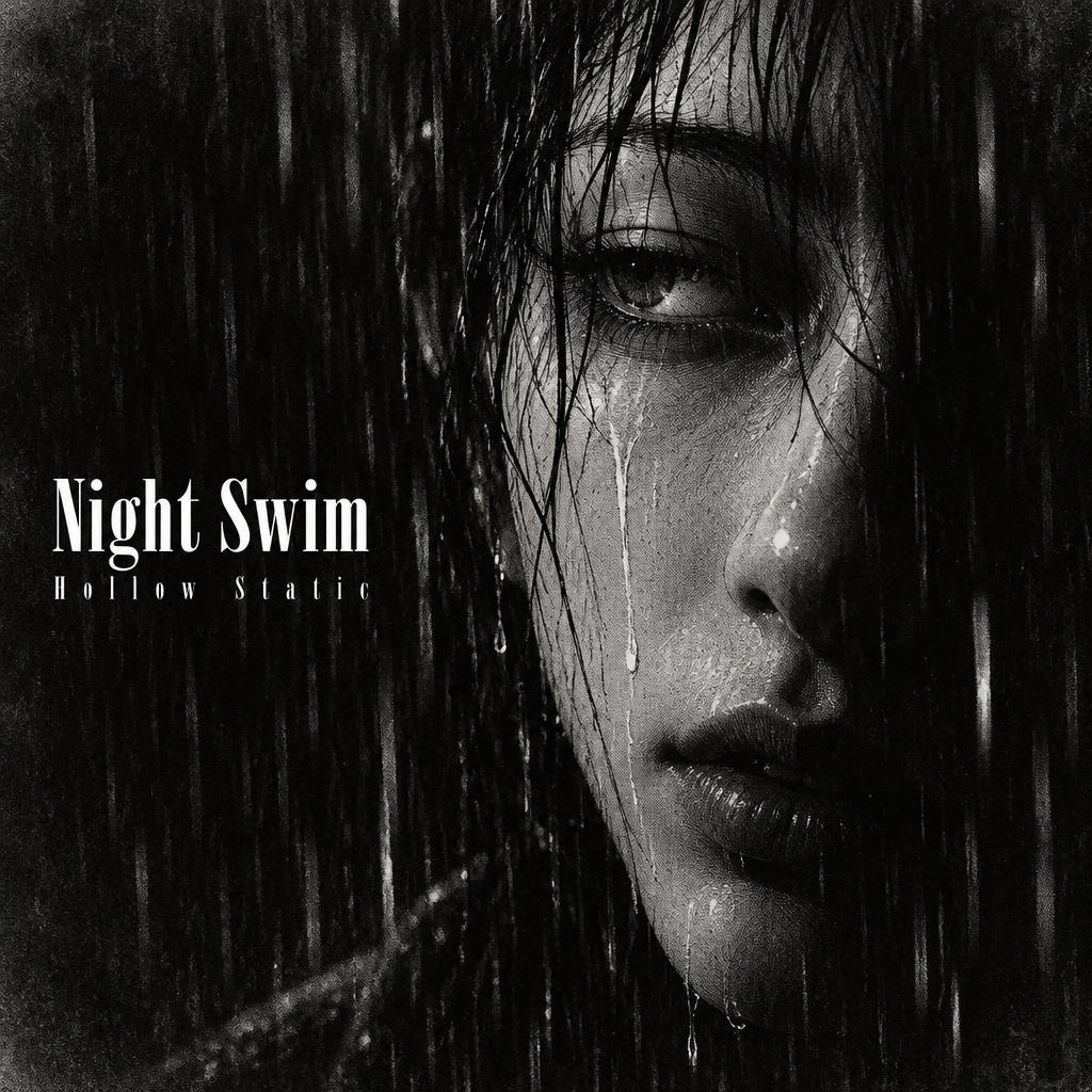
Square covers for albums, mixtapes and playlists: a close-up in shadow with the title small at the edge.
Dark Black and White Matching PFPs
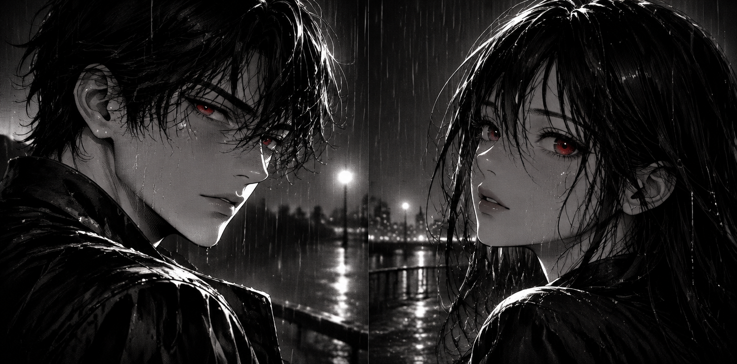
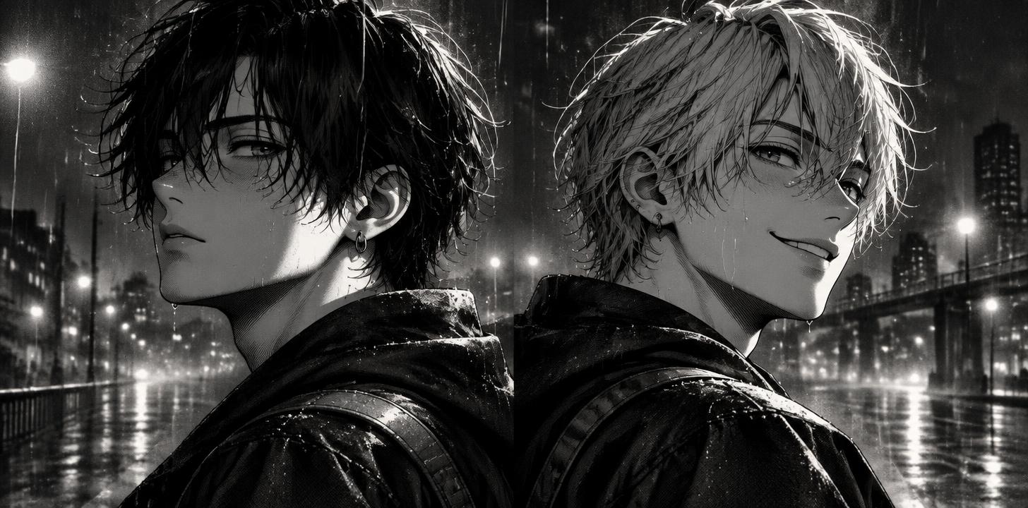
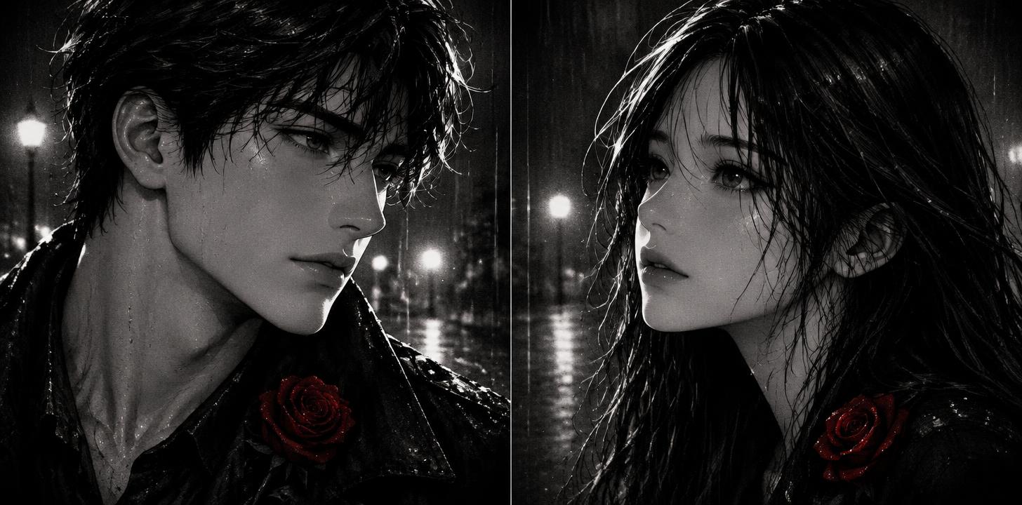
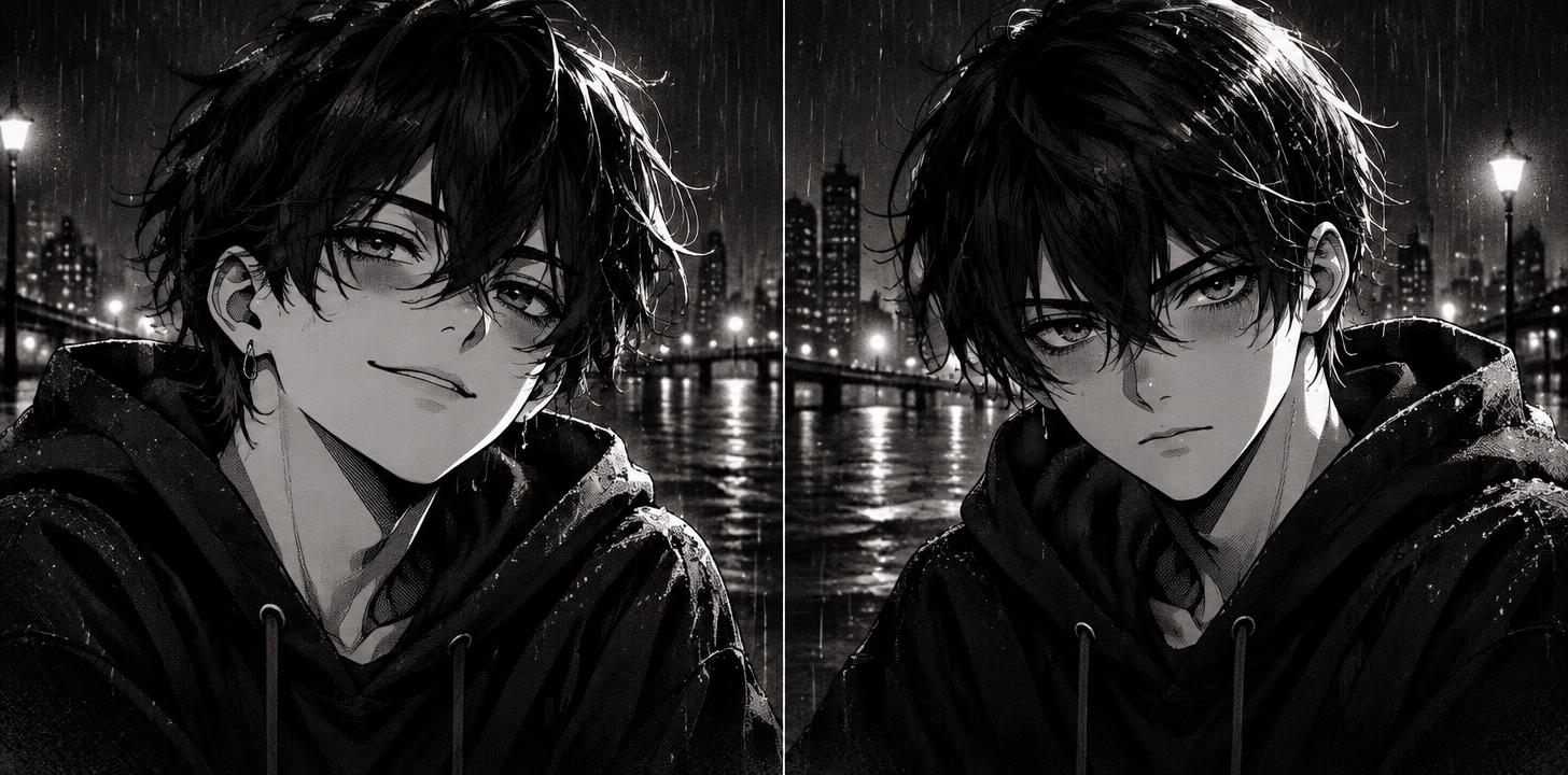
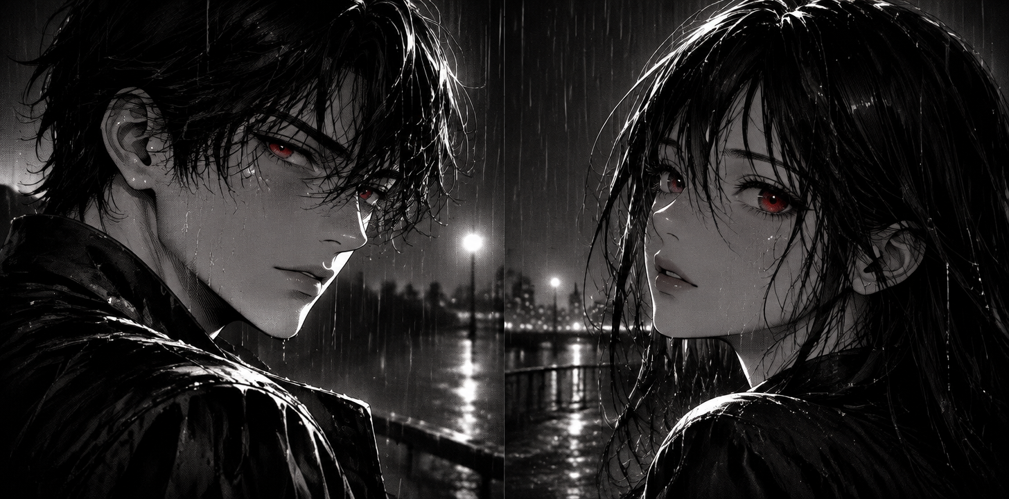
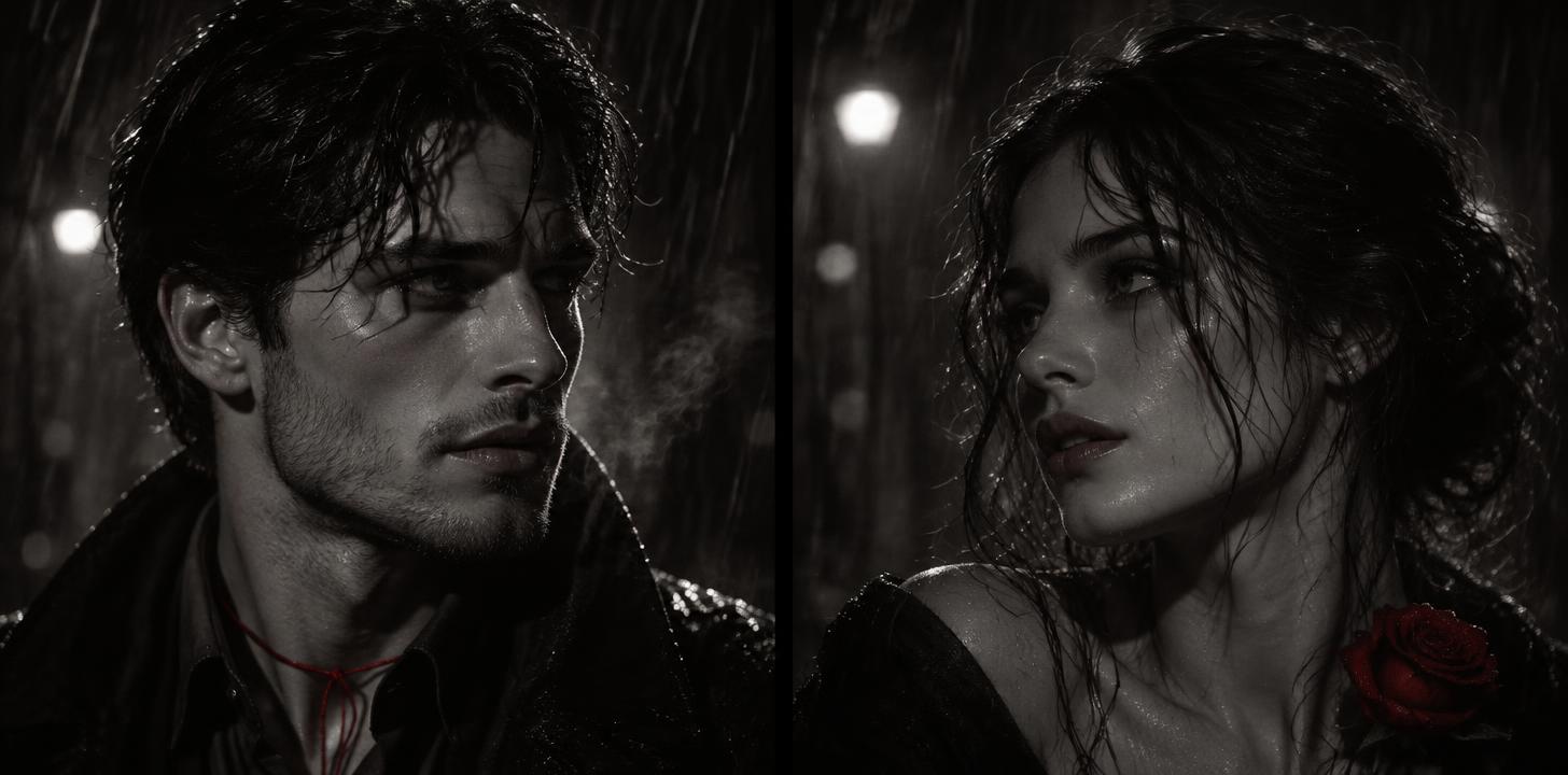
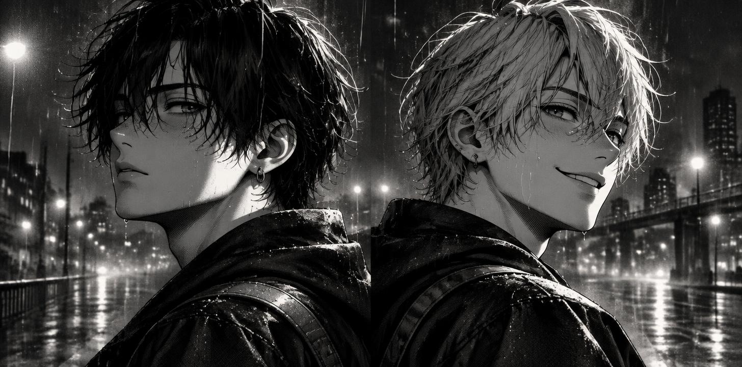
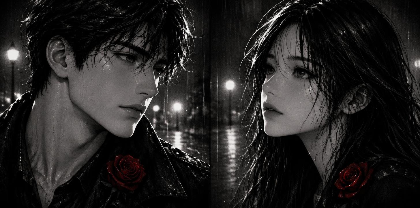
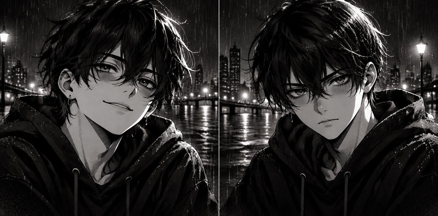
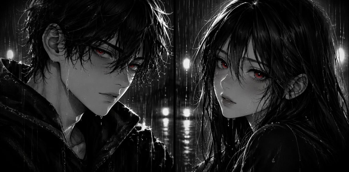
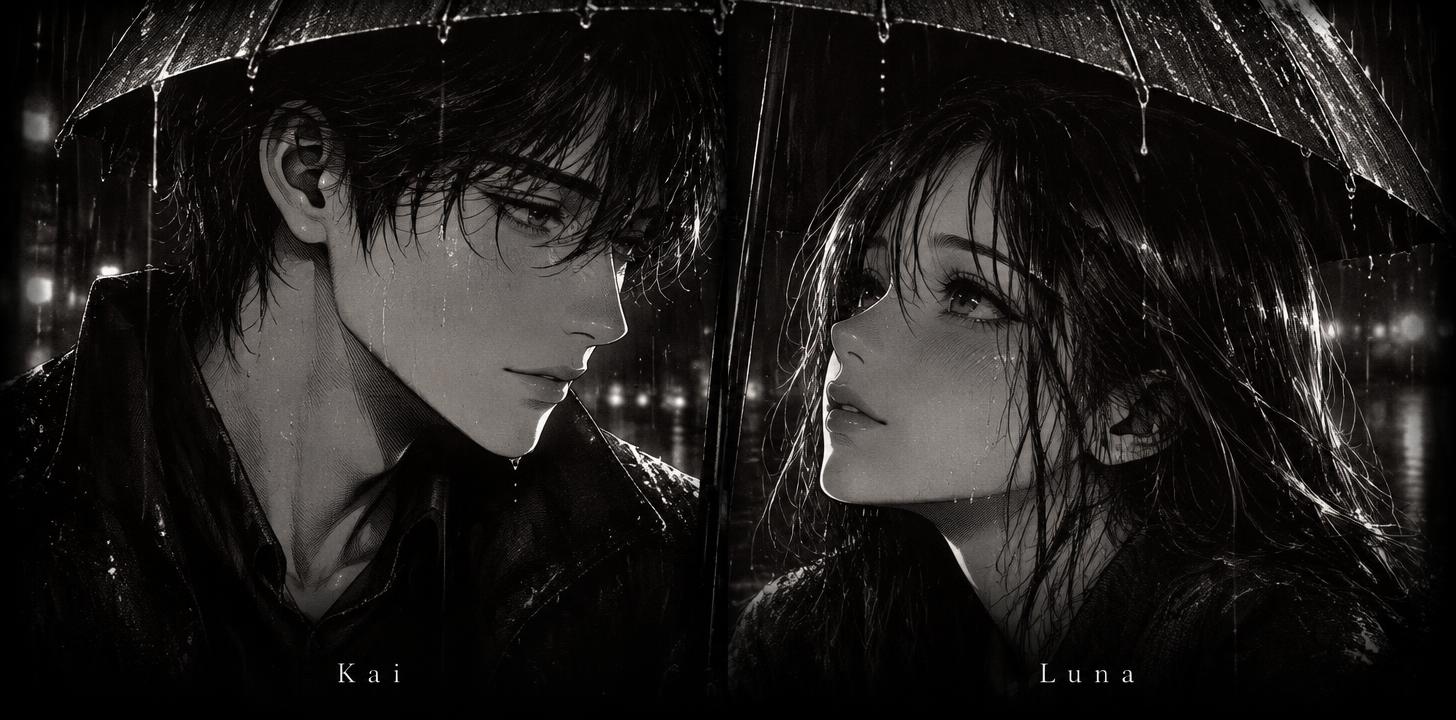
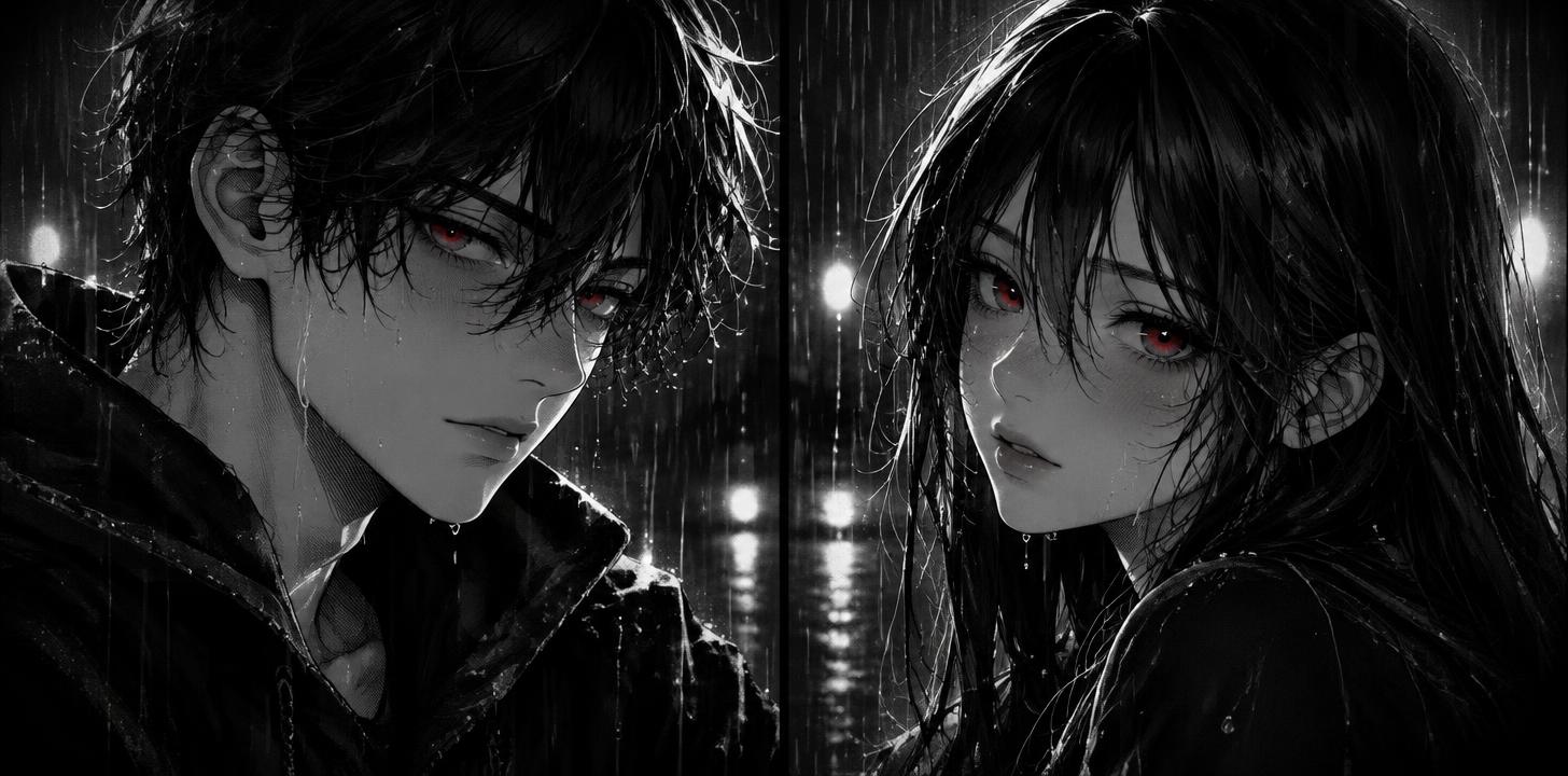
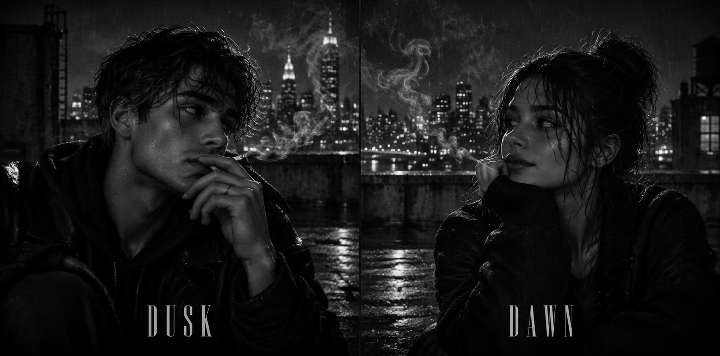
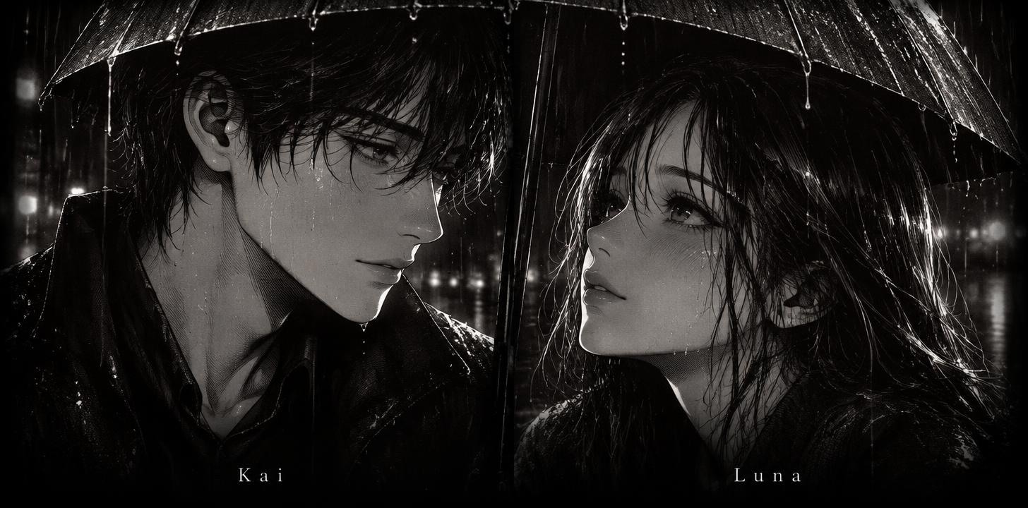
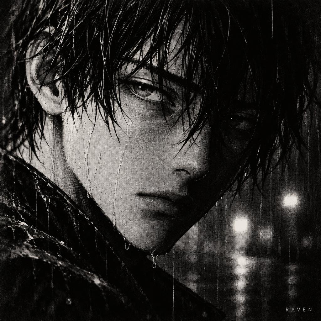
Wide pairs split into two halves for couples or best friends, each half a full portrait that shares one scene with the other.
Black and White Aesthetic Posters
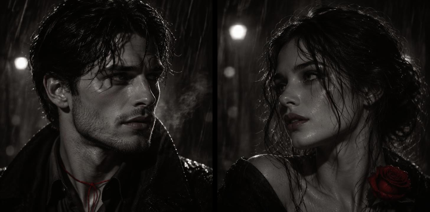
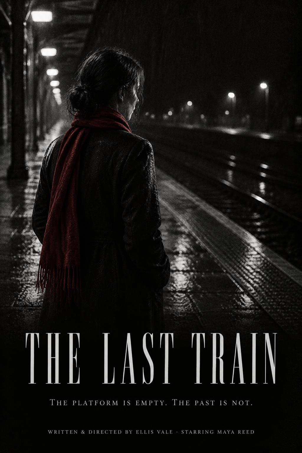
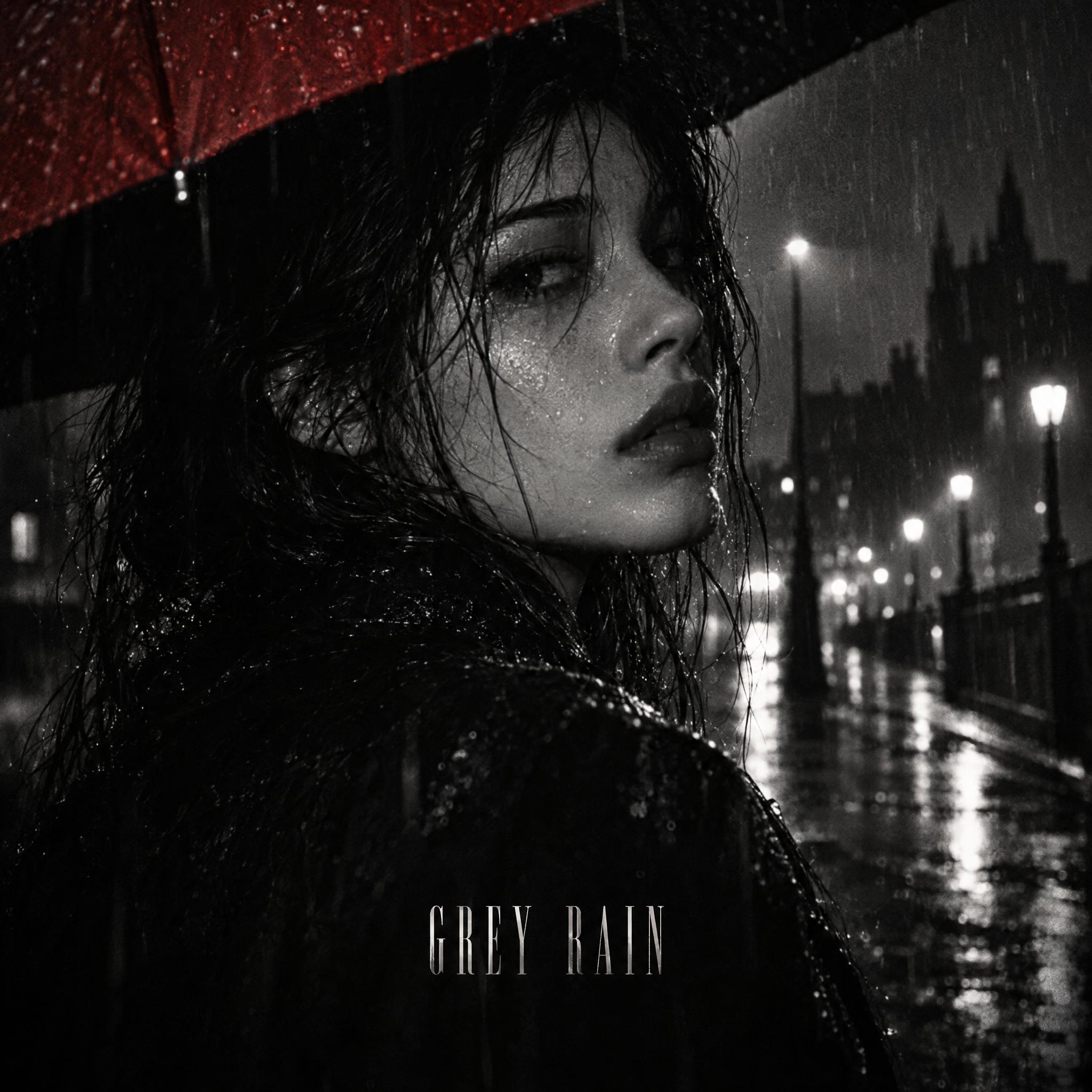
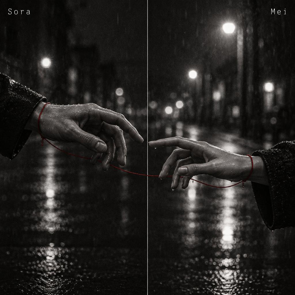
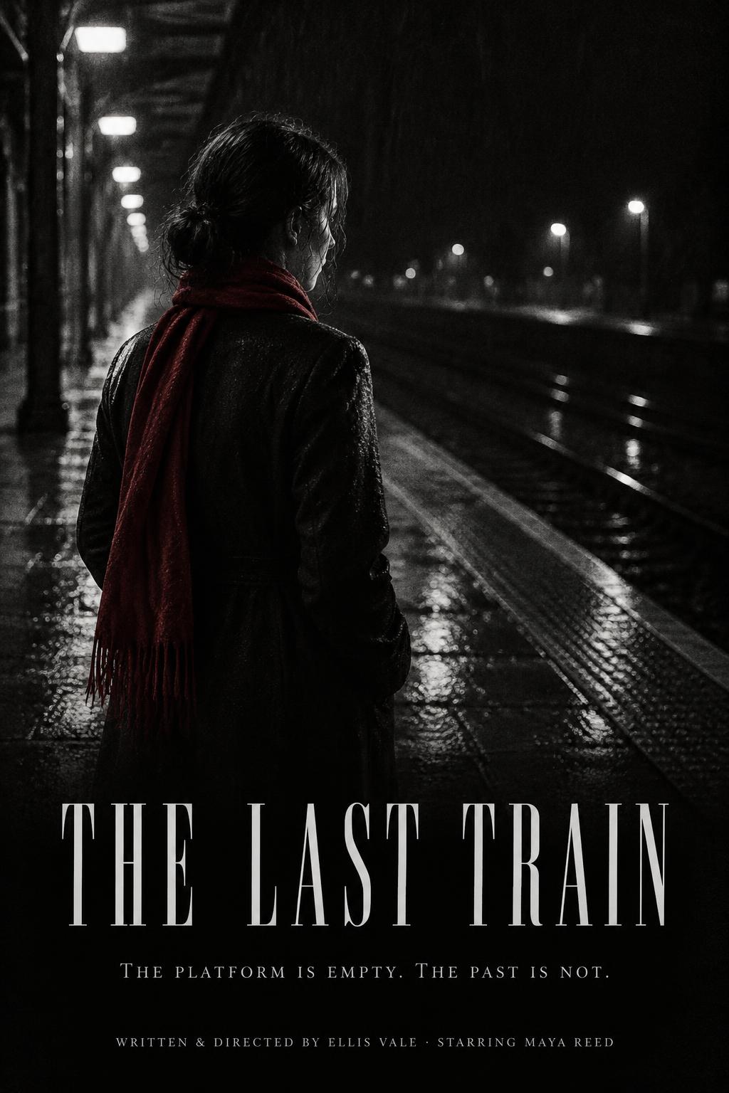
Film-noir style posters with one grainy figure, deep shadow, a single red detail and a credits block at the bottom.
Black and White Aesthetic Wallpapers
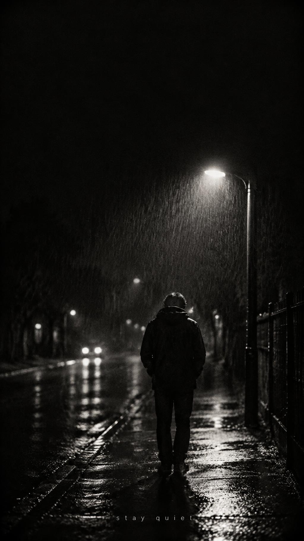
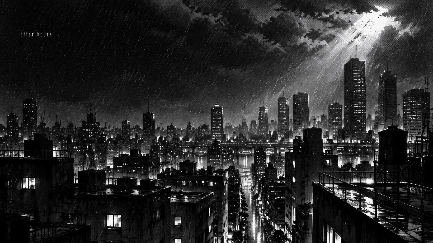
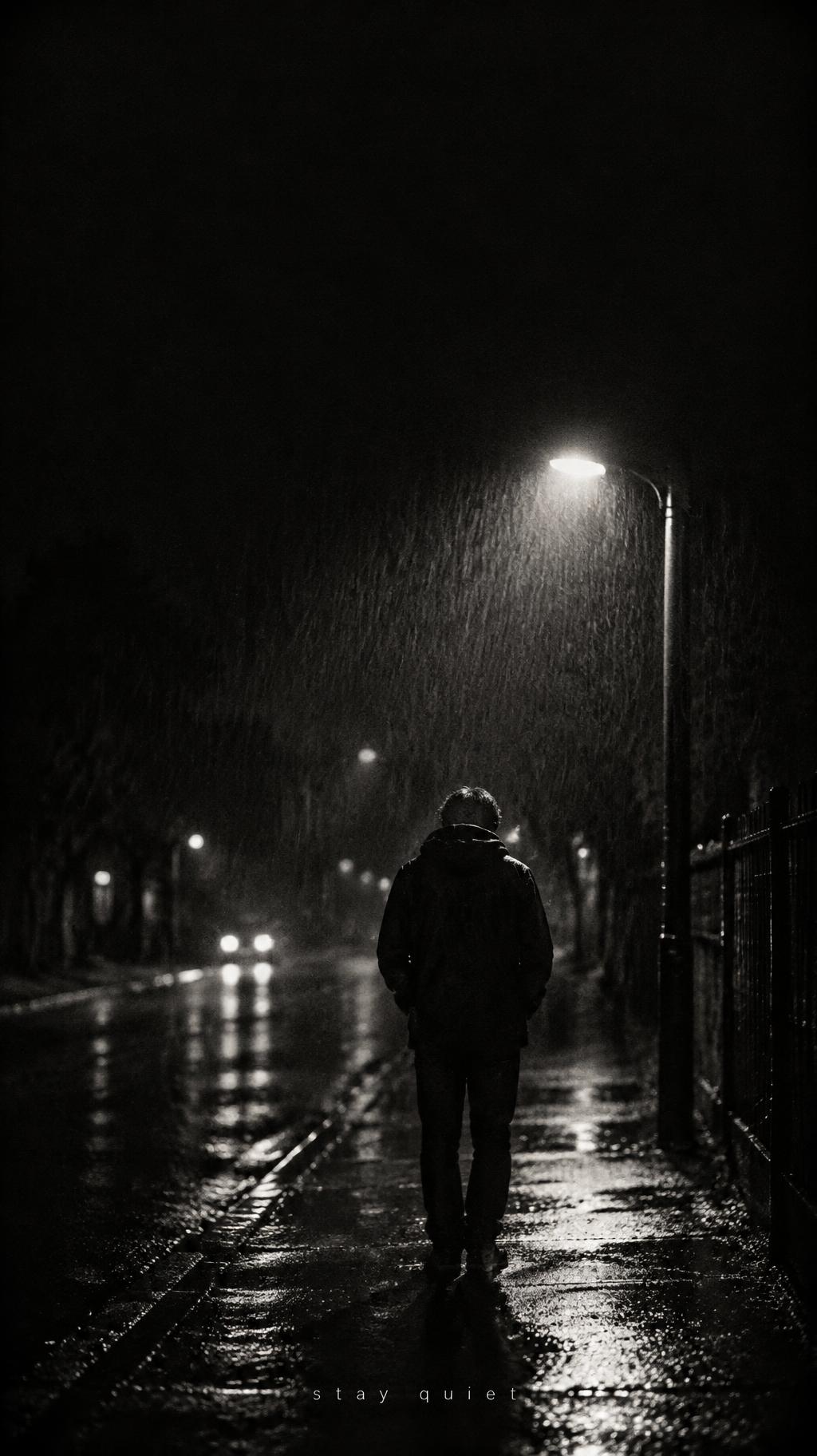
Tall phone lock screens and wide desktop wallpapers of rainy streets, lone figures and city skylines, with space for the clock.
AI fonts that fit Black & White Aesthetic
Every AI font here fits the Black & White Aesthetic frame. Pick one, or let the generator choose.


Black & White Aesthetic style designs
Real designs made on FontVibe. Open any one, or reuse it with your own text.
What you can make with Black & White Aesthetic
Pages for the things people make in the Black & White Aesthetic style. Each one has ready-made ideas and the right size.


Similar styles
Other looks that work for the same kinds of designs.





Tags in Black & White Aesthetic
Every tag used on this page — each opens the designs, fonts and styles that share it.
Questions
The story behind Black & White Aesthetic
Where the look comes from, the moments that shaped it and the facts behind it, with sources.
Where the black and white aesthetic comes from
The look starts with light and dark. Chiaroscuro, Italian for light-dark, means strong contrasts between light and dark across a whole picture; the term began in the Renaissance with drawing on coloured paper, and Caravaggio (1571–1610) was crucial in developing tenebrism, where shadow focuses the eye on the subject.
Photography kept it. Monochrome imagery dominated photography until the mid-twentieth century, and Kodak Tri-X, introduced around 1940 and released in 35 mm and 120 in 1954, was once one of the most popular films with photojournalists. Hollywood made it a mood: the French critic Nino Frank applied the term film noir to Hollywood films in 1946, and the classic noirs of the 1940s and 1950s are tied to a low-key, black-and-white visual style.
Comics gave it an illustrated form. Screentone sheets such as Zip-A-Tone (1937) and Letratone (1966) let artists add shading from preprinted patterns instead of hatching. Sin City (2005) rendered most of its frames in black and white while keeping colour for selected objects, the same trick as today’s single red detail. Dark aesthetic profile pictures mix all of it: hard light, grain, screentone and one splash of red.
Sources: Wikipedia — Chiaroscuro · Wikipedia — Monochrome photography · Wikipedia — Kodak Tri-X · Wikipedia — Film noir · Wikipedia — Screentone · Wikipedia — Sin City (film) · Wikipedia — Film grain
Moments that shaped the black and white aesthetic
Did you know?
Chiaroscuro is Italian for light-dark; the term began in the Renaissance with drawing on coloured paper. Source ↗
Caravaggio (1571–1610) was crucial in developing tenebrism, the use of shadow and contrast to focus on the subject. Source ↗
Tri-X was introduced around 1940 as sheet film rated ASA 200 in daylight; its sales declined in the 1970s and 1980s as colour film spread. Source ↗
Panchromatic black-and-white film records the entire visible spectrum, while orthochromatic film records only light shorter than 590 nanometres. Source ↗
Raymond Borde and Étienne Chaumeton’s 1955 book Panorama du film noir américain 1941–1953 was the original extended study of film noir. Source ↗
Black and white aesthetic in typography
On a black and white aesthetic profile picture the words stay small: a name or handle in a corner, often lowercase, white on black with wide spacing, so the face stays the subject. In a matching pair both names sit in the same position in each half, so the two avatars line up side by side.
Posters and album covers borrow from film noir title cards: a tall high-contrast serif or a typewriter face for the title, set at the edge of the shadow, with credits in a narrow block at the bottom.
Where you’ll see it
- ✦Profile pictures on Instagram, TikTok, Discord and X
- ✦Matching pfps for couples and best friends
- ✦Phone lock screens and desktop wallpapers
- ✦Indie film and event posters
- ✦Album, mixtape and playlist covers
- ✦Story highlights and channel icons
The dark aesthetic: shadow, hard light, monochrome and grain
Every black and white aesthetic piece here is built from the same four parts. The style draws the shadow, light, tones and grain of the whole picture; the letters come from the AI font you pick.
Dark aesthetic PFPs, matching pairs, wallpapers, posters and album covers
Every format here is one moody black-and-white picture with your name or words set small in the dark. Pick a format to see designs made in it, or describe your own.
Black and White Album Covers
Square covers for albums, mixtapes and playlists: a close-up in shadow with the title small at the edge.
Dark Black and White Matching PFPs
Wide pairs split into two halves for couples or best friends, each half a full portrait that shares one scene with the other.
Black and White Aesthetic Posters
Film-noir style posters with one grainy figure, deep shadow, a single red detail and a credits block at the bottom.
Black and White Aesthetic Wallpapers
Tall phone lock screens and wide desktop wallpapers of rainy streets, lone figures and city skylines, with space for the clock.
AI fonts that fit Black & White Aesthetic
Every AI font here fits the Black & White Aesthetic frame. Pick one, or let the generator choose.


Black & White Aesthetic style designs
Real designs made on FontVibe. Open any one, or reuse it with your own text.
What you can make with Black & White Aesthetic
Pages for the things people make in the Black & White Aesthetic style. Each one has ready-made ideas and the right size.
Similar styles
Other looks that work for the same kinds of designs.
Tags in Black & White Aesthetic
Every tag used on this page — each opens the designs, fonts and styles that share it.
Questions
The story behind Black & White Aesthetic
Where the look comes from, the moments that shaped it and the facts behind it, with sources.
Where the black and white aesthetic comes from
The look starts with light and dark. Chiaroscuro, Italian for light-dark, means strong contrasts between light and dark across a whole picture; the term began in the Renaissance with drawing on coloured paper, and Caravaggio (1571–1610) was crucial in developing tenebrism, where shadow focuses the eye on the subject.
Photography kept it. Monochrome imagery dominated photography until the mid-twentieth century, and Kodak Tri-X, introduced around 1940 and released in 35 mm and 120 in 1954, was once one of the most popular films with photojournalists. Hollywood made it a mood: the French critic Nino Frank applied the term film noir to Hollywood films in 1946, and the classic noirs of the 1940s and 1950s are tied to a low-key, black-and-white visual style.
Comics gave it an illustrated form. Screentone sheets such as Zip-A-Tone (1937) and Letratone (1966) let artists add shading from preprinted patterns instead of hatching. Sin City (2005) rendered most of its frames in black and white while keeping colour for selected objects, the same trick as today’s single red detail. Dark aesthetic profile pictures mix all of it: hard light, grain, screentone and one splash of red.
Sources: Wikipedia — Chiaroscuro · Wikipedia — Monochrome photography · Wikipedia — Kodak Tri-X · Wikipedia — Film noir · Wikipedia — Screentone · Wikipedia — Sin City (film) · Wikipedia — Film grain
Moments that shaped the black and white aesthetic
Did you know?
Chiaroscuro is Italian for light-dark; the term began in the Renaissance with drawing on coloured paper. Source ↗
Caravaggio (1571–1610) was crucial in developing tenebrism, the use of shadow and contrast to focus on the subject. Source ↗
Tri-X was introduced around 1940 as sheet film rated ASA 200 in daylight; its sales declined in the 1970s and 1980s as colour film spread. Source ↗
Panchromatic black-and-white film records the entire visible spectrum, while orthochromatic film records only light shorter than 590 nanometres. Source ↗
Raymond Borde and Étienne Chaumeton’s 1955 book Panorama du film noir américain 1941–1953 was the original extended study of film noir. Source ↗
Black and white aesthetic in typography
On a black and white aesthetic profile picture the words stay small: a name or handle in a corner, often lowercase, white on black with wide spacing, so the face stays the subject. In a matching pair both names sit in the same position in each half, so the two avatars line up side by side.
Posters and album covers borrow from film noir title cards: a tall high-contrast serif or a typewriter face for the title, set at the edge of the shadow, with credits in a narrow block at the bottom.
Where you’ll see it
- ✦Profile pictures on Instagram, TikTok, Discord and X
- ✦Matching pfps for couples and best friends
- ✦Phone lock screens and desktop wallpapers
- ✦Indie film and event posters
- ✦Album, mixtape and playlist covers
- ✦Story highlights and channel icons