


AI Typewriter Text Effect Generator
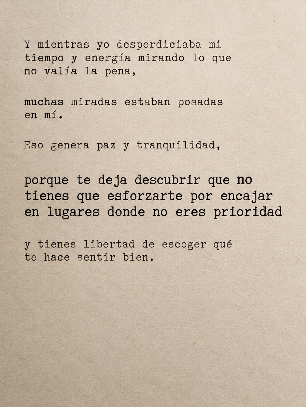
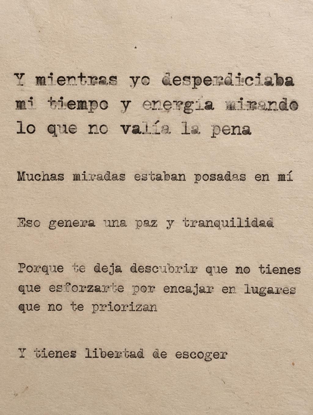
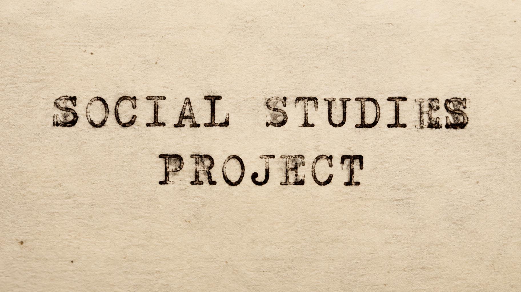
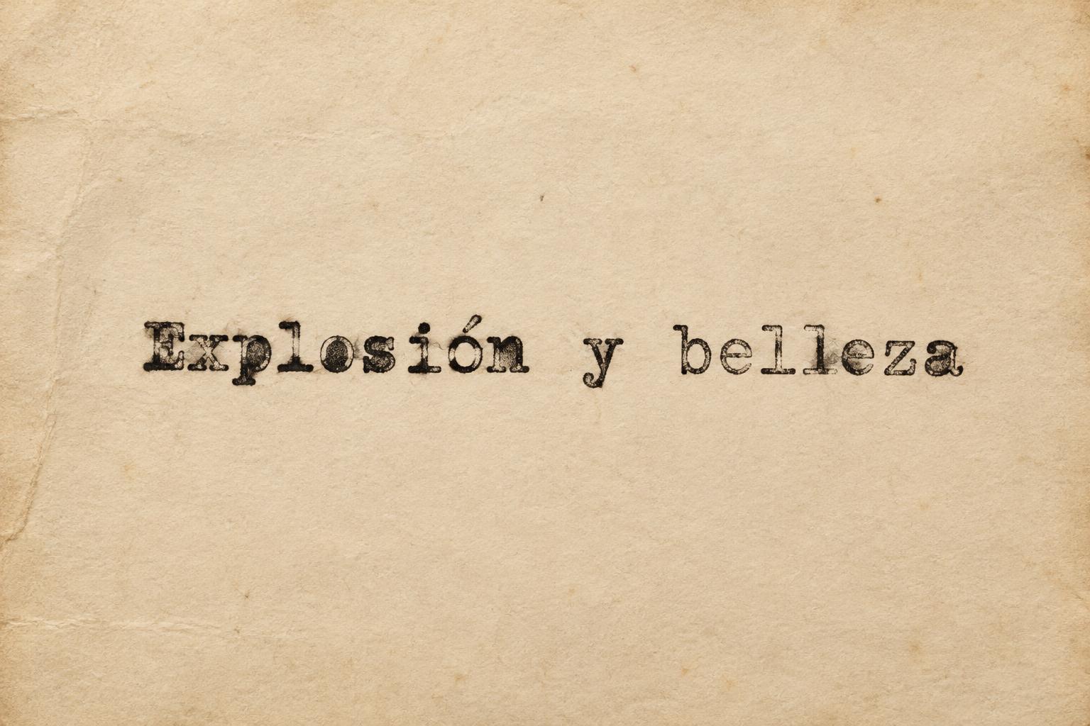
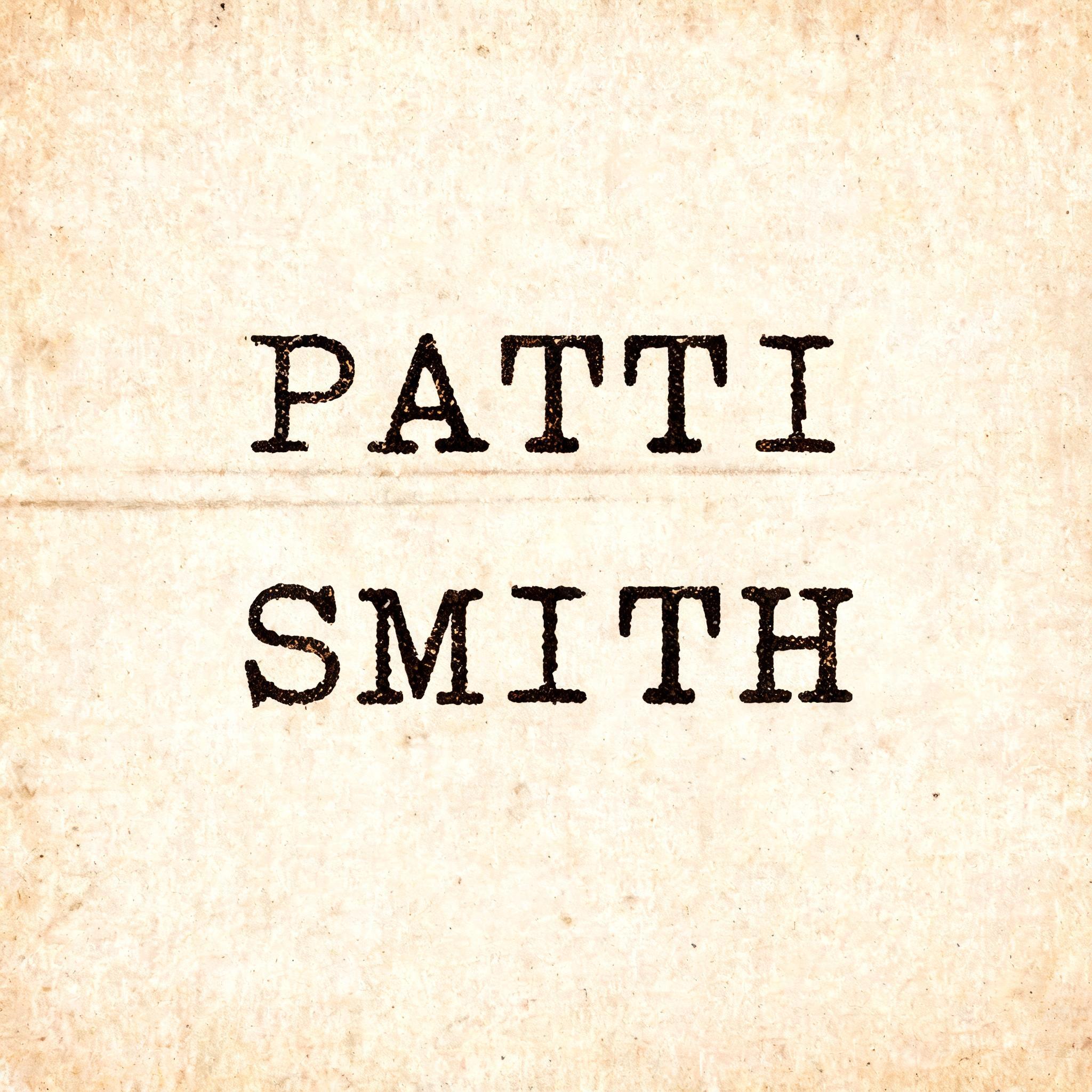
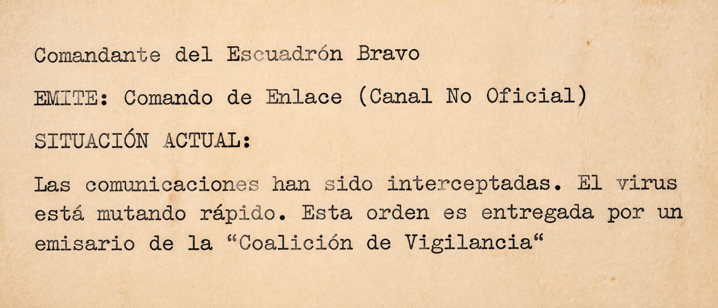
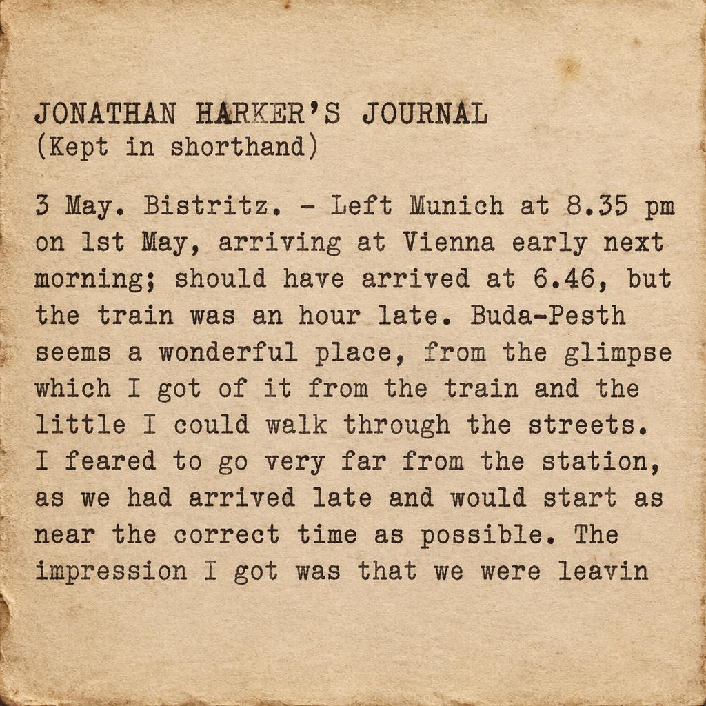
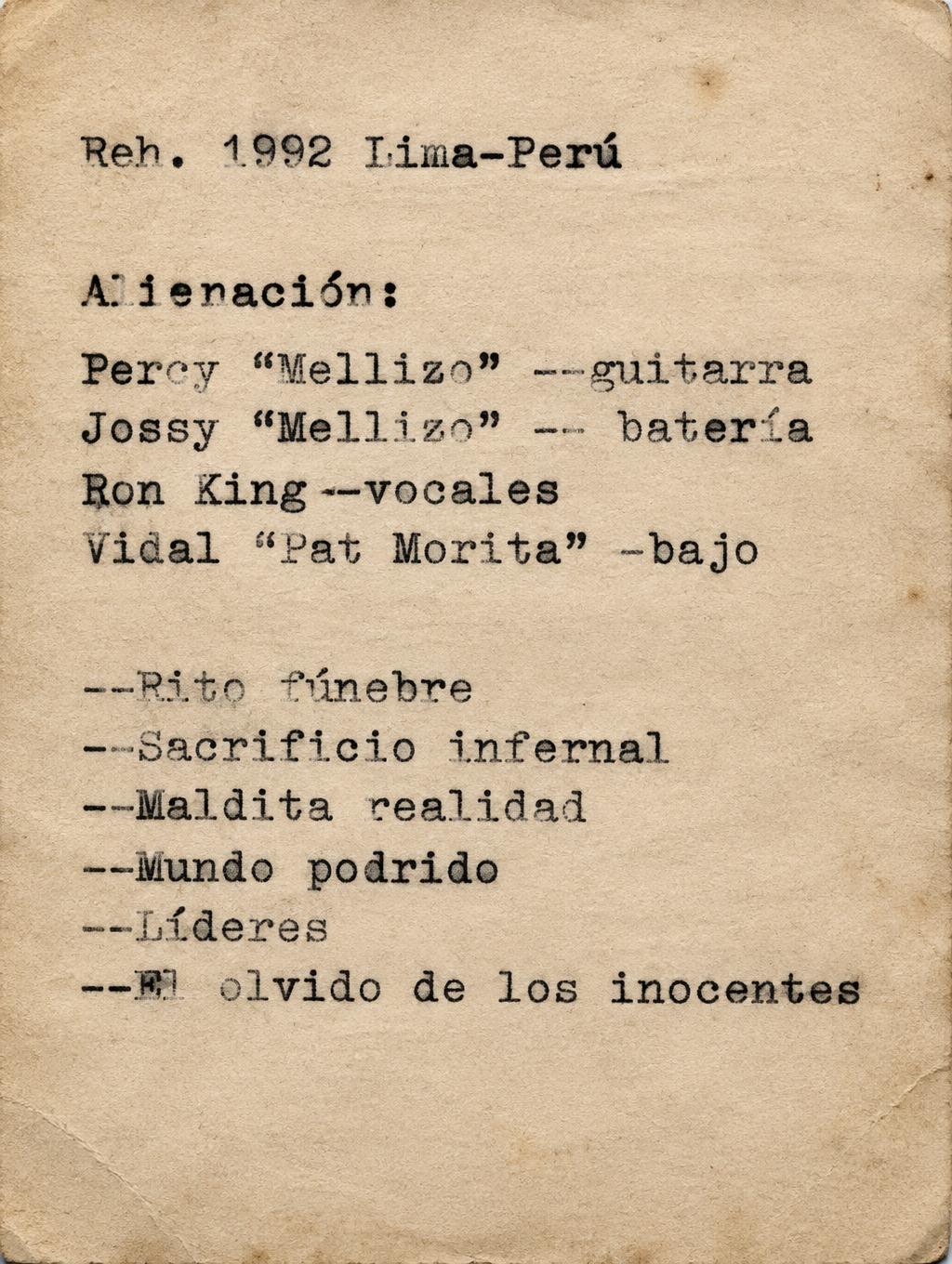
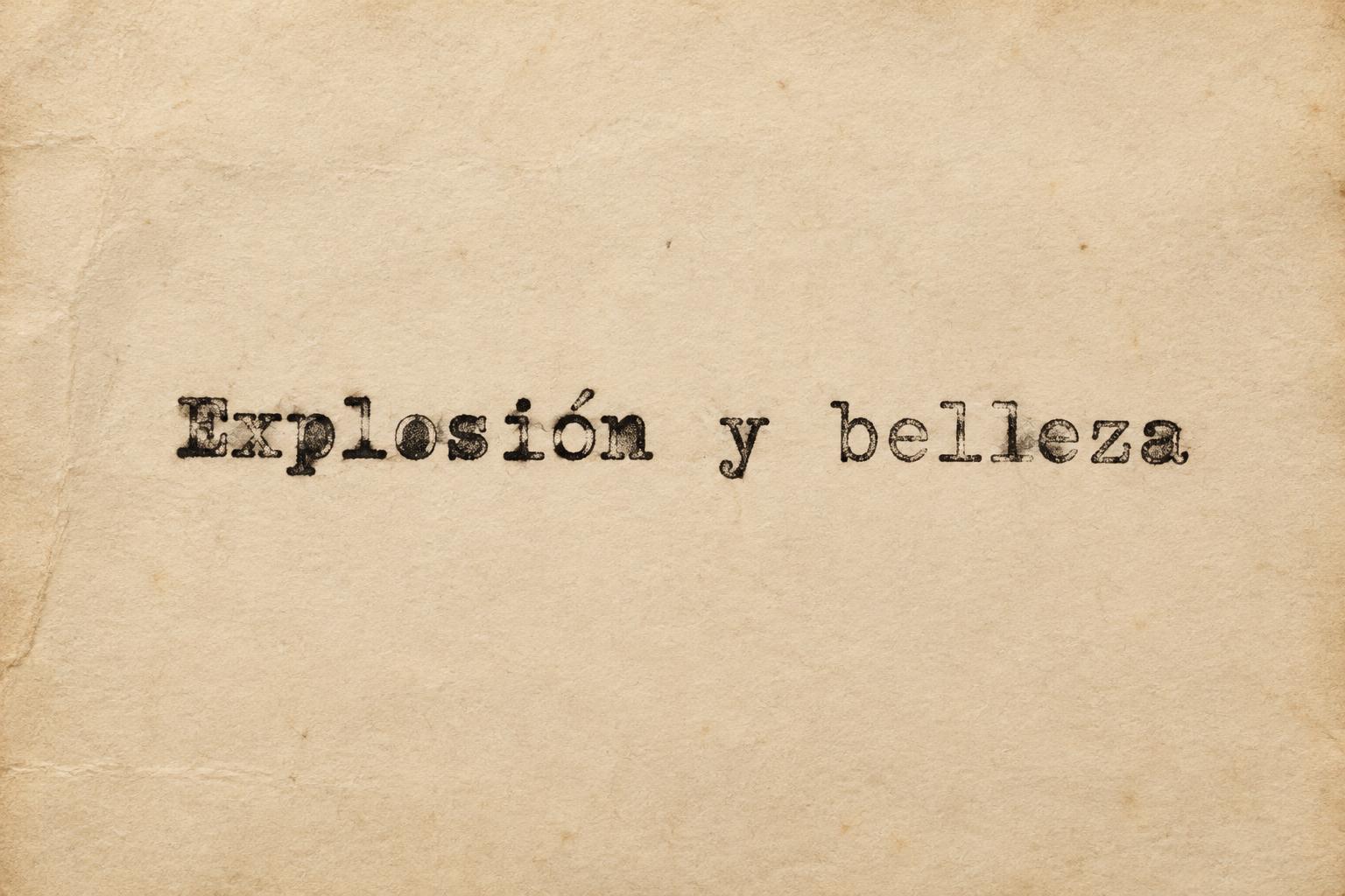
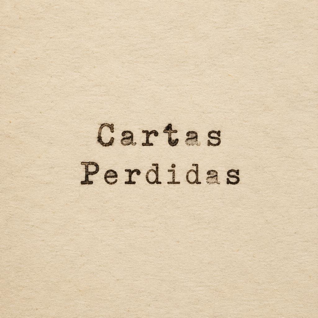
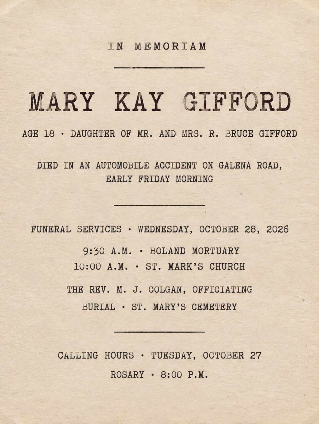
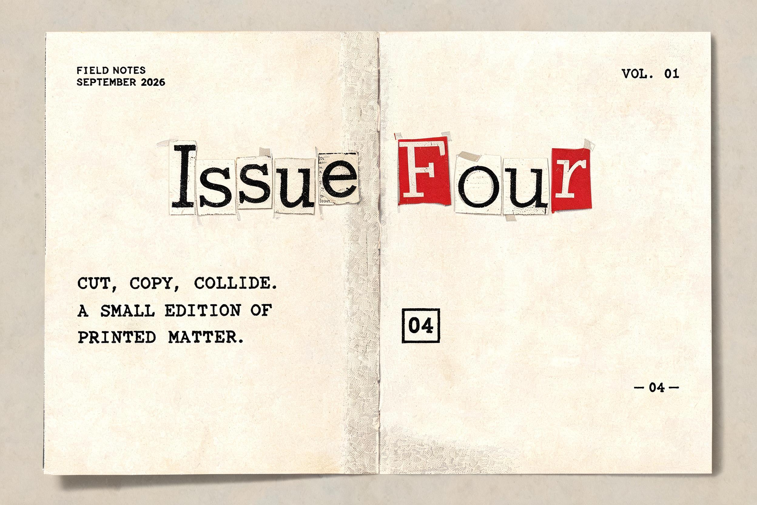
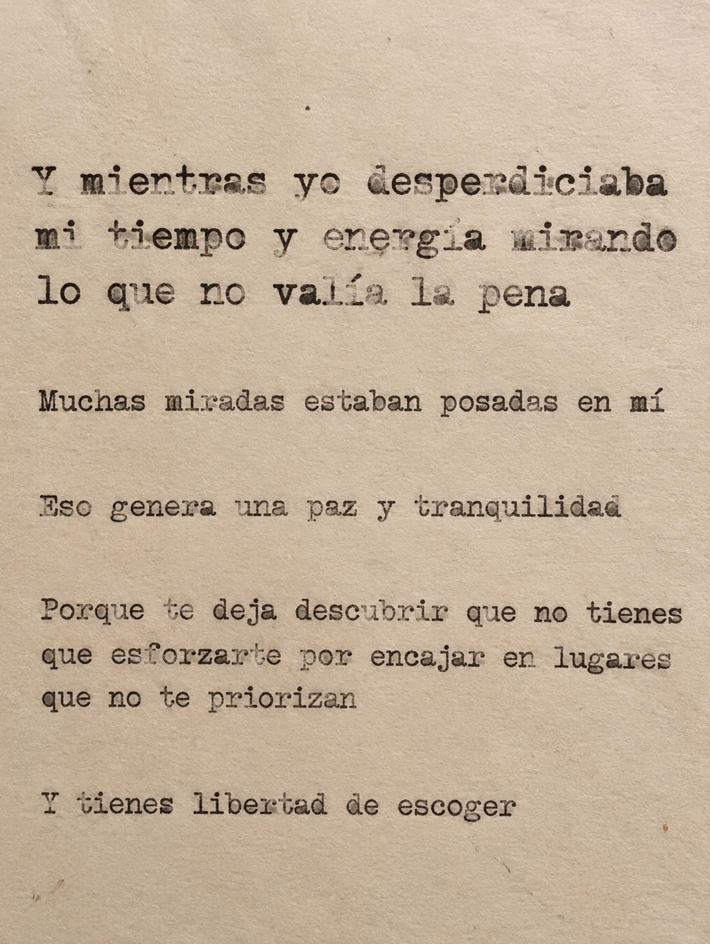
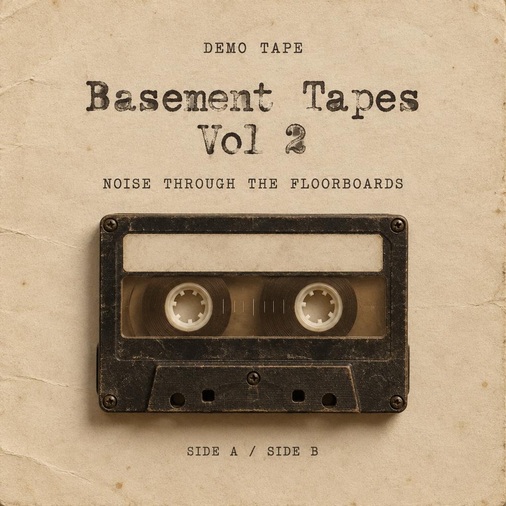
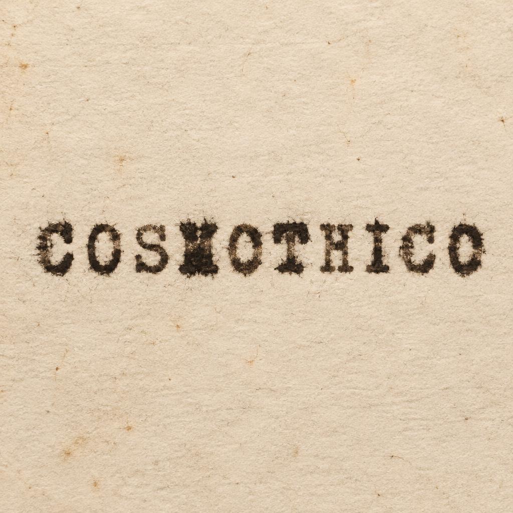
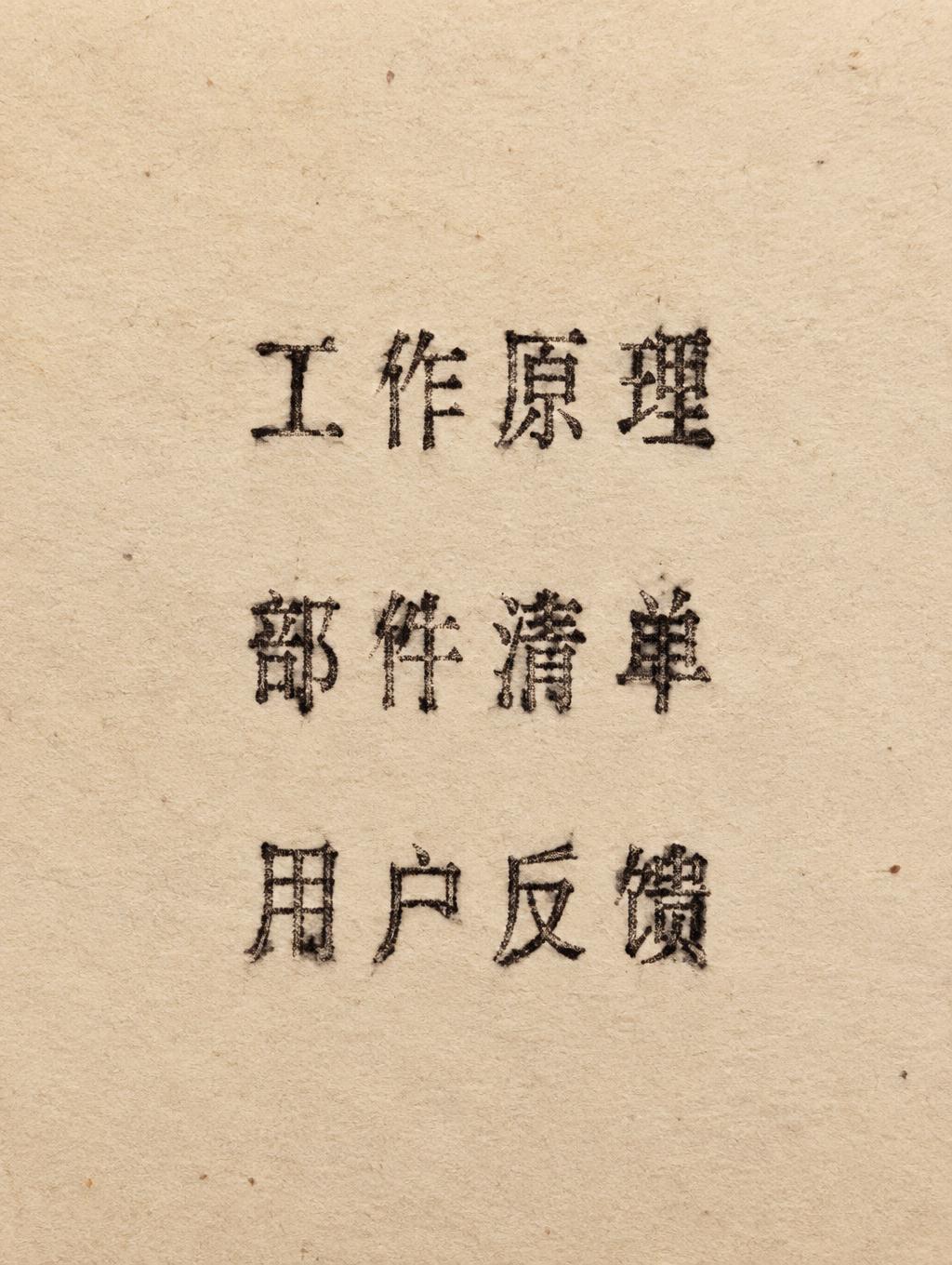
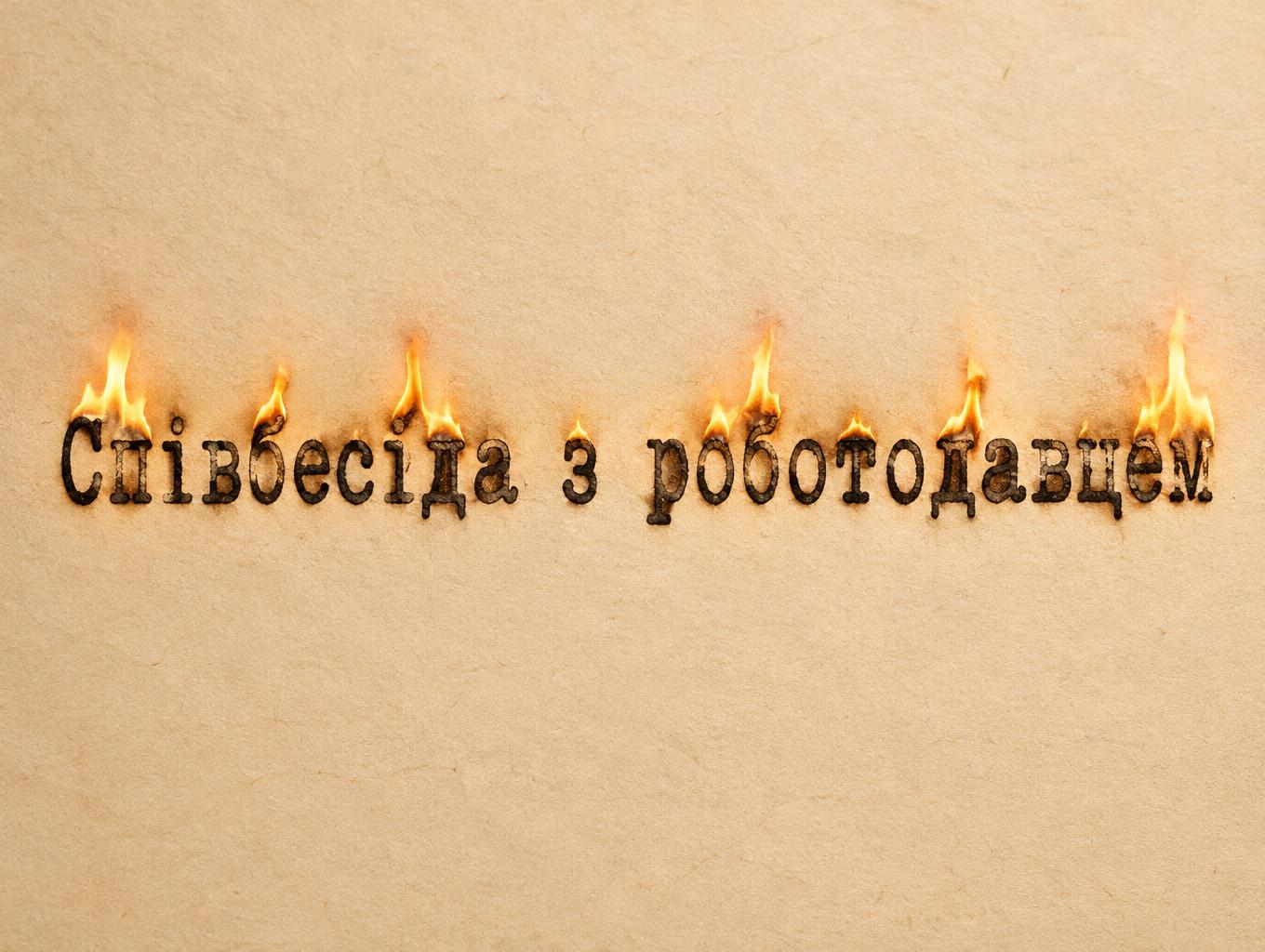
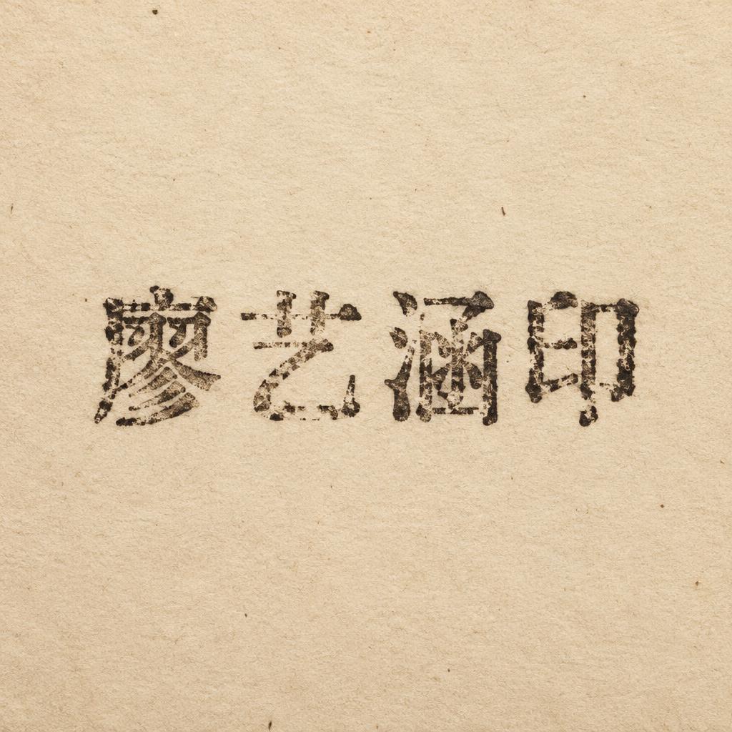
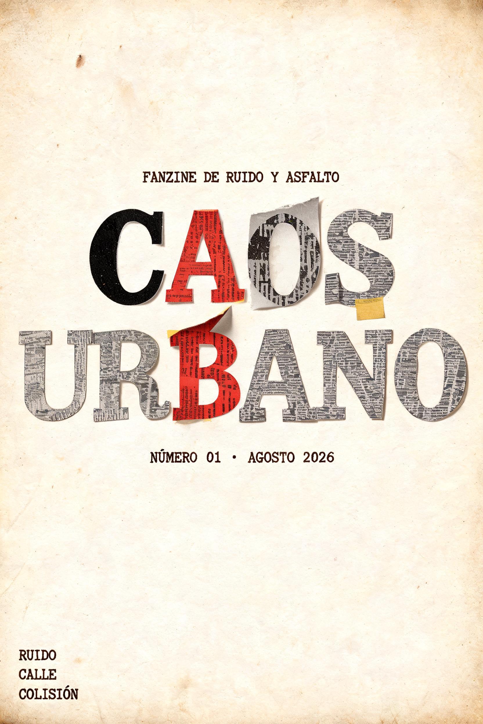
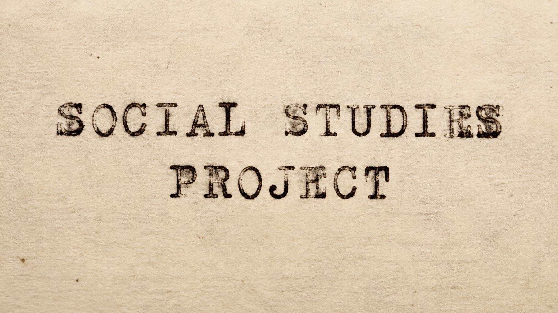
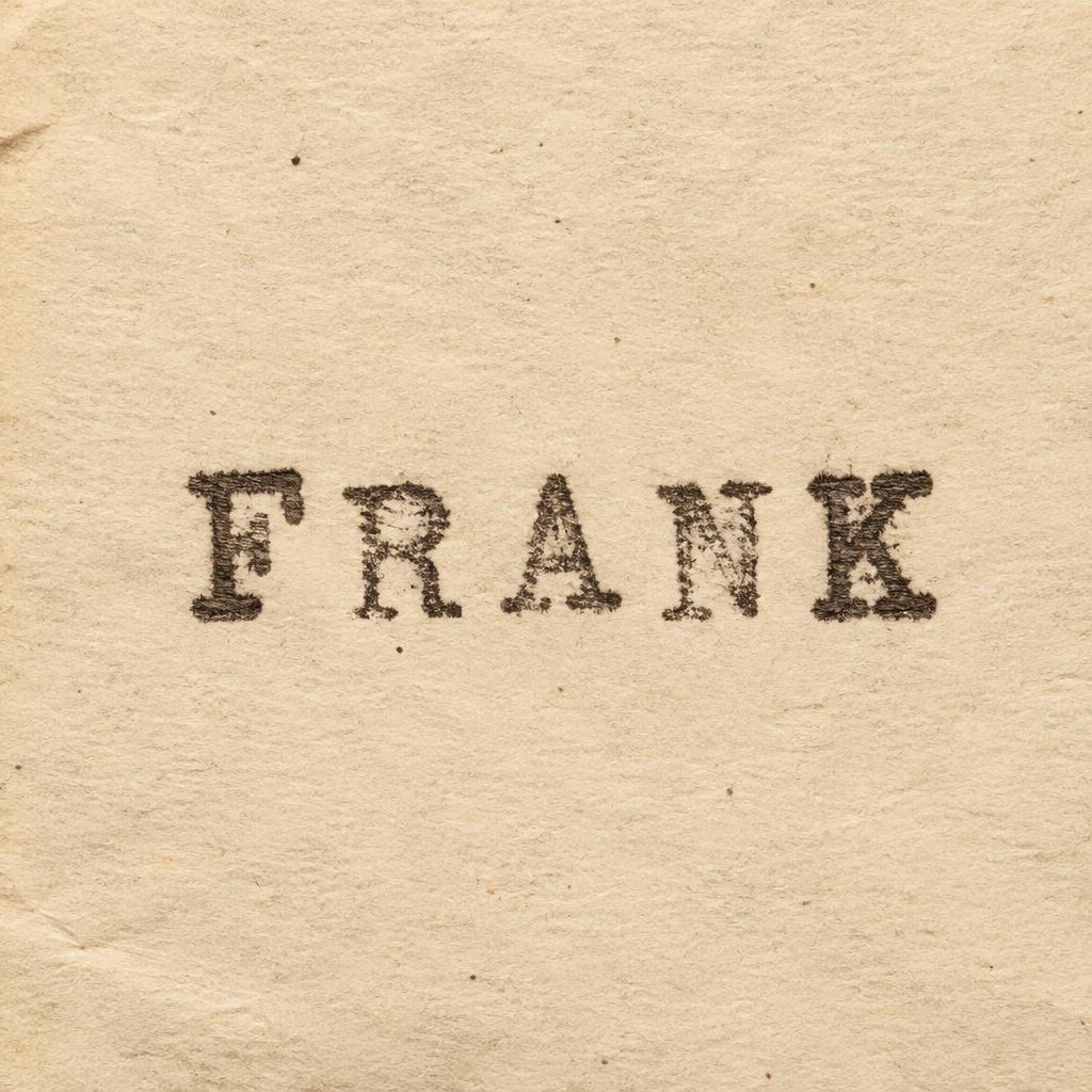
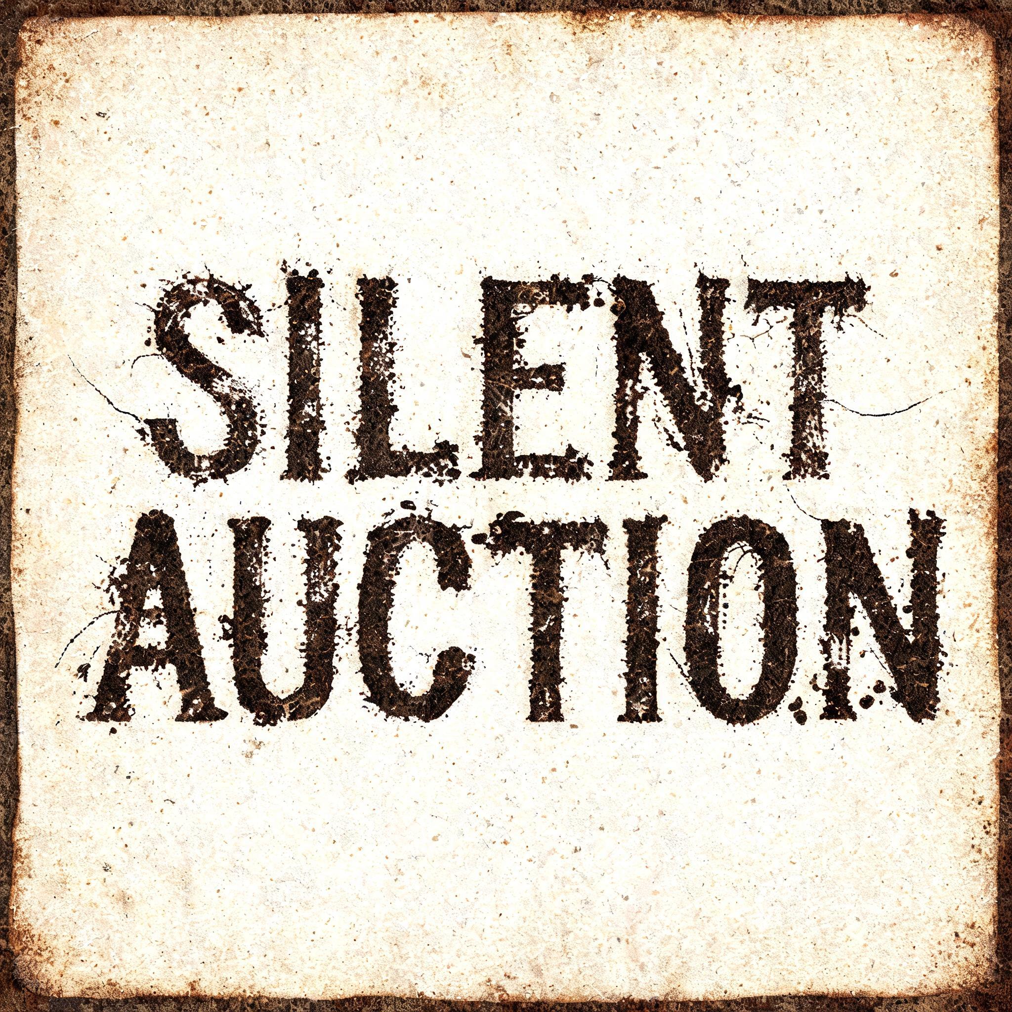
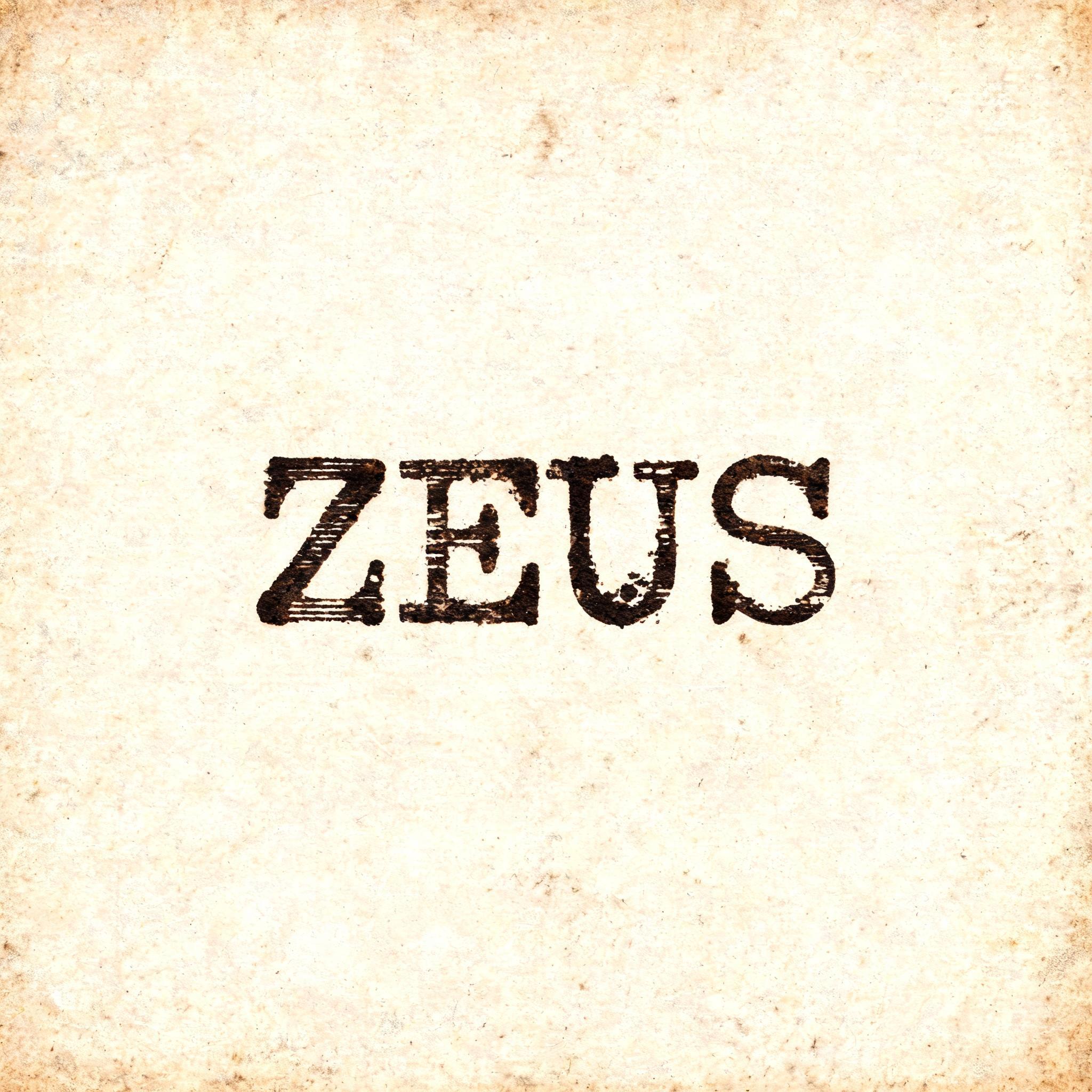
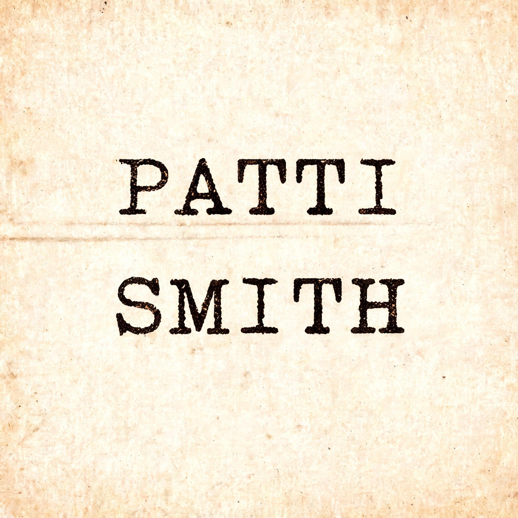
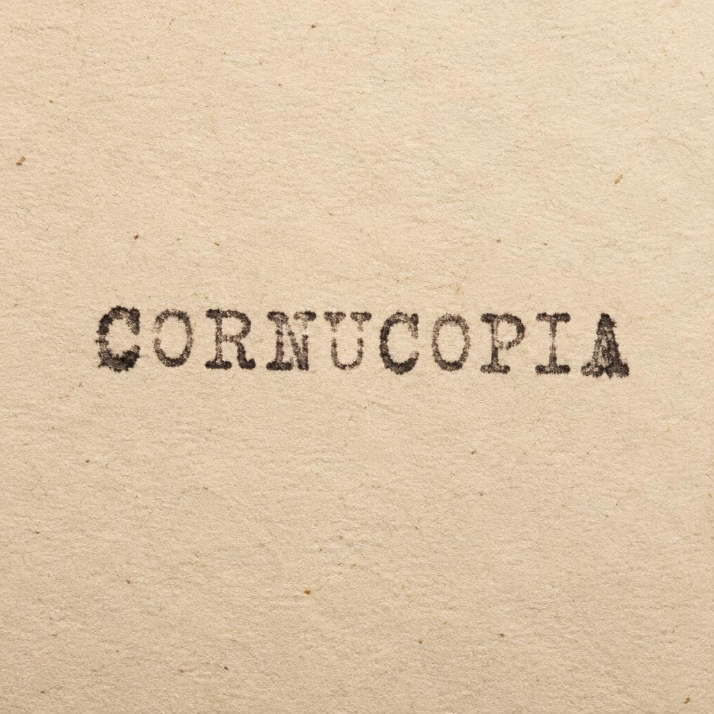
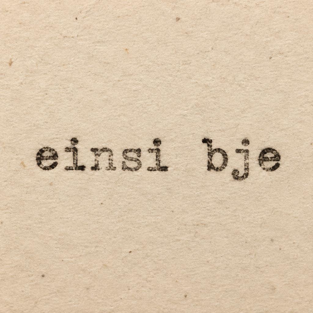
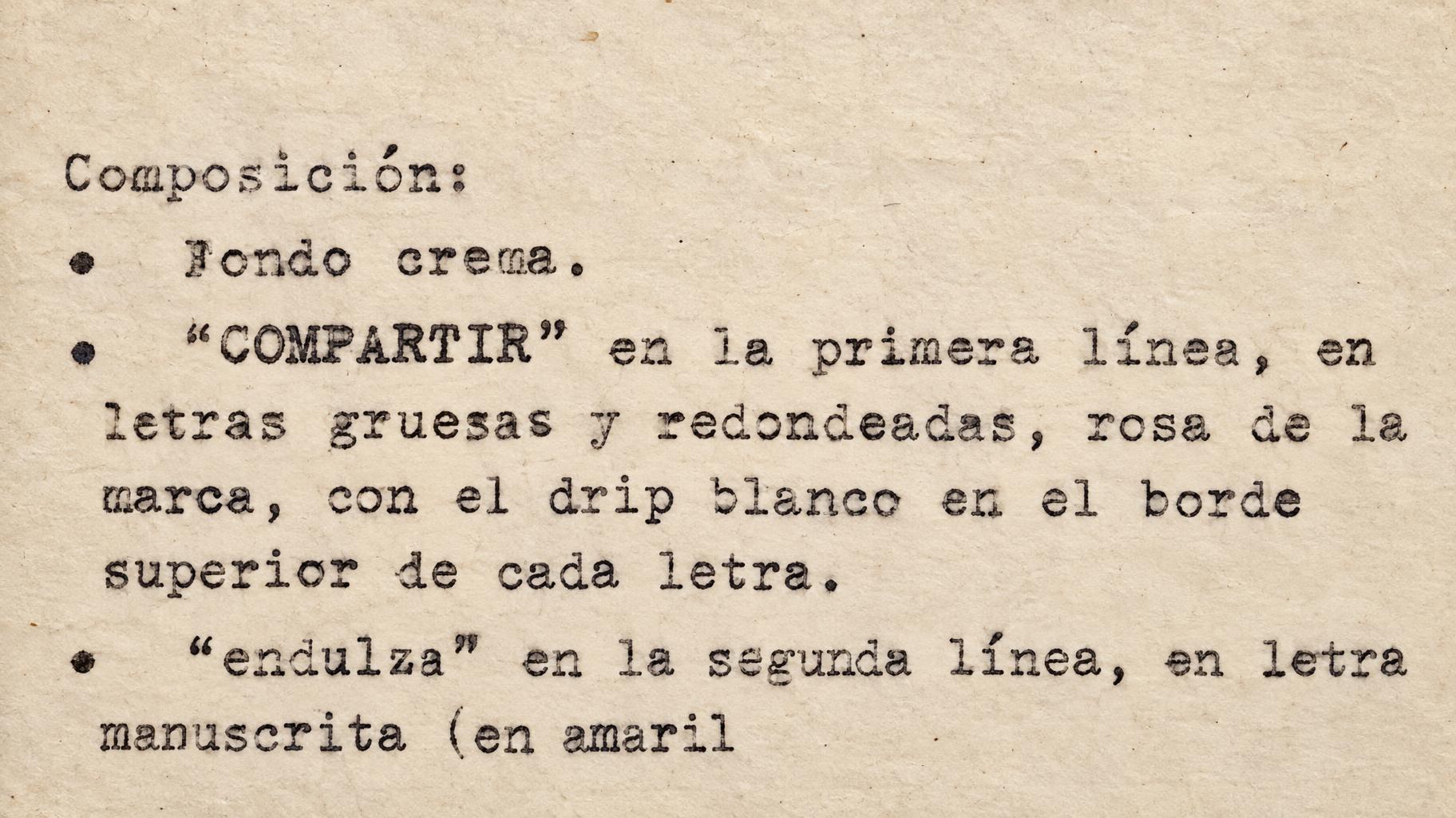
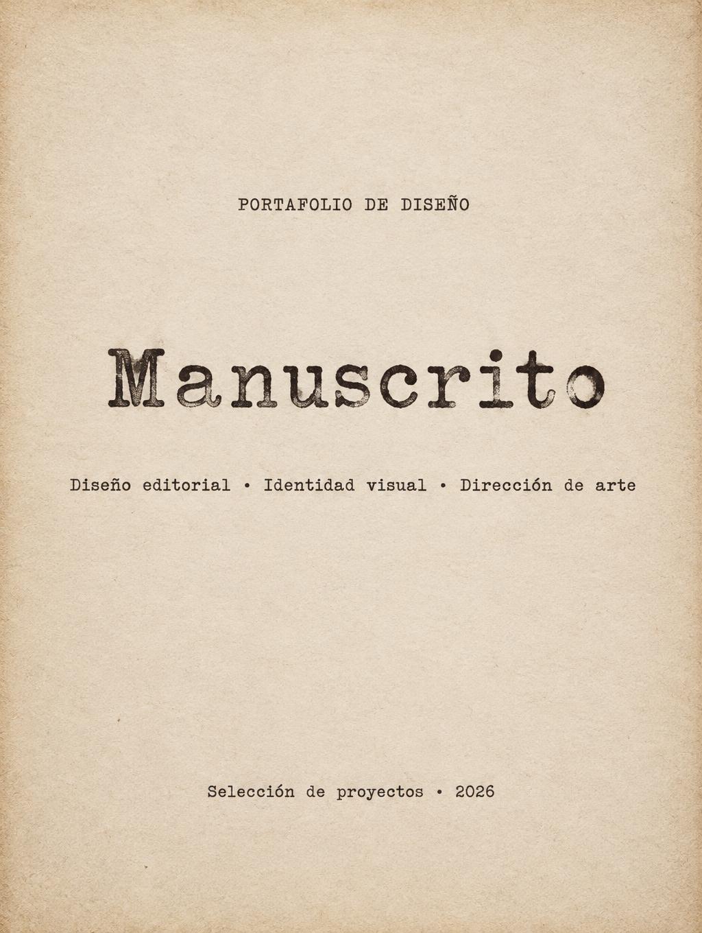
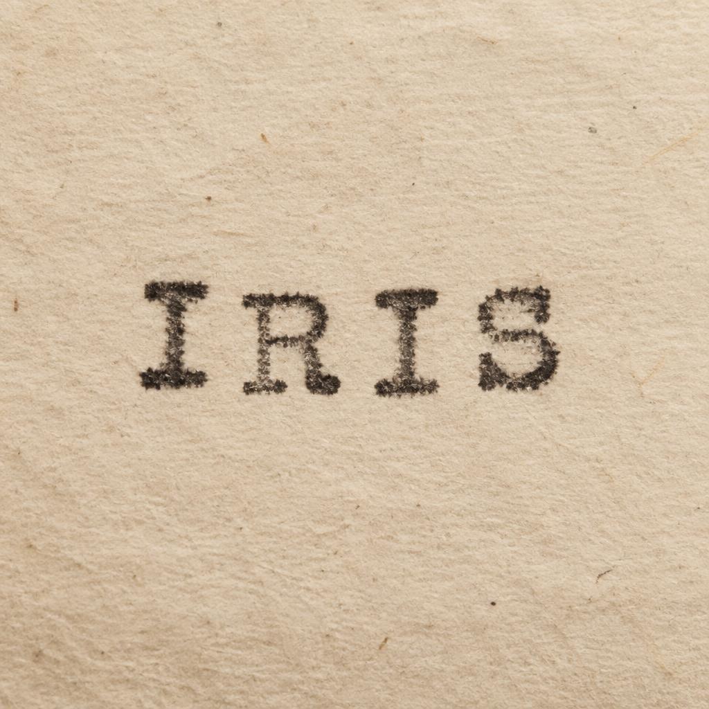
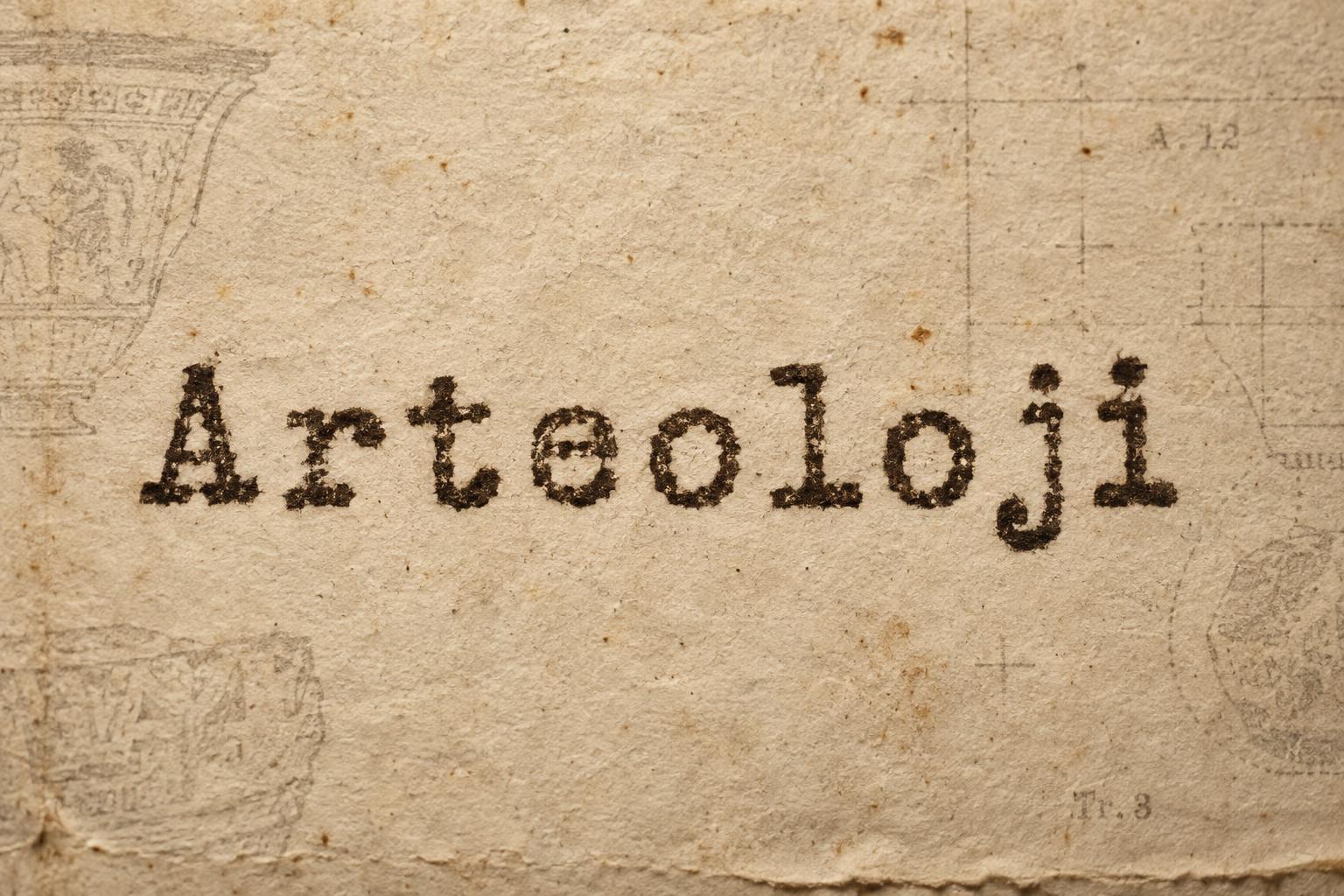
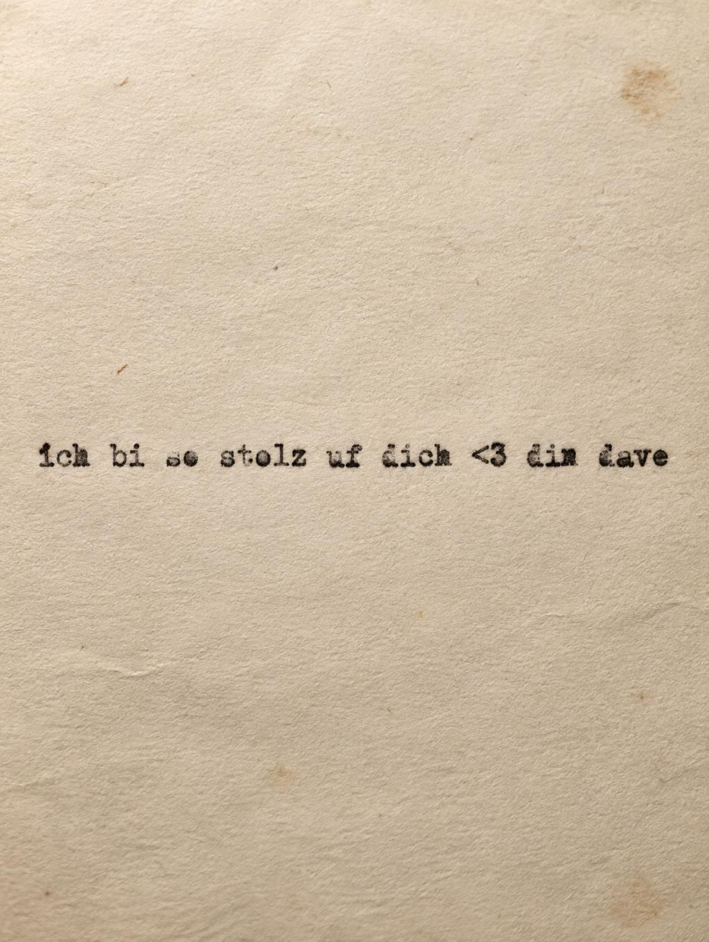
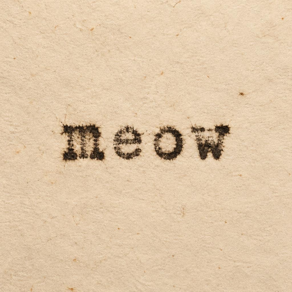
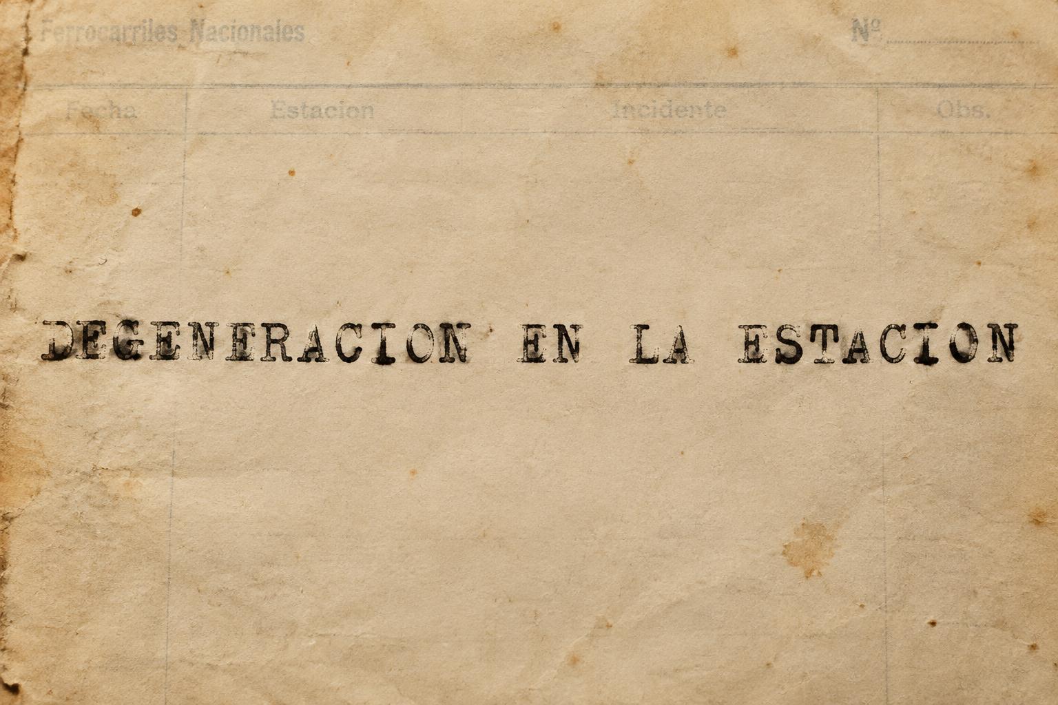
Monospaced slab-serif type struck into cream paper, with uneven ink density, ribbon texture, faint letter misalignment and soft paper fibers. — no font license needed.
Typewriter in different AI fonts
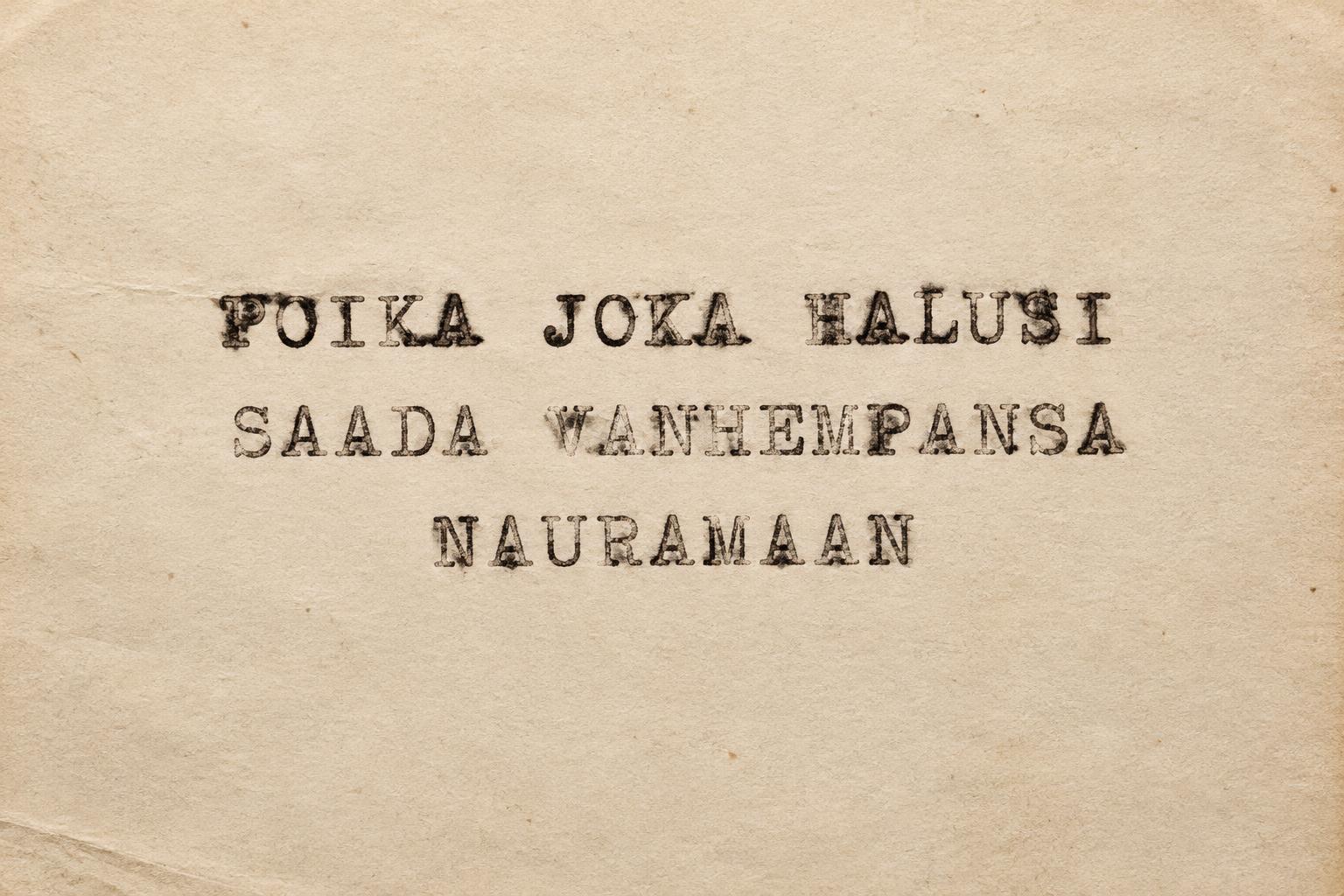
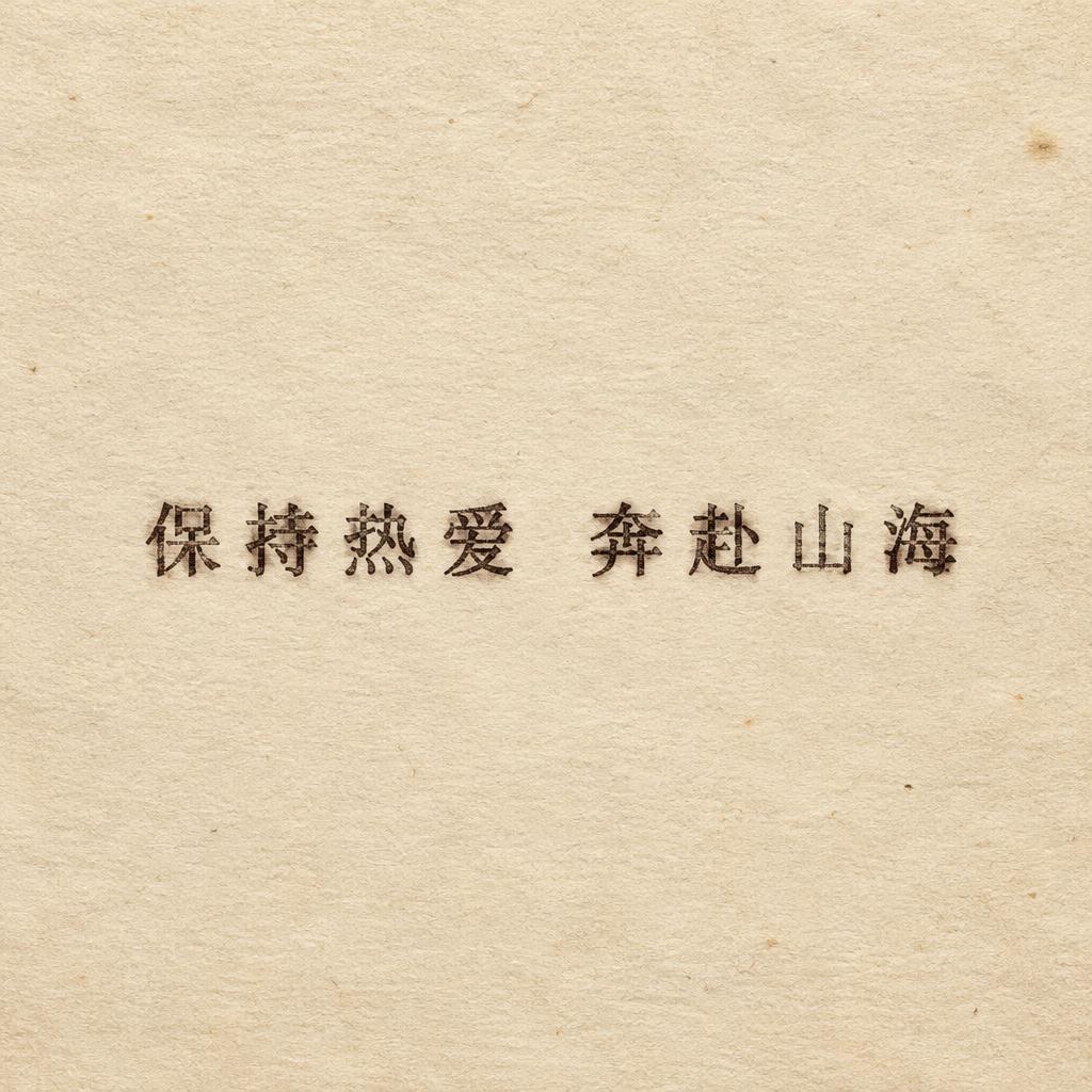
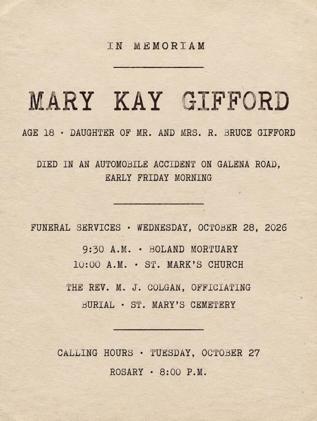
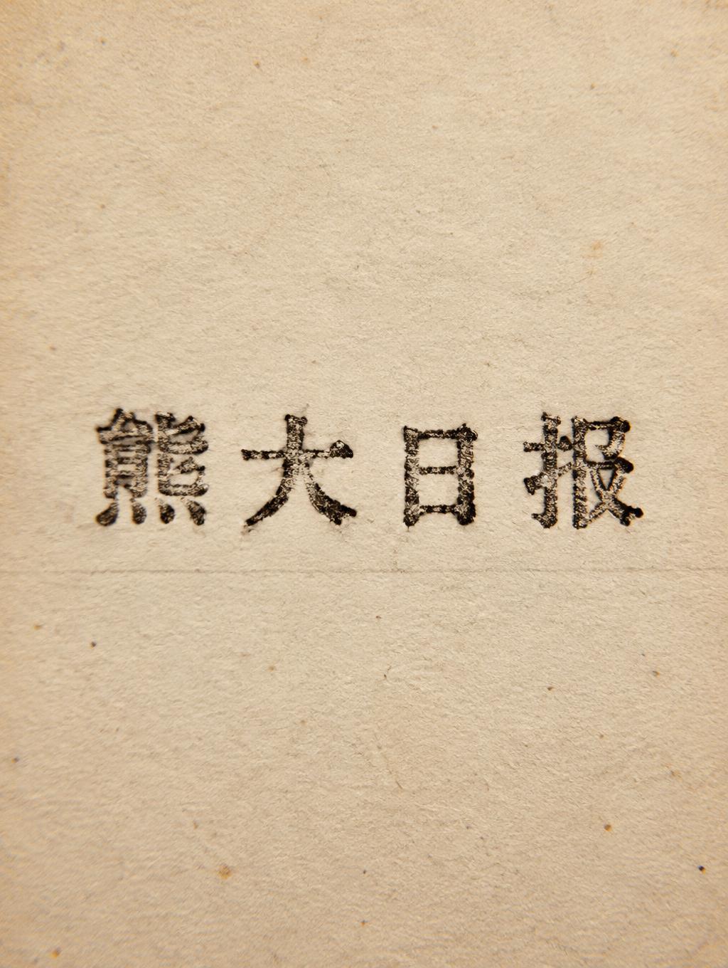


Typewriter Gallery
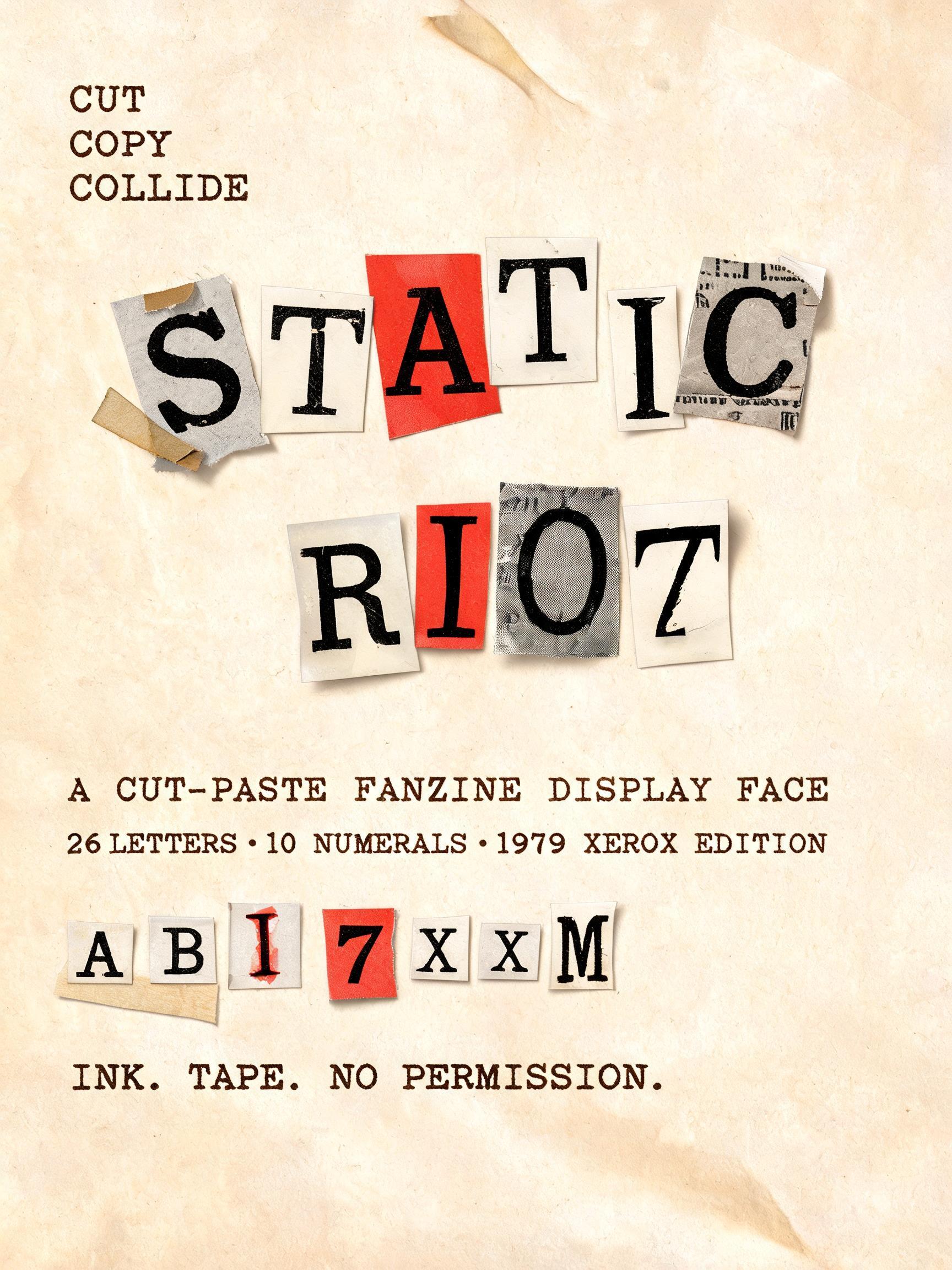
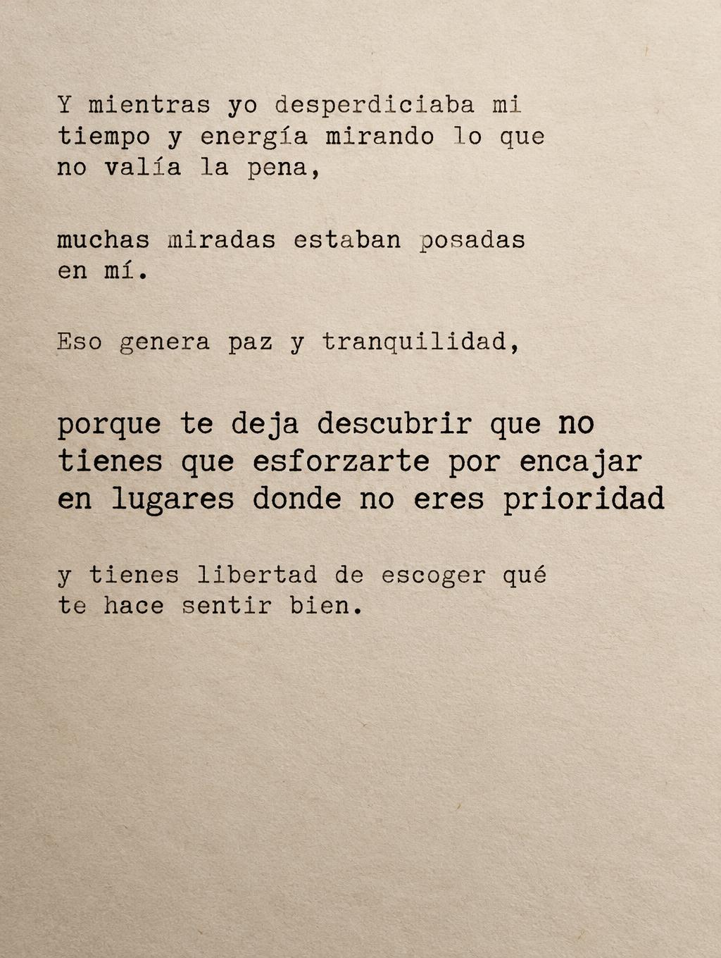
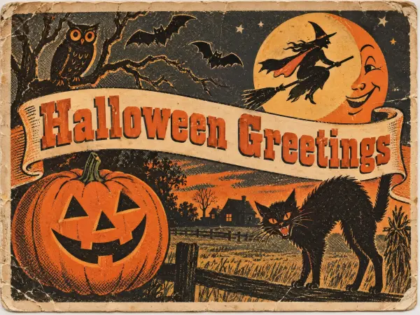
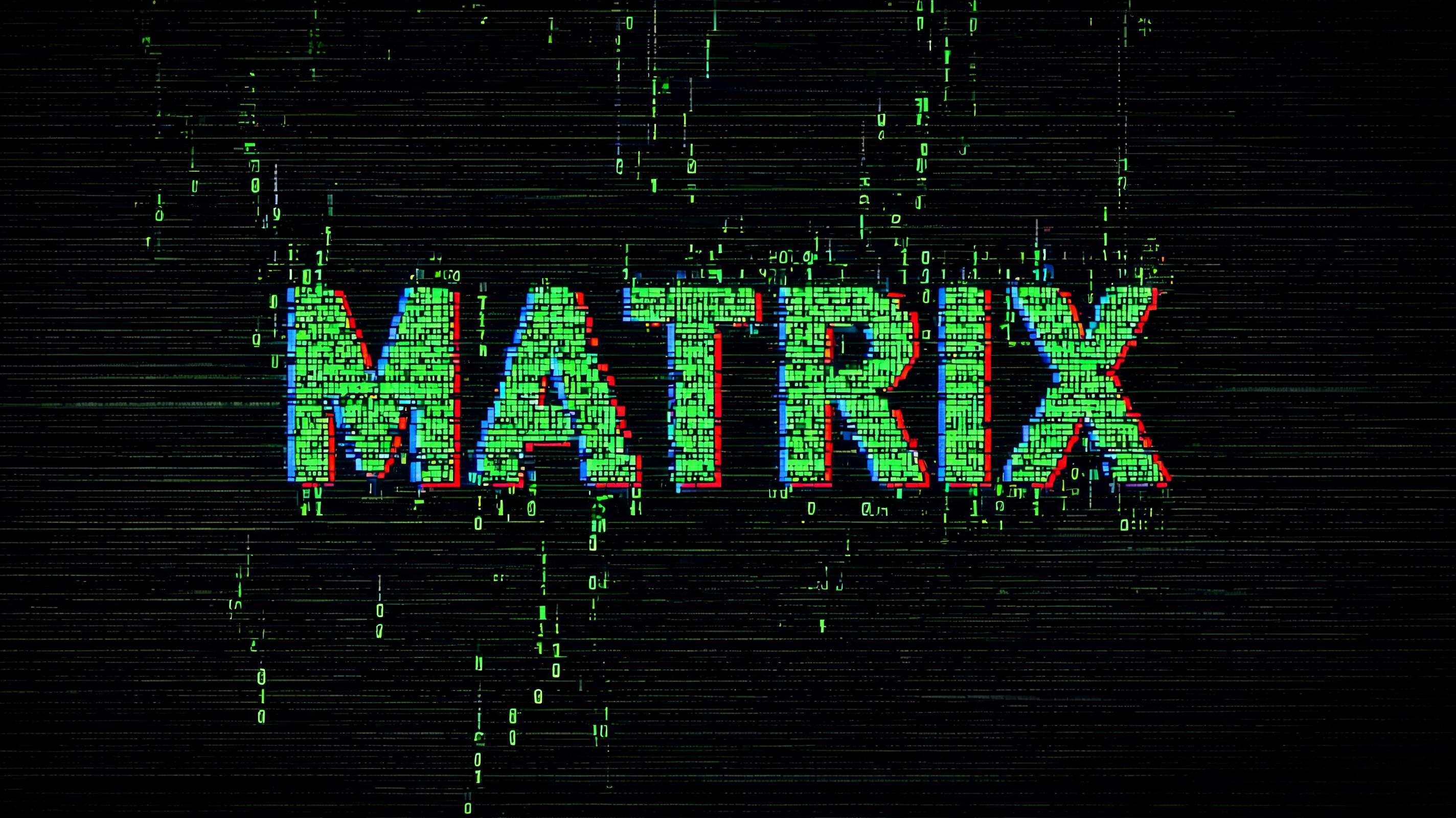
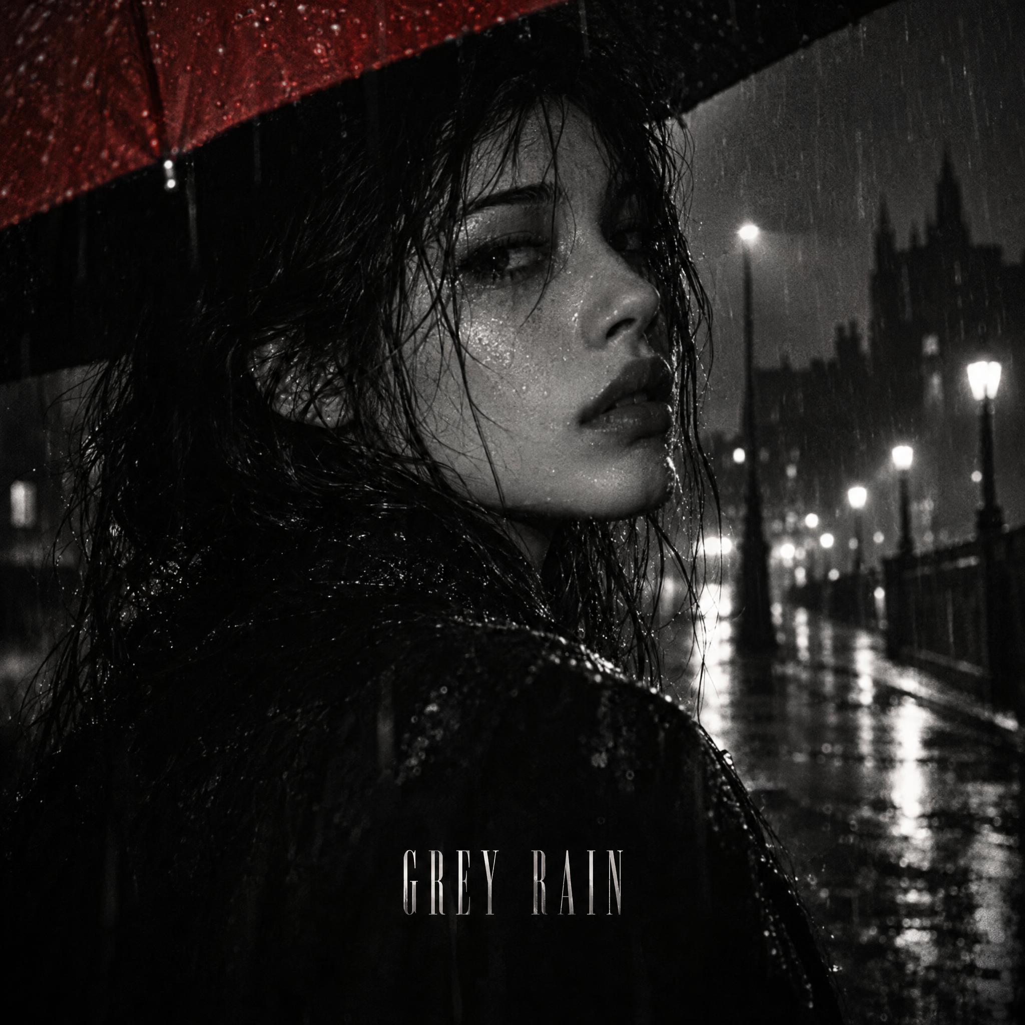
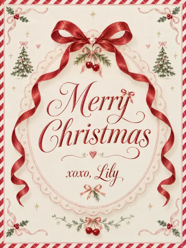
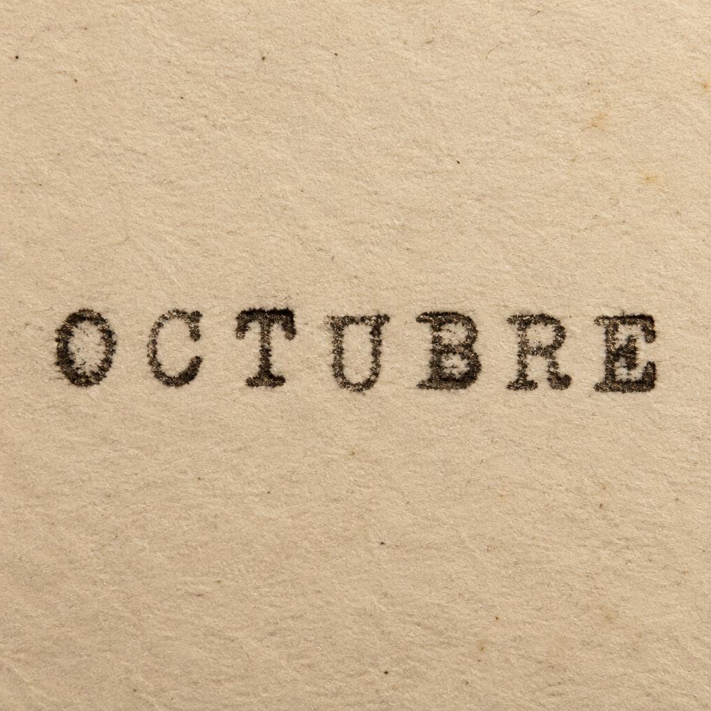
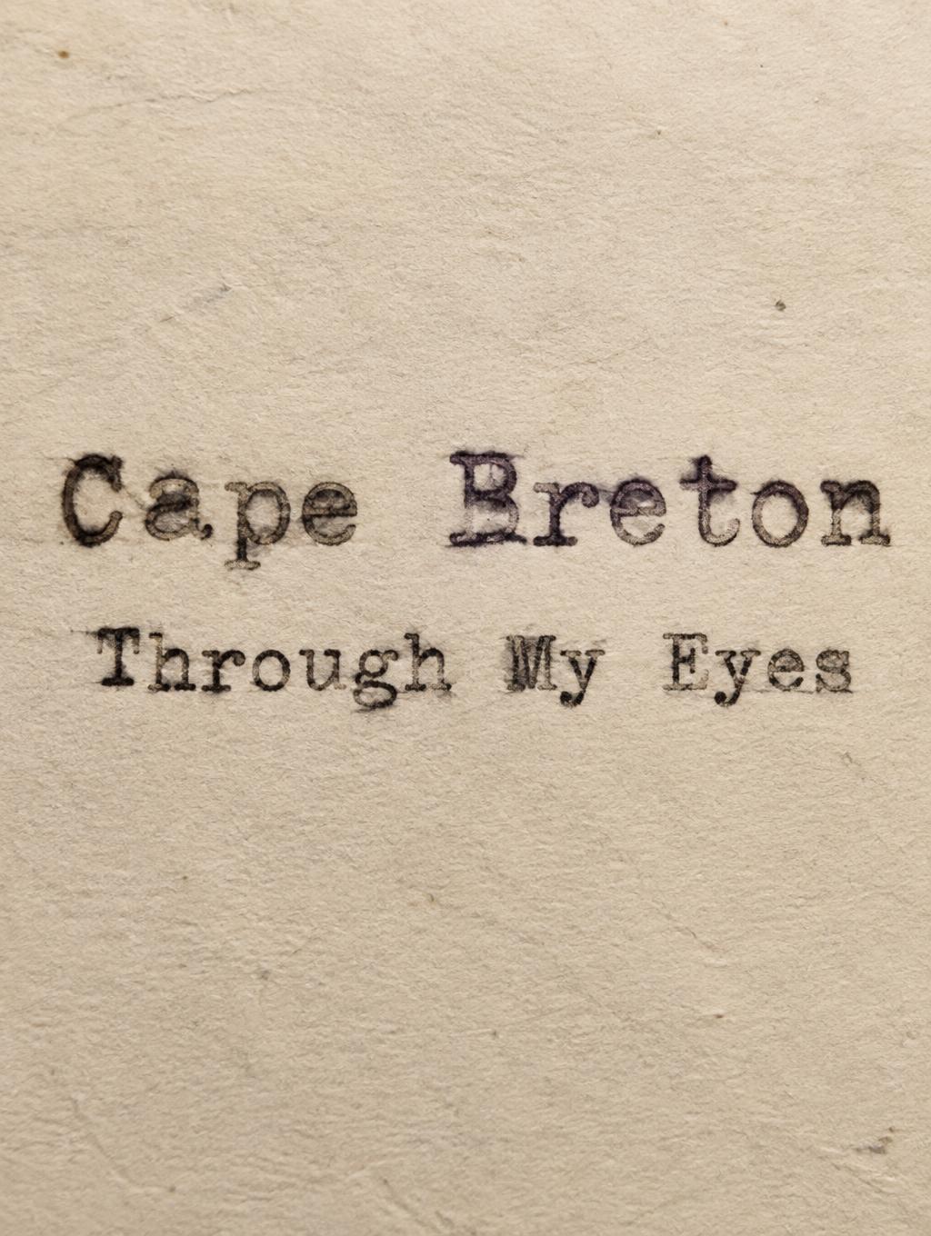
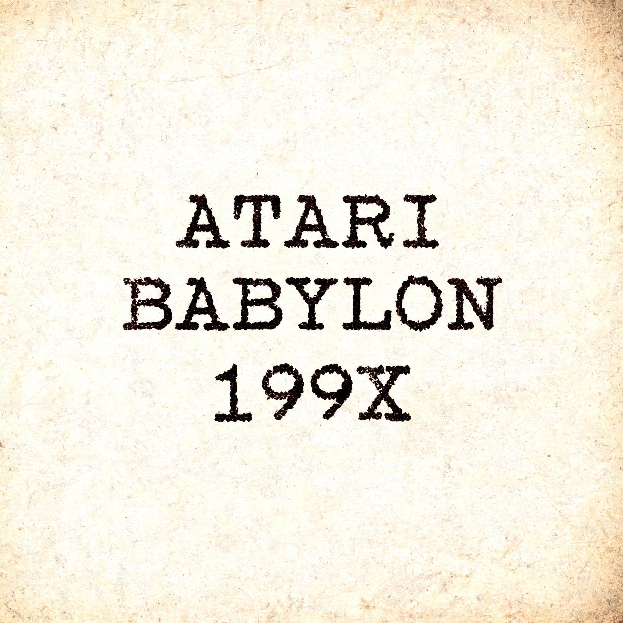
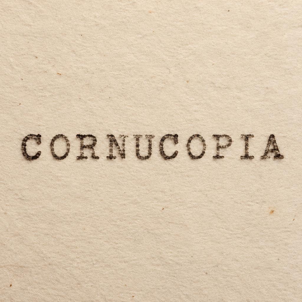
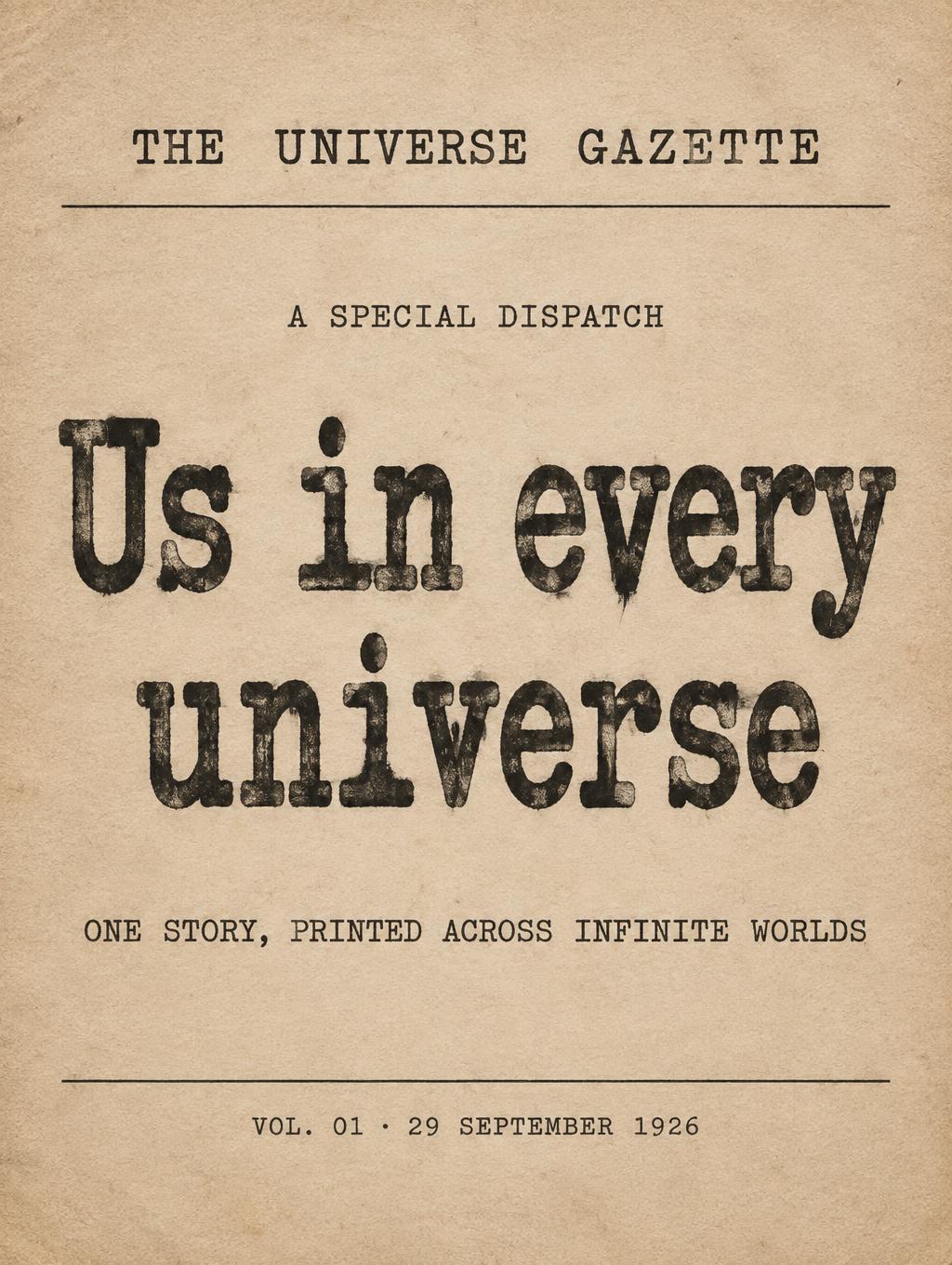
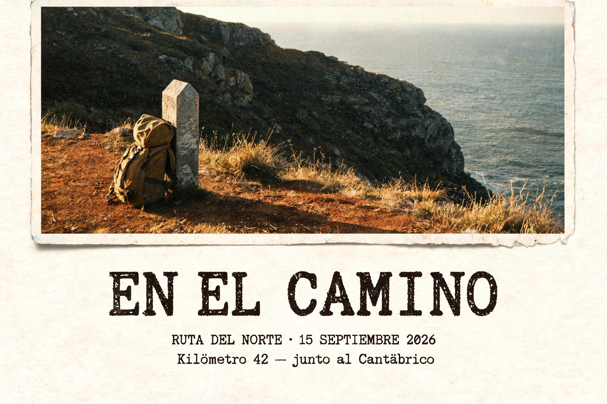
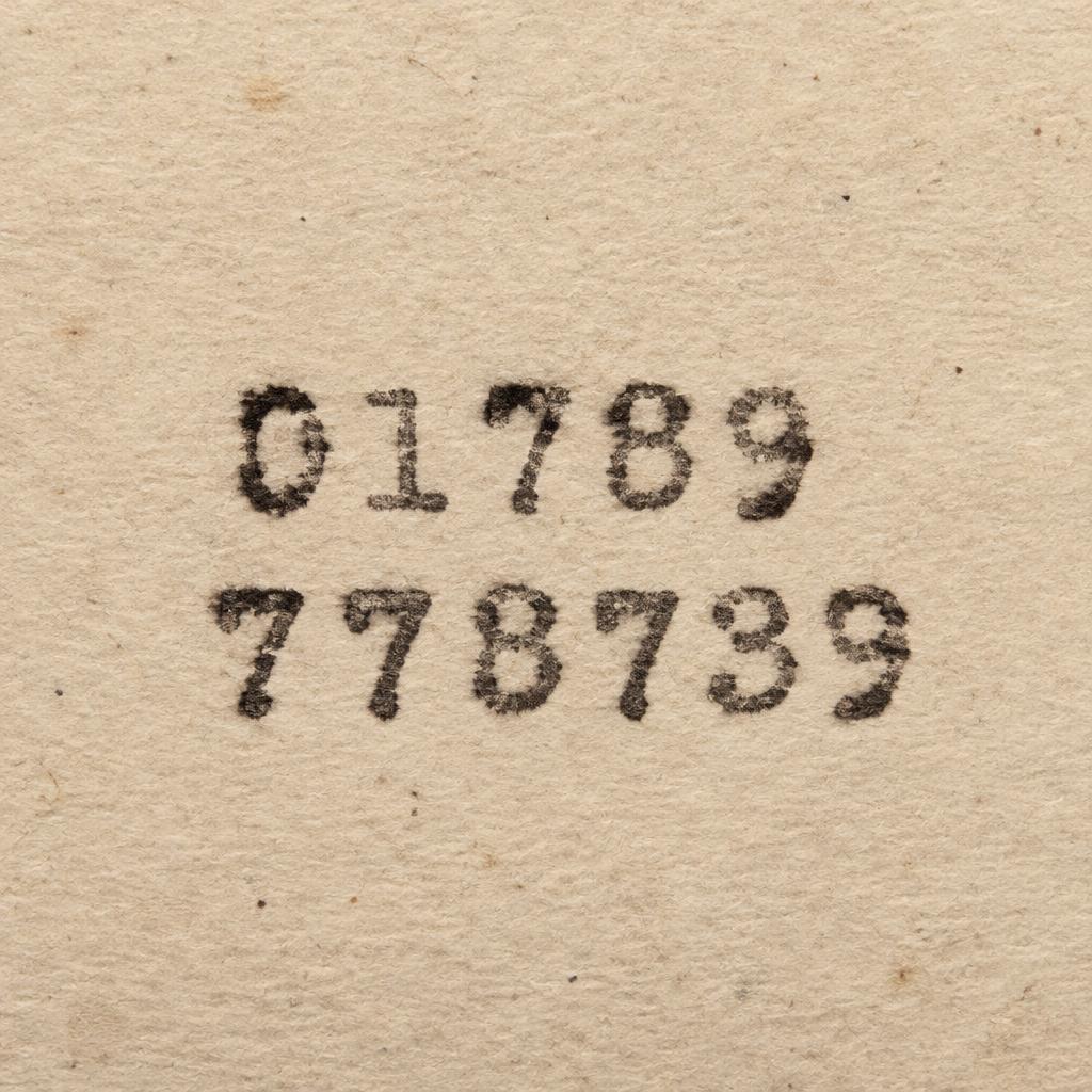
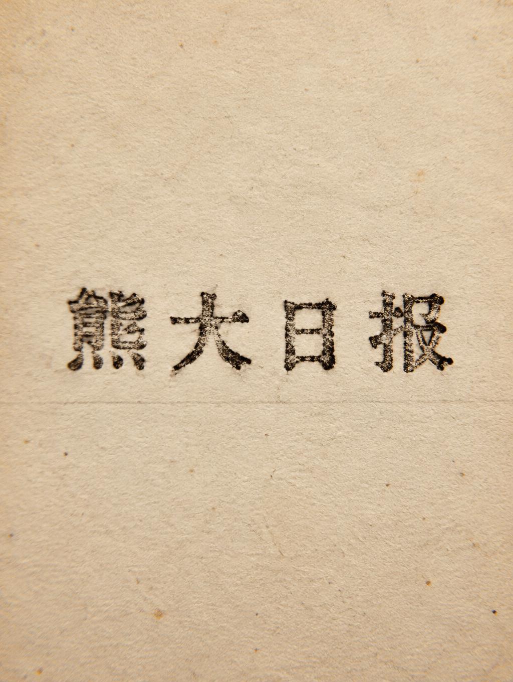
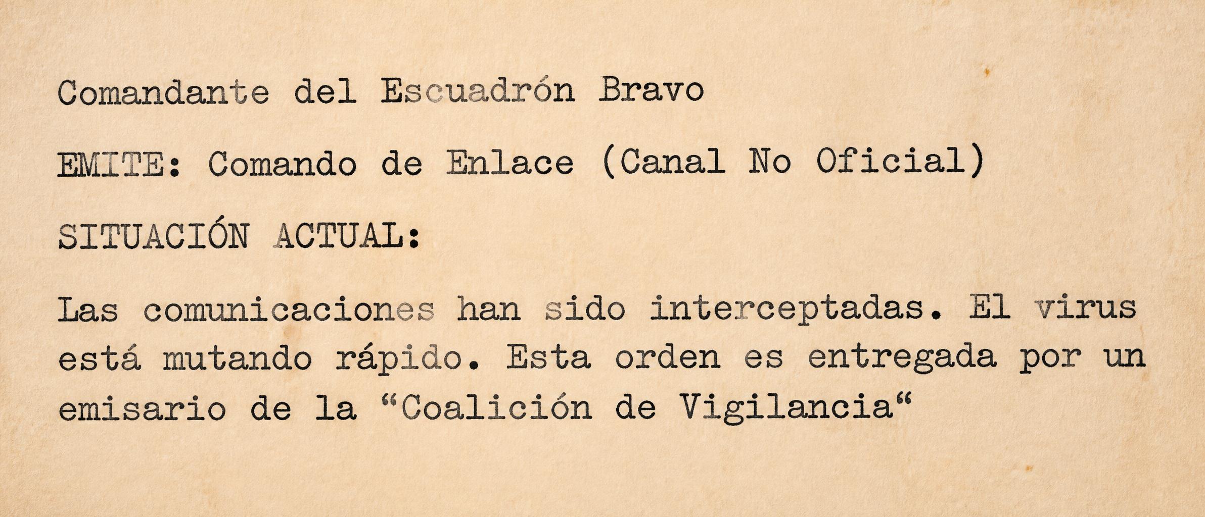
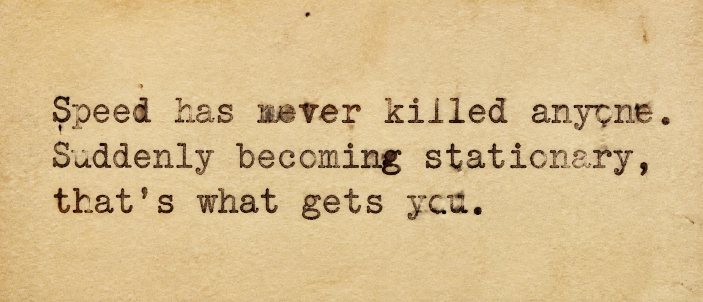
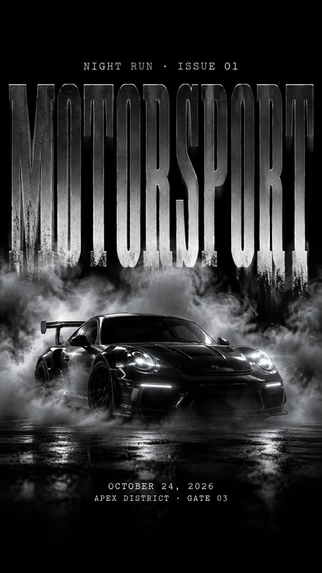
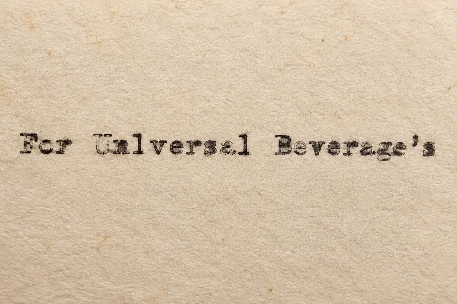
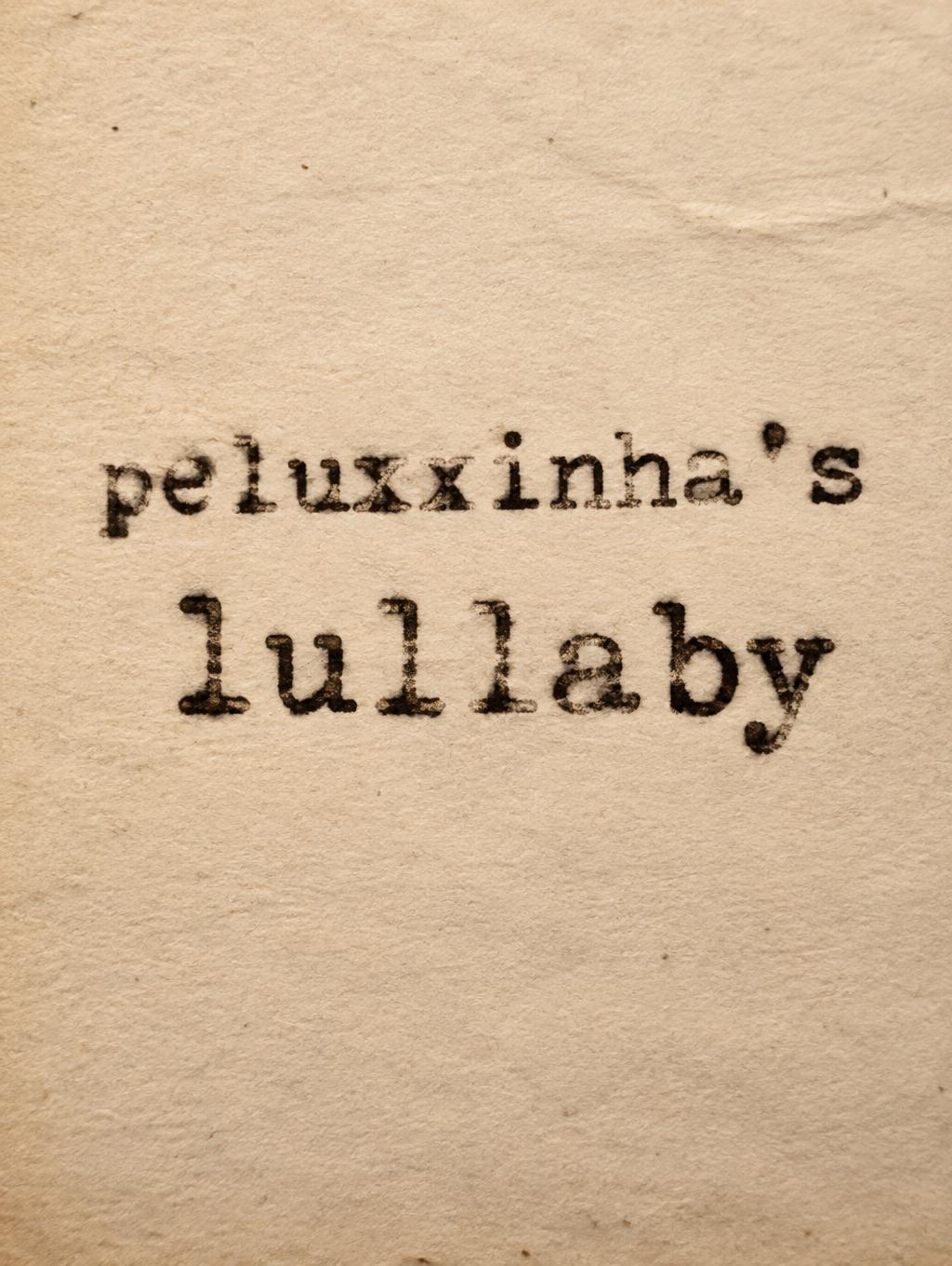
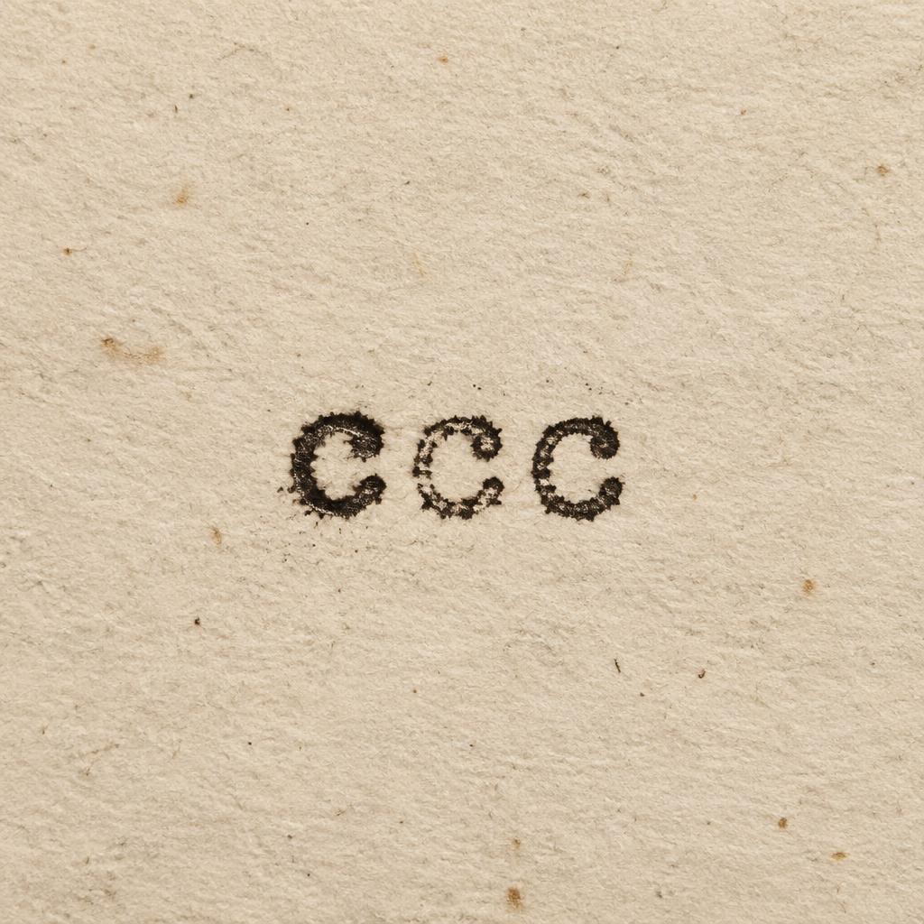
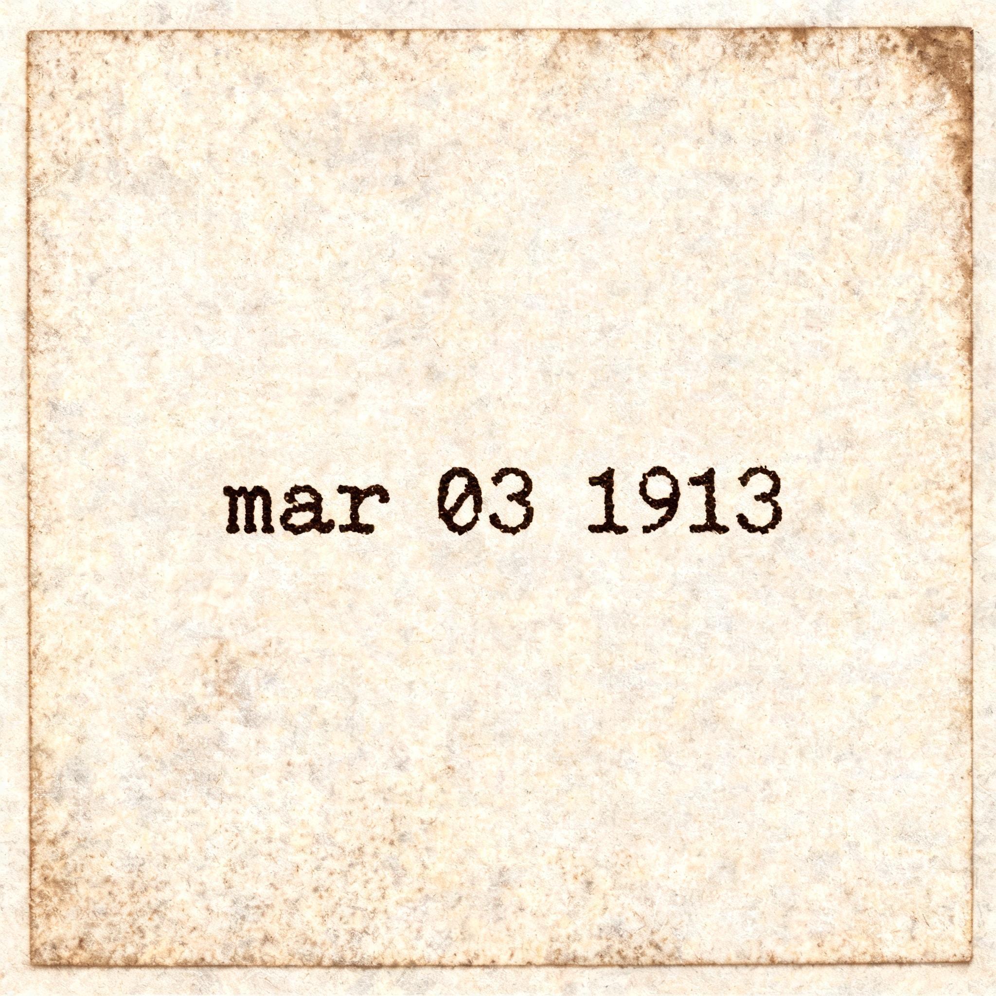
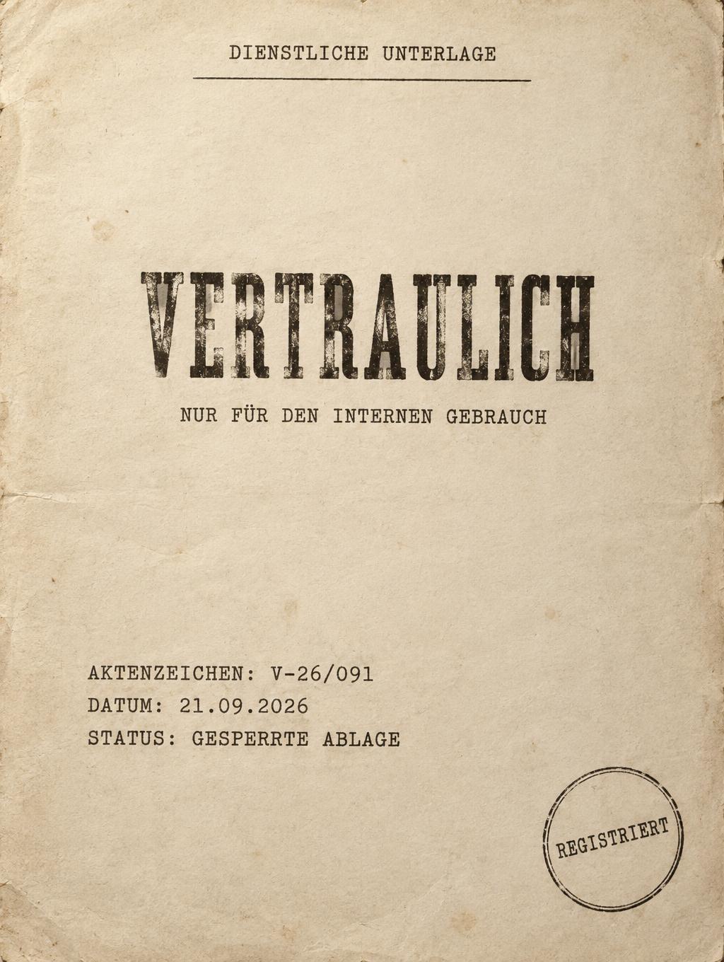
Real outputs from the Typewriter style. Click any image to see details.
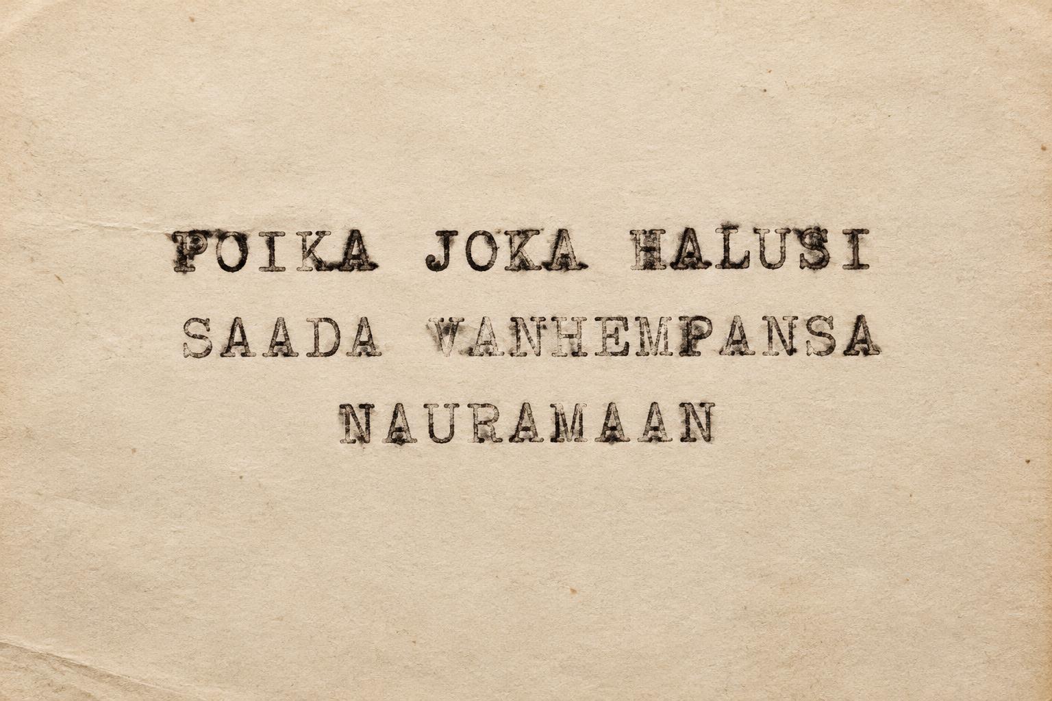
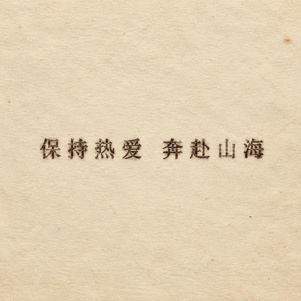


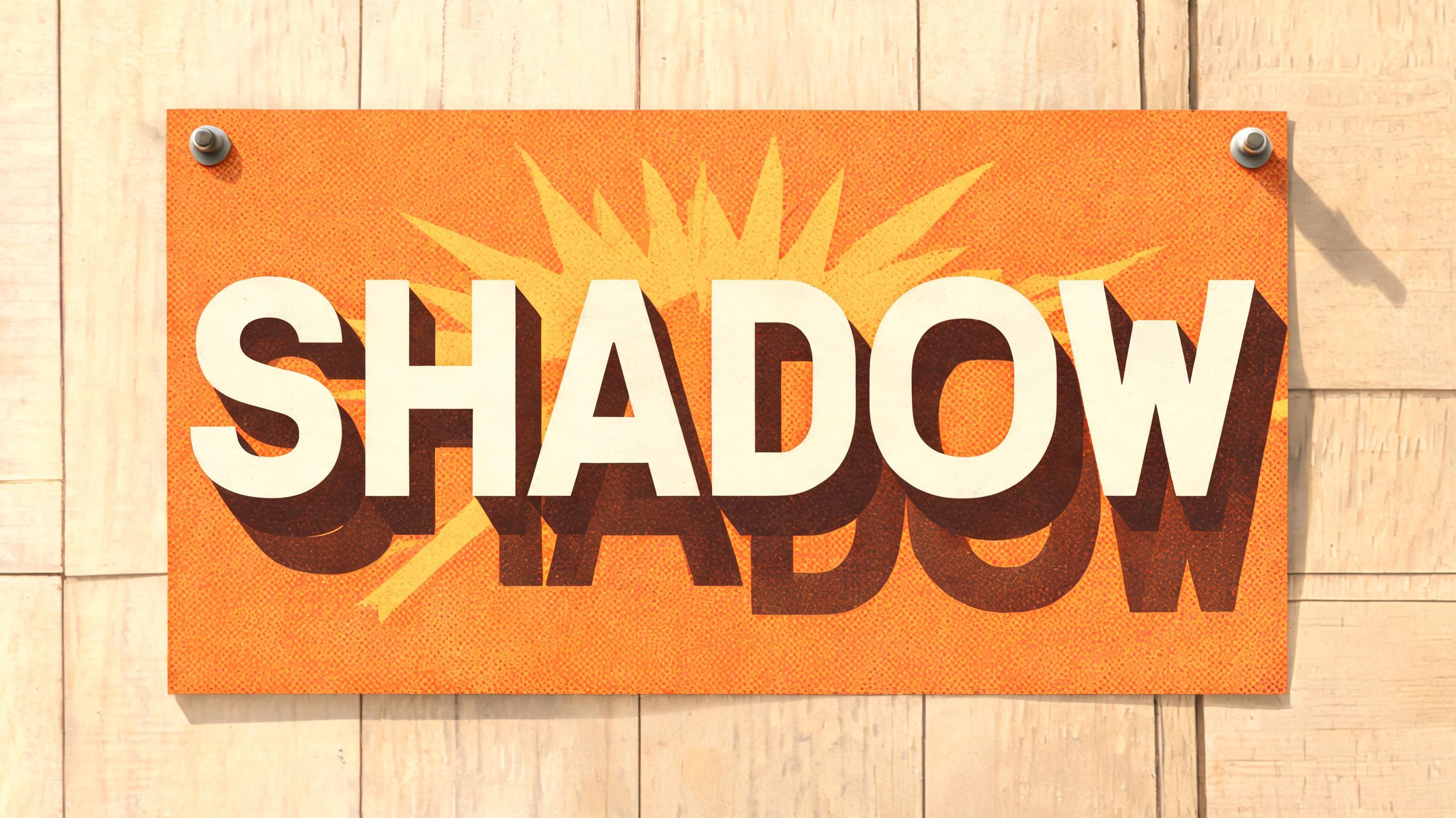


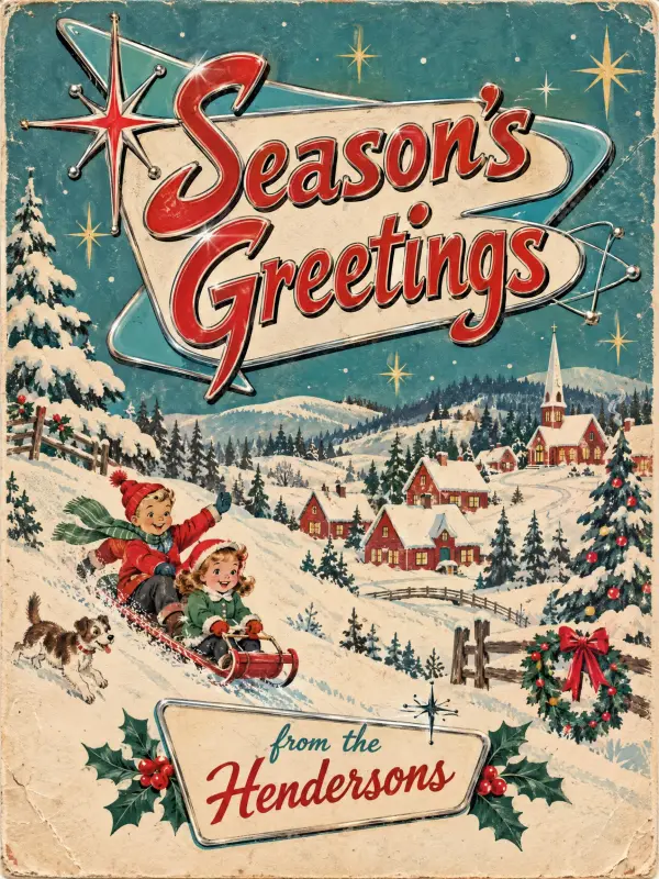




Looking for copy-paste fancy text? Try our free Font Generator Tools — cursive, gothic, bubble & 30+ styles.
Perfect for These Projects
Typewriter Text Effect — FAQ
What is the Typewriter Font Style?
The Typewriter font style is a distinctive AI-generated typography effect. Monospaced slab-serif type struck into cream paper, with uneven ink density, ribbon texture, faint letter misalignment and soft paper fibers. Using FontVibe's AI typewriter generator you can create stunning text effects in seconds — no Photoshop, no font licensing, no design experience needed.
Explore the Typewriter gallery for inspiration, or browse all 138+ AI text effect styles available on FontVibe.
How to Create Typewriter Typography in FontVibe Studio
The Story Behind Typewriter
History, visual DNA, and cultural context.
Where It Came From
The typewriter was invented in the 1860s, but its visual language peaked in the mid-20th century — the era of carbon copies, ribbon replacements, and Wite-Out. Every government memo, every literary manuscript, every ransom note was typed on a machine that left a unique physical trace on paper. The aesthetic didn't die when word processors arrived — it evolved into a cultural signifier. Typewriter typography now means something specific: authenticity, analog warmth, the idea that a human actually sat down and pressed those keys. In a world of infinite smooth digital fonts, the imperfection is the point.
Sources: Wikipedia — Typewriter
The Visual DNA
Typographic Landmarks
Sources: Wikipedia — Horace Smart Beattie
Did You Know?
William Gibson wrote Neuromancer (1984) — the novel that popularized 'cyberspace', a word he coined in his 1982 story Burning Chrome — on a Hermes manual portable typewriter. He later said he had never so much as touched a PC when he wrote it. Source ↗
The ransom-note aesthetic (letters cut from newspaper headlines and pasted together) became a punk design staple in the late 1970s through Jamie Reid, who first used it for Suburban Press in 1970. His artwork for the Sex Pistols' 1977 album Never Mind the Bollocks used the same collage logic. Source ↗
Sources: Wikipedia — Cyberspace
In Typography
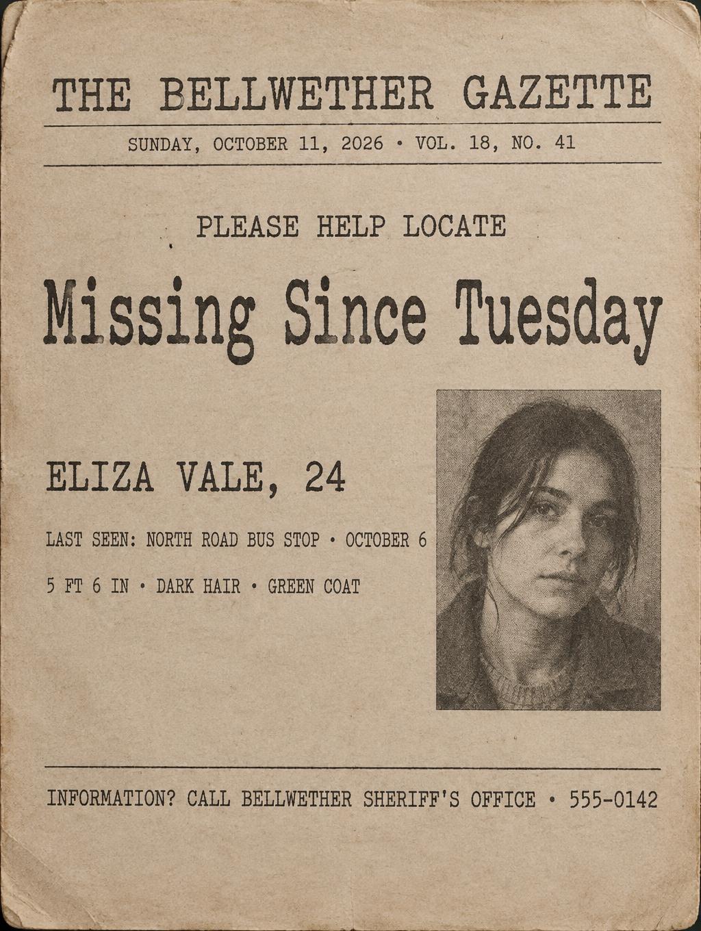
Typewriter typography is fundamentally about constraint producing character. The limitations of the machine — fixed-width spacing, limited type styles, ink ribbon degradation — created an aesthetic that feels irreplaceable. For designers, the key decision is which layer of wear to apply. Classic vintage (light wear, cream paper) reads as literary and warm. Grunge-destroyed (heavy damage, stains) reads as underground and rebellious. Military-document (official off-white, dense ink) reads as authoritative and classified. Newspaper (high-contrast, halftone paper) reads as journalistic and urgent. The imperfections should feel earned, not decorative — each variation has a visual logic tied to a specific physical context.
Create Your Typewriter Typography in Studio
Free to start. No design skills needed. Your artwork, your copyright.
AI Typewriter Text Effect Generator
Monospaced slab-serif type struck into cream paper, with uneven ink density, ribbon texture, faint letter misalignment and soft paper fibers. — no font license needed.
Typewriter in different AI fonts
Generate Your Typewriter Text Effect
Type any word — see it transformed in seconds. No sign-up required.
Typewriter Style Gallery
Real outputs from the Typewriter style. Click any image to see details.
!["']5])e1]-c0BH?P?PU4]-[8AT_0a1_:b0S2e1Y0a2\\.a.>P\\-^,]6" — Typewriter | AI Text Effect Generator](https://cos.fontvibe.ai/generations/user/0/33edfa4d-2f33-48af-880b-e21af8284c56.jpeg?imageMogr2/thumbnail/480x/format/webp/resolution/80)
!["']5])e1]-c0BH?P?PU4]-[8AT_0a1_:b0S2e1Y0a2\\.a.>P\\-^,]6" — Typewriter | AI Text Effect Generator](https://cos.fontvibe.ai/generations/user/0/1de07cf5-2997-4a06-8555-caf679a7ccd5.jpeg?imageMogr2/thumbnail/480x/format/webp/resolution/80)
Similar Text Effect Styles
Try these styles and create your own AI-generated text effects.
Looking for copy-paste fancy text? Try our free Font Generator Tools — cursive, gothic, bubble & 30+ styles.
Perfect for These Projects
Typewriter text effects are popular for creative projects where visual impact matters.
What is the Typewriter Font Style?
The Typewriter font style is a distinctive AI-generated typography effect. Monospaced slab-serif type struck into cream paper, with uneven ink density, ribbon texture, faint letter misalignment and soft paper fibers.
Using FontVibe's AI typewriter generator you can create stunning text effects in seconds — no Photoshop, no font licensing, no design experience needed.
Explore the Typewriter gallery for inspiration, or browse all 138+ AI text effect styles available on FontVibe.
How to Create Typewriter Typography in FontVibe Studio
1. Enter your text — Any word, phrase, or brand name. Works best with short, punchy text.
2. Select Typewriter — From the style library. Optionally describe a mood in the custom prompt.
3. Generate and download. Your Typewriter font artwork is ready in seconds. PNG, JPG, or transparent PNG.
Looking for something different? Browse the full font style library for more AI typography options.
Typewriter Text Effect — FAQ
The Story Behind Typewriter
History, visual DNA, and cultural context — everything that makes this style what it is.
Where It Came From
The typewriter was invented in the 1860s, but its visual language peaked in the mid-20th century — the era of carbon copies, ribbon replacements, and Wite-Out. Every government memo, every literary manuscript, every ransom note was typed on a machine that left a unique physical trace on paper. The aesthetic didn't die when word processors arrived — it evolved into a cultural signifier. Typewriter typography now means something specific: authenticity, analog warmth, the idea that a human actually sat down and pressed those keys. In a world of infinite smooth digital fonts, the imperfection is the point.
Sources: Wikipedia — Typewriter
The Visual DNA
Typographic Landmarks
Sources: Wikipedia — Horace Smart Beattie
Did You Know?
William Gibson wrote Neuromancer (1984) — the novel that popularized 'cyberspace', a word he coined in his 1982 story Burning Chrome — on a Hermes manual portable typewriter. He later said he had never so much as touched a PC when he wrote it. Source ↗
The ransom-note aesthetic (letters cut from newspaper headlines and pasted together) became a punk design staple in the late 1970s through Jamie Reid, who first used it for Suburban Press in 1970. His artwork for the Sex Pistols' 1977 album Never Mind the Bollocks used the same collage logic. Source ↗
Sources: Wikipedia — Cyberspace
In Typography
Typewriter typography is fundamentally about constraint producing character. The limitations of the machine — fixed-width spacing, limited type styles, ink ribbon degradation — created an aesthetic that feels irreplaceable. For designers, the key decision is which layer of wear to apply. Classic vintage (light wear, cream paper) reads as literary and warm. Grunge-destroyed (heavy damage, stains) reads as underground and rebellious. Military-document (official off-white, dense ink) reads as authoritative and classified. Newspaper (high-contrast, halftone paper) reads as journalistic and urgent. The imperfections should feel earned, not decorative — each variation has a visual logic tied to a specific physical context.