


AI Vintage Text Effect Generator
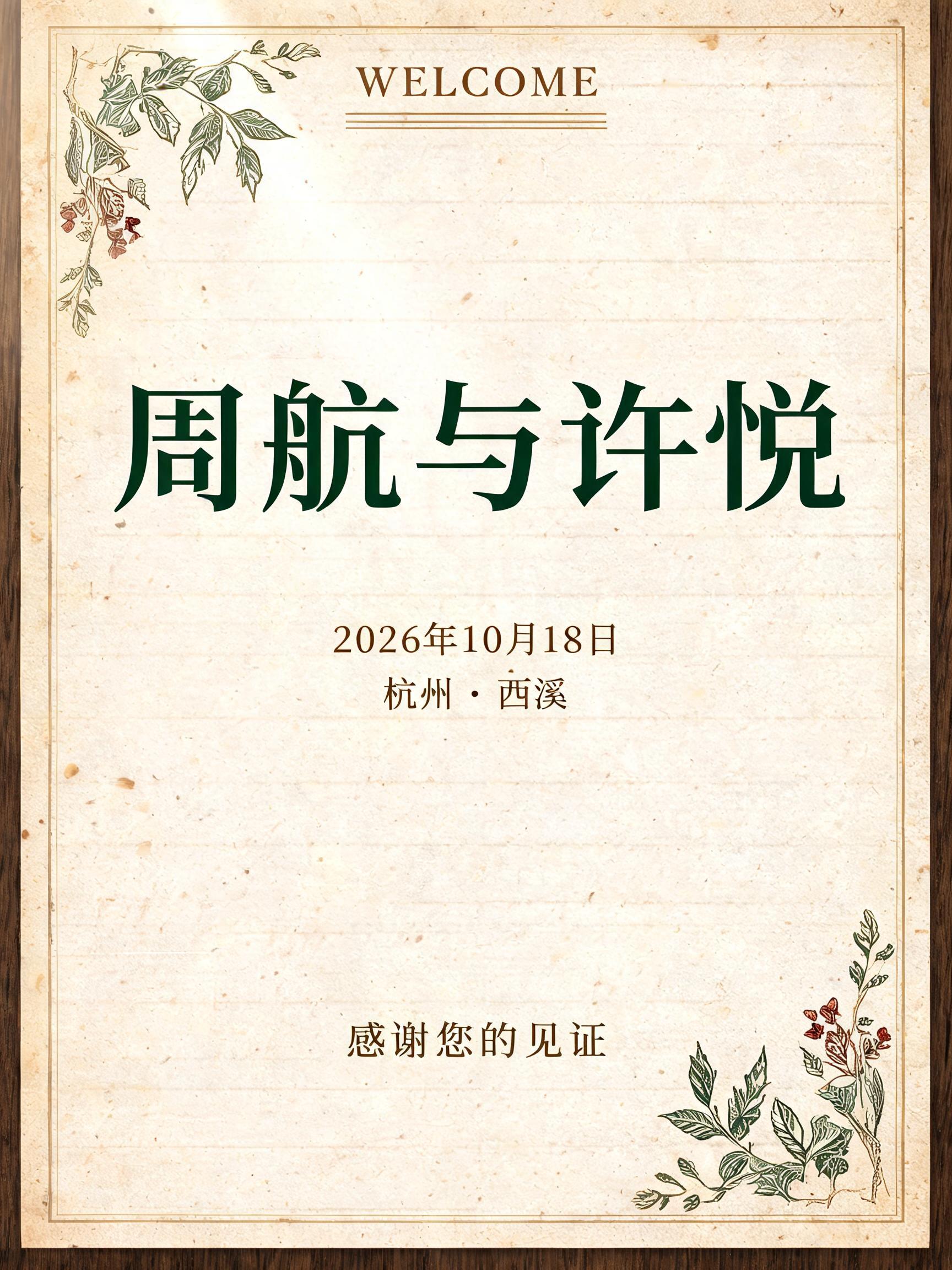
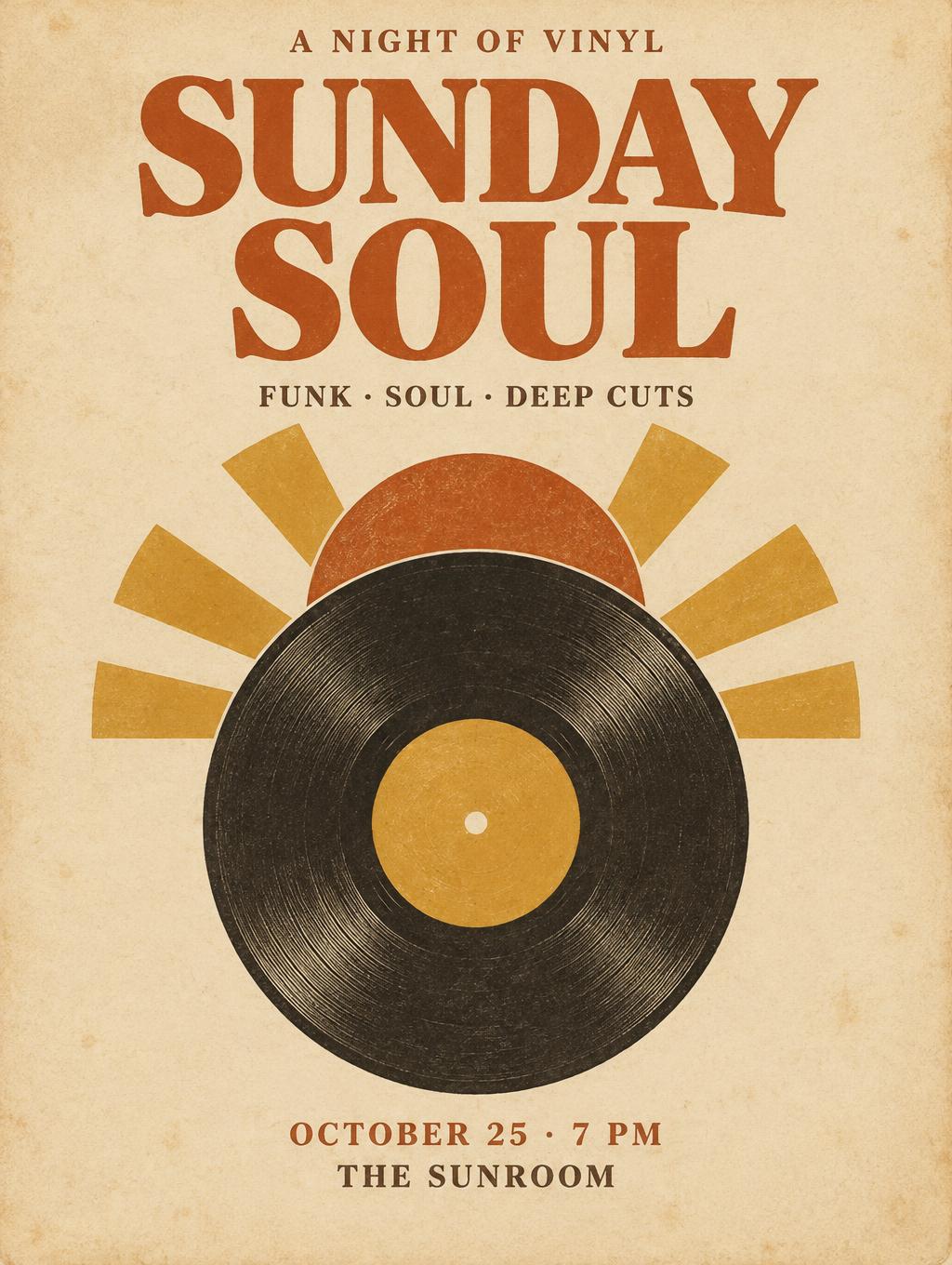
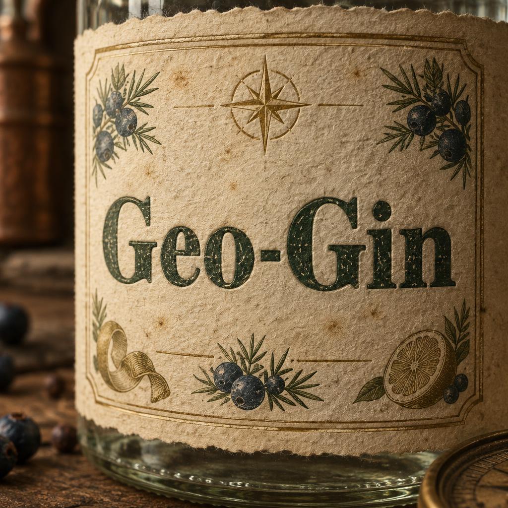
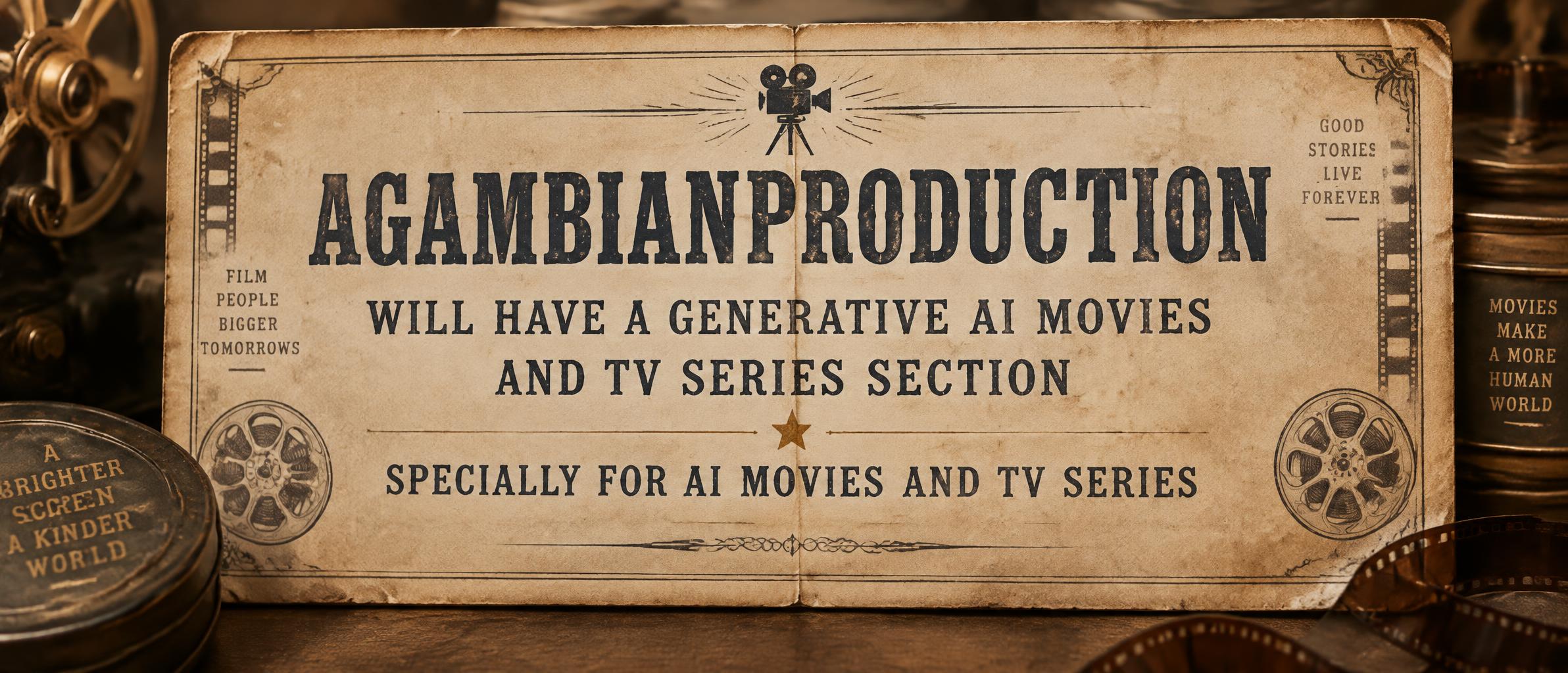
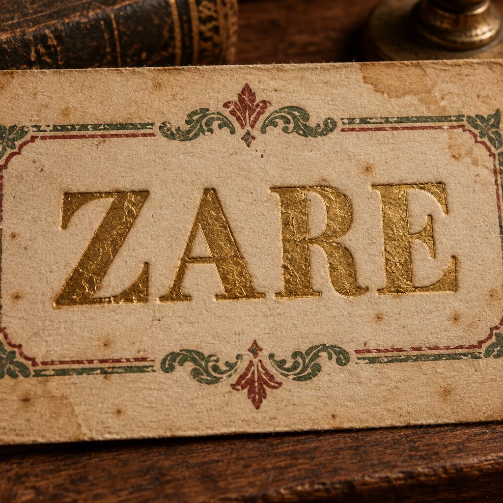
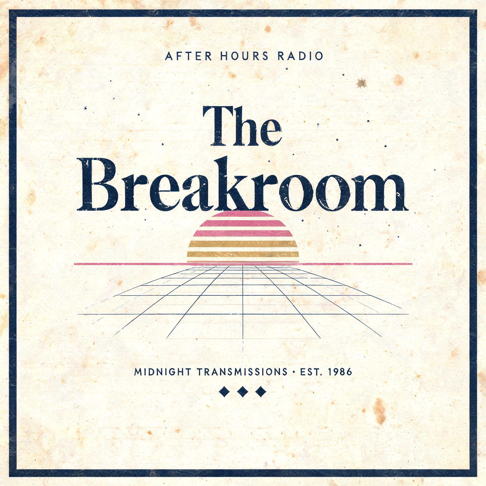
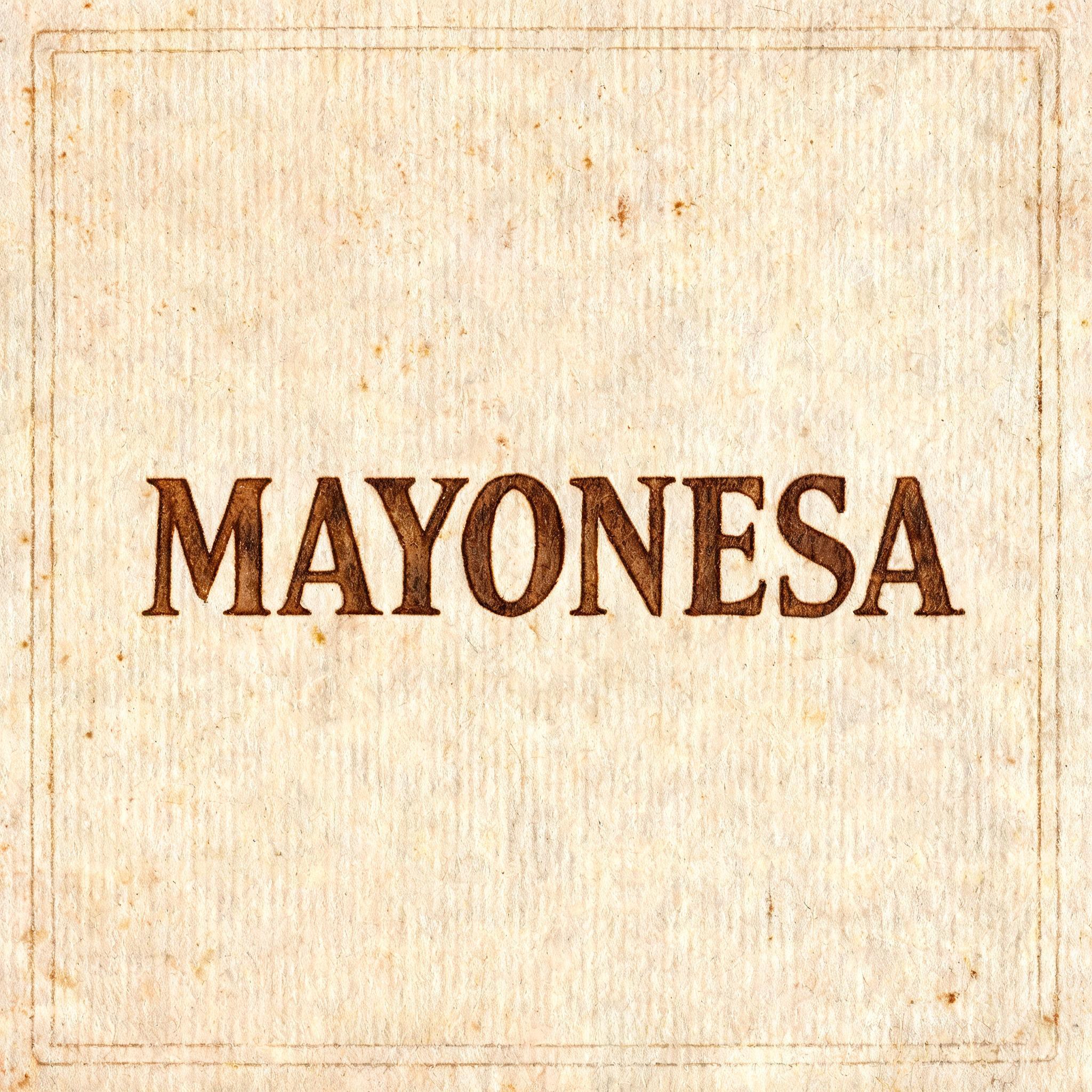
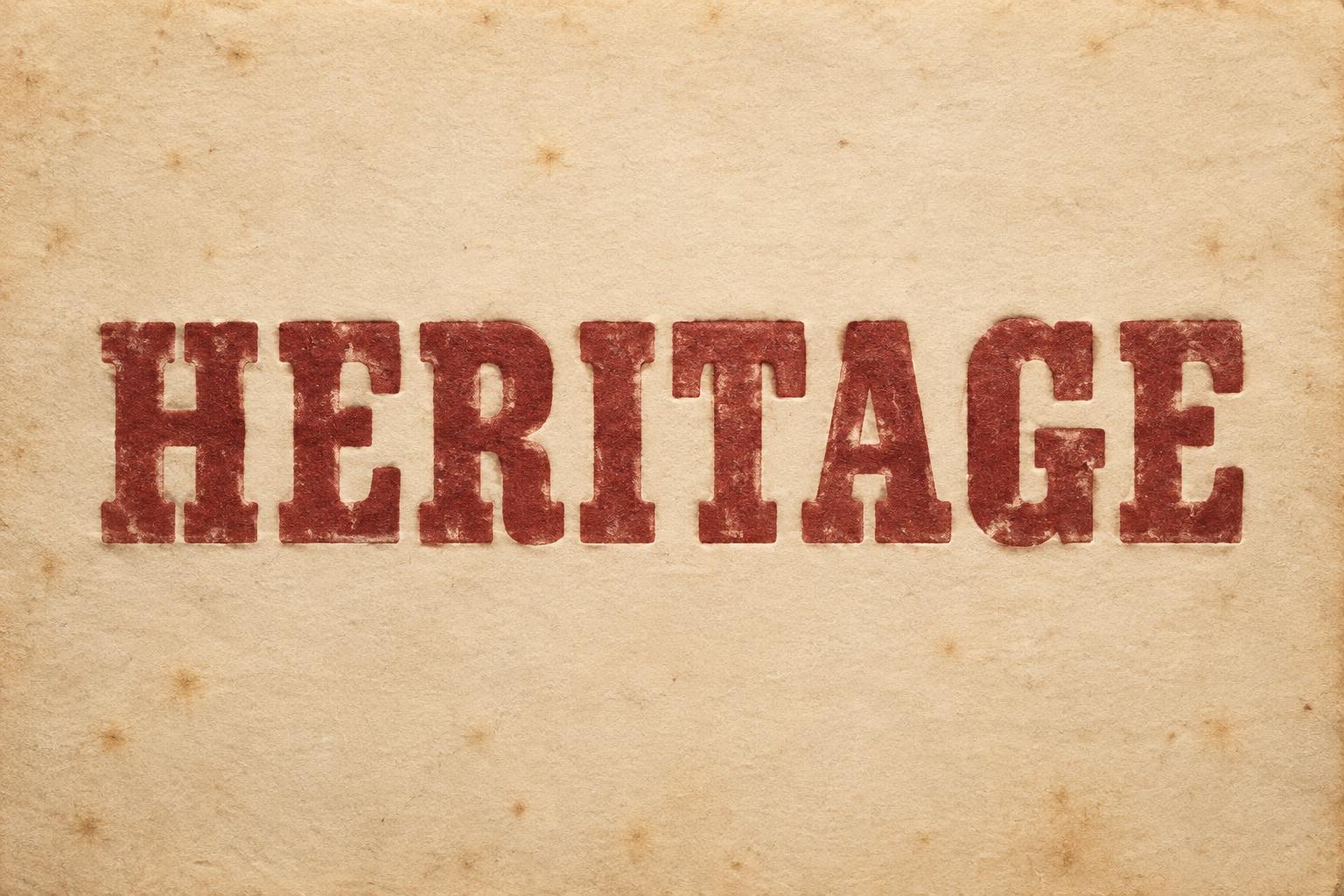
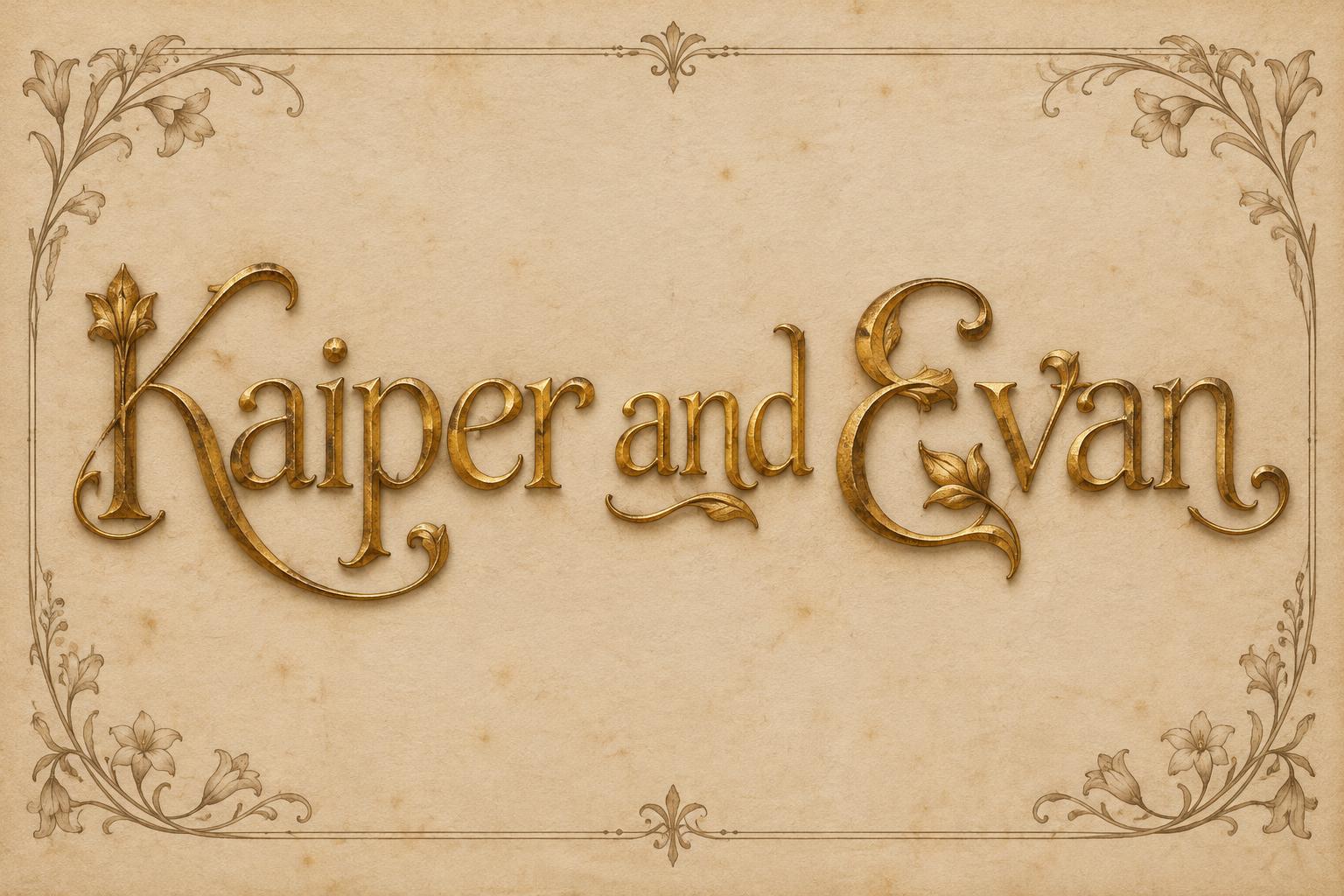
Serif capitals letterpress-bitten into cream cotton card with slightly broken ink, set on an old press bed among scattered metal type. — no font license needed.
Vintage in different AI fonts



What Will You Make?
Real use cases, real outputs. Pick your scene.


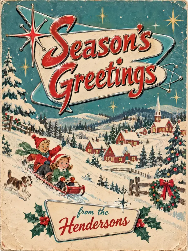
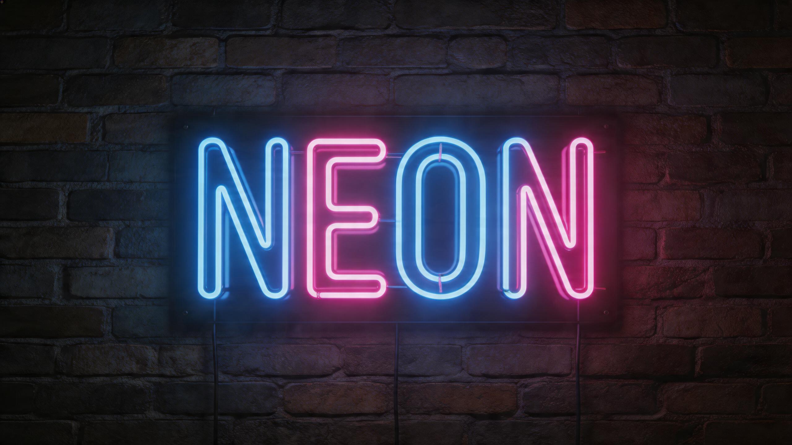
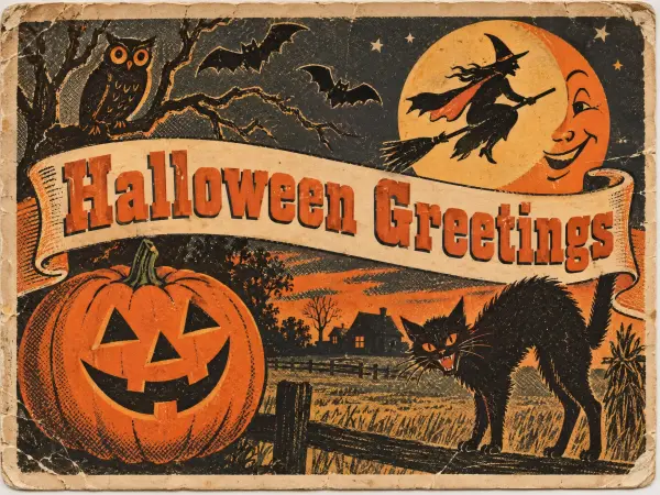
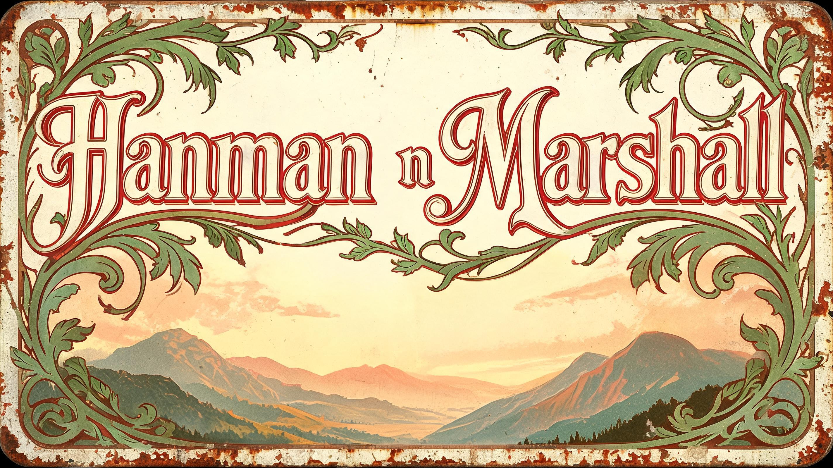
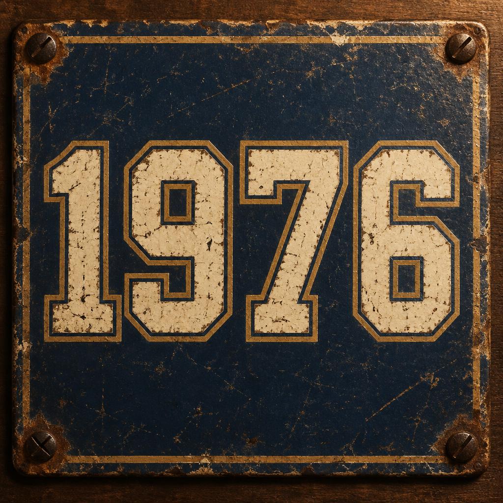
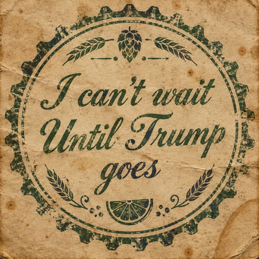
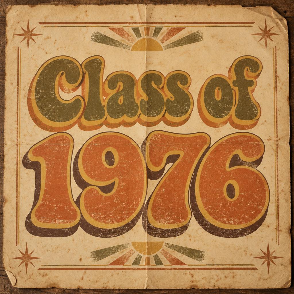
Vintage Gallery
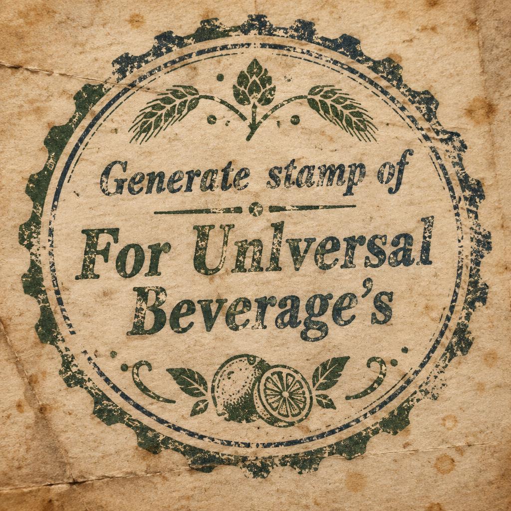
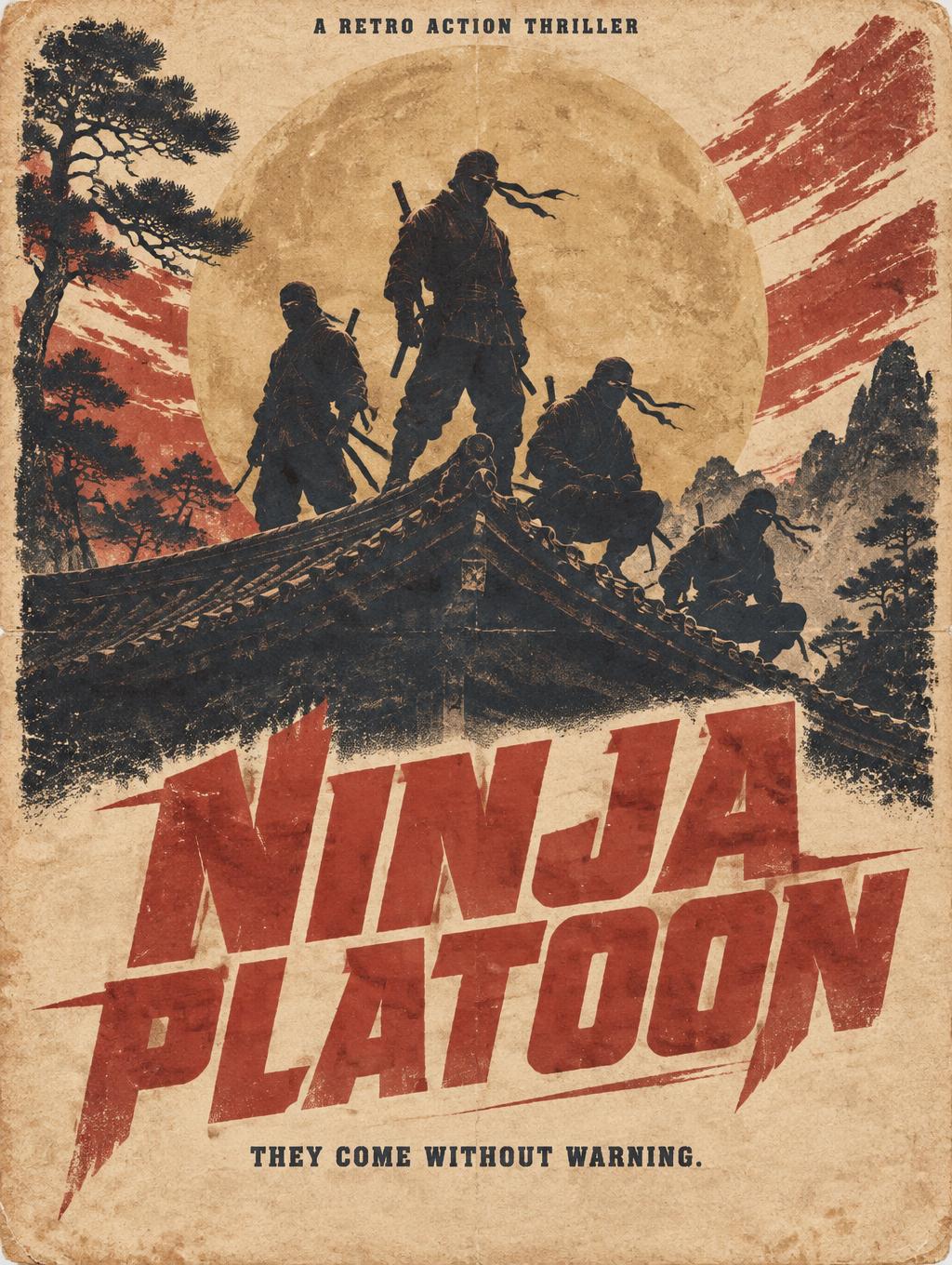
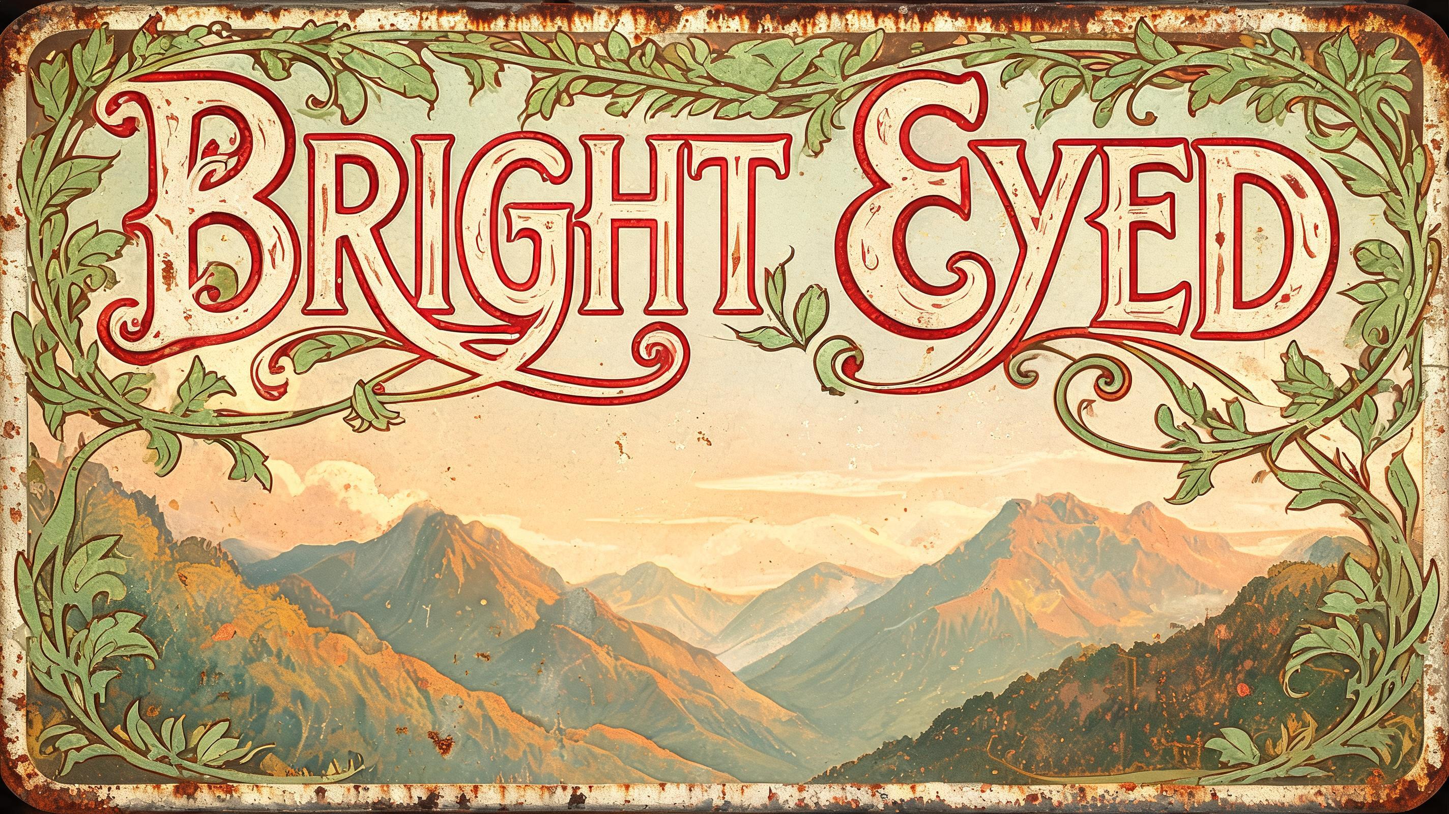
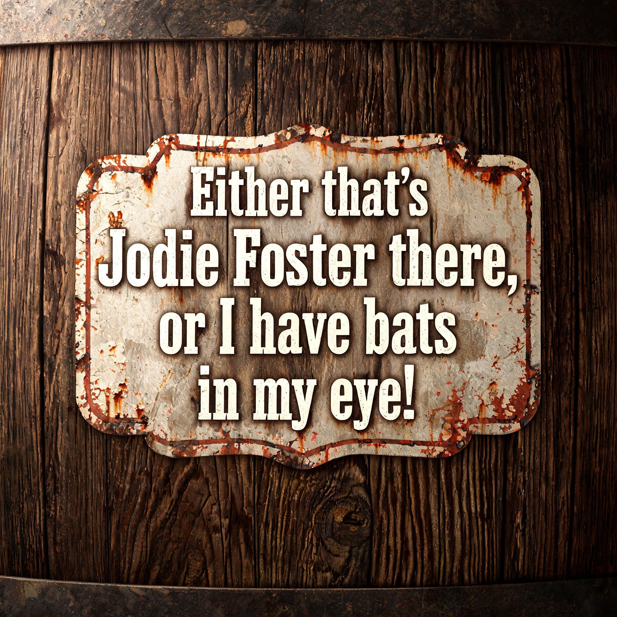
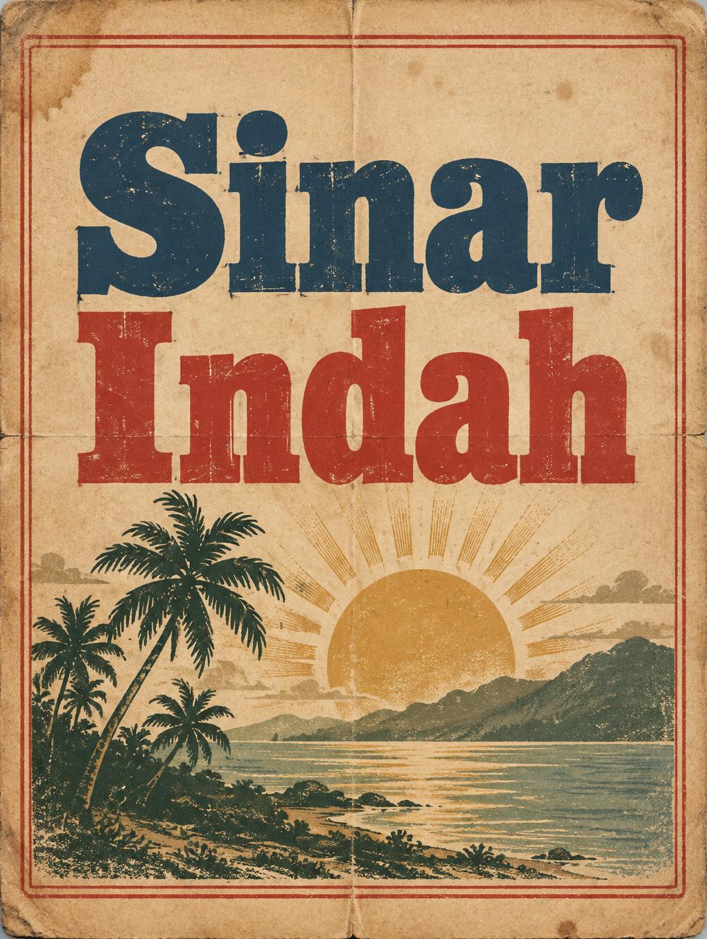
Real outputs from the Vintage style. Click any image to see details.
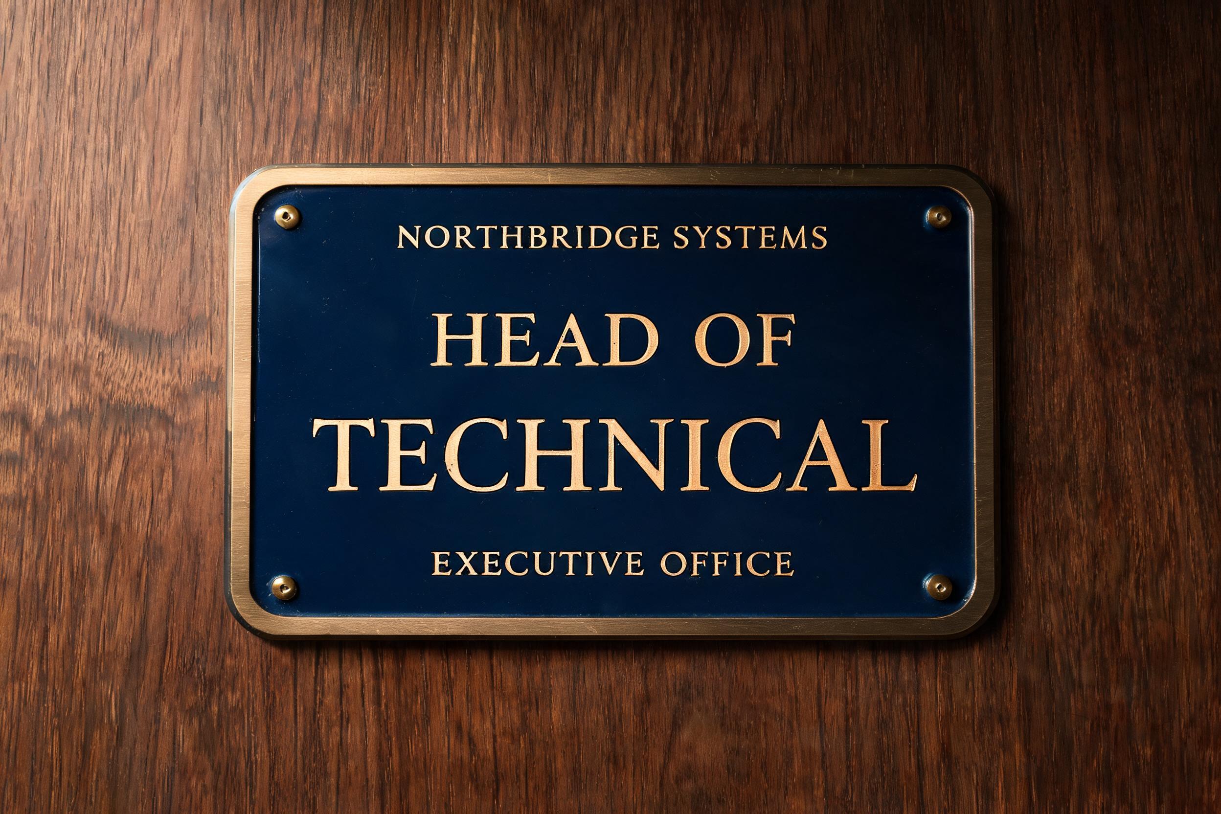
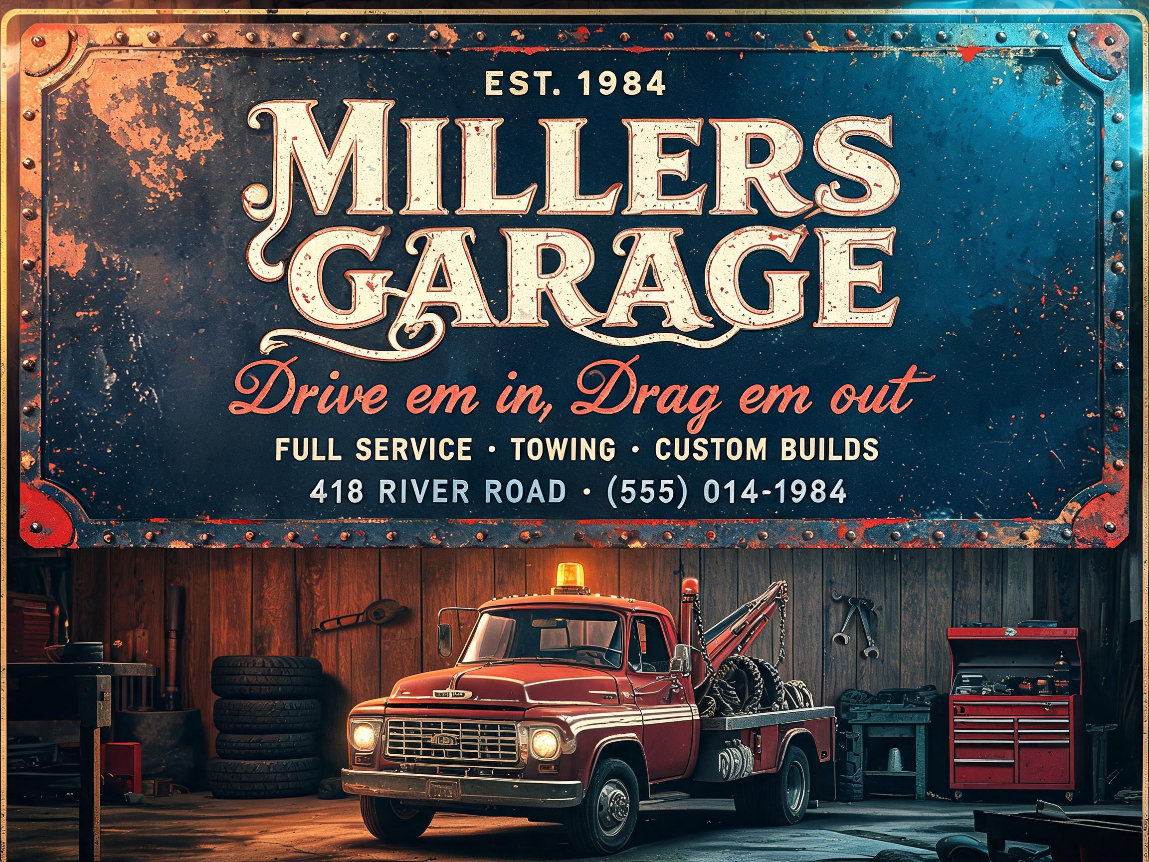
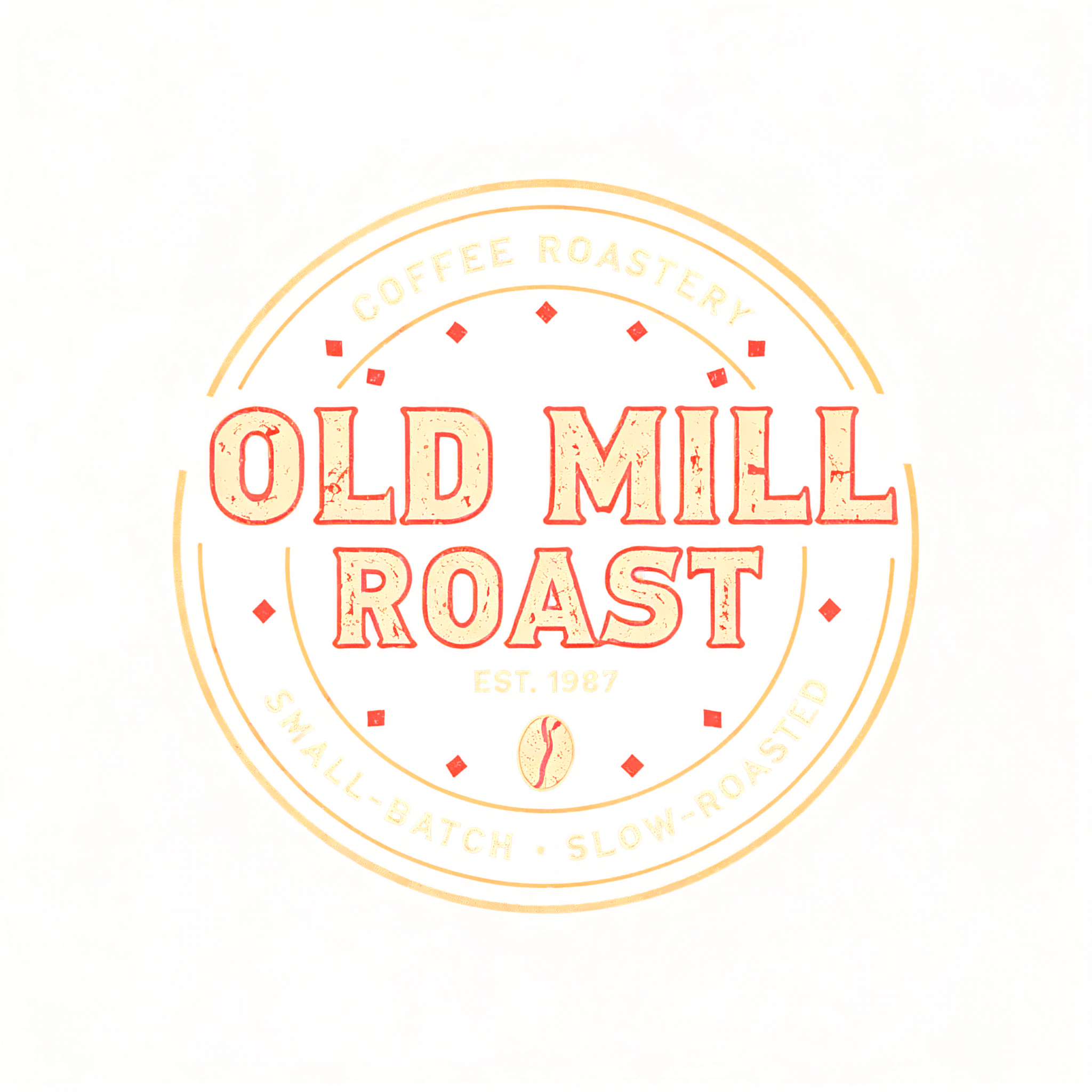
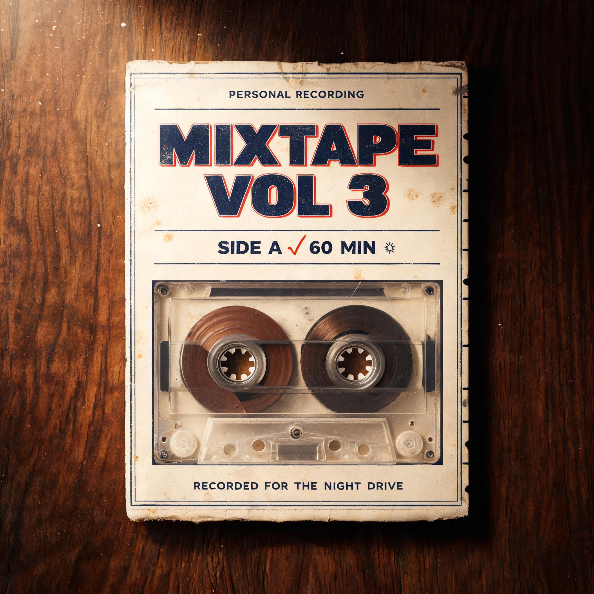
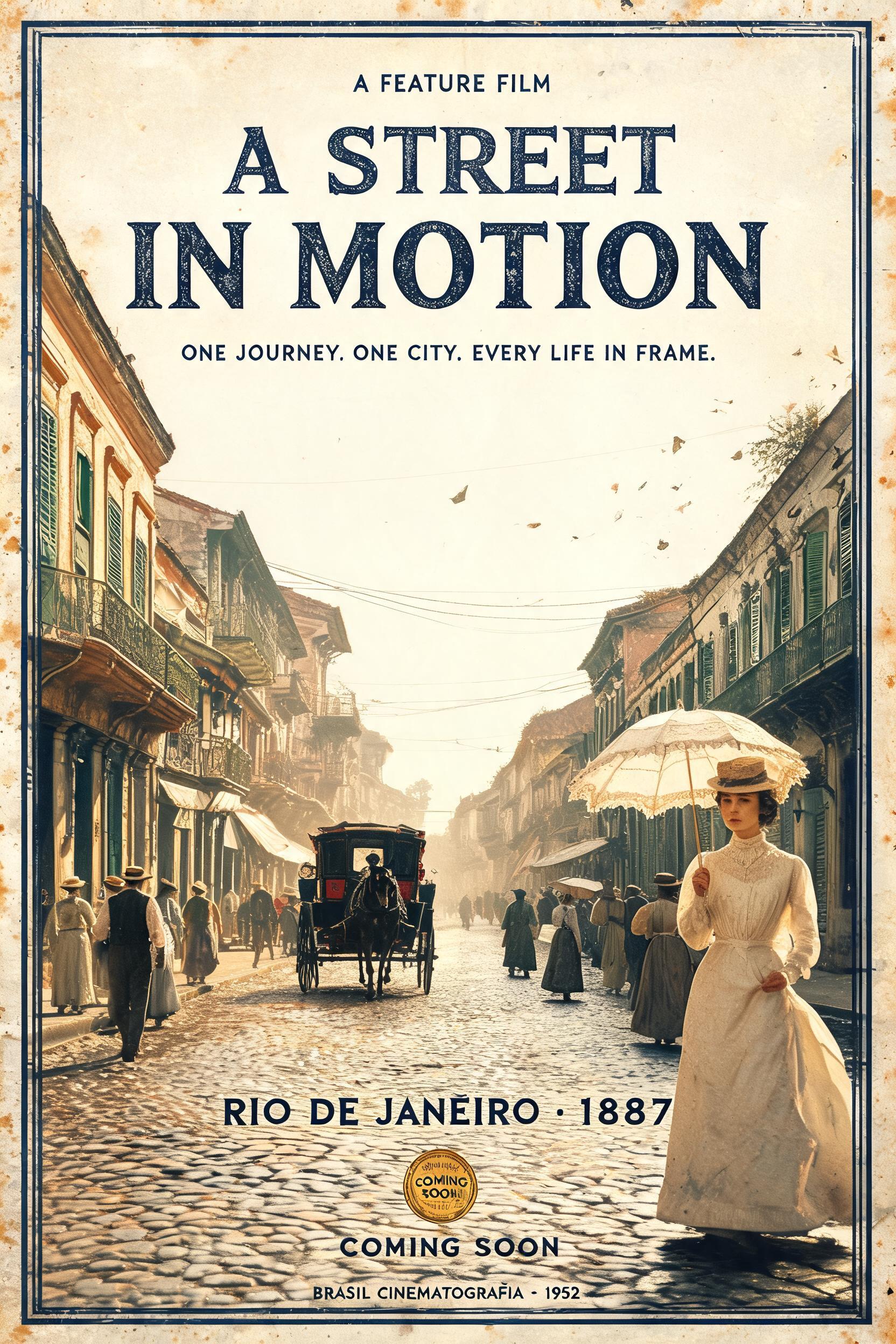
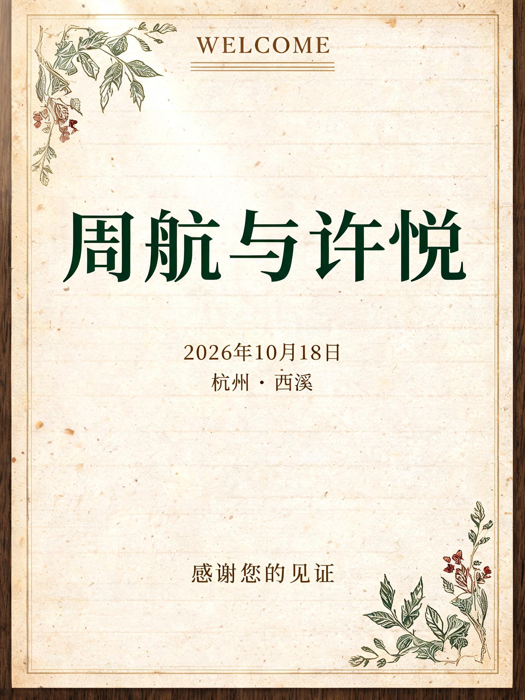
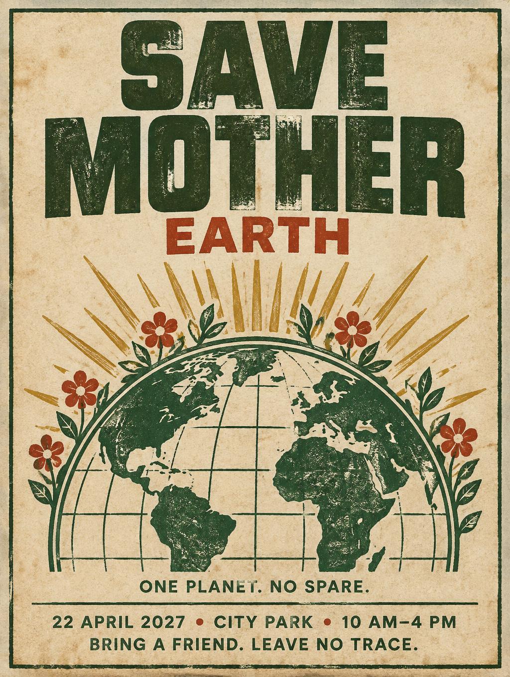
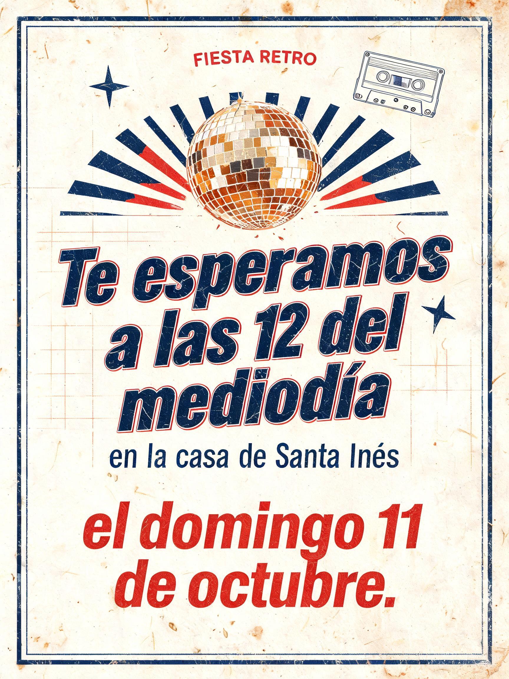
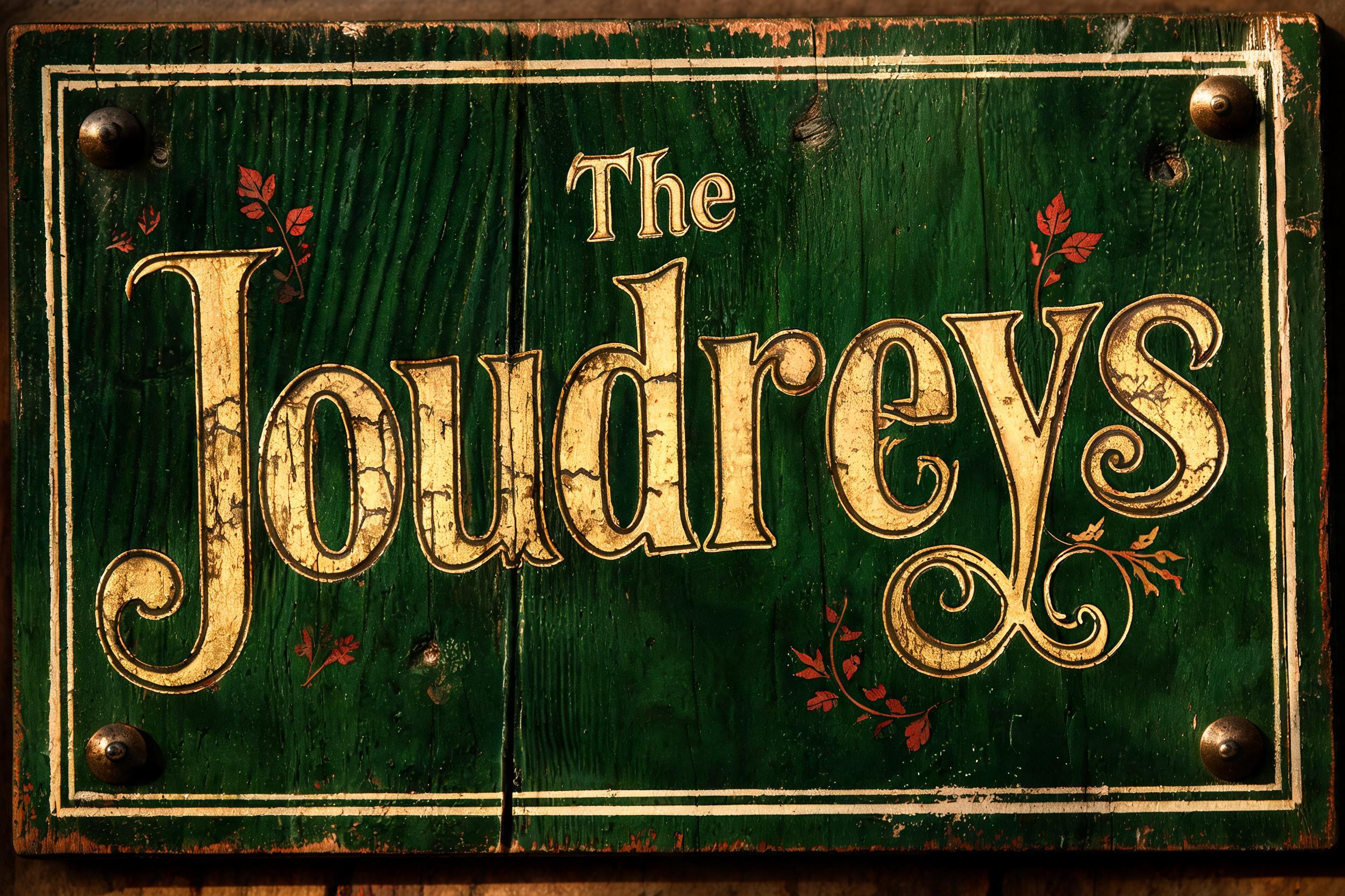
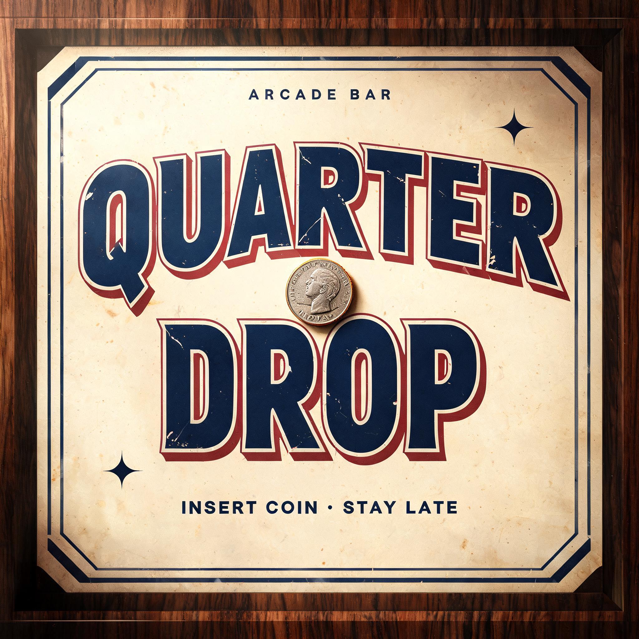
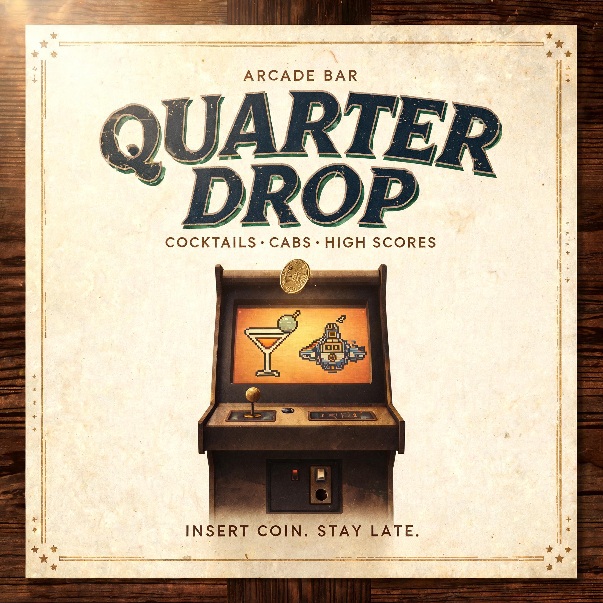
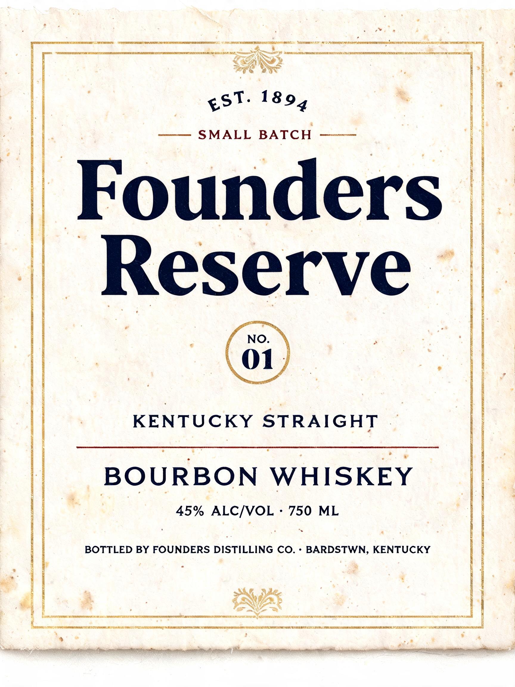
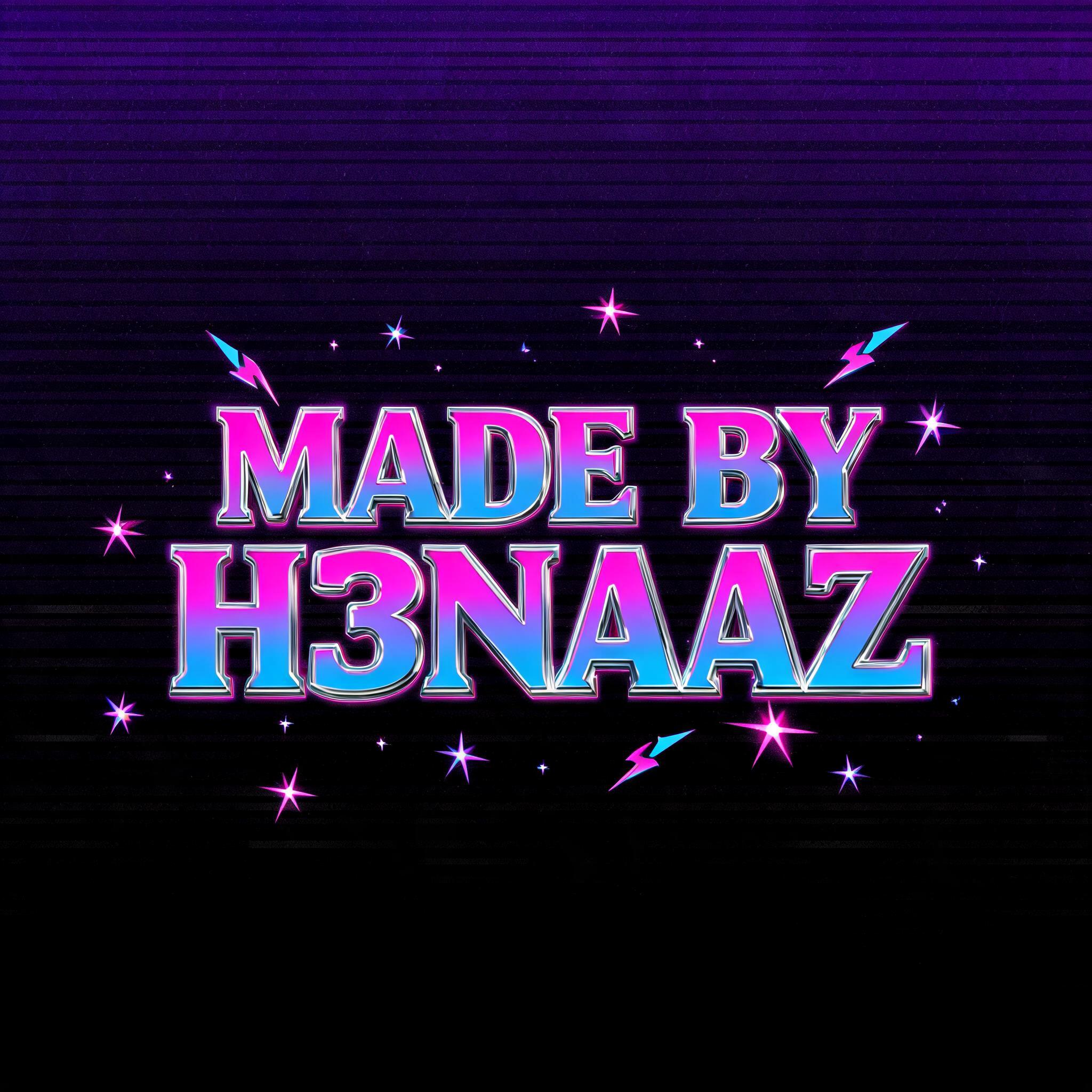
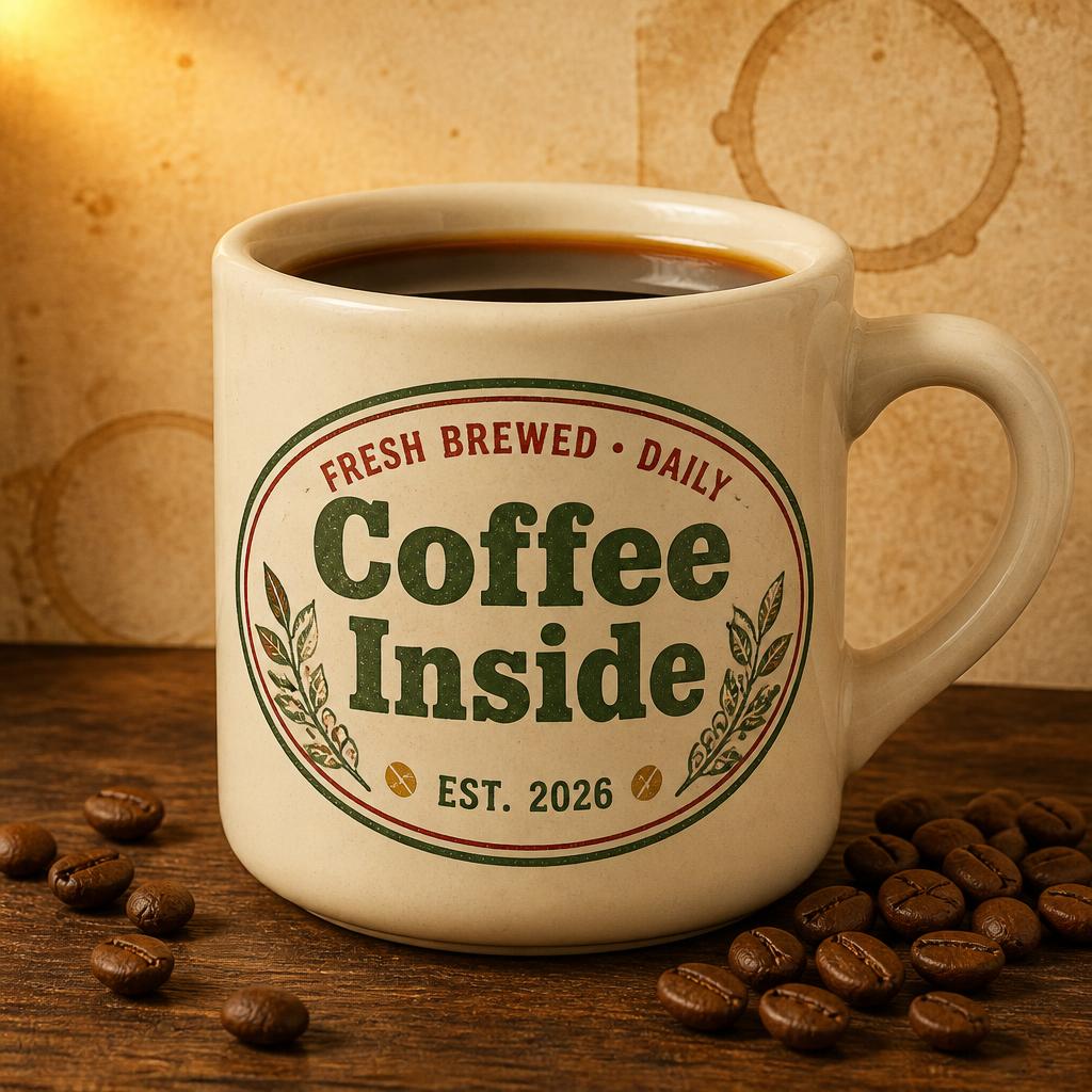
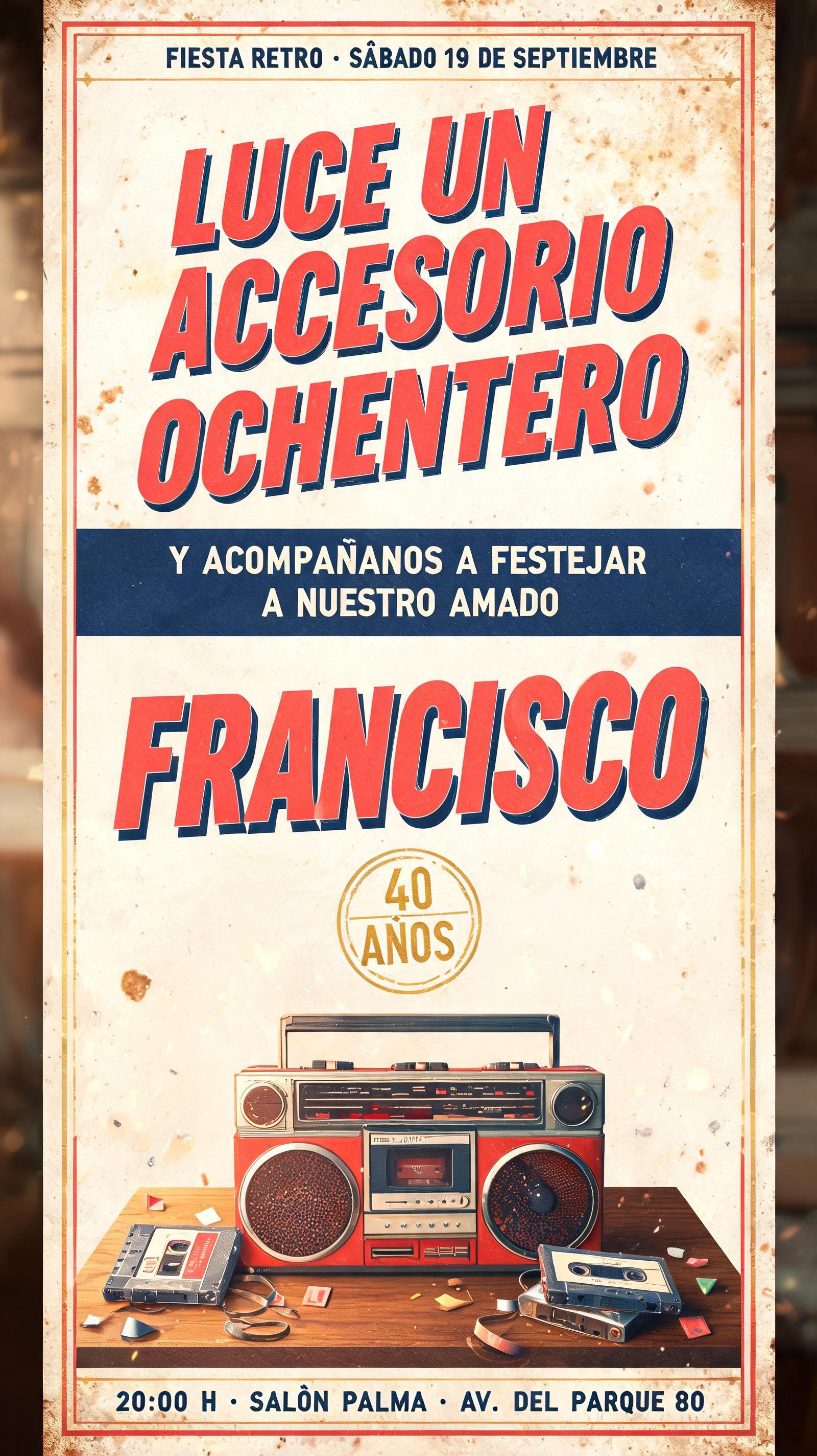
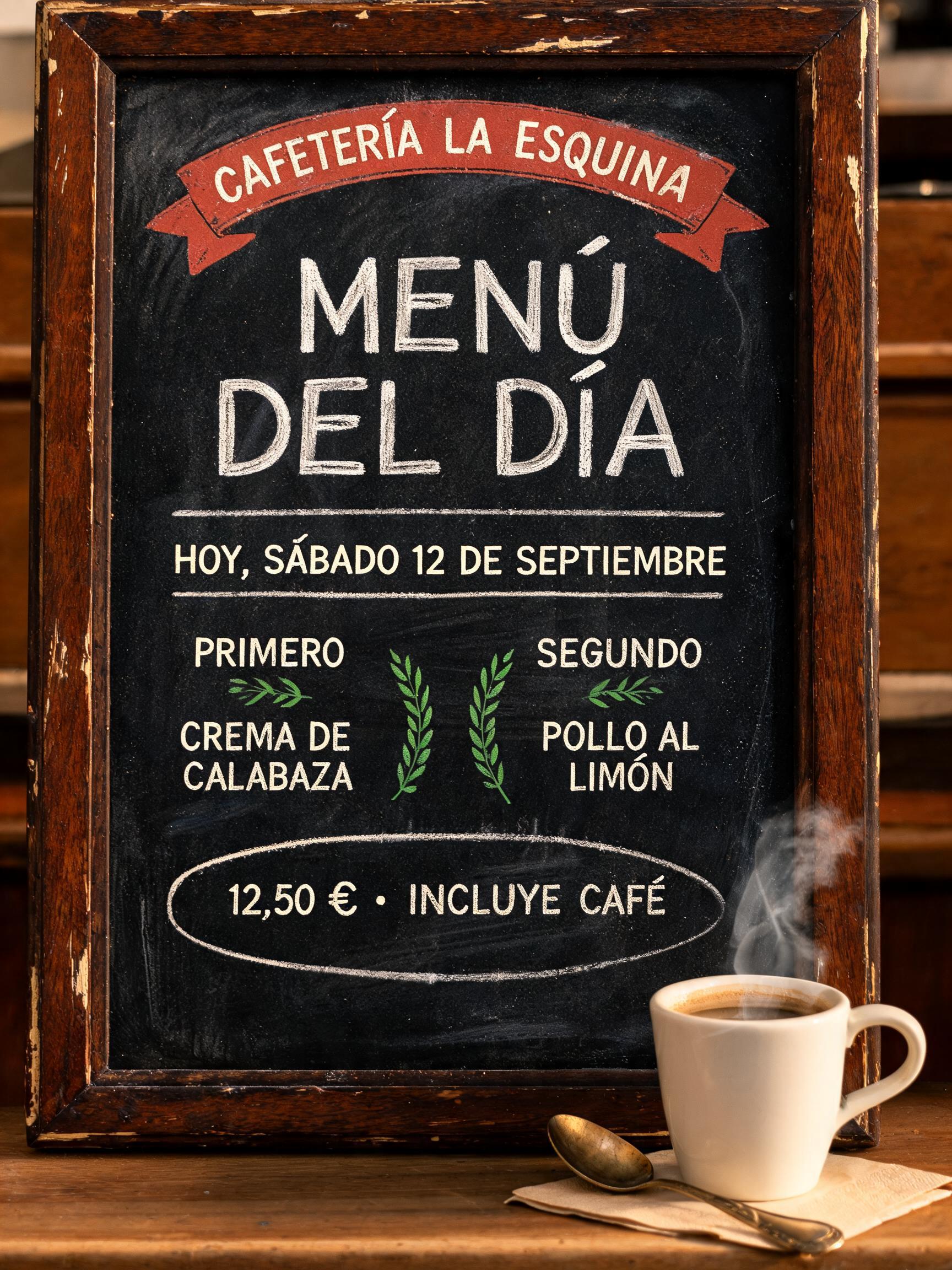
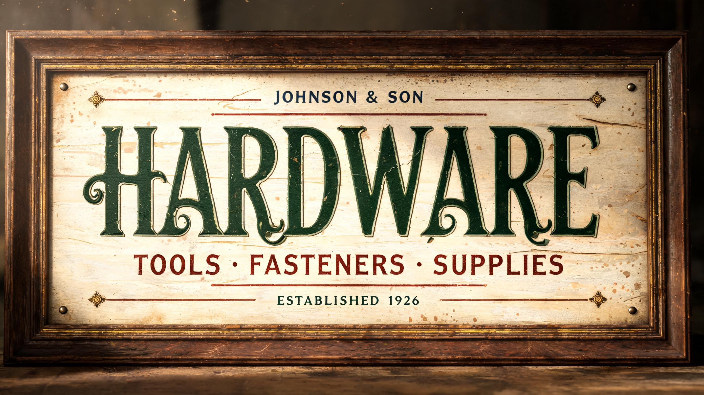
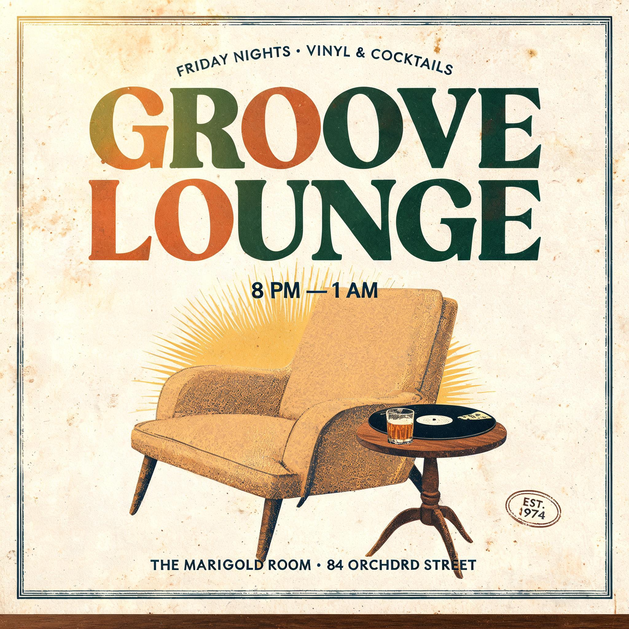
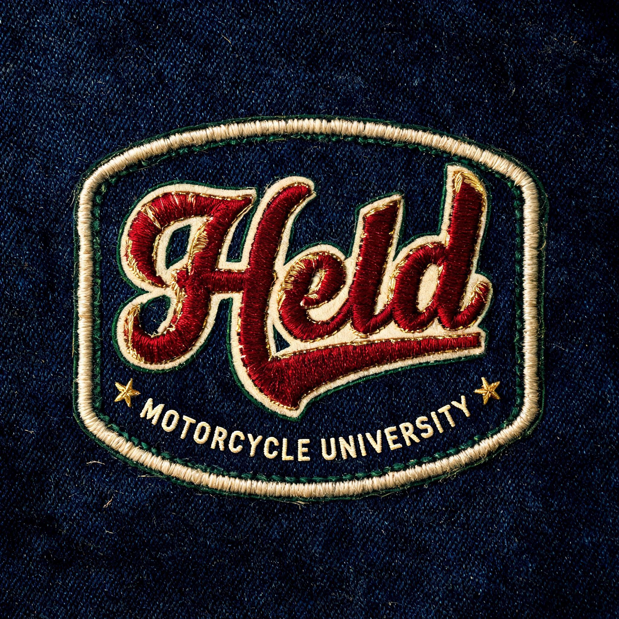


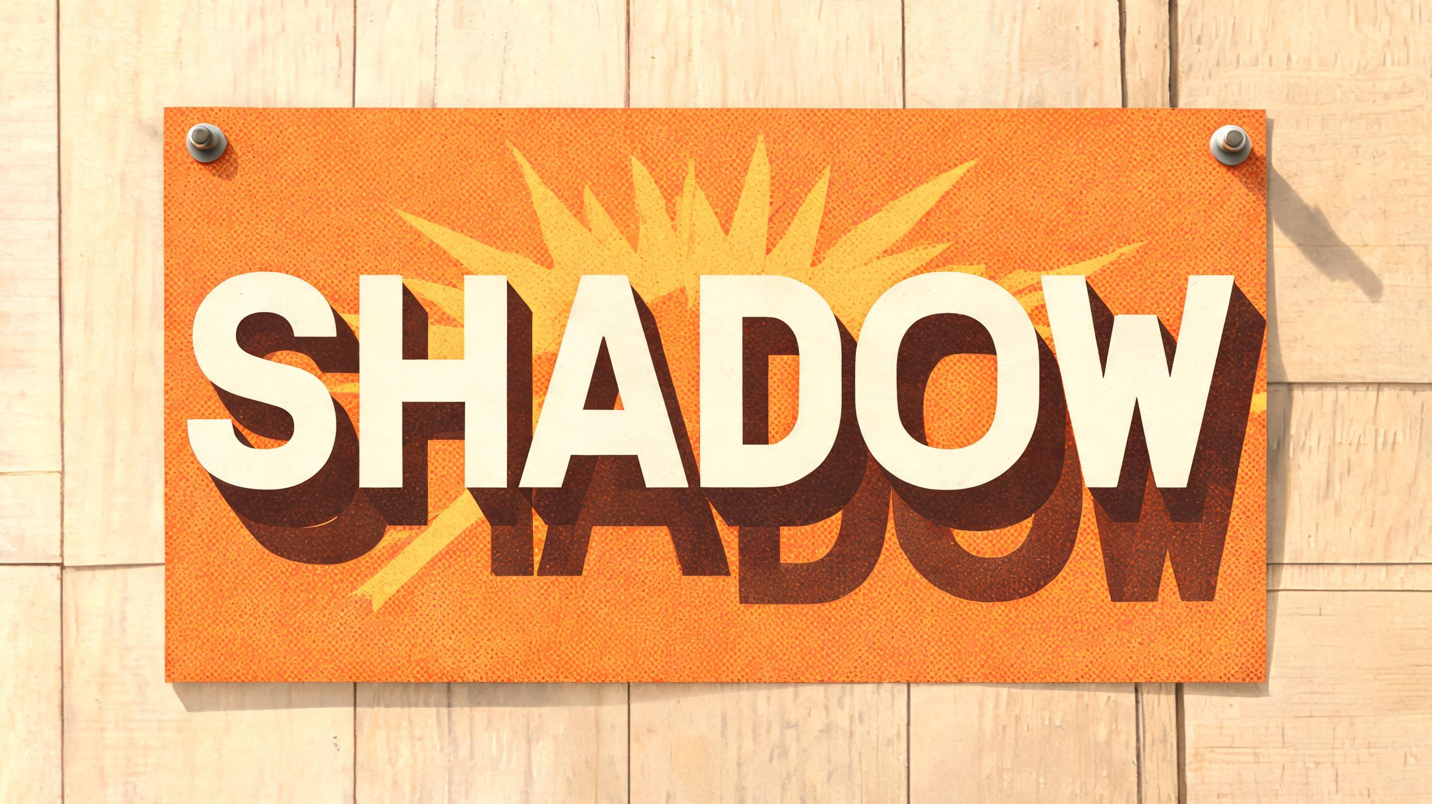






Looking for copy-paste fancy text? Try our free Font Generator Tools — cursive, gothic, bubble & 30+ styles.
Perfect for These Projects
Vintage Text Effect — FAQ
What is the Vintage Font Style?
The Vintage font style is a distinctive AI-generated typography effect. Serif capitals letterpress-bitten into cream cotton card with slightly broken ink, set on an old press bed among scattered metal type. Using FontVibe's AI vintage generator you can create stunning text effects in seconds — no Photoshop, no font licensing, no design experience needed.
Explore the Vintage gallery for inspiration, or browse all 134+ AI text effect styles available on FontVibe.
How to Create Vintage Typography in FontVibe Studio
The Story Behind Vintage
History, visual DNA, and cultural context.
The Typography of Trust
Vintage typography is not a single style — it is a cluster of print production technologies from different eras, all united by the physical evidence of their making. The letterpress, the lithograph, the woodblock, the screen print: each leaves different artifacts in the final printed object, and those artifacts are what we now call "vintage."
The American contribution is the most visually specific. Nineteenth-century wood type — large letterforms cut from end-grain maple for use in broadside printing, circus posters, and auction announcements — established the aesthetic that dominates what most people call "vintage typography": condensed display typefaces in multiple weights, set in horizontal bands, with heavy rules and ornamental borders. The Hamilton Type Foundry in Two Rivers, Wisconsin produced wood type from 1880 to 1985. Their catalog, which ran to hundreds of faces, is the visual DNA of American commercial printing.
European tin signs and enamel advertising from the same era contributed a different register: bold geometric sans-serifs, simple illustrated marks, a palette constrained by available enamel colors — cream, red, blue, black, ochre. These signs were designed to last decades outdoors. Their durability became their aesthetic; a sign that had survived weather became more credible than a new one.
The patina is the message. Vintage typography signals age, and age signals survival. A business whose visual identity looks like it has been around for a long time inherits that implied longevity, whether it was founded in 1890 or last Tuesday.
The Visual DNA
In Typography
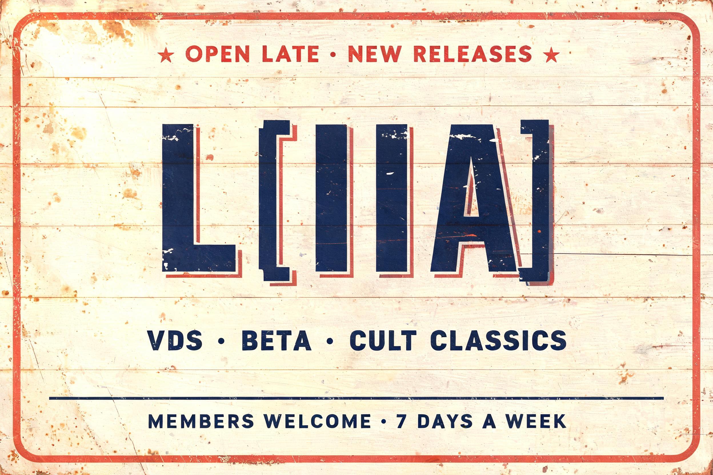
Vintage typography has become the default aesthetic for a specific set of contemporary categories: craft beer labels, artisan food packaging, barbershops, whiskey branding, independent coffee roasters, outdoor clothing. The visual language signals exactly the values these categories want to project: small-batch production, attention to craft, longevity, and a specific relationship with American or European history.
The challenge with vintage type is calibrating the age signal correctly. Too little texture and patina reads as "inspired by vintage but obviously contemporary"; too much reads as costume rather than character. The most effective vintage typography uses period-accurate letterforms with subtle texture — enough to feel earned, not so much that it overwhelms the content.
The authentic source material — Hamilton Wood Type Museum in Two Rivers, Wisconsin maintains the original wood type collection and still prints from it — remains the most reliable reference for what vintage American display typography actually looks like versus what it looks like when designed from memory.
Did You Know?
The Hamilton Wood Type and Printing Museum in Two Rivers, Wisconsin houses the world's largest collection of wood type — over 1.5 million pieces from the 19th and 20th centuries. The museum operates a working letterpress shop and continues to print from the original type. What was functional industrial equipment is now treated as cultural heritage.
The pointing hand or manicule is one of the oldest annotation marks in Western writing, appearing in European manuscripts from the 12th century. It migrated into letterpress printing as an ornamental pointer, and its current use in vintage design is an unbroken chain from medieval scribes to contemporary label designers — one of the longest-running typographic conventions in existence.
The American craft beer industry, which emerged in the 1980s–90s, standardized vintage typography as its primary visual language to distinguish small-batch products from mass-market brands. The signal has become so established that a new brewery choosing it today is not referencing history — it is buying into a category convention that is itself only about 40 years old.
Create Your Vintage Typography in Studio
Free to start. No design skills needed. Your artwork, your copyright.
AI Vintage Text Effect Generator
Serif capitals letterpress-bitten into cream cotton card with slightly broken ink, set on an old press bed among scattered metal type. — no font license needed.
Vintage in different AI fonts
What Will You Make?
Real use cases, real outputs. Pick your scene.
Generate Your Vintage Text Effect
Type any word — see it transformed in seconds. No sign-up required.
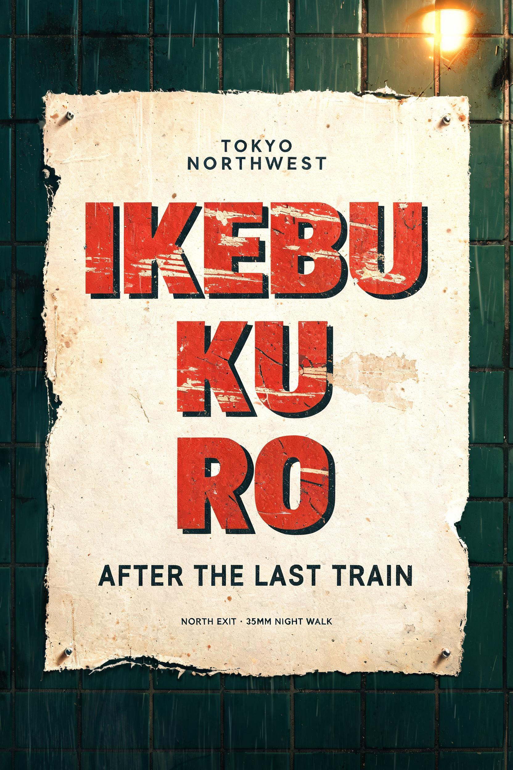
Vintage Style Gallery
Real outputs from the Vintage style. Click any image to see details.









Similar Text Effect Styles
Try these styles and create your own AI-generated text effects.
Looking for copy-paste fancy text? Try our free Font Generator Tools — cursive, gothic, bubble & 30+ styles.
Perfect for These Projects
Vintage text effects are popular for creative projects where visual impact matters.
What is the Vintage Font Style?
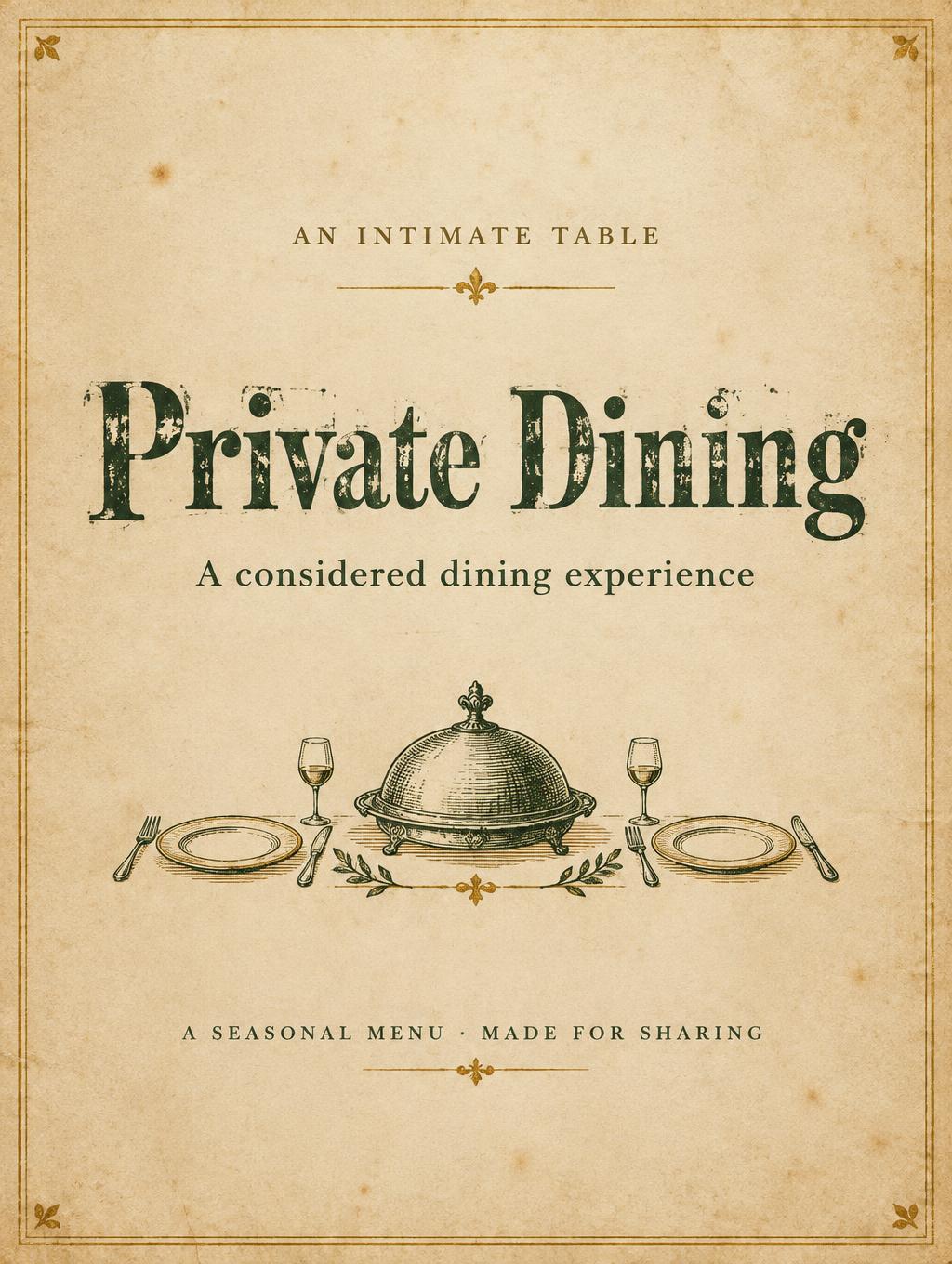
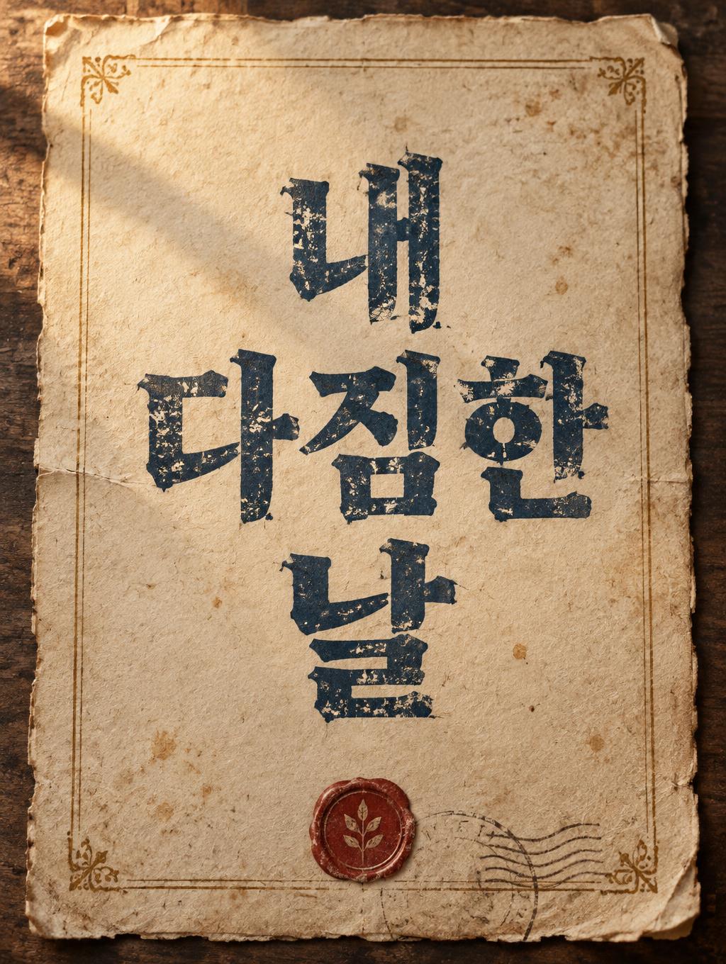
The Vintage font style is a distinctive AI-generated typography effect. Serif capitals letterpress-bitten into cream cotton card with slightly broken ink, set on an old press bed among scattered metal type.
Using FontVibe's AI vintage generator you can create stunning text effects in seconds — no Photoshop, no font licensing, no design experience needed.
Explore the Vintage gallery for inspiration, or browse all 134+ AI text effect styles available on FontVibe.
How to Create Vintage Typography in FontVibe Studio
1. Enter your text — Any word, phrase, or brand name. Works best with short, punchy text.
2. Select Vintage — From the style library. Optionally describe a mood in the custom prompt.
3. Generate and download. Your Vintage font artwork is ready in seconds. PNG, JPG, or transparent PNG.
Looking for something different? Browse the full font style library for more AI typography options.
Vintage Text Effect — FAQ
The Story Behind Vintage
History, visual DNA, and cultural context — everything that makes this style what it is.
The Typography of Trust
Vintage typography is not a single style — it is a cluster of print production technologies from different eras, all united by the physical evidence of their making. The letterpress, the lithograph, the woodblock, the screen print: each leaves different artifacts in the final printed object, and those artifacts are what we now call "vintage."
The American contribution is the most visually specific. Nineteenth-century wood type — large letterforms cut from end-grain maple for use in broadside printing, circus posters, and auction announcements — established the aesthetic that dominates what most people call "vintage typography": condensed display typefaces in multiple weights, set in horizontal bands, with heavy rules and ornamental borders. The Hamilton Type Foundry in Two Rivers, Wisconsin produced wood type from 1880 to 1985. Their catalog, which ran to hundreds of faces, is the visual DNA of American commercial printing.
European tin signs and enamel advertising from the same era contributed a different register: bold geometric sans-serifs, simple illustrated marks, a palette constrained by available enamel colors — cream, red, blue, black, ochre. These signs were designed to last decades outdoors. Their durability became their aesthetic; a sign that had survived weather became more credible than a new one.
The patina is the message. Vintage typography signals age, and age signals survival. A business whose visual identity looks like it has been around for a long time inherits that implied longevity, whether it was founded in 1890 or last Tuesday.
The Visual DNA
In Typography
Vintage typography has become the default aesthetic for a specific set of contemporary categories: craft beer labels, artisan food packaging, barbershops, whiskey branding, independent coffee roasters, outdoor clothing. The visual language signals exactly the values these categories want to project: small-batch production, attention to craft, longevity, and a specific relationship with American or European history.
The challenge with vintage type is calibrating the age signal correctly. Too little texture and patina reads as "inspired by vintage but obviously contemporary"; too much reads as costume rather than character. The most effective vintage typography uses period-accurate letterforms with subtle texture — enough to feel earned, not so much that it overwhelms the content.
The authentic source material — Hamilton Wood Type Museum in Two Rivers, Wisconsin maintains the original wood type collection and still prints from it — remains the most reliable reference for what vintage American display typography actually looks like versus what it looks like when designed from memory.
Did You Know?
The Hamilton Wood Type and Printing Museum in Two Rivers, Wisconsin houses the world's largest collection of wood type — over 1.5 million pieces from the 19th and 20th centuries. The museum operates a working letterpress shop and continues to print from the original type. What was functional industrial equipment is now treated as cultural heritage.
The pointing hand or manicule is one of the oldest annotation marks in Western writing, appearing in European manuscripts from the 12th century. It migrated into letterpress printing as an ornamental pointer, and its current use in vintage design is an unbroken chain from medieval scribes to contemporary label designers — one of the longest-running typographic conventions in existence.
The American craft beer industry, which emerged in the 1980s–90s, standardized vintage typography as its primary visual language to distinguish small-batch products from mass-market brands. The signal has become so established that a new brewery choosing it today is not referencing history — it is buying into a category convention that is itself only about 40 years old.