AI Long Shadow Text Effect Generator
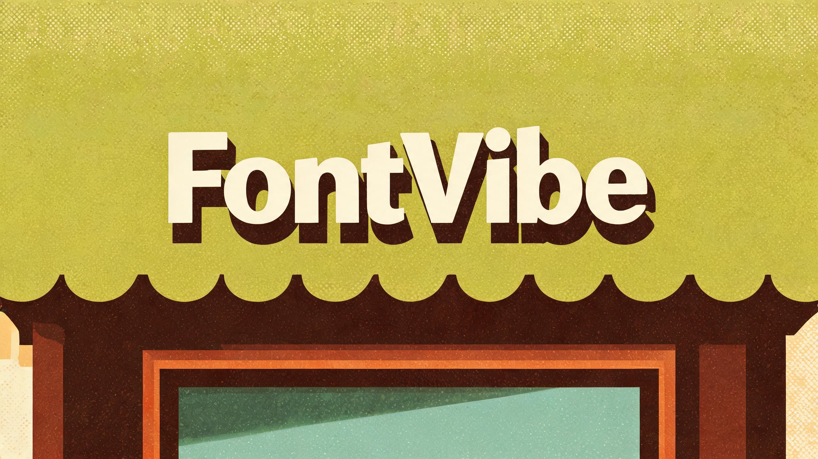
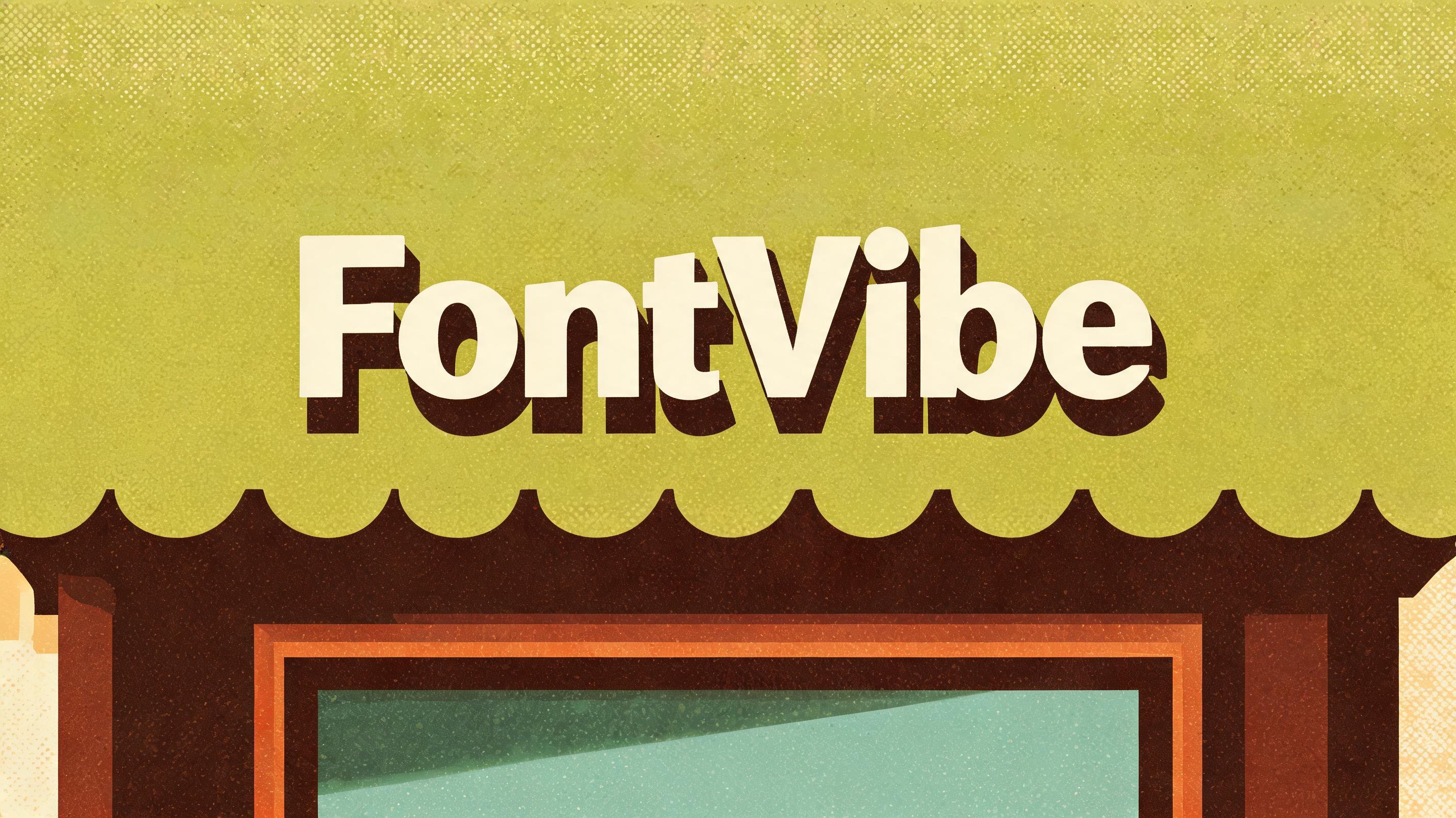
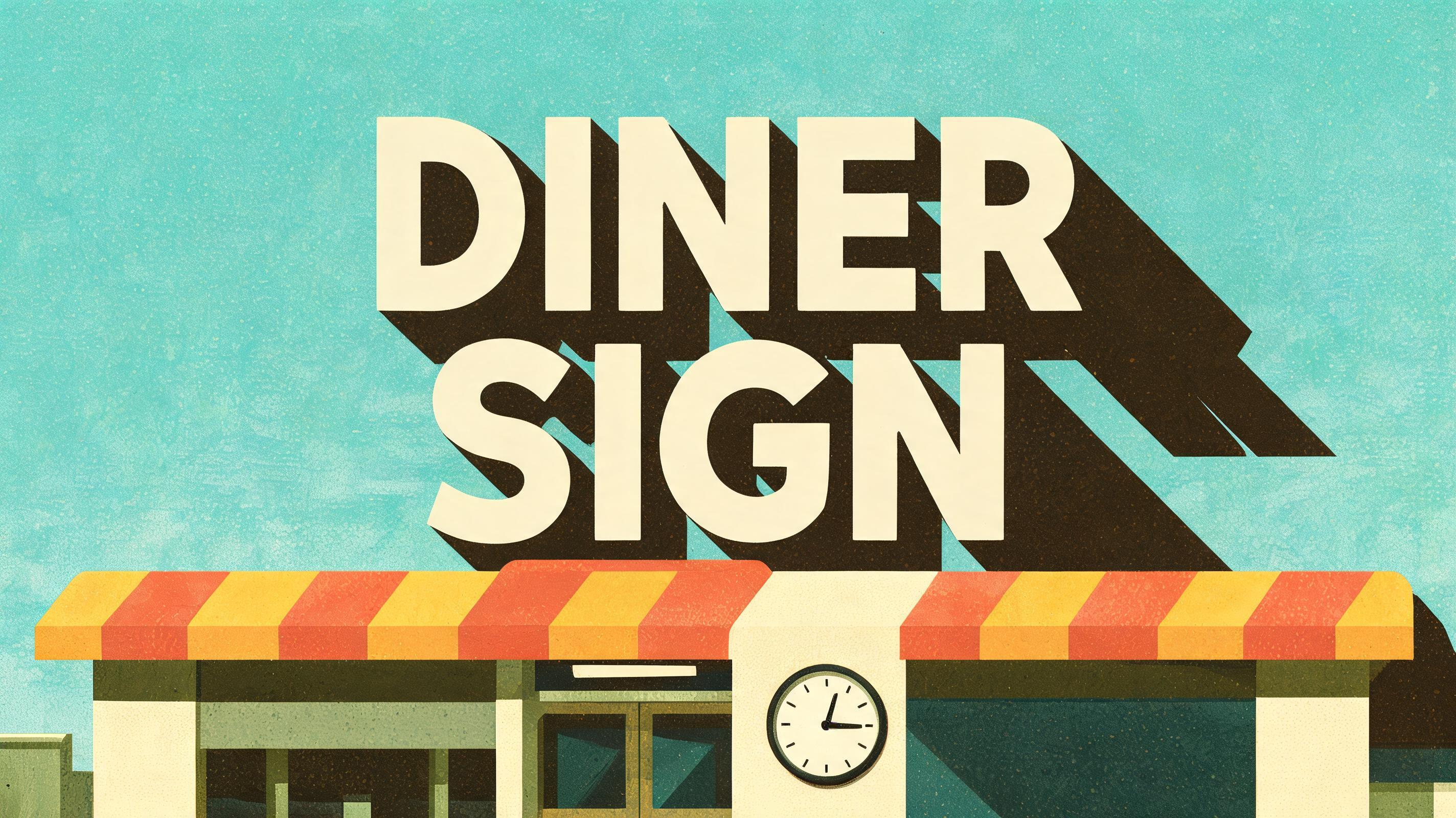
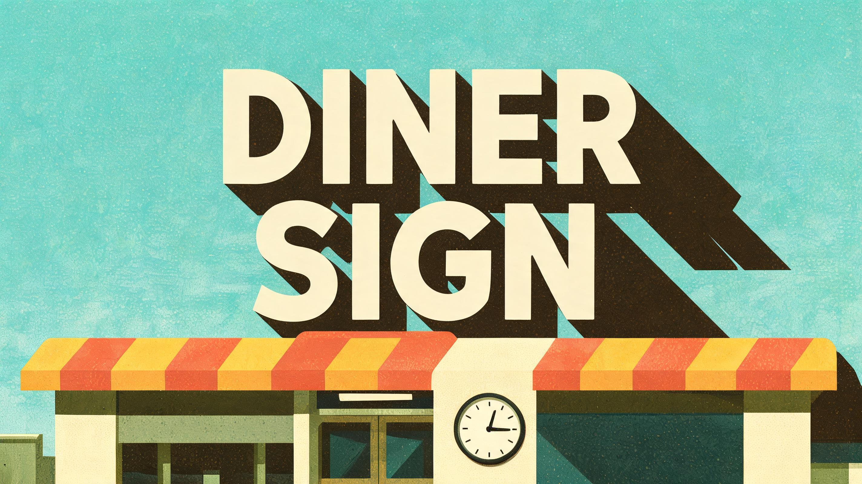
Bold 45-degree text shadow effects in flat retro-poster colors — the long shadow look vintage design templates are built on. — no font license needed.


Long Shadow Gallery
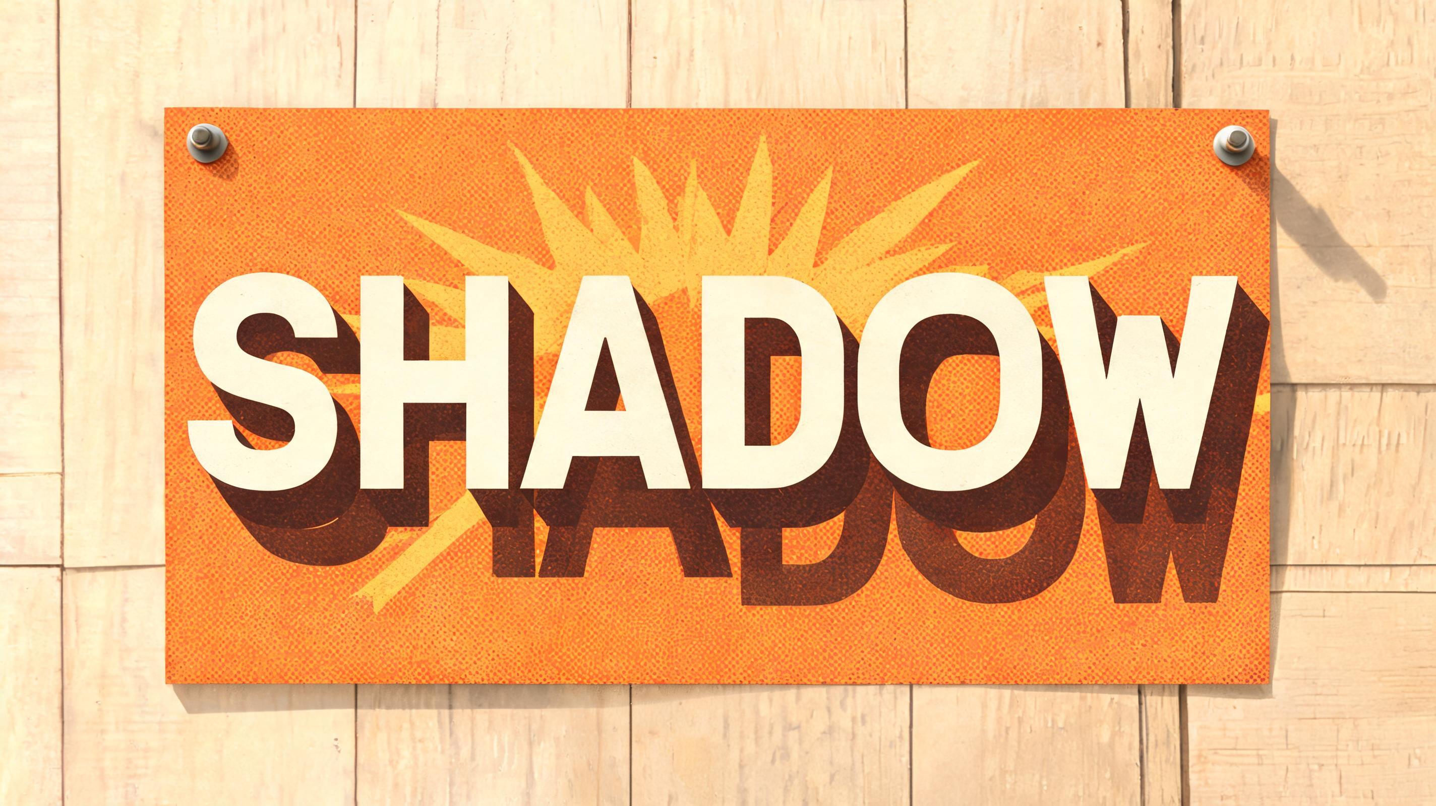
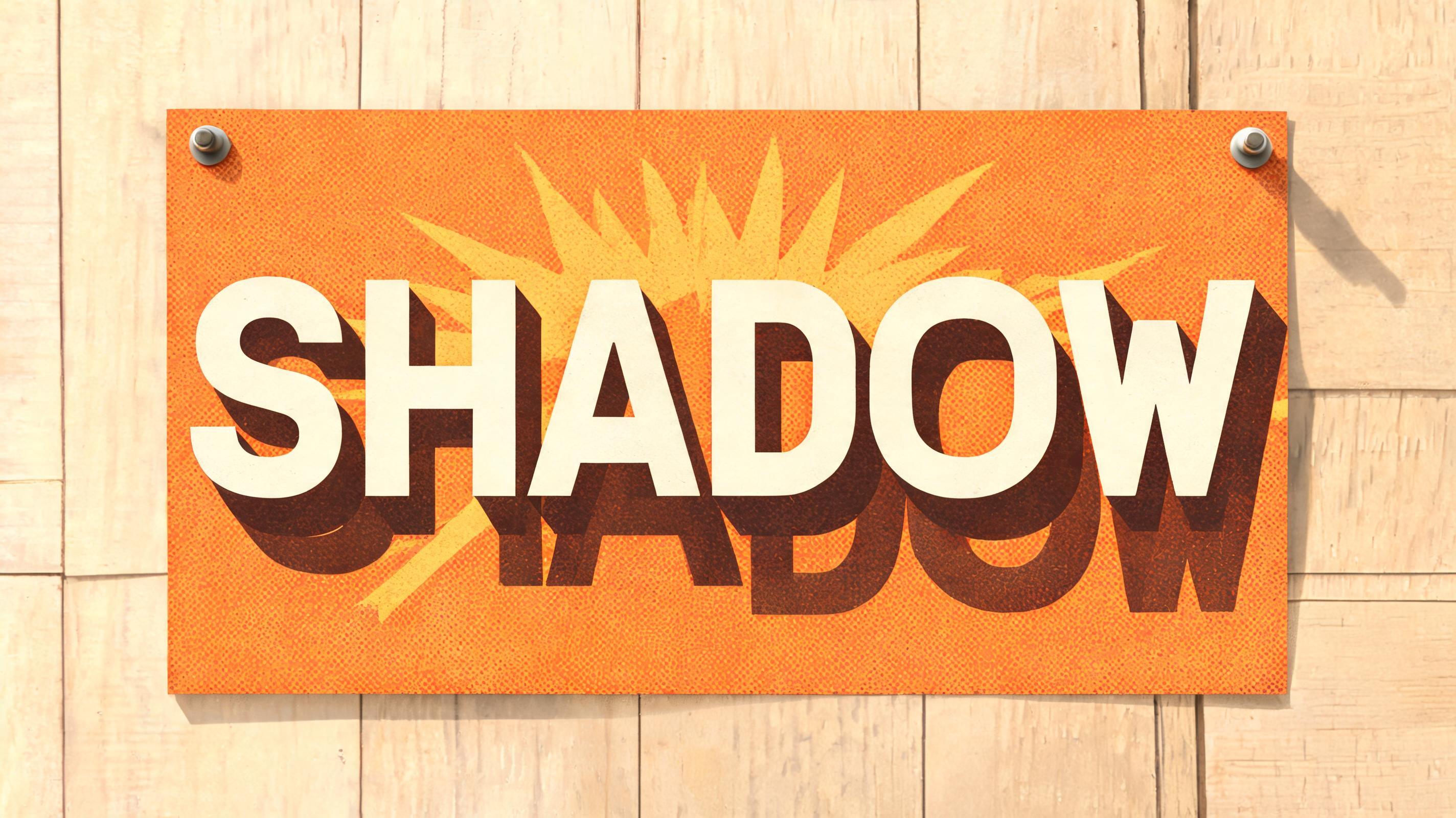
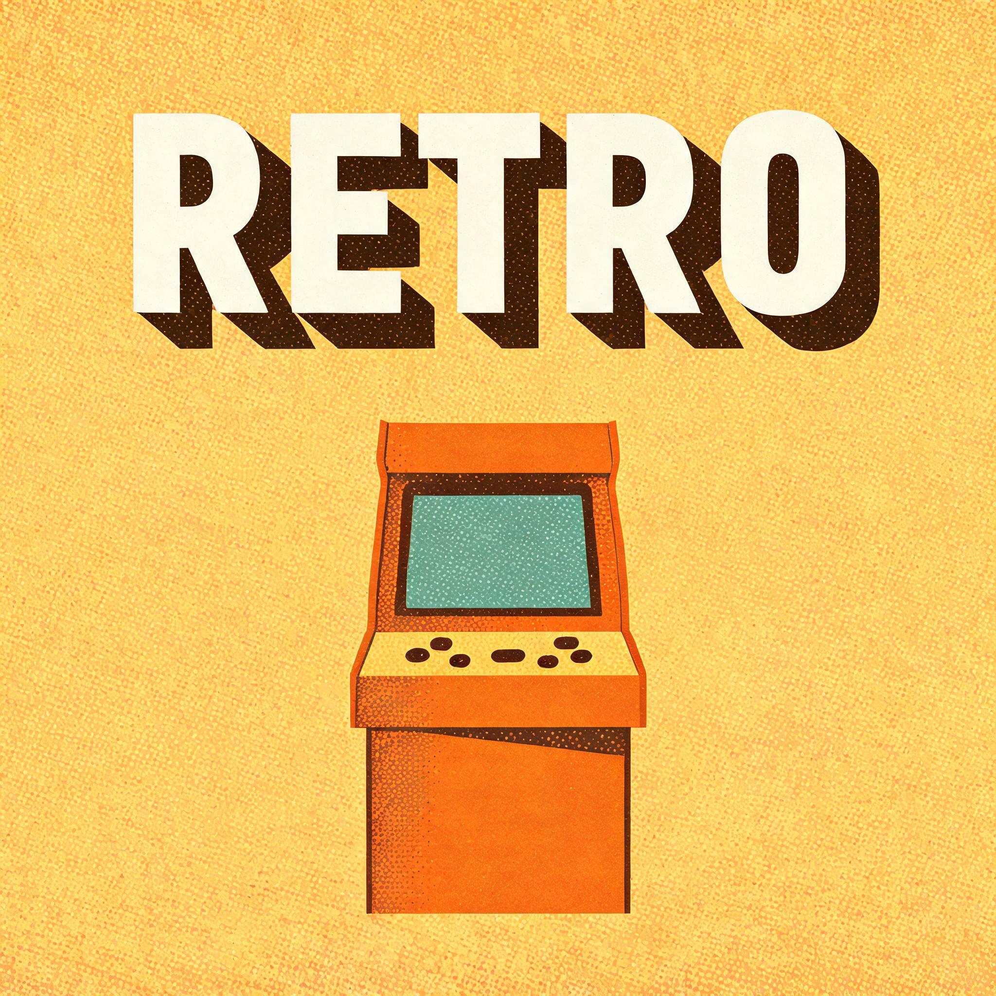
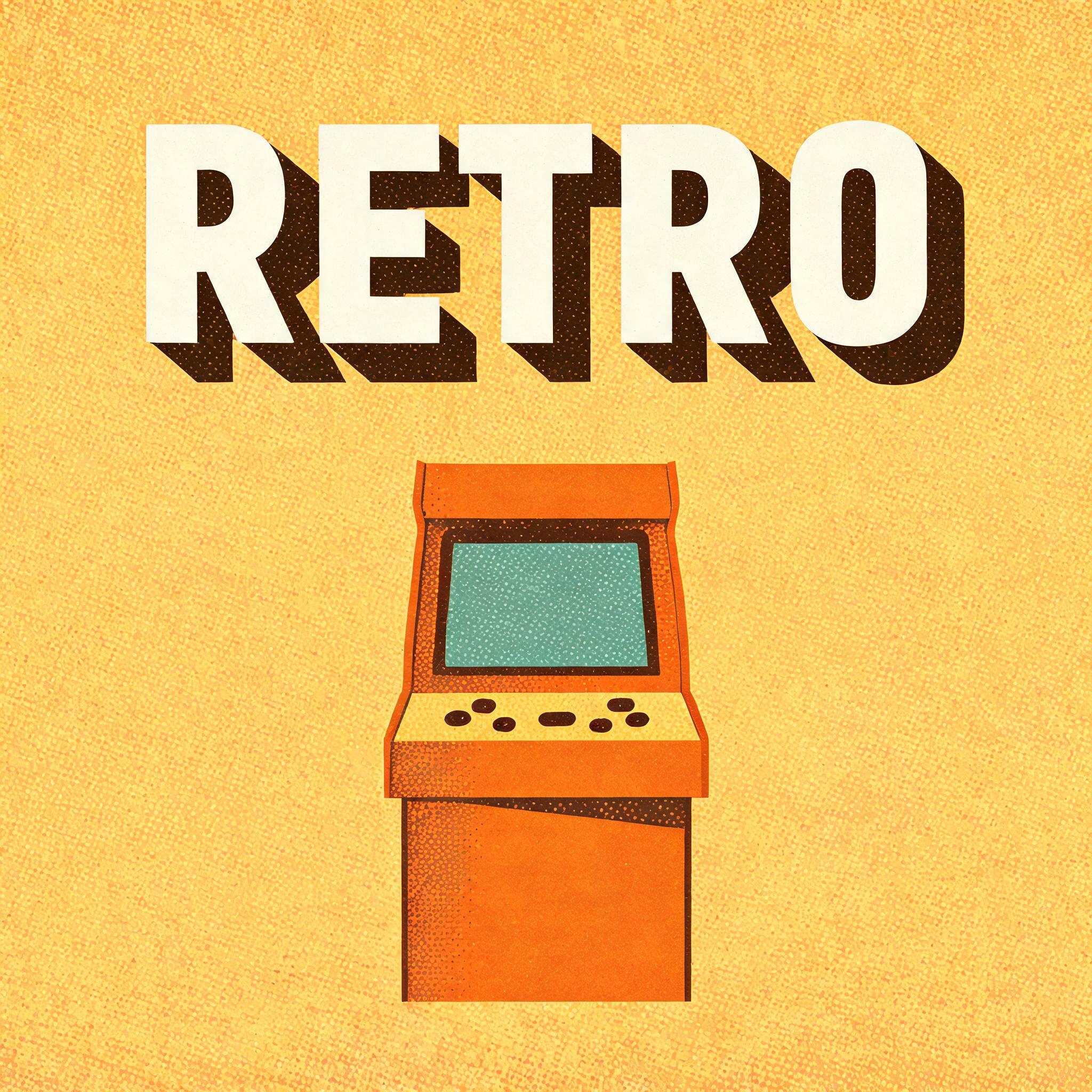
Real outputs from the Long Shadow style. Click any image to see details.


Looking for copy-paste fancy text? Try our free Font Generator Tools — cursive, gothic, bubble & 30+ styles.
Perfect for These Projects
Long Shadow Text Effect — FAQ
What is the Long Shadow Font Style?
The Long Shadow font style is a distinctive AI-generated typography effect. Bold 45-degree text shadow effects in flat retro-poster colors — the long shadow look vintage design templates are built on. Using FontVibe's AI long shadow generator you can create stunning text effects in seconds — no Photoshop, no font licensing, no design experience needed.
Explore the Long Shadow gallery for inspiration, or browse all 124+ AI text effect styles available on FontVibe.
How to Create Long Shadow Typography in FontVibe Studio
The Story Behind Long Shadow
History, visual DNA, and cultural context.
The Visual DNA
In Typography
A long shadow only reads correctly on short, bold words — a name, a headline, a single strong noun. Long paragraphs lose the effect because the shadows from adjacent letters start to overlap and muddy the background; the technique was built for icons and short display type, not body copy.
The 45-degree angle is not arbitrary — it is steep enough to read as a deliberate design choice rather than an accidental cast shadow, but shallow enough that the shadow stays legible as a distinct shape rather than folding back under the letter. Break that angle and the effect stops reading as 'long shadow' and starts reading as a mistake.
Keep the shadow flat. The moment a bevel, gradient, or highlight sneaks onto the shadow, it stops being a long shadow and becomes a 3D extrusion — a different effect with a different history.
Did You Know?
Designer Jeff Escalante coined and popularized "Long Shadow Design" in 2013, defining the shadow's length as roughly two-and-a-half times the object's own size and its angle as a consistent 45 degrees.
The technique caught on right as flat design was taking over mainstream software — Apple stripped away skeuomorphism for iOS 7 in 2013, the same year long shadows spread across icon design as a way to give flat shapes a hint of depth without breaking the flat aesthetic.
Windows 8's "Metro" design language, launched by Microsoft in 2012, was one of the design movements that set the stage for flat design's rise — the same movement long shadow icons emerged to complement a year later.
Create Your Long Shadow Typography in Studio
Free to start. No design skills needed. Your artwork, your copyright.
AI Long Shadow Text Effect Generator
Generate Your Long Shadow Text Effect
Type any word — see it transformed in seconds. No sign-up required.
Long Shadow Style Gallery
Real outputs from the Long Shadow style. Click any image to see details.


Similar Text Effect Styles
Try these styles and create your own AI-generated text effects.
Looking for copy-paste fancy text? Try our free Font Generator Tools — cursive, gothic, bubble & 30+ styles.
Perfect for These Projects
Long Shadow text effects are popular for creative projects where visual impact matters.
What is the Long Shadow Font Style?
The Long Shadow font style is a distinctive AI-generated typography effect. Bold 45-degree text shadow effects in flat retro-poster colors — the long shadow look vintage design templates are built on.
Using FontVibe's AI long shadow generator you can create stunning text effects in seconds — no Photoshop, no font licensing, no design experience needed.
Explore the Long Shadow gallery for inspiration, or browse all 124+ AI text effect styles available on FontVibe.
How to Create Long Shadow Typography in FontVibe Studio
1. Enter your text — Any word, phrase, or brand name. Works best with short, punchy text.
2. Select Long Shadow — From the style library. Optionally describe a mood in the custom prompt.
3. Generate and download. Your Long Shadow font artwork is ready in seconds. PNG, JPG, or transparent PNG.
Looking for something different? Browse the full font style library for more AI typography options.
Long Shadow Text Effect — FAQ
The Story Behind Long Shadow
History, visual DNA, and cultural context — everything that makes this style what it is.
The Visual DNA
In Typography
A long shadow only reads correctly on short, bold words — a name, a headline, a single strong noun. Long paragraphs lose the effect because the shadows from adjacent letters start to overlap and muddy the background; the technique was built for icons and short display type, not body copy.
The 45-degree angle is not arbitrary — it is steep enough to read as a deliberate design choice rather than an accidental cast shadow, but shallow enough that the shadow stays legible as a distinct shape rather than folding back under the letter. Break that angle and the effect stops reading as 'long shadow' and starts reading as a mistake.
Keep the shadow flat. The moment a bevel, gradient, or highlight sneaks onto the shadow, it stops being a long shadow and becomes a 3D extrusion — a different effect with a different history.
Did You Know?
Designer Jeff Escalante coined and popularized "Long Shadow Design" in 2013, defining the shadow's length as roughly two-and-a-half times the object's own size and its angle as a consistent 45 degrees.
The technique caught on right as flat design was taking over mainstream software — Apple stripped away skeuomorphism for iOS 7 in 2013, the same year long shadows spread across icon design as a way to give flat shapes a hint of depth without breaking the flat aesthetic.
Windows 8's "Metro" design language, launched by Microsoft in 2012, was one of the design movements that set the stage for flat design's rise — the same movement long shadow icons emerged to complement a year later.