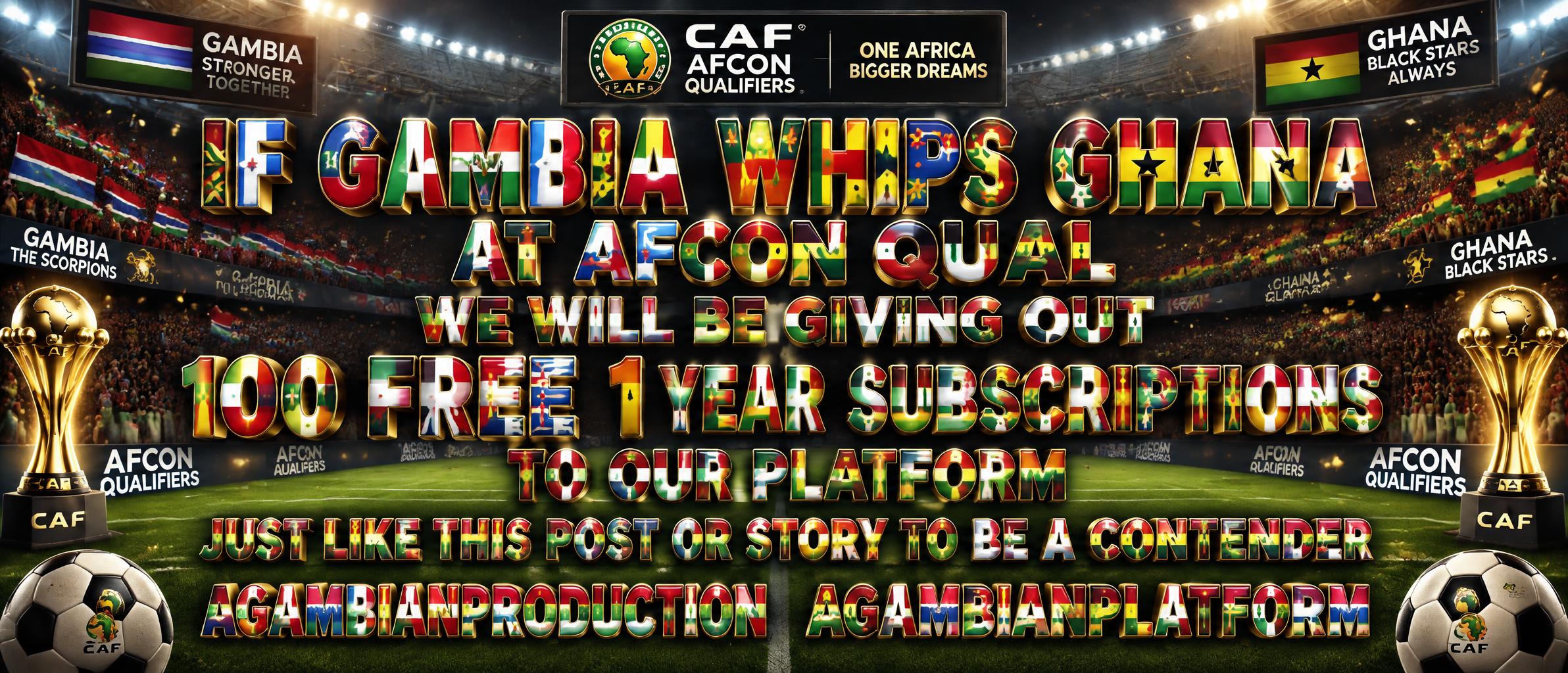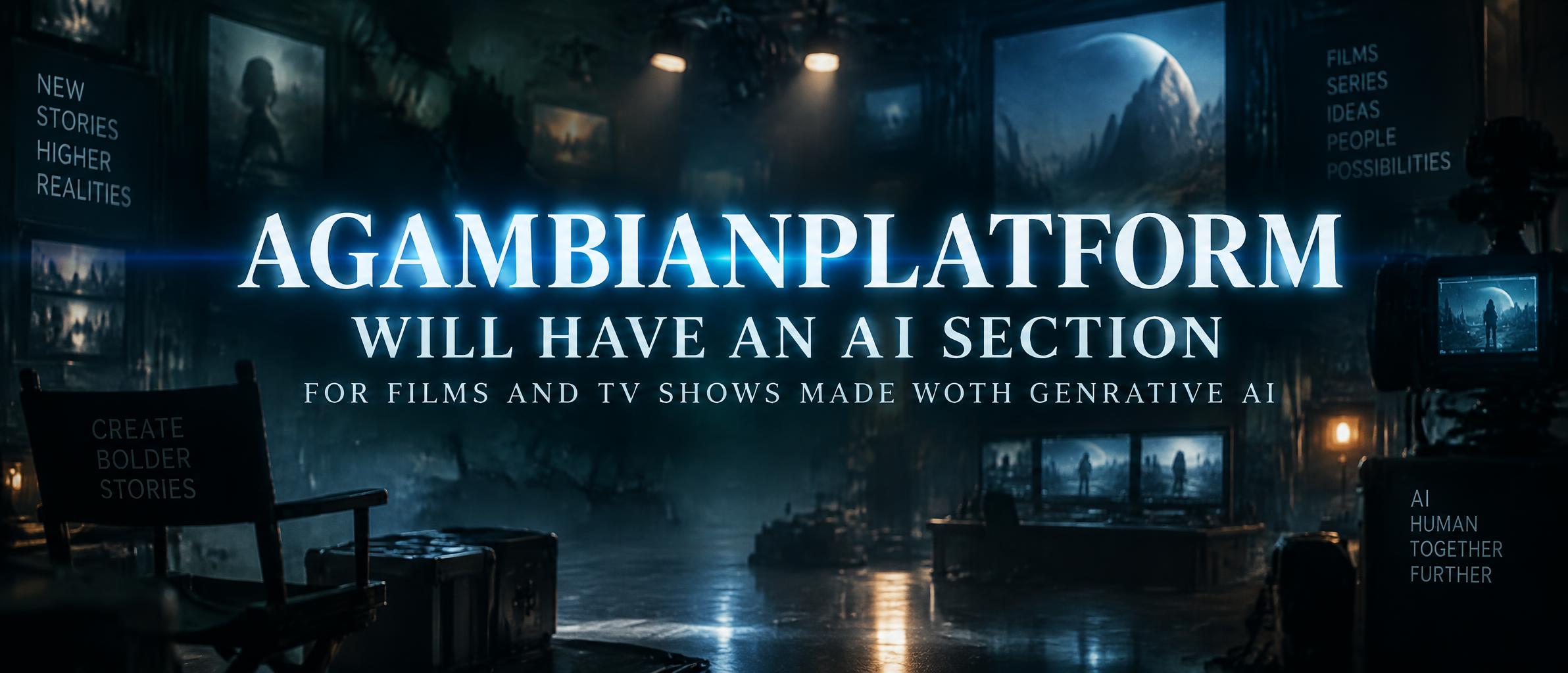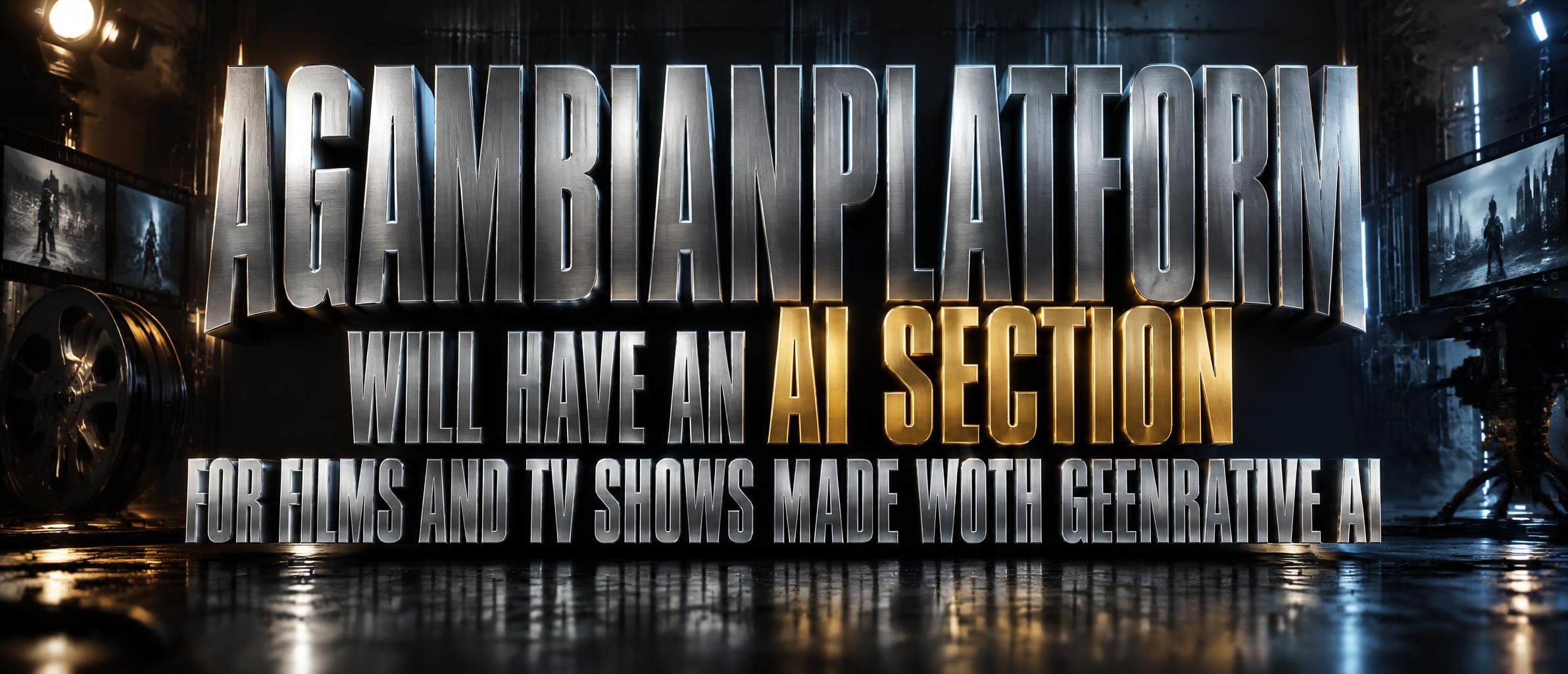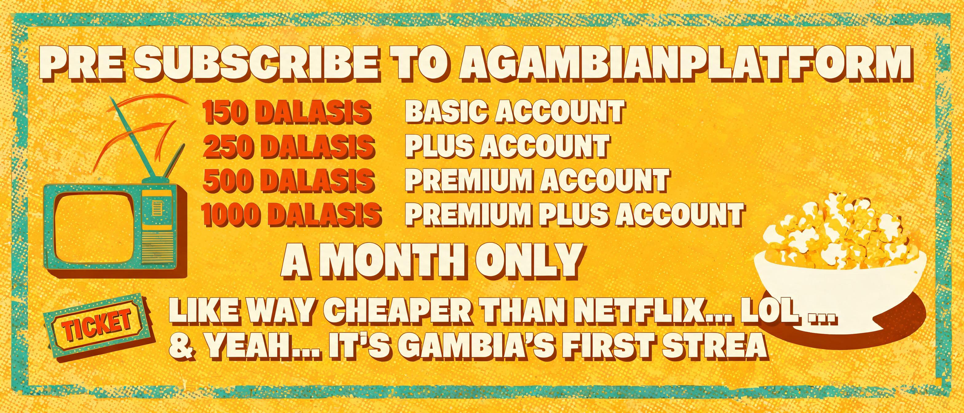
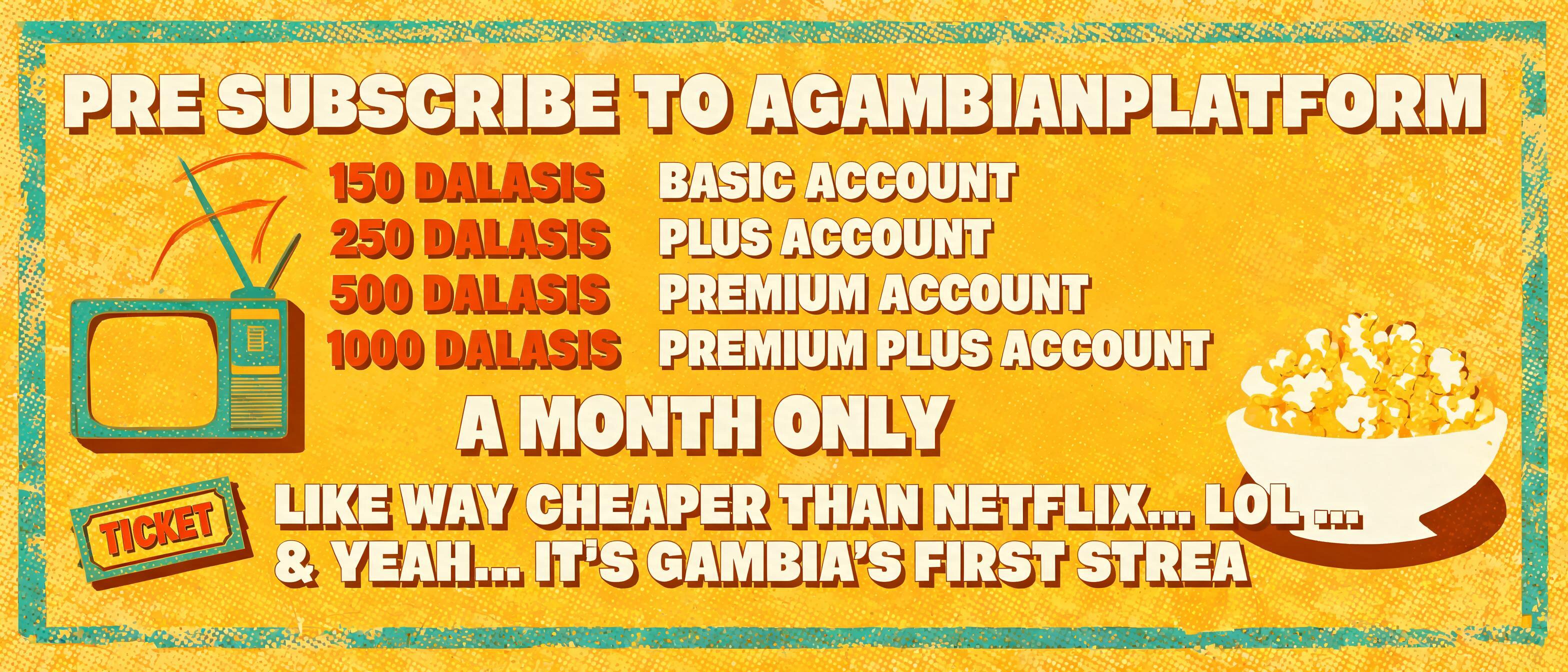
PRE SUBSCRIBE TO AGAMBIANPLATFORM FOR 150 DALASIS BASIC ACCOUNT / 250 DALASIS PLUS ACCOUNT 500 DALASIS PREMIUM ACCOUNT AND 1000 DALASIS FOR A PREMIUM PLUS ACCOUNT A MONTH ONLY LIKE WAY CHEAPER THAN NETFLIX.. LOL .. & YEAH.. IT'S GAMBIA'S FIRST STREA - Long Shadow Text Effect

Uses BytePlus Seedream 5.0, the model behind this artwork · 15 credits



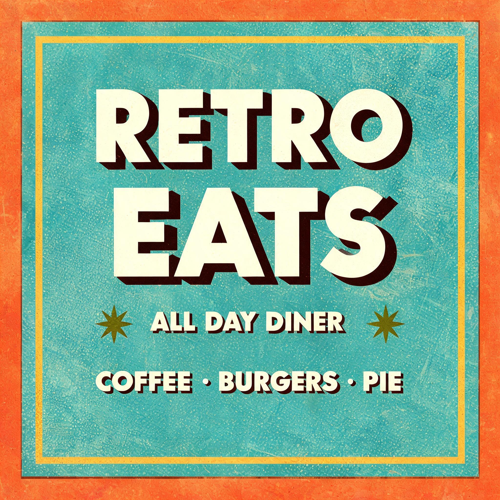
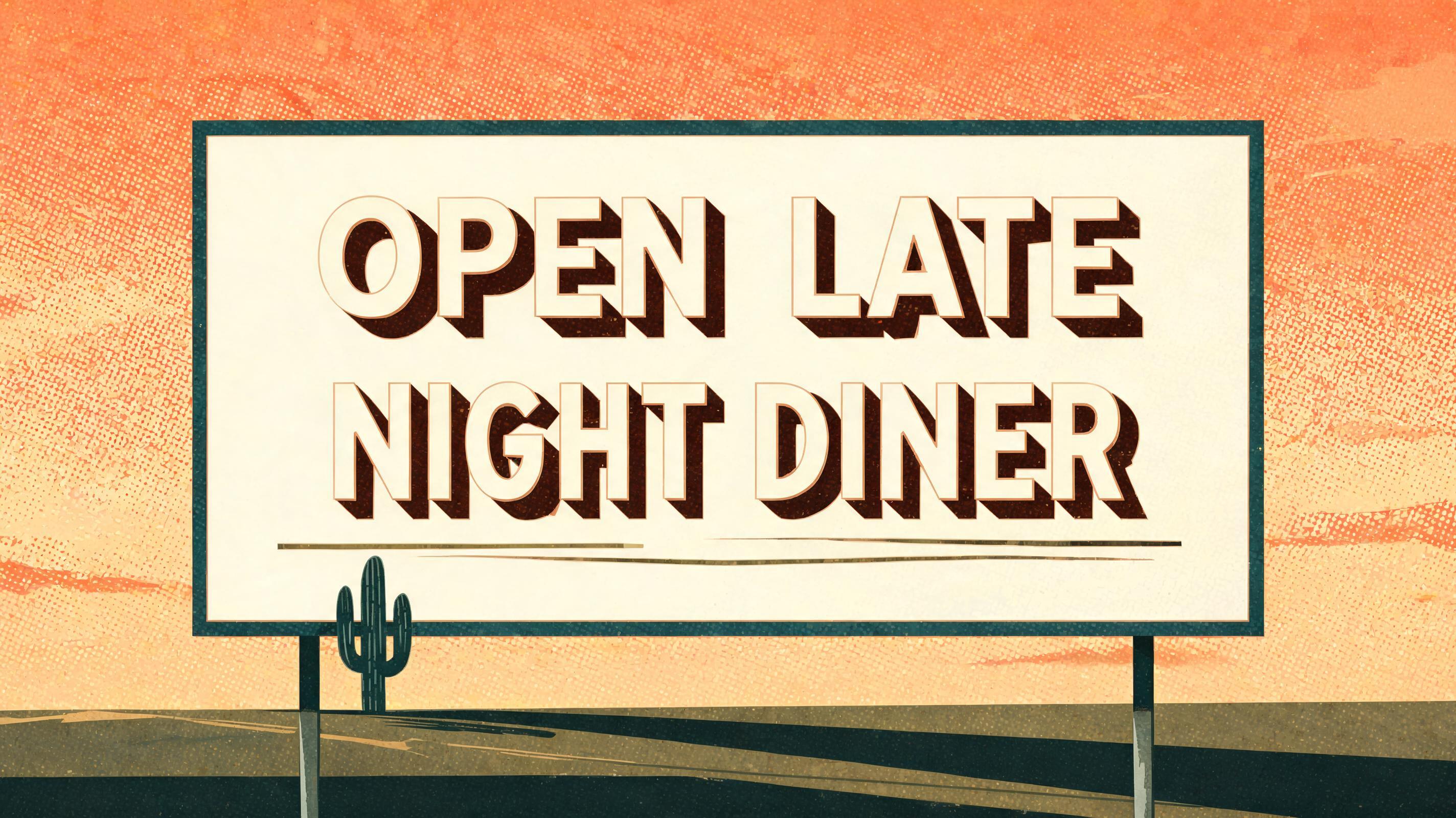
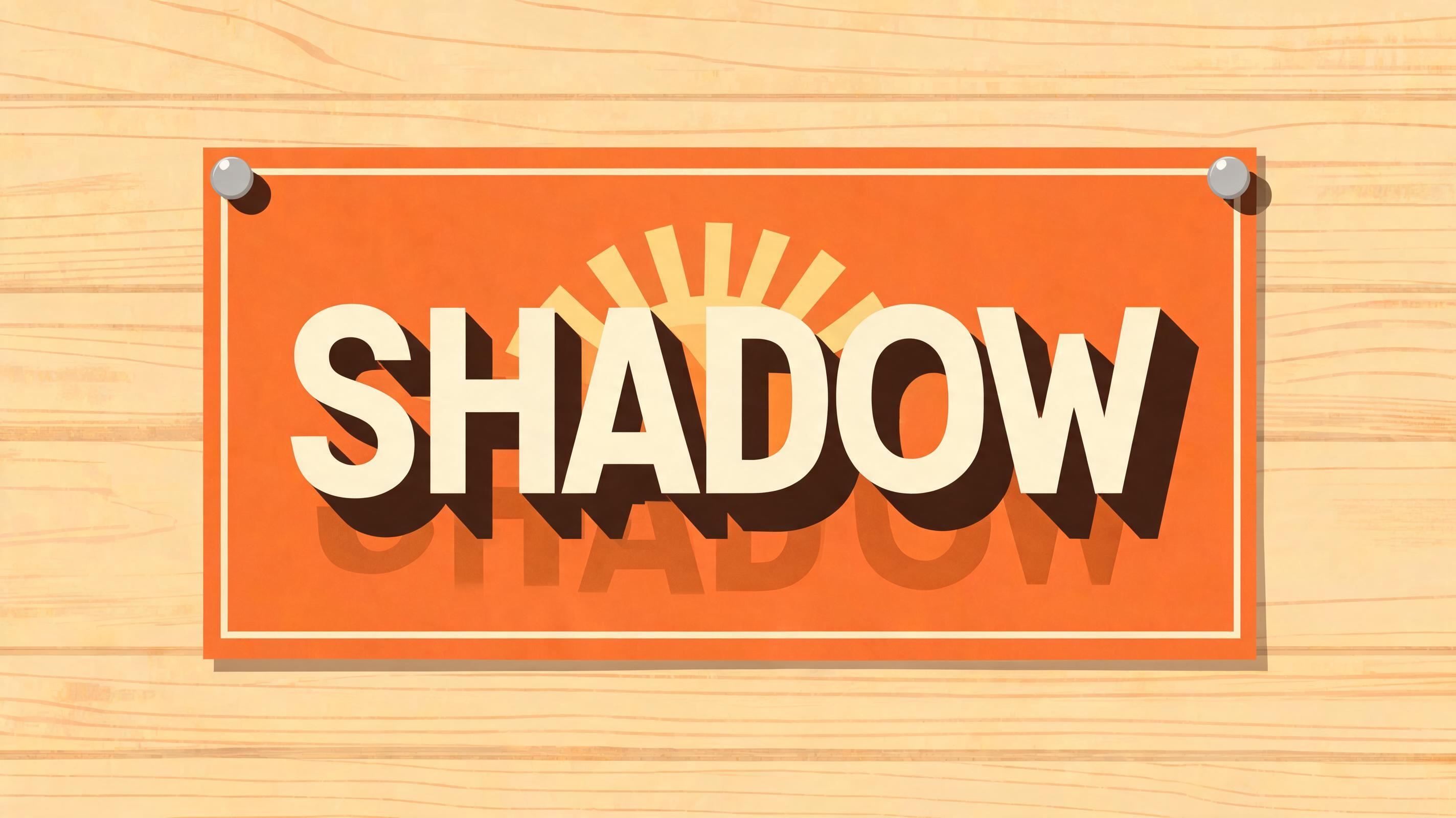
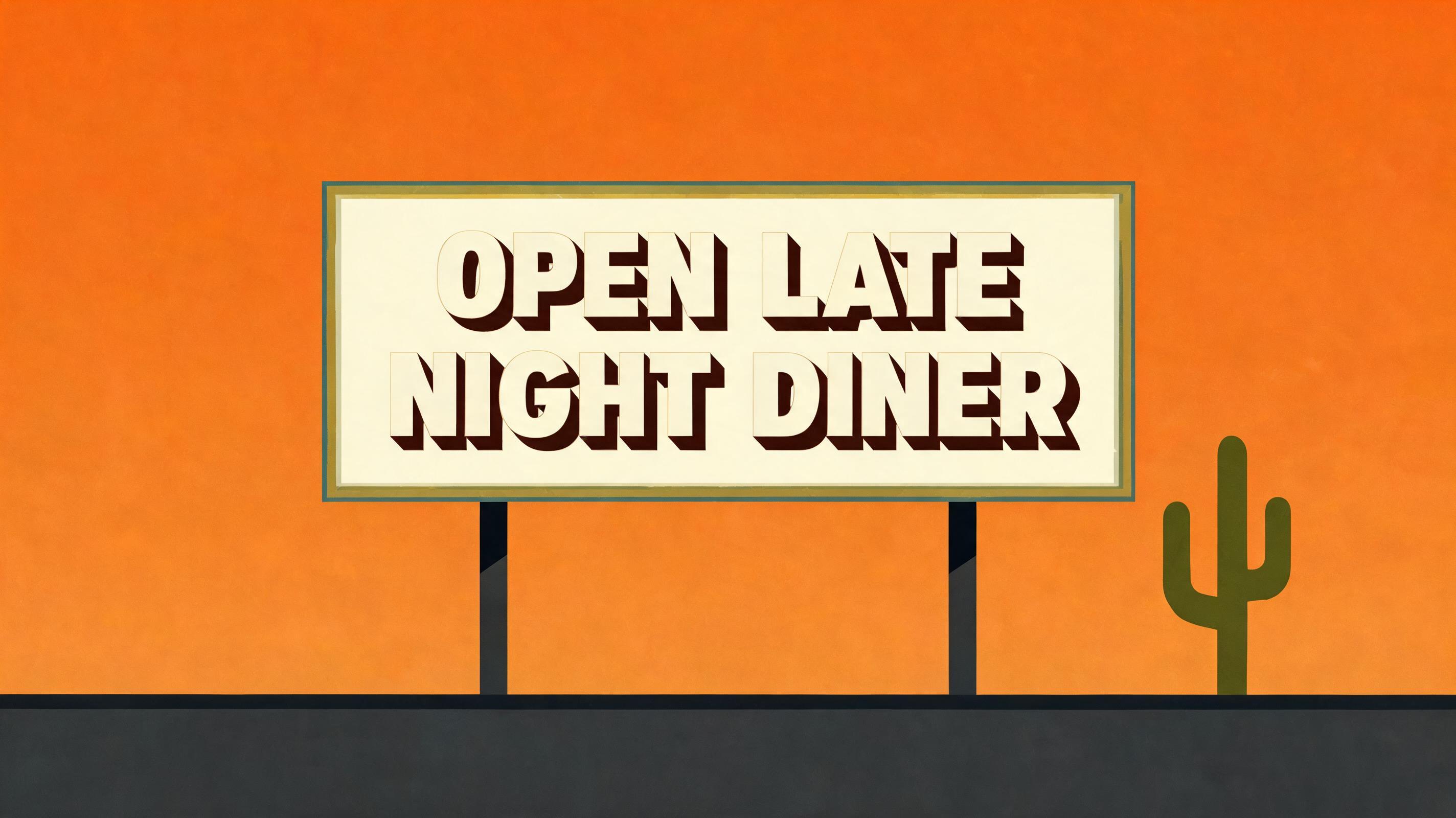
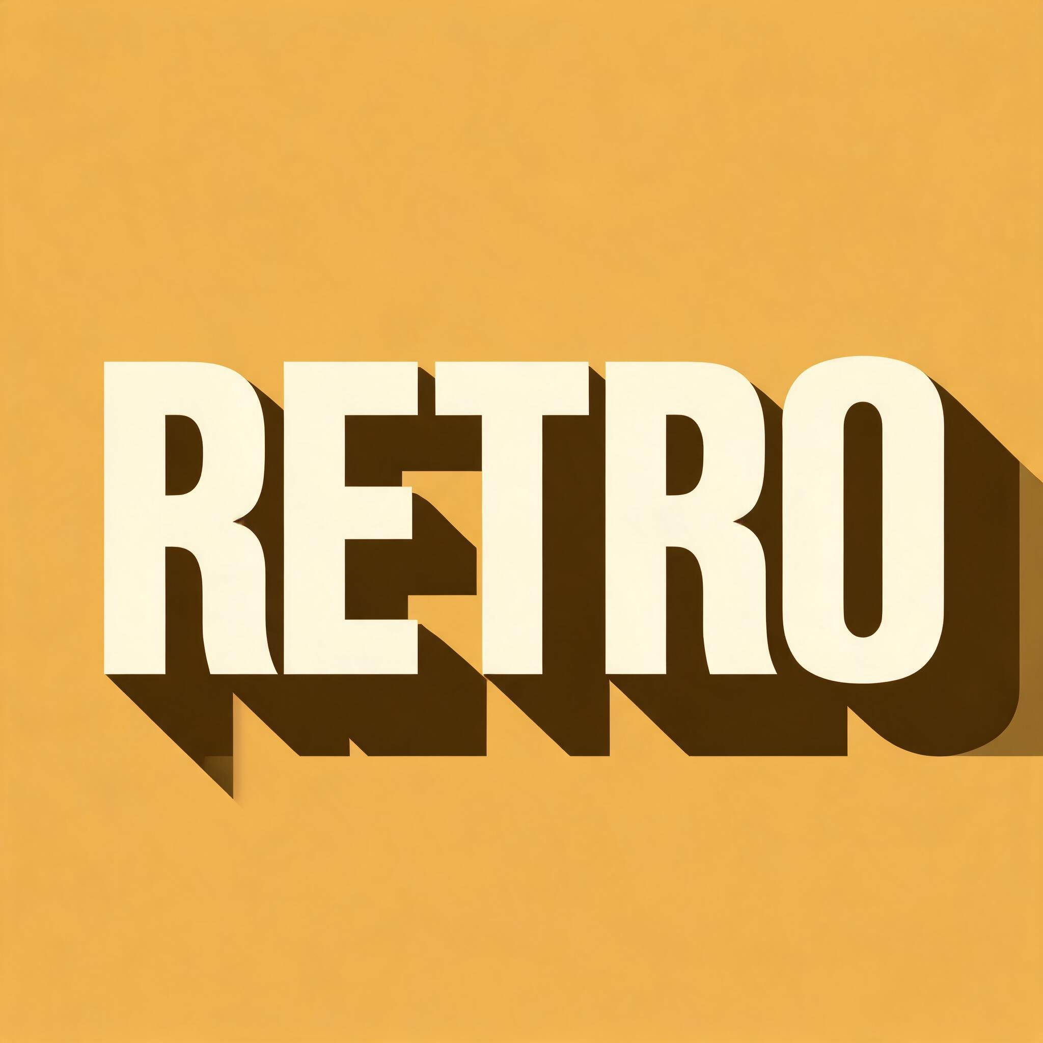
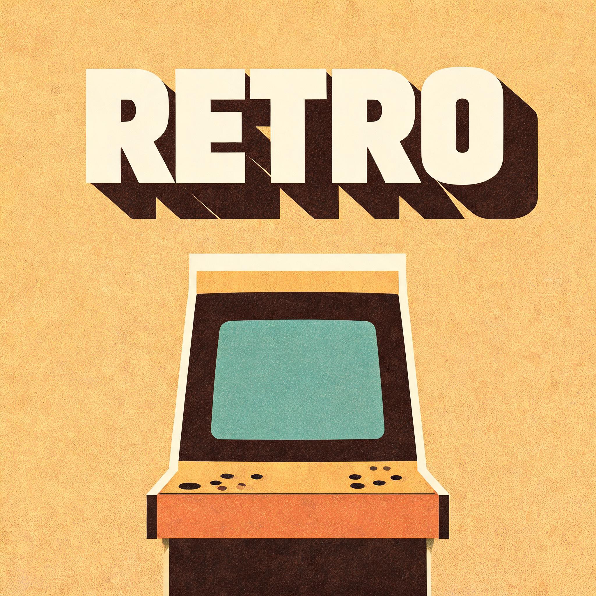
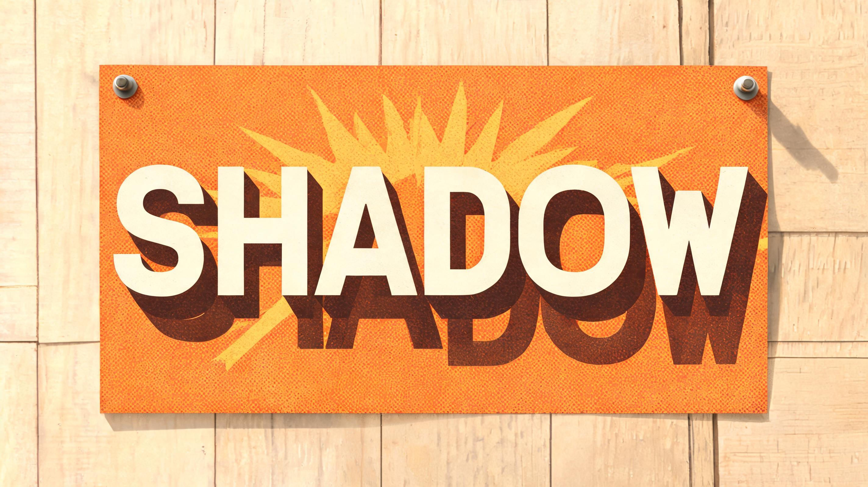
“PRE SUBSCRIBE TO AGAMBIANPLATFORM FOR 150 DALASIS BASIC ACCOUNT / 250 DALASIS PLUS ACCOUNT 500 DALASIS PREMIUM ACCOUNT AND 1000 DALASIS FOR A PREMIUM PLUS ACCOUNT A MONTH ONLY LIKE WAY CHEAPER THAN NETFLIX.. LOL .. & YEAH.. IT'S GAMBIA'S FIRST STREA” is a Kagemoji text effect text effect created with FontVibe AI. Bold 45-degree text shadow effects in flat retro-poster colors — the long shadow look vintage design templates are built on.
LONG SHADOW (mandatory, every letter): each letter casts a second, darker copy of its shape, dragged toward the lower-right at 45 degrees, 2.5-3x the letter height -- large, unmistakable, covering much of the background. NOT a plain letter with no shadow. NOT a small drop shadow. The shadow is one flat solid color with a crisp straight edge: no gradient, no blur, no glow, no bevel, no vanishing point -- flat, not a 3D block. COLOR: font's own color takes priority for the letter; the shadow uses a darker tone of it. No font color -> cream-white letter, deep brown-black shadow. ATMOSPHERE: a flat-graphic register -- no photographic texture, no gradient sky -- in a warm muted retro palette (mustard, burnt orange, faded teal, olive), one consistent light source from the upper-left, like a printed vintage text-effect template rather than a photograph. Render the exact text "PRE SUBSCRIBE TO AGAMBIANPLATFORM FOR 150 DALASIS BASIC ACCOUNT / 250 DALASIS PLUS ACCOUNT 500 DALASIS PREMIUM ACCOUNT AND 1000 DALASIS FOR A PREMIUM PLUS ACCOUNT A MONTH ONLY LIKE WAY CHEAPER THAN NETFLIX.. LOL .. & YEAH.. IT'S GAMBIA'S FIRST STREA" as the dominant subscription offer on a large hand-painted streaming-service billboard, with the platform name and DALASIS price tiers given the strongest weight and the remaining copy arranged in clear poster-like reading groups. Use cream-white primary lettering with select pricing words in faded mustard and burnt orange. Every single letter must cast an unmistakable second darker copy of its own shape, dragged exactly toward the lower-right at 45 degrees for 2.5 to 3 times the letter height; use solid deep brown-black or dark rust shadows with crisp straight edges. The long shadows must spread across much of the sign and background as flat graphic forms: no blur, no glow, no gradient, no bevel, no 3D extrusion, no vanishing point. Surround the typography with sparse screen-printed imagery: a simplified television set, radiating broadcast arcs, a ticket stub, and a small bowl of popcorn, built from confident muted-ink shapes. Use a dusty mustard background, faded teal border panels, olive details, burnt-orange accents, restrained halftone dots, slight ink misregistration, and subtle aged paper grain. Single upper-left light logic only, flat 1960s printed-poster treatment, no photographic texture.
Generated on September 9, 2026 · 3136 × 1344 · JPEG · BytePlus Seedream 5.0 · Shared by the creator · Free for commercial use (CC BY 4.0)