


AI Minimal Text Effect Generator
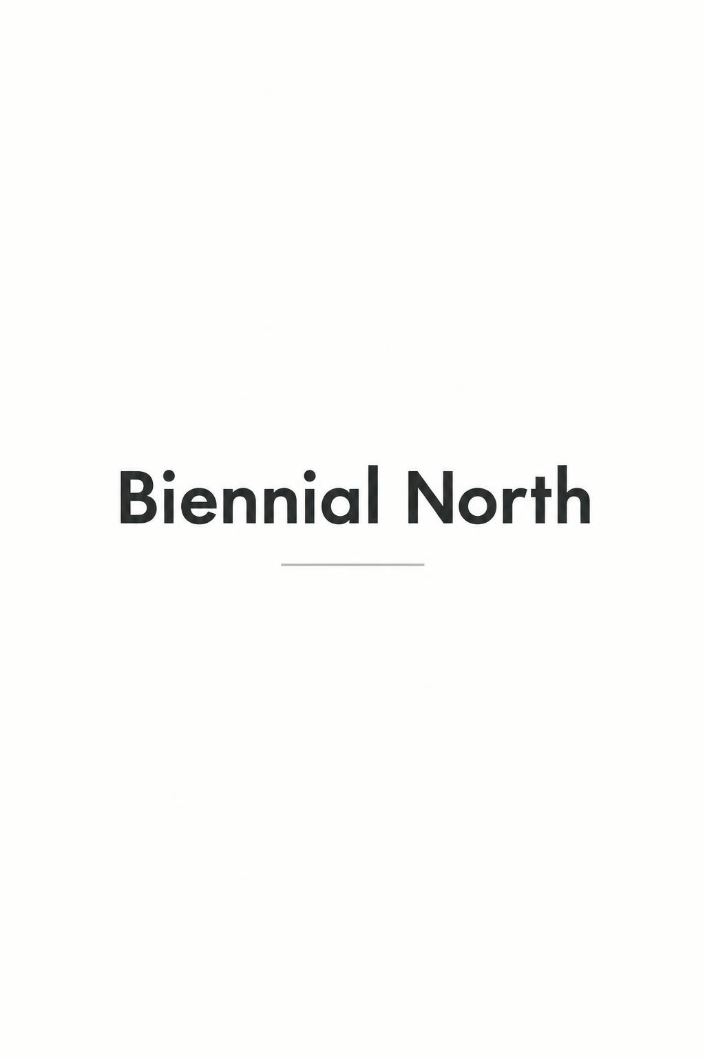
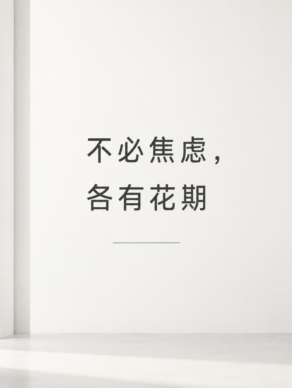
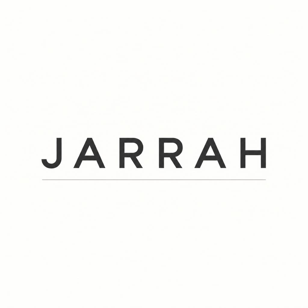
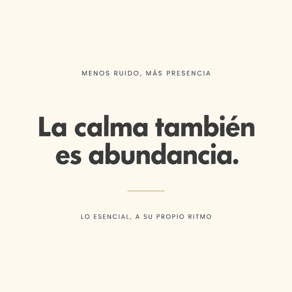
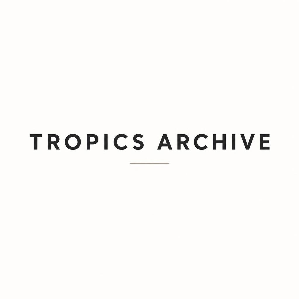
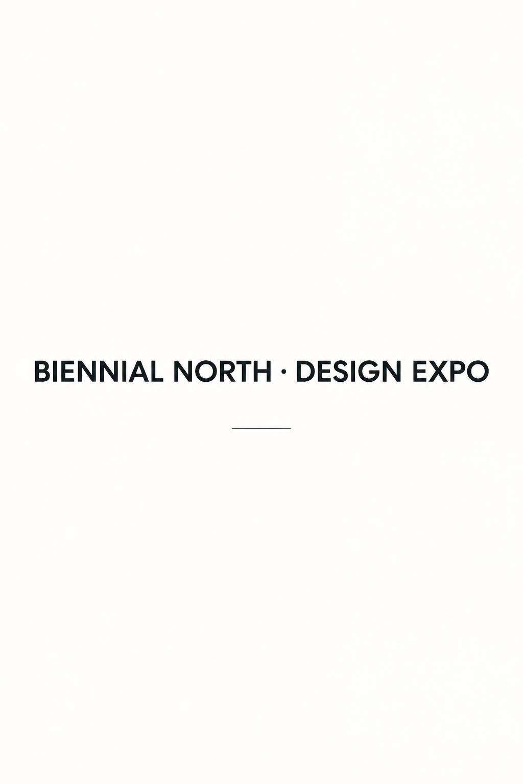
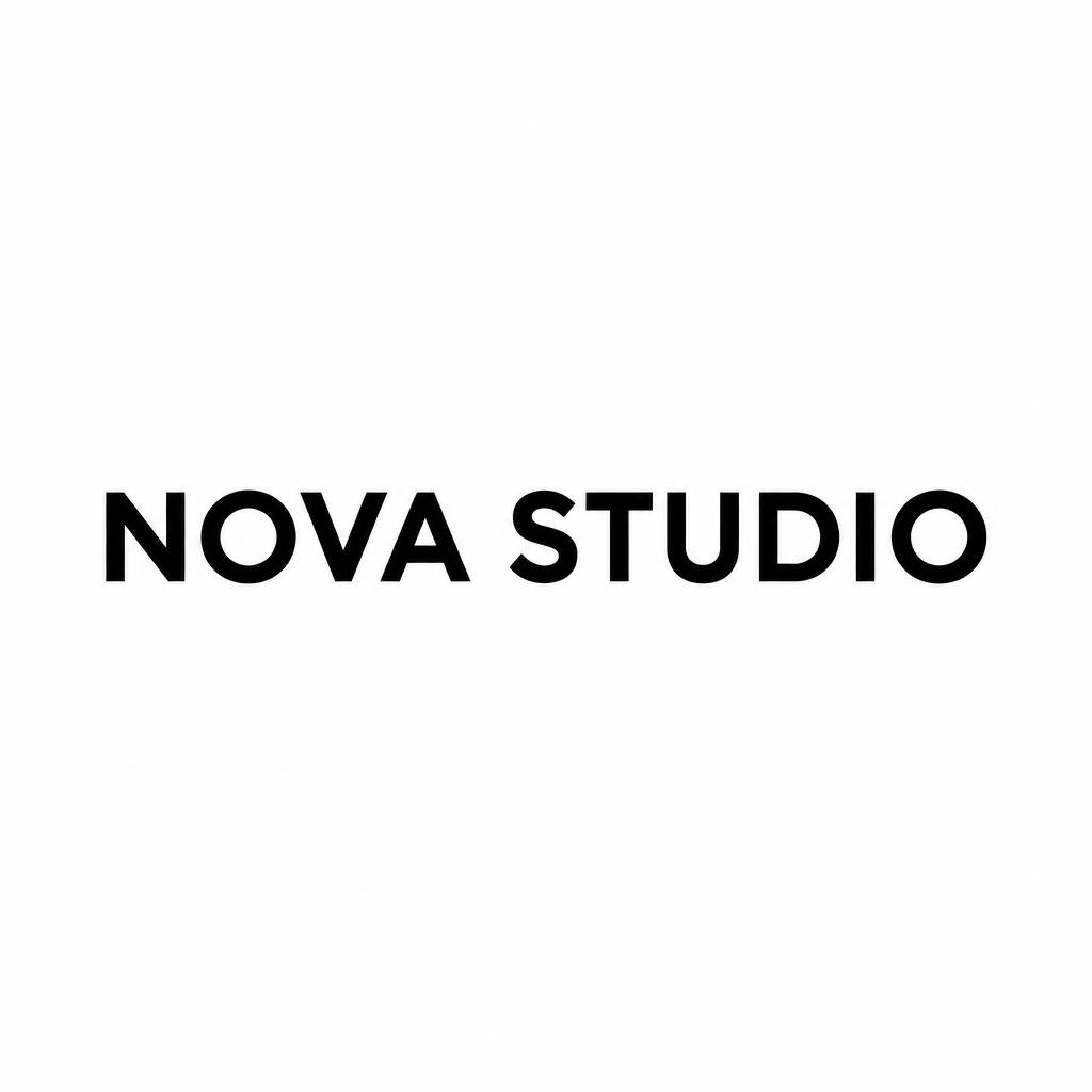
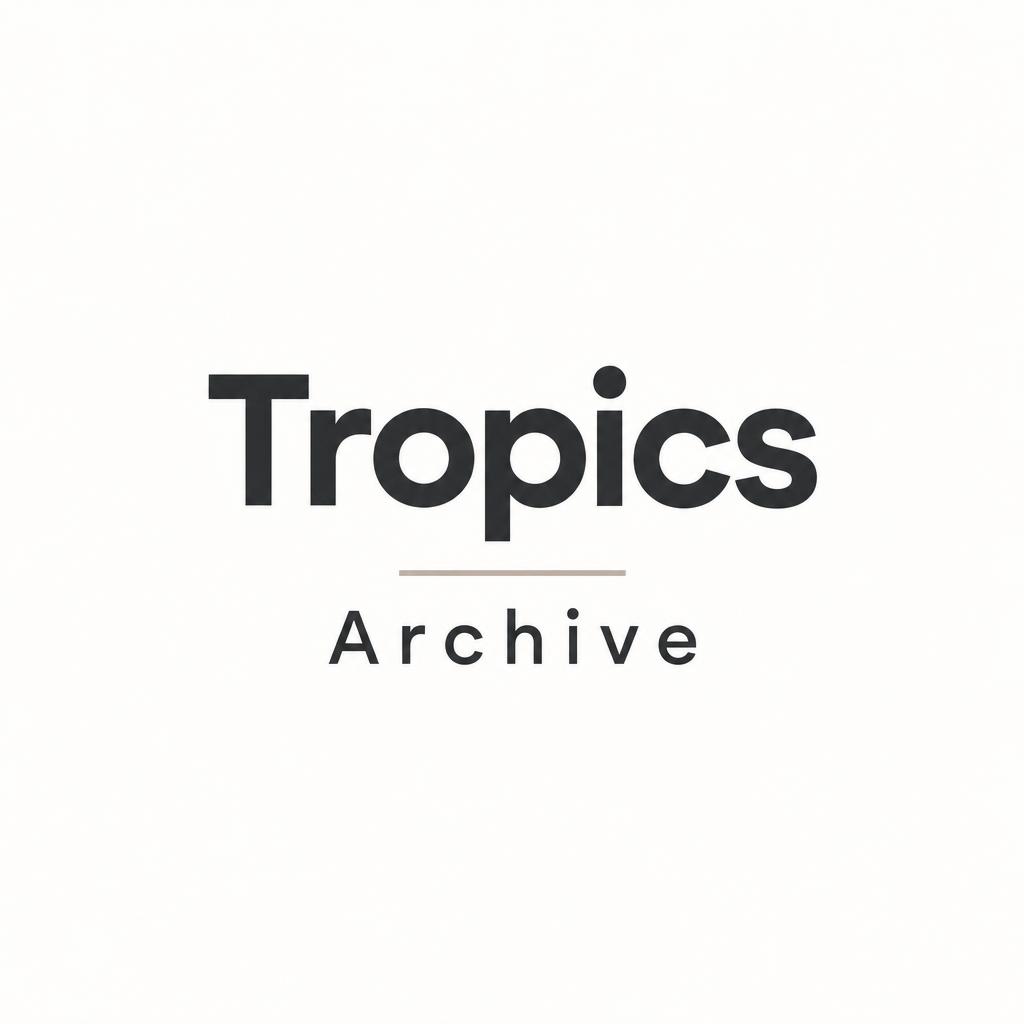
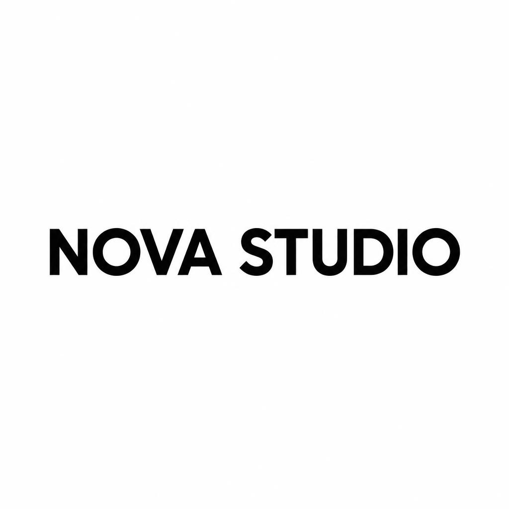
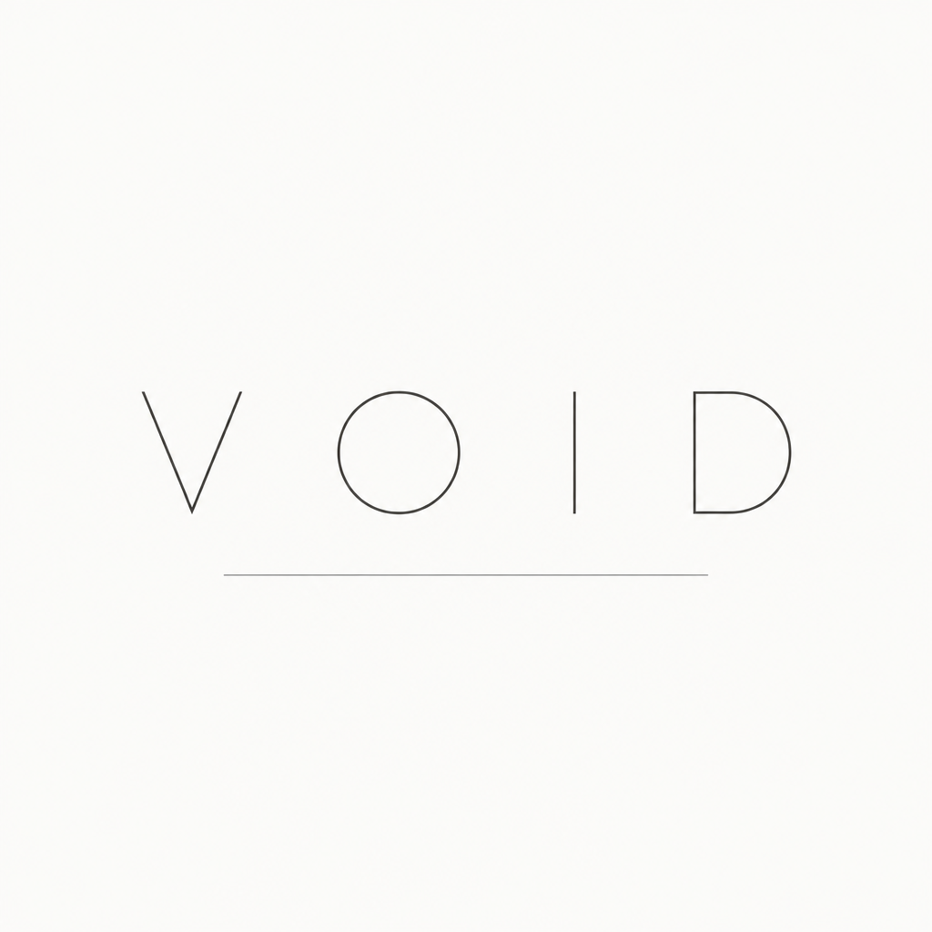
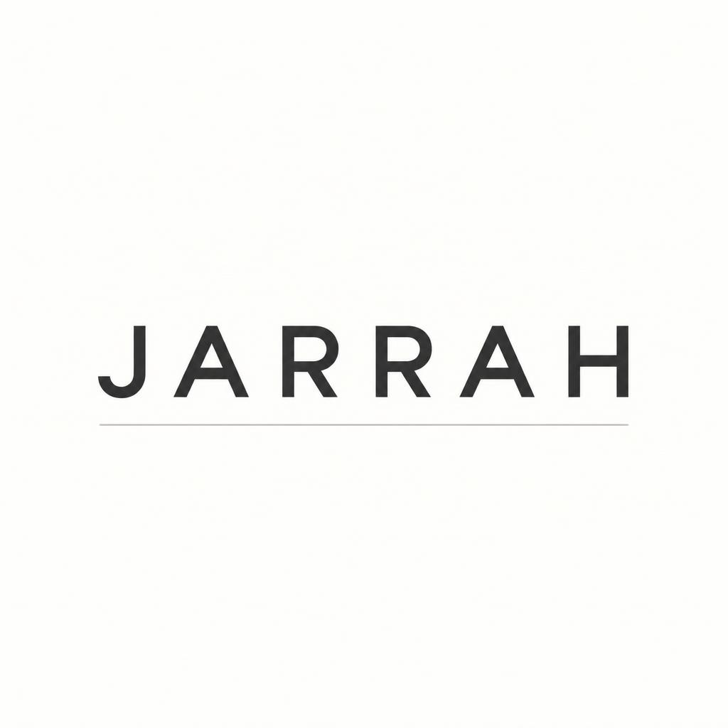
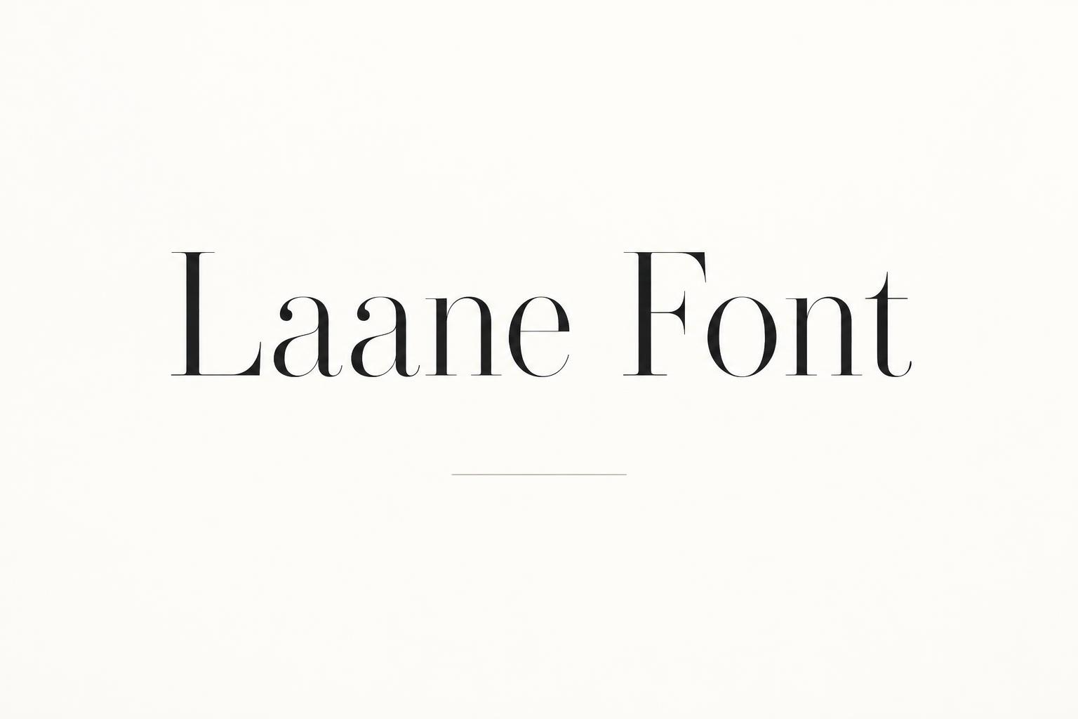
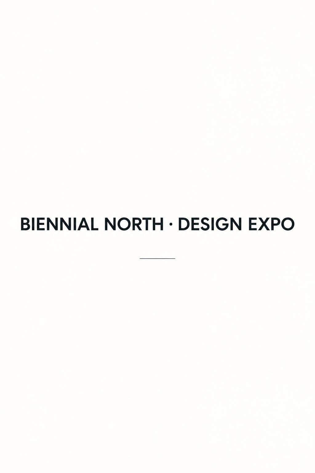
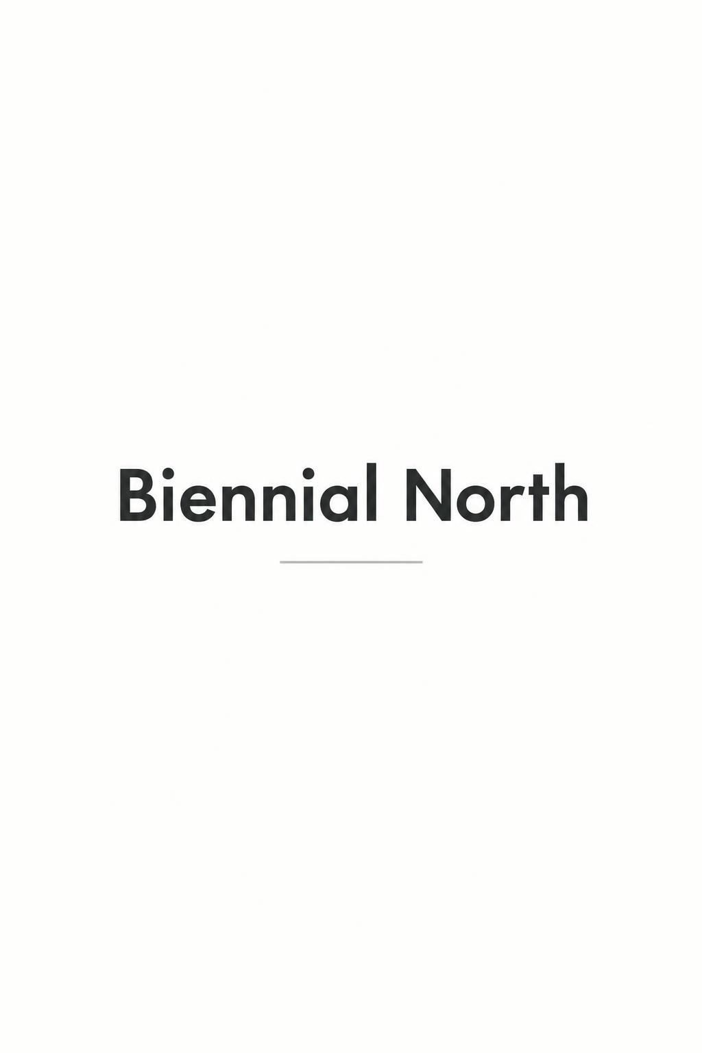
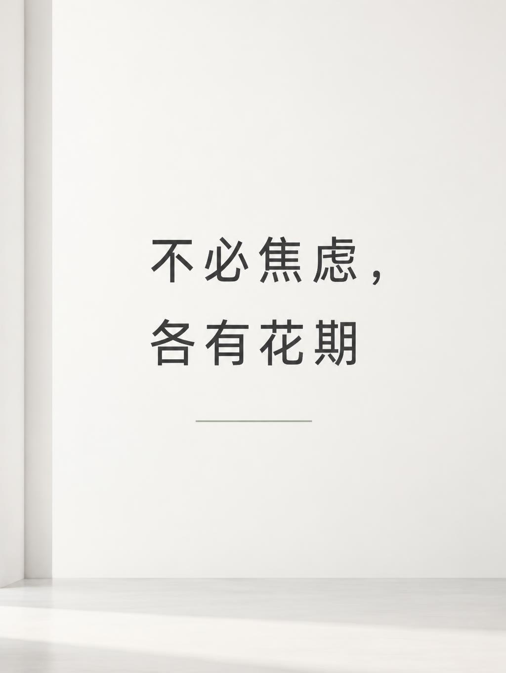
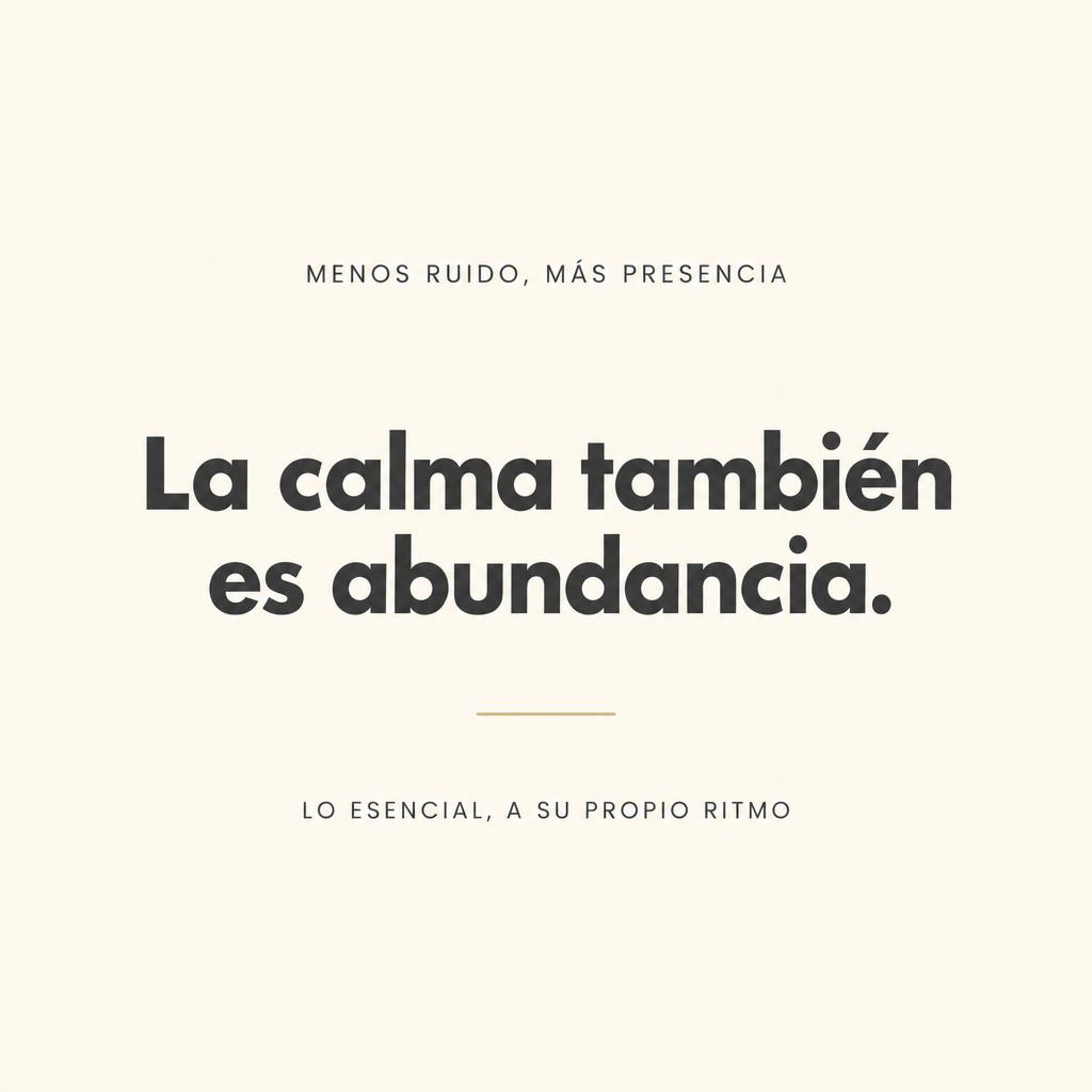
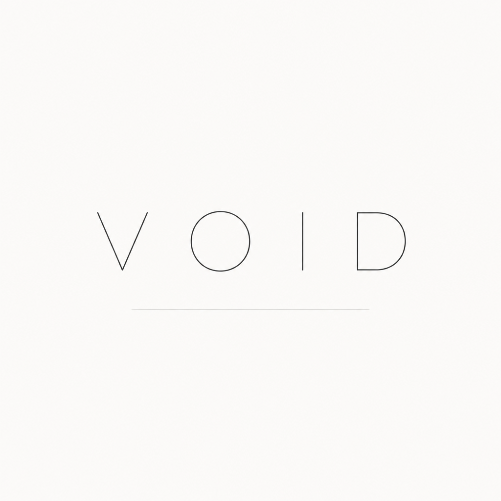
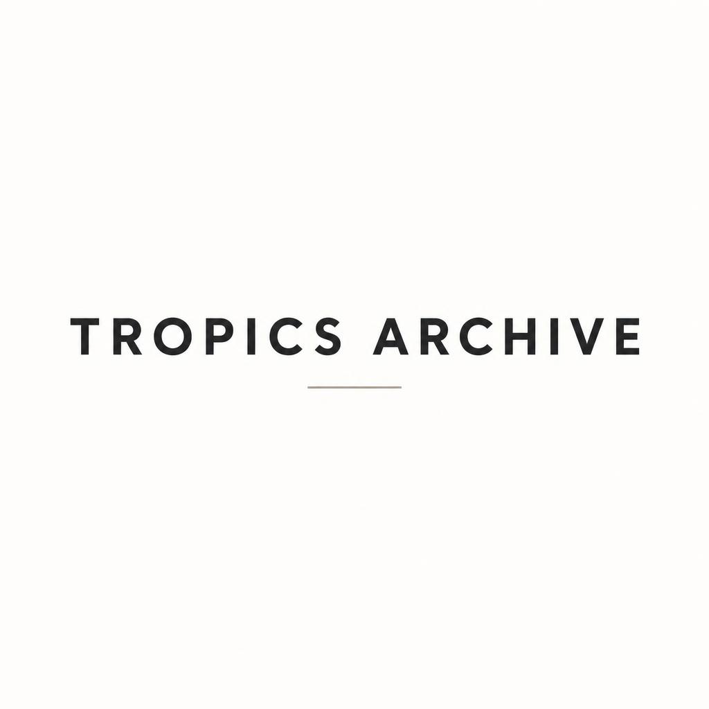
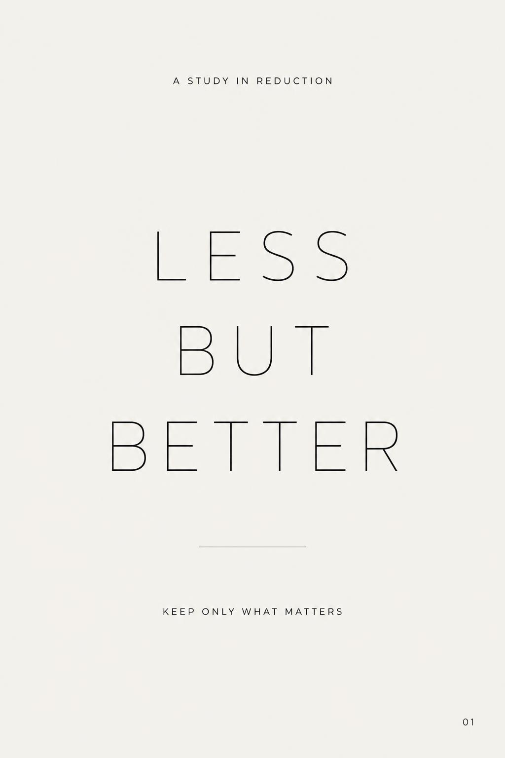
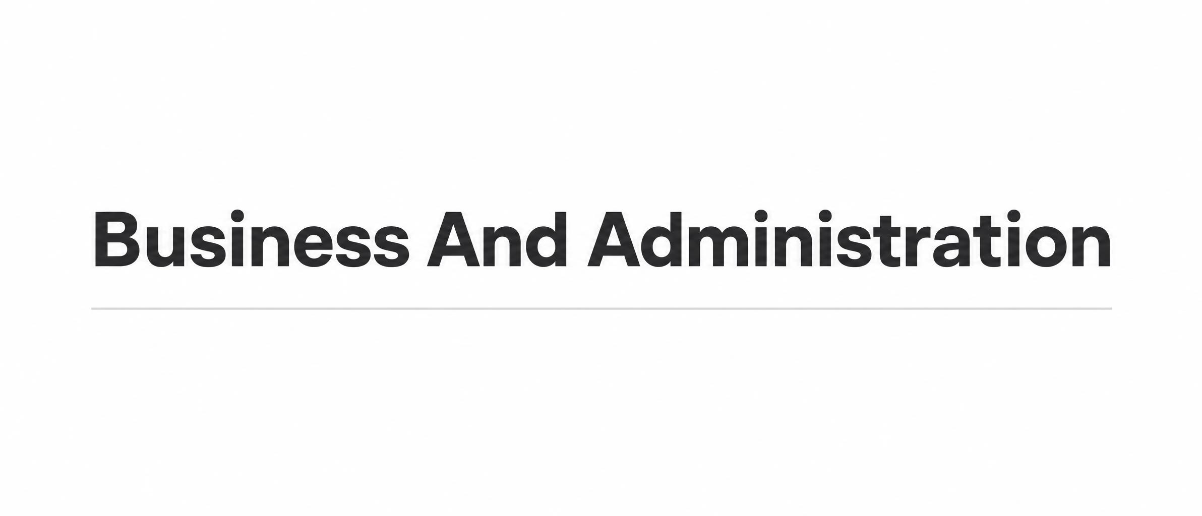
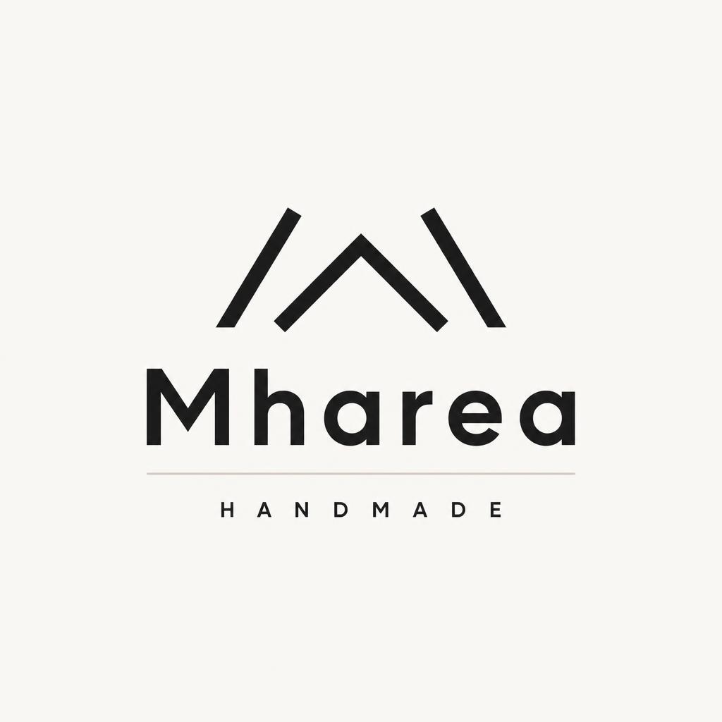
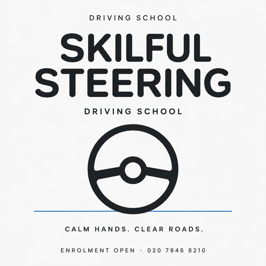
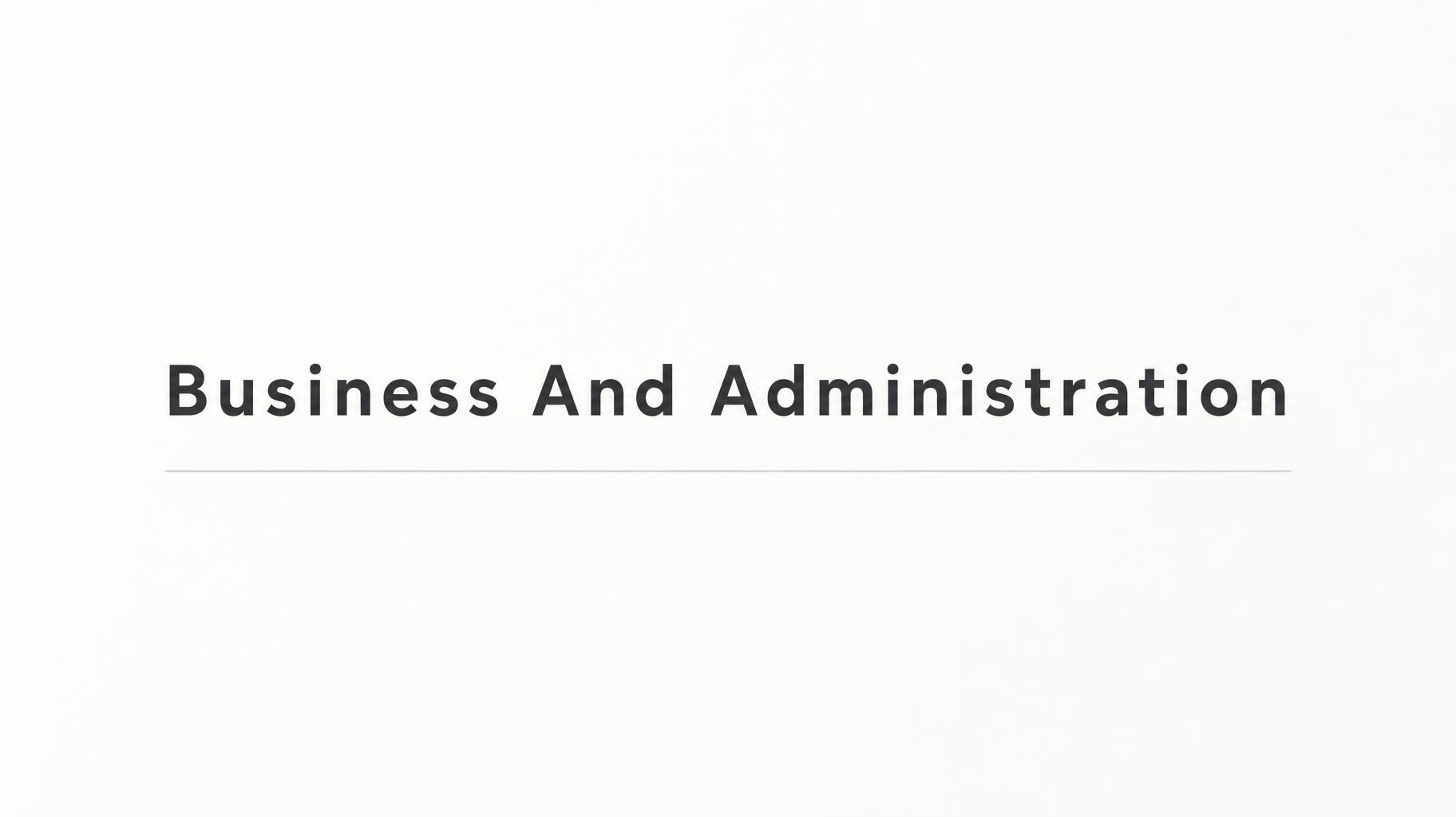
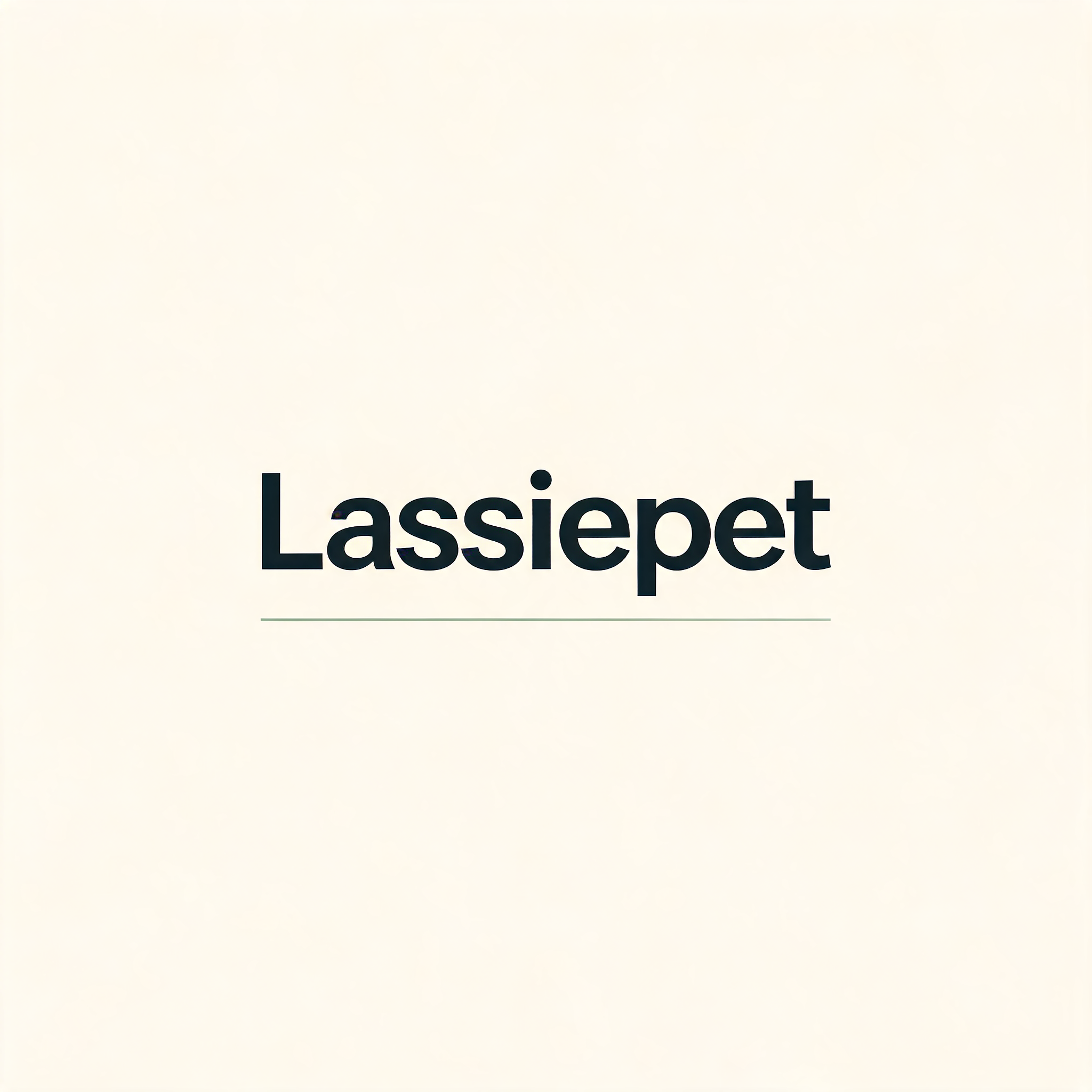
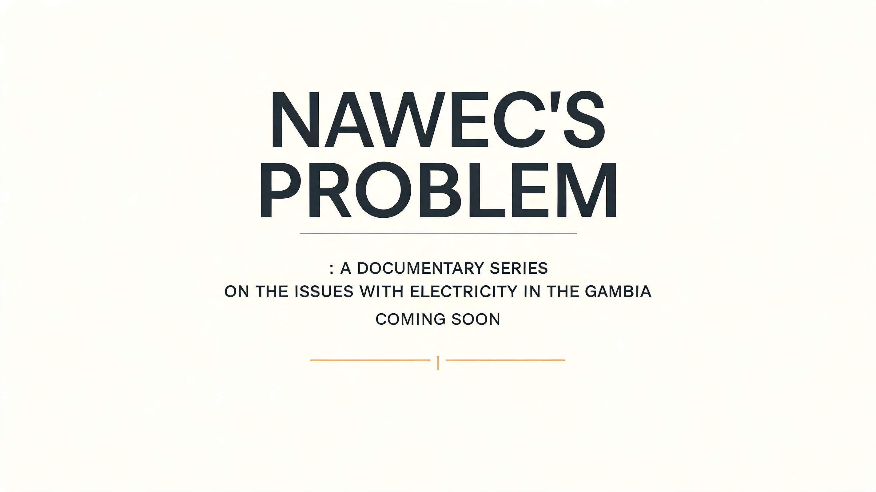
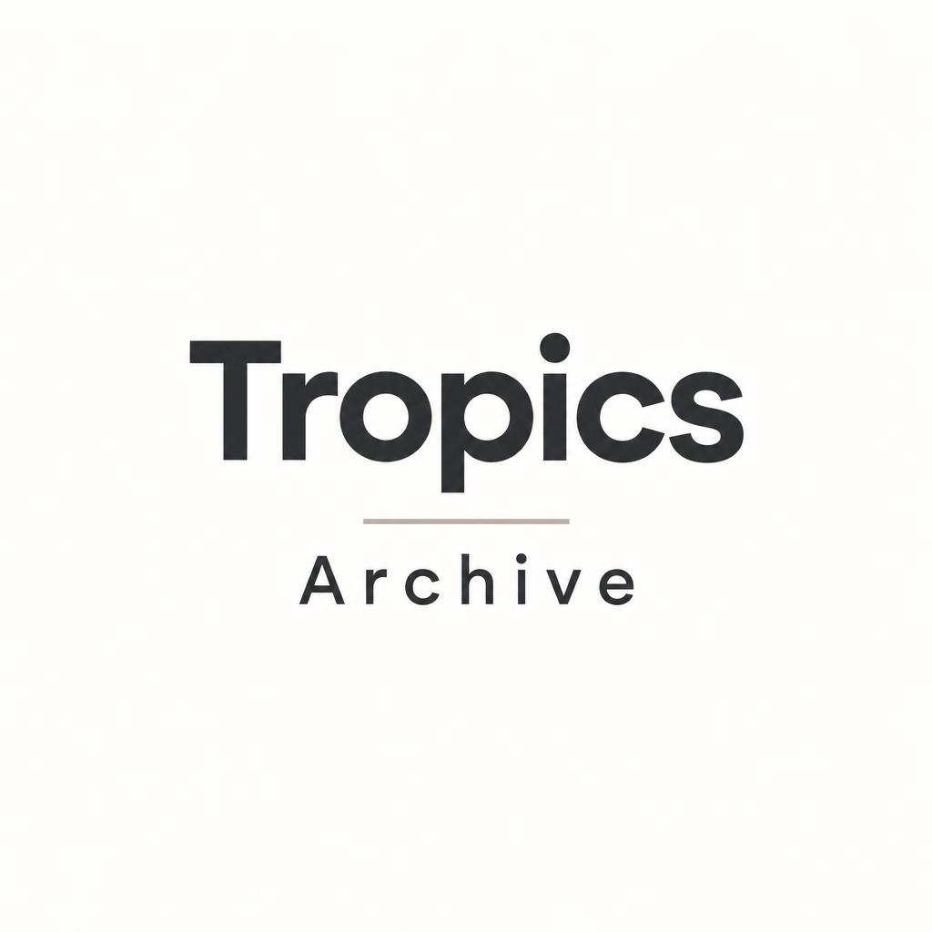
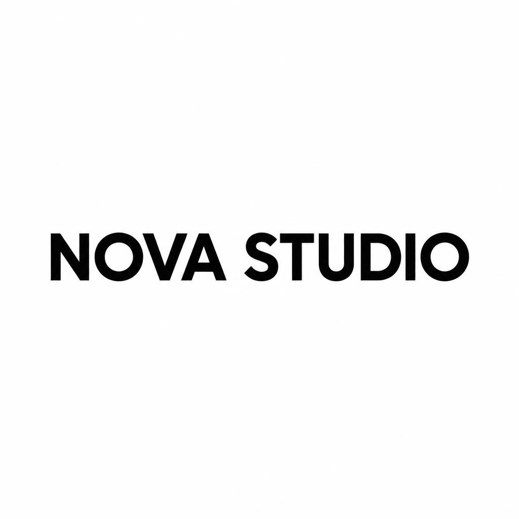
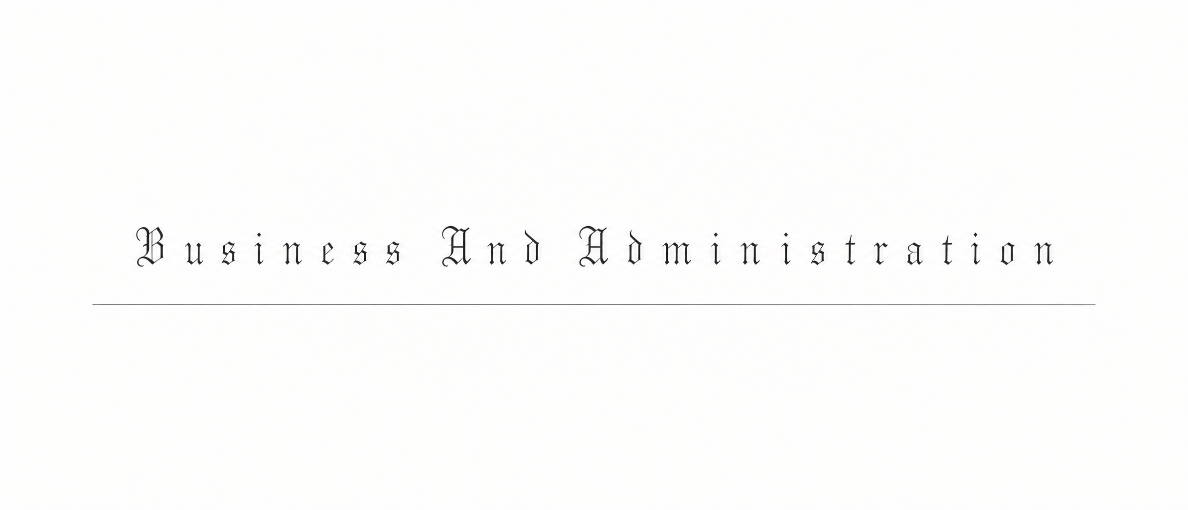
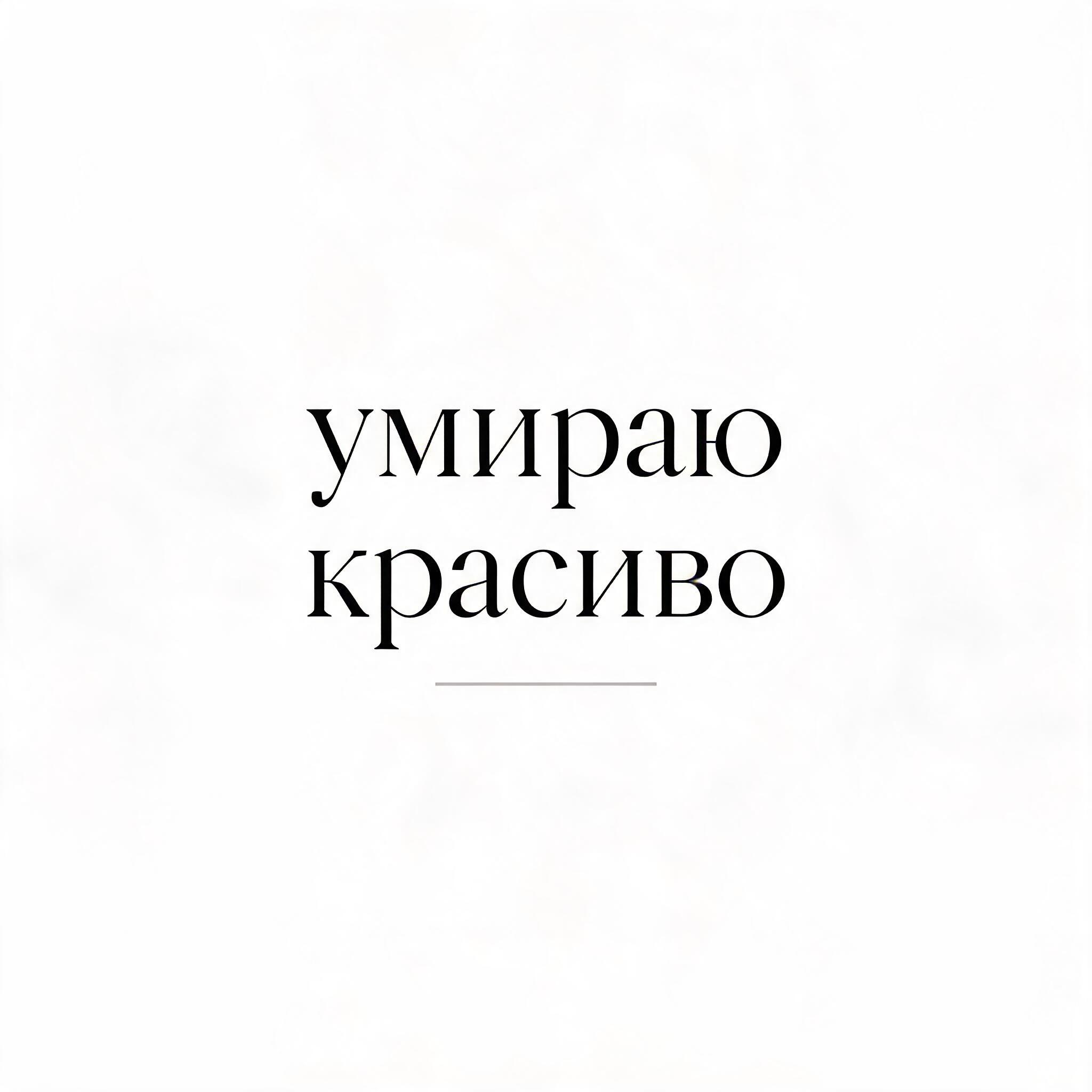
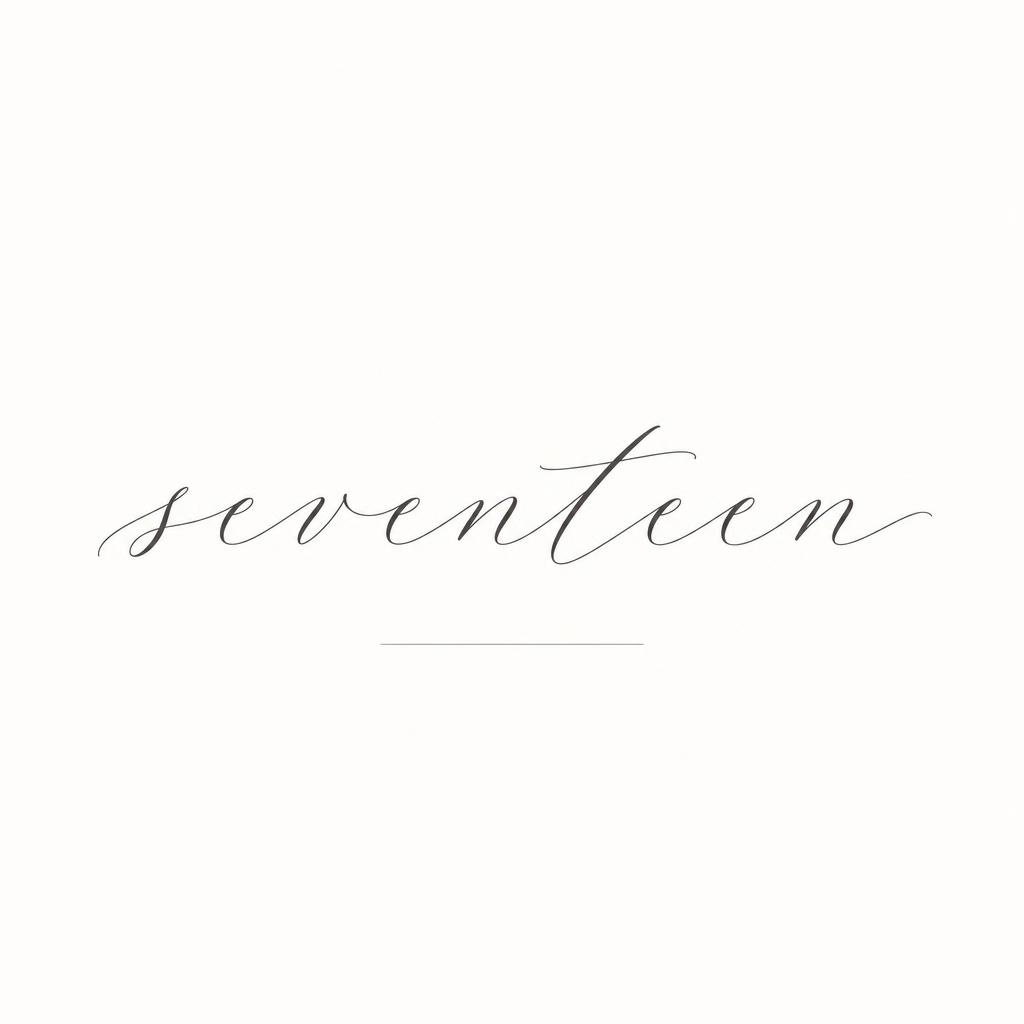
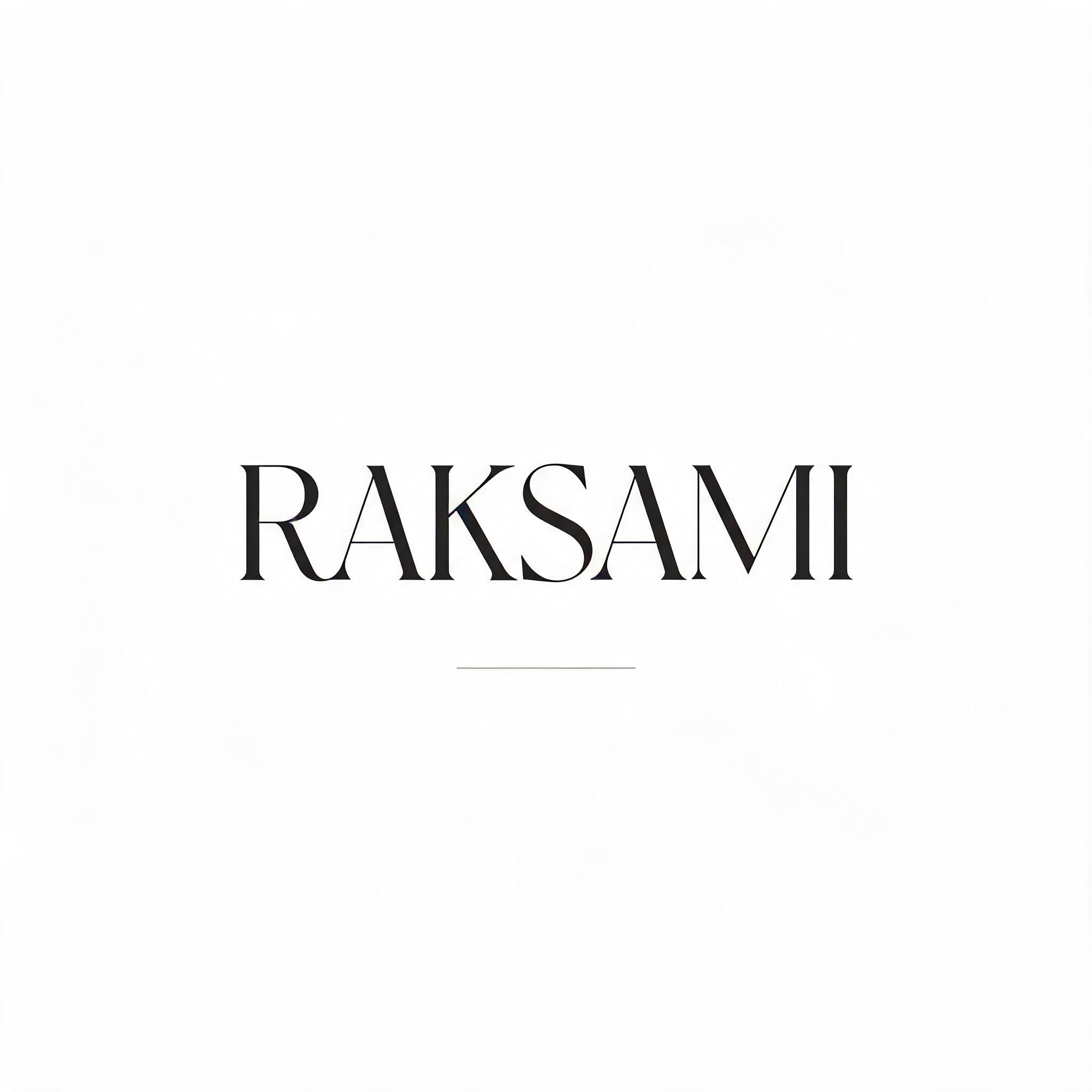
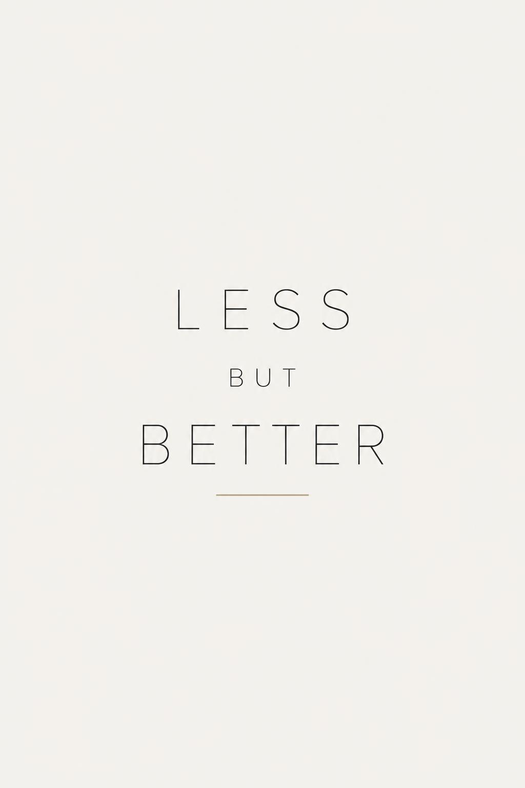
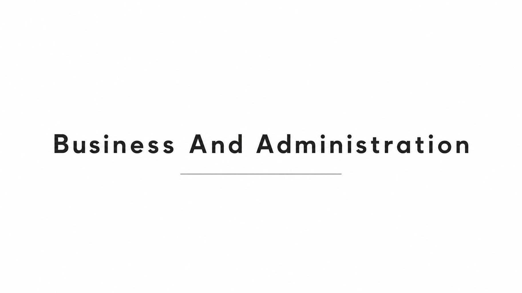
Dark grey geometric sans with generous spacing and a single hairline rule beneath, flat and matte on an almost empty off-white ground. — no font license needed.
Minimal in different AI fonts


What you can make with Minimal

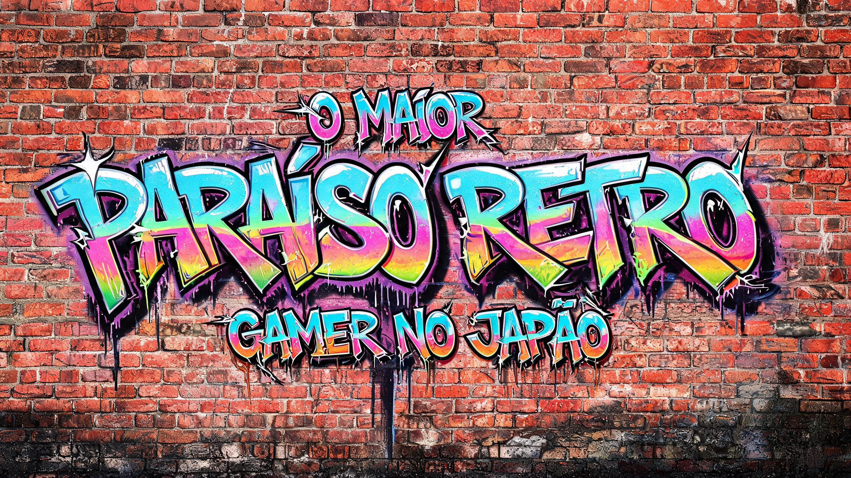
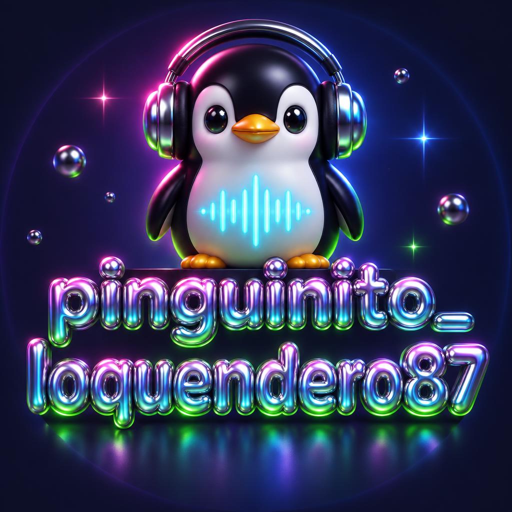

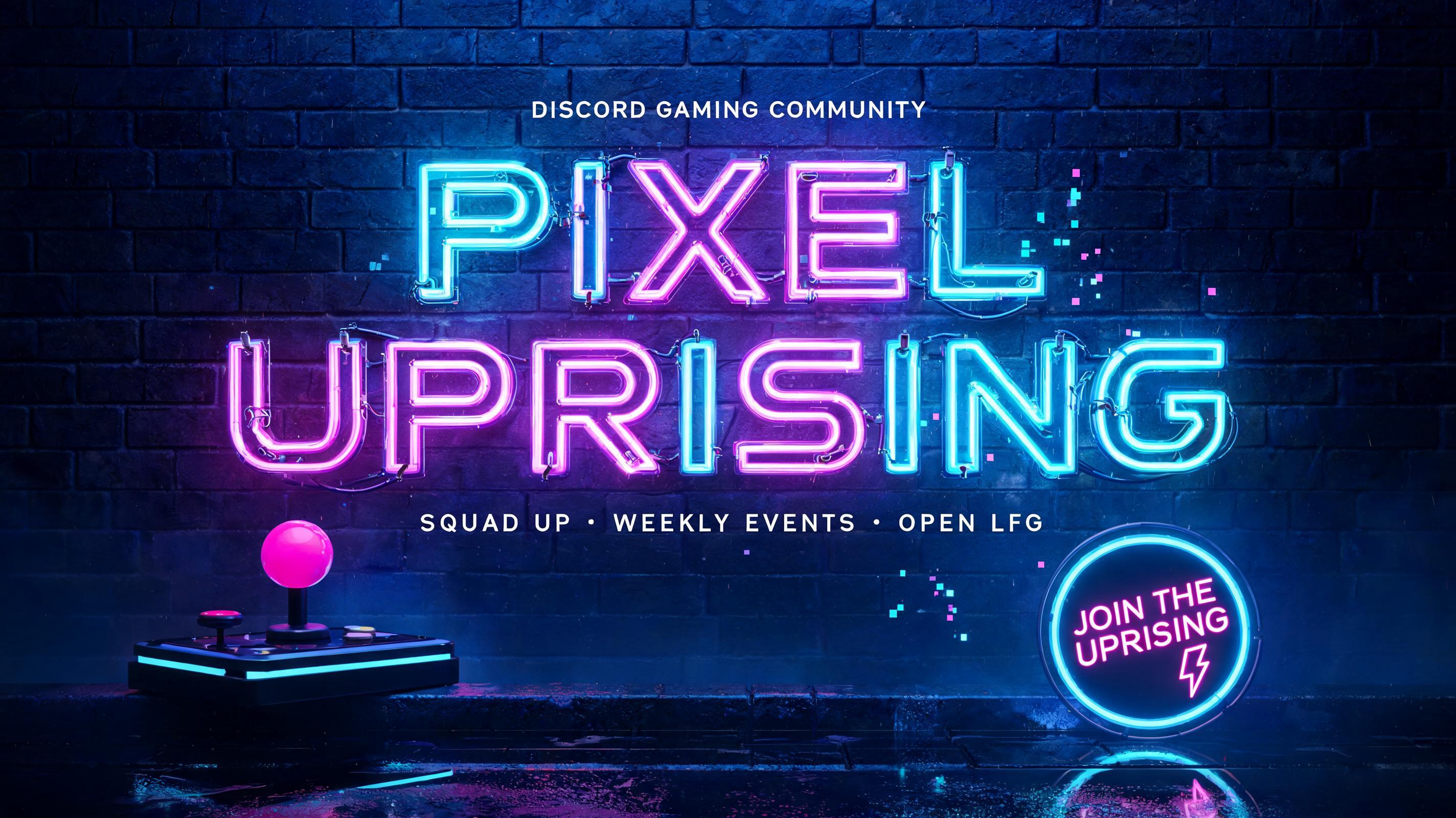
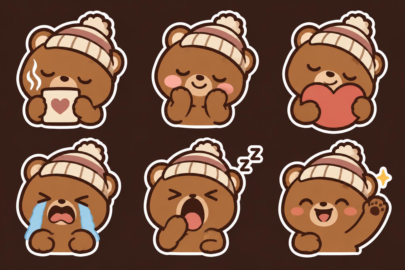
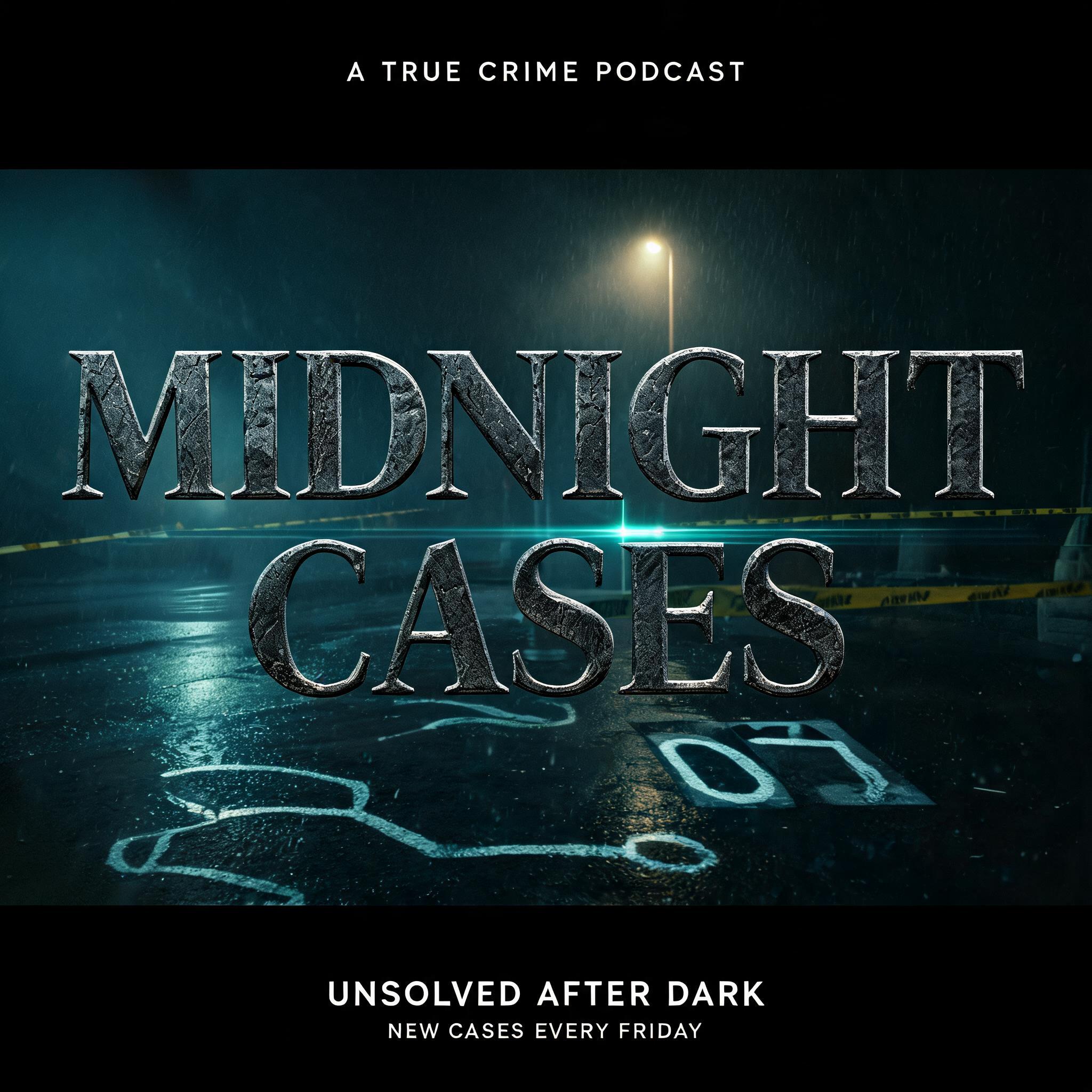
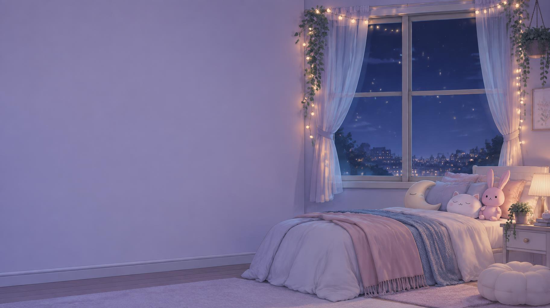
Minimal Gallery
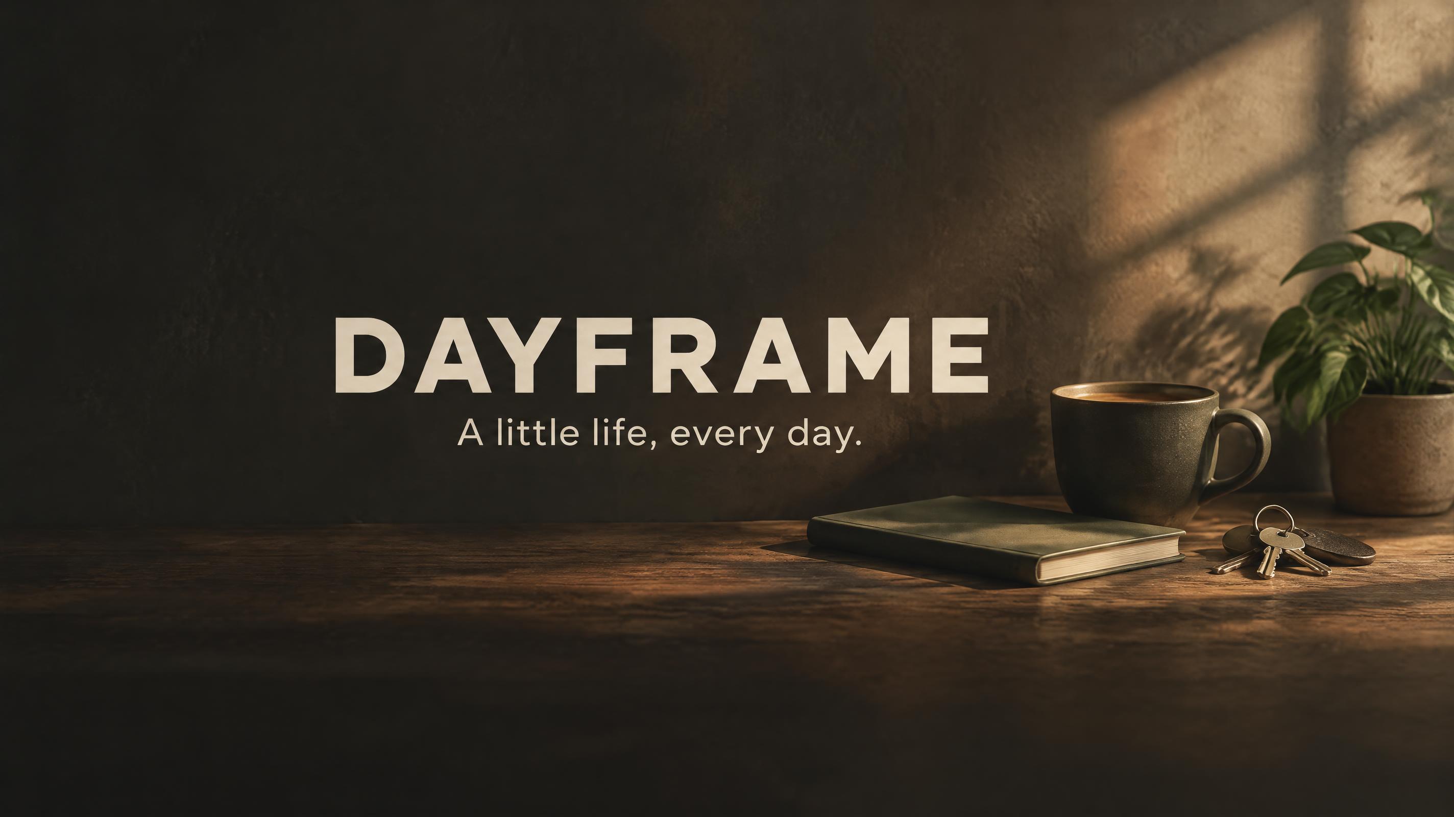
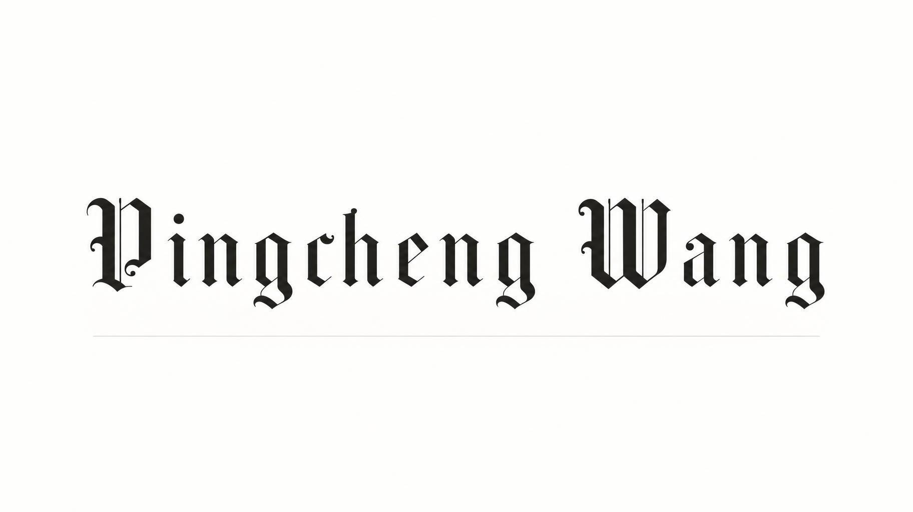
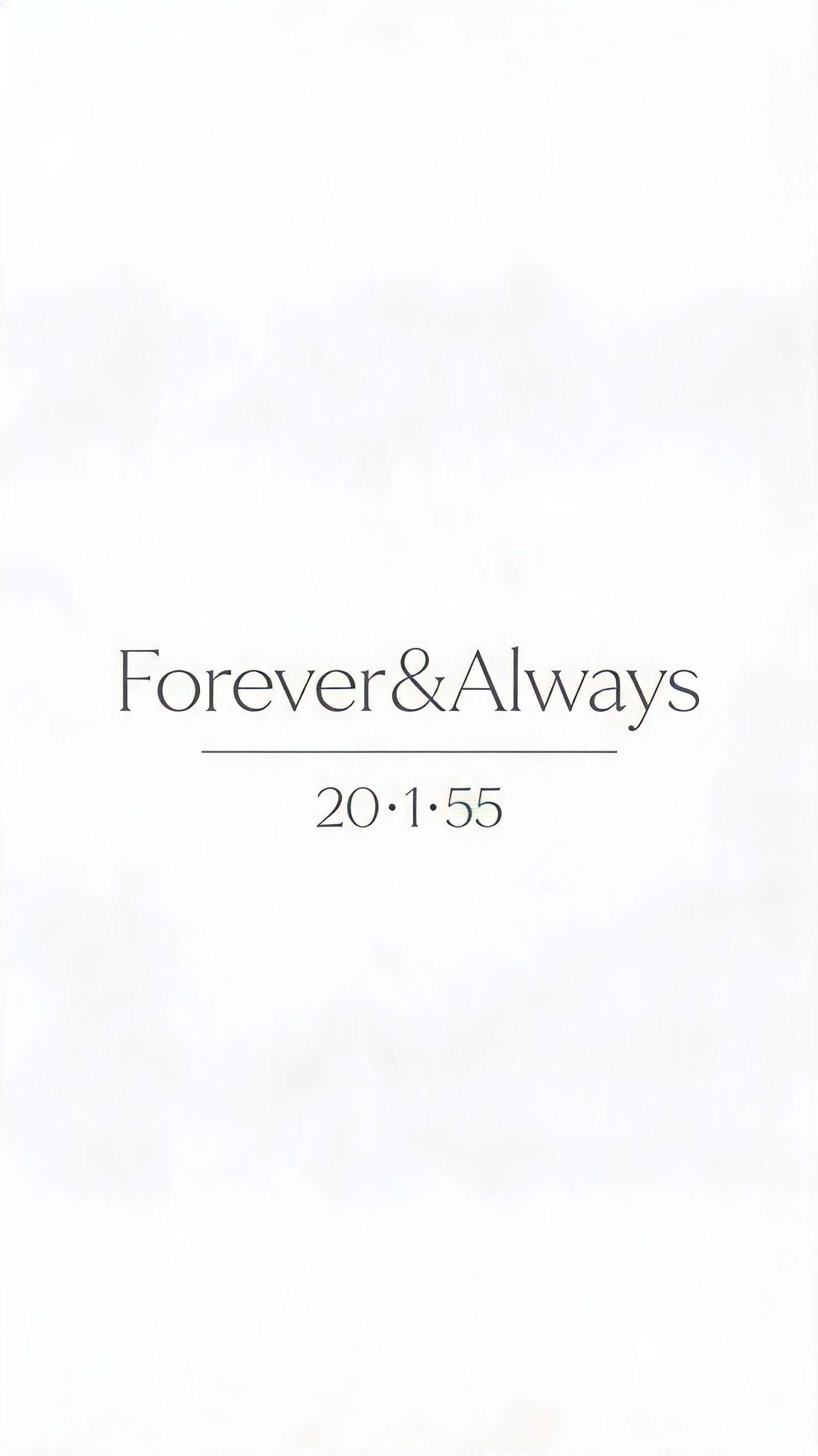
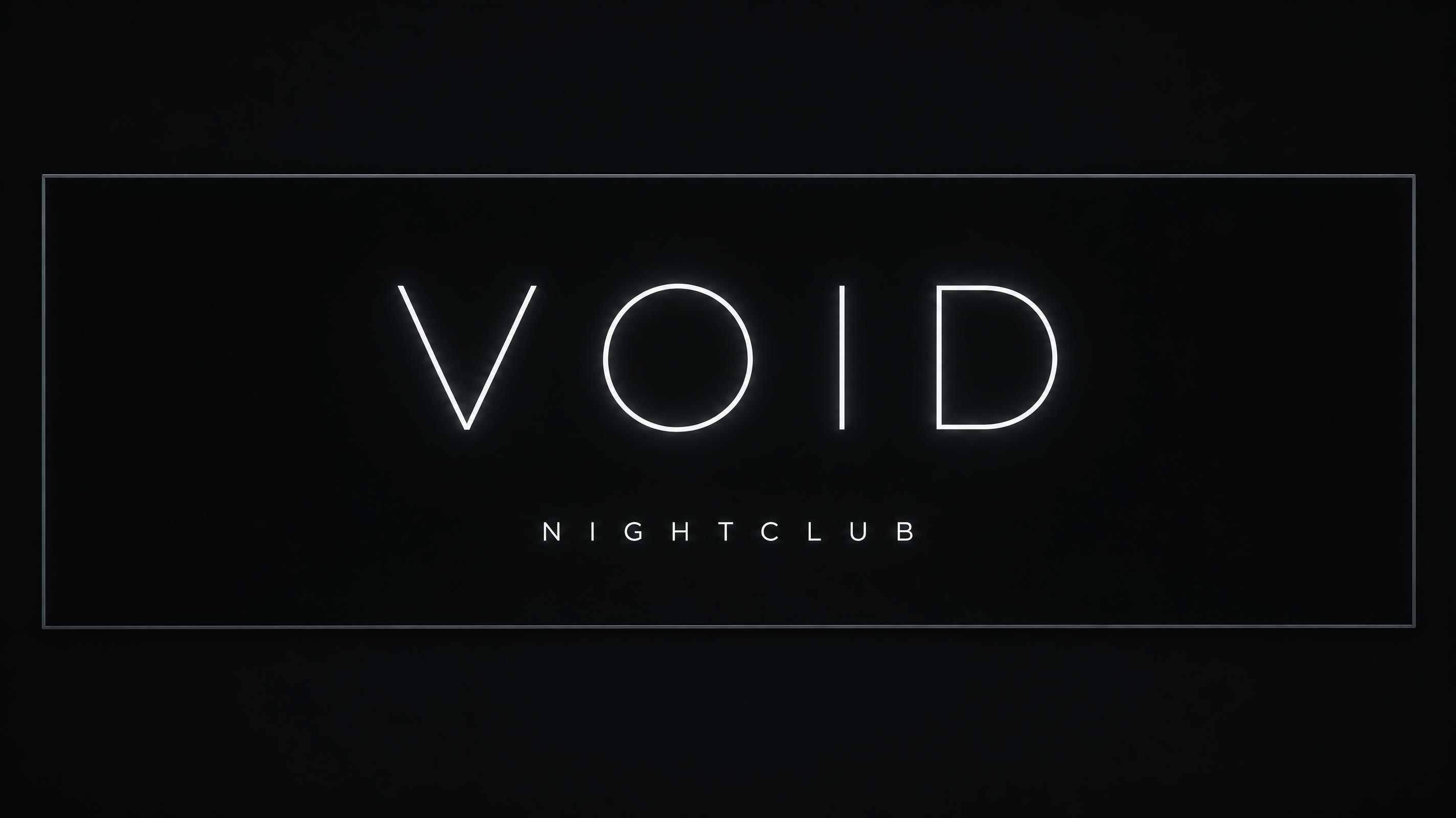
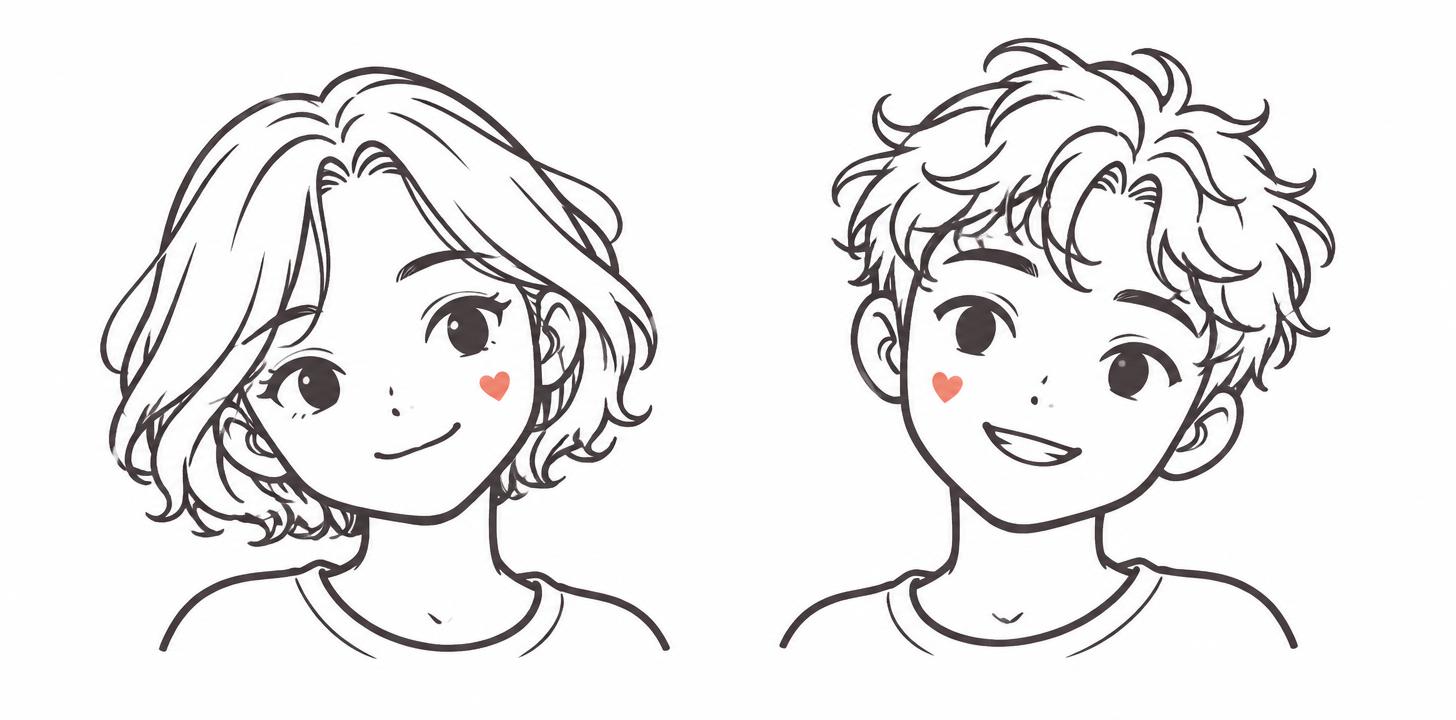
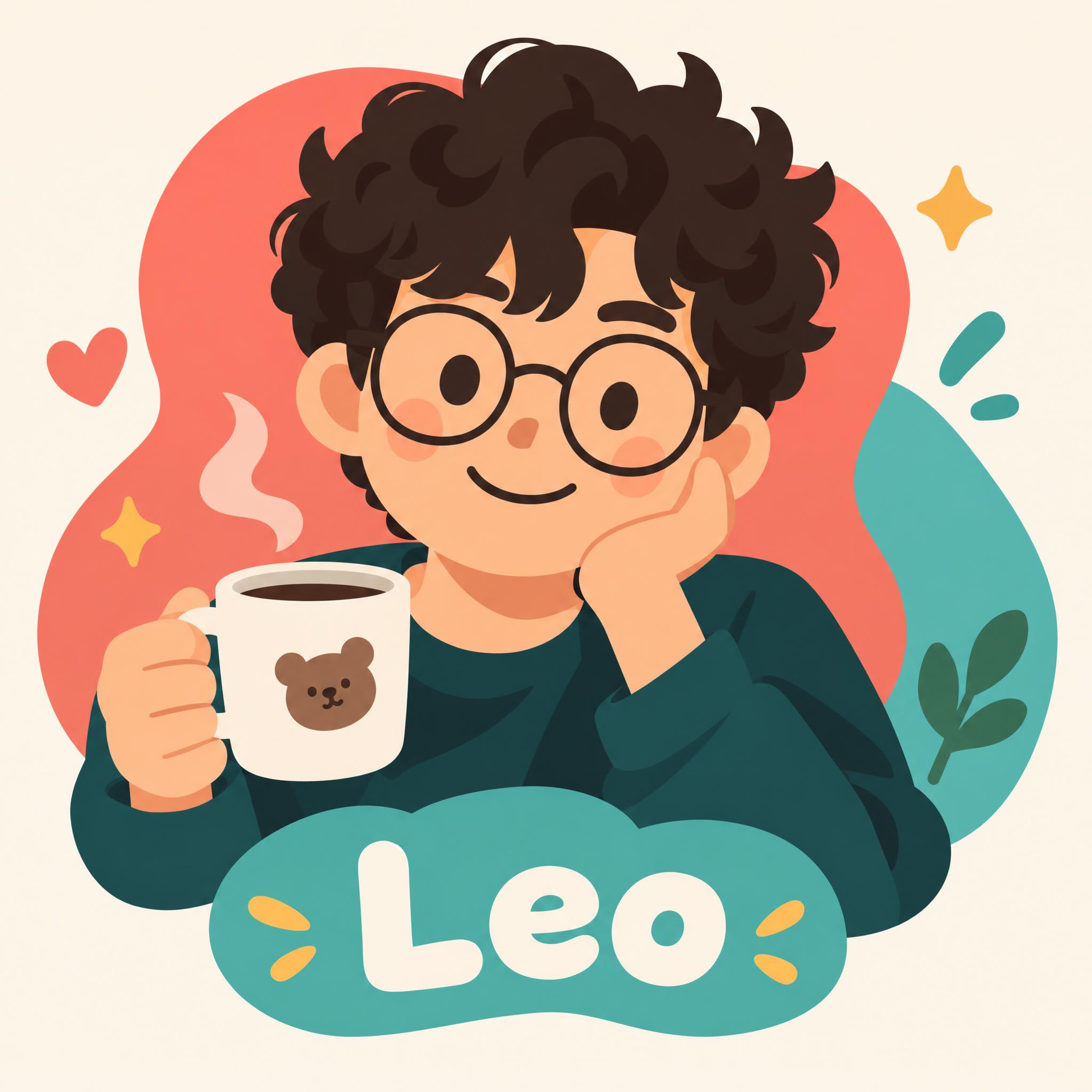
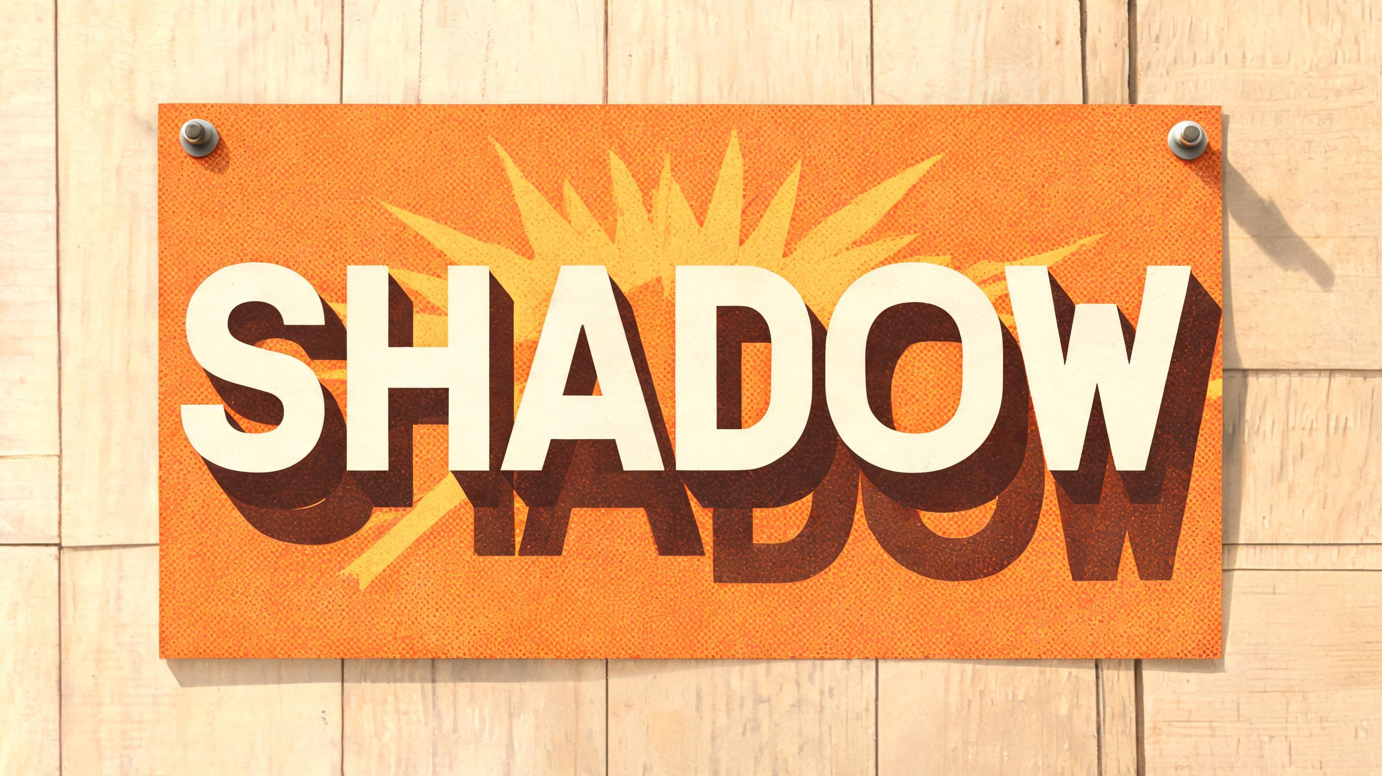
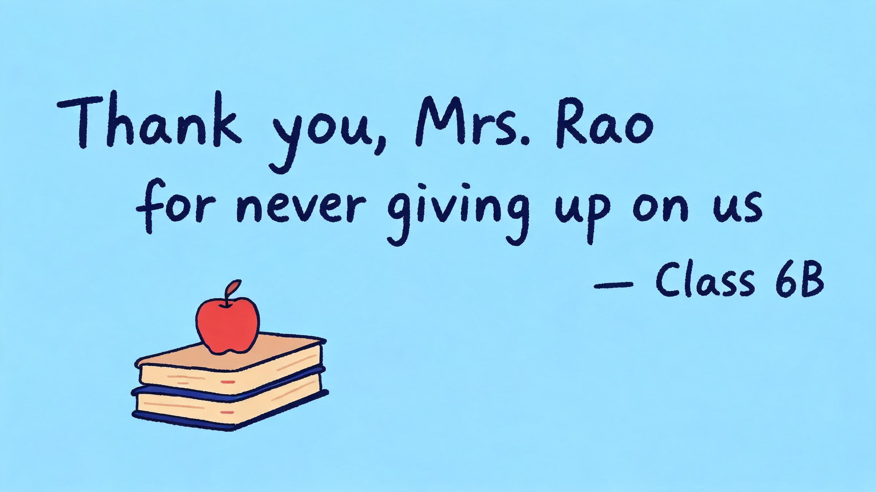
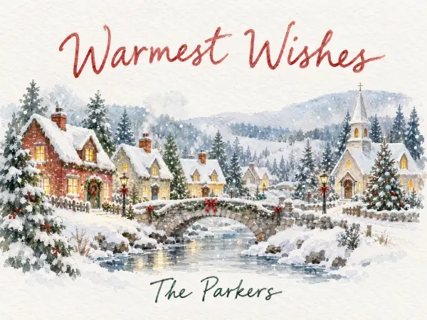
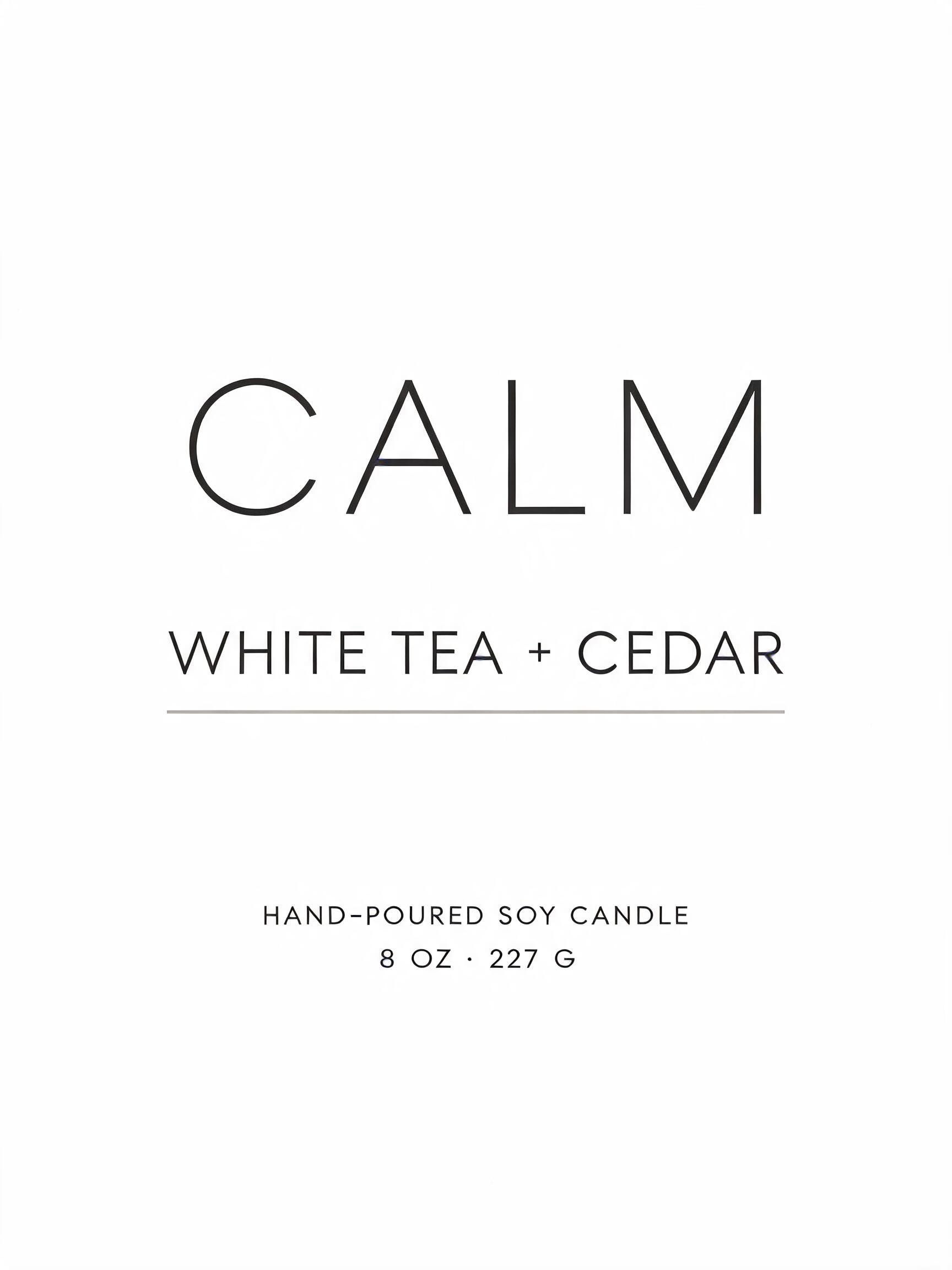
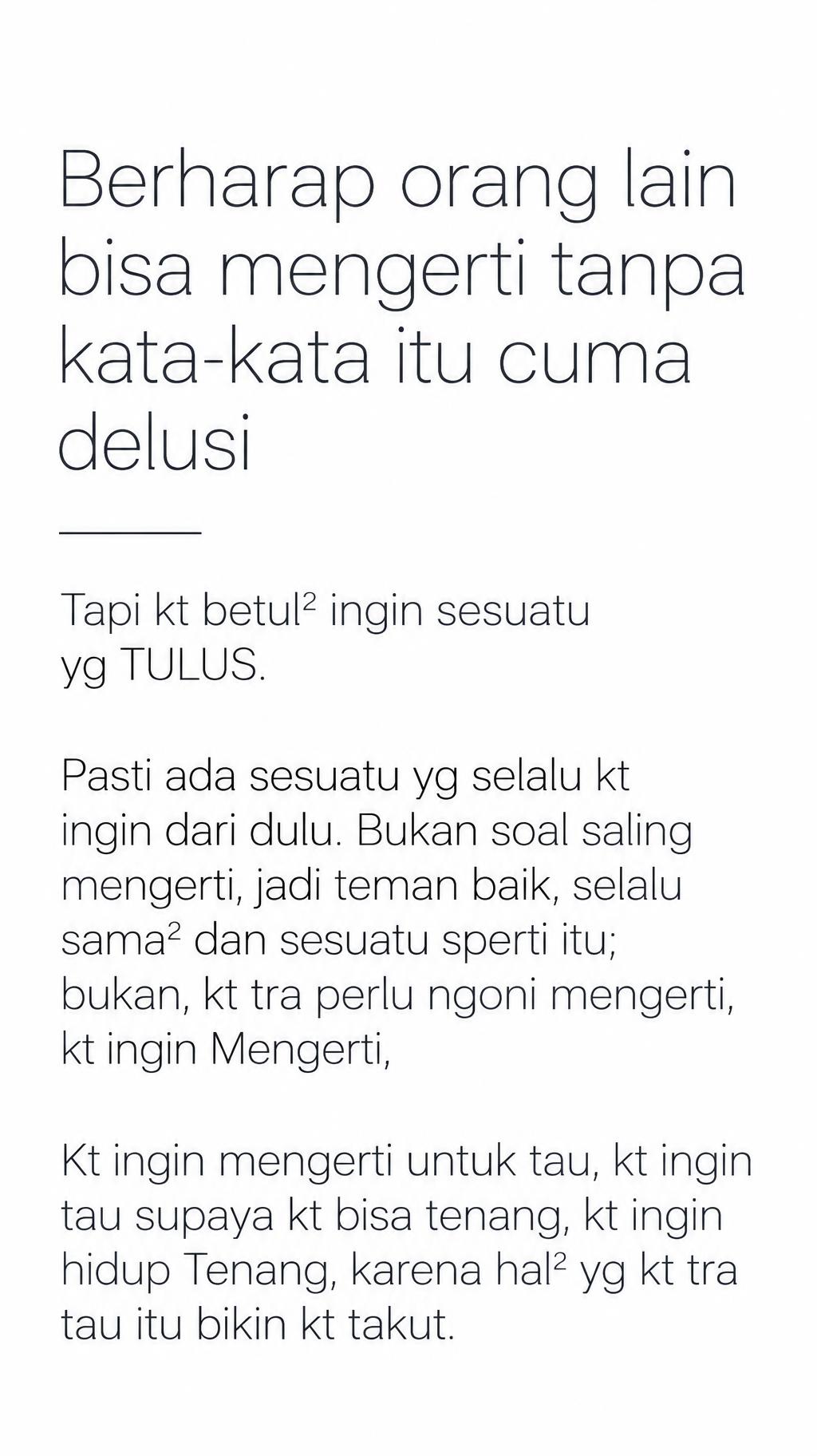
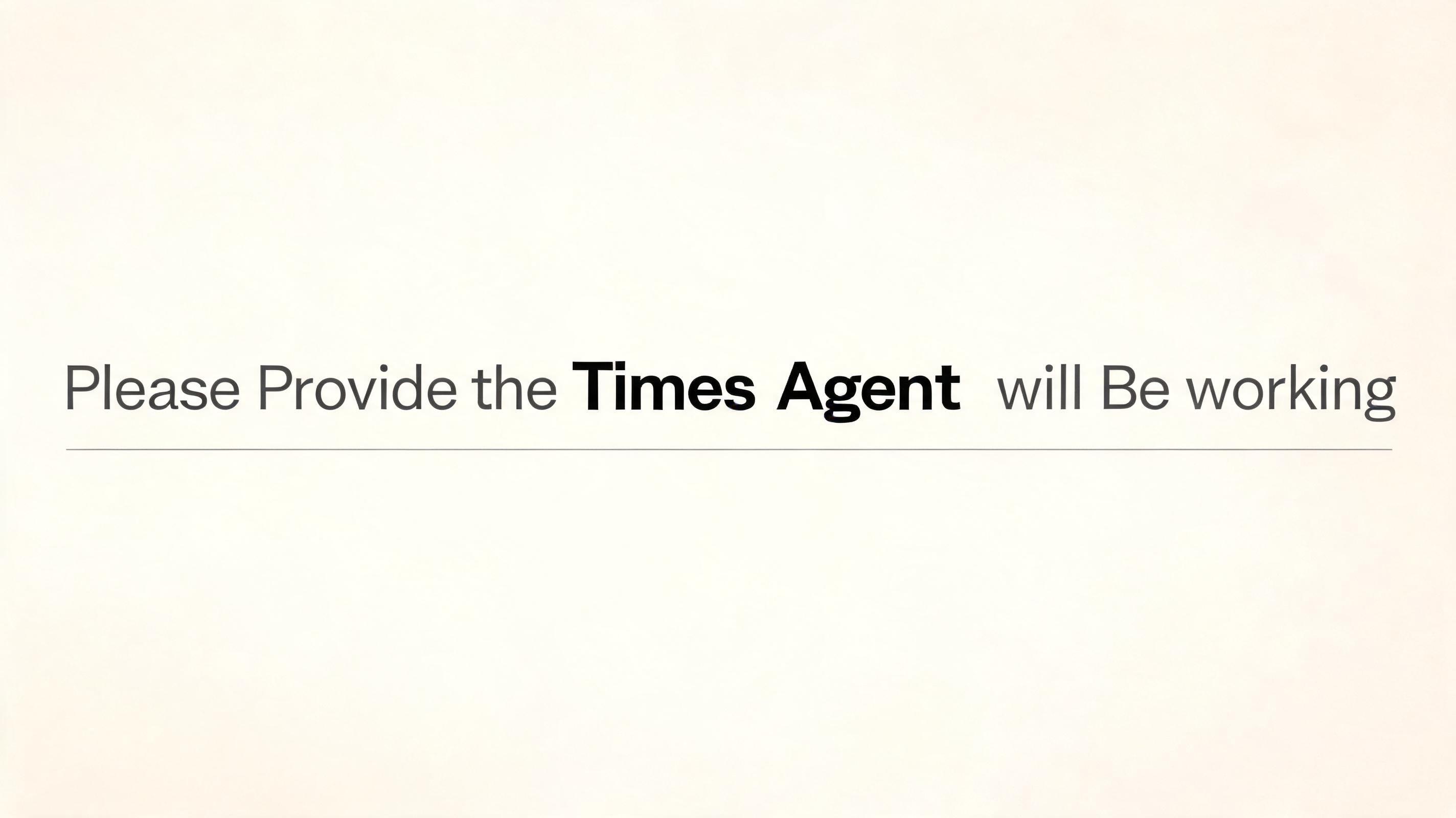
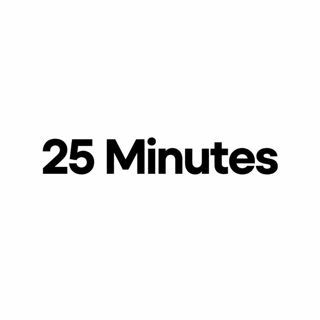
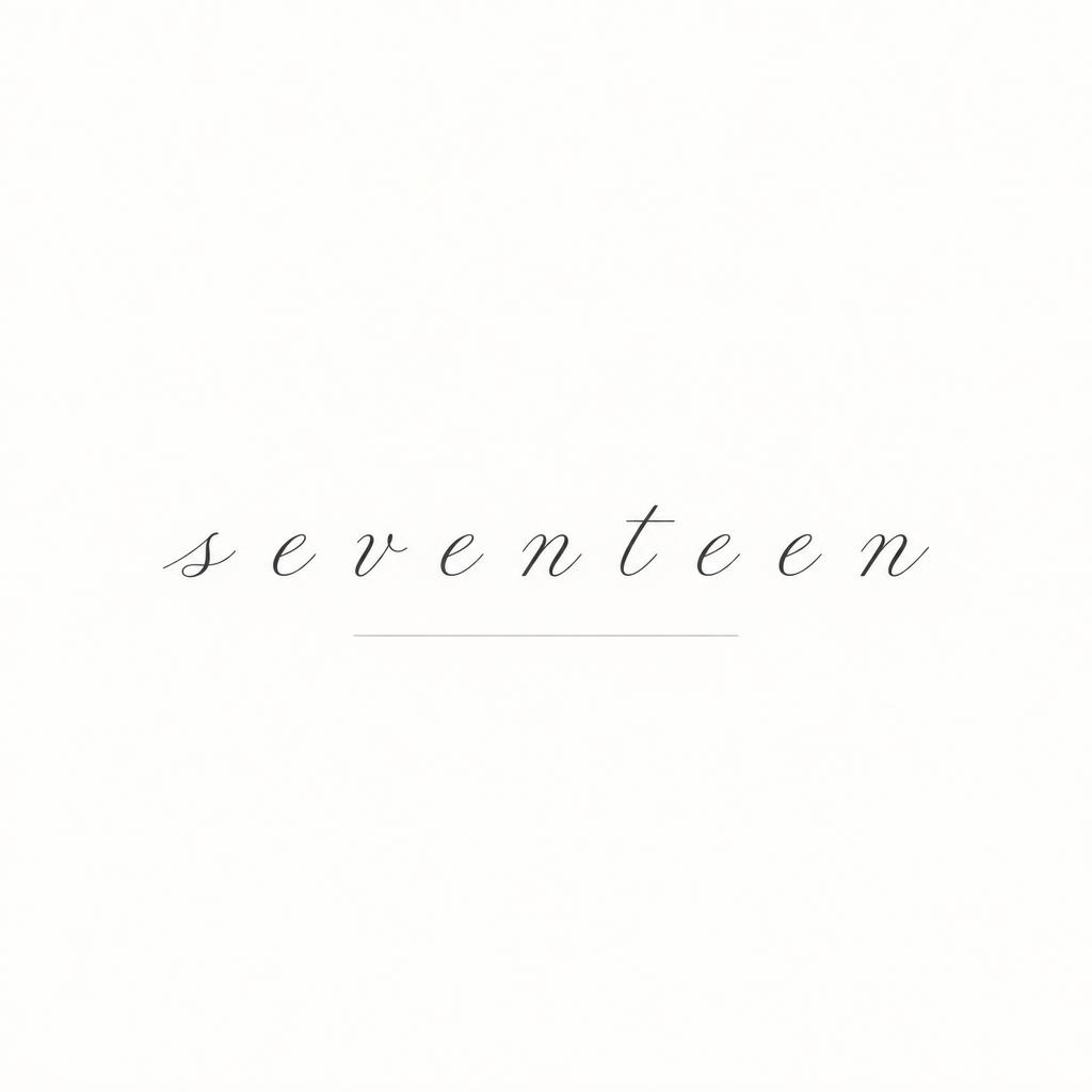
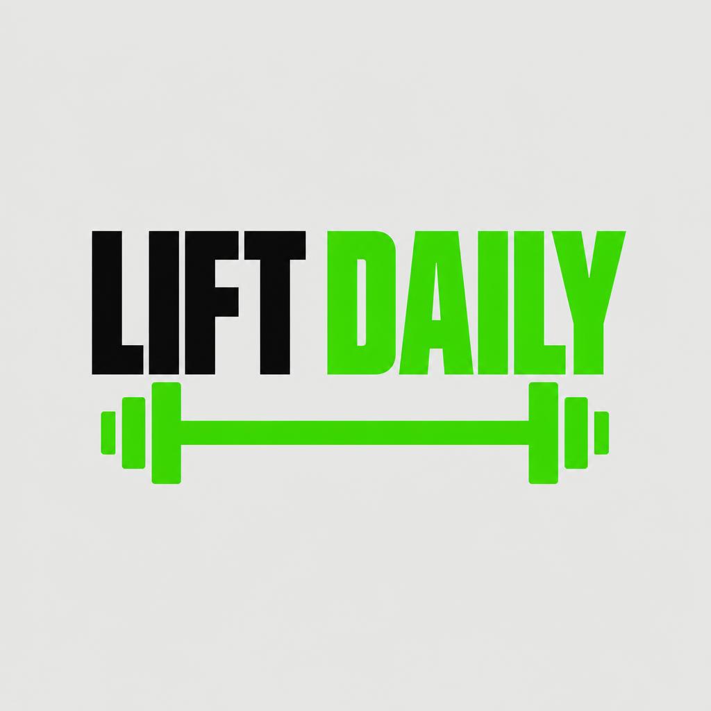
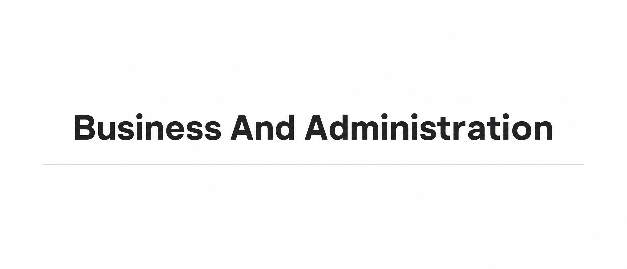
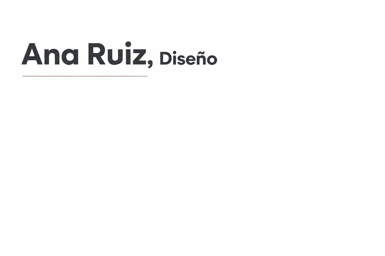
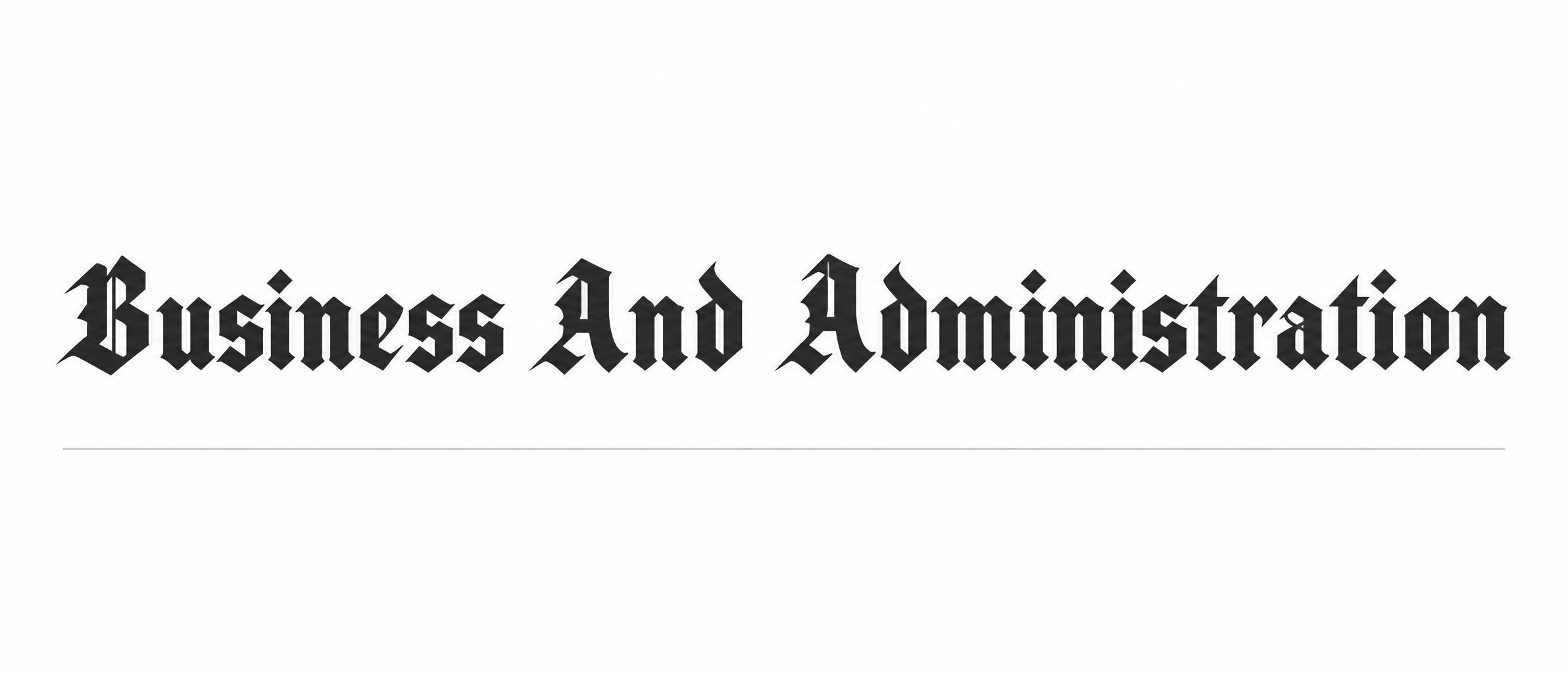
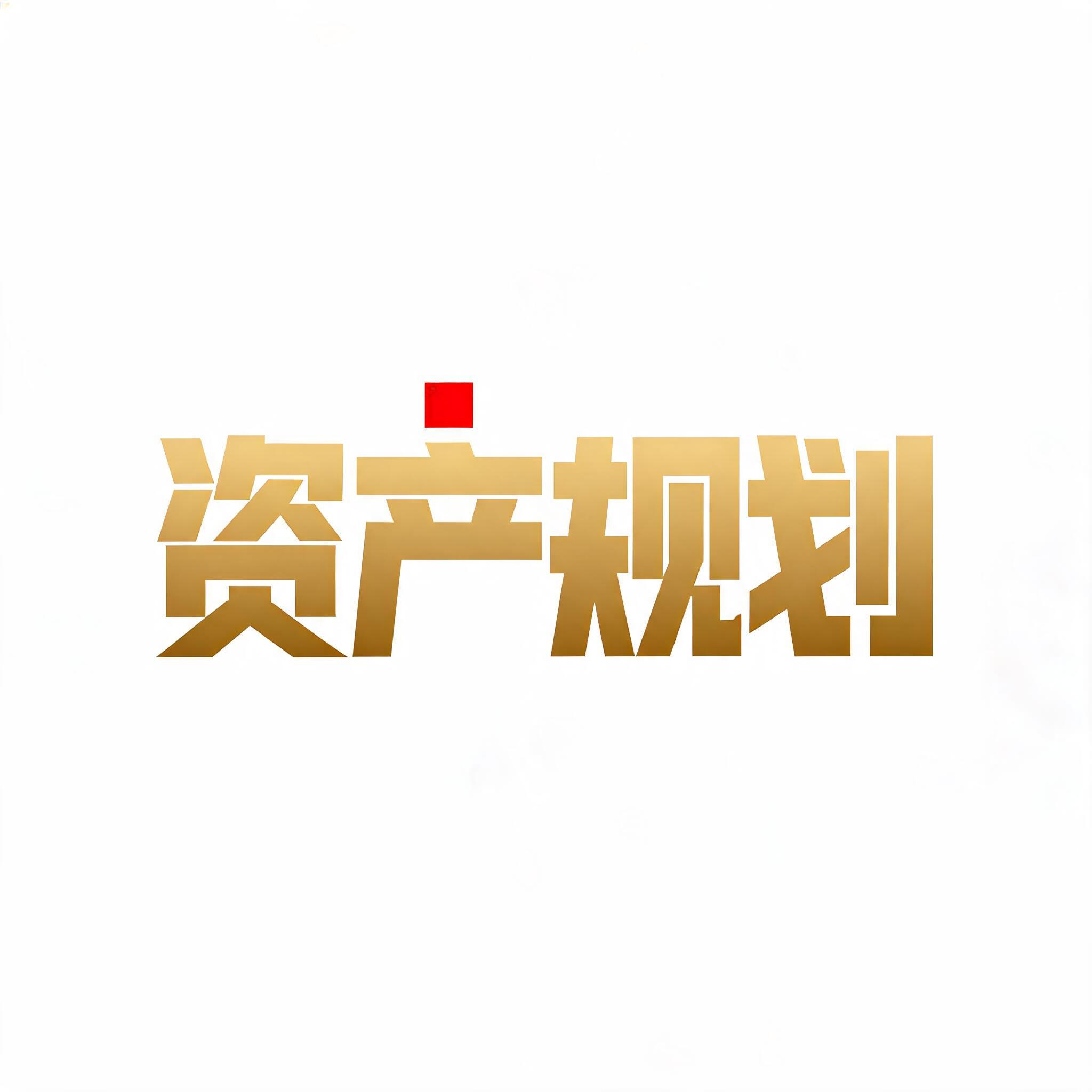
Real outputs from the Minimal style. Click any image to see details.

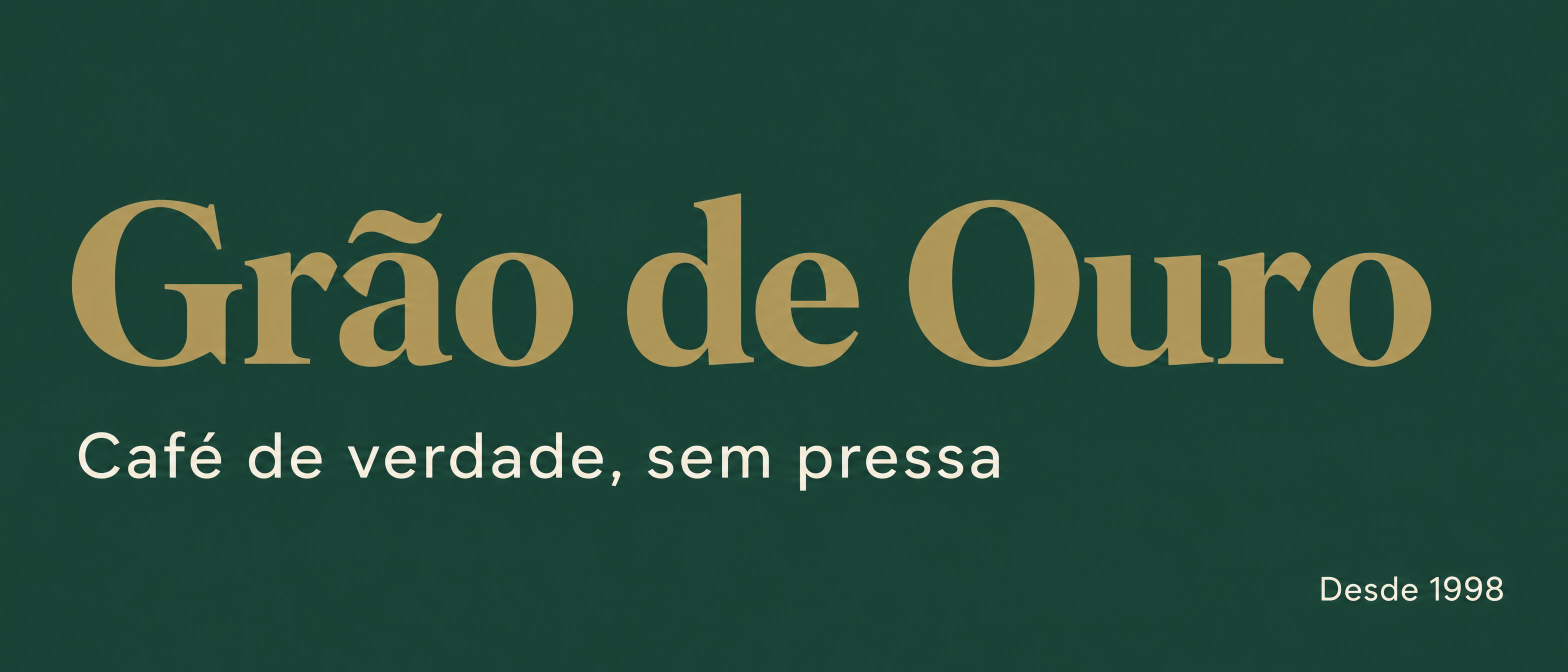
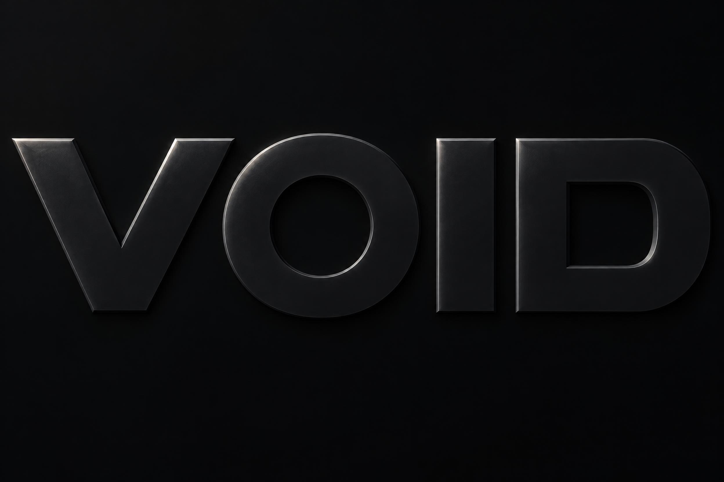












Looking for copy-paste fancy text? Try our free Font Generator Tools — cursive, gothic, bubble & 30+ styles.
Perfect for These Projects
Minimal Text Effect — FAQ
What is the Minimal Font Style?
The Minimal font style is a distinctive AI-generated typography effect. Dark grey geometric sans with generous spacing and a single hairline rule beneath, flat and matte on an almost empty off-white ground. Using FontVibe's AI minimal generator you can create stunning text effects in seconds — no Photoshop, no font licensing, no design experience needed.
Explore the Minimal gallery for inspiration, or browse all 138+ AI text effect styles available on FontVibe.
How to Create Minimal Typography in FontVibe Studio
The Story Behind Minimal
History, visual DNA, and cultural context.
Less Is Not Nothing
Minimalism as a design philosophy has a precise intellectual genealogy: it runs through the Swiss International Style of the 1950s–60s (grid-based design, objective typography, the principle that form follows function), through the influence of Japanese Ma (間) — the concept of meaningful empty space — and through the work of designers like Massimo Vignelli, who stated that "the life of a designer is a life of fight: fight against the ugliness."
The Swiss Style produced Helvetica (1957) and Univers (1957), two typefaces designed to be so optically neutral that they would not impose any stylistic character on the content — the ideal of the invisible container. This was a reaction against the decorative excesses of the preceding decades, an argument that good design was the elimination of everything unnecessary.
But minimalism is not absence of design — it is a discipline of attention. The decision about what to keep is harder than the decision about what to add. A composition with three elements requires each element to carry full weight; a composition with thirty elements allows any one of them to be weak. Minimalist design is higher stakes than ornamental design.
Sources: Frank Chimero — Massimo and Me · designboom — Graphic designer Massimo Vignelli has died aged 83 · Wikipedia — Helvetica · Wikipedia — Univers
The Visual DNA
Typographic Landmarks
Did You Know?
Mies van der Rohe's dictum "less is more" — the founding statement of architectural minimalism — already appears in Robert Browning's 1855 poem Andrea del Sarto, spoken by the Renaissance painter. The phrase is so overused that many designers now prefer the satirical counter-phrase "less is a bore," coined by architect Robert Venturi in 1966. Source ↗
Sources: Wikipedia — Complexity and Contradiction in Architecture
Create Your Minimal Typography in Studio
Free to start. No design skills needed. Your artwork, your copyright.
AI Minimal Text Effect Generator
Dark grey geometric sans with generous spacing and a single hairline rule beneath, flat and matte on an almost empty off-white ground. — no font license needed.
Minimal in different AI fonts
What you can make with Minimal
Generate Your Minimal Text Effect
Type any word — see it transformed in seconds. No sign-up required.
Minimal Style Gallery
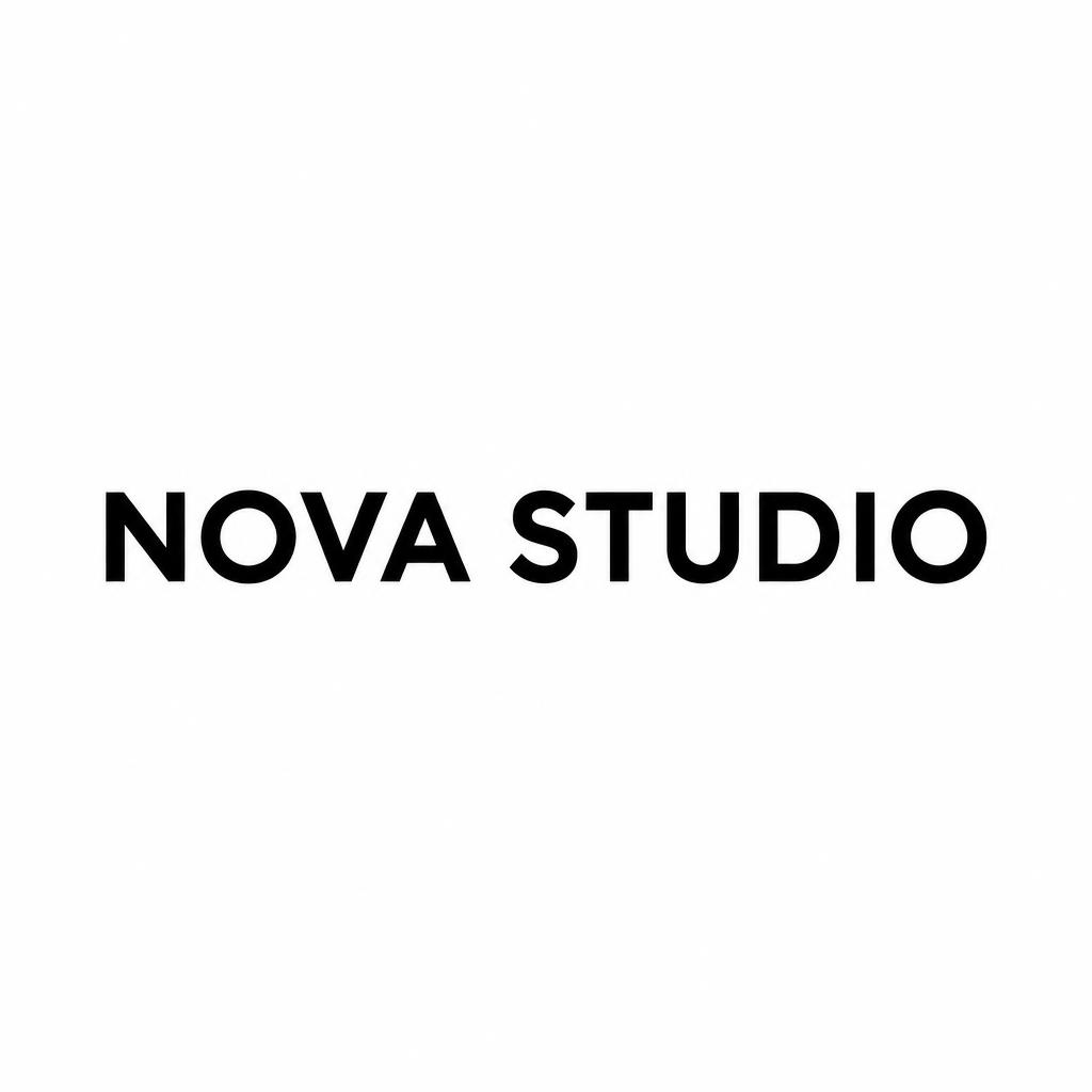
Real outputs from the Minimal style. Click any image to see details.

Similar Text Effect Styles
Try these styles and create your own AI-generated text effects.
Looking for copy-paste fancy text? Try our free Font Generator Tools — cursive, gothic, bubble & 30+ styles.
Perfect for These Projects
Minimal text effects are popular for creative projects where visual impact matters.
What is the Minimal Font Style?
The Minimal font style is a distinctive AI-generated typography effect. Dark grey geometric sans with generous spacing and a single hairline rule beneath, flat and matte on an almost empty off-white ground.
Using FontVibe's AI minimal generator you can create stunning text effects in seconds — no Photoshop, no font licensing, no design experience needed.
Explore the Minimal gallery for inspiration, or browse all 138+ AI text effect styles available on FontVibe.
How to Create Minimal Typography in FontVibe Studio
1. Enter your text — Any word, phrase, or brand name. Works best with short, punchy text.
2. Select Minimal — From the style library. Optionally describe a mood in the custom prompt.
3. Generate and download. Your Minimal font artwork is ready in seconds. PNG, JPG, or transparent PNG.
Looking for something different? Browse the full font style library for more AI typography options.
Minimal Text Effect — FAQ
The Story Behind Minimal
History, visual DNA, and cultural context — everything that makes this style what it is.
Less Is Not Nothing
Minimalism as a design philosophy has a precise intellectual genealogy: it runs through the Swiss International Style of the 1950s–60s (grid-based design, objective typography, the principle that form follows function), through the influence of Japanese Ma (間) — the concept of meaningful empty space — and through the work of designers like Massimo Vignelli, who stated that "the life of a designer is a life of fight: fight against the ugliness."
The Swiss Style produced Helvetica (1957) and Univers (1957), two typefaces designed to be so optically neutral that they would not impose any stylistic character on the content — the ideal of the invisible container. This was a reaction against the decorative excesses of the preceding decades, an argument that good design was the elimination of everything unnecessary.
But minimalism is not absence of design — it is a discipline of attention. The decision about what to keep is harder than the decision about what to add. A composition with three elements requires each element to carry full weight; a composition with thirty elements allows any one of them to be weak. Minimalist design is higher stakes than ornamental design.
Sources: Frank Chimero — Massimo and Me · designboom — Graphic designer Massimo Vignelli has died aged 83 · Wikipedia — Helvetica · Wikipedia — Univers
The Visual DNA
Typographic Landmarks
Did You Know?
Mies van der Rohe's dictum "less is more" — the founding statement of architectural minimalism — already appears in Robert Browning's 1855 poem Andrea del Sarto, spoken by the Renaissance painter. The phrase is so overused that many designers now prefer the satirical counter-phrase "less is a bore," coined by architect Robert Venturi in 1966. Source ↗
Sources: Wikipedia — Complexity and Contradiction in Architecture