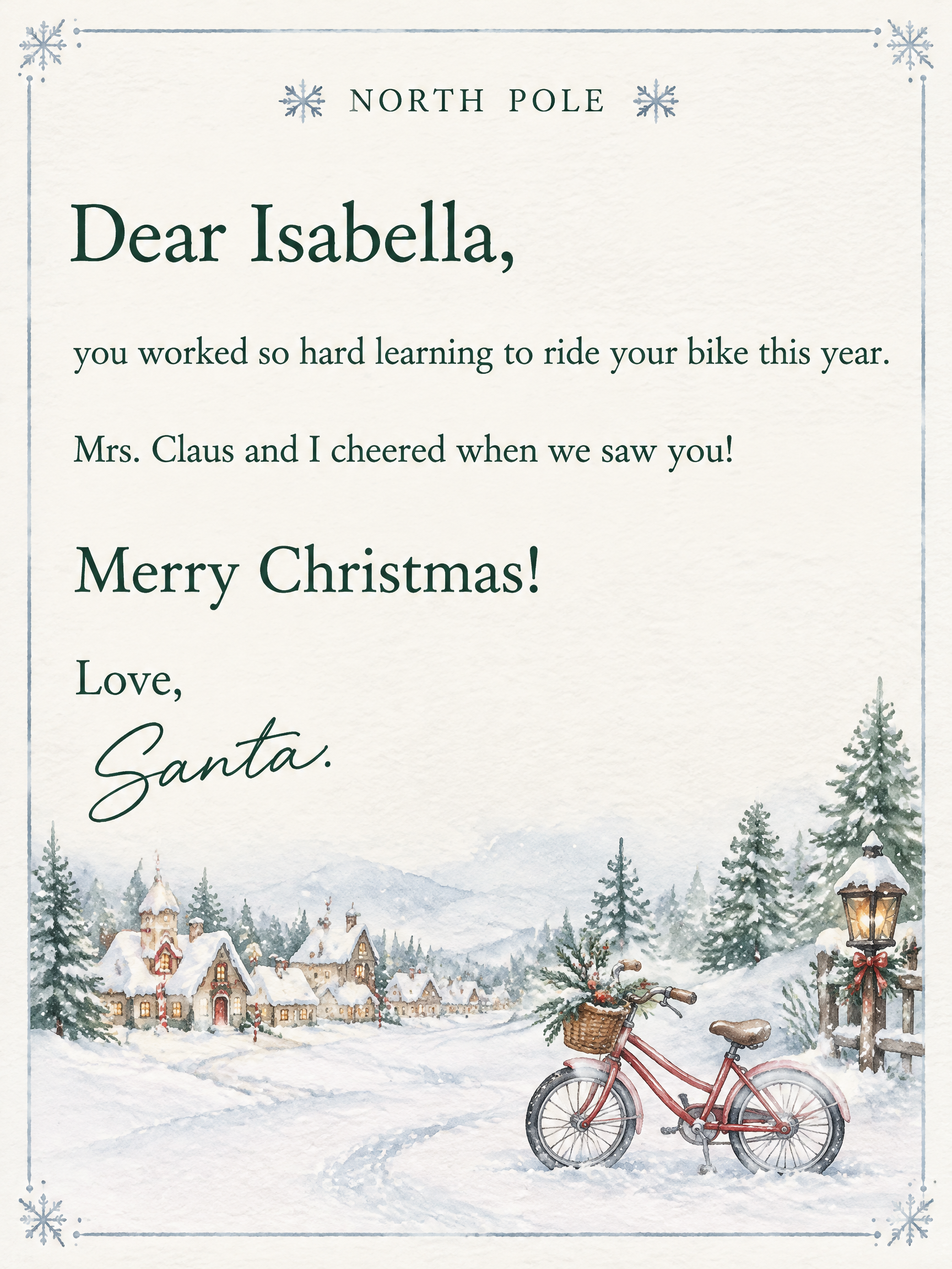

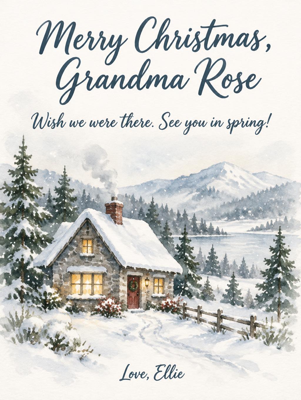
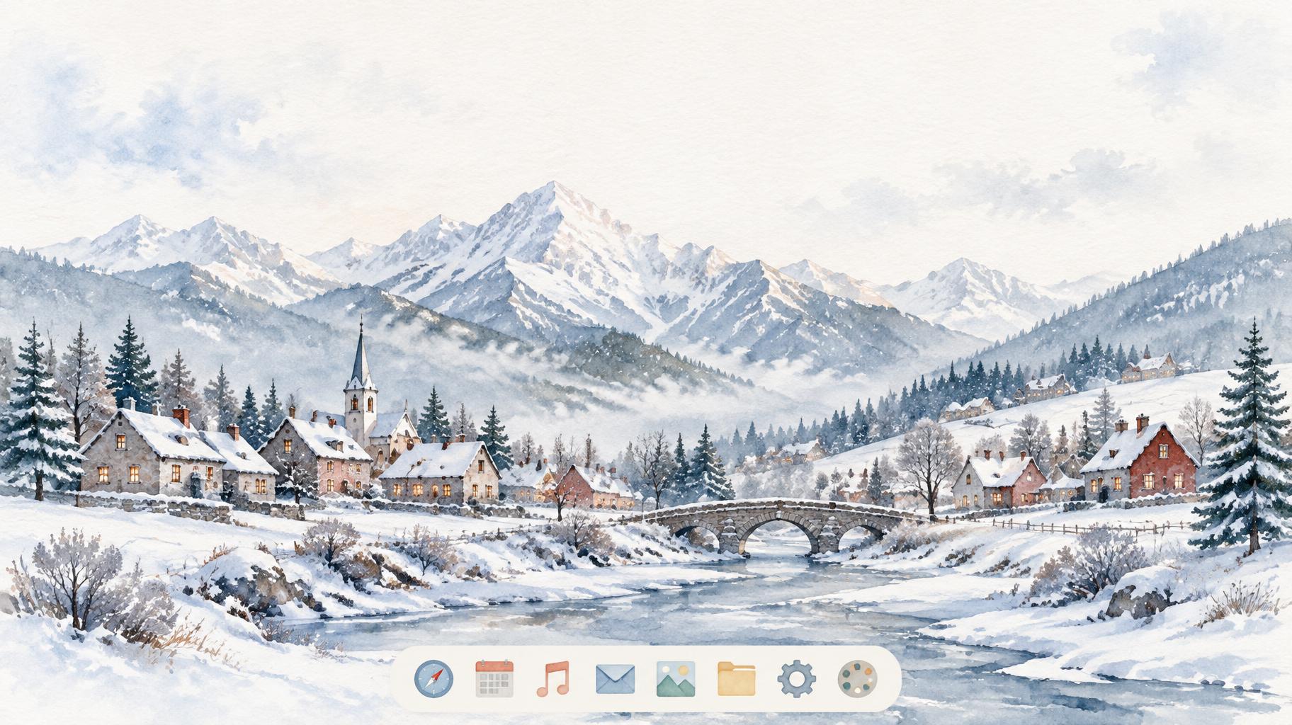
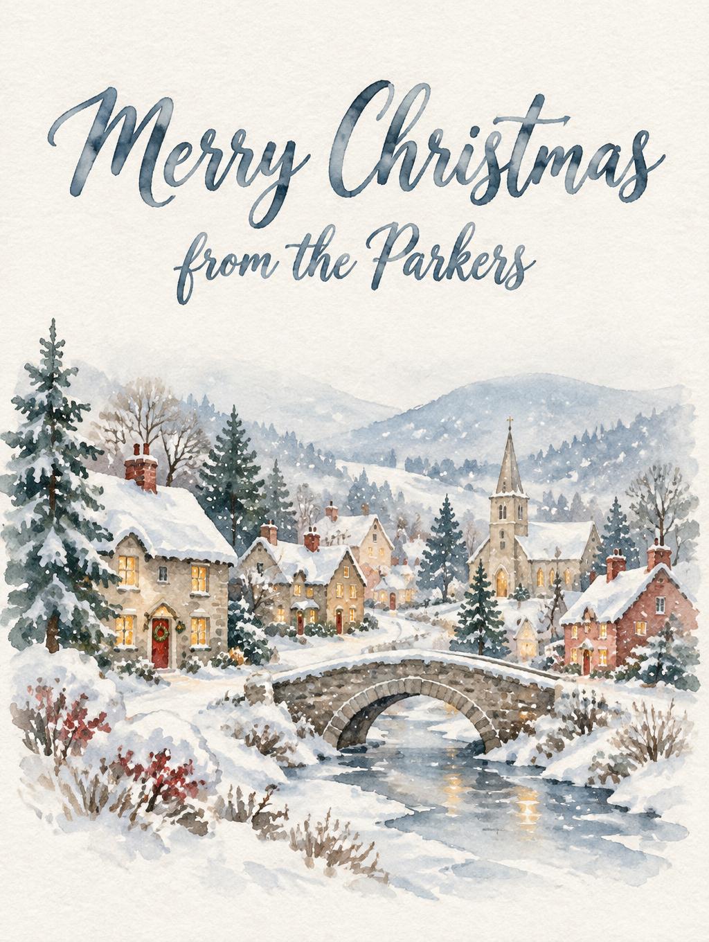
The watercolor Christmas aesthetic: painted winter scenes, cold light, muted palette and paper texture
Every watercolor Christmas piece here is built from the same four parts. The style paints the scene, the light, the palette and the paper around your words; the letters come from the AI font you pick.
Watercolor Christmas cards, clipart, illustrations and wallpapers
Every format here pairs your words with a hand-painted winter scene on white watercolor paper. Pick a format to see designs made in it, or describe your own.
Watercolor Christmas Cards
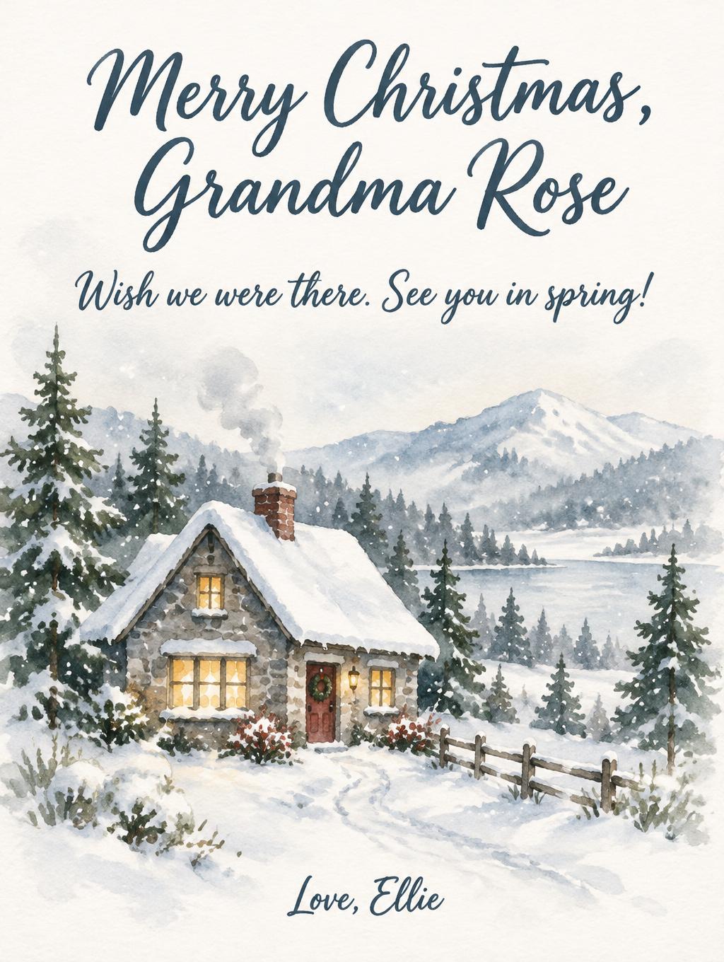
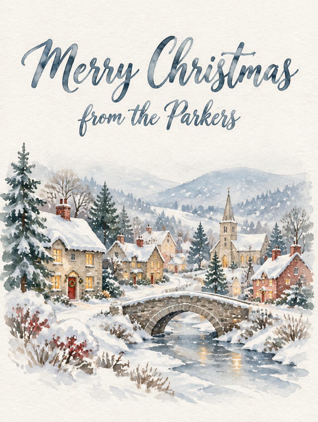
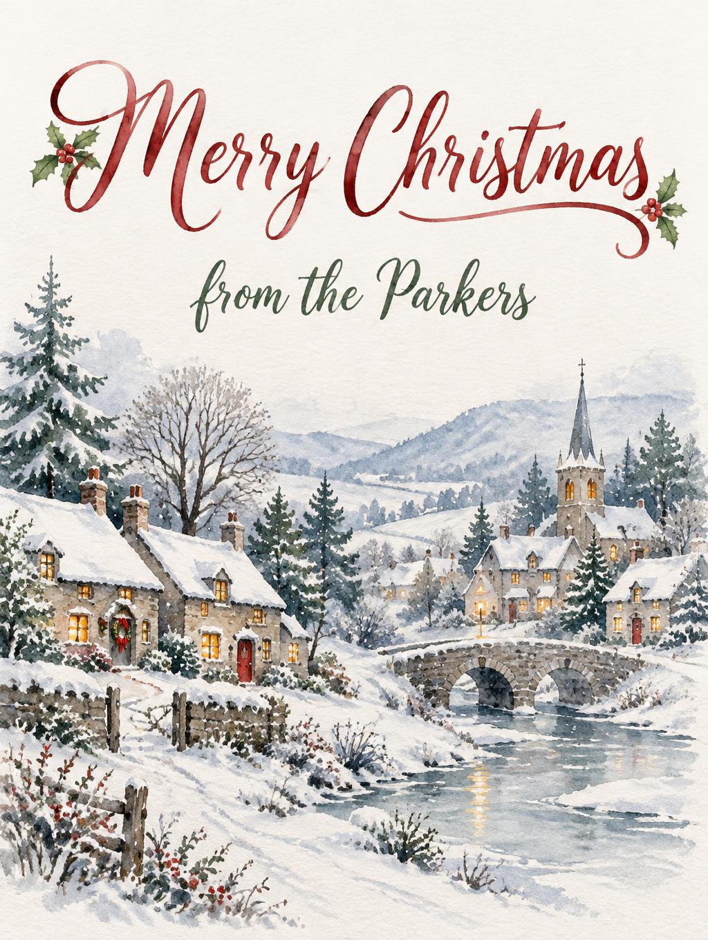
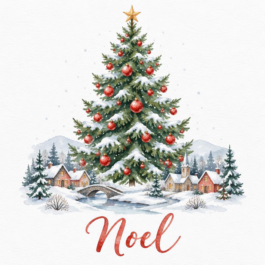
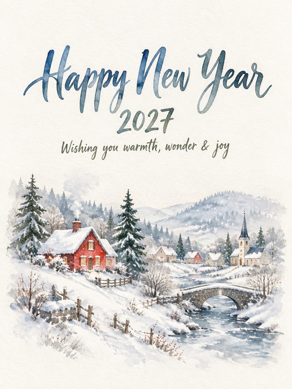
Card fronts with your greeting in white space above a painted snowy village, pine or landscape.





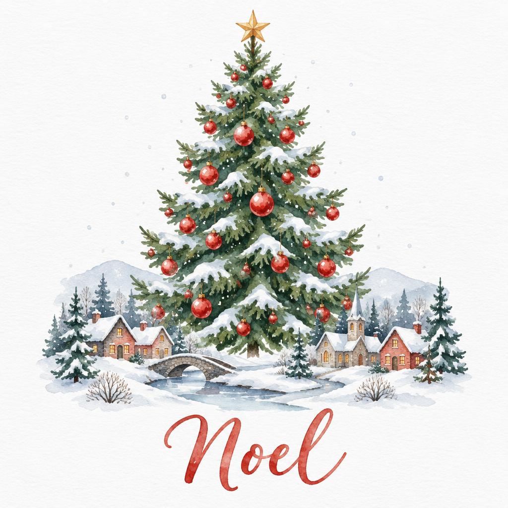
Watercolor Christmas Clipart
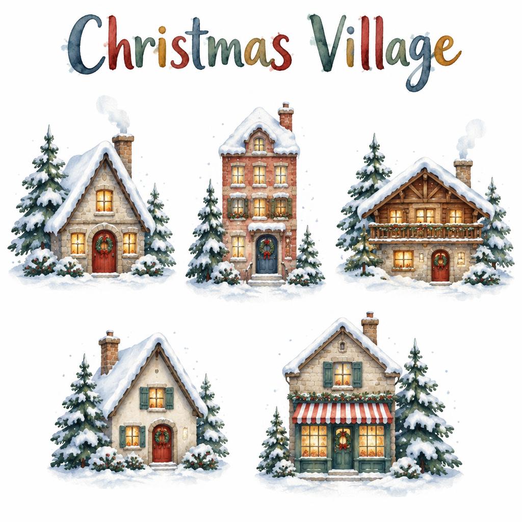
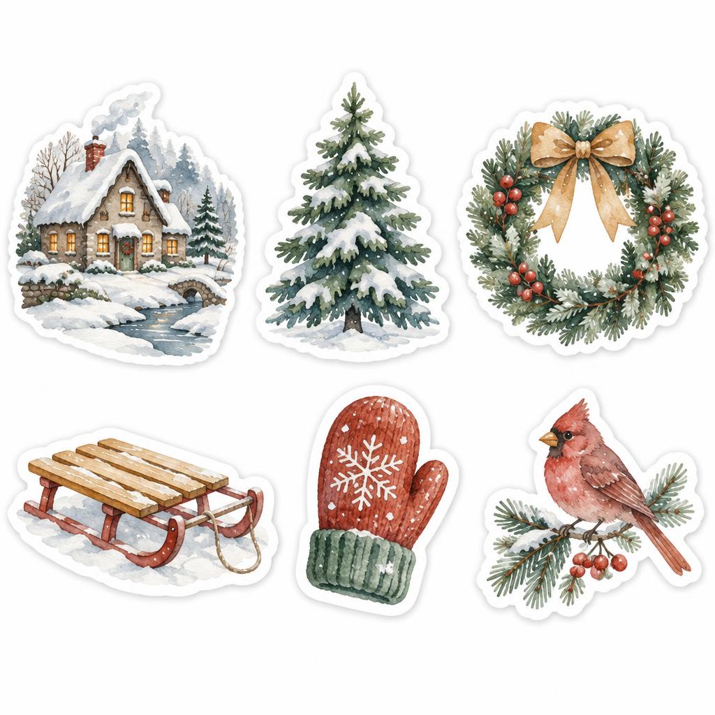
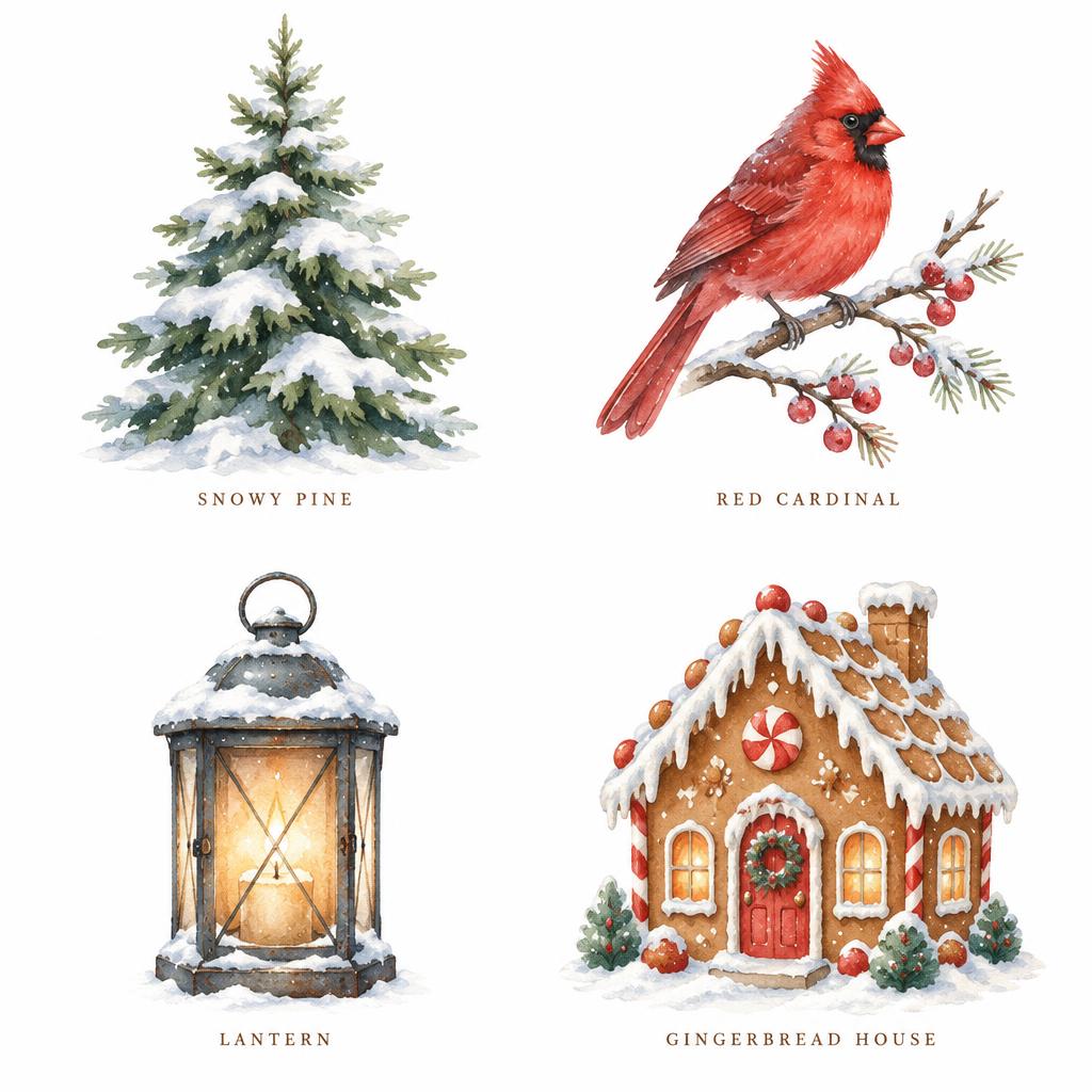
Painted village houses, trees and wreaths on plain white, ready to place on your own designs.

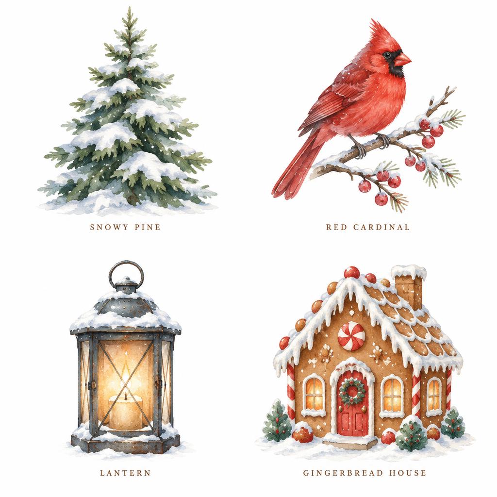
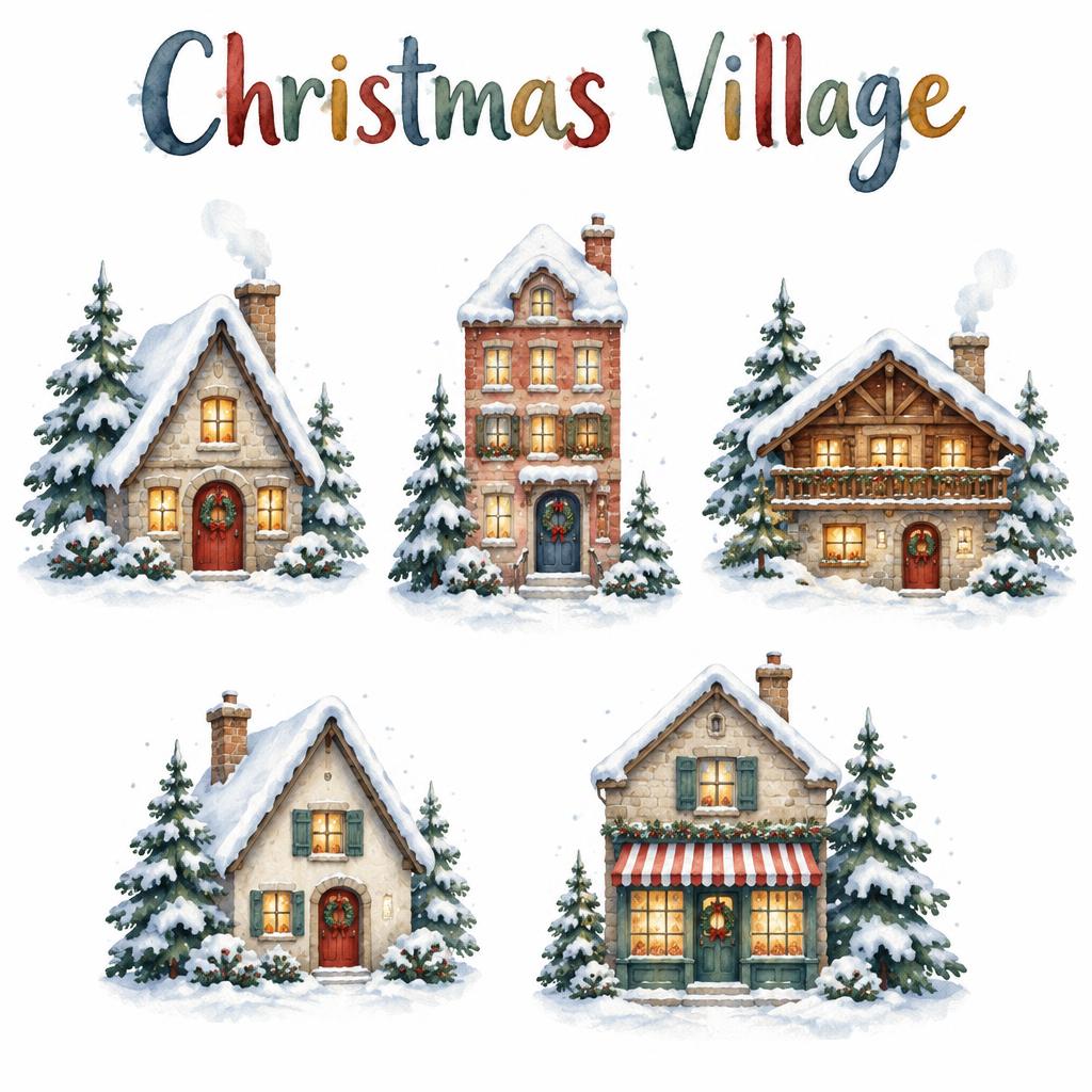
Watercolor Christmas Wallpapers
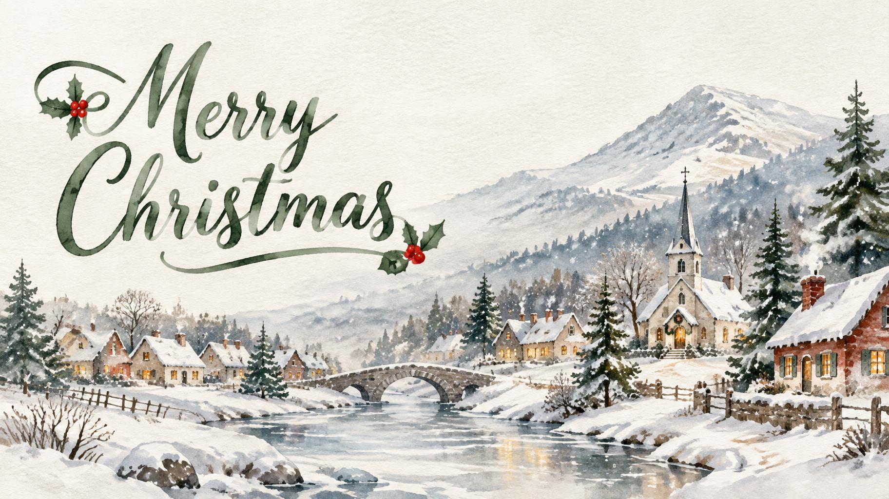
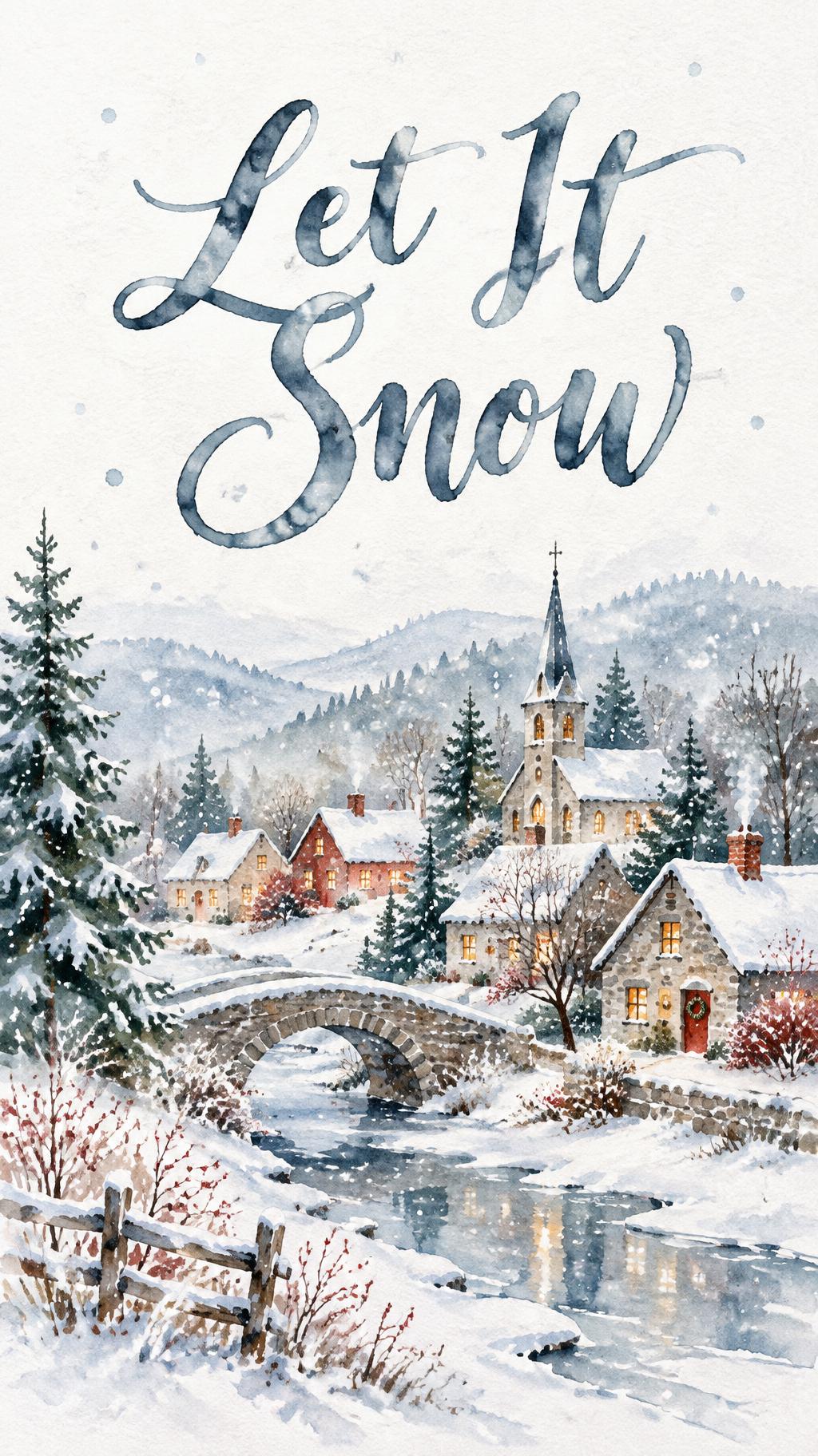
Phone and desktop wallpapers with painted pines and villages and a calm area for your words.
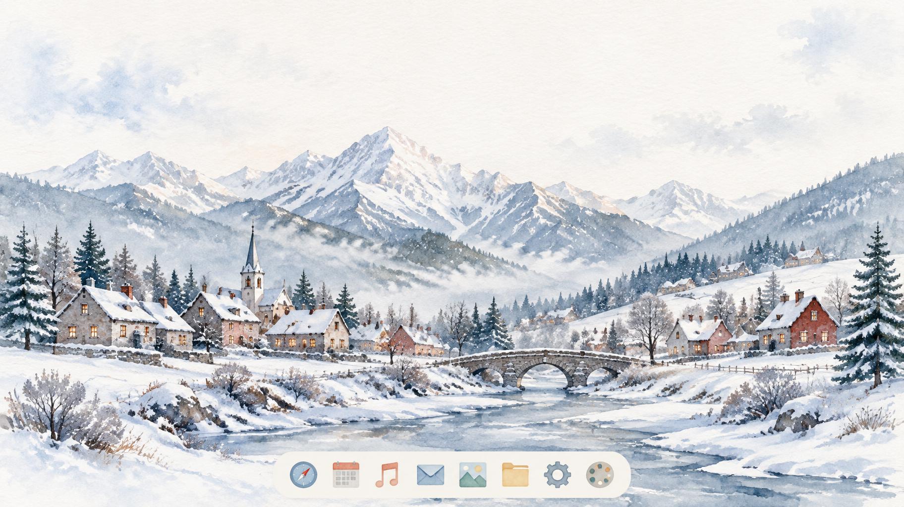
AI fonts that fit Watercolor Christmas
Every AI font here fits the Watercolor Christmas frame. Pick one, or let the generator choose.



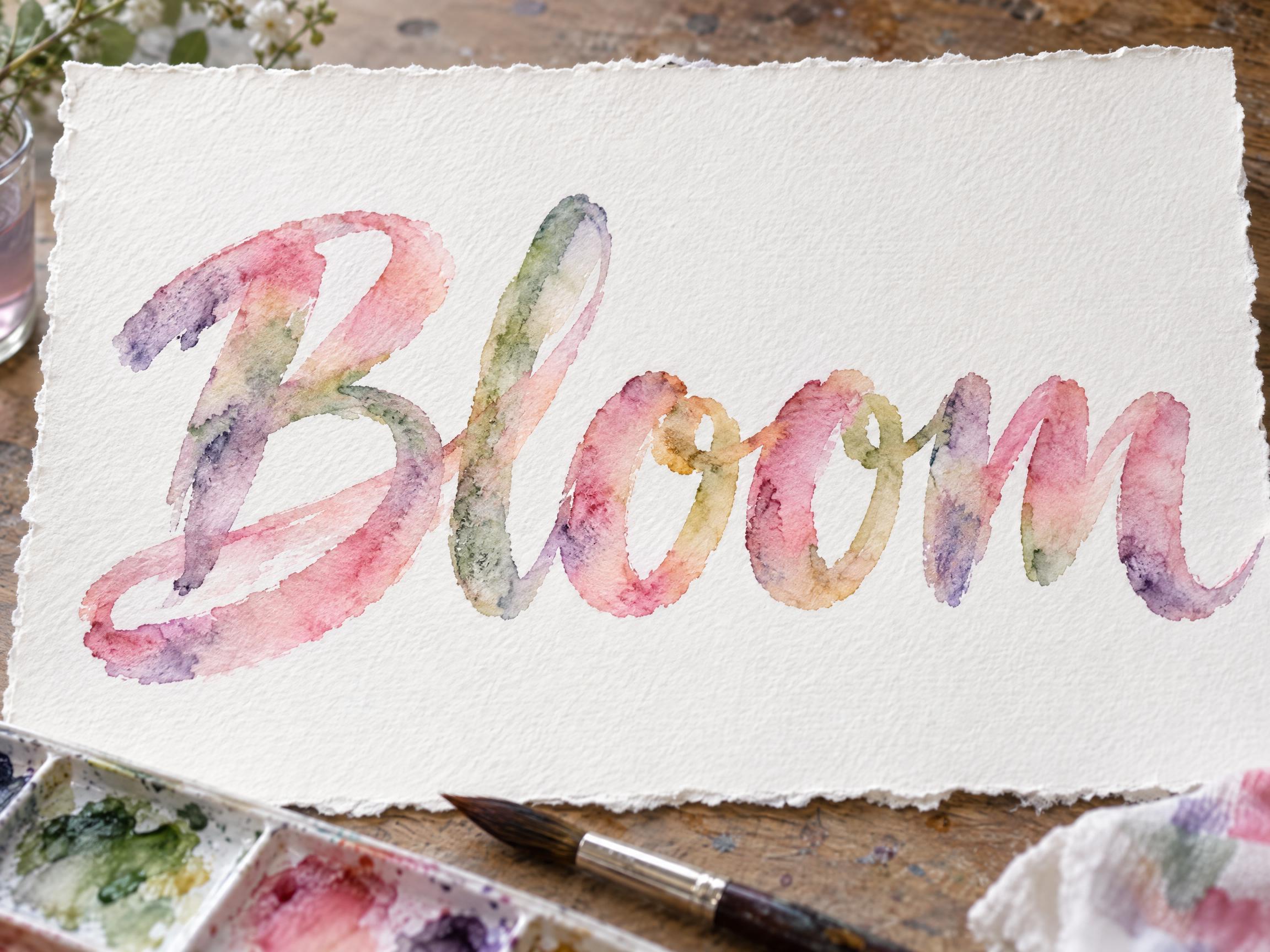


Watercolor Christmas style designs
Real designs made on FontVibe. Open any one, or reuse it with your own text.
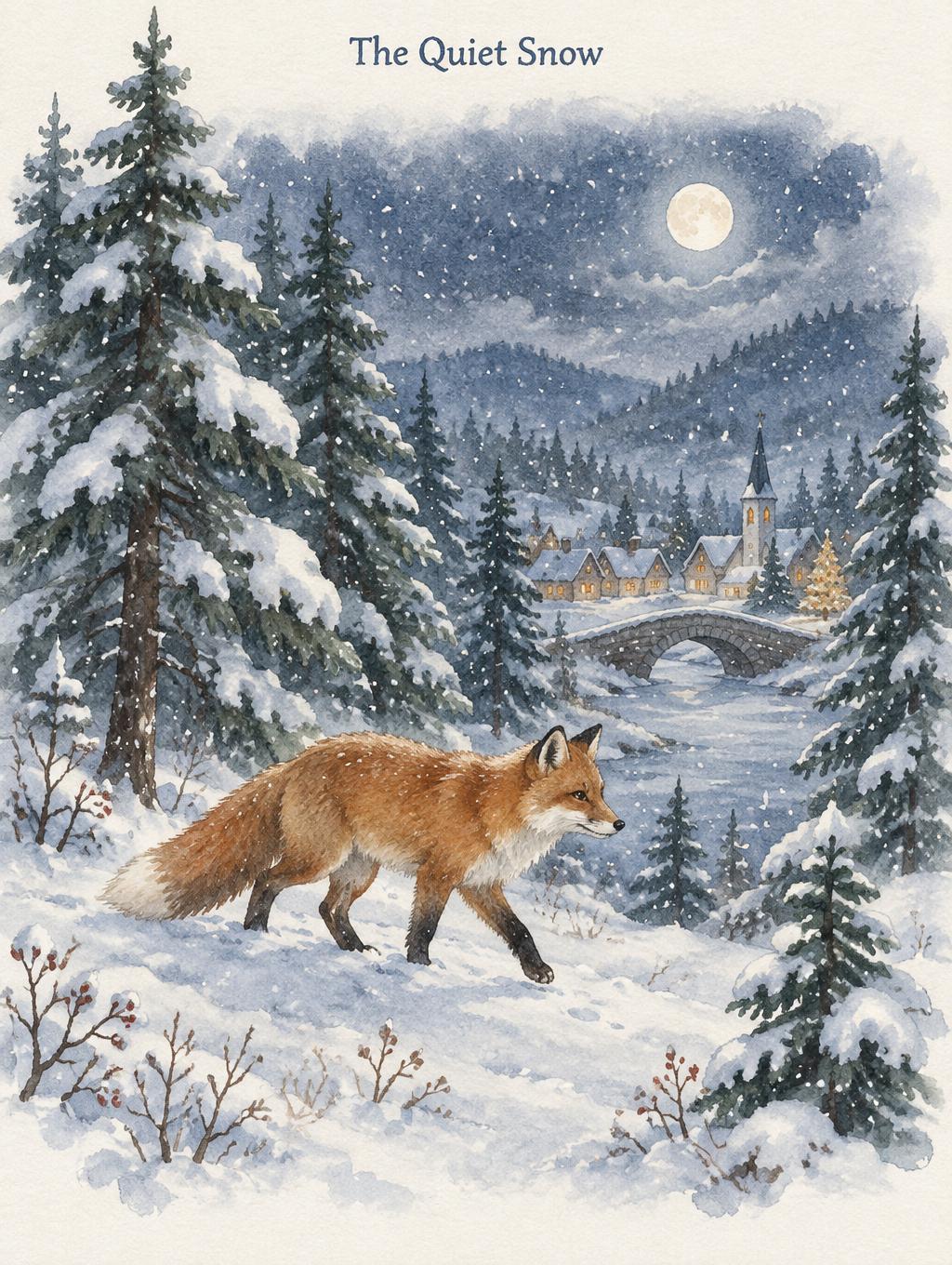
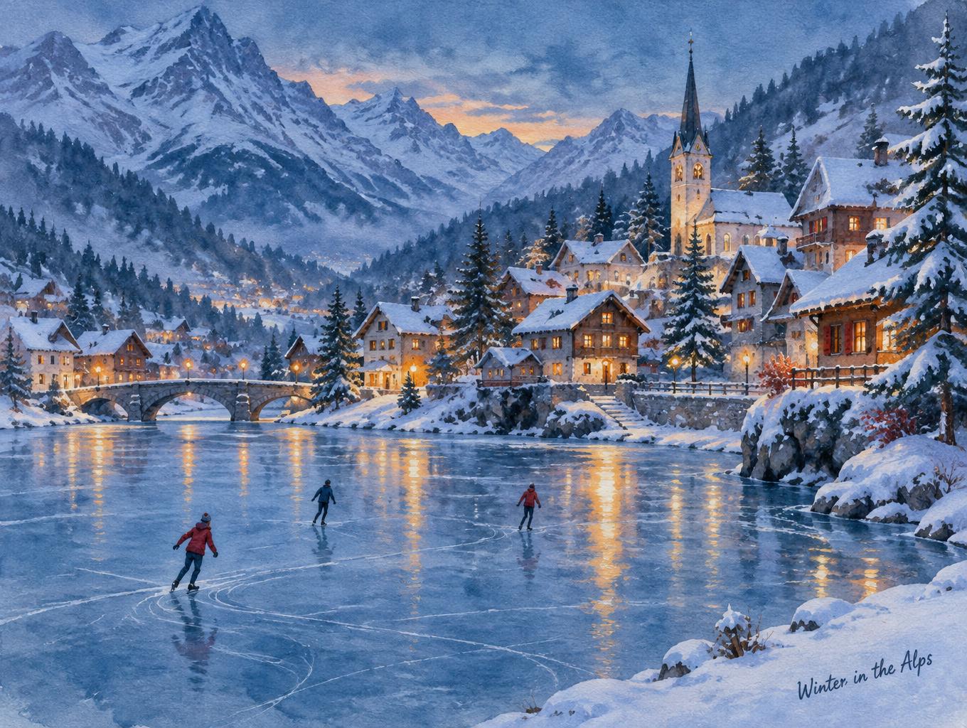

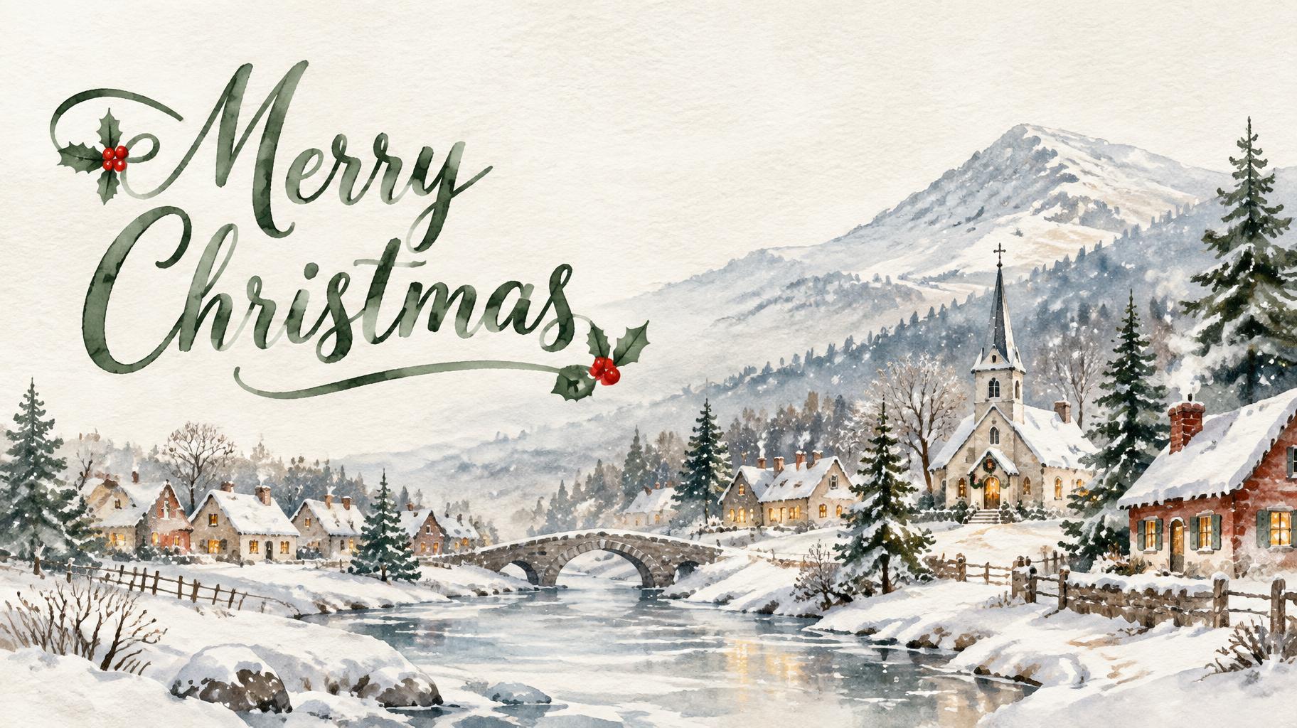













What you can make with Watercolor Christmas
Pages for the things people make in the Watercolor Christmas style. Each one has ready-made ideas and the right size.












Similar styles
Other looks that work for the same kinds of designs.




Tags in Watercolor Christmas
Every tag used on this page — each opens the designs, fonts and styles that share it.
Questions
The story behind Watercolor Christmas
Where the look comes from, the moments that shaped it and the facts behind it, with sources.
Where the watercolor Christmas look comes from
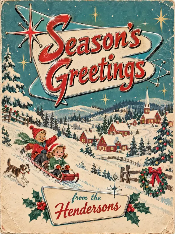
Painted winter scenes were selling long before printed Christmas cards were common. Currier and Ives, the New York print firm that took that name in 1857, published sentimental scenes such as sleigh rides in the country, with winter scenes supplied by George H. Durrie. Every print was coloured by hand, by a dozen or more women each adding one colour.
The snowy village became its own tradition. Christmas villages grew out of the late 18th century putz of the Moravian Church; after World War II Japanese companies mass-produced little cardboard houses with cellophane windows and mica-dusted roofs that looked like snow, and in the 1970s ceramic villages arrived.
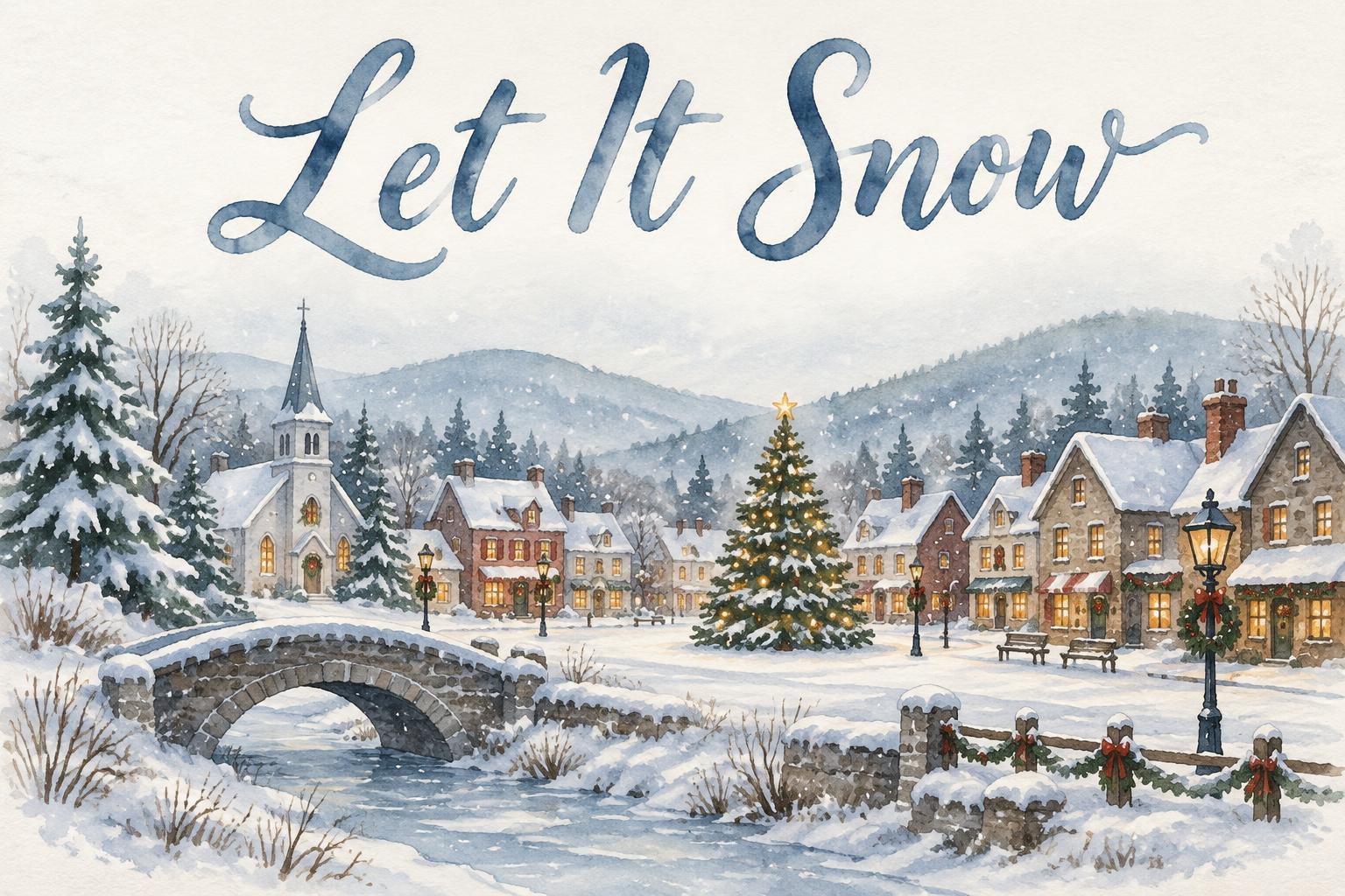
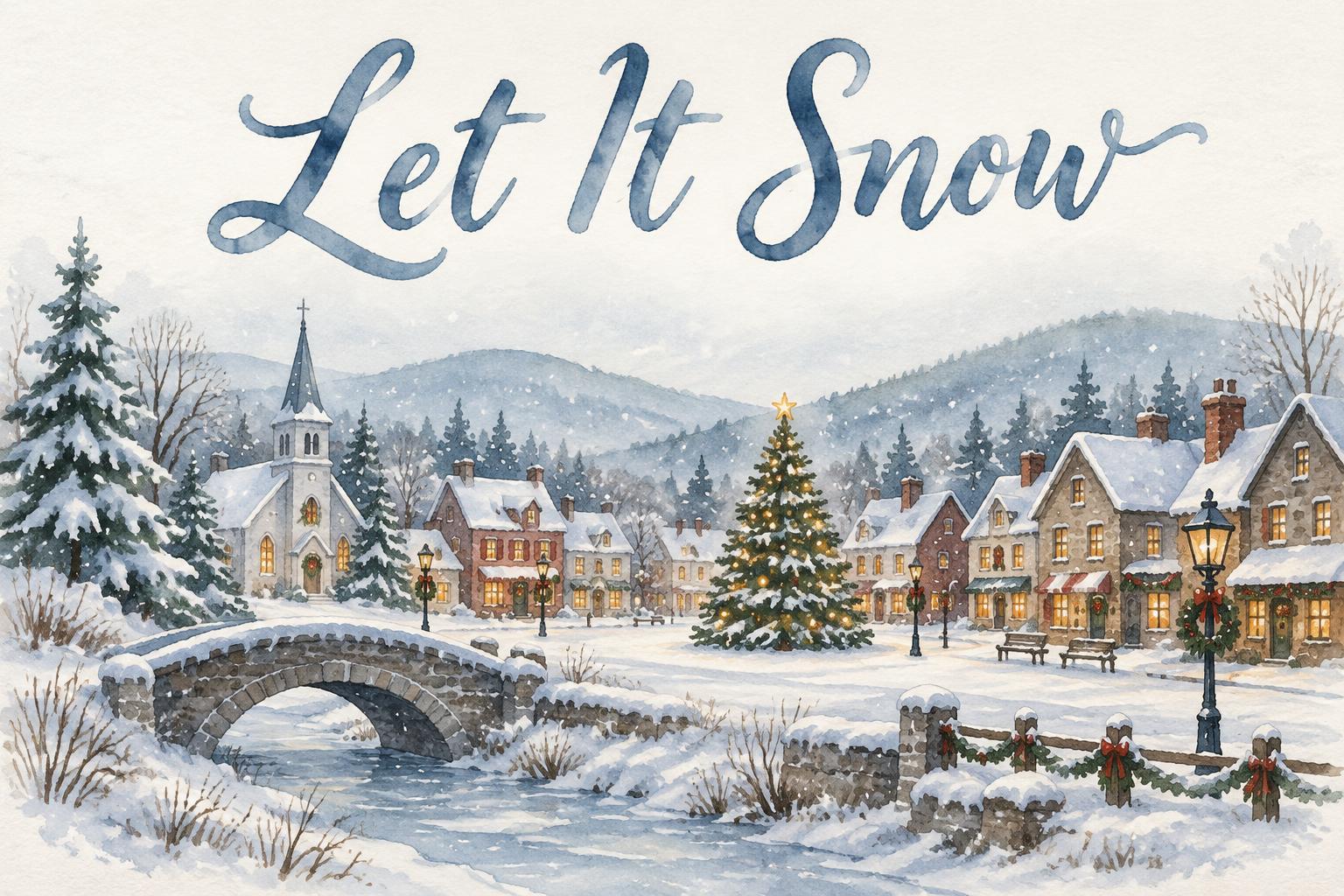
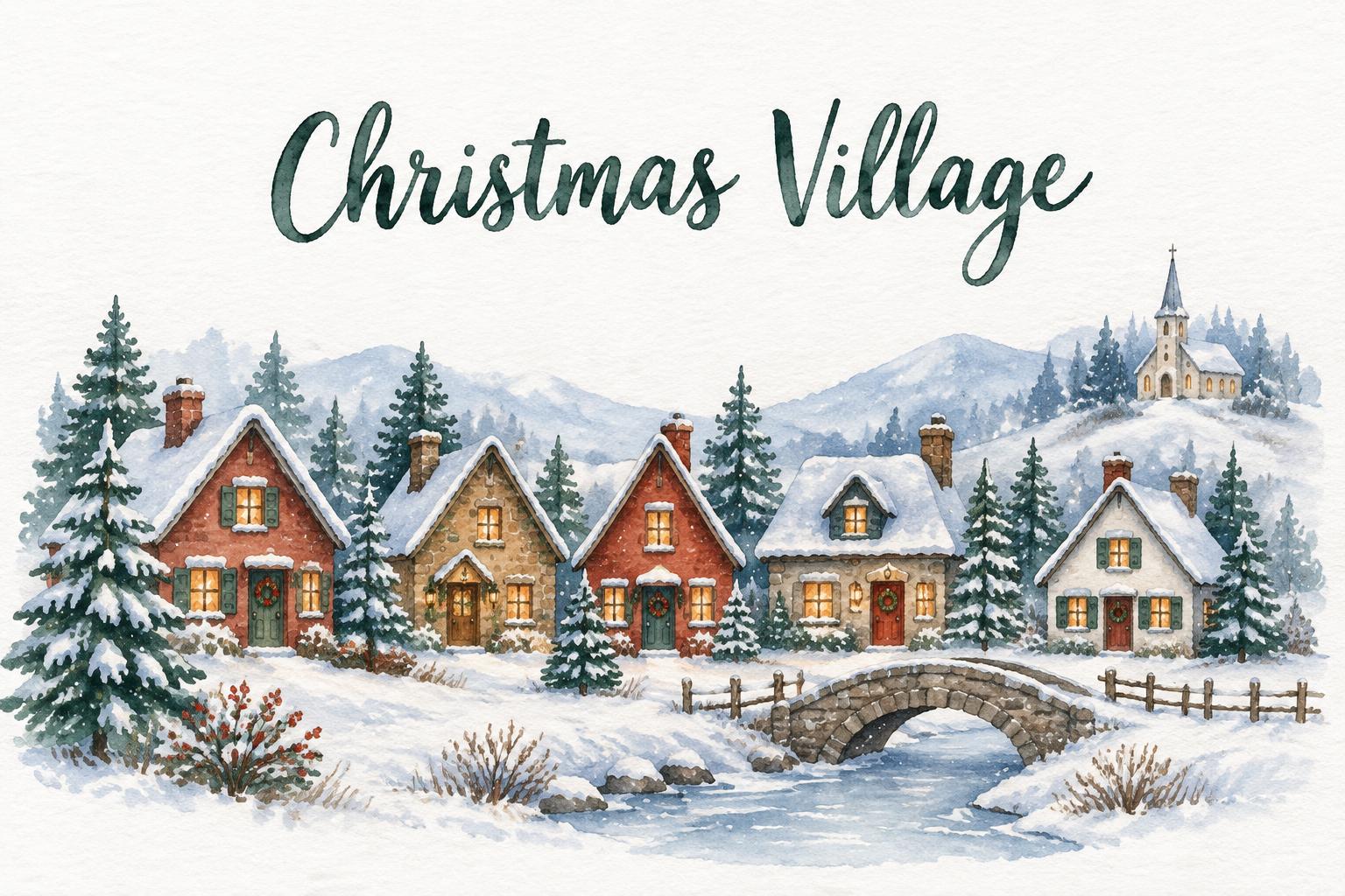
Watercolor Christmas cards paint that same village by hand: a row of houses with glowing windows, pines and soft hills in loose wet-on-wet colour, left to fade into white paper around the greeting.
Sources: Wikipedia — Currier and Ives · Wikipedia — Christmas village · Wikipedia — Watercolor painting · Wikipedia — Christmas card
Moments that shaped the watercolor Christmas look
Did you know?
Currier and Ives colourists were paid $6 for every 100 hand-coloured prints, and the favoured colours were clear and simple. Source ↗
Christmas village buildings are not made to a consistent scale: a church only needs to be noticeably taller than the houses. Source ↗
Christmas villages are rooted in the Moravian putz, a nativity landscape that could grow to fill an entire room. Source ↗
The late Georgian and Victorian periods are seen as the zenith of British watercolor, with painters such as J. M. W. Turner and Myles Birket Foster. Source ↗
Watercolor Christmas in typography
Watercolor cards pair painted scenes with light, hand-made lettering: a brush script or loose handwriting in deep red, slate blue or pine green, sitting in the white paper above the scene rather than on top of it.
Names and small lines are set in a quiet serif or small handwriting, often in the same colour as one detail in the painting, so the words and the picture feel painted together.
Where you’ll see it
- ✦Family and business Christmas cards
- ✦New Year and season’s greetings cards
- ✦Clipart for invitations, labels and blogs
- ✦Holiday illustrations for newsletters and menus
- ✦Phone and desktop wallpapers in winter
- ✦Stationery shop and Etsy holiday collections
The watercolor Christmas aesthetic: painted winter scenes, cold light, muted palette and paper texture
Every watercolor Christmas piece here is built from the same four parts. The style paints the scene, the light, the palette and the paper around your words; the letters come from the AI font you pick.
Watercolor Christmas cards, clipart, illustrations and wallpapers
Every format here pairs your words with a hand-painted winter scene on white watercolor paper. Pick a format to see designs made in it, or describe your own.
Watercolor Christmas Cards
Card fronts with your greeting in white space above a painted snowy village, pine or landscape.
Watercolor Christmas Clipart
Painted village houses, trees and wreaths on plain white, ready to place on your own designs.
Watercolor Christmas Wallpapers
Phone and desktop wallpapers with painted pines and villages and a calm area for your words.
AI fonts that fit Watercolor Christmas
Every AI font here fits the Watercolor Christmas frame. Pick one, or let the generator choose.





Watercolor Christmas style designs
Real designs made on FontVibe. Open any one, or reuse it with your own text.
What you can make with Watercolor Christmas
Pages for the things people make in the Watercolor Christmas style. Each one has ready-made ideas and the right size.
Similar styles
Other looks that work for the same kinds of designs.
Tags in Watercolor Christmas
Every tag used on this page — each opens the designs, fonts and styles that share it.
Questions
The story behind Watercolor Christmas
Where the look comes from, the moments that shaped it and the facts behind it, with sources.
Where the watercolor Christmas look comes from
Painted winter scenes were selling long before printed Christmas cards were common. Currier and Ives, the New York print firm that took that name in 1857, published sentimental scenes such as sleigh rides in the country, with winter scenes supplied by George H. Durrie. Every print was coloured by hand, by a dozen or more women each adding one colour.
The snowy village became its own tradition. Christmas villages grew out of the late 18th century putz of the Moravian Church; after World War II Japanese companies mass-produced little cardboard houses with cellophane windows and mica-dusted roofs that looked like snow, and in the 1970s ceramic villages arrived.
Watercolor Christmas cards paint that same village by hand: a row of houses with glowing windows, pines and soft hills in loose wet-on-wet colour, left to fade into white paper around the greeting.
Sources: Wikipedia — Currier and Ives · Wikipedia — Christmas village · Wikipedia — Watercolor painting · Wikipedia — Christmas card
Moments that shaped the watercolor Christmas look
Did you know?
Currier and Ives colourists were paid $6 for every 100 hand-coloured prints, and the favoured colours were clear and simple. Source ↗
Christmas village buildings are not made to a consistent scale: a church only needs to be noticeably taller than the houses. Source ↗
Christmas villages are rooted in the Moravian putz, a nativity landscape that could grow to fill an entire room. Source ↗
The late Georgian and Victorian periods are seen as the zenith of British watercolor, with painters such as J. M. W. Turner and Myles Birket Foster. Source ↗
Watercolor Christmas in typography
Watercolor cards pair painted scenes with light, hand-made lettering: a brush script or loose handwriting in deep red, slate blue or pine green, sitting in the white paper above the scene rather than on top of it.
Names and small lines are set in a quiet serif or small handwriting, often in the same colour as one detail in the painting, so the words and the picture feel painted together.
Where you’ll see it
- ✦Family and business Christmas cards
- ✦New Year and season’s greetings cards
- ✦Clipart for invitations, labels and blogs
- ✦Holiday illustrations for newsletters and menus
- ✦Phone and desktop wallpapers in winter
- ✦Stationery shop and Etsy holiday collections