
🧪 Design something with Futura Bold
Transparent Effect
✦ Transparent Effect
Generates a PNG with the background removed — only the text and its visual effects remain. The AI automatically selects the optimal background color for clean removal based on your style.
Output is always PNG for lossless transparency.
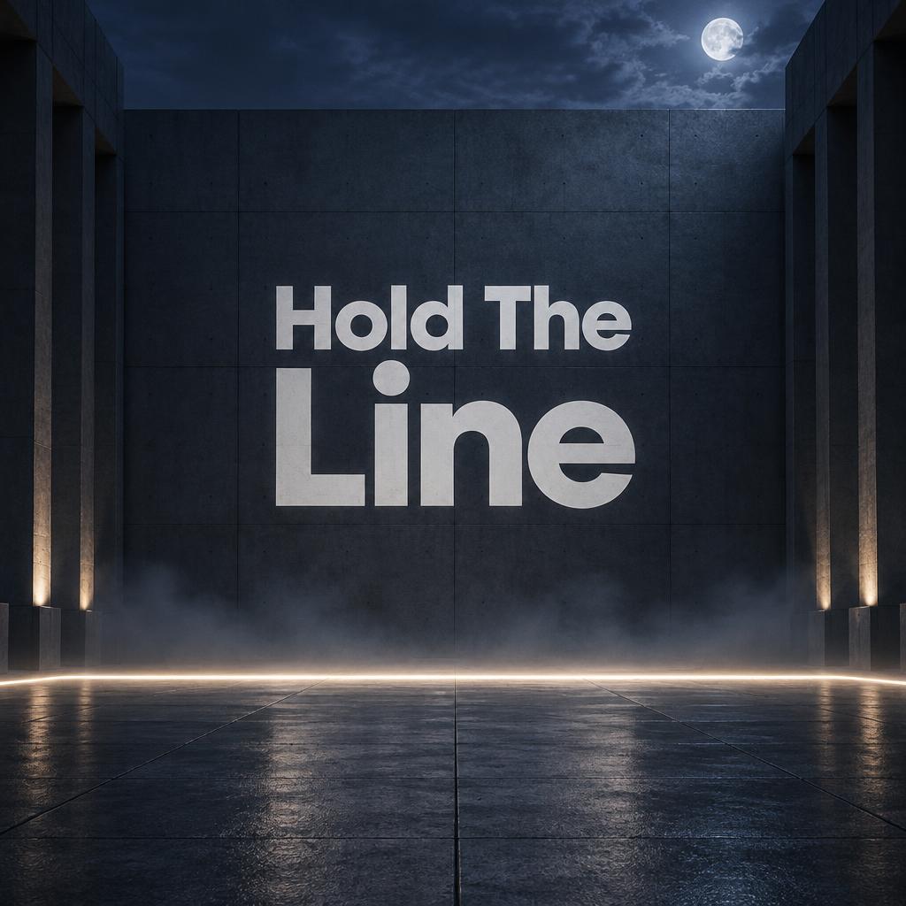
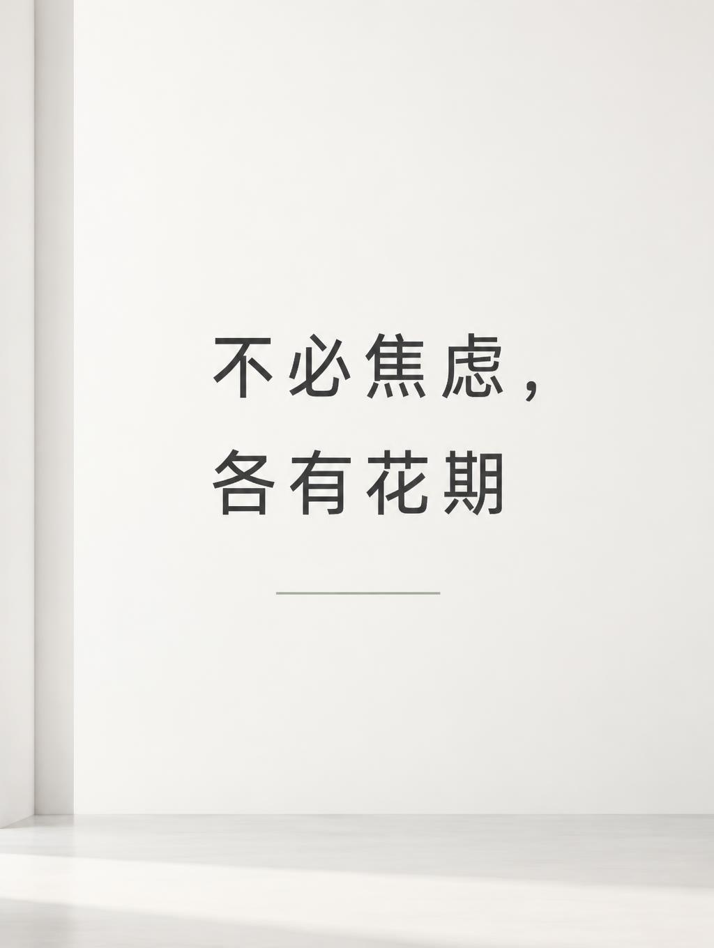
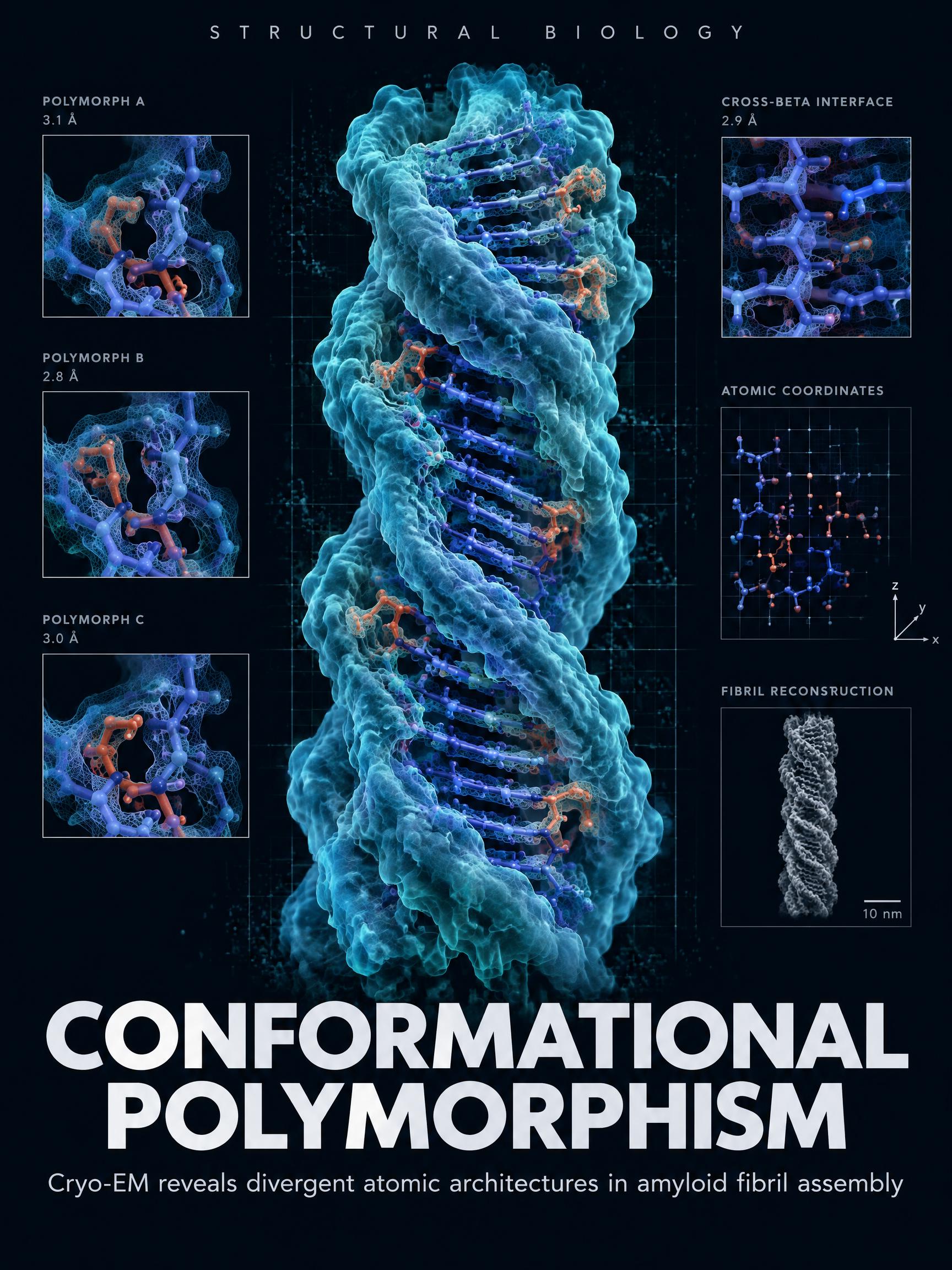

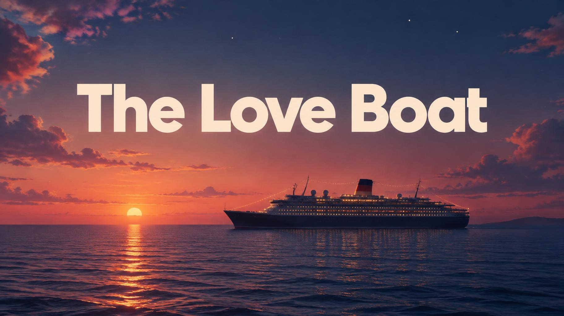
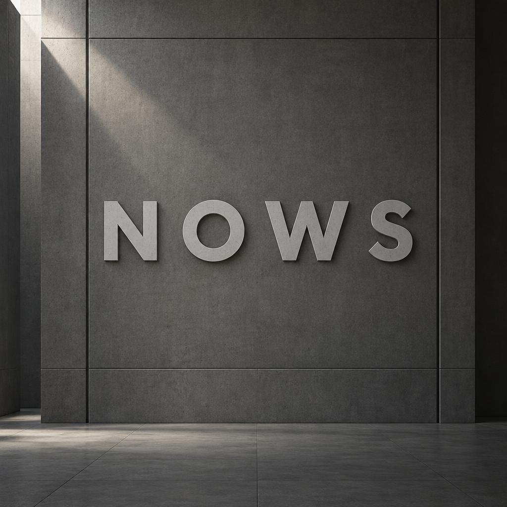
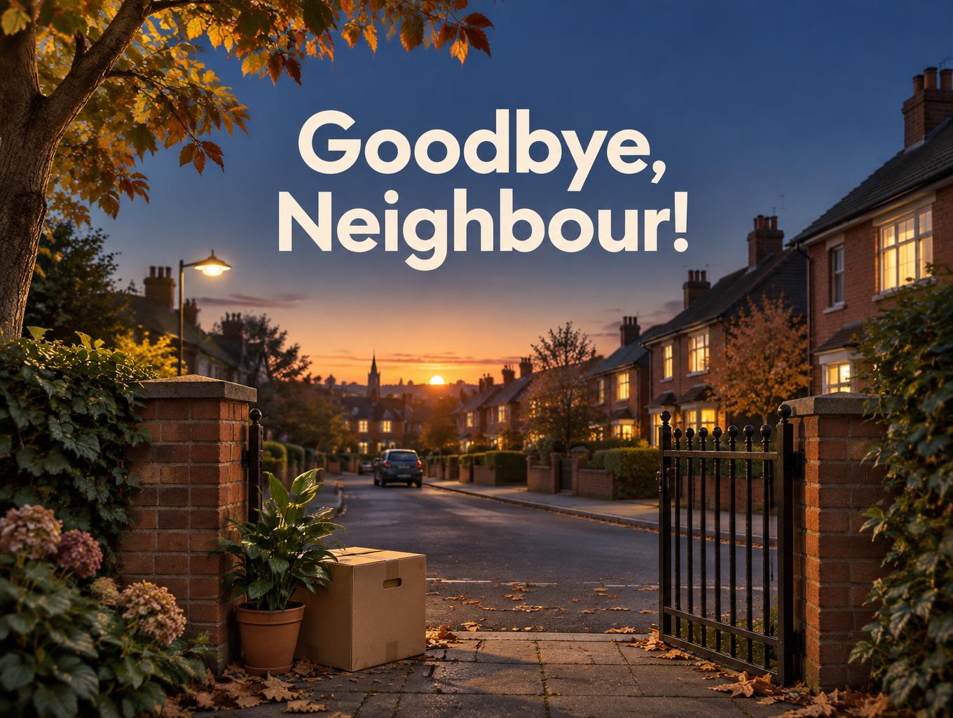
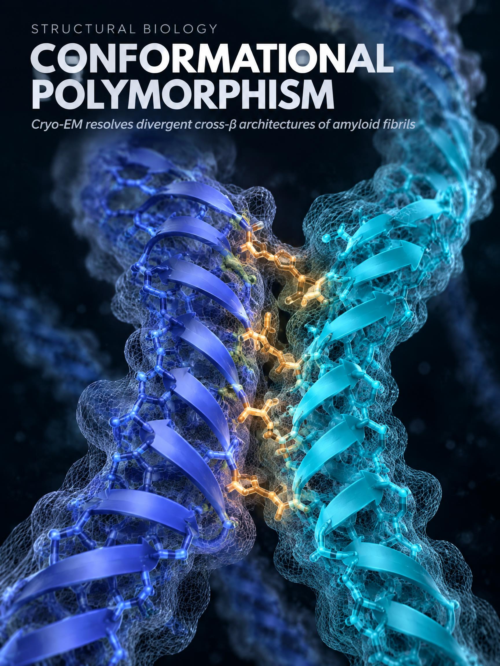

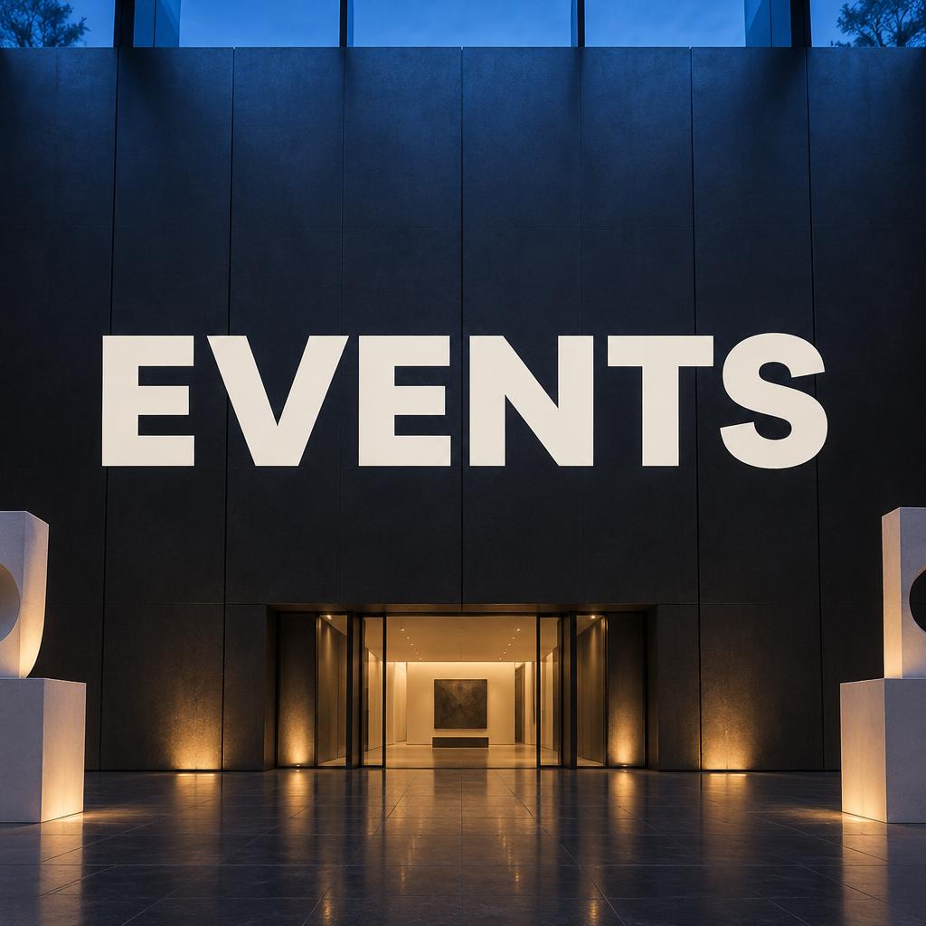

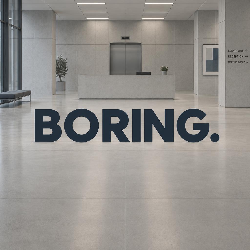
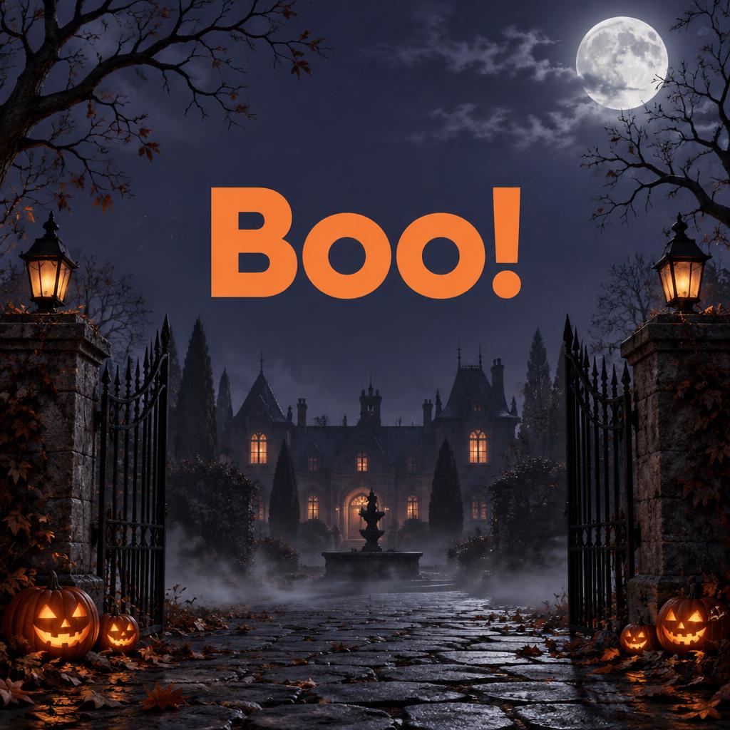
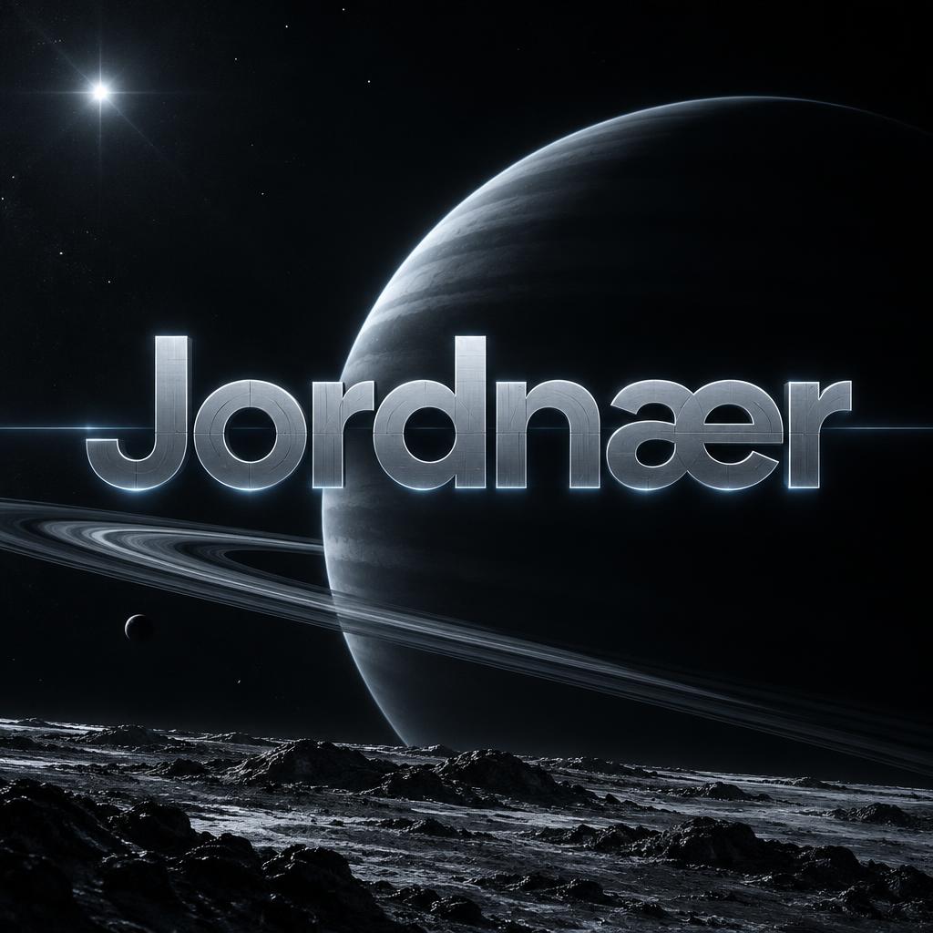


More AI fonts like Futura Bold


Looking for copy-paste fancy text? Try our free Font Generator Tools — cursive, gothic, bubble & 30+ styles.
FAQ
What is the Futura Bold font?
Futura Bold is a geometric sans-serif built from near-perfect circular and straight-line forms — a heavy, even-weight version of the classic modernist geometric type. It reads as timeless, clean and authoritative, the register of confident branding, editorial and modern design.
Can I download Futura Bold?
There is no installable file. You type your text and the generator sets the geometric letters fitted to your actual shapes, and returns a high-resolution image.
Where does this style work best?
Brand and logo work, editorial and poster headlines, fashion and lifestyle, tech and product design, signage and packaging, anything that wants a clean modern authority. It works across headlines and short lines.
Can I use it for commercial work?
Yes. Generated images may be used commercially, including logos, packaging, print and video. No licence or attribution is required.
Why build letters from perfect circles and straight lines — and why isn't it quite that simple?
The idea came from modernist designers who wanted to strip letters back to pure geometric primitives — the circle, the triangle, the straight line — as a rejection of historical ornament and a statement that a rational, machine-age alphabet could be built from first principles. But there is a catch the eye forces on the geometry: a mathematically perfect circle does not look right next to straight-sided letters. A truly circular O, drawn to the same height as an H, reads as visibly smaller and lighter, because the round shape only touches the top and bottom lines at a single point while the flat-topped H sits along them fully. So even a 'purely geometric' face like this cheats: the round letters are drawn slightly taller and heavier, overshooting the lines, so that they appear the same size. The clean geometry is the ideal, and the small optical corrections are what make it actually look even — proof that the eye, not the compass, has the final say.
What fonts look similar?
For the foundational geometric-modernist relative, see Bauhaus Primary. For a heavier geometric display built to carry effects, try Bold Geo Sans.