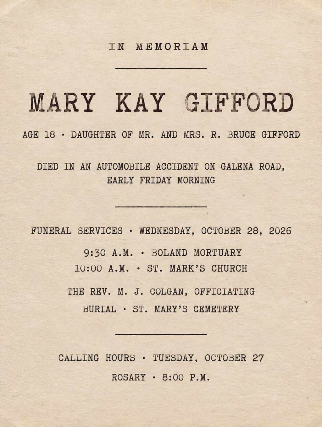
IN MEMORIAM MARY KAY GIFFORD AGE 18 · DAUGHTER OF MR. AND MRS. R. BRUCE GIFFORD DIED IN AN AUTOMOBILE ACCIDENT ON GALENA ROAD, EARLY FRIDAY MORNING FUNERAL SERVICES · WEDNESDAY, OCTOBER 28, 2026 9:30 A.M. · BOLAND MORTUARY 10:00 A.M. · ST. MARK'S CHURCH THE REV. M. J. COLGAN, OFFICIATING BURIAL · ST. MARY'S CEMETERY CALLING HOURS · TUESDAY, OCTOBER 27 ROSARY · 8:00 P.M. - Typewriter Text Effect


Uses OpenAI GPT-Image-2.5 Sunburst, the model behind this artwork · 15 credits


“IN MEMORIAM MARY KAY GIFFORD AGE 18 · DAUGHTER OF MR. AND MRS. R. BRUCE GIFFORD DIED IN AN AUTOMOBILE ACCIDENT ON GALENA ROAD, EARLY FRIDAY MORNING FUNERAL SERVICES · WEDNESDAY, OCTOBER 28, 2026 9:30 A.M. · BOLAND MORTUARY 10:00 A.M. · ST. MARK'S CHURCH THE REV. M. J. COLGAN, OFFICIATING BURIAL · ST. MARY'S CEMETERY CALLING HOURS · TUESDAY, OCTOBER 27 ROSARY · 8:00 P.M.” was created with FontVibe AI — explore more Typewriter text effect. Monospaced slab-serif type struck into cream paper, with uneven ink density, ribbon texture, faint letter misalignment and soft paper fibers.
Create a finished, restrained funeral notice on aged cream bond paper, portrait 3:4. Make the paper and the lettering the entire composition: no photographic scene, no props, no gradients, and no modern graphic effects. Set every line exactly as quoted, with crisp, correctly spelled, readable type and this hierarchy: Small centered eyebrow: "IN MEMORIAM" Dominant name: "MARY KAY GIFFORD" Smaller centered line: "AGE 18 · DAUGHTER OF MR. AND MRS. R. BRUCE GIFFORD" Compact factual line, broken naturally into two lines if needed: "DIED IN AN AUTOMOBILE ACCIDENT ON GALENA ROAD, EARLY FRIDAY MORNING" Section heading: "FUNERAL SERVICES · WEDNESDAY, OCTOBER 28, 2026" Indented service details: "9:30 A.M. · BOLAND MORTUARY" and "10:00 A.M. · ST. MARK'S CHURCH" Smaller lines: "THE REV. M. J. COLGAN, OFFICIATING" and "BURIAL · ST. MARY'S CEMETERY" Lower notice section: "CALLING HOURS · TUESDAY, OCTOBER 27" and "ROSARY · 8:00 P.M." Use authentic monospaced typewriter display letterforms with slab serifs, uniform stroke weight, and modest mechanical spacing irregularities. The name is the largest tier, clearly legible at a glance; all supporting lines are smaller but comfortably readable. Render the ink as warm sepia-tinted black, with visible ribbon texture, subtle ink grain, slightly heavier deposits at stroke intersections and terminals, and occasional lighter mid-strokes. Let a few letters sit on subtly uneven baselines, never enough to impair reading. Show fine aged cream paper fibers and soft side lighting that reveals the paper texture. Set the text in a carefully aligned centered notice column with generous margins, clear vertical spacing between the identity, service schedule, and calling details. Add only fine, understated horizontal rules to organize the sections. Keep the vintage mechanical impression physically convincing, like a clean, enlarged typewritten notice on bond paper.
Made for Old Newspaper
Generated on October 28, 2026 · 1024 × 1360 · JPEG · OpenAI GPT-Image-2.5 Sunburst · Layout: Memorial Notice Column · Shared by the creator · Free for commercial use (CC BY 4.0)


