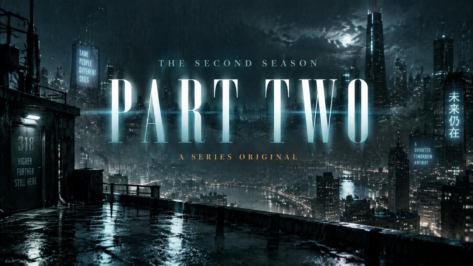
PART TWO THE SECOND SEASON A SERIES ORIGINAL - Netflix & Streaming Text Effect


Uses OpenAI GPT-Image-2.5 Sunburst, the model behind this artwork · 15 credits
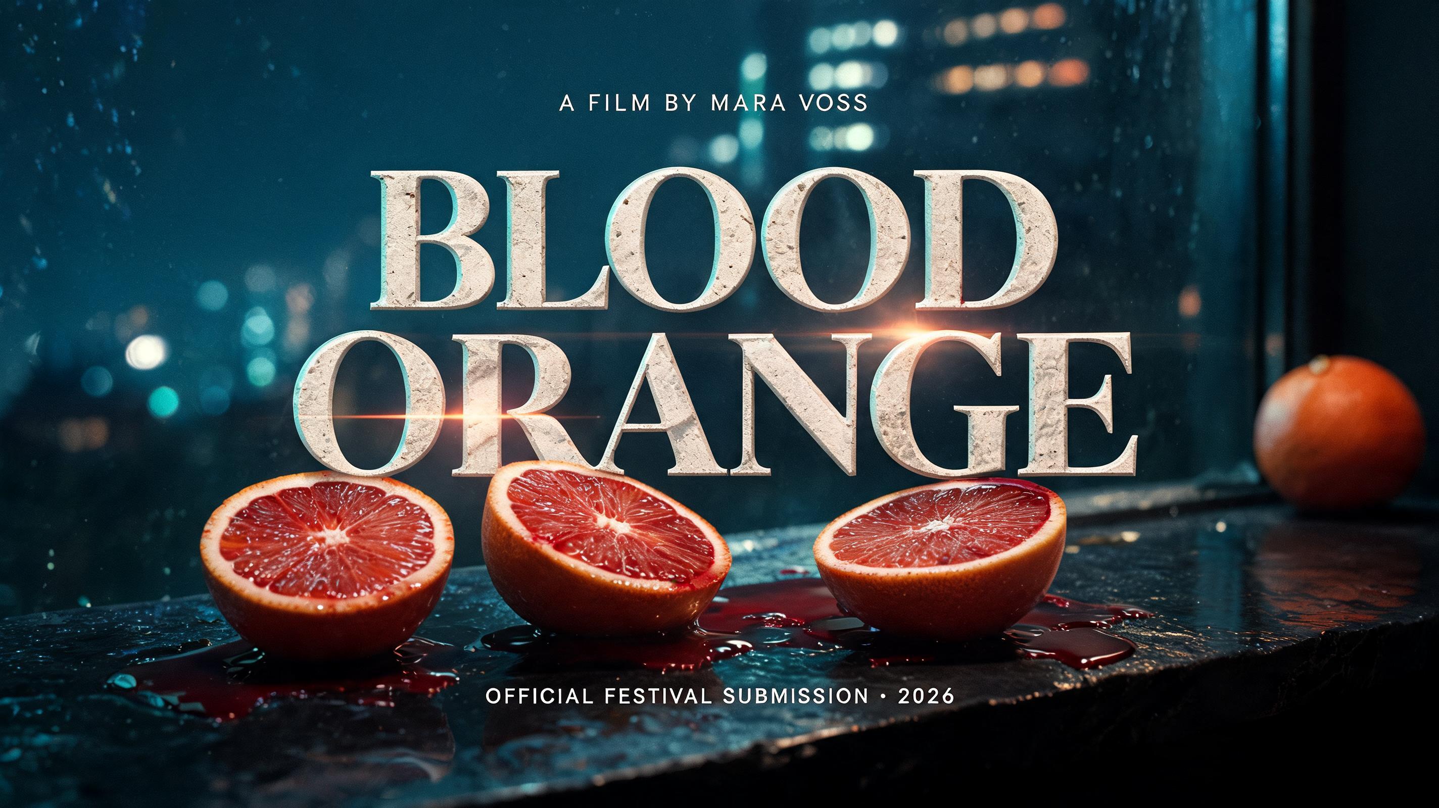
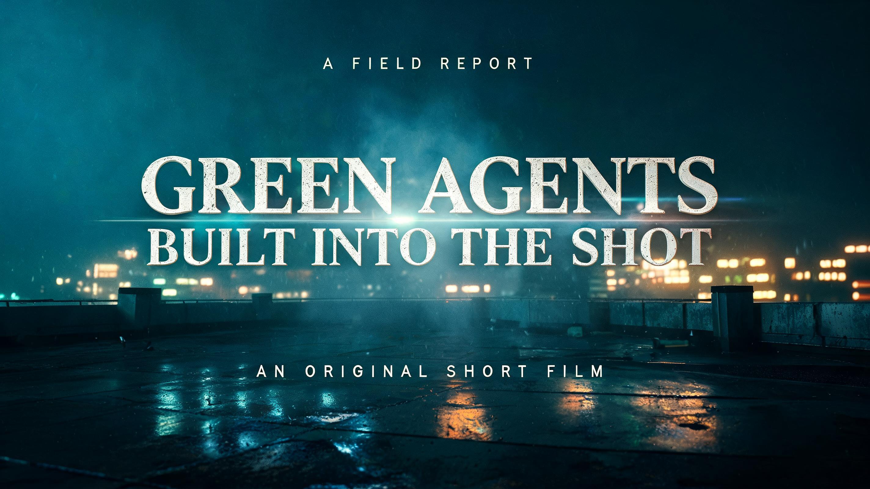


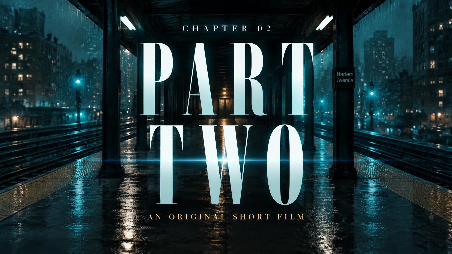
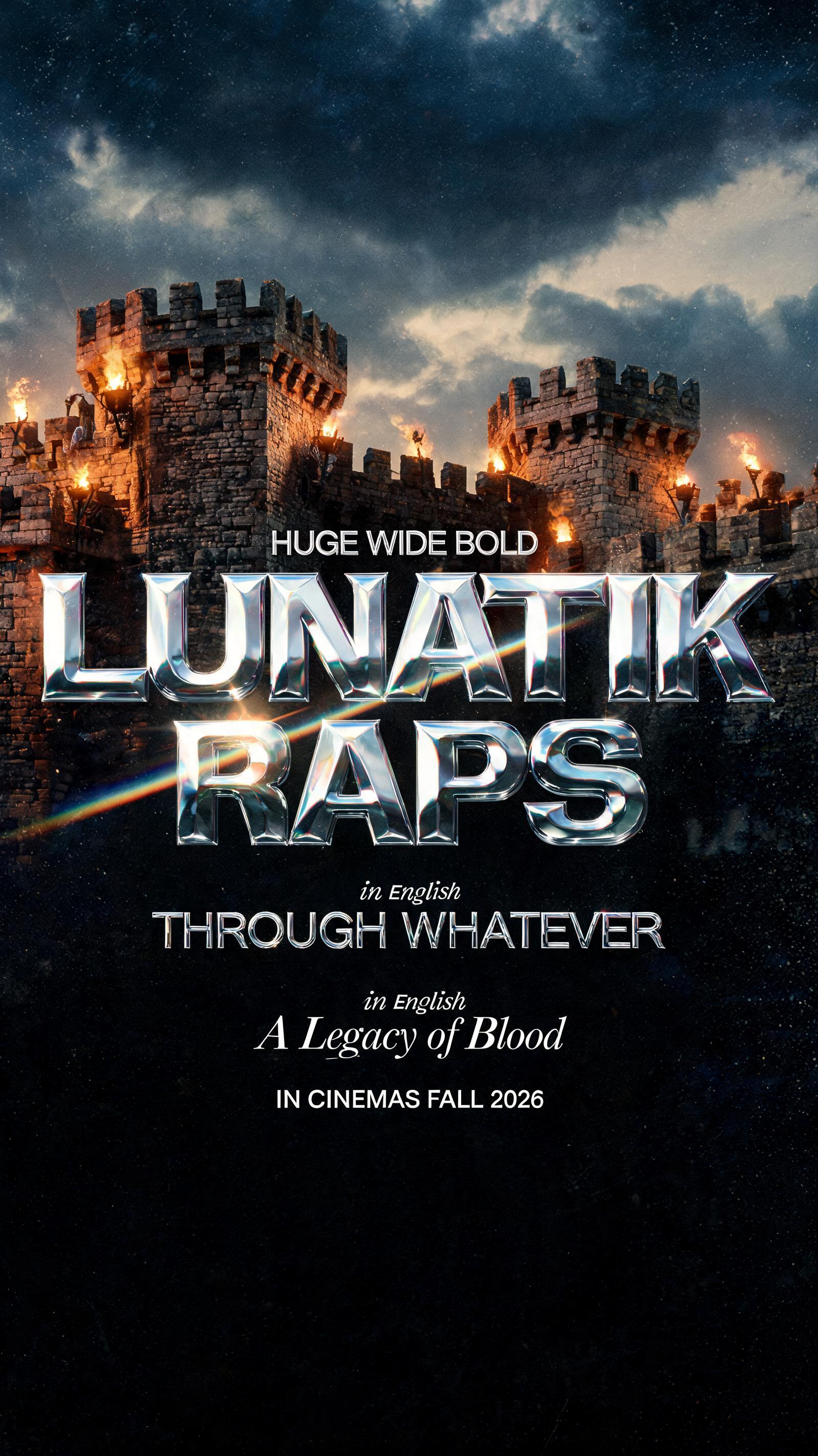




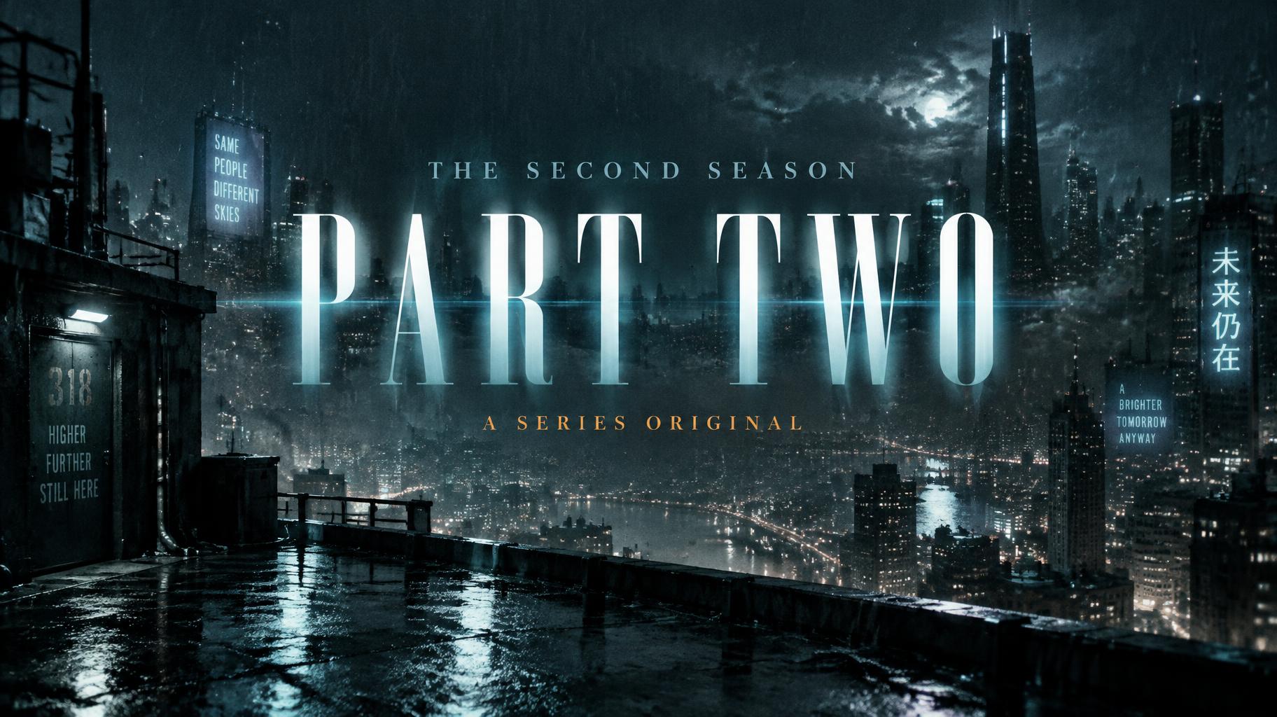
“PART TWO THE SECOND SEASON A SERIES ORIGINAL” was created with FontVibe AI — explore more Cinematic Netflix text effect. Bold sans-serif series titles with a cold teal glow and anamorphic flare, set over a rain-slicked night city with small tagline and season text.
A cinematic streaming-series title card, widescreen, where the words "PART TWO" are built into the opening shot of the film itself. The scene is a rain-soaked rooftop at night looking out over a vast city grid. Blurred neon signs hang in wet air, and the pavement is slick and reflects teal and cold-white light. Deep teal-to-black colour grade, with atmospheric depth haze layering the distant towers into blue-black. Fine film grain across the whole frame and a soft shallow vignette at the edges. The title "PART TWO" sits in the centre of the frame, filling about 80% of the frame width on a single line. It is set in tall, compressed, high-contrast serif capitals: near-hairline horizontal strokes, dominant thick vertical stems, sharp unbracketed serifs with precision-cut terminals. The letters are clean crisp cold white with a faint teal cast. They carry no texture or material effect, only the way light falls: a hard directional light from the upper left catches the thick stems, and the hairlines sink into shadow. The letters belong to the shot. A thin veil of drifting haze passes in front of the lower part of the letters, rain streaks cross them, and the city glow and wet-air bokeh sit faintly behind them, so the title reads as a sign in the depth of the scene. A thin anamorphic horizontal lens flare in pale cyan-white streaks across the title at mid-height. Above the title, a tiny tracking-spaced caps label "THE SECOND SEASON" in cold pale grey-blue, about 28% of frame width, centred. Below the title, small refined caps in warm amber, about 40% of frame width, reading "A SERIES ORIGINAL", centred. The amber is the only warm note against the teal. Vertical spacing is roughly 1:5:1.5. The title dominates, with strong size contrast against both small lines. Everything is centred on one vertical axis.
Made for Cinematic Title Card Maker
Generated on November 11, 2026 · 1824 × 1024 · JPEG · OpenAI GPT-Image-2.5 Sunburst · Layout: Poster · Shared by the creator · Free for commercial use (CC BY 4.0)



