🧪 Design something with Liquid Pour
Transparent Effect
✦ Transparent Effect
Generates a PNG with the background removed — only the text and its visual effects remain. The AI automatically selects the optimal background color for clean removal based on your style.
Output is always PNG for lossless transparency.

More fonts like Liquid Pour


Looking for copy-paste fancy text? Try our free Font Generator Tools — cursive, gothic, bubble & 30+ styles.
About Liquid Pour Font
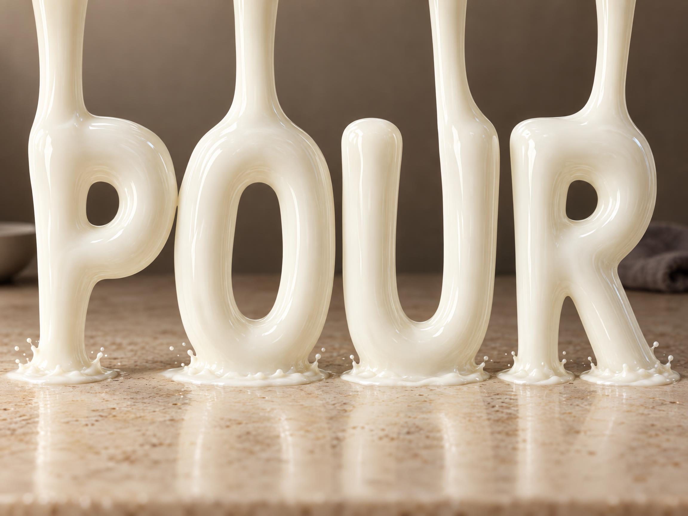
A display typeface whose letters are streams of liquid caught in mid-fall. Every stroke arrives from above at full width, tapers as it falls, and breaks into a thin splash ring where it lands — the word is the pour itself, not a letter with liquid poured over it. Surface tension holds every column round and one stretched highlight runs each stroke's full length. Colour follows the scene. Built for beverage, dairy and juice packaging that needs the word to look freshly poured.
Emotions
freshfluidappetizingsmoothwholesome
Best For
beverage branddairy labelmilk carton letteringjuice packagingsummer drink campaigncafé menu header
Vibes
liquidroundedcleanfriendly
Visual Traits
pourstreammid-falllaminarunbroken-columntapered-strokeimpact-ringflow-linessurface-tensionspecular-highlightwide-counters
FAQ
What is the Liquid Pour font?
Every letter is a stream of liquid caught in mid-fall. Each stroke arrives from above at full width, tapers as it drops, and breaks into a thin splash ring where it lands — the word is the pour itself rather than a solid letter with liquid poured over it. Surface tension holds every column round, laminar flow keeps the skin glassy, and a single stretched highlight runs the full length of each stroke.
How is it different from a melting or dripping font?
Melting and dripping styles keep the letter still and let the material sag: the shape is solid, the liquid hangs off it, and the drops stay put. Liquid Pour is the opposite — nothing is hanging, everything is falling. The stroke is the moving liquid, it comes in from above the frame, and it lands, which is why every letter sits in its own splash ring.
Can I download Liquid Pour?
There's no installable font file. You type your text and the generator builds the pouring lettering fitted to your actual wording, then returns a high-resolution image you can use straight away.
Where does this style work best?
Beverage and dairy branding, milk carton lettering, juice and smoothie packaging, summer drink campaigns and café menu headers — anywhere the word itself should look freshly poured. Short words work best, since each letter carries its own stream.
Can I use it for commercial work?
Yes. Generated images can be used commercially, including packaging, advertising, posters, merchandise and branding. No license or attribution required.
What fonts look similar?
For a thick chocolate mass sagging off a still letter, see Melting Chocolate. For droplets hanging motionless from the baseline see Drip Display. For metal caught mid-melt with its own heat glow see Molten Gold. For hard transparent glass rather than opaque liquid see Liquid Glass 3D.