🧪 Design something with Liquid Splash
Transparent Effect
✦ Transparent Effect
Generates a PNG with the background removed — only the text and its visual effects remain. The AI automatically selects the optimal background color for clean removal based on your style.
Output is always PNG for lossless transparency.

More fonts like Liquid Splash


Looking for copy-paste fancy text? Try our free Font Generator Tools — cursive, gothic, bubble & 30+ styles.
About Liquid Splash Font
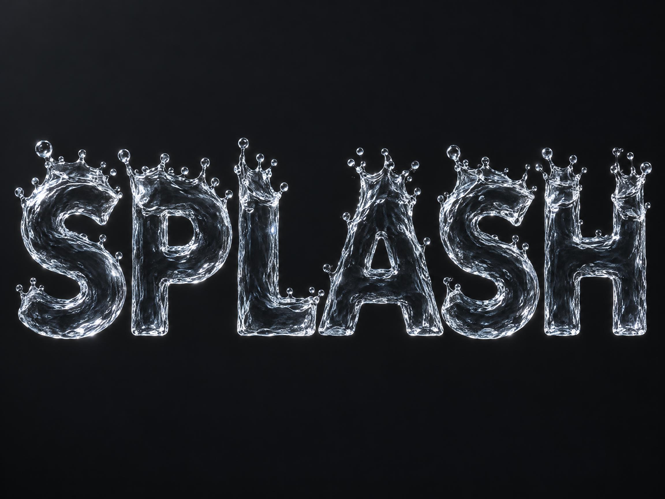
A display typeface caught at the instant of impact. A thin unbroken sheet of water rises from the rim of every stroke and curls outward, its top edge tearing into separate airborne beads — and every bead stays on its own stroke's rim, nothing scattered loose around the word. The letter body stays whole and its outline closed, so the word reads cleanly. Surface tension pulls each bead into a sphere, a hard glint on every one. It is clear water, so it needs a dark surface behind it.
Emotions
refreshingcoldcrispexplosiveinvigorating
Best For
beverage splash adsports drink packagingbottled water labelsummer drink campaignenergy drink canice-cold product reveal
Vibes
liquidgeometricclean
Visual Traits
splashcoronetstruck-from-aboveairborne-beadsbeads-on-the-rimclear-watertranslucent-sheetsurface-tensionspecular-glintrim-highlighteven-stroke-weight
FAQ
What is the Liquid Splash font?
Every letter is a body of water caught at the instant it is struck. A thin unbroken sheet rises from the rim of each stroke and curls outward, its top edge tearing into separate beads that hang in the air. The letter body itself stays whole and its outline stays closed, so the word still reads cleanly. Surface tension pulls every airborne bead into a sphere and a hard glint sits on each one.
How is it different from an ink or watercolour splatter font?
Splatter styles are paint on paper: the letters are brush strokes, and the splatter is a field of loose specks flung into the space around the word. Liquid Splash is three-dimensional water, and nothing is scattered — every bead is still sitting on the rim of a stroke it came from. The splash is attached to the letters rather than sprayed around them.
Can I download Liquid Splash?
There's no installable font file. You type your text and the generator builds the splash lettering fitted to your actual wording, then returns a high-resolution image.
Why does it need a dark background?
The letters are clear water, so they carry almost no colour of their own — they read by their bright rim highlights and by the background bending through them. On a pale background there is nothing for those highlights to stand against and the word goes faint. Keep whatever sits behind the word clearly darker than the water.
Where does this style work best?
Beverage and sports-drink packaging, bottled water labels, energy drink cans, summer drink campaigns and ice-cold product reveals — anywhere the word should read as struck. Short words work best, since every letter carries its own crown of beads.
What fonts look similar?
For flung specks of sumi ink around brush-written letters, see Ink Splatter. For loose watercolour spray and runny drips see Watercolor Splatter. For a thick swollen body of transparent glass rather than a thin sheet of water see Liquid Glass 3D. For solid frozen ice with trapped bubbles see 3D Ice.