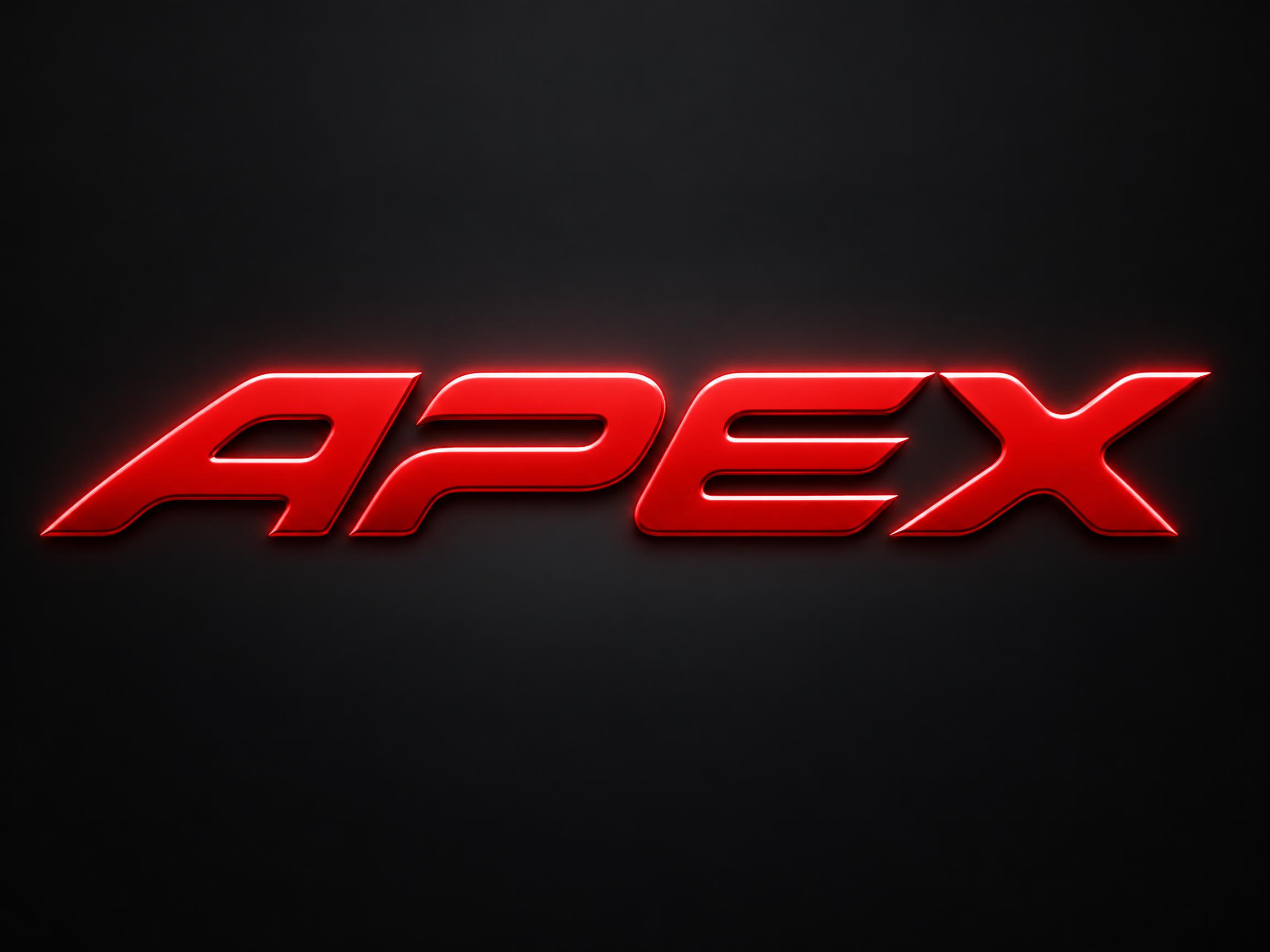
🧪 Design something with Racing Slant
Transparent Effect
✦ Transparent Effect
Generates a PNG with the background removed — only the text and its visual effects remain. The AI automatically selects the optimal background color for clean removal based on your style.
Output is always PNG for lossless transparency.


More fonts like Racing Slant


Looking for copy-paste fancy text? Try our free Font Generator Tools — cursive, gothic, bubble & 30+ styles.
About Racing Slant Font
A display typeface where every letter is plainly wider than it is tall, so the word reads long and low like a car seen from the side. Each letter leans, its top well to the right of its foot, and every stroke ends in the same slanted cut, all parallel and long enough to read as a main edge. Inside the letters every corner is turned in one wide curve, while the slanted cuts at the ends stay razor-sharp. The faces are painted sheet metal with a narrow chamfer round each edge.
Emotions
competitivechargedflagshipstreamlinedtriumphant
Best For
racing team wordmarkmotorsport poster titleesports racing team logoYouTube racing channel bannerrace event lockupcar meet flyer
Vibes
geometricclean
Visual Traits
flat-widelow-cap-heightparallelogram-lettersparallel-slant-cutsrazor-sharp-cut-endsrounded-inside-cornerschamfered-edgeautomotive-painteven-glossclose-haloclosed-letterforms
FAQ
What is the Racing Slant font?
Every letter is plainly wider than it is tall, so the word reads long and low, like a car seen from the side. Each letter leans — its top sits well to the right of its foot — and every stroke ends in the same slanted cut, all of them parallel and long enough to read as one of the letter's own main edges. Inside the letters every corner is turned in one wide curve, while those slanted cuts stay razor-sharp.
Is this the Formula 1 font?
No. Formula 1's typefaces are custom and proprietary, and its logo is a registered trademark — neither is used or reproduced here. Racing Slant is an original design drawn from the general visual language of motorsport lettering: flat proportions, a hard lean, parallel slanted cuts and a painted metal face. It has no connection to, or endorsement from, Formula 1.
How is it different from other sports and racing fonts?
Most fast-looking fonts lean the letters and taper the trailing edges, which reads as athletic rather than automotive. Racing Slant leaves the stroke weight even and puts all the character into the cuts: every stroke ends on the same long diagonal, and those cuts stay sharp even though every corner inside the letter is rounded off. That contrast between sharp ends and soft corners is the signature.
Can I download Racing Slant?
There's no installable font file. You type your text and the generator builds the lettering fitted to your actual wording, then returns a high-resolution image.
Where does this style work best?
Racing team wordmarks, motorsport poster titles, esports racing team logos, YouTube racing channel banners, race event lockups and car meet flyers. Short words work best — the flat wide proportions mean a long word runs off the edge of the frame.
What fonts look similar?
For a tapered athletic italic aimed at sportswear rather than cars, see Sport Italic. For letters machined from plate with hard 45-degree shear faces see Angular Slash Display. For a brushed-metal EV wordmark with letters cut apart see Roadster Style.