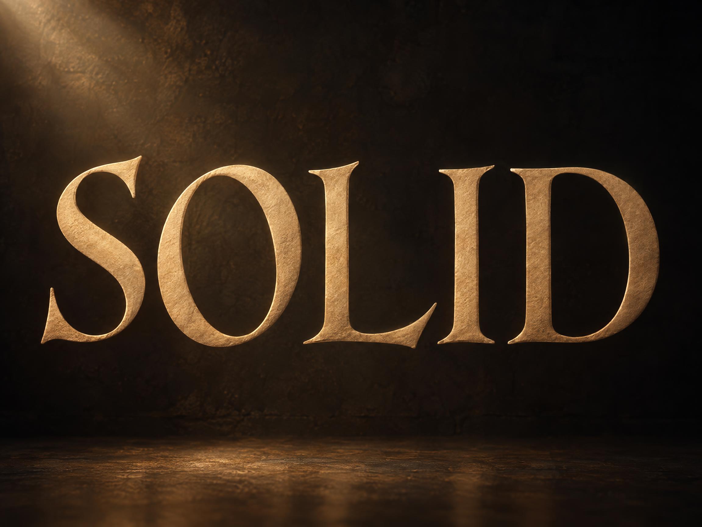
🧪 Design something with Old Style Serif
Transparent Effect
✦ Transparent Effect
Generates a PNG with the background removed — only the text and its visual effects remain. The AI automatically selects the optimal background color for clean removal based on your style.
Output is always PNG for lossless transparency.
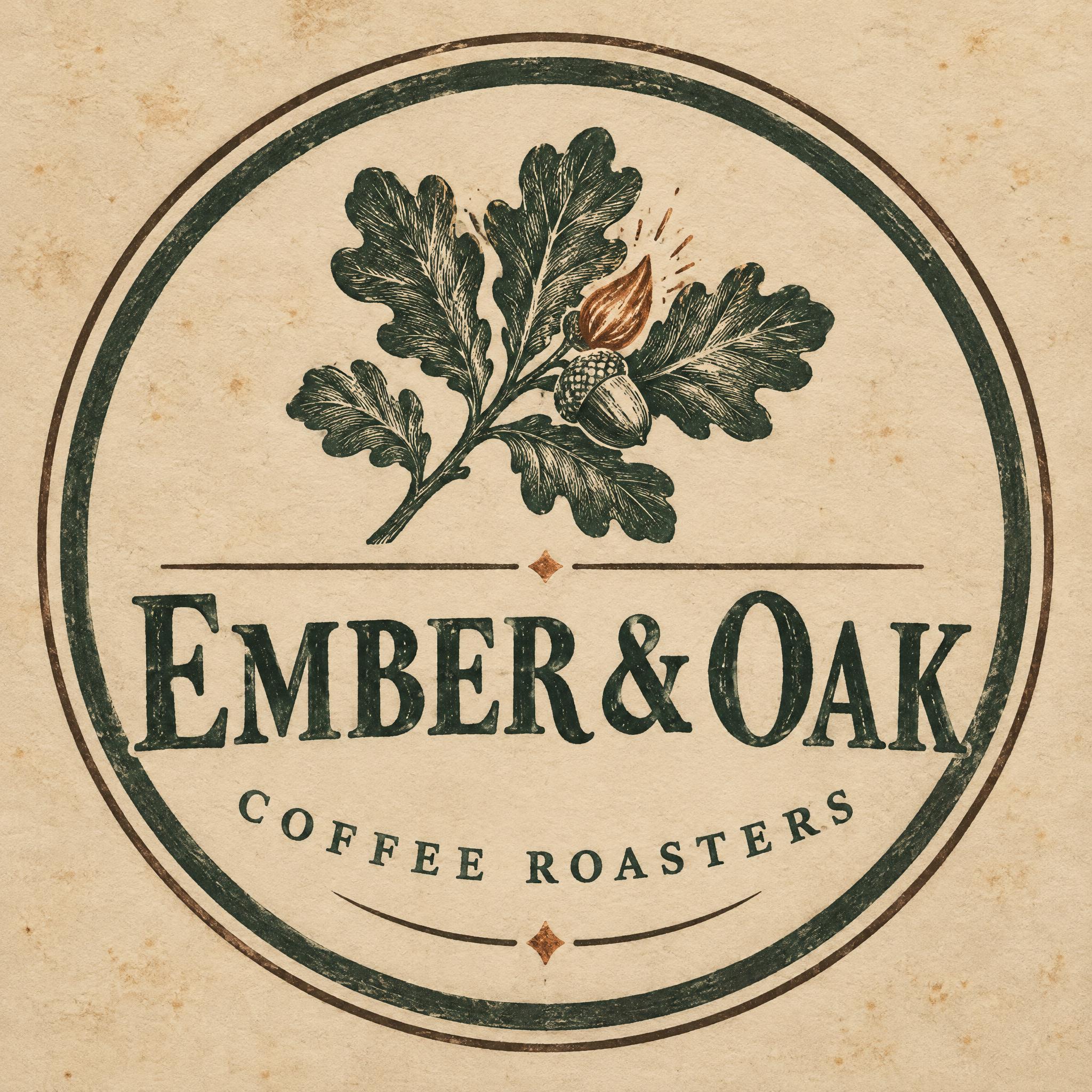

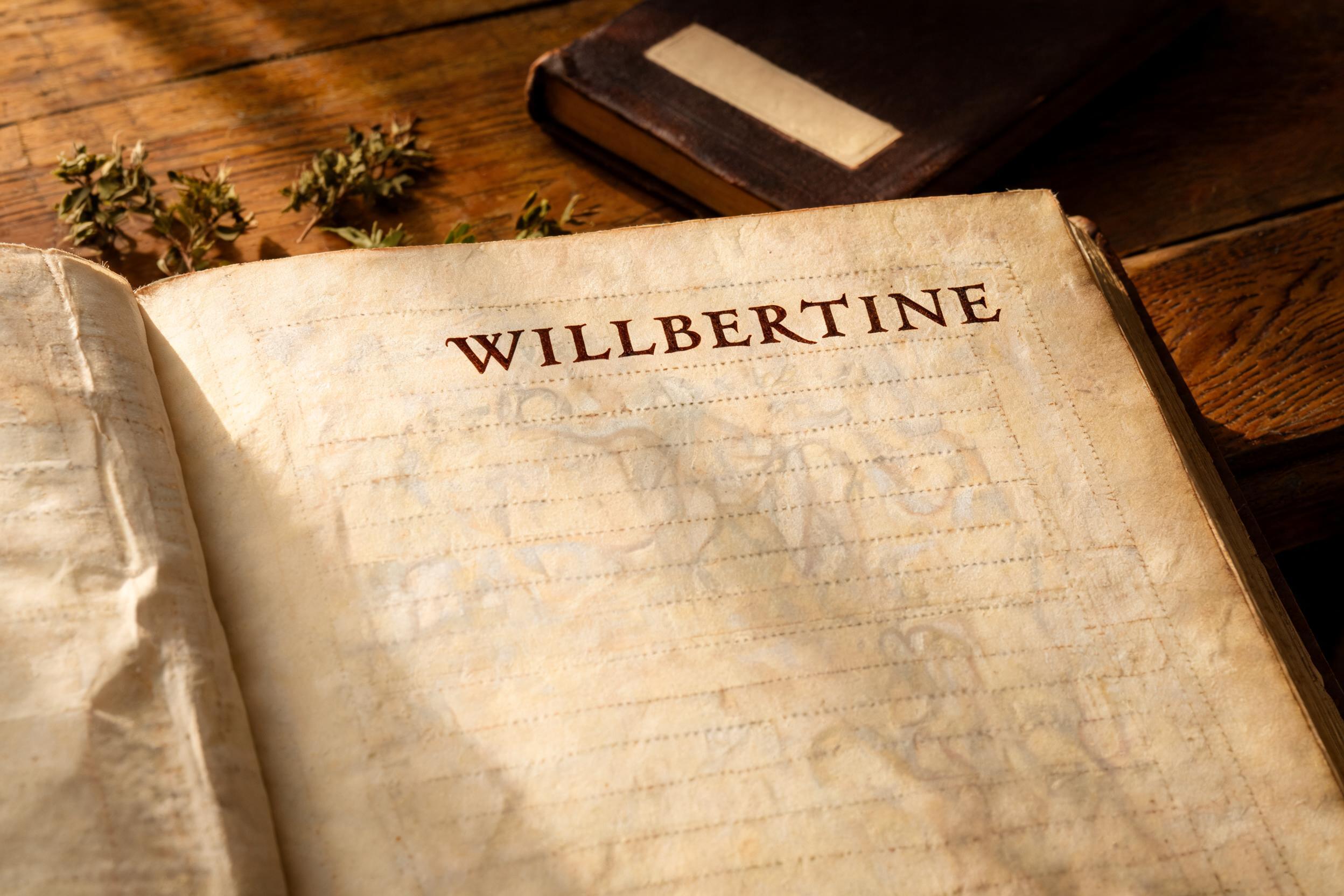

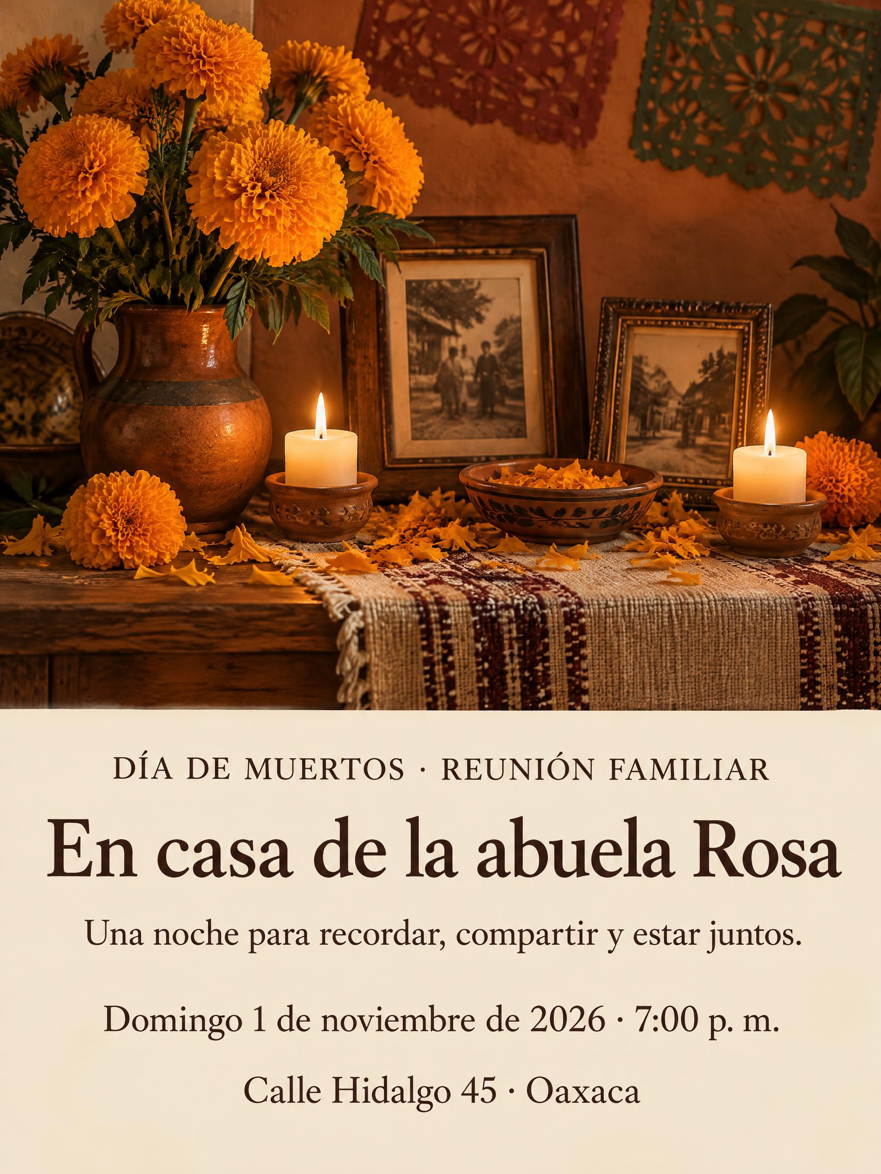
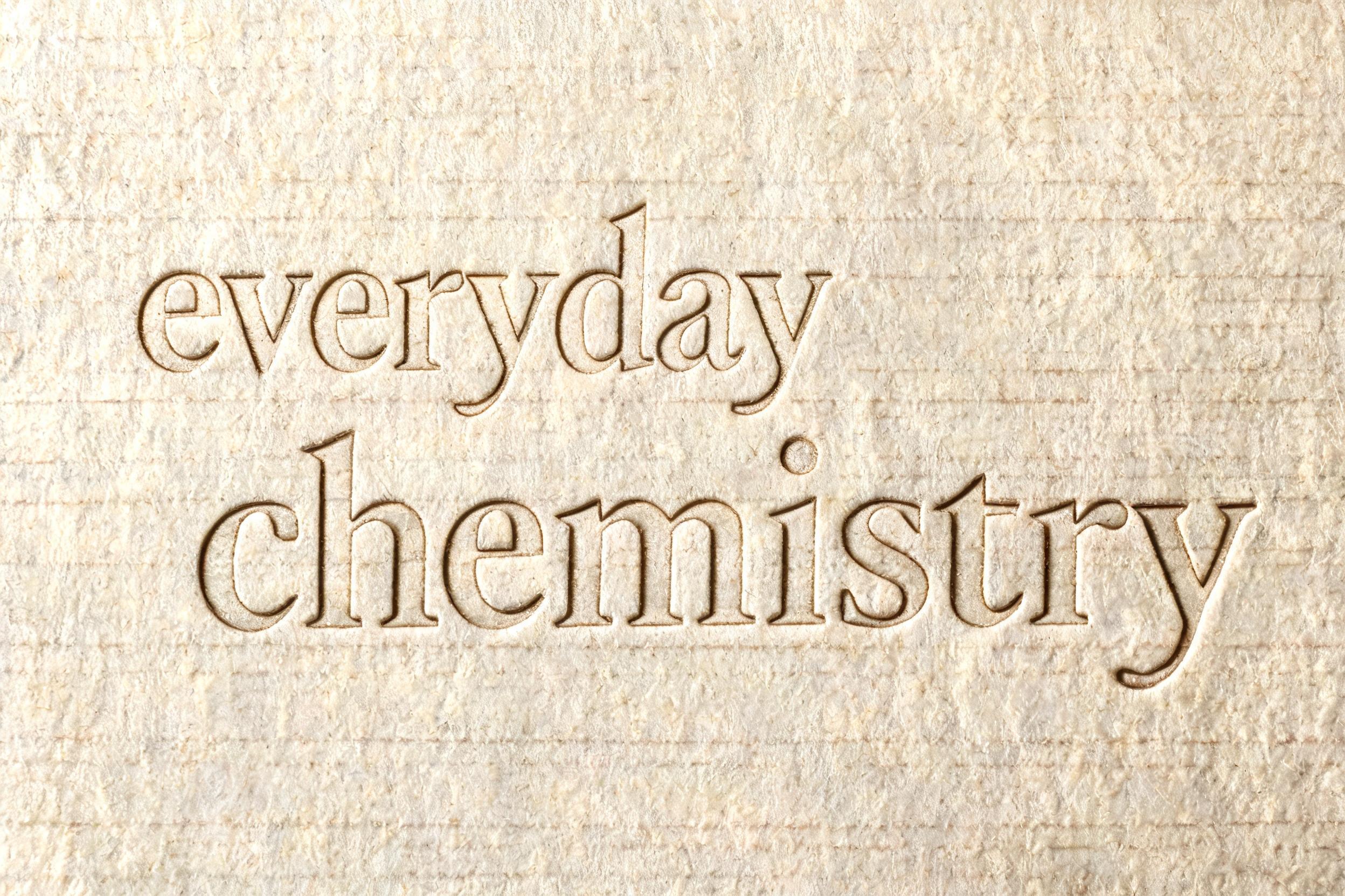

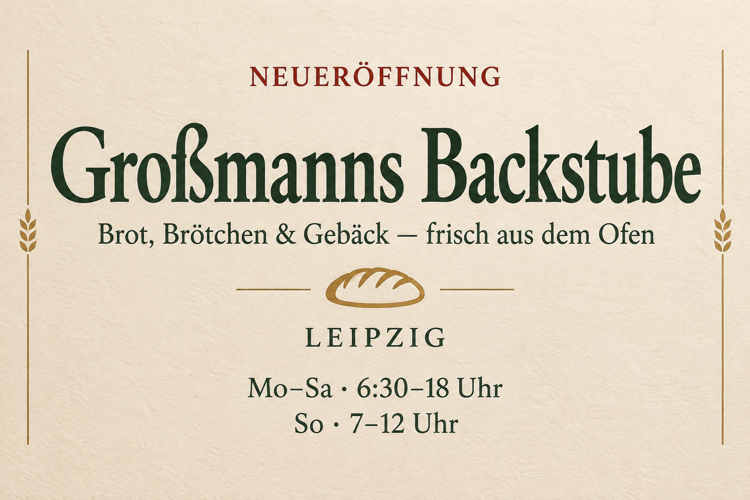
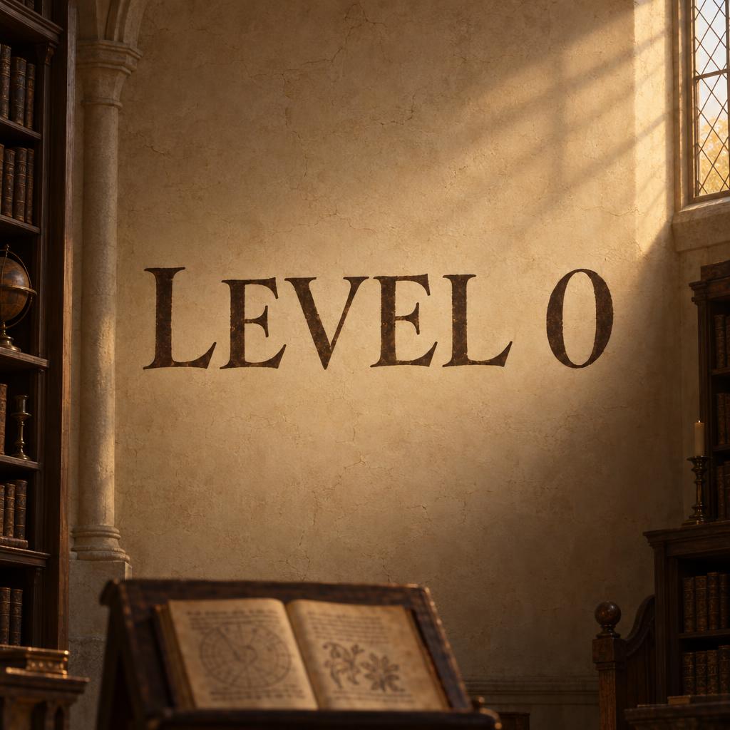

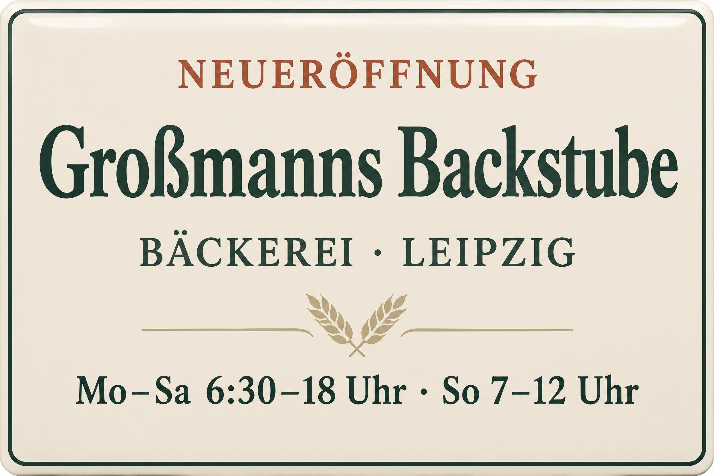

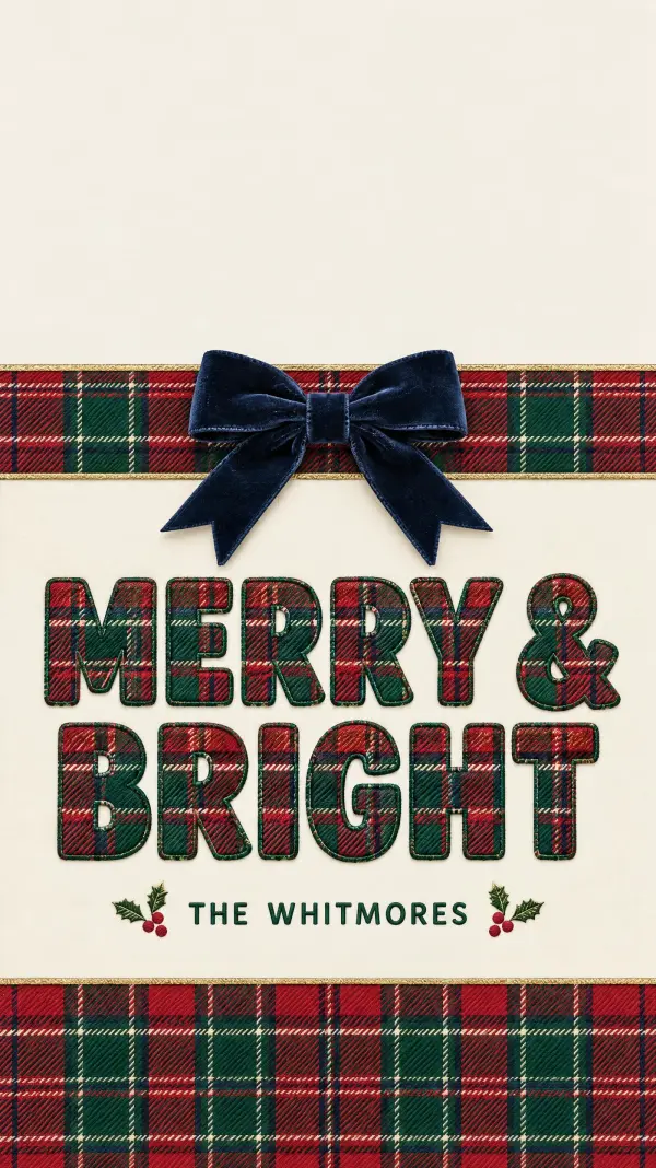

More AI fonts like Old Style Serif


Looking for copy-paste fancy text? Try our free Font Generator Tools — cursive, gothic, bubble & 30+ styles.
About Old Style Serif AI font
Warm, humanist, readable. Calligraphic roots visible in the bracketed serifs and diagonal stress.
Scene
Look
Lettering
Letterforms
FAQ
What is the Old Style Serif font?
Old Style Serif is warm, humanist and readable: calligraphic roots visible in its bracketed serifs and gently diagonal stress. It reads as classic, literary and trustworthy — the register of books, editorial, heritage brands and considered long-form design.
Can I download Old Style Serif?
There is no installable file. You type your text and the generator sets the humanist serif letters fitted to your actual shapes, and returns a high-resolution image.
Where does this style work best?
Book and editorial titles, heritage and literary branding, long-form and magazine work, certificates and formal documents, refined packaging, considered identities. It works well large and comfortably at reading sizes.
Can I use it for commercial work?
Yes. Generated images may be used commercially, including print, packaging and signage. No licence or attribution is required.
Why do old-style serifs have a slanted stress and only moderate thick-thin?
Because they descend directly from writing with a broad-nib pen, and they preserve the trace of that hand. A broad-edged pen held at a fixed, tilted angle makes a thick mark when pulled in one direction and a thin one when pulled across, so on a round letter like an o the thinnest points do not fall top and bottom — they fall on a diagonal, tilted by the angle of the pen. That is the 'diagonal stress' you see in old-style faces, and it is simply the geometry of the writing tool captured in the letter. The contrast between thick and thin stays moderate because a real pen only varies so much, and the serifs are bracketed — joined to the stems by a soft curve — because that is how a pen naturally finishes a stroke. All of this keeps the visible fingerprint of the calligraphic hand, which is why old-style serifs read as warm and humanist rather than cold and mechanical. Reproducing that pen-derived stress and bracketing is what gives the style its readable, classic warmth.
What fonts look similar?
For the same warmth threaded with botanical ornament, see Cottagecore Botanical. For a classic letterpress serif, try Letterpress Classic.