Stranger Things Style AI Serif Font Generator
Read the full description ↓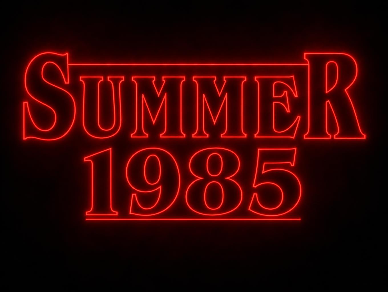
Design something with Stranger Things Style
Transparent Effect
✦ Transparent Effect
Generates a PNG with the background removed — only the text and its visual effects remain. The AI automatically selects the optimal background color for clean removal based on your style.
Output is always PNG for lossless transparency.
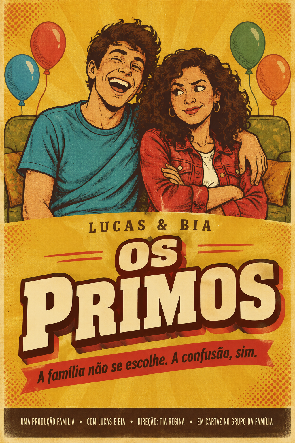
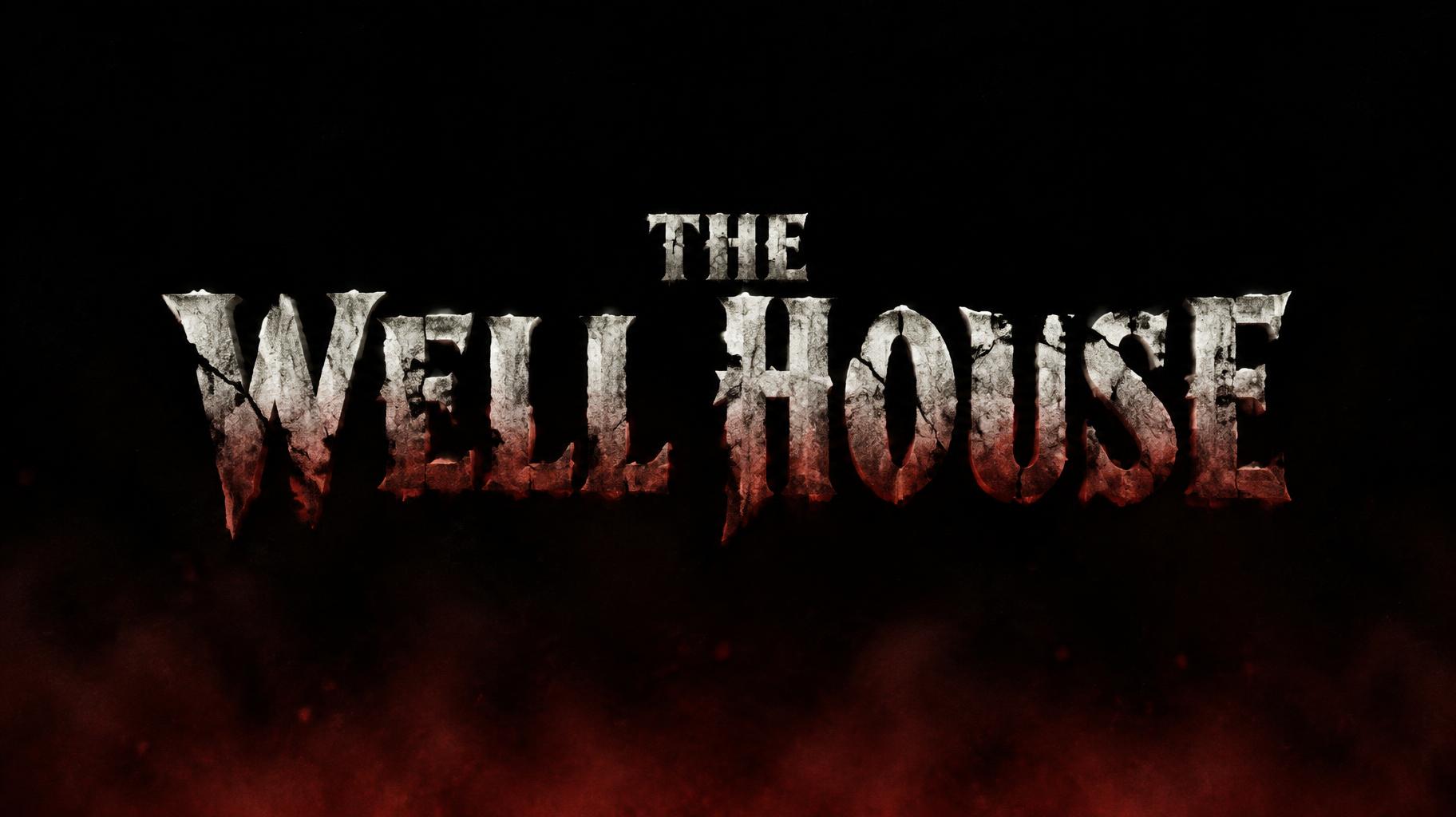
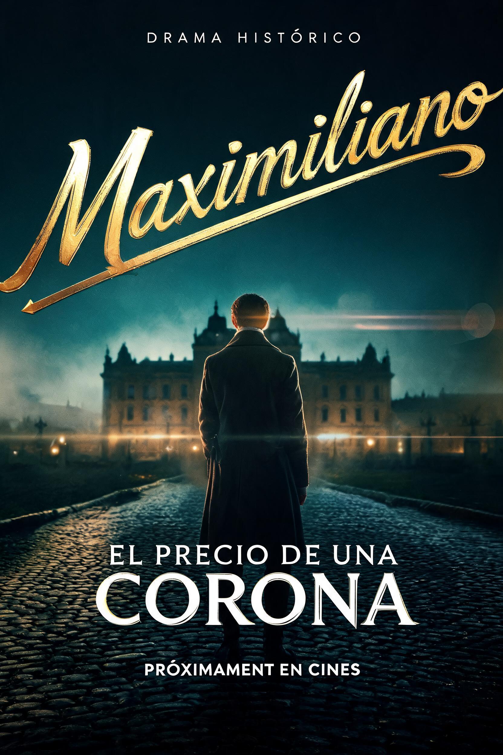
More AI fonts like Stranger Things Style


Looking for copy-paste fancy text? Try our free Font Generator Tools — cursive, gothic, bubble & 30+ styles.
About Stranger Things Style AI font
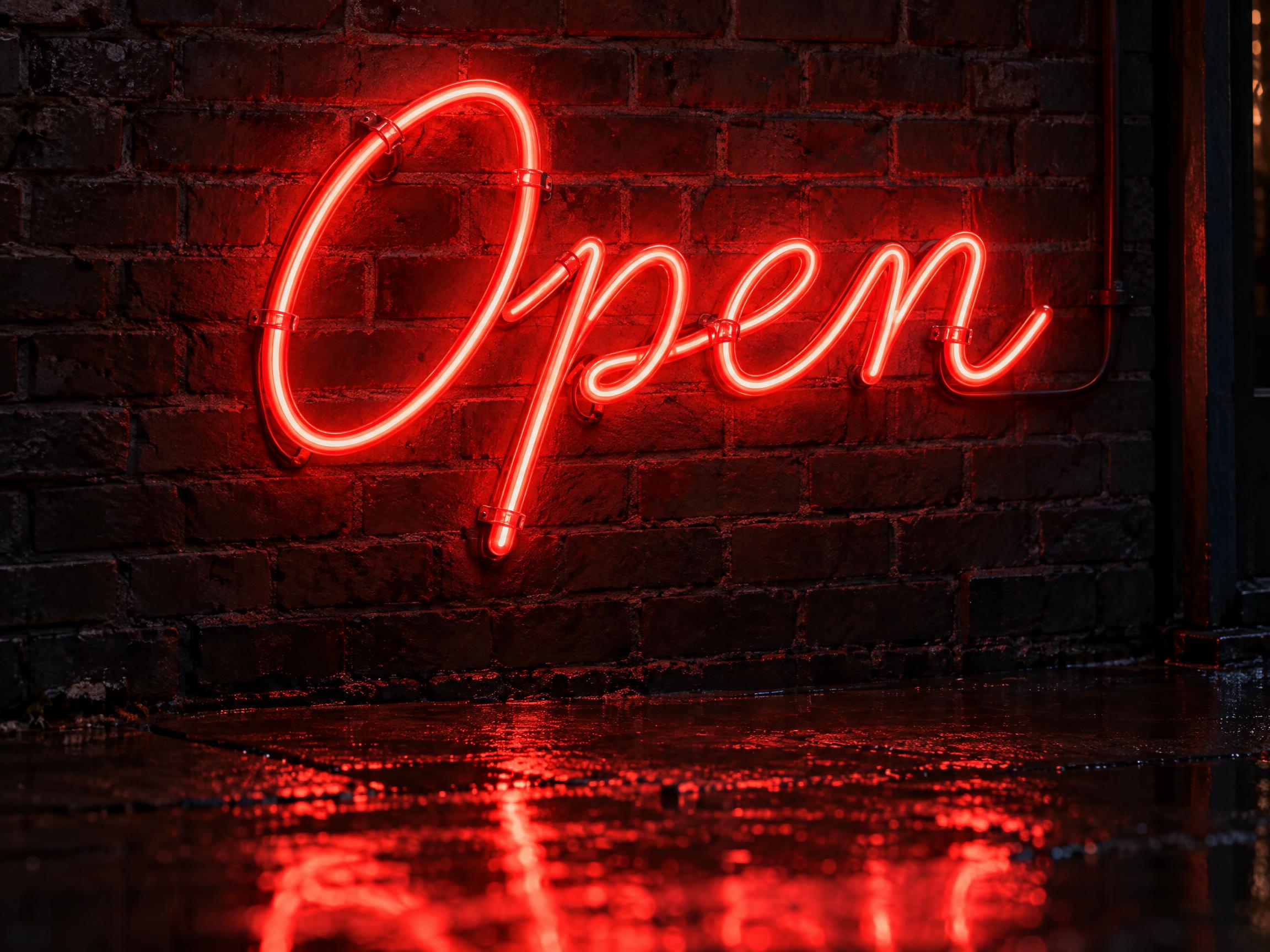
A Stranger Things style font inspired by the title of the 1980s-set supernatural series. Bold 1970s book-jacket serif capitals drawn as thin glowing red outlines, with the first and last letters of the top word standing taller and a thin rule running across their tops and under the second line. An unofficial tribute for party invites, Halloween posters, fan shirts and video titles.
Scene
Lettering
Theme
FAQ
What does the Stranger Things Style font look like?
Bold, high-contrast serif capitals with soft wedge serifs, drawn as thin red outlines that glow against the dark. The first and last letters of the top word stand about one and a half times taller, a thin rule runs across their tops, and a matching rule sits under the second line.
Is this the official Stranger Things font?
No. Stranger Things Style is an unofficial tribute inspired by the show's title. It is not affiliated with or endorsed by Netflix and does not reproduce the official logo. The show's title is based on the 1970s typeface ITC Benguiat; here you get the whole glowing title look as an image instead of a font file.
Why are the first and last letters bigger?
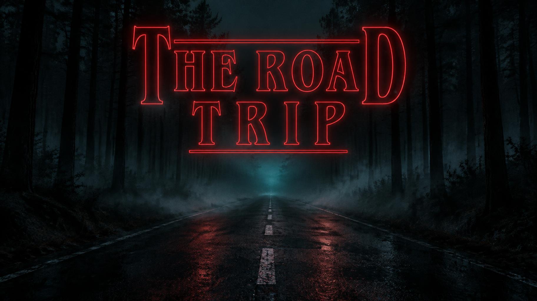
That is the title lockup the show made famous: the end letters of the top word rise above the rest and carry a thin rule between them. It works best with one to three short words, for example a name on the first line and a year or an event on the second.
Can I download the Stranger Things font?
There is no font file to install. Type a name or a short phrase and you get a high-resolution PNG or JPG, ready for an invitation, a T-shirt, a poster or a video intro.
What can I make with it?
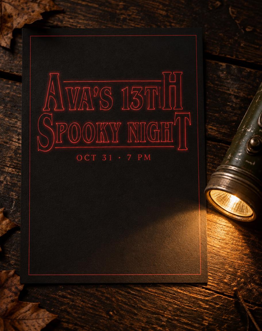
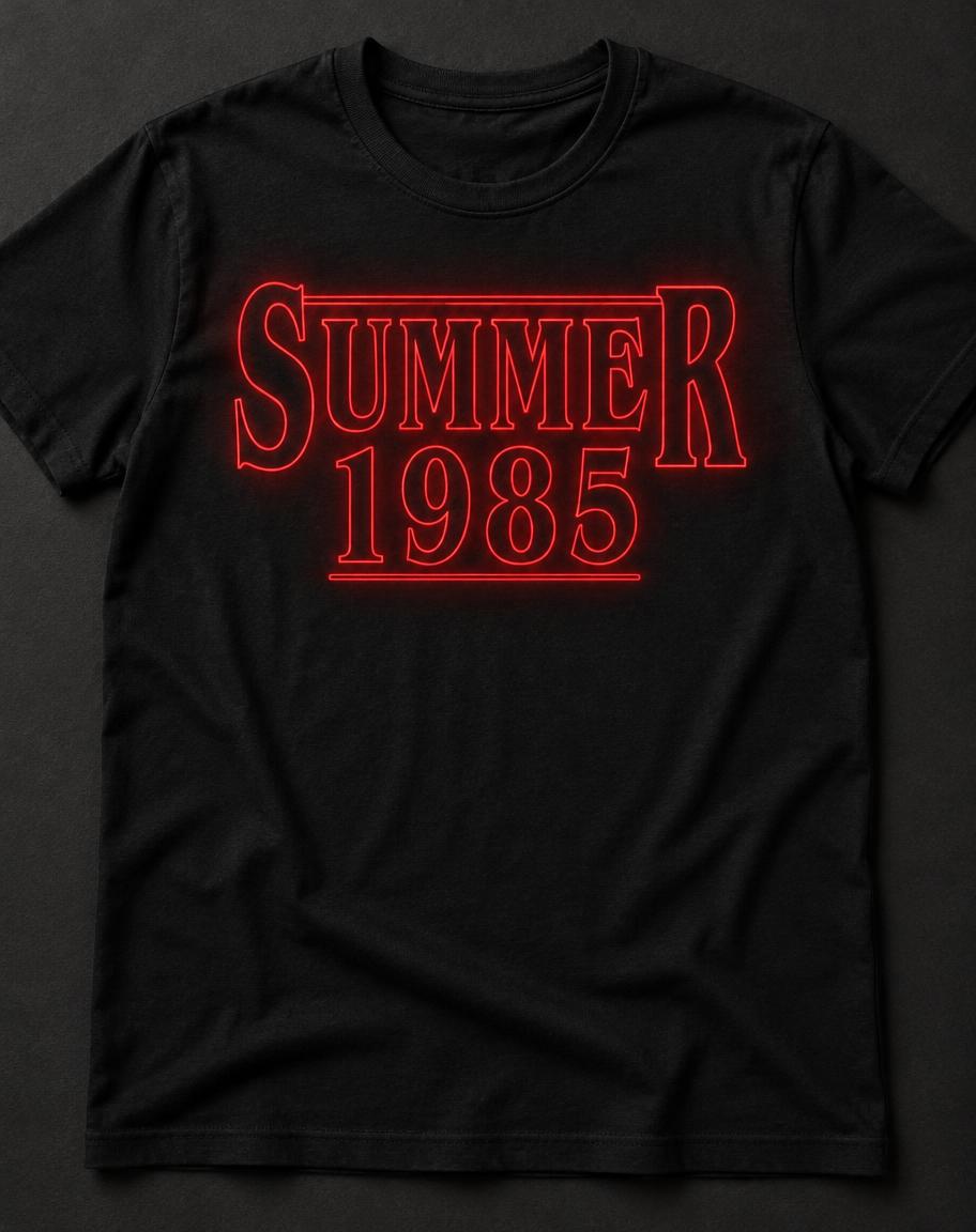
Birthday and Halloween party invitations, 80s movie-night title cards, fan T-shirts, video intros and thumbnails. For more film lettering, see the movie fonts collection.