75週年紀念特刊 - メタリック Text Effect


この作品と同じ OpenAI GPT-Image-2.5 Sunburst を使用 · 15 クレジット









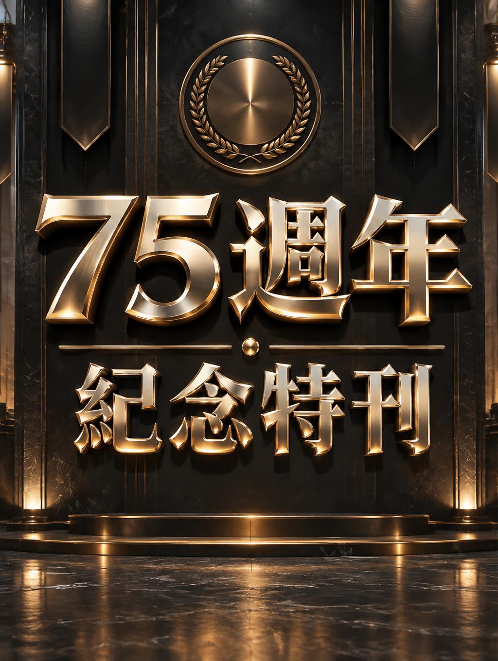
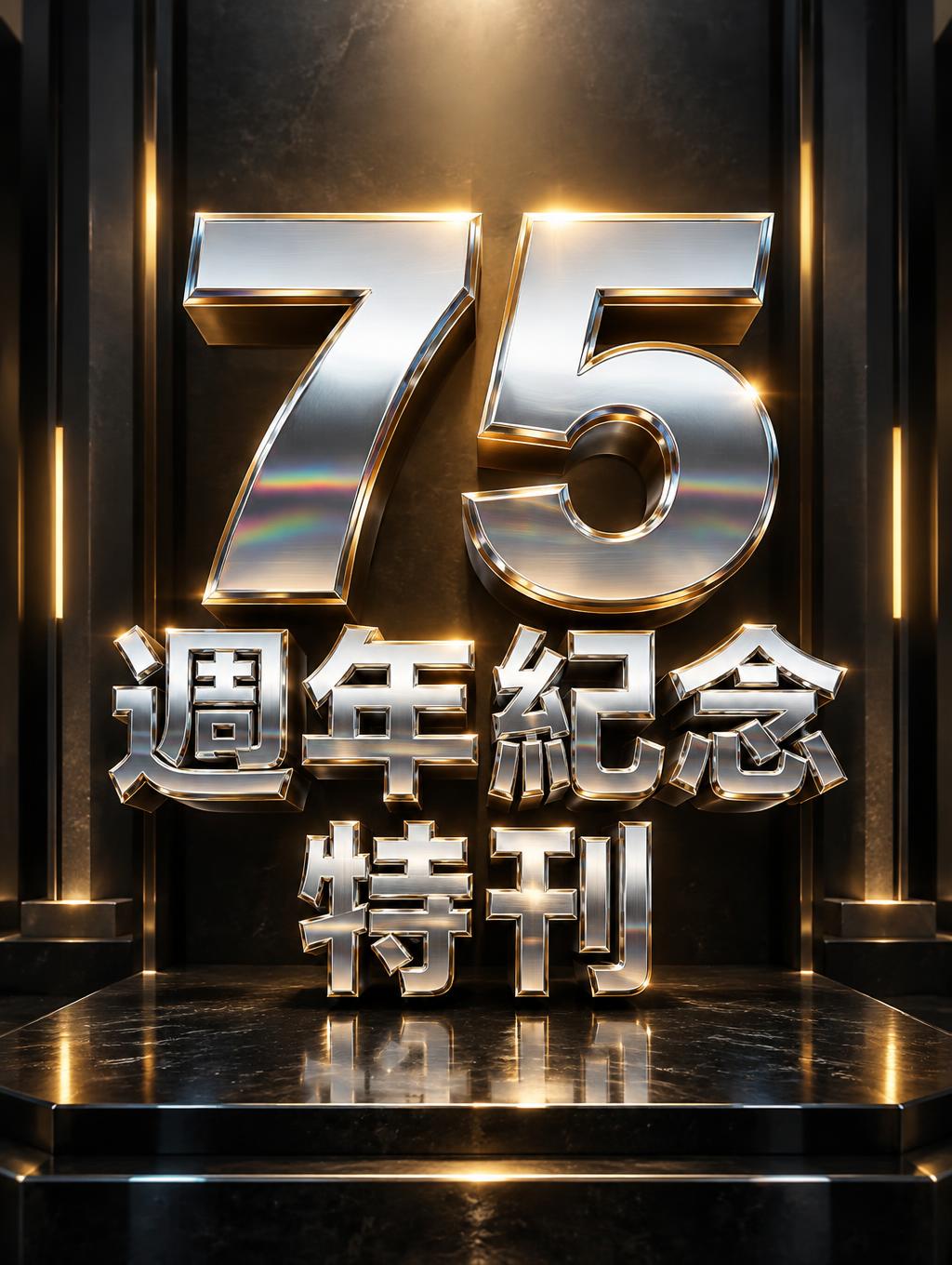
「75週年紀念特刊」は FontVibe AI で作成したメタリックの文字エフェクトです。磨いた金とヘアラインのスチールを組み合わせた面取りの3D大文字。鋭いハイライトの線、方向性のあるスタジオ光の下で冷たい反射床に映ります。
Rendered as bold 3D extruded letters with realistic metal surface physics — two signature material tracks: brushed steel with directional anisotropic highlight streaks across the surface, matte-satin finish, subtle horizontal grain texture, industrial grey with cool undertones; and gold/trophy with warm amber-yellow color temperature, wide smooth specular gradient from bright highlight to deep shadow, achievement trophy polish and weight. Supporting track: chrome/mirror for high-contrast metallic accent work. Core optical behavior rules across all tracks: wide specular highlight gradient (not a point highlight), ambient reflection in shadow zones capturing environmental color, material-specific color temperature held consistently, edge highlight compression where bevel planes meet. Never flat grey paint — always show the metal's interaction with light. Dark industrial background to maximize material contrast. LETTERFORM PRIORITY: when the chosen font carries its own treatment, that font's letterform shapes take priority and own the letters; this style governs the metal-surface physics, the specular lighting and the finish. FALLBACK MATERIAL: if the font carries no material of its own, render the letters as bold 3D-extruded metal — brushed steel or polished gold/trophy with a wide specular gradient and compressed edge highlights. COLOR PRIORITY: keep the font's own colors if specified; otherwise hold the chosen metal's color temperature — cool steel grey or warm trophy gold. Create a refined commemorative cover for the exact Traditional Chinese text “75週年紀念特刊.” Arrange the characters in three deliberate lines: “75” as the dominant centerpiece, “週年紀念” directly beneath it, and “特刊” as a compact finishing line, preserving every character exactly. Give the lettering generous scale and clear separation so the dense Chinese text remains legible at a glance. Set it against a deep charcoal-black exhibition backdrop with a restrained architectural sense of depth: a dark reflective plinth below, faint vertical panels receding into shadow, and a few slender warm-gold light bars framing the central composition without competing with the words. A broad, warm overhead light sweeps across the lettering, while cool steel-blue reflections gather softly in the surrounding shadows. Let the characters cast crisp dimensional shadows onto the backdrop and plinth, with a subtle, controlled reflection beneath them. Add a fine halo of amber light behind the central number and delicate metallic glints near the edges, suggesting a milestone worthy of an archival special edition. Keep the layout centered, balanced, uncluttered, and unmistakably designed as a premium anniversary publication cover; include no other text, numbers, badges, or symbols.
2026年11月9日に生成 · 1024 × 1360 · JPEG · OpenAI GPT-Image-2.5 Sunburst · 制作者がシェア · 商用利用無料(CC BY 4.0)