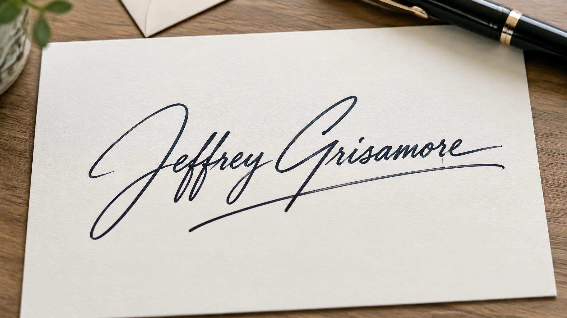
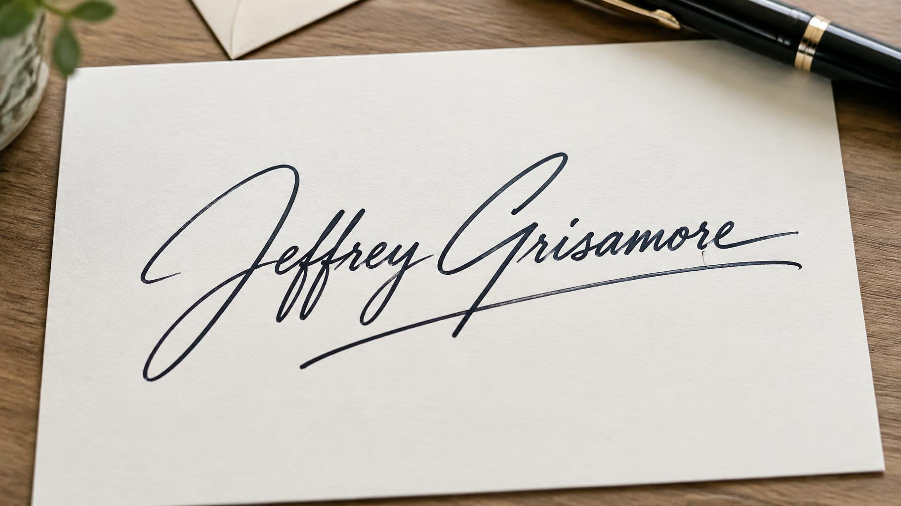
Jeffrey Grisamore - サインスクリプト Text Effect


この作品と同じ OpenAI GPT-Image-2.5 Sunburst を使用 · 15 クレジット
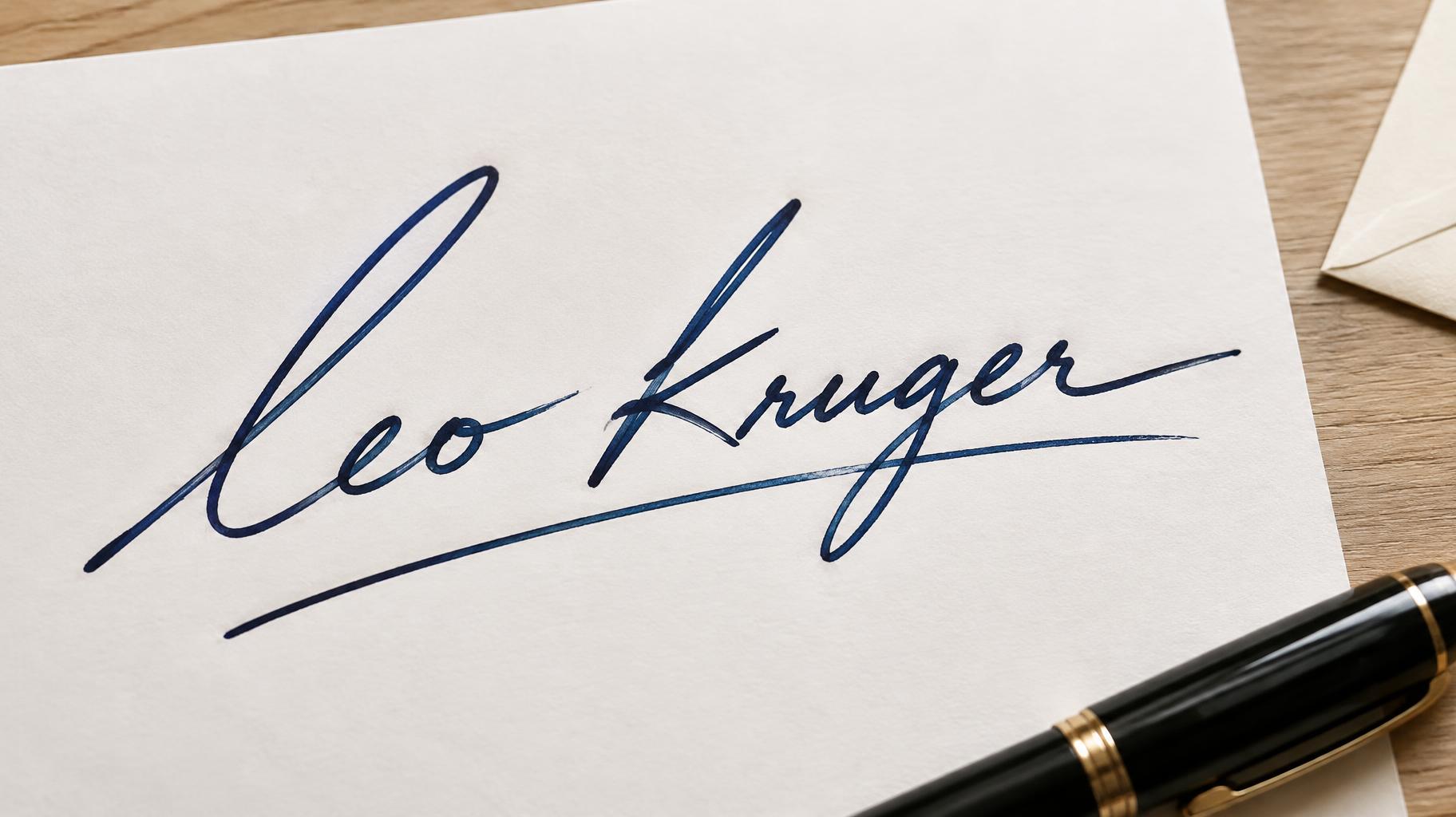
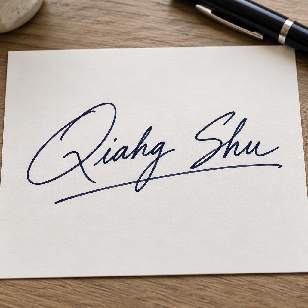
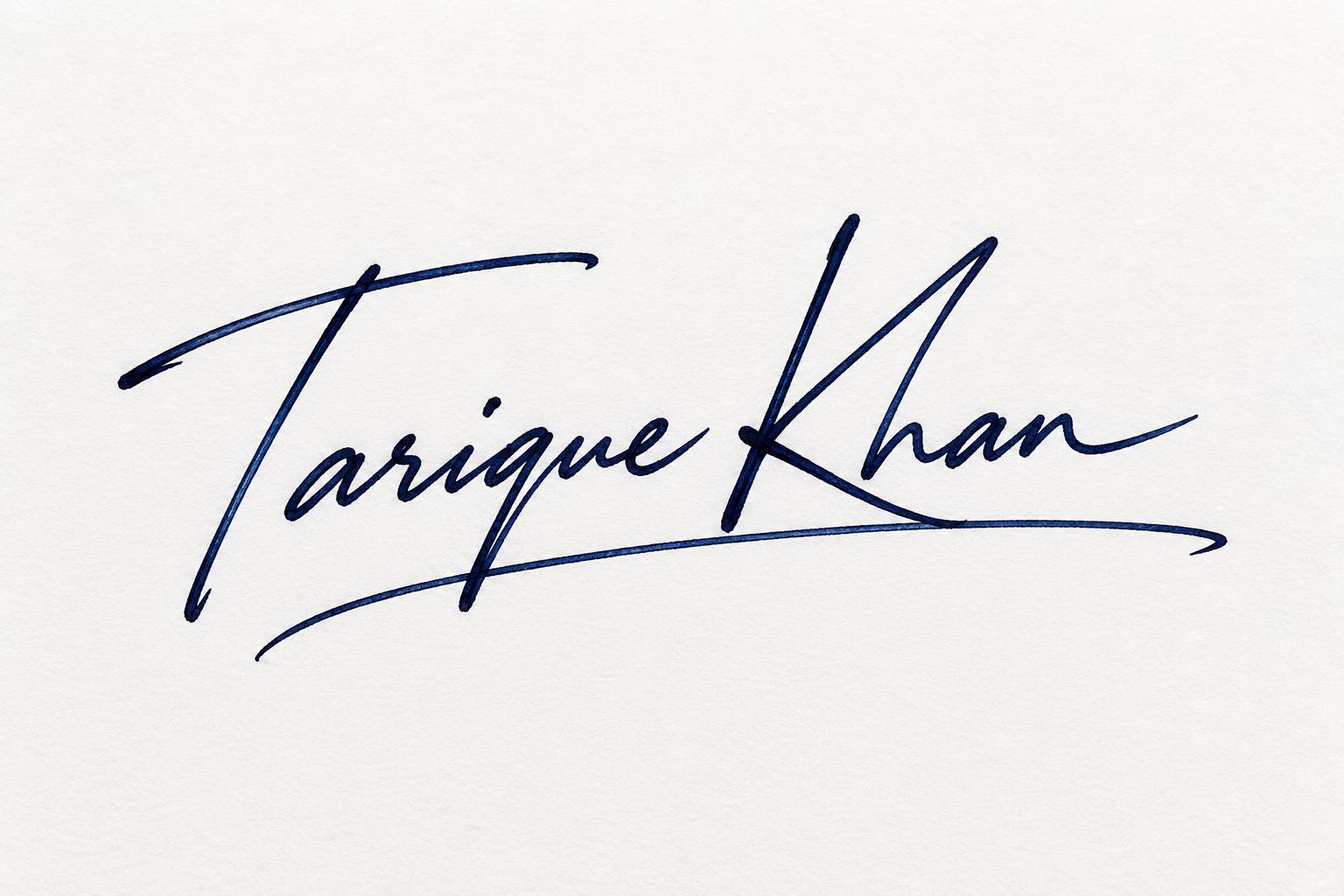
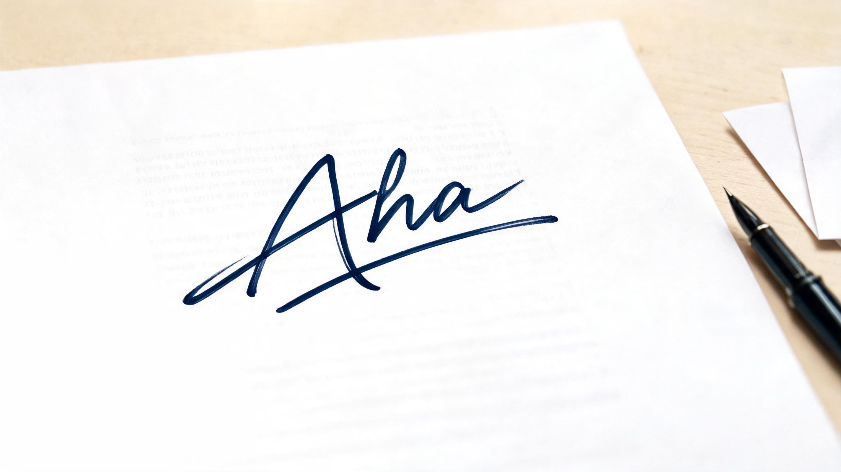
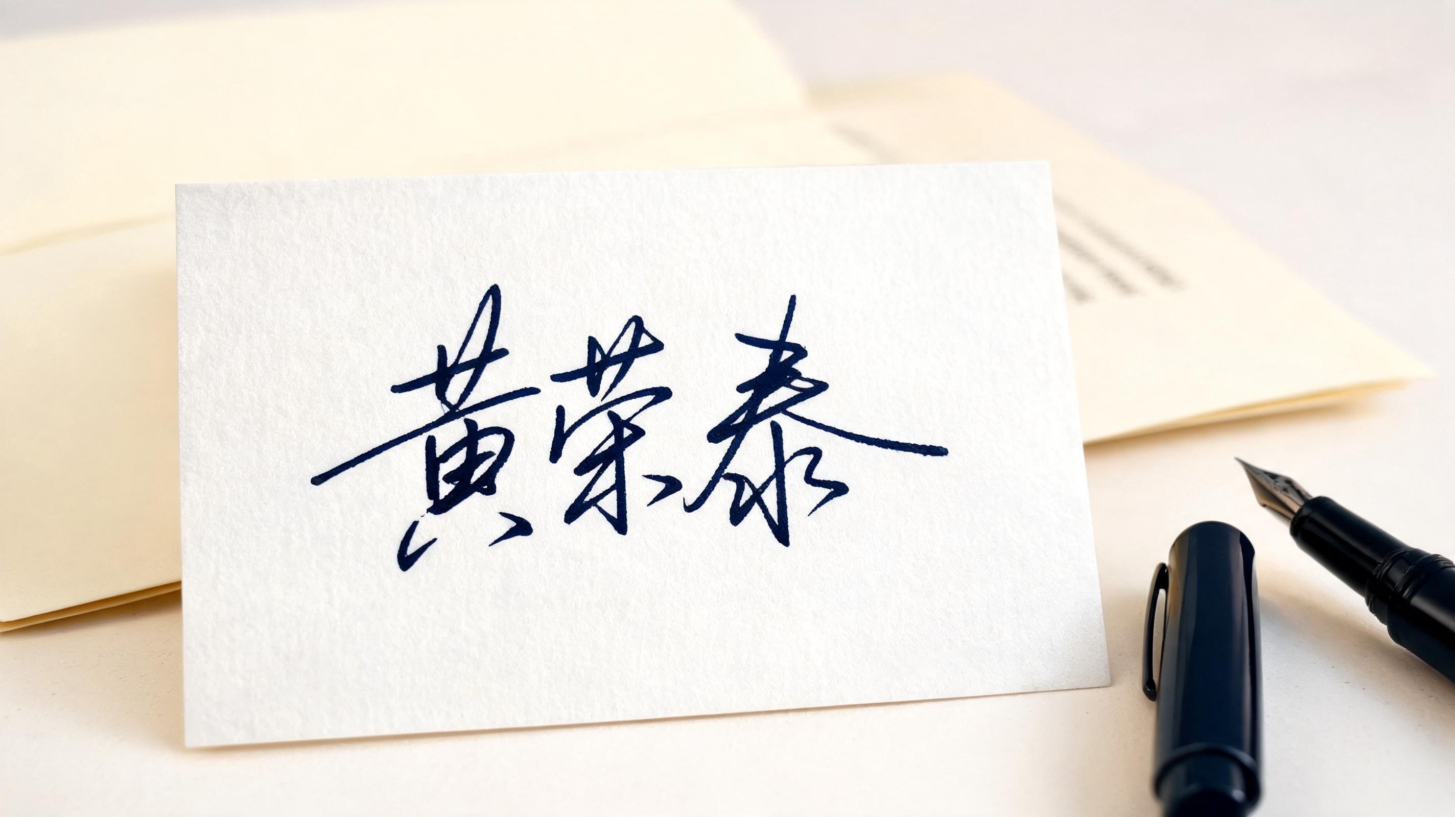
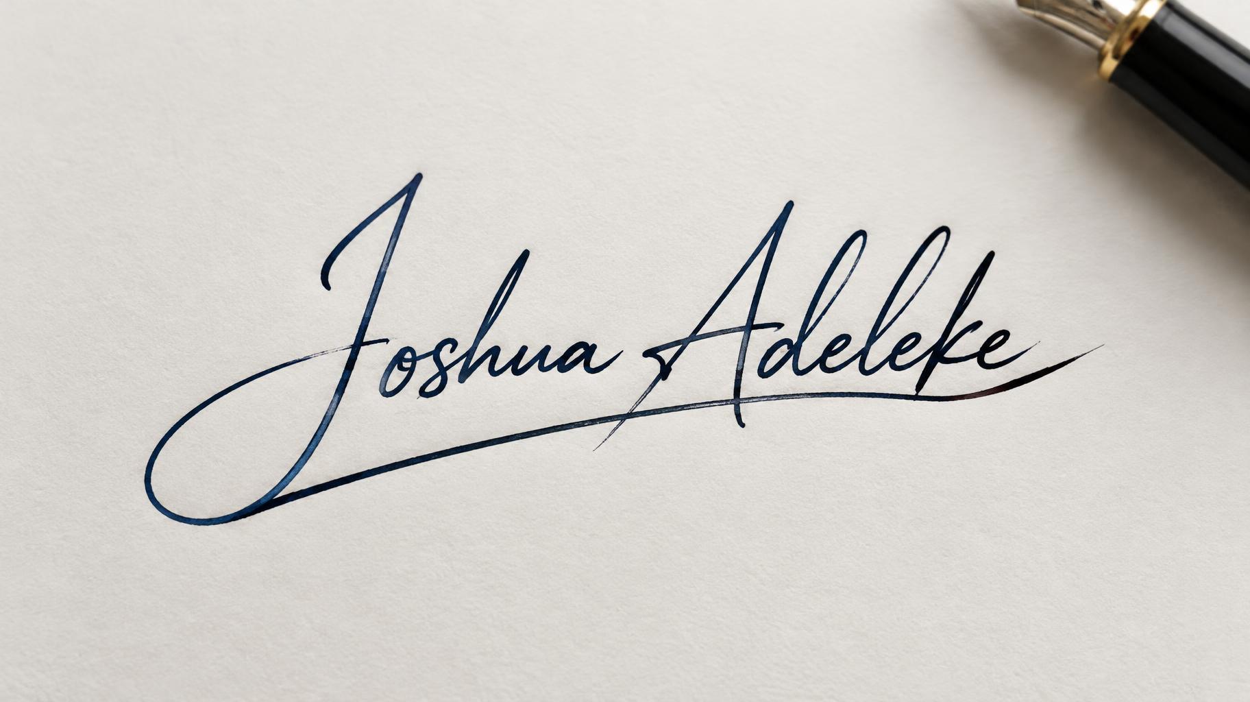
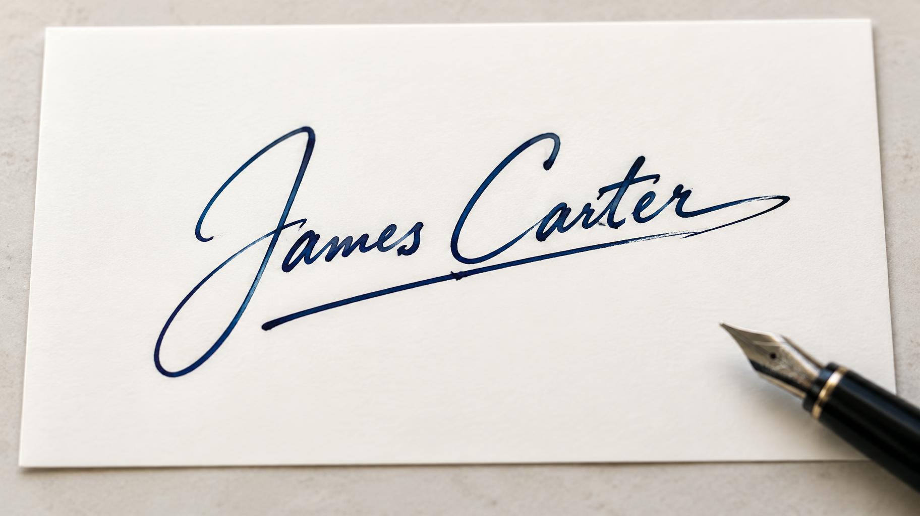
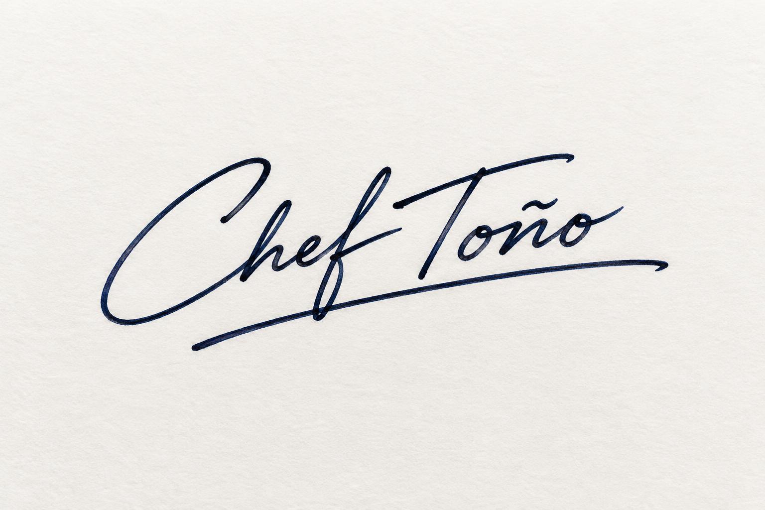
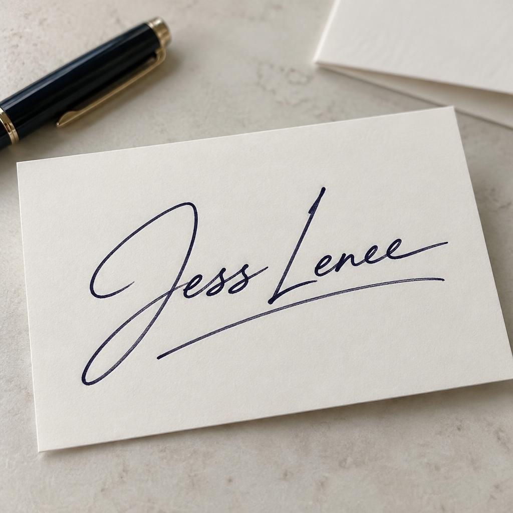
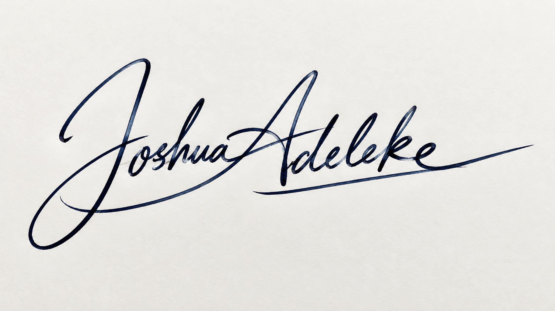
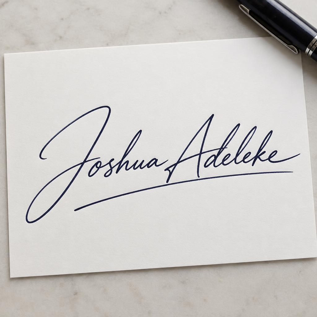
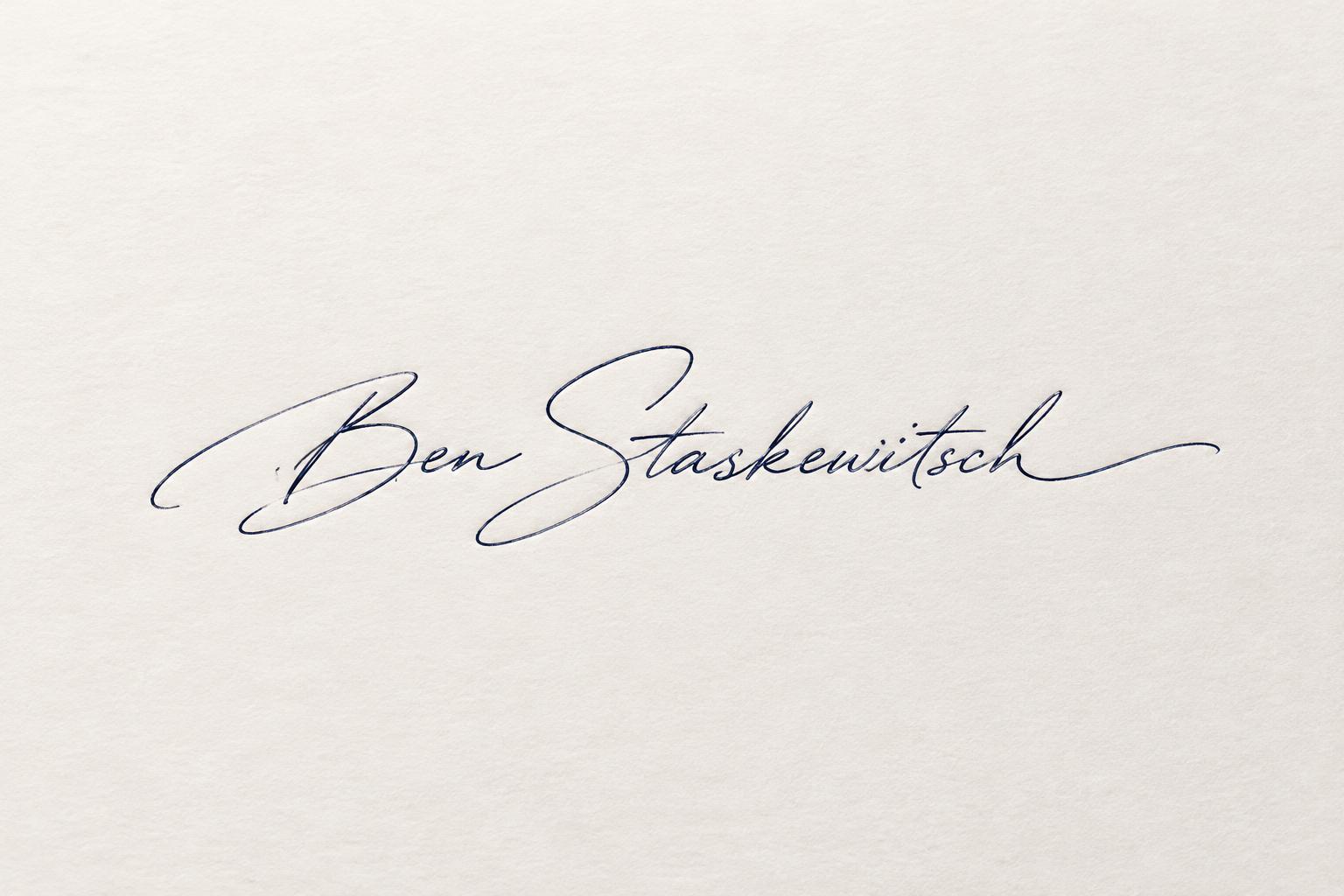
「Jeffrey Grisamore」は FontVibe AI で作成したサインスクリプトの文字エフェクトです。手書きのサイン。一本の流れる線で、目立つ頭文字に小さくつながる文字、最後に長いアンダーラインのスワッシュ。白い紙に青黒いインク。
captured as an authentic hand-signed autograph. SURFACE / INK: the name is laid down in one confident pass as a real pen signature — a fine ballpoint or fountain-pen line in flat matte ink, with natural pen texture: subtle ink pooling where strokes turn, faint pen-skips where the nib lifts, no gloss, no metallic, no decorative shine. GROUND: a plain, real signing surface — crisp white document or card stock, a signed letter or contract, a clean notebook page or a soft neutral paper — understated and everyday, with generous space so the name reads. LIGHT: even, natural, document-like — soft flat daylight or a gentle desk light, minimal drama, the signature reading clear and legible the way a real autograph does. ATMOSPHERE: personal, confident and authentic — the feel of a genuine hand-signed name or personal-brand mark, dashed off yet unmistakably distinctive. LETTERFORM PRIORITY: when the chosen font carries its own treatment, that font's letterform shapes and personal flourishes take priority and own the letters; this style governs only the ink surface, ground and light, never the letter shapes. When no specific material is defined by the font: a fine matte pen-ink line with natural ballpoint or fountain-pen texture in a single flat ink color, on the clean paper ground. COLOR: if the font declares its own color keep it; otherwise the ink reads as a deep classic signing tone — near-black or a dark blue-black — on the light paper ground. “Jeffrey Grisamore” is the sole visible text, signed in one confident pass across a crisp warm-white personal stationery card. Keep both words intact and clearly legible, with a natural pause between them; let the full name lead as one distinctive autograph, large and centered, spanning roughly two-thirds of the card’s width. Preserve generous clean space around the signature so its fine, matte, near-black ink reads unmistakably against the plain paper. Show subtle ink pooling at turns and occasional faint pen skips, like a real nib moving quickly across the surface. Place the card on a quiet, soft-neutral desk, with a slim dark pen resting nearby and a folded note just beyond it, both gently out of focus and secondary. Use even, soft daylight, restrained natural shadows, and a simple close overhead view that keeps the paper and the complete name sharp. The finished image should feel personal, confident, and genuinely signed, not like a formal advertisement or decorative calligraphy.
2026年11月10日に生成 · 1824 × 1024 · JPEG · OpenAI GPT-Image-2.5 Sunburst · 制作者がシェア · 商用利用無料(CC BY 4.0)



