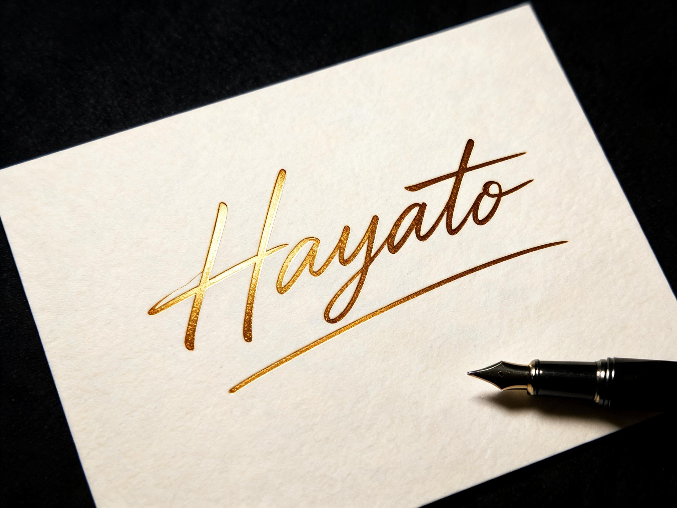
Hayato - 筆記体 Text Effect


この作品と同じ BytePlus Seedream 5.0 を使用 · 15 クレジット
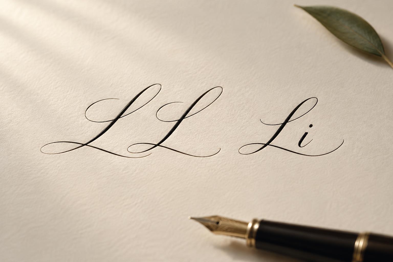
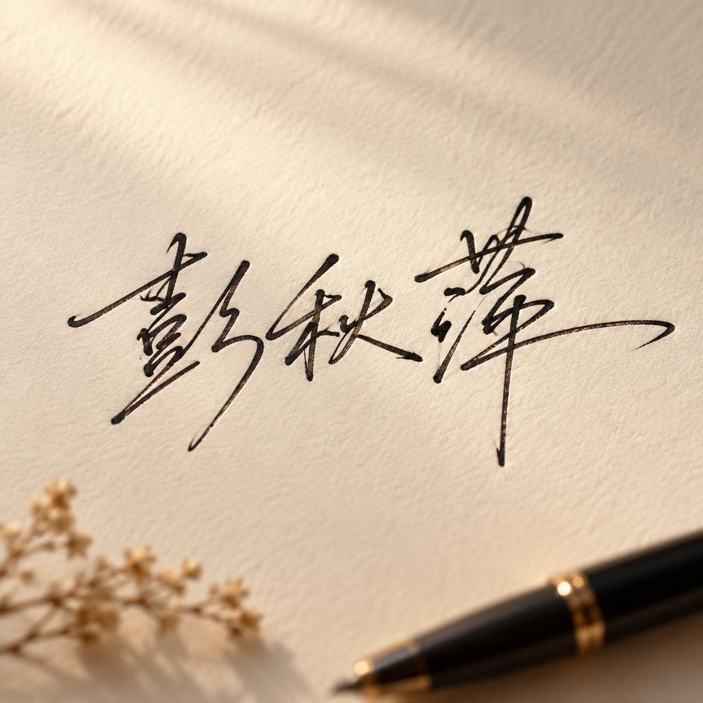
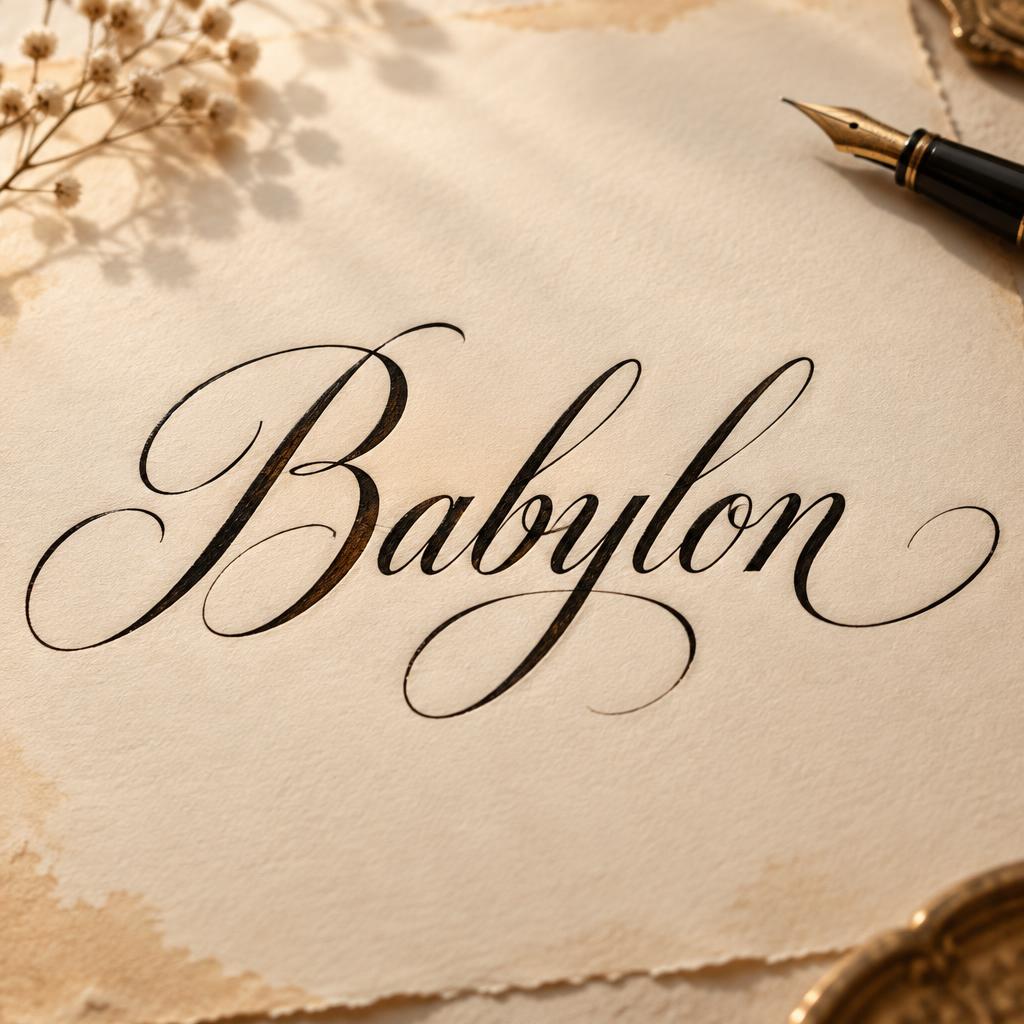
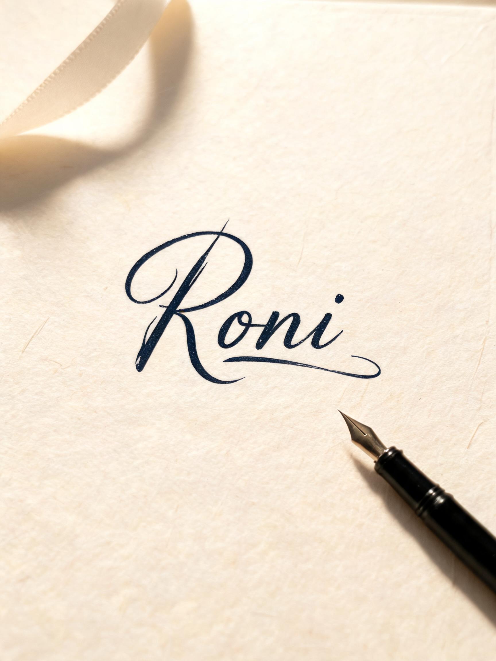

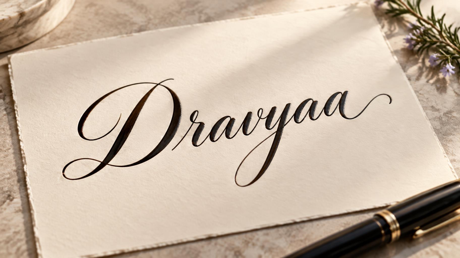
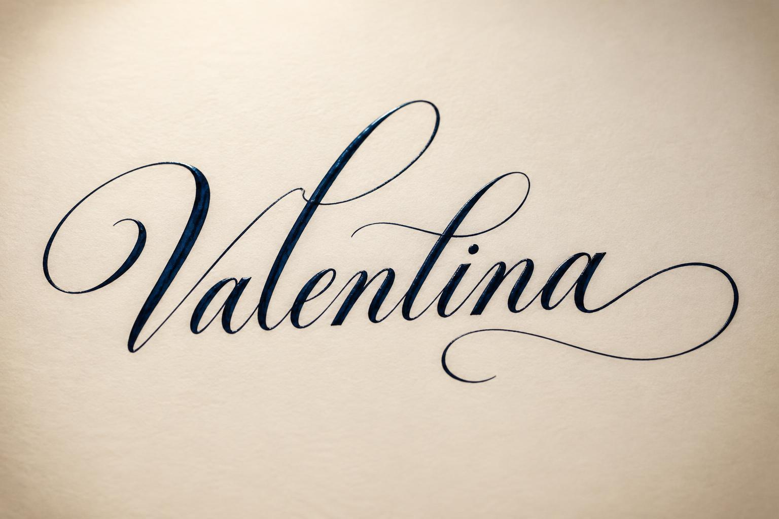
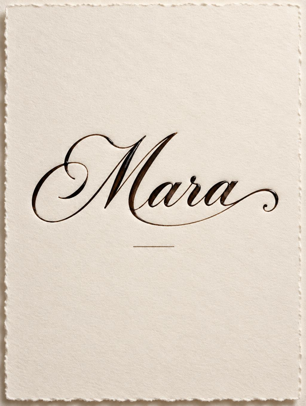
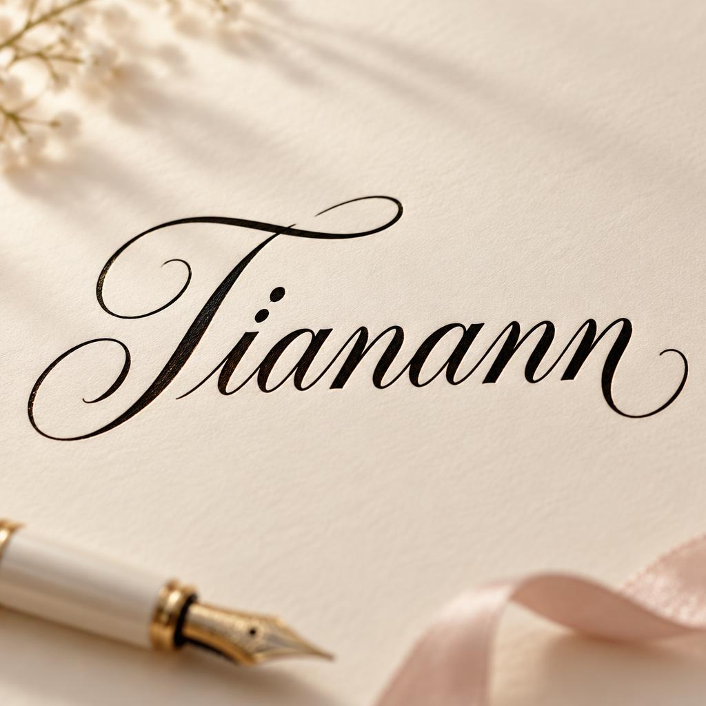
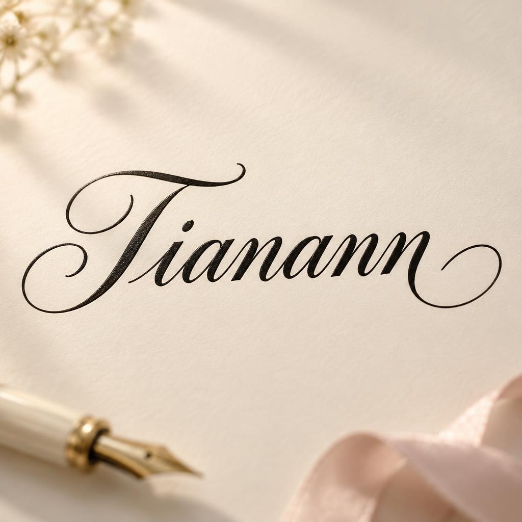

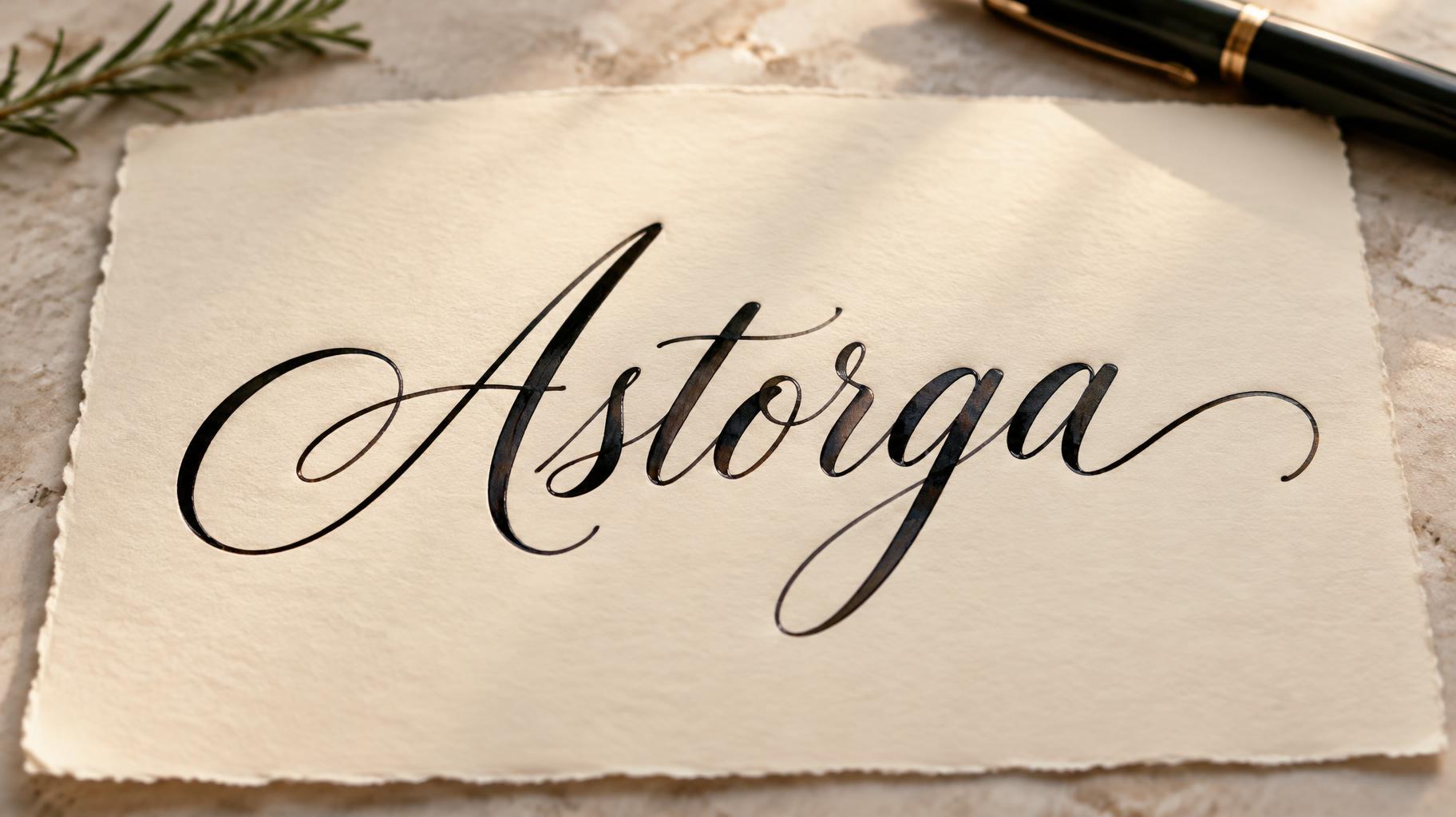
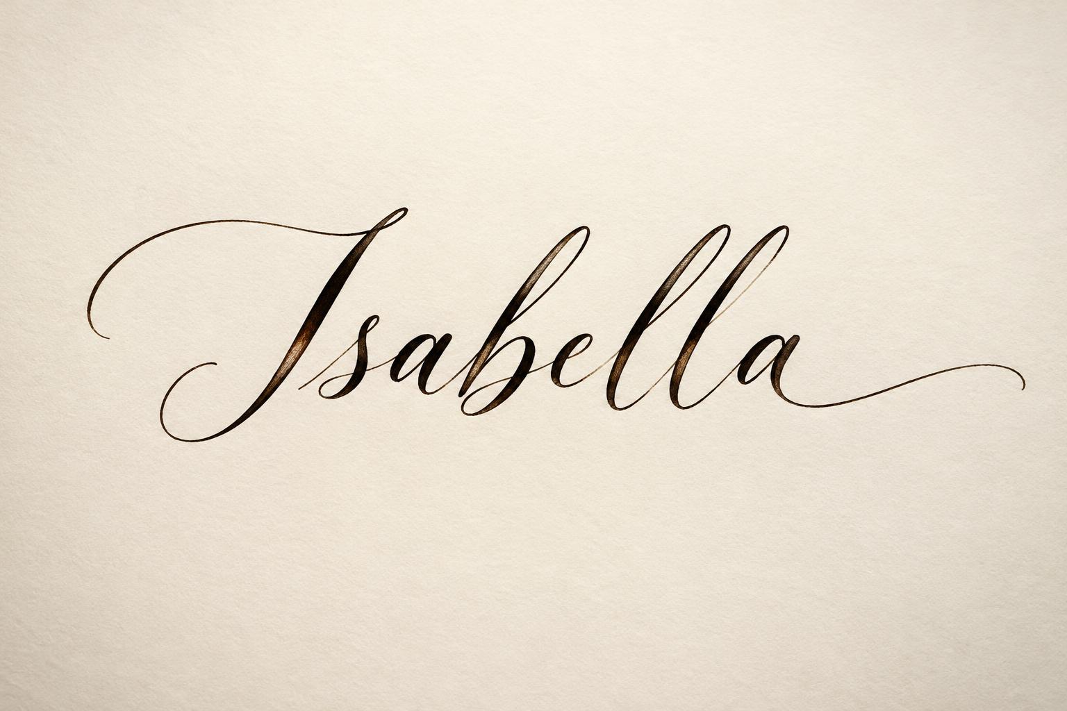
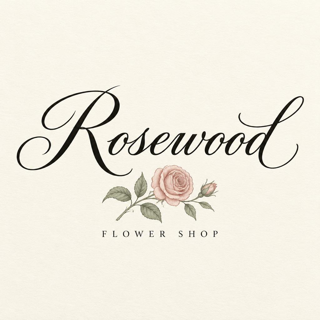
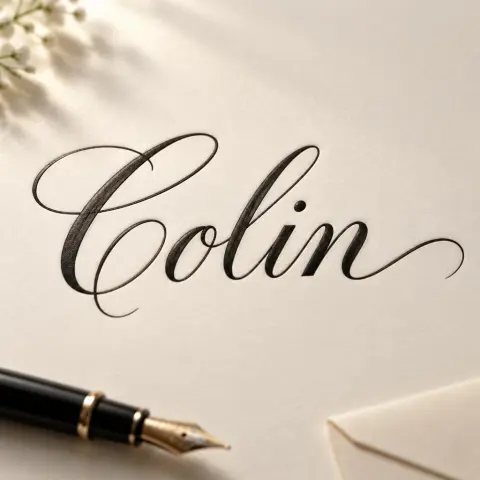
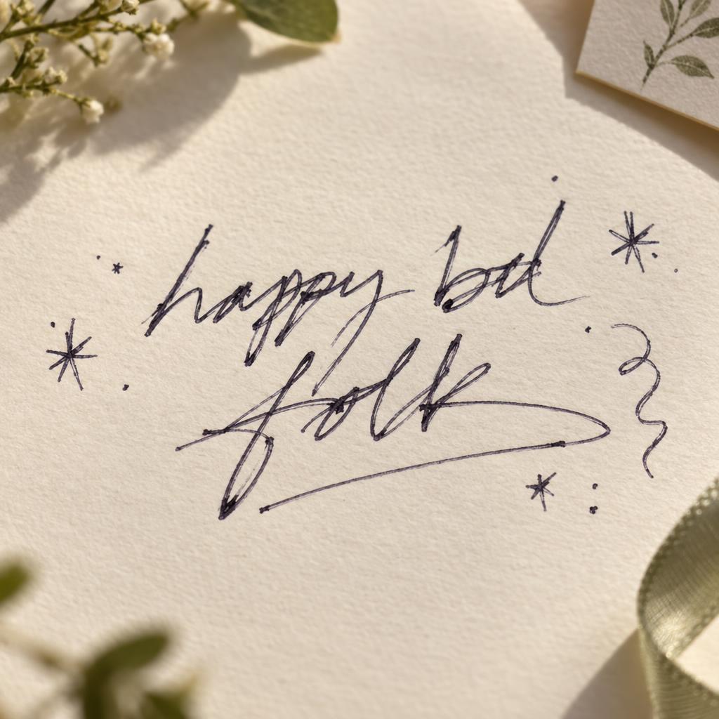
「Hayato 」は FontVibe AI で作成した筆記体の文字エフェクトです。流れるようなペンとインクの筆記体。文字がつながり、アセンダーはループを描き、入りと抜けに長いスワッシュ。上質な白い紙に黒インク、柔らかな斜光。
placed in a soft, refined calligraphy light field — a gentle directional light rakes across the surface from an upper angle, grazing the strokes so their natural ink body and subtle sheen read with depth, while a soft fill keeps shadows intimate rather than harsh. GROUND: a clean elegant art surface — fine hot-press cotton paper, smooth cream card, a soft neutral or a quiet dark editorial ground — with generous negative space so the lettering breathes. ATMOSPHERE: the timeless, romantic feel of masterful pen calligraphy — poised and versatile, at home on a name, a quote, a bio or a card. LETTERFORM PRIORITY: when the chosen font carries its own treatment, that font's letterform shapes and built-in flourishes take priority and own the letters; this style governs only the surrounding light, ground and finish, never the letter shapes. When no specific material is defined by the font: rich flowing ink with a soft natural sheen and a fine wet-edge glisten where strokes catch the light, on the clean paper ground. COLOR: if the font declares its own color keep it; otherwise the ink reads as a deep elegant tone — classic near-black or a soft romantic ink hue — on the light ground. Create a finished calligraphic name print featuring the exact text “Hayato” on one line, centered and large enough to command the composition while leaving generous, balanced margins. Keep the spelling and capitalization exact, with no additional words or lettering. Set the piece on a single sheet of smooth, warm ivory cotton paper, its subtle fibers visible in the open space around the name. Let the ink sit naturally on the paper, with a delicate wet-edge glint and restrained sheen where the light catches it. A soft directional light from the upper left grazes the sheet, lending the ink gentle depth and allowing quiet shadows to gather along the paper’s edge without becoming dramatic. Place the paper on a calm pale-stone writing surface, with only a slim fountain pen resting near one corner, softly out of focus and secondary to the name. Keep the arrangement spare, intimate, and refined: no flowers, decorative borders, seals, extra marks, or competing props. The name remains the unmistakable focal point, surrounded by clean negative space in a timeless, personal stationery composition.
2026年11月10日に生成 · 2304 × 1728 · JPEG · BytePlus Seedream 5.0 · 制作者がシェア · 商用利用無料(CC BY 4.0)



