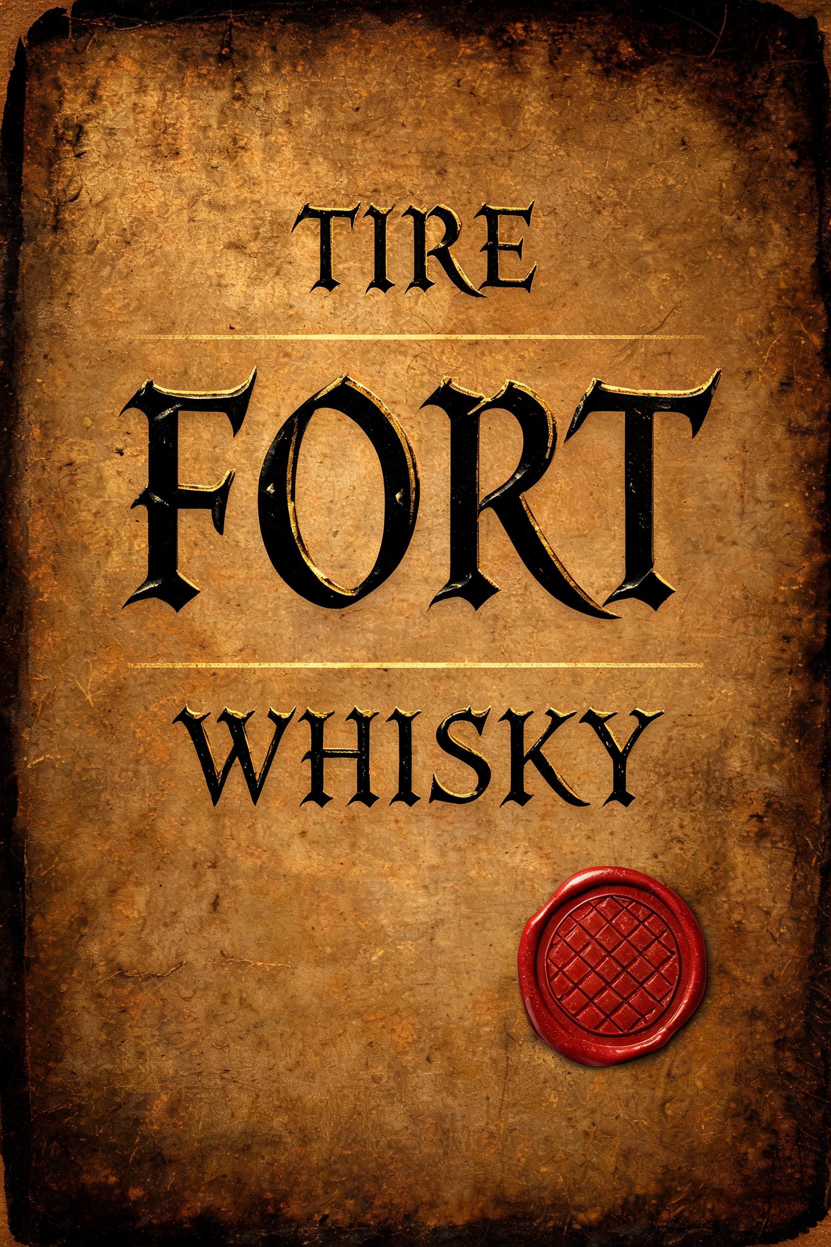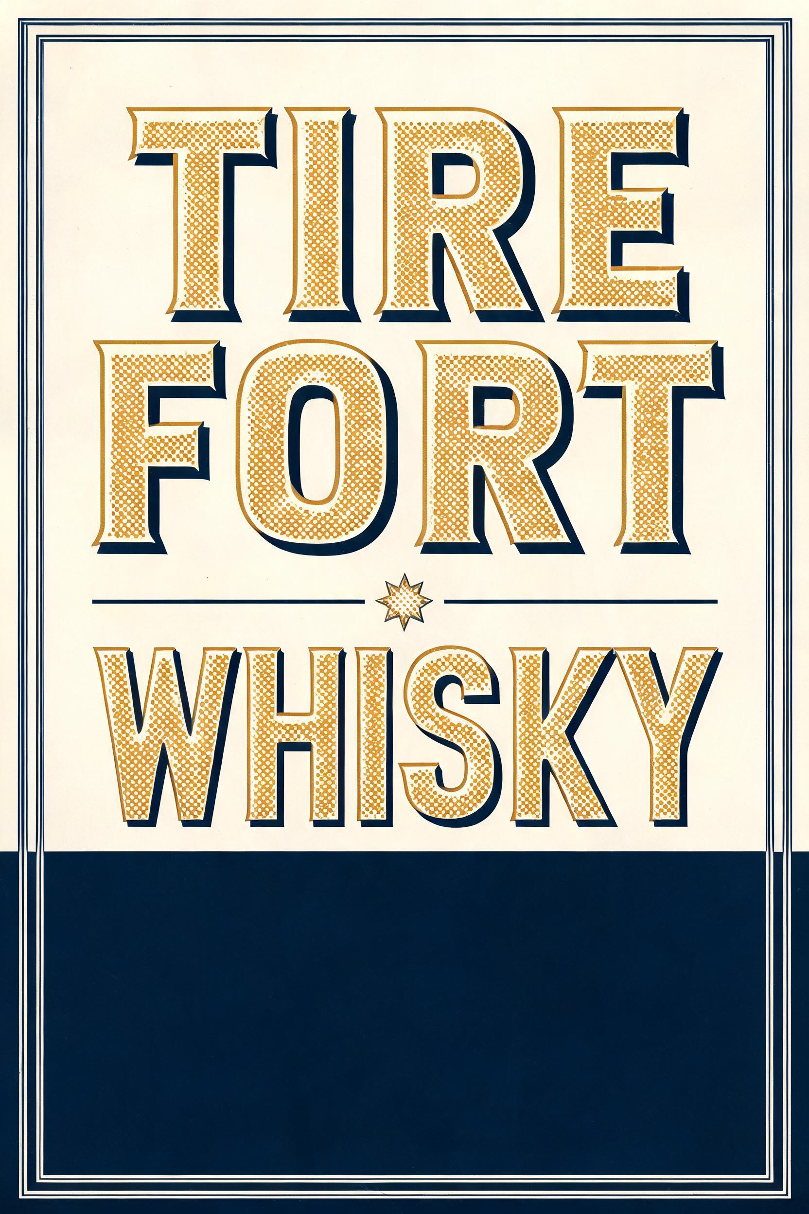
TIRE FORT WHISKY - Duotone Text Effect


Nutzt BytePlus Seedream 5.0, das Modell dieses Werks · 15 Credits


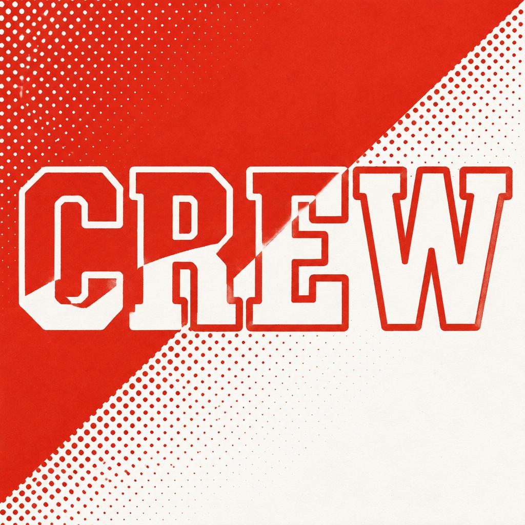
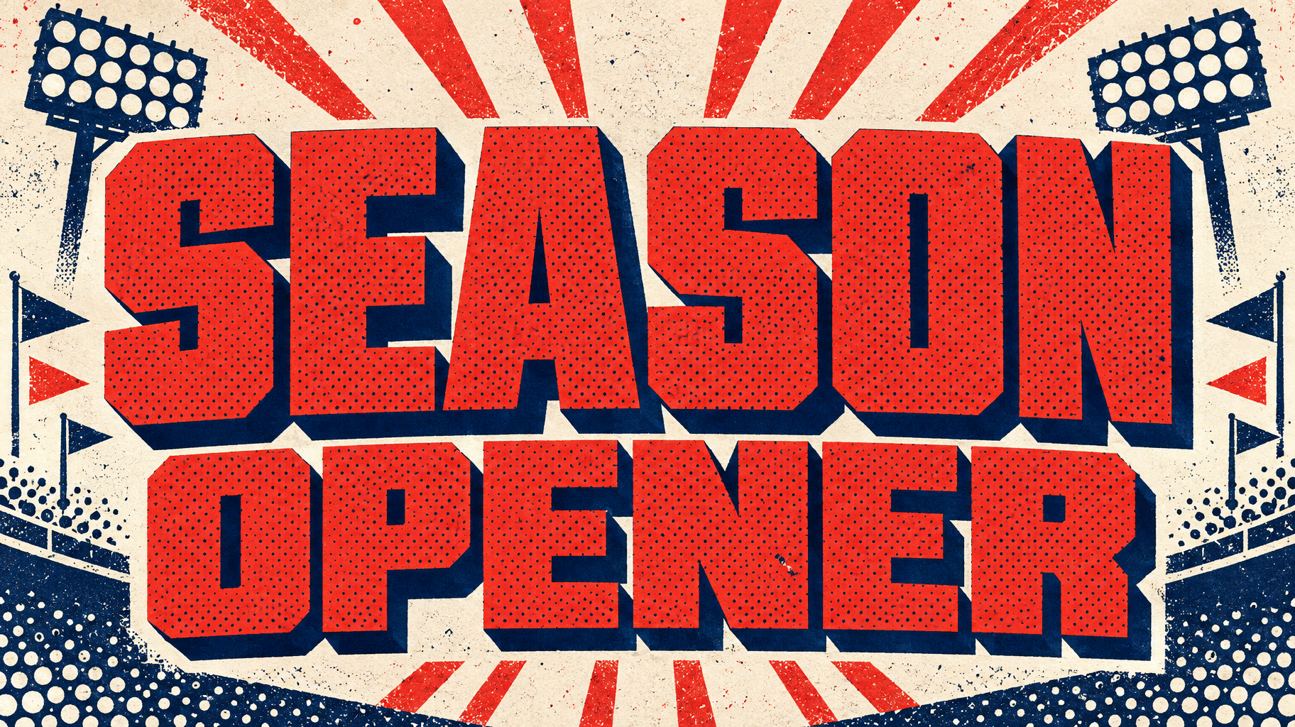

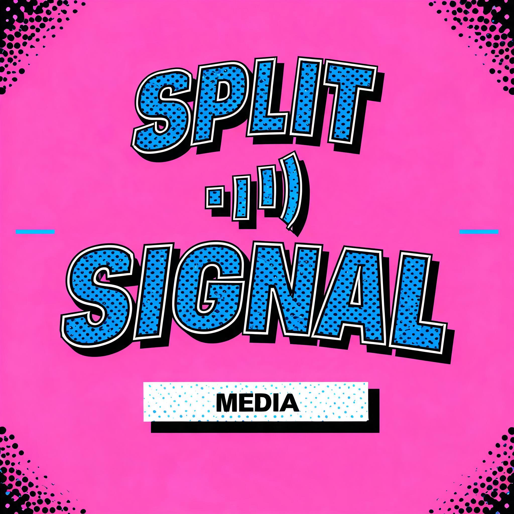
“TIRE FORT WHISKY” is a Duotone text effect Texteffekt erstellt mit FontVibe KI. Kräftige, schmale Slab-Versalien in einer leuchtenden Farbe mit Rasterpunkt-Textur und einem versetzten Vollschatten in einer zweiten Farbe, auf einem flachen Kontrastgrund.
a bold duotone piece — graphic, punchy and print-like. SURFACE / STYLE: the lettering is rendered in a striking two-color treatment — one bright color dominating the letter face, a second deep contrasting color filling the drop shadow, bevel inset or offset layer — with a visible halftone screen-dot pattern in the dominant color and a crisp hard-edged graphic finish. SCENE ATMOSPHERE: a flat bold poster setting — clean two-tone ground, simple geometric or halftone accents, high-contrast graphic energy. PALETTE: any high-contrast two-color pair — vermillion red + midnight navy, electric blue + hot pink, black + bright accent — flat, saturated and bold, never gradient-soft or muddy. LETTERFORM PRIORITY: when the chosen font carries its own treatment (retro or Clarendon slab, condensed or geo sans, halftone comic, 3D shadow, sticker outline), that font's letterform takes priority and owns the letters; this style governs the two-color split, the halftone dots and the graphic poster finish. FALLBACK MATERIAL: if the font carries no material of its own, render the letters in a bold duotone — bright face with a deep contrasting offset shadow and a halftone dot pattern — so the punchy two-color graphic always reads. 'TIRE FORT WHISKY' rendered as a bold duotone poster title — three-word stacked typographic hierarchy with 'TIRE FORT' carrying dominant visual weight and 'WHISKY' as a punchy secondary line, all in a hard-edged two-color treatment. Letter faces blaze in deep amber-gold while a thick midnight navy offset shadow punches behind each letterform, creating a flat dimensional slab silhouette. A coarse halftone screen-dot pattern — mid-density Ben-Day dots — floods the amber face color, referencing vintage letterpress printing. The ground is a clean two-tone split: navy blue lower field meeting an aged cream upper zone, with a thin double-rule border framing the composition like a classic bottling label reimagined as a bold graphic poster. Geometric ornamental rules and a small halftone star rosette accent the space between the text bands without competing with the type. No gradients, no soft shadows — purely flat saturated color, crisp ink-on-stock graphic finish. High-contrast vermillion-navy energy, punchy and print-ready, 8k sharp-edged render.
Generiert am 12. August 2026 · 1664 × 2496 · JPEG · BytePlus Seedream 5.0 · Von der erstellenden Person geteilt · Kostenlos kommerziell nutzbar (CC BY 4.0)