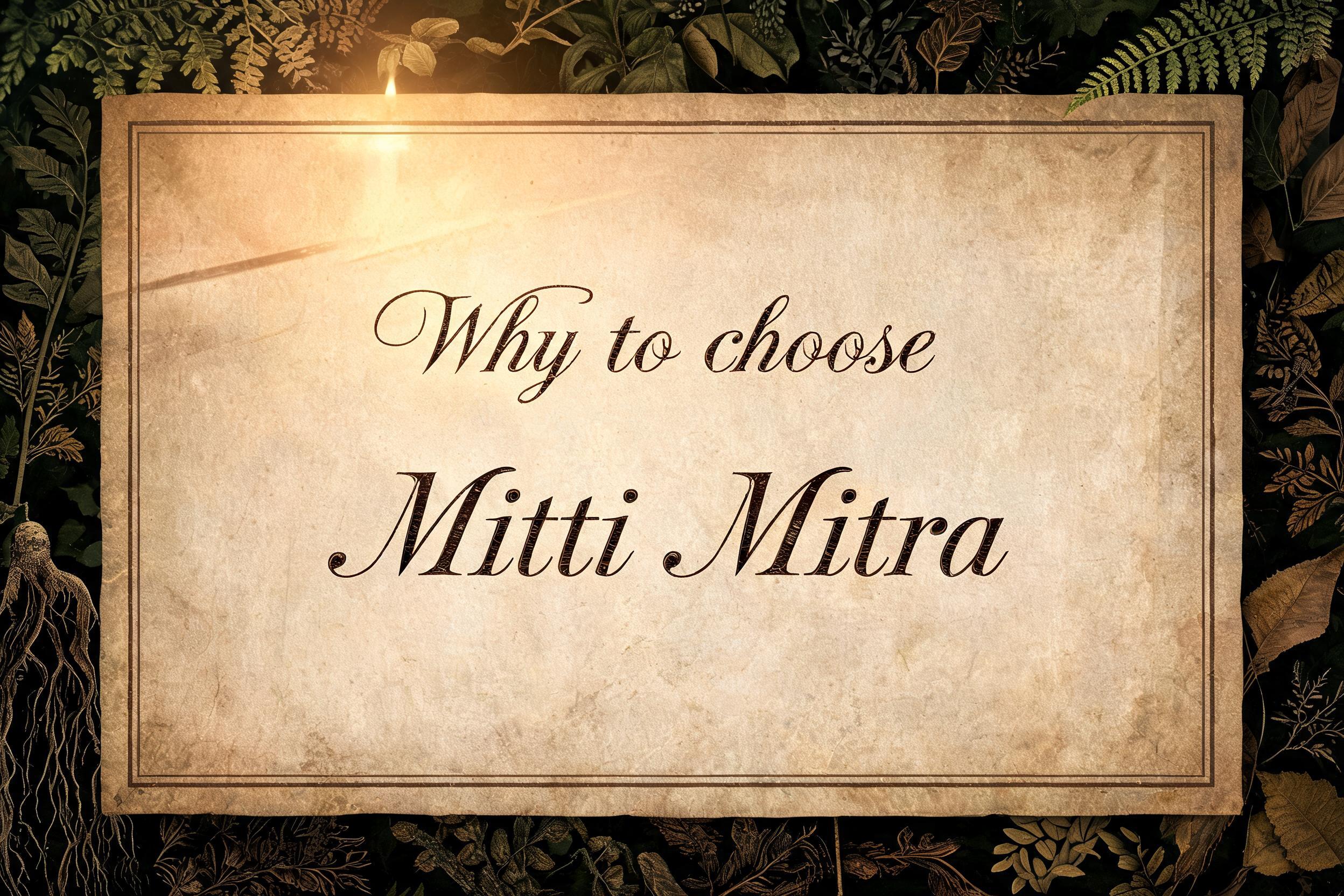
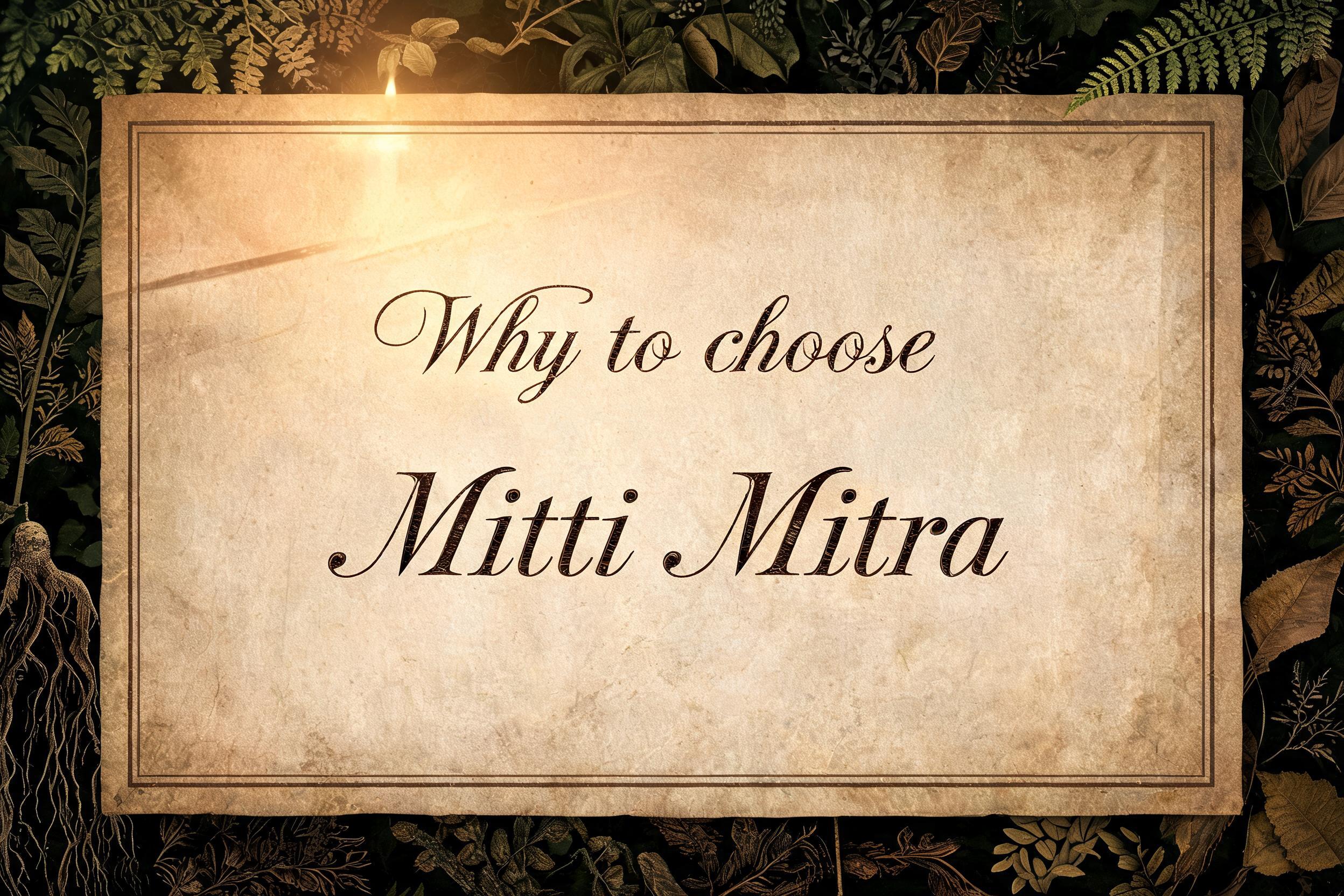
Why to choose Mitti Mitra Text Effect

Nutzt BytePlus Seedream 5.0, das Modell dieses Werks · 15 Credits









“Why to choose Mitti Mitra” is a Texteffekt erstellt mit FontVibe KI.
A weathered antique parchment sheet, aged sepia-cream with soft umber and ochre tonal variations, forms the central panel — its surface showing faint pressed texture of cotton-rag paper under shallow raking sidelight from upper left, creating delicate micro-shadow across the grain. The parchment sits against a deep forest-moss background composed of dried pressed botanical specimens — leaves, fern fronds, and root sketches rendered in ink, arranged as a naturalist's field study border framing the central text panel. The botanical border is dark and organic, pulled back in low ambient shadow so it never competes with the central panel. The parchment itself is gently lit by warm candlelight from top-left: soft warm tungsten at 2900K creating a low-contrast, even wash across the surface with just enough directionality to lift the lettering above the paper. A hairline-thin rectangular rule border, dark sepia ink, sits inset 18pt from the parchment edge, creating an elegant envelope around the content area. The text 'Why to choose Mitti Mitra' is set as a single flowing headline centered on the parchment, with 'Why to choose' on the first line at a medium display scale and 'Mitti Mitra' on the second line at a noticeably larger scale — acting as the visual climax — creating a natural two-tier hierarchy. Generous negative space above and below anchors the composition. The overall palette is warm amber, aged ivory, and deep botanical green with near-black shadow accents.
Generiert am 18. August 2026 · 2496 × 1664 · JPEG · BytePlus Seedream 5.0 · Von der erstellenden Person geteilt · Kostenlos kommerziell nutzbar (CC BY 4.0)


