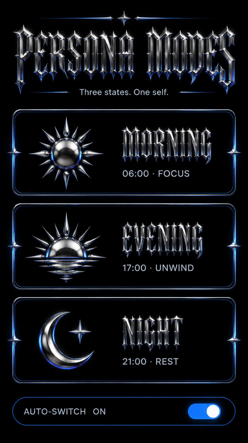
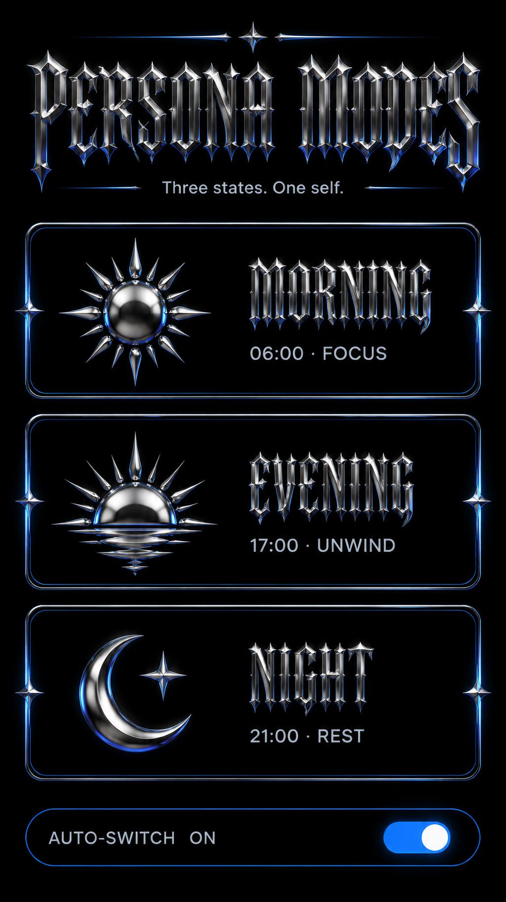
PERSONA MODES Three states. One self. MORNING 06:00 · FOCUS EVENING 17:00 · UNWIND NIGHT 21:00 · REST AUTO-SWITCH ON - Chrome Metal 3D Text Effect


Uses OpenAI GPT-Image-2.5 Sunburst, the model behind this artwork · 15 credits
“PERSONA MODES Three states. One self. MORNING 06:00 · FOCUS EVENING 17:00 · UNWIND NIGHT 21:00 · REST AUTO-SWITCH ON” is a Chrome Metal 3d text effect text effect created with FontVibe AI. Mirror-finish chrome 3D metallic text with razor-sharp silver highlights and cold industrial precision. Gaming branding, music covers, esports teams — the go-to for bold metallic authority.
Create a finished 9:16 mobile persona-mode UI screen, designed as a complete, readable interface. Use a pure black background with a restrained Y2K gothic interface language: thin electric-blue rules, chrome dividers and compact control details. Center a tall three-card selector with generous spacing and clear tap targets. At the top, set the exact headline “PERSONA MODES” in large custom gothic-inspired display lettering made from polished liquid mercury chrome: heavy narrow strokes, convex edges, tapered teardrop terminals, mirror-silver reflections, white edge highlights and electric-blue rim light. Below it, render the exact supporting line “Three states. One self.” in small clean sans-serif UI text. The central interface is three vertically stacked, distinct chrome-edged cards. Each card has a simple sculptural chrome time-of-day icon and two clearly separated text tiers. Render these exact lines, in order: “MORNING” / “06:00 · FOCUS”; “EVENING” / “17:00 · UNWIND”; “NIGHT” / “21:00 · REST”. Give each mode name a smaller, legible version of the liquid-metal gothic lettering; set the time and descriptor in crisp, restrained sans-serif UI typography. Use a rising chrome sun icon for Morning, a half-sun on the horizon for Evening, and a crescent moon with a small star for Night. Do not add any other text or numbers. At the bottom, include one compact toggle row reading exactly “AUTO-SWITCH ON”, with a blue-lit active toggle aligned right. Keep all interface labels sharp and easy to read at phone-screen size. Use black negative space between cards, polished chrome surfaces with high-contrast environment reflections, near-black cold shadow zones, ultra-thin white specular lines tracing bevels, and subtle electric-blue rim light. The liquid chrome owns the letter surfaces; the cool blue lighting belongs to the surrounding interface. Straight-on screen view, precise alignment, crisp rendered UI, no device mockup, no extra lettering.
Made for Liquid Chrome Font
Generated on October 6, 2026 · 1024 × 1824 · JPEG · OpenAI GPT-Image-2.5 Sunburst · Layout: Three Mode Stack · Shared by the creator · Free for commercial use (CC BY 4.0)