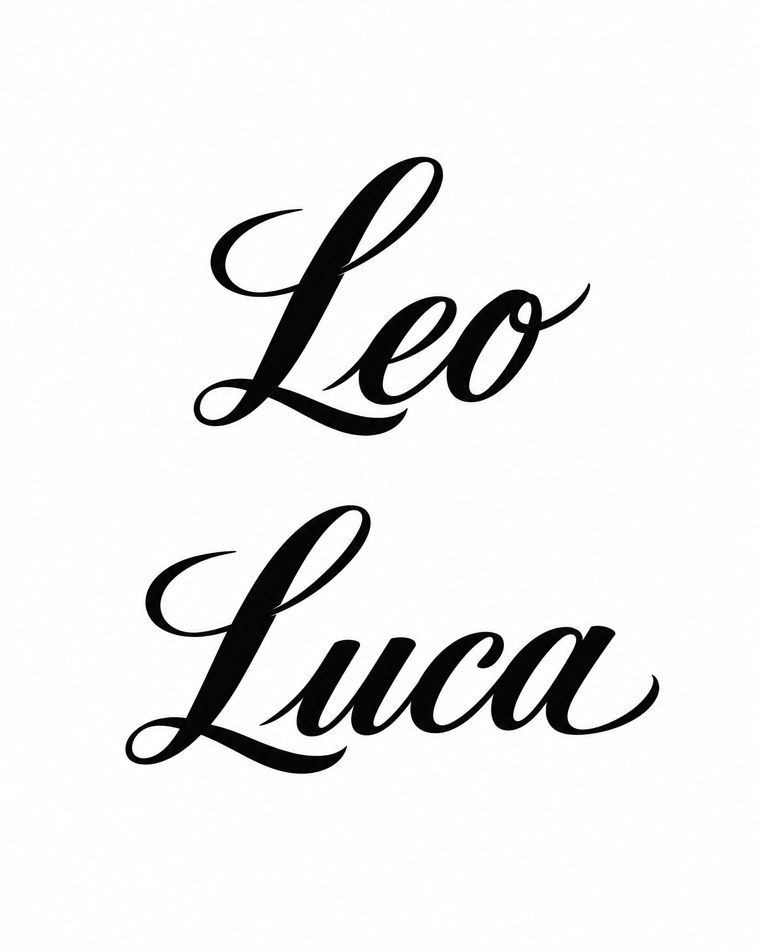
Leo Luca - チカーノ Text Effect


この作品と同じ OpenAI GPT-Image-2.5 Sunburst を使用 · 80 クレジット


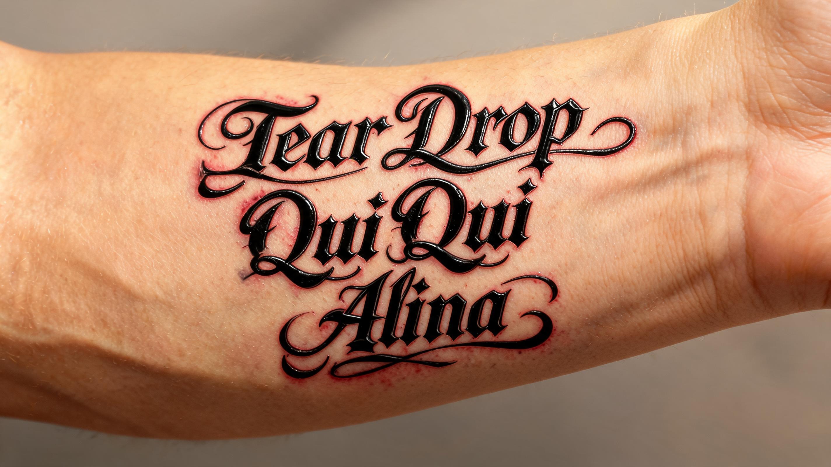
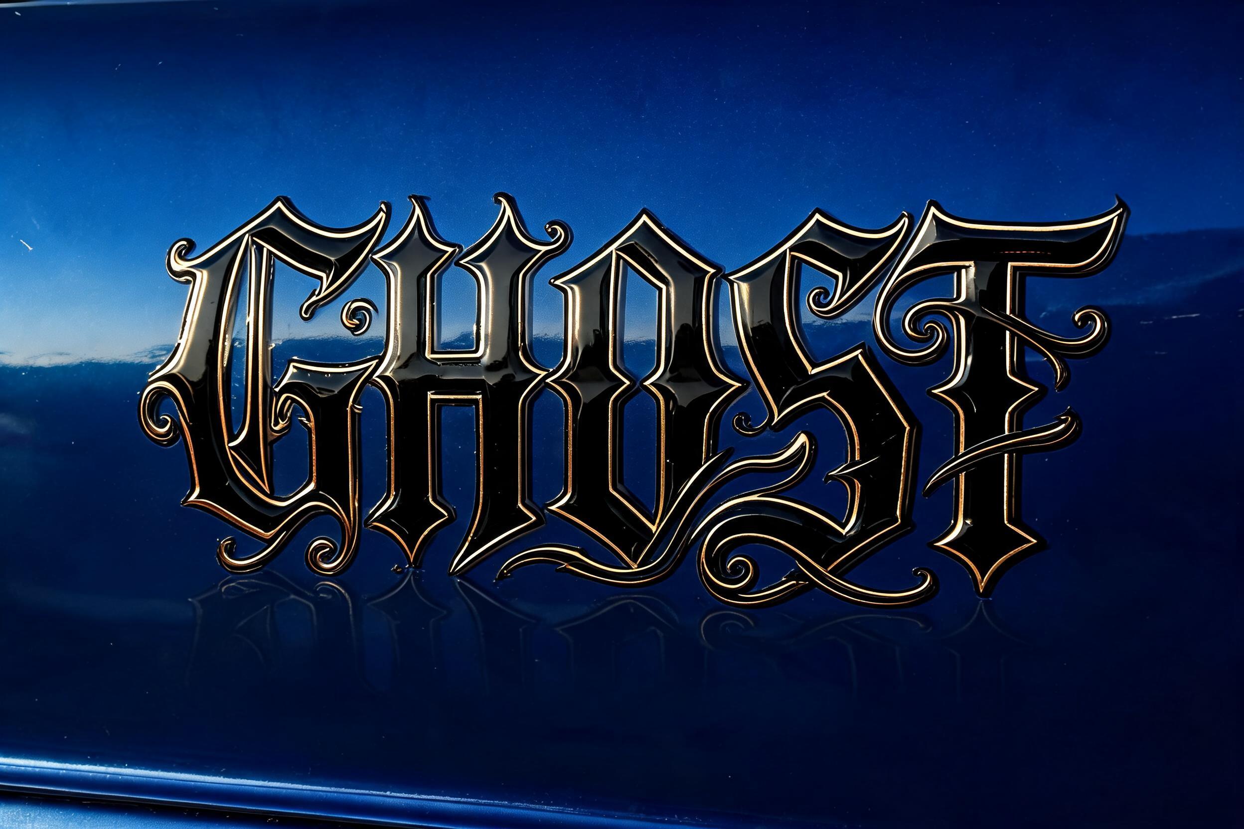
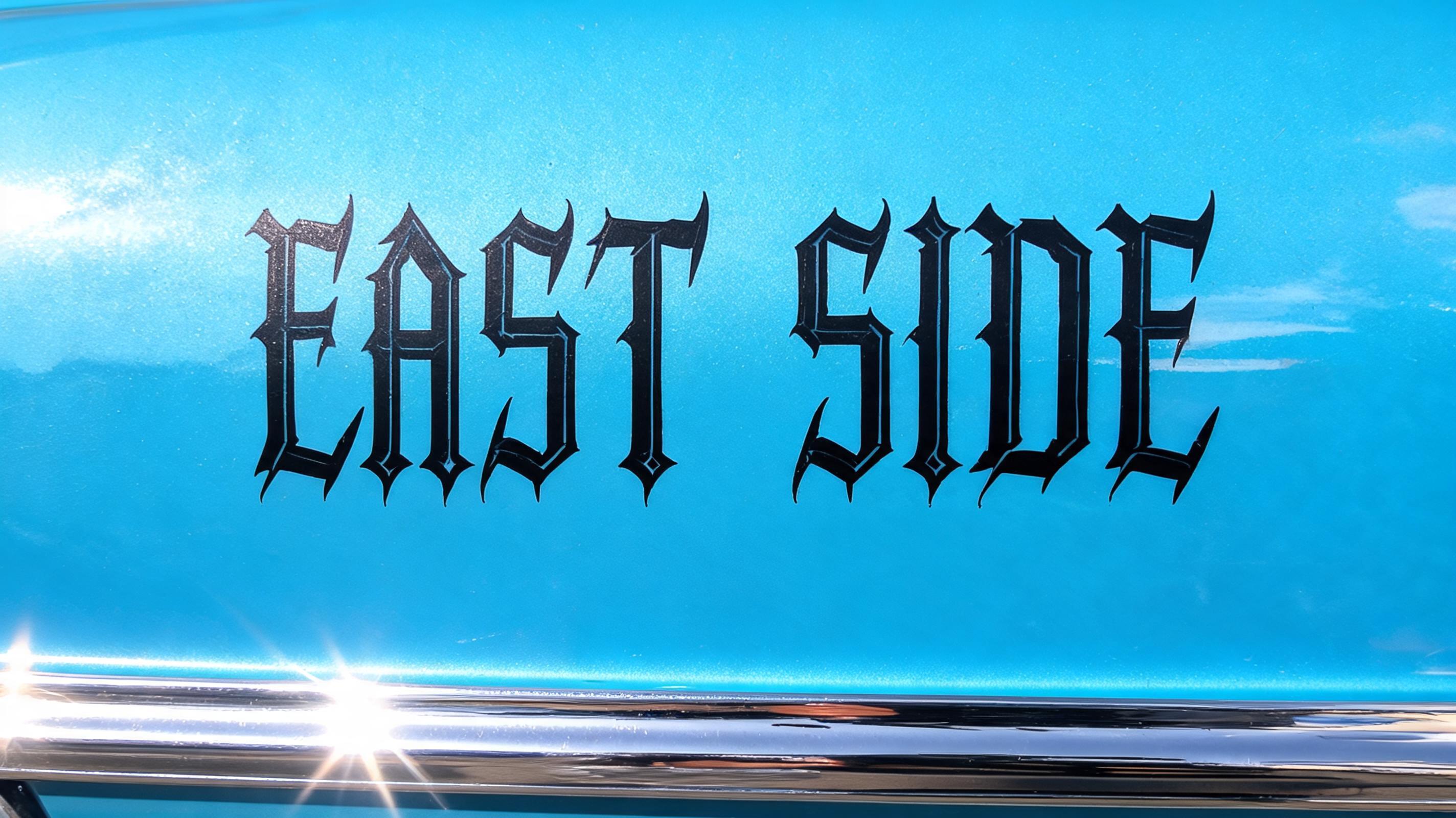
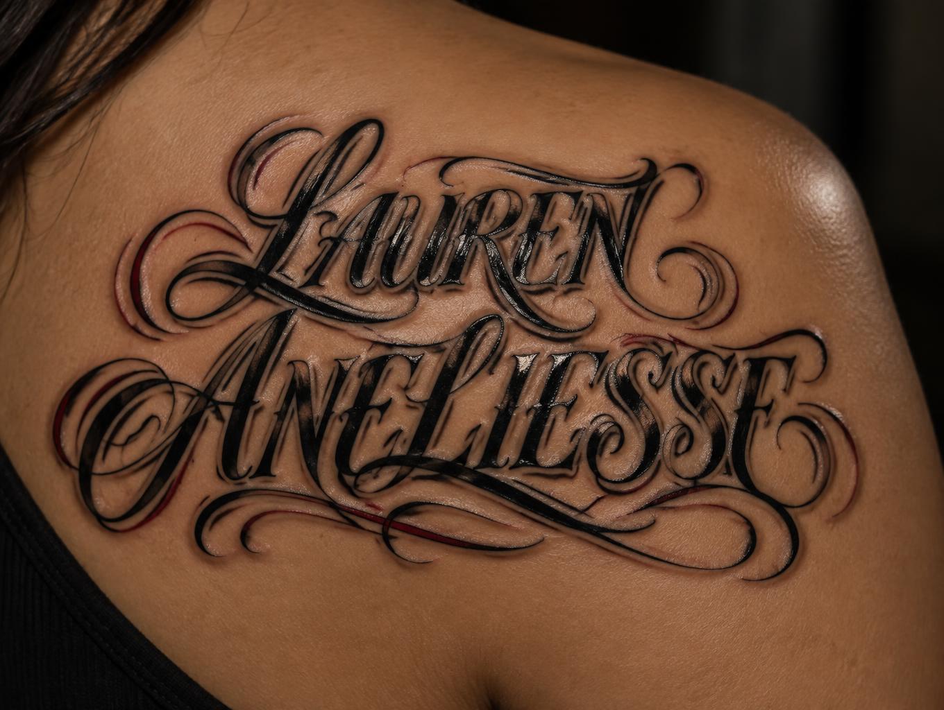
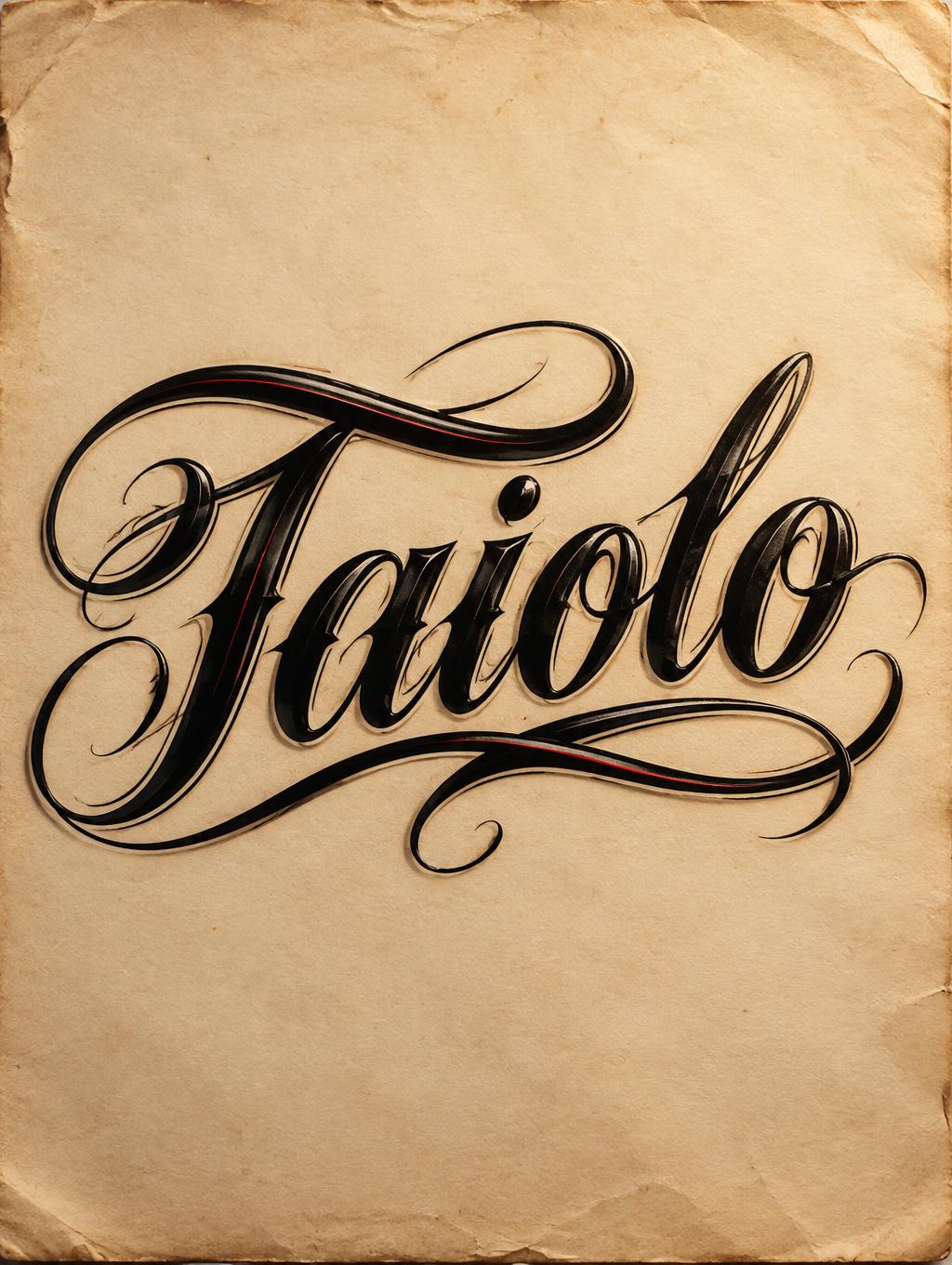
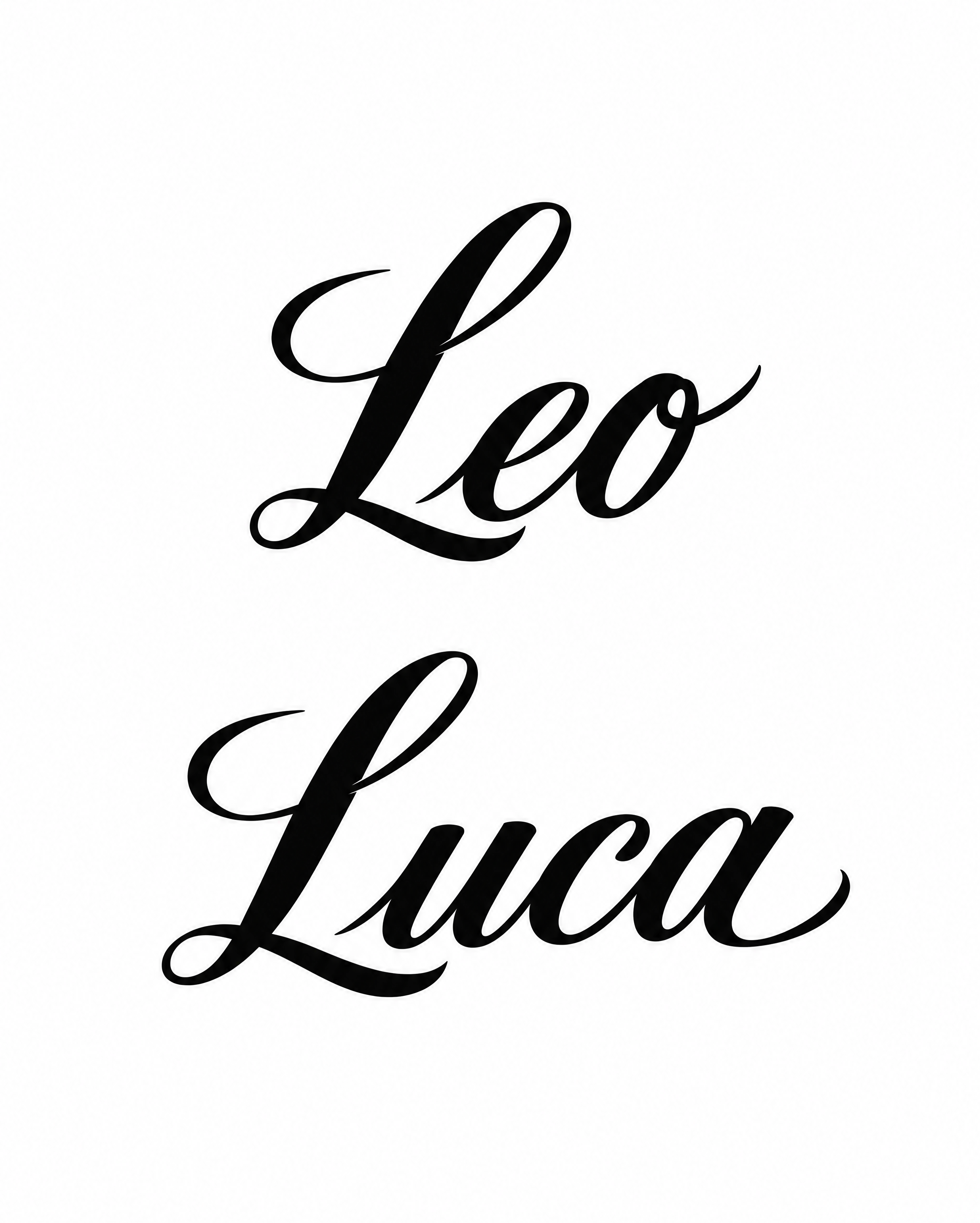
「Leo」の下に「Luca」を重ねた二つの名前を、装飾的な大文字と長い払いを持つ黒いブラシ筆記体で白地に描いたデザインです。太くコントラストの強い文字が右に傾き、二つ目の名前は一つ目よりやや左にずれています。名前を変えたり、色を変えたり、肌や紙の質感を加えられます。
A tattoo lettering reference showing two names stacked and centred on one vertical axis, in solid black ink on a flat pure white background with nothing else. Top line: "Leo". Bottom line: "Luca". Both names are in the same Chicano calligraphic script: thick swelling downstrokes, fine but clearly visible hairline connectors, a forward lean of about 12 degrees, and letters joined in one continuous stroke. Each capital L has one graceful entry swash and a short curled tail. Leo's final o ends in a small flick. Luca's final a ends in a matching flick that sweeps slightly under the word. Both names share the same slant, stroke weight and swash style, so they read as a matched pair. Luca is slightly wider than Leo and both are optically centred. Leave generous clear space between the two lines, with no ascender or swash crossing into the other name. Counters and letter gaps stay open, and the thinnest line is thick enough to hold up as a tattoo at shoulder size. Edges are crisp, with glossy sign-painter black, no grey, no gradient, no shadow, no texture, no colour. Around the names sit only wide empty margins, kept free so more can be added to the piece over the years. No other text, symbols, borders or ornaments.
タグ
2026年11月6日に生成 · 2576 × 3216 · PNG · 透過 PNG · OpenAI GPT-Image-2.5 Sunburst · レイアウト:センター · 制作者がシェア · 商用利用無料(CC BY 4.0)