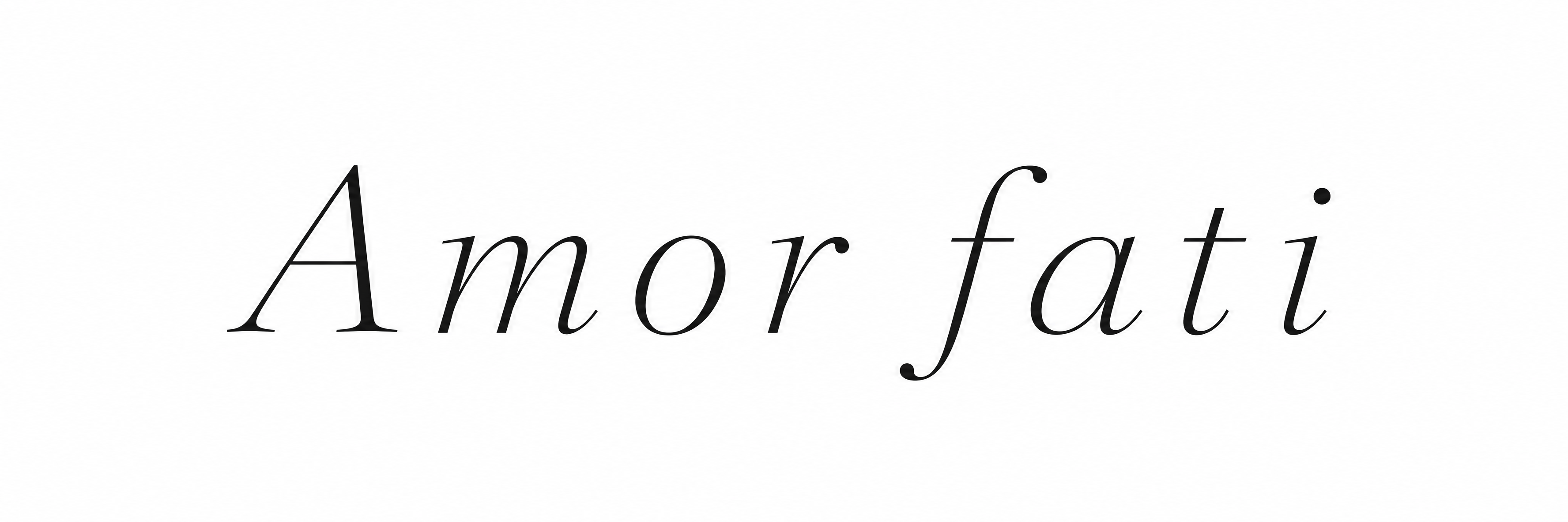
Amor fati - Fine Line Ink Stencil Text Effect
この作品と同じ OpenAI GPT-Image-2.5 Sunburst を使用 · 40 クレジット
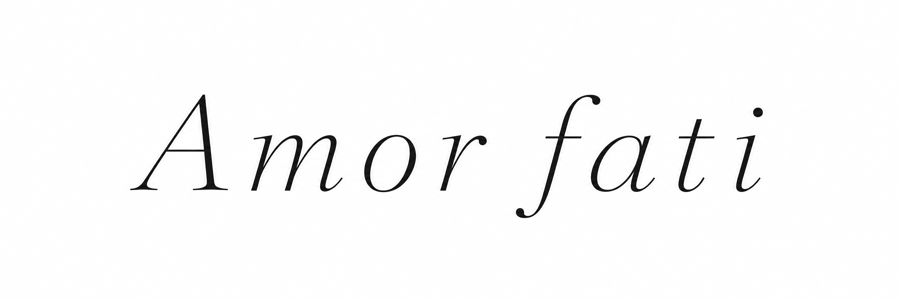
「Amor fati」という言葉を、字間を広くとった細いイタリックのセリフ体で無地の白地に描いた細線タトゥー風のレタリングです。傾いたハイコントラストの文字に、大きなAと下へ鉤状に伸びる背の高いfがあり、すべて濃い炭色の一行です。自分のフレーズに変えたり、インクの色や字間を調整できます。
A tattoo lettering reference showing exactly the two words "Amor fati", set on a single horizontal line, centred on a flat pure white background. The letterforms are a fine line serif: light, elegant, high-contrast strokes with delicate hairline serifs and slightly thicker stems. Capital A is followed by lowercase "mor", then a clear word space, then lowercase "fati". There is a very slight italic lean. The stroke weight is uniform and thin, as if drawn with a single needle. All strokes are solid, crisp, near-black ink (#111111) with clean rounded ends and smooth curves. Letters are spaced generously, with open gaps between every pair, so none touch or blur together. The crossbar of the f and the t join gently and stay open, and the counters of the a, o and r stay wide and clear. The lettering fills about 70% of the canvas width and sits at the vertical centre, with wide empty margins on all sides. There is no shading, no gradient, no texture, no shadow, no ornaments, no flourishes, no border, no skin and no mockup, only pure flat black linework on white, easy to trace and stencil.
タグ
2026年11月6日に生成 · 3552 × 1184 · PNG · 透過 PNG · OpenAI GPT-Image-2.5 Sunburst · レイアウト:Forearm Single Line · 制作者がシェア · 商用利用無料(CC BY 4.0)