MEMENTO MORI - Fine Ink Stencil Text Effect
この作品と同じ OpenAI GPT-Image-2.5 Sunburst を使用 · 40 クレジット
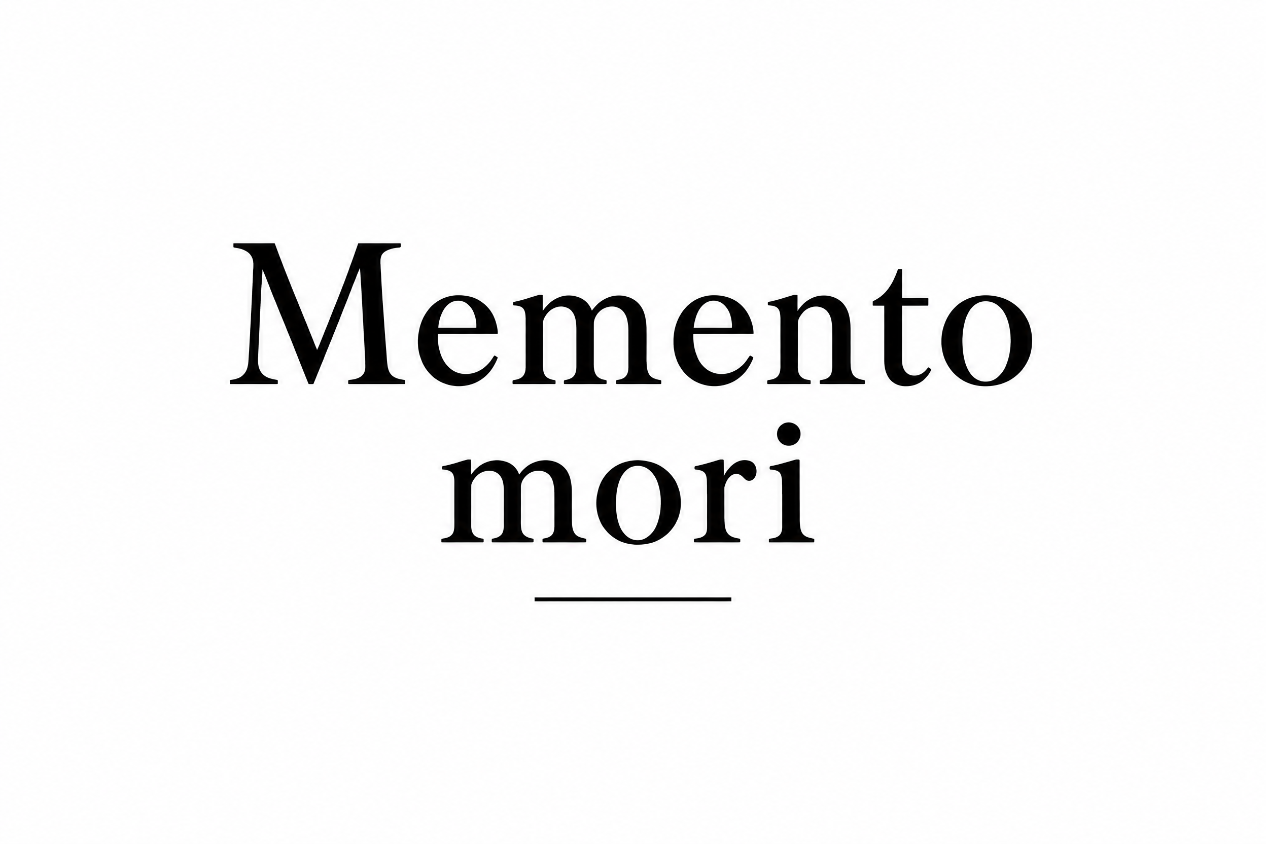
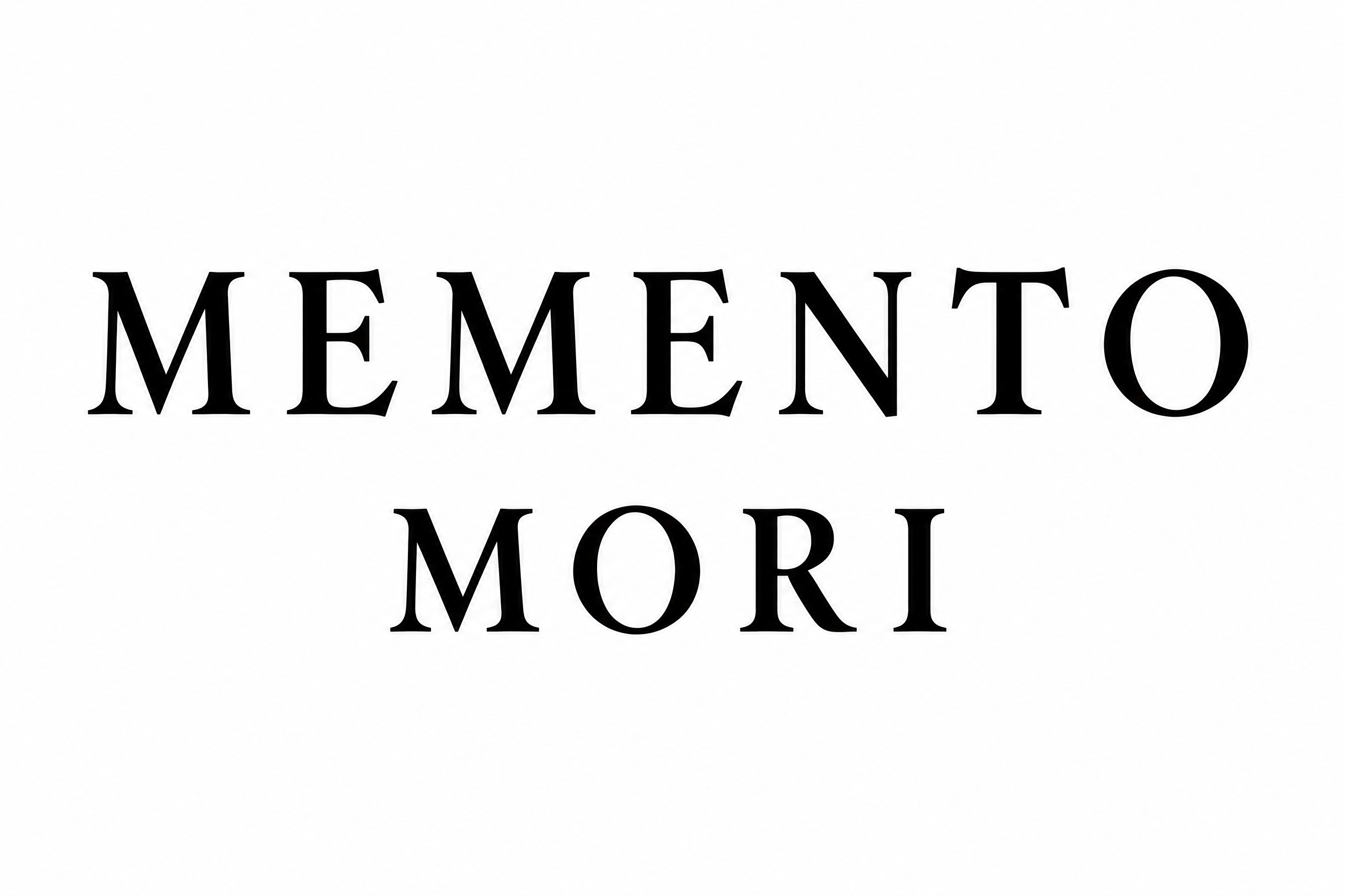
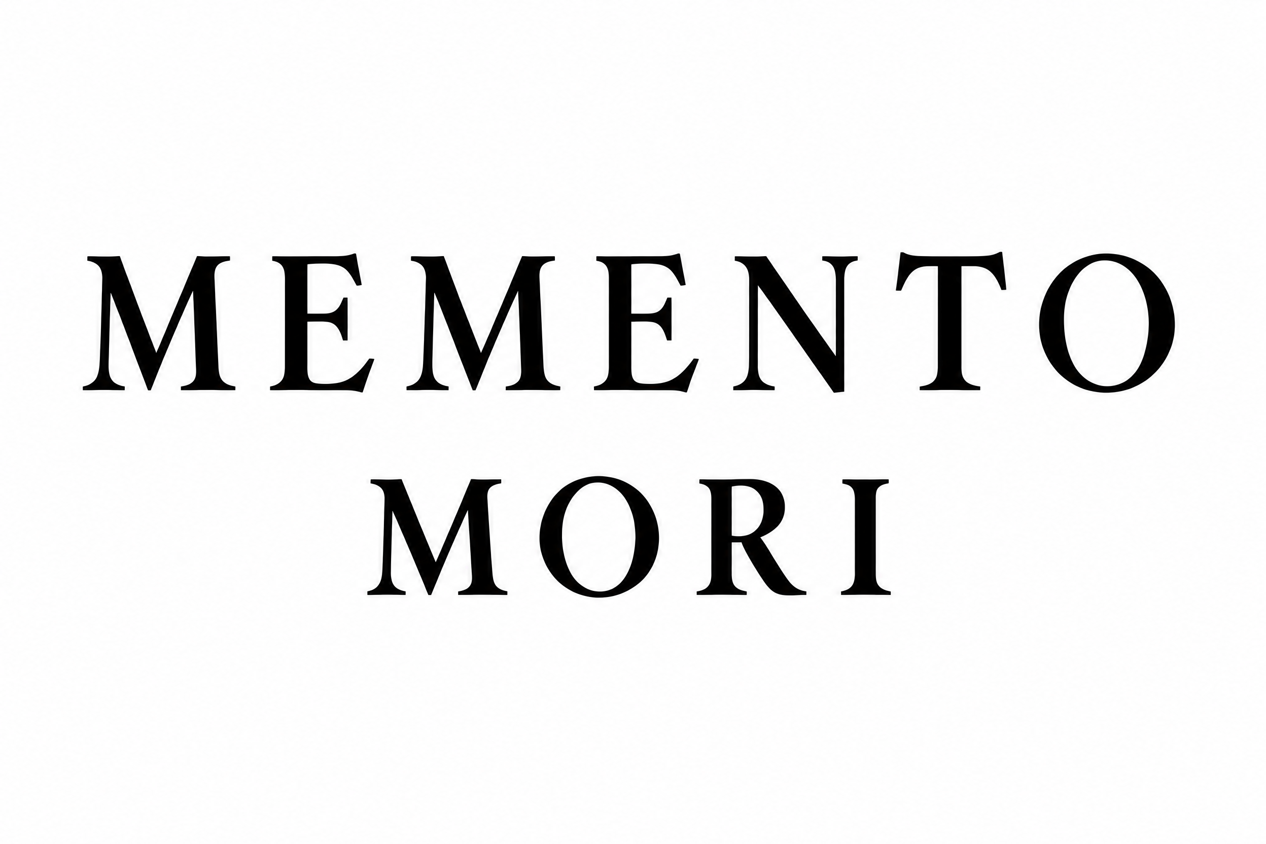
黒いローマン体のセリフ大文字で「MEMENTO MORI」と二行中央揃えに書かれたタトゥーのレタリングデザインです。字間の広い文字は細いセリフと穏やかな太細のコントラストを持ち、短い二行目が一行目の下に中央で置かれ、無地の白地です。ラテン語の句を自分の言葉に替え、同じクラシックなセリフ体で清潔なステンシルにできます。
A tattoo lettering reference: the words "Memento mori" set on two lines, "MEMENTO" on the first line and "MORI" on the second, centred, in classic Roman serif capitals. High-contrast letterforms with thick vertical stems, fine but not hairline-thin thin strokes, and bracketed serifs with crisp pointed ends. Letter-spacing is wide and open so no letters touch or blur together. The second line is slightly narrower than the first and stays centred beneath it. Line spacing is generous, with a clear gap of about half the cap height. Solid, flat, pure black ink on a flat pure white background. No shading, no gradients, no texture, no shadow, no ornaments, no skulls, no borders and no extra text. Stroke weights are uniform and open enough to survive on skin at forearm size. The lettering fills about 70% of the canvas width with a wide safe margin on all sides, in the manner of a clean stencil an artist can trace.
タグ
2026年11月6日に生成 · 2496 × 1664 · PNG · 透過 PNG · OpenAI GPT-Image-2.5 Sunburst · レイアウト:Stacked Forearm Pair · 制作者がシェア · 商用利用無料(CC BY 4.0)