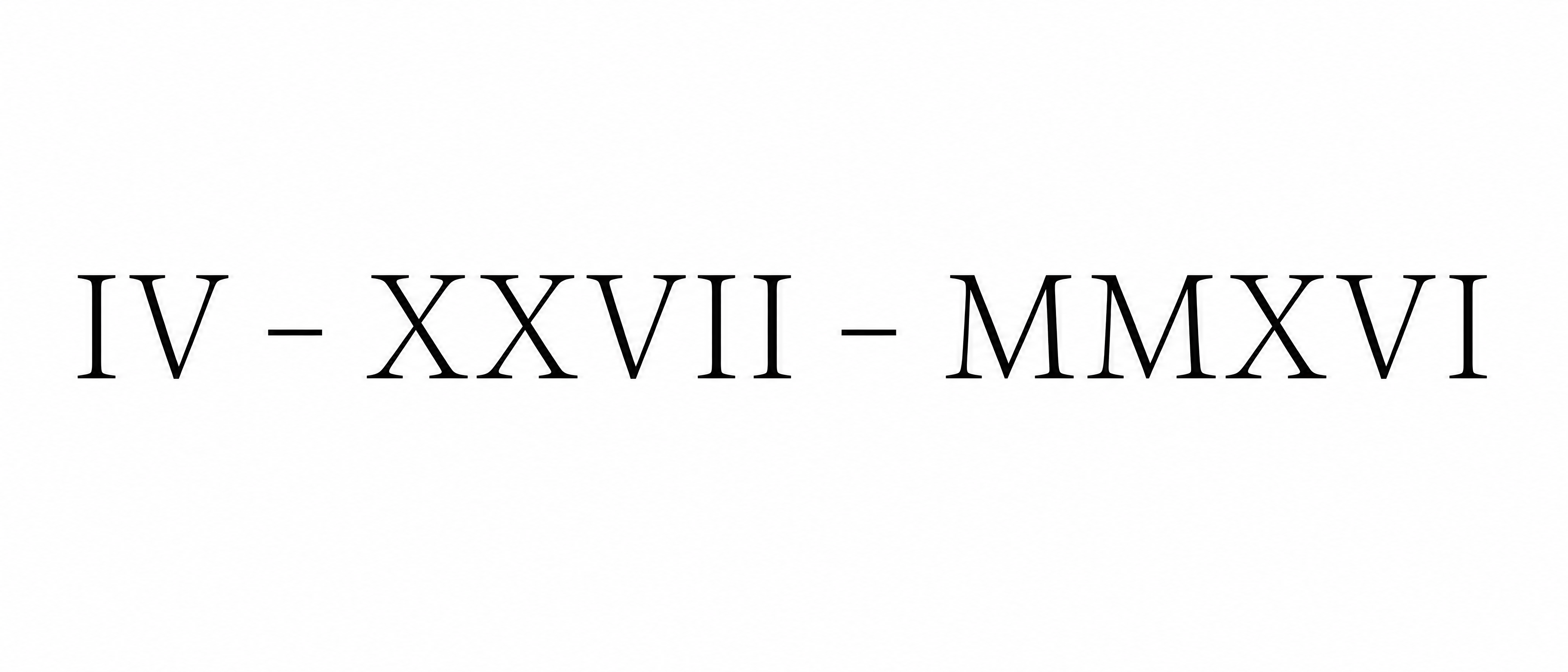
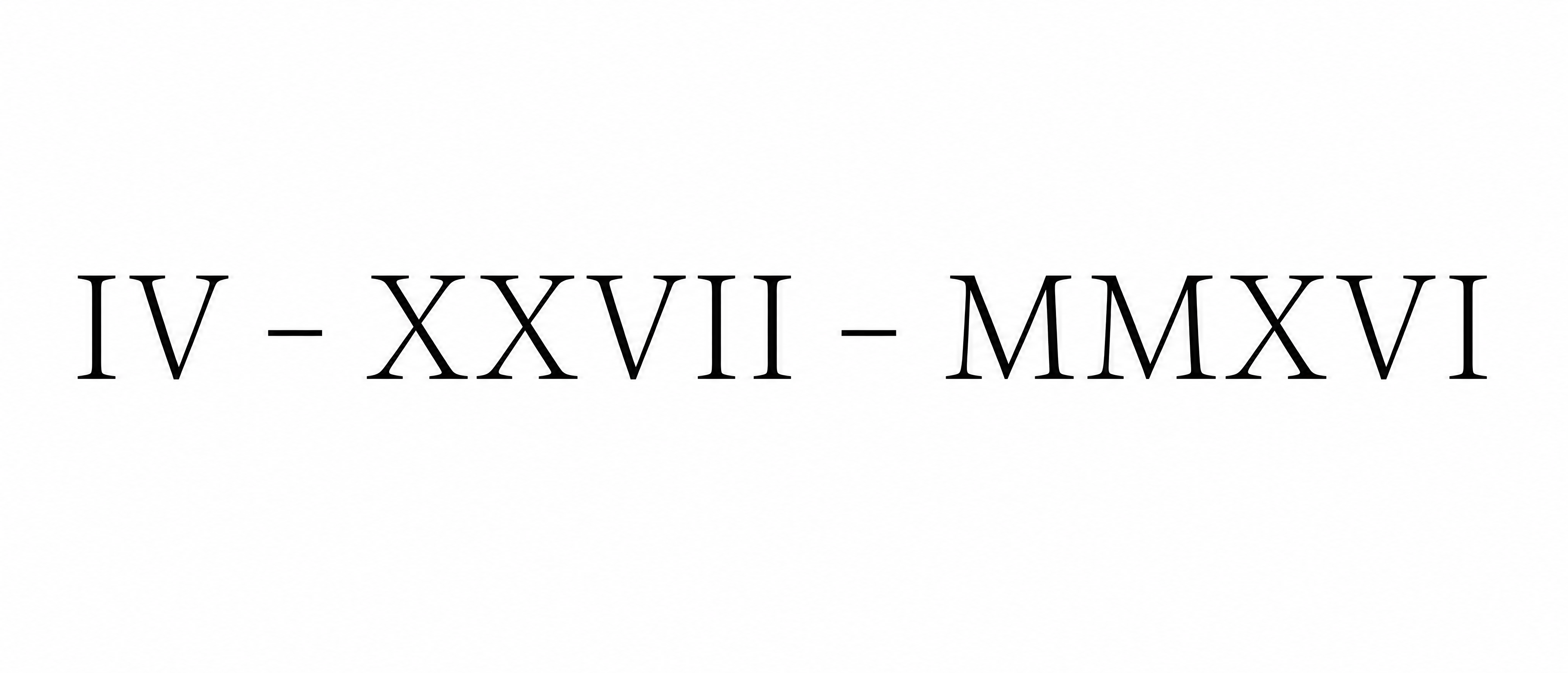
IV - XXVII - MMXVI - Fine Line Stencil Text Effect
この作品と同じ OpenAI GPT-Image-2.5 Sunburst を使用 · 80 クレジット



細い黒のローマ数字をハイフンでつないだ日付「IV - XXVII - MMXVI」を書いたタトゥーのレタリングデザインです。開放的なセリフ大文字が一行に並び、軽く均一な線と穏やかな太細のコントラストを持ち、無地の白地です。自分の日付をローマ数字に替え、軽やかなセリフ体のまま繊細なステンシルにできます。
A tattoo lettering reference, drawn as one single horizontal line of text on a flat pure white background, with no skin, body, shadow, texture or decoration. The text reads exactly: "IV - XXVII - MMXVI". Three Roman numeral groups, IV then XXVII then MMXVI, are separated by two short horizontal dashes with a clear gap on each side. Do not add any other character, dot or word. The lettering is a fine line serif in solid black ink with an even, consistent stroke weight, as a thin clean pen line. The letterforms are classic Roman capitals: upright, evenly proportioned, with short, simple, lightly bracketed serifs, only slight thick-thin contrast and wide open counters. Letters are spaced generously so no two serifs touch, and every gap stays open enough to survive as a tattoo. The two dashes are the same weight as the letter strokes, centred on the letter midline, and about one letter-stem wide in length. The line of text is centred and spans about 88% of the canvas width and about 22% of its height, with wide empty margins above and below. The edges are crisp, smooth vector-clean black strokes. It is flat and matte, with no gradients, no shading, no glow and no colour, in the manner of a stencil an artist can trace.
タグ
2026年11月6日に生成 · 3840 × 1648 · PNG · 透過 PNG · OpenAI GPT-Image-2.5 Sunburst · レイアウト:Rib Run · 制作者がシェア · 商用利用無料(CC BY 4.0)