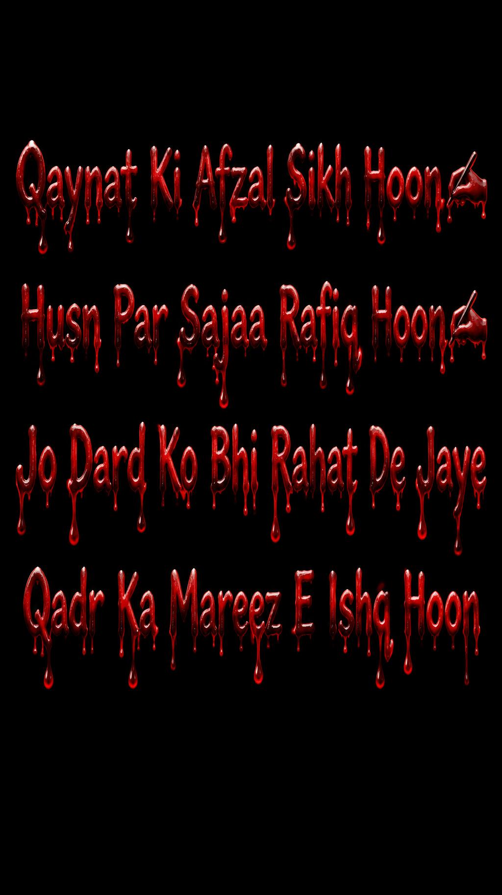
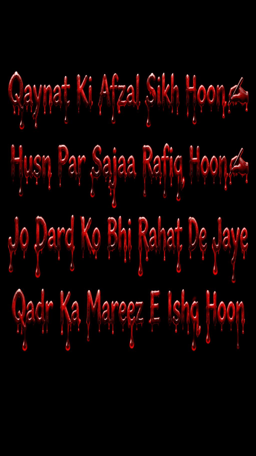
Qaynat Ki Afzal Sikh Hoon✍️ Husn Par Sajaa Rafiq Hoon✍️ Jo Dard Ko Bhi Rahat De Jaye Qadr Ka Mareez E Ishq Hoon - 血のしたたるフォント Text Effect


この作品と同じ OpenAI GPT-Image-2.5 Sunburst を使用 · 15 クレジット







「Qaynat Ki Afzal Sikh Hoon✍️ Husn Par Sajaa Rafiq Hoon✍️ Jo Dard Ko Bhi Rahat De Jaye Qadr Ka Mareez E Ishq Hoon」は FontVibe AI で作成した血のしたたるフォントの文字エフェクトです。濡れた暗赤色の表面を持つ太い深紅の文字。長い血の滴は丸い粒で終わり、横からの光を受けて真っ黒な背景に浮かびます。
Thick crimson blood saturating every surface — viscous, high-density fluid with authentic physical behavior: large tear-shaped drops suspended at each drip terminus with surface tension visible at the meniscus, connecting streams thinning as they extend downward, deep near-black pooling where blood accumulates. Material properties: subsurface scattering gives deep red glow when backlit, specular gloss on convex drip surfaces catching directional light, matte-dark at clotted pooling zones. Blood color gradient from bright arterial red (#CC0000) at active drip streams to near-black clot (#3D0000) at base pools. Gravity-driven physics — every drip pulled downward with anatomically accurate tension. Horror film practical effects quality — not painted, not stylized, photorealistic blood. LETTERFORM PRIORITY: when the chosen font carries its own treatment, that font's letterform shapes take priority and own the letters; this style governs the viscous blood fluid physics, the suspended drips and the pooling. FALLBACK MATERIAL: if the font carries no material of its own, render the letters as viscous crimson blood letters with tear-shaped drops held by surface tension, thinning connecting streams and near-black pooling. COLOR PRIORITY: keep the font's own colors if specified; otherwise arterial red (#CC0000) grading to near-black clot (#3D0000). Create a finished, restrained horror-inspired poetry poster, portrait composition, with a pure black background and generous dark negative space around the lettering. Preserve the supplied Roman Urdu words exactly, including capitalization, spelling, punctuation, and both ✍️ symbols; do not add any other text. Set the poem as four clearly separated, centered lines, in the exact supplied order. Give the first two lines ample width, then let the longer third line span the central field; keep the final line visually distinct beneath it. Make all four lines large and immediately legible, with even spacing and careful alignment. The lettering sits like a blood-wet title against the void: thick, viscous crimson coats the letter surfaces, with authentic glossy highlights, dark clotted recesses, and heavy gravity-drawn drips that taper into rounded suspended drops. Let a few substantial drips descend beneath the first and second lines without obscuring any words. Use cold, narrow side lighting to pick out wet edges and leave deep near-black shadows. Keep the overall image solemn and poetic rather than chaotic; no splatter competing with the text, no extra objects, no warm colors, and no decorative additions. Ensure the two ✍️ symbols remain recognizable and attached to their respective lines.
用途: 血文字フォントジェネレーター
2026年11月6日に生成 · 1024 × 1824 · JPEG · OpenAI GPT-Image-2.5 Sunburst · 制作者がシェア · 商用利用無料(CC BY 4.0)



