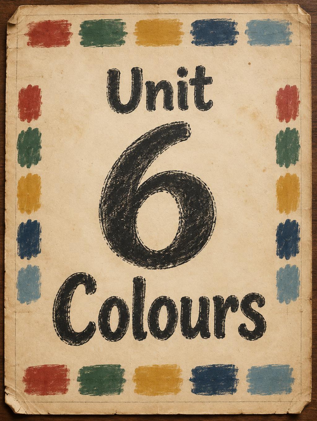
Unit 6 Colours - ヴィンテージ Text Effect


この作品と同じ OpenAI GPT-Image-2.5 Sunburst を使用 · 15 クレジット



「Unit 6 Colours」は FontVibe AI で作成したヴィンテージの文字エフェクトです。インクがわずかにかすれる活版でクリーム色のコットンカードに押し込んだセリフ体大文字。古い印刷機の版盤に置かれ、金属活字が散らばります。
a timeless vintage piece carrying the physical evidence of an older making — warm, aged and classic. SURFACE / STYLE: the lettering looks produced by a heritage craft and softened by time — a letterpress impression bitten into cotton paper with ink slightly broken up, weathered paint on aged metal or wood, a worn rubber-stamp or postal imprint, or warm gold leaf — carrying patina, foxing, grain and gentle wear. SCENE ATMOSPHERE: a warm nostalgic setting — aged cream or kraft paper, dark wood, soft amber light, faint dust and a faded heritage feel. PALETTE: warm aged tones — cream, kraft, sepia, faded red, forest green, navy, tan and antique gold — muted and time-softened, never neon-bright. LETTERFORM PRIORITY: when the chosen font carries its own treatment (western slab, art deco, art nouveau, letterpress, postal or rubber stamp, gold leaf, typewriter, hand-lettered script, grunge chalk), that font treatment takes absolute priority and owns the letters; this style supplies the warm aged tone, the time-worn surface and the nostalgic heritage scene. FALLBACK MATERIAL: if the font carries no material of its own, render the letters as a classic serif printed in warm faded ink on aged cream paper with a soft letterpress impression and gentle wear, so the timeless vintage feel always reads. Create a finished vintage educational poster for young learners, with the exact wording “Unit 6 Colours” as the only readable text. Set the words on three lines—“Unit” smaller above a very large “6,” with “Colours” beneath it—so the number anchors the composition and the full title is immediately legible. Center the title on a broad sheet of aged cream classroom paper, leaving generous margins and a quiet border of tiny painted colour swatches: faded red, forest green, navy, ochre, and muted blue. Arrange the swatches like handmade samples from an old school colour chart, with a few pencil marks and lightly worn paper edges, but no other letters, numbers, or labels. Use a restrained, balanced layout with the title occupying most of the central area and the surrounding details kept secondary. Warm amber light falls softly across the paper, revealing subtle grain, foxing, and gentle wear; a dark wood tabletop just peeks around the sheet. Keep the palette mellow and time-softened, with a welcoming heritage classroom feel. Preserve crisp, accurate lettering and strong contrast against the paper, as though the title was carefully printed long ago and has aged gracefully.
用途: 黒板フォントジェネレーター
2026年11月7日に生成 · 1024 × 1360 · JPEG · OpenAI GPT-Image-2.5 Sunburst · 制作者がシェア · 商用利用無料(CC BY 4.0)



