INDIA AFRICA - レーザーカット Text Effect


この作品と同じ OpenAI GPT-Image-2.5 Sunburst を使用 · 15 クレジット








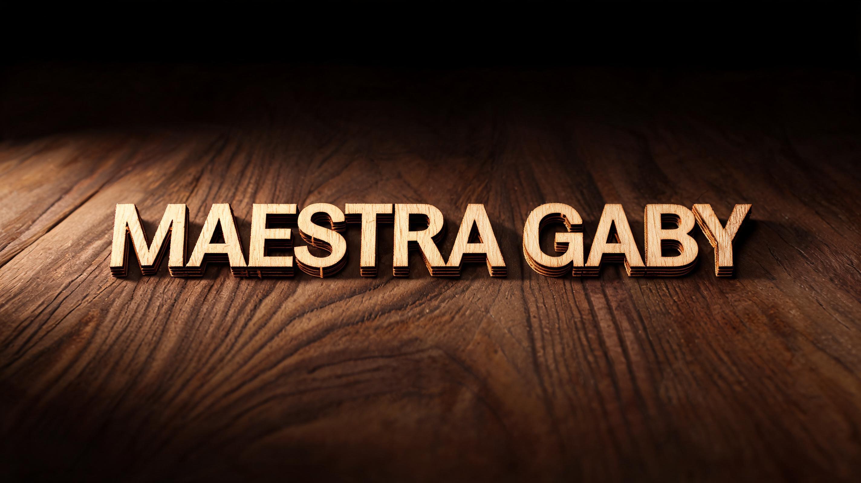
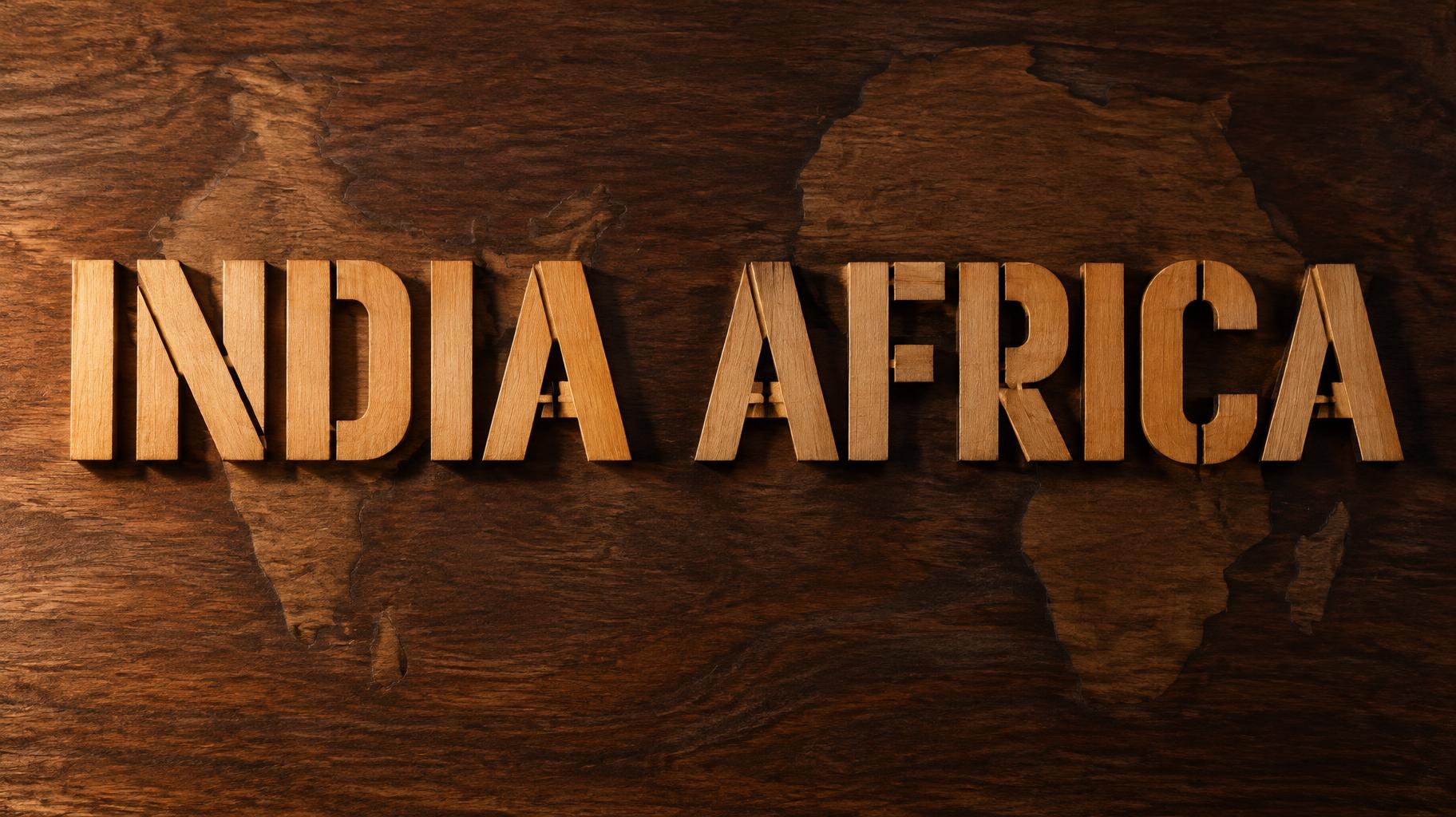
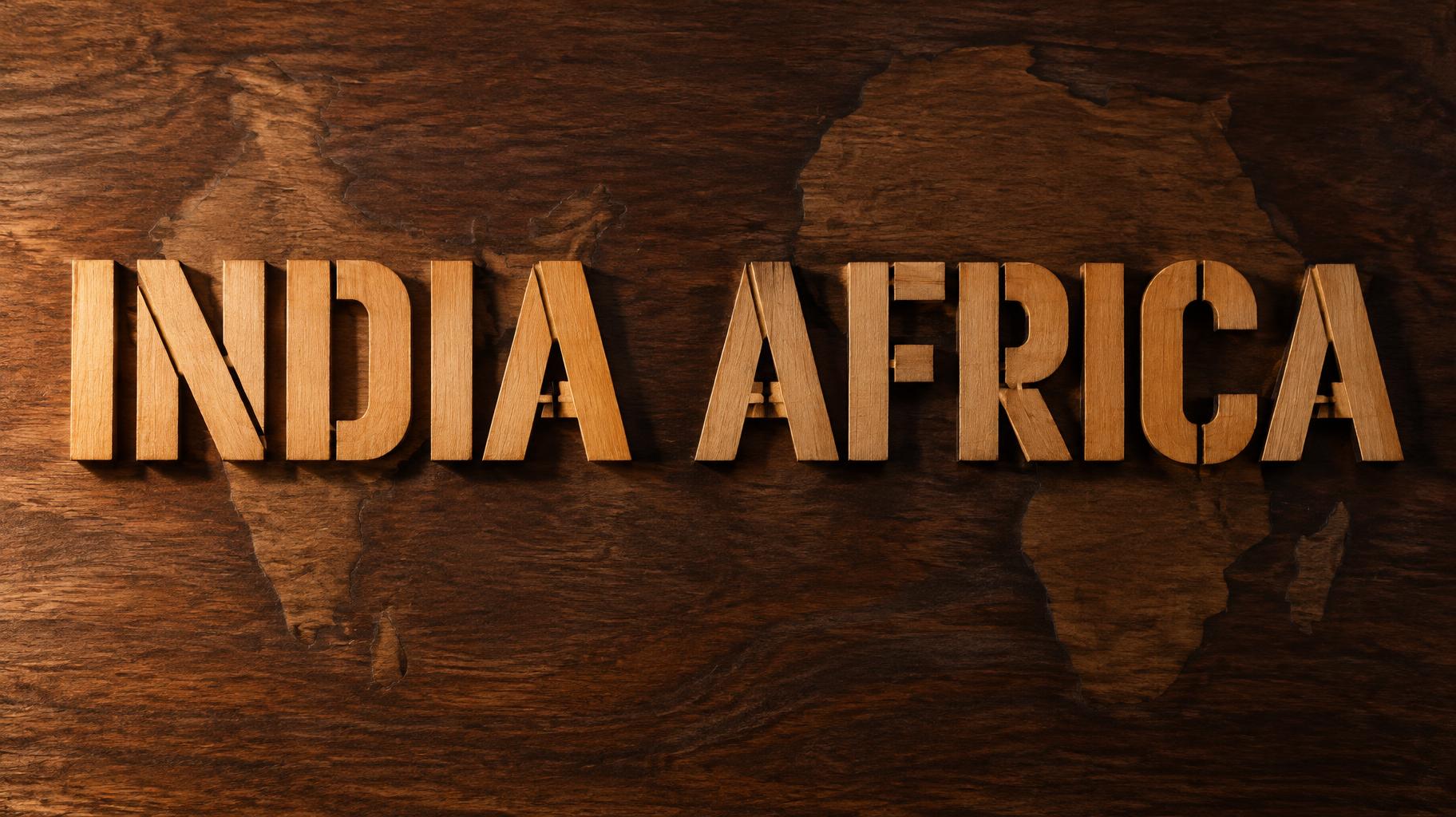
「INDIA AFRICA」は FontVibe AI で作成したレーザーカットの文字エフェクトです。暖かな白樺材から切り出した太いサンセリフ大文字。焦げたカット面と木目が見え、暗いウォルナットの板から浮き上がり、琥珀色の横光。
Precision fabrication aesthetic: text exists as physical cut material — not rendered, not painted. The laser kerf is the only boundary: mathematically exact edges, zero roughness. MATERIAL SURFACE RULES: — Wood: warm grain on letter face (birch honey or dark walnut); charred dark seam along every kerf edge; cross-grain cross-section at cut face. Gentle warm transmission through thin sections. — Acrylic: glassy-smooth kerf edges scatter light as luminous halos — frosted emits soft white-blue edge glow; clear creates prismatic edge-light. Face stays matte or polished. — Metal: bright machined cut face against brushed exterior. Raking light reveals mechanical precision and directional grain. — Paper/Organic: bone-clean cut edges casting hairline shadows on backing. Maximum filigree detail preserved. FABRICATION LAWS (all materials): — Enclosed counters (O,D,B,P,R,A) retained by structural bridge connections — thin material tabs turned into design features. — Material thickness always visible as dimensional depth: each letter is a physical slab. — Negative space is real air or backing material showing through. — No added outlines, glow effects, or drop shadows — the kerf edge is the only boundary. FORBIDDEN: graphic fills, smooth gradient fills on letter faces, extruded 3D depth. When no specific material is defined by the font: default lighting — warm amber side light raking from low-left, deep warm shadow on right and behind, dark warm-brown craft-studio background. Create a finished, museum-quality typographic relief celebrating the connection between India and Africa. Set the exact words “INDIA AFRICA” on one generous line, centered and commanding, with ample breathing room around the lettering. Fabricate the words as thick, precision laser-cut warm birch slabs, their honey-colored grain visible across each face and their cross-grain cut surfaces clearly visible along the dimensional edges. Preserve the laser-cut character: a fine dark char seam marks every kerf, and the perfectly clean cut edges are the only boundary. Where enclosed letter spaces occur, retain them with small, clearly visible structural bridge tabs integrated into the design. Mount the physical lettering on a dark, richly grained timber panel, with real backing visible through every cutout. A low amber sidelight from the left grazes the wood, revealing the slab thickness and warm grain; the right side falls into deep, natural shadow. Suggest a subtle meeting of landscapes through the panel’s restrained grain pattern: faint, organic contours reminiscent of the Indian subcontinent and Africa, kept behind and subordinate to the words. Keep the composition uncluttered and tactile, with no extra writing, decorative outlines, artificial glow, or graphic fills. The lettering remains the unmistakable focal point.
2026年11月7日に生成 · 1824 × 1024 · JPEG · OpenAI GPT-Image-2.5 Sunburst · 制作者がシェア · 商用利用無料(CC BY 4.0)



