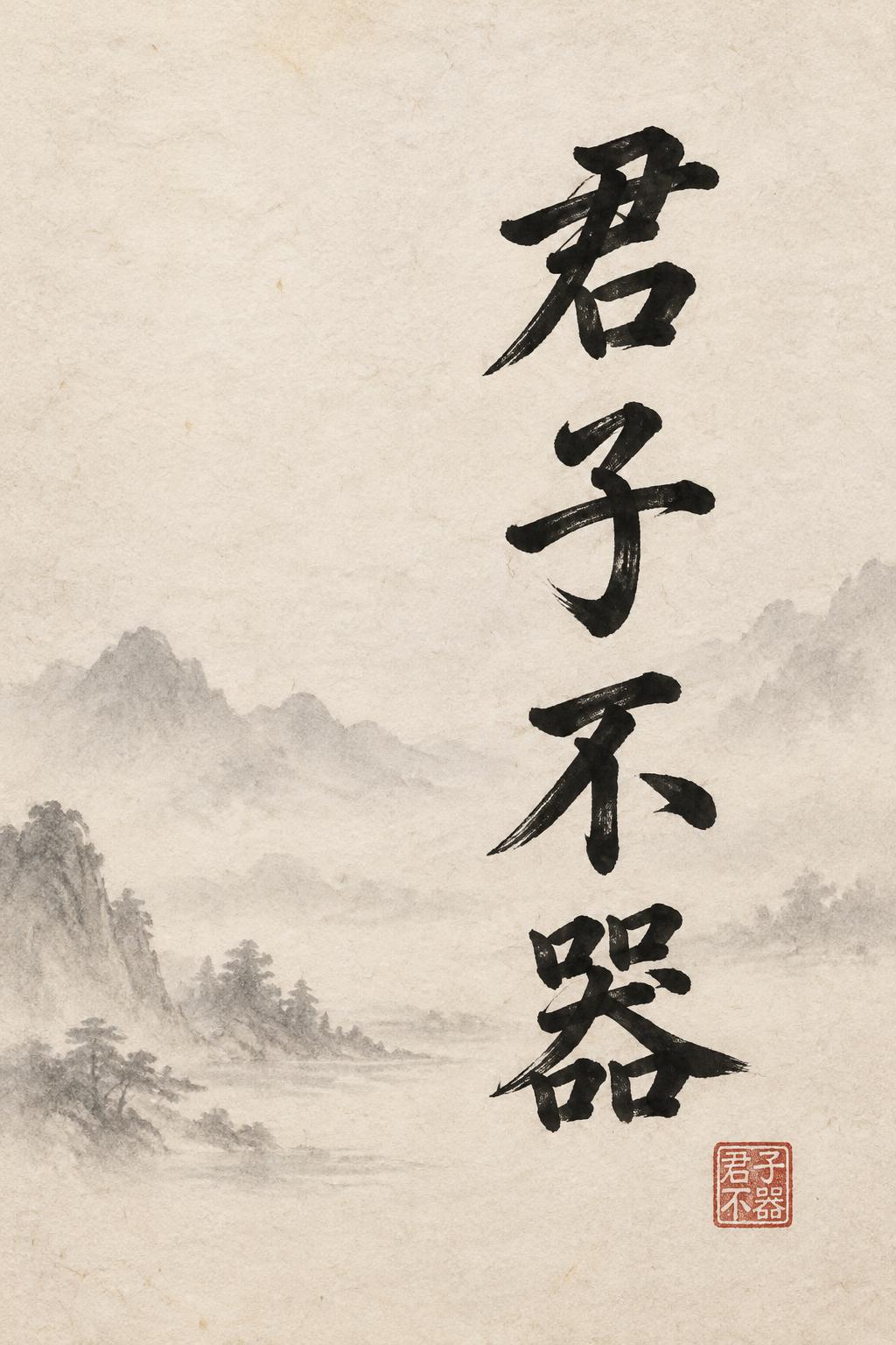
君子不器 - 中国墨絵ブラシ Text Effect


この作品と同じ OpenAI GPT-Image-2.5 Sunburst を使用 · 15 クレジット
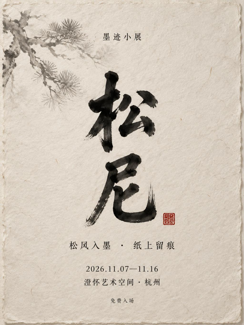


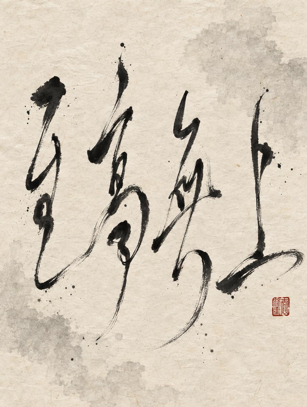

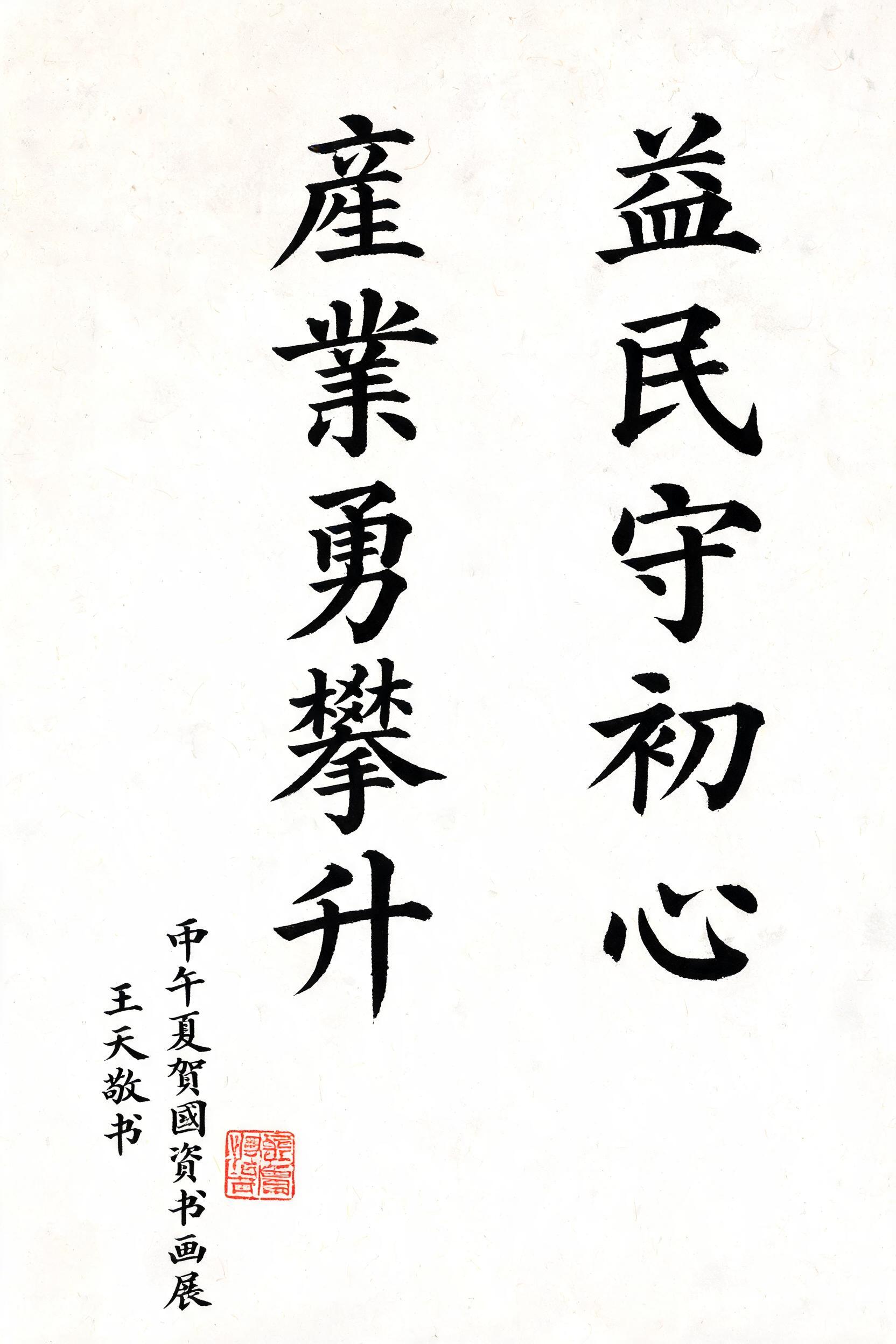
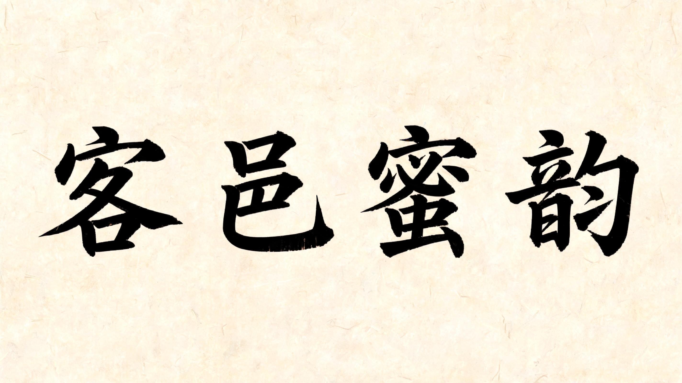

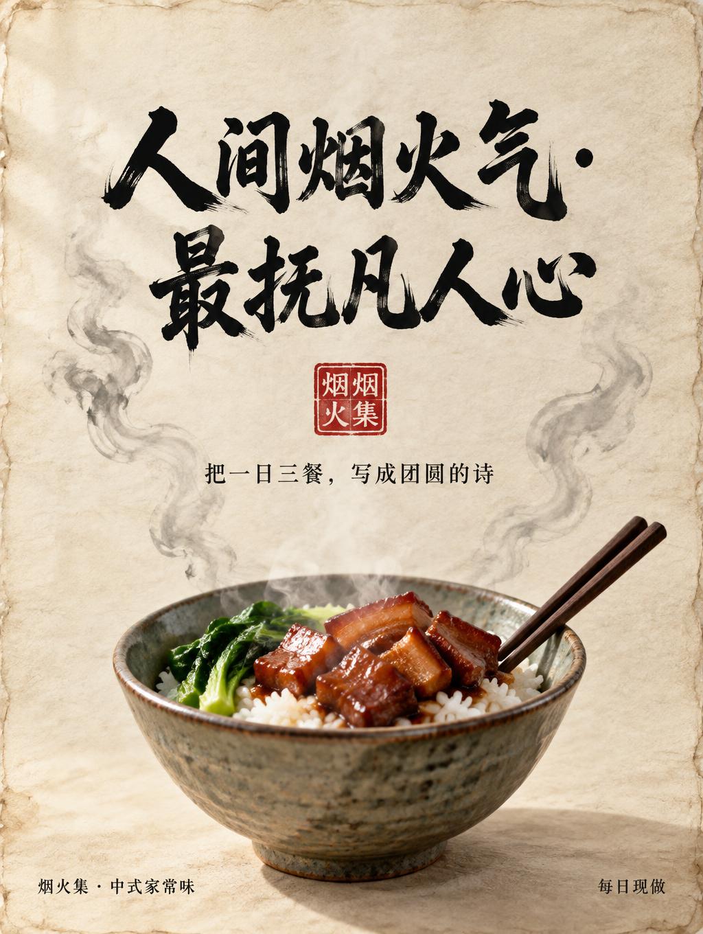
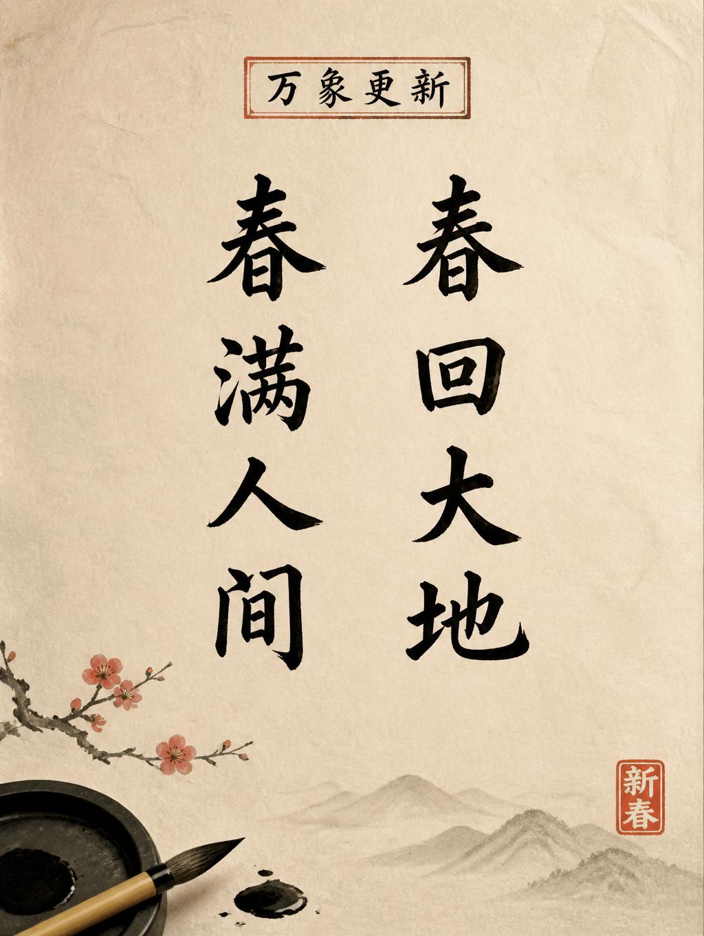
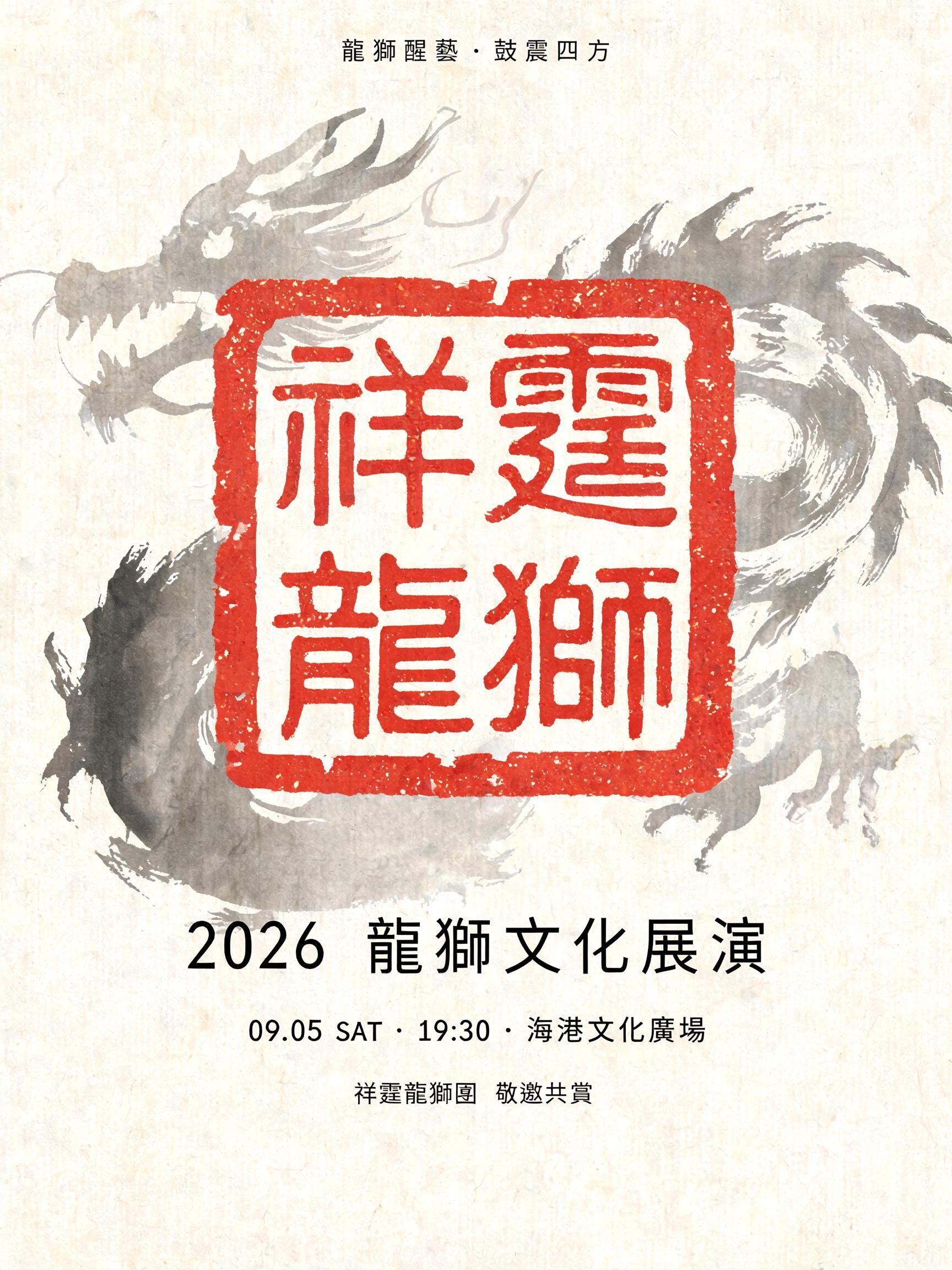


「君子不器」は FontVibe AI で作成した中国墨絵ブラシの文字エフェクトです。中国の墨(すみ)による筆文字書道のスタイルをラテン文字に応用しました。深い黒墨に本物の筆先の質感、太細のはっきりした筆致の変化、そして画仙紙の趣を備えています。中華レストランのブランディング、武術、ウェルネス、文化的なデザインに最適です。
rendered in Chinese ink brush calligraphy style. Letterforms painted with a fully loaded sumi ink brush — deep black ink, visible bristle marks along stroke edges, wet ink pooling at stroke starts, feathered dry-brush trailing ends. Authentic ink density variation: thick rich black cores fading to grey at thin passages. Rice paper texture visible behind. Traditional Chinese calligraphy energy — each stroke confident, intentional, irreversible. LETTERFORM PRIORITY: when the chosen font carries its own treatment, that font's letterform shapes take priority and own the letters; this style governs the sumi ink medium, the bristle and ink-density behavior and the rice-paper ground. FALLBACK MATERIAL: if the font carries no material of its own, render the letters as deep black sumi brush strokes with visible bristle marks, wet ink pooling at stroke starts and feathered dry-brush trails on rice paper. COLOR PRIORITY: keep the font's own colors if specified; otherwise rich black ink fading to grey at thin passages. Create a finished, contemplative calligraphy artwork featuring the exact text “君子不器” as four large characters in a single vertical column, read from top to bottom. Give each character generous breathing room while keeping the column visually unified, centered slightly to the right of the canvas. Let the strokes feel decisive and alive, with distinct wet-to-dry changes and open passages where the paper shows through. Set the column against warm ivory xuan paper with fine visible fibers and very faint age mottling. Behind it, add a restrained pale grey ink wash suggesting distant mountain ridges and mist, dissolving softly into the paper and never competing with the words. Keep the upper and left areas mostly clear, creating quiet negative space around the calligraphy. Place a small vermilion seal impression near the lower right of the column as a compact accent, without any additional legible writing. The composition should feel balanced, scholarly, and serene, like a carefully preserved work on handmade paper; the four requested characters remain unmistakably dominant and fully legible.
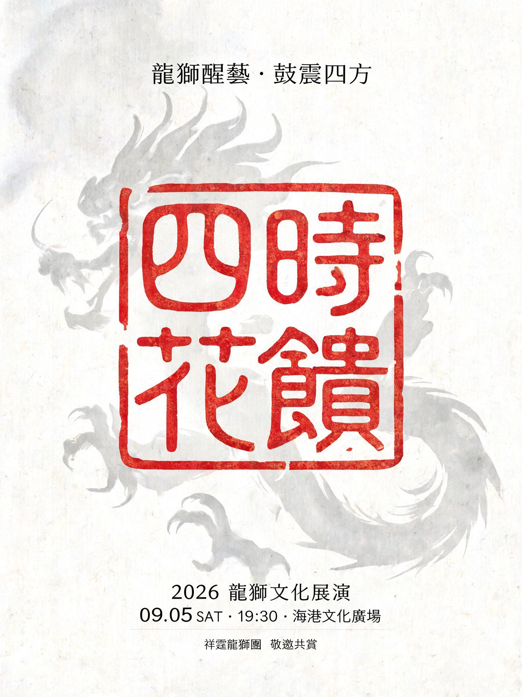
用途: 篆刻フォントジェネレーター
2026年11月9日に生成 · 1024 × 1536 · JPEG · OpenAI GPT-Image-2.5 Sunburst · 制作者がシェア · 商用利用無料(CC BY 4.0)



