75週年紀念特刊 - メタリック Text Effect


この作品と同じ OpenAI GPT-Image-2.5 Sunburst を使用 · 15 クレジット









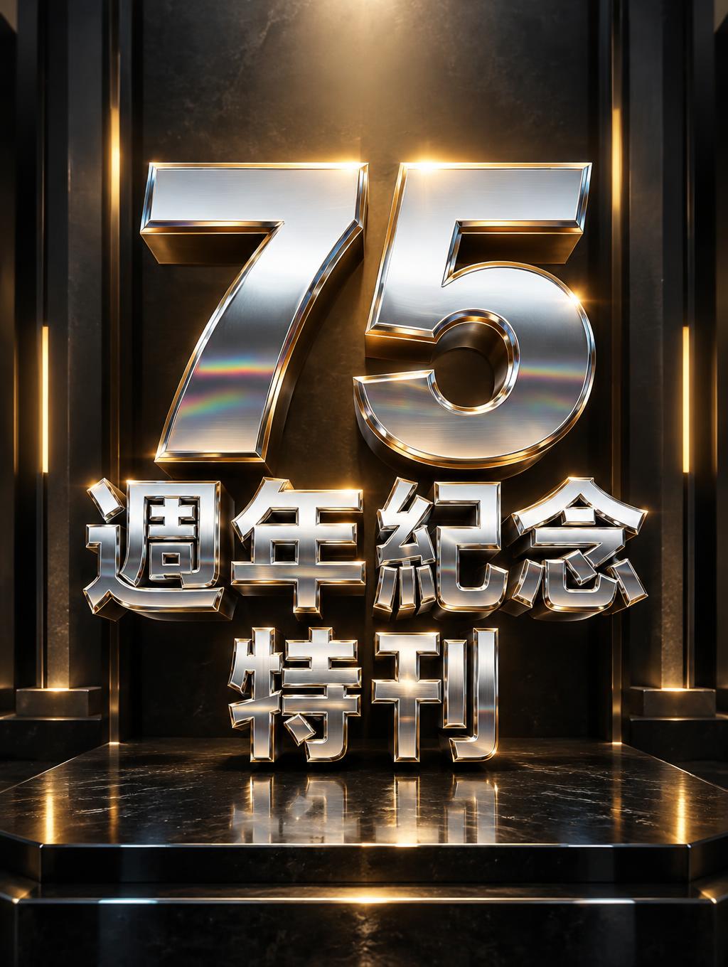
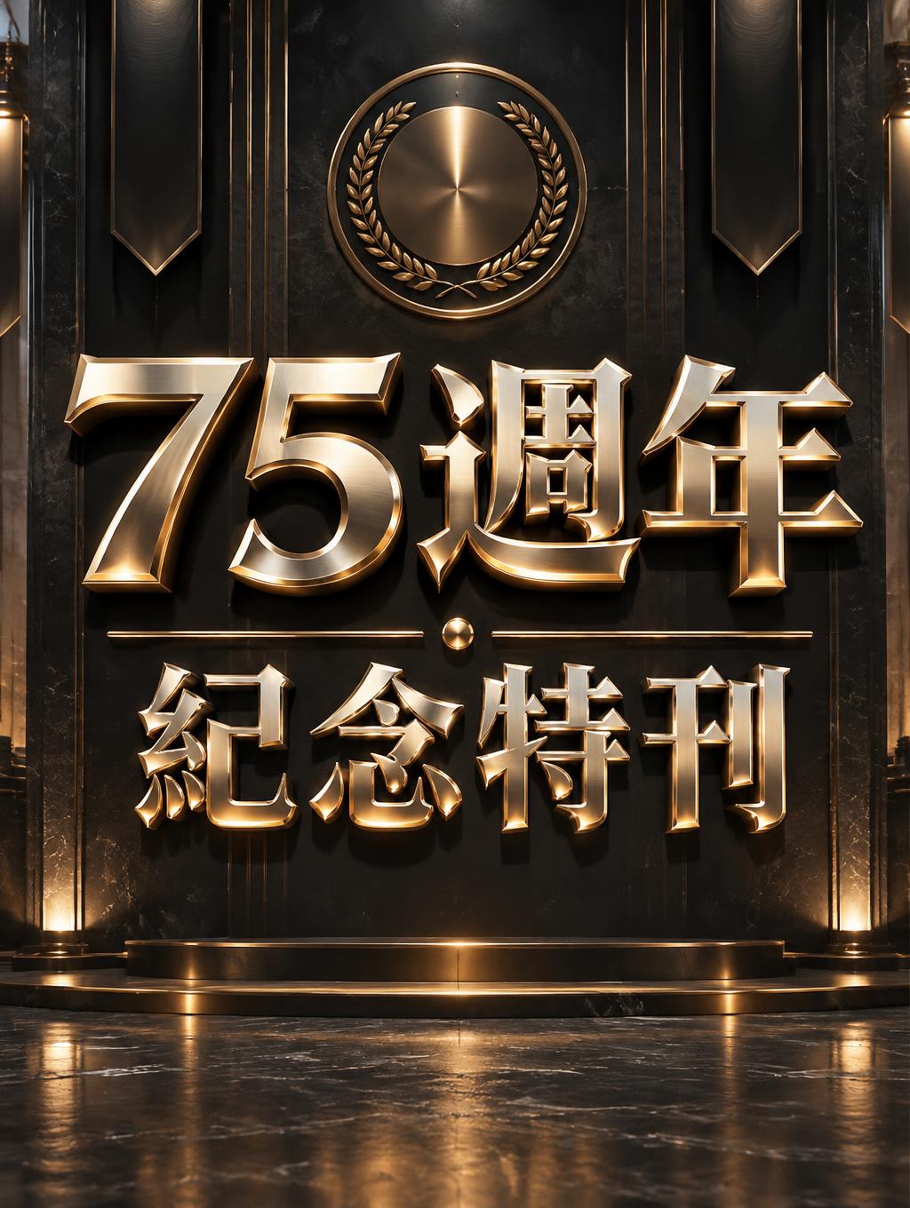
「75週年紀念特刊」は FontVibe AI で作成したメタリックの文字エフェクトです。磨いた金とヘアラインのスチールを組み合わせた面取りの3D大文字。鋭いハイライトの線、方向性のあるスタジオ光の下で冷たい反射床に映ります。
Rendered as bold 3D extruded letters with realistic metal surface physics — two signature material tracks: brushed steel with directional anisotropic highlight streaks across the surface, matte-satin finish, subtle horizontal grain texture, industrial grey with cool undertones; and gold/trophy with warm amber-yellow color temperature, wide smooth specular gradient from bright highlight to deep shadow, achievement trophy polish and weight. Supporting track: chrome/mirror for high-contrast metallic accent work. Core optical behavior rules across all tracks: wide specular highlight gradient (not a point highlight), ambient reflection in shadow zones capturing environmental color, material-specific color temperature held consistently, edge highlight compression where bevel planes meet. Never flat grey paint — always show the metal's interaction with light. Dark industrial background to maximize material contrast. LETTERFORM PRIORITY: when the chosen font carries its own treatment, that font's letterform shapes take priority and own the letters; this style governs the metal-surface physics, the specular lighting and the finish. FALLBACK MATERIAL: if the font carries no material of its own, render the letters as bold 3D-extruded metal — brushed steel or polished gold/trophy with a wide specular gradient and compressed edge highlights. COLOR PRIORITY: keep the font's own colors if specified; otherwise hold the chosen metal's color temperature — cool steel grey or warm trophy gold. Create a premium commemorative magazine-cover image for the 75th anniversary special issue. Preserve the exact Traditional Chinese text 「75週年紀念特刊」, with no additional words, numerals, or lettering. Arrange it in a deliberate two-line hierarchy: make 「75週年」 the dominant headline across the upper center, with 「紀念特刊」 beneath it, slightly smaller but still imposing and clearly legible. Keep every character unobstructed, carefully spaced, and large enough to read at a glance. Set the composition against a deep charcoal, near-black editorial backdrop with subtle architectural depth and a restrained suggestion of a grand anniversary exhibition hall. Give the headline generous breathing room; use a few fine horizontal rules and a discreet, circular anniversary medallion motif without any writing or numbers. Light the dimensional metal lettering with broad, controlled reflections: warm amber highlights sweep across the faces while cool steel-blue reflections collect in the shadowed areas, with compressed bright glints along bevel edges. Let the lettering cast crisp, substantial shadows onto the dark surface. Keep decorative elements sparse and secondary, directing attention to the exact text and its ceremonial, enduring significance. Sophisticated, balanced, and polished like a landmark publication cover.
2026年11月9日に生成 · 1024 × 1360 · JPEG · OpenAI GPT-Image-2.5 Sunburst · 制作者がシェア · 商用利用無料(CC BY 4.0)