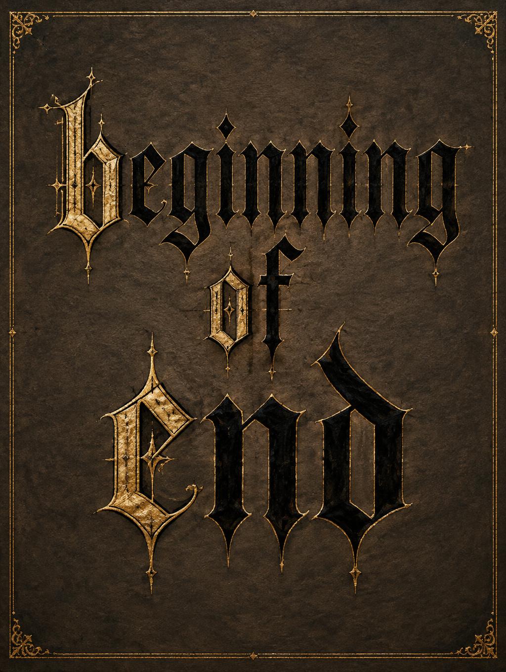
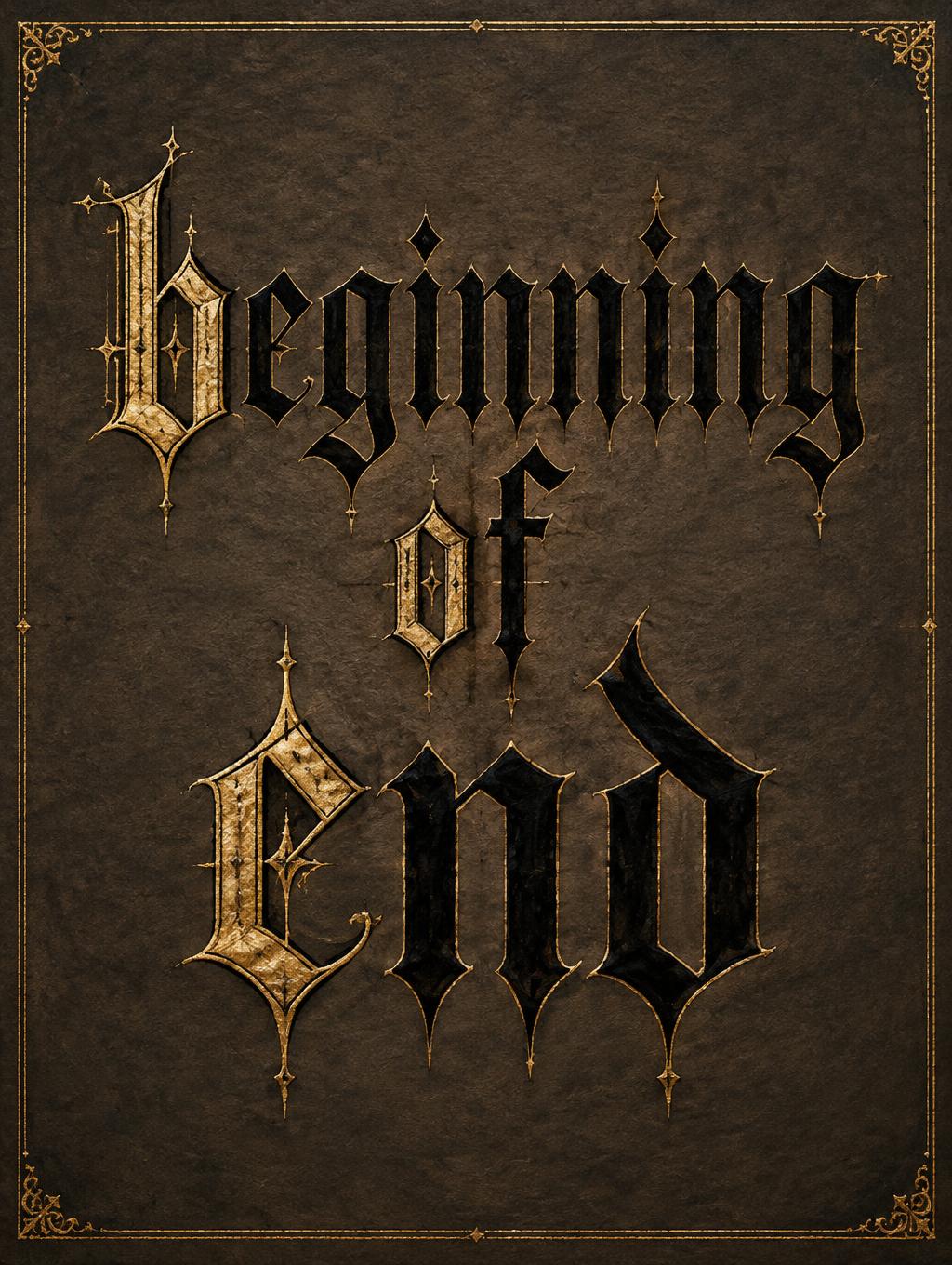
beginning of end - ゴシックフォント Text Effect


この作品と同じ OpenAI GPT-Image-2.5 Sunburst を使用 · 15 クレジット




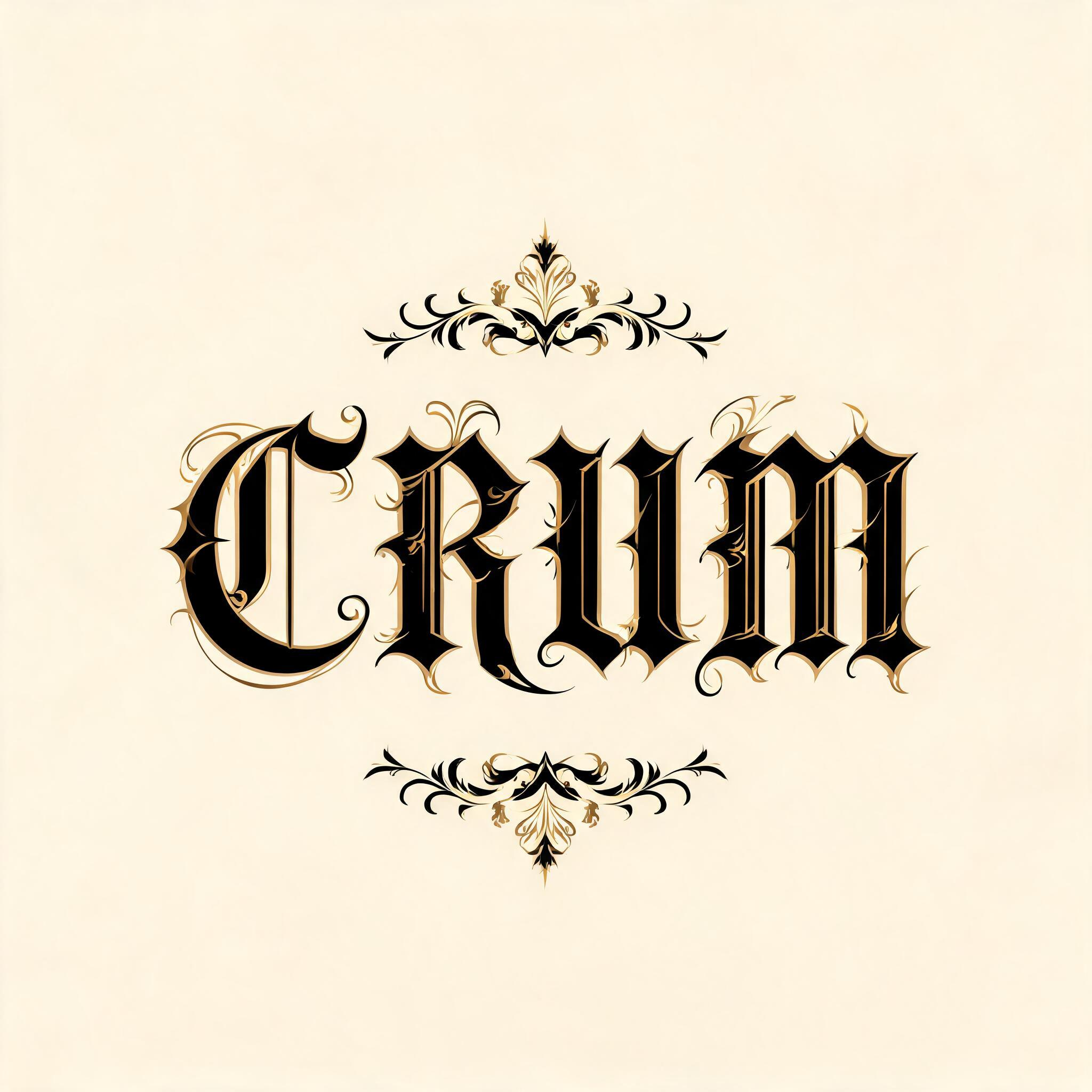

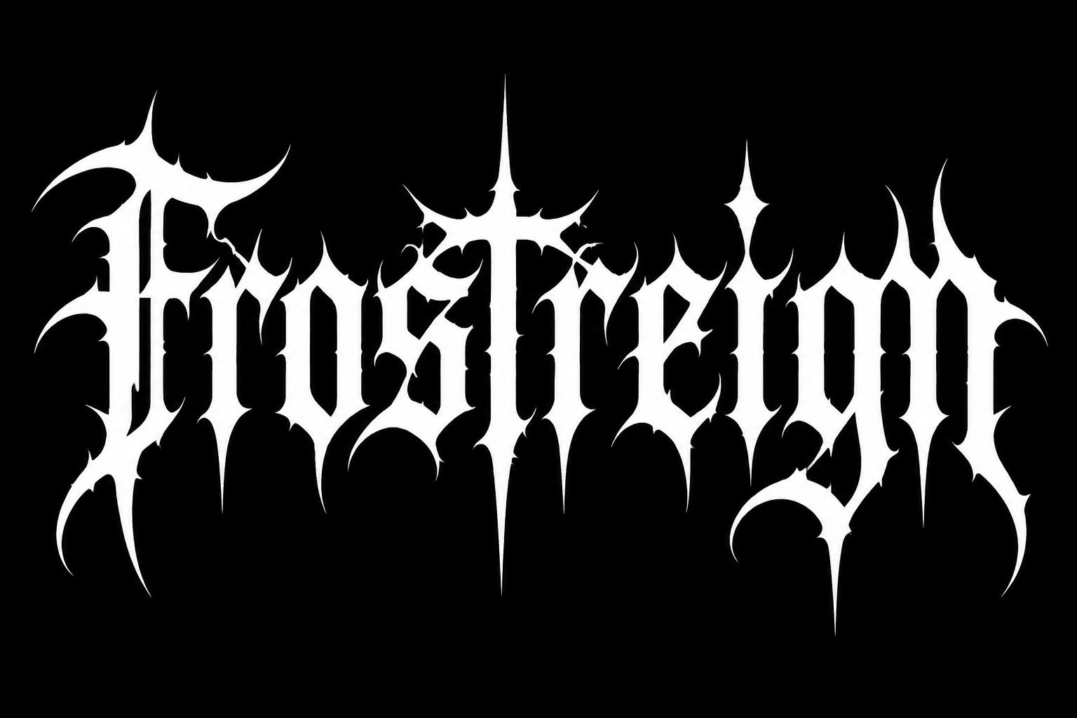

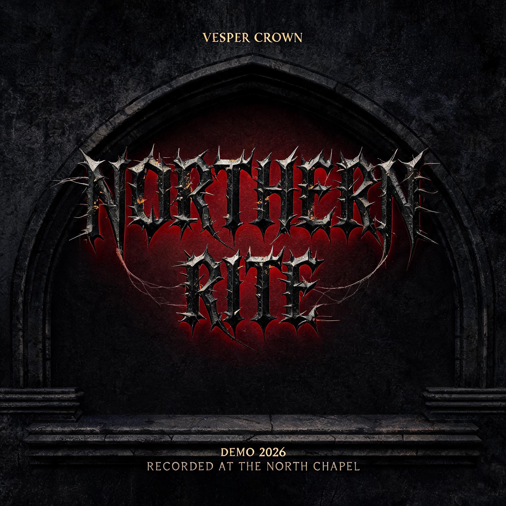
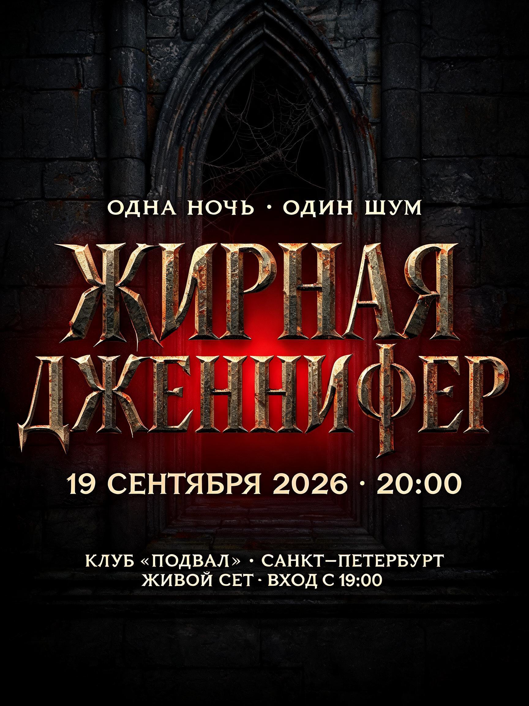
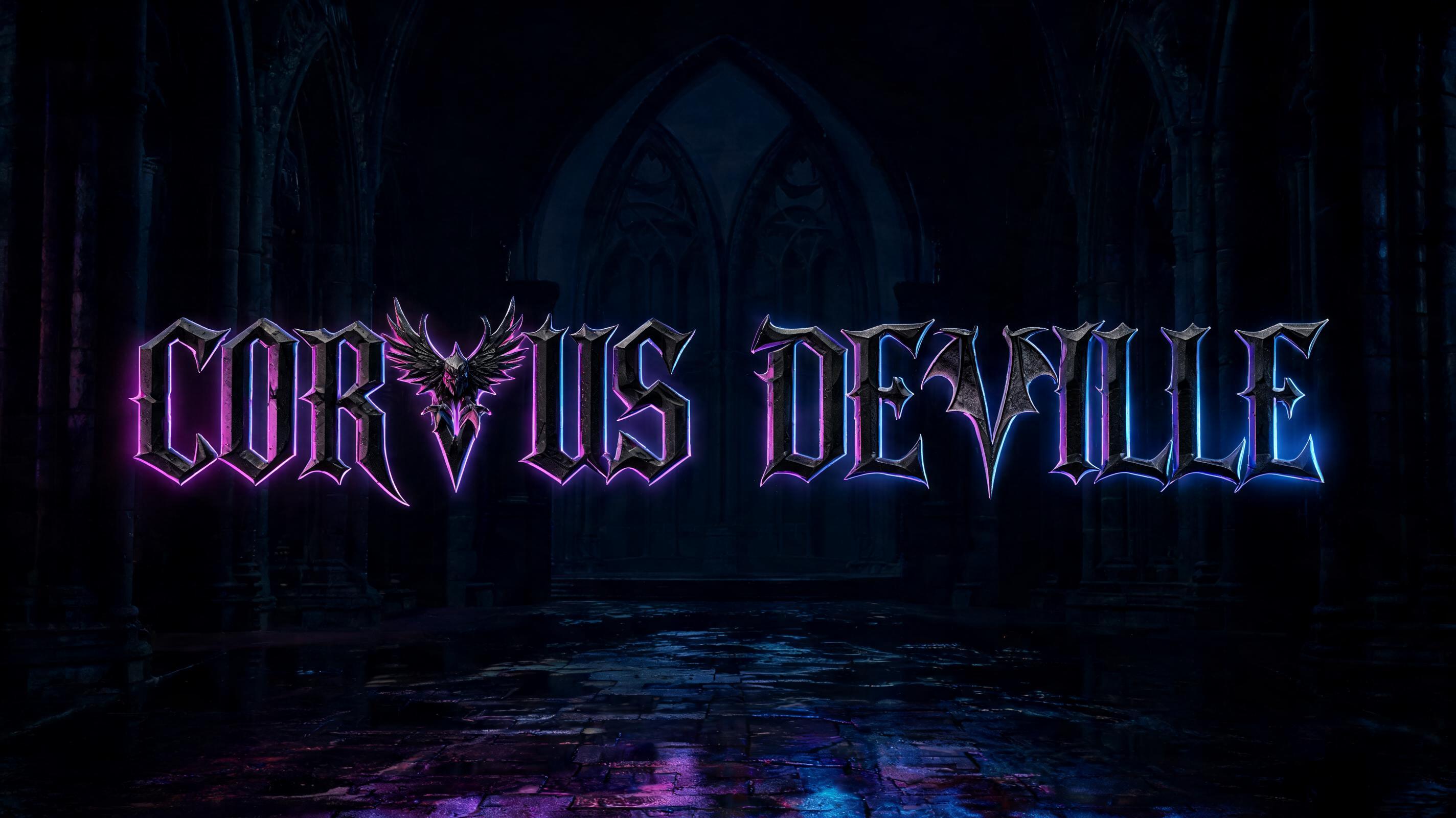


「beginning of end」は FontVibe AI で作成したゴシックフォントの文字エフェクトです。端正なテクストゥーラのブラックレター。細く折れる線、菱形の筆端、強い太細の差を、金でふちどった黒インクで暗い古い羊皮紙に。
rendered in precise gothic blackletter letterforms with authentic calligraphic construction — diamond-shaped stroke terminals, strong thick-thin contrast, pointed arch counters. Rich black ink with warm depth on dark parchment or deep charcoal background. Subtle gold ink highlights on serifs and capitals. Medieval scribal precision. No cobwebs, no rust, no atmospheric fog — pure typographic craft. LETTERFORM PRIORITY: when the chosen font carries its own treatment, that font's letterform shapes take priority and own the letters; this style governs the rich ink, the parchment ground and the subtle gold highlights. FALLBACK MATERIAL: if the font carries no material of its own, render the letters as precise gothic blackletter in rich black ink with subtle gold highlights on dark parchment — pure typographic craft, no cobwebs, rust or fog. COLOR PRIORITY: keep the font's own colors if specified; otherwise black ink with warm gold accents. Create a finished Gothic manuscript title piece featuring the exact words “beginning of end,” arranged in three centered lines: “beginning” above “of,” with “end” as the strongest, largest line beneath. Keep every word clearly legible and preserve its spelling. Set the lettering prominently on a single dark parchment page, with generous breathing room around the composition and a disciplined, balanced hierarchy. Treat the capital forms at the start of each line as illuminated accents, touched with restrained gold leaf; keep the rest of the words in rich black ink, with delicate gold glints catching selected terminals. Frame the page with a narrow, precise gold rule and very small corner ornaments drawn from manuscript illumination, leaving the text as the unmistakable focus. Let a faint parchment fibre texture and barely visible ruled guides provide tactile detail without clutter or competing with the lettering. Soft, even, warm light falls across the page, revealing the ink edges and gold accents without dramatic shadows. The overall image should feel like a carefully preserved page from a serious medieval volume: solemn, refined, and composed through typographic craft rather than horror imagery.
用途: ブラックメタル・ゴシック
2026年11月11日に生成 · 1024 × 1360 · JPEG · OpenAI GPT-Image-2.5 Sunburst · 制作者がシェア · 商用利用無料(CC BY 4.0)



