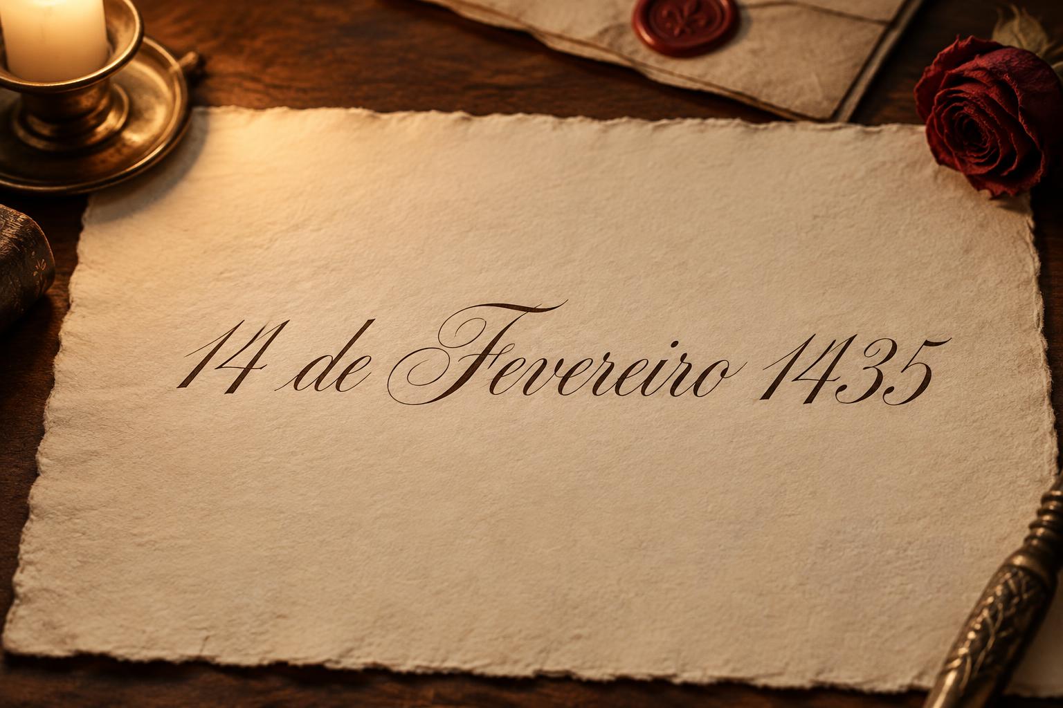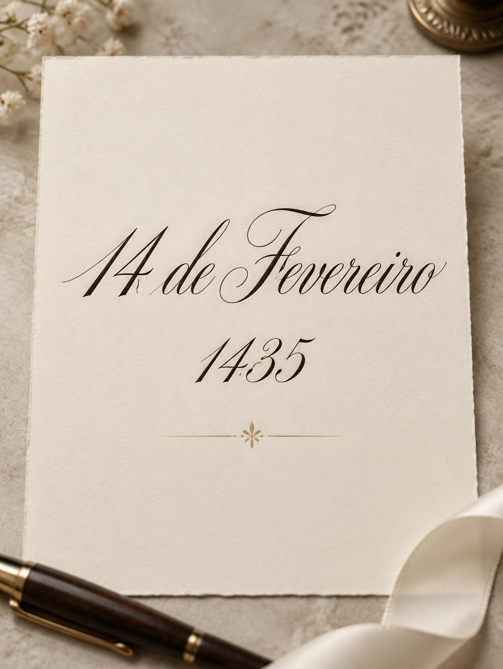
14 de Fevereiro 1435 - カリグラフィースクリプト Text Effect


この作品と同じ OpenAI GPT-Image-2.5 Sunburst を使用 · 15 クレジット
「14 de Fevereiro 1435」は FontVibe AI で作成したカリグラフィースクリプトの文字エフェクトです。尖ったペンによる格式あるカッパープレート体。強い太細の差、傾いた楕円の字形、スワッシュの大文字を、薄い罫線のあるクリーム色の紙に黒インクで。
laid down as the exacting art of formal pointed-pen calligraphy. SURFACE / INK: crisp, controlled ink — deep black or warm sepia — sitting cleanly on the page with fine wet-ink edges and a faint natural sheen where it catches the light, precise and disciplined rather than loose, the exacting hand of a master penman. GROUND: fine calligraphy paper — smooth hot-press cotton, cream or ivory practice stock, sometimes with faint ruled guideline slants, or a formal certificate or invitation ground — with generous margins so the lettering reads. LIGHT: even, clean studio light — soft and flat — showing the crisp ink edges and fine wet-ink detail, minimal drama. ATMOSPHERE: formal, timeless and disciplined — the tradition of copperplate and Spencerian penmanship, wedding invitations, diplomas and certificates, the poised craft of the calligrapher's desk. LETTERFORM PRIORITY: when the chosen font carries its own treatment, that font's letterform shapes and built-in flourishes take priority and own the letters; this style governs only the ink surface, ground and light, never the letter shapes. When no specific material is defined by the font: crisp controlled pointed-pen ink with fine wet edges and a faint sheen, in a single deep tone, on the calligraphy-paper ground. COLOR: if the font declares its own color keep it; otherwise the ink reads as a classic penmanship tone — deep black or warm sepia — on the pale paper ground. Create a formal Portuguese wedding-anniversary keepsake, arranged as a single tall ivory cotton-paper card on a pale stone writing desk. Render the exact text “14 de Fevereiro 1435” as the only lettering, with the date on the first line, “de Fevereiro” on the second, and “1435” on the third. Give “14 de Fevereiro” the strongest presence, with “1435” slightly smaller but clearly legible beneath it. Keep the composition centered with generous clean margins and enough open paper around every line; preserve the accents and spelling exactly. A faint diagonal guideline slant may show beneath the writing. Place a small capped dip pen and a restrained cream silk ribbon near the card’s lower edge, softly out of focus and never overlapping the words. Use even, clean studio daylight across the page so the ink edges and subtle paper texture remain clear, with only gentle shadows at the card’s edges. The finished image should feel like a carefully prepared formal invitation or commemorative certificate: quiet, timeless and meticulously composed, with the writing as the unmistakable focal point.
2026年11月12日に生成 · 1024 × 1360 · JPEG · OpenAI GPT-Image-2.5 Sunburst · 制作者がシェア · 商用利用無料(CC BY 4.0)