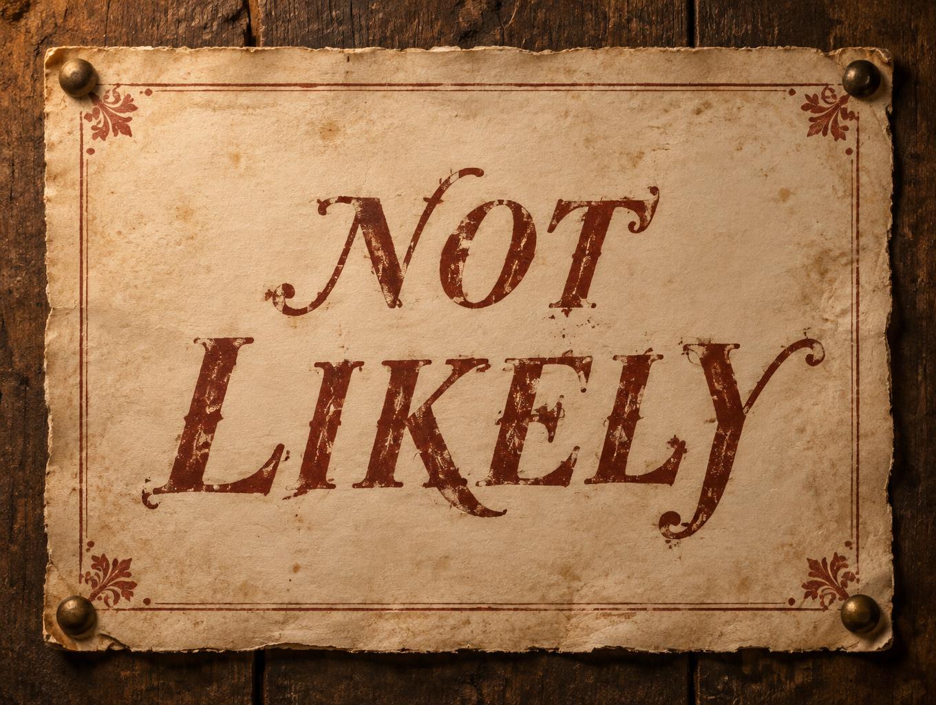
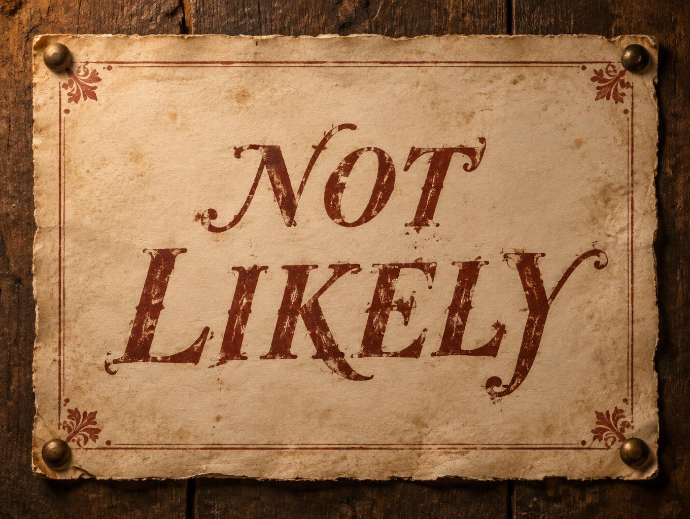
NOT LIKELY - ヴィンテージ Text Effect


この作品と同じ OpenAI GPT-Image-2.5 Sunburst を使用 · 15 クレジット

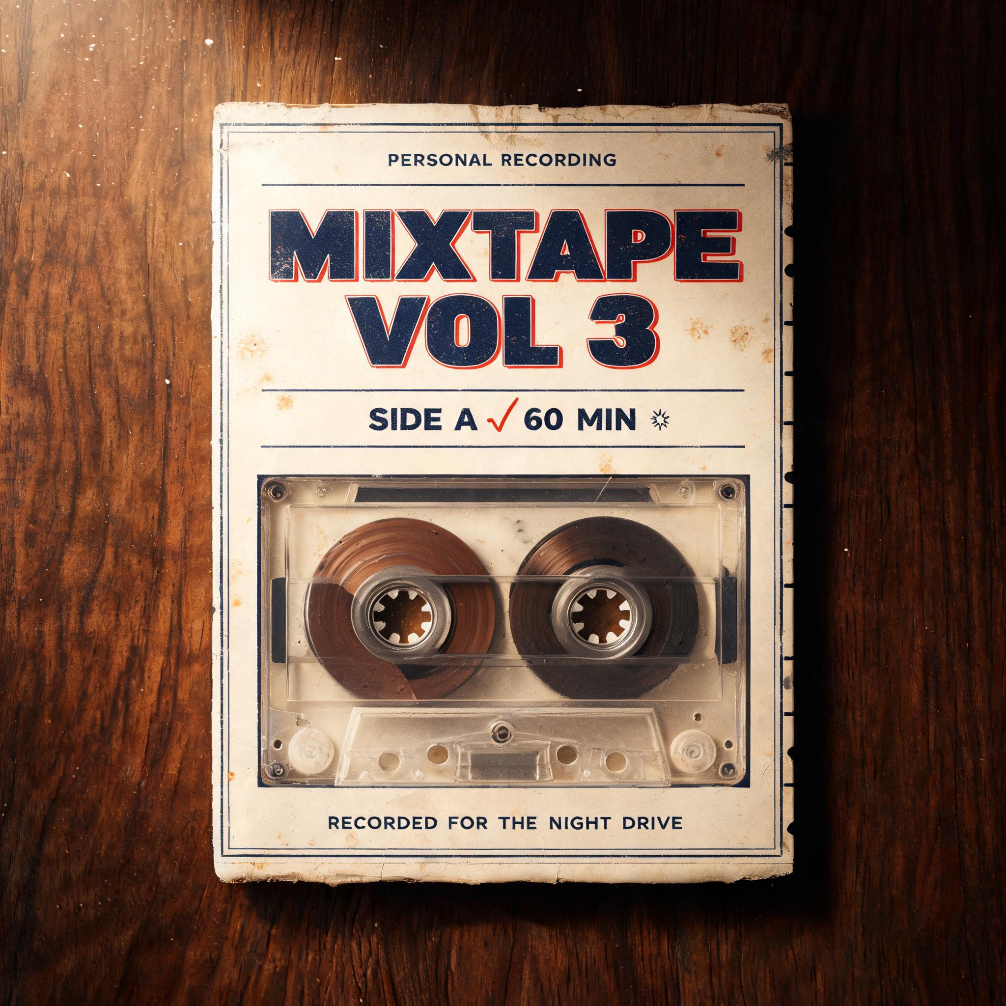
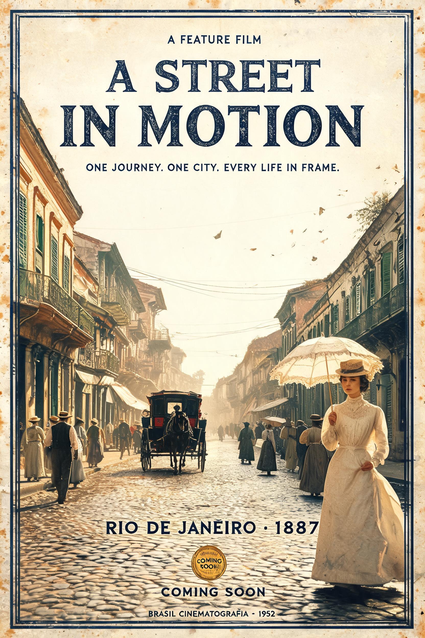
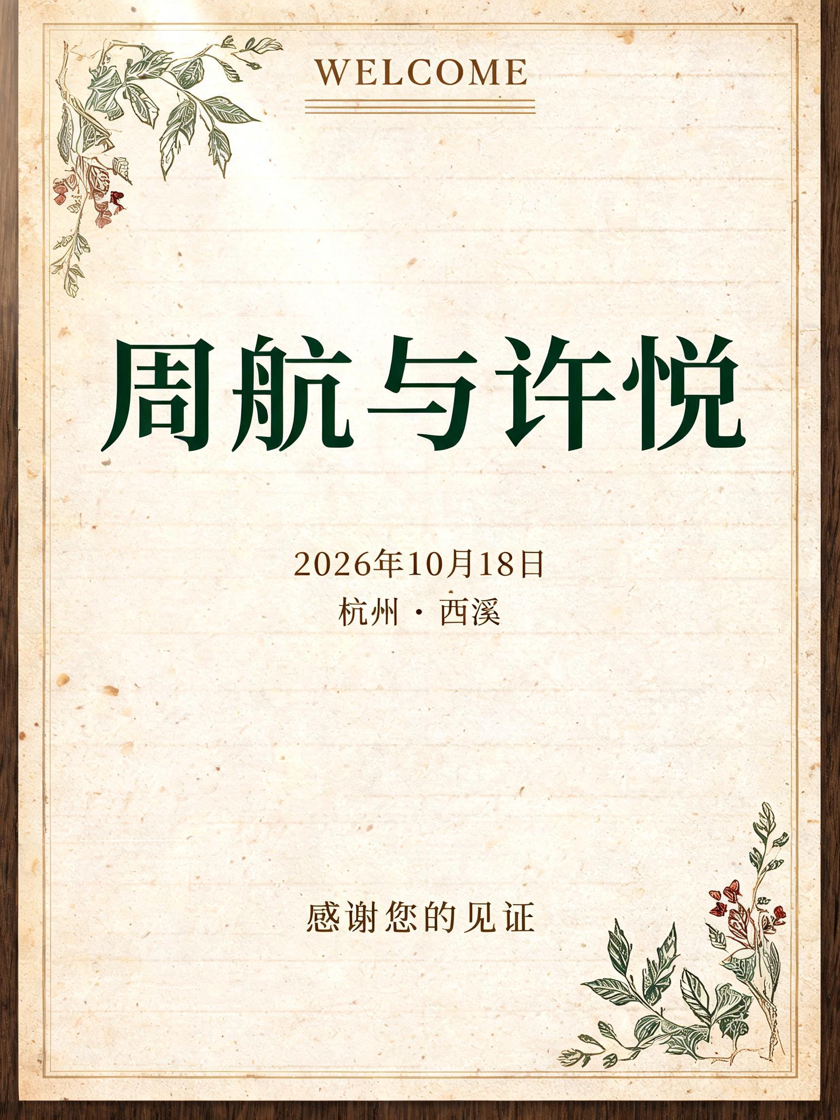


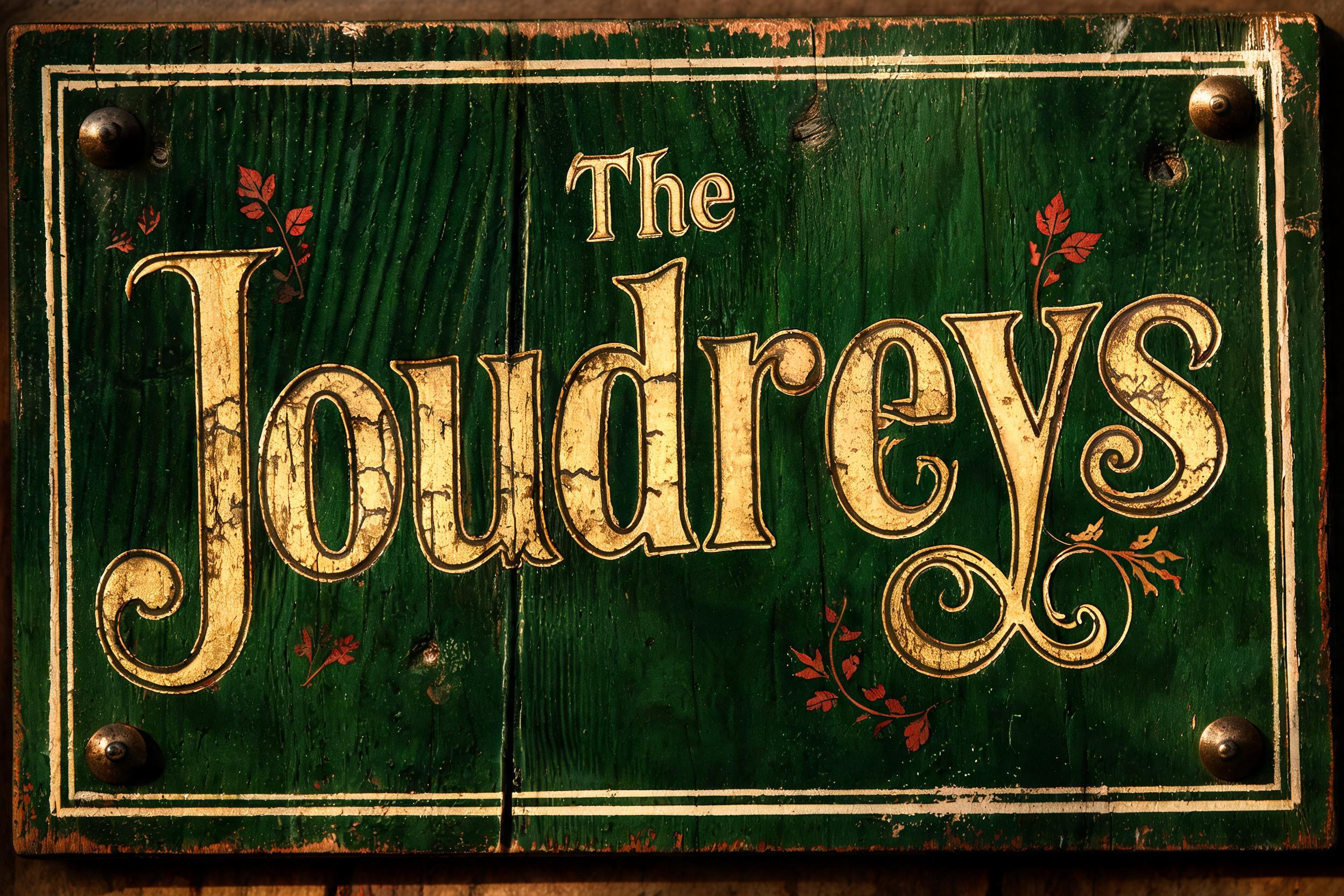
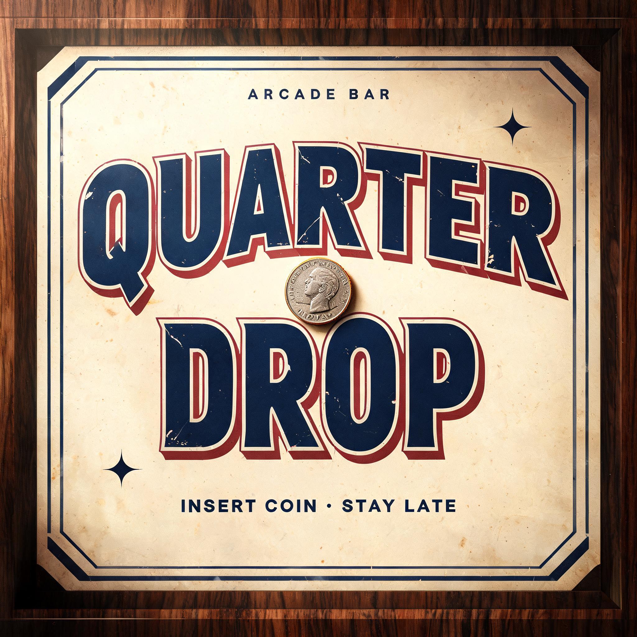
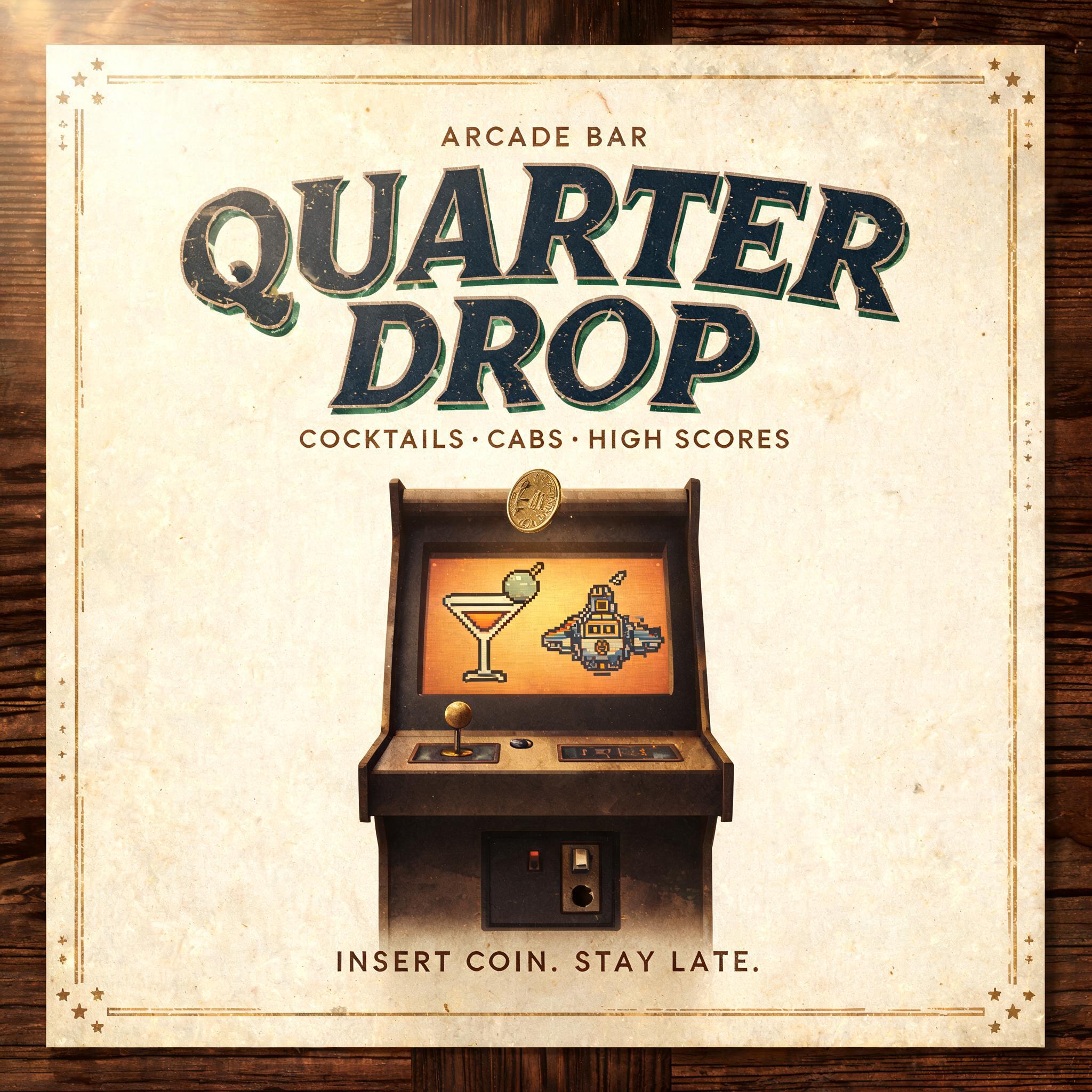
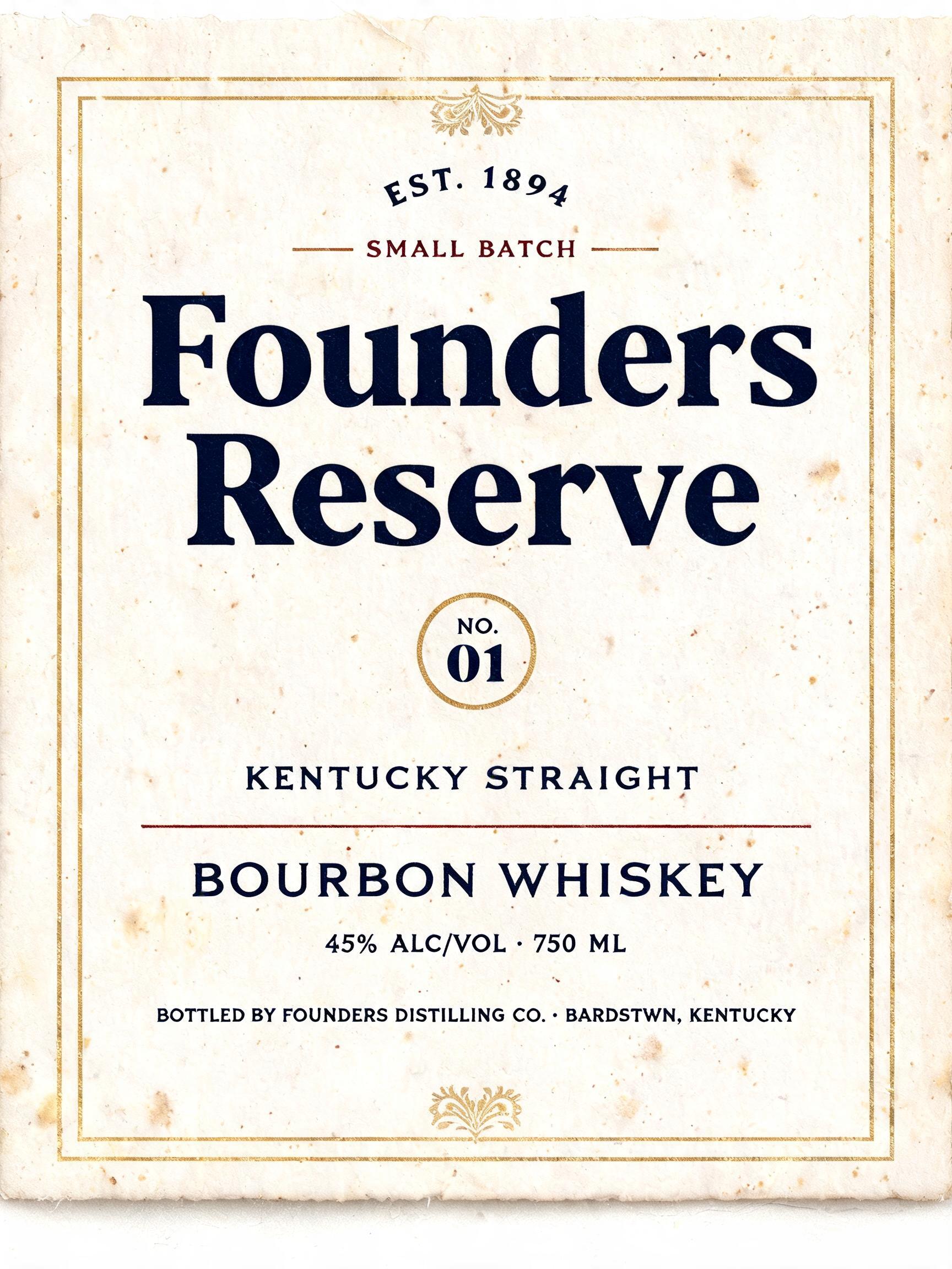
「NOT LIKELY」は FontVibe AI で作成したヴィンテージの文字エフェクトです。インクがわずかにかすれる活版でクリーム色のコットンカードに押し込んだセリフ体大文字。古い印刷機の版盤に置かれ、金属活字が散らばります。
a timeless vintage piece carrying the physical evidence of an older making — warm, aged and classic. SURFACE / STYLE: the lettering looks produced by a heritage craft and softened by time — a letterpress impression bitten into cotton paper with ink slightly broken up, weathered paint on aged metal or wood, a worn rubber-stamp or postal imprint, or warm gold leaf — carrying patina, foxing, grain and gentle wear. SCENE ATMOSPHERE: a warm nostalgic setting — aged cream or kraft paper, dark wood, soft amber light, faint dust and a faded heritage feel. PALETTE: warm aged tones — cream, kraft, sepia, faded red, forest green, navy, tan and antique gold — muted and time-softened, never neon-bright. LETTERFORM PRIORITY: when the chosen font carries its own treatment (western slab, art deco, art nouveau, letterpress, postal or rubber stamp, gold leaf, typewriter, hand-lettered script, grunge chalk), that font treatment takes absolute priority and owns the letters; this style supplies the warm aged tone, the time-worn surface and the nostalgic heritage scene. FALLBACK MATERIAL: if the font carries no material of its own, render the letters as a classic serif printed in warm faded ink on aged cream paper with a soft letterpress impression and gentle wear, so the timeless vintage feel always reads. Create a finished vintage poster built around the exact words “NOT LIKELY,” arranged on two lines with NOT above LIKELY. Make LIKELY the slightly larger, dominant line, with both lines centered and occupying roughly two-thirds of the canvas width. Set the lettering into the face of a broad, aged cream-paper notice mounted against a dark, weathered wood surface, as though an old print has been kept and handled for decades. Give the surrounding paper generous breathing room, softly deckled edges, faint foxing, rubbed corners, and a few restrained ink imperfections. Frame the notice with a fine faded-red rule and small, understated ornamental corner marks; keep these details secondary and include no other words, numbers, or symbols that could read as text. A small antique brass tack at each corner holds the sheet in place. Warm amber light falls from one side, grazing the paper and revealing its texture, while the wood recedes into soft shadow. Use a restrained palette of aged cream, sepia, faded red, dark walnut, and muted antique gold. The overall composition should feel like a wry, timeworn heritage broadside: clear at a glance, carefully made, and quietly characterful.
用途: スタンプフォントジェネレーター
2026年11月12日に生成 · 1360 × 1024 · JPEG · OpenAI GPT-Image-2.5 Sunburst · 制作者がシェア · 商用利用無料(CC BY 4.0)



