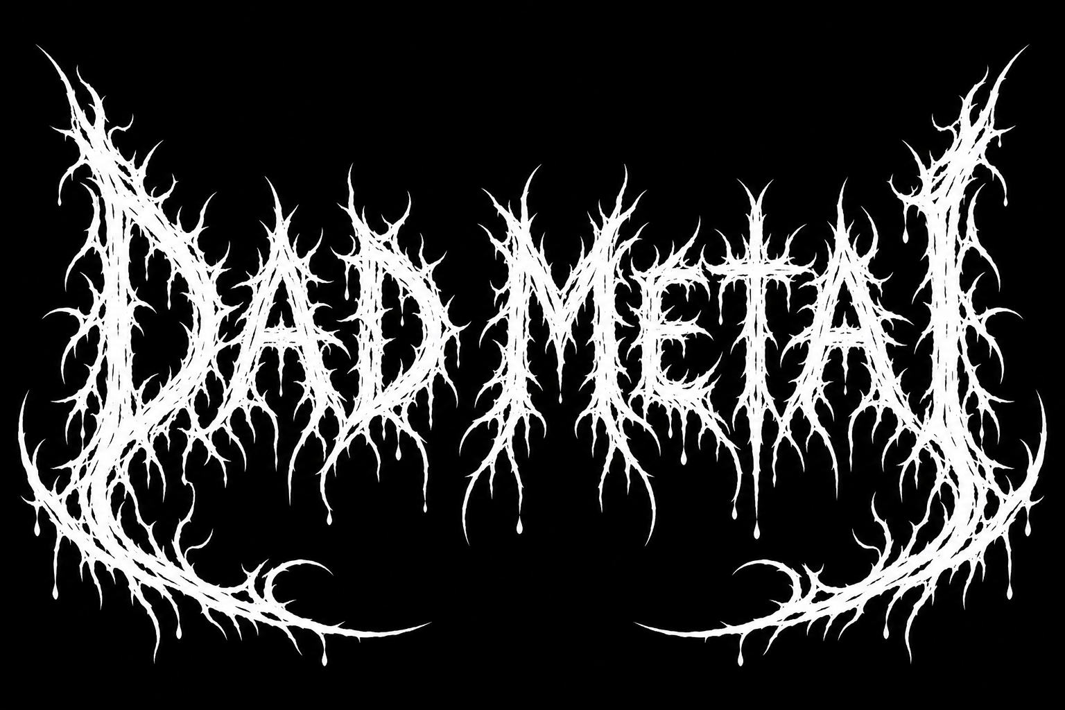
Dad Metal - Inked White Crest Text Effect
この作品と同じ OpenAI GPT-Image-2.5 Sunburst を使用 · 25 クレジット
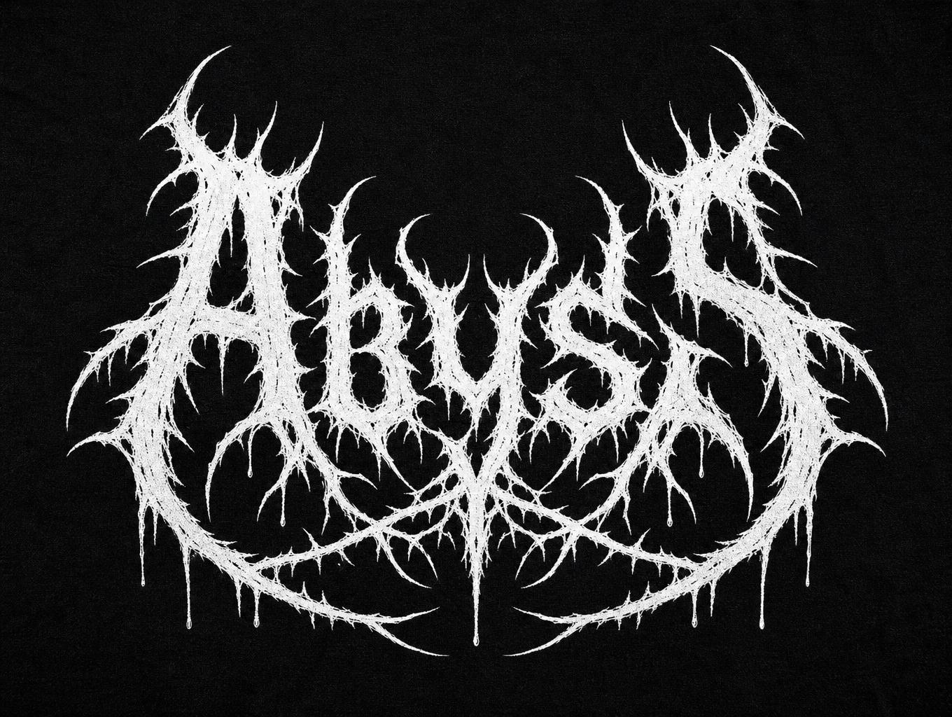
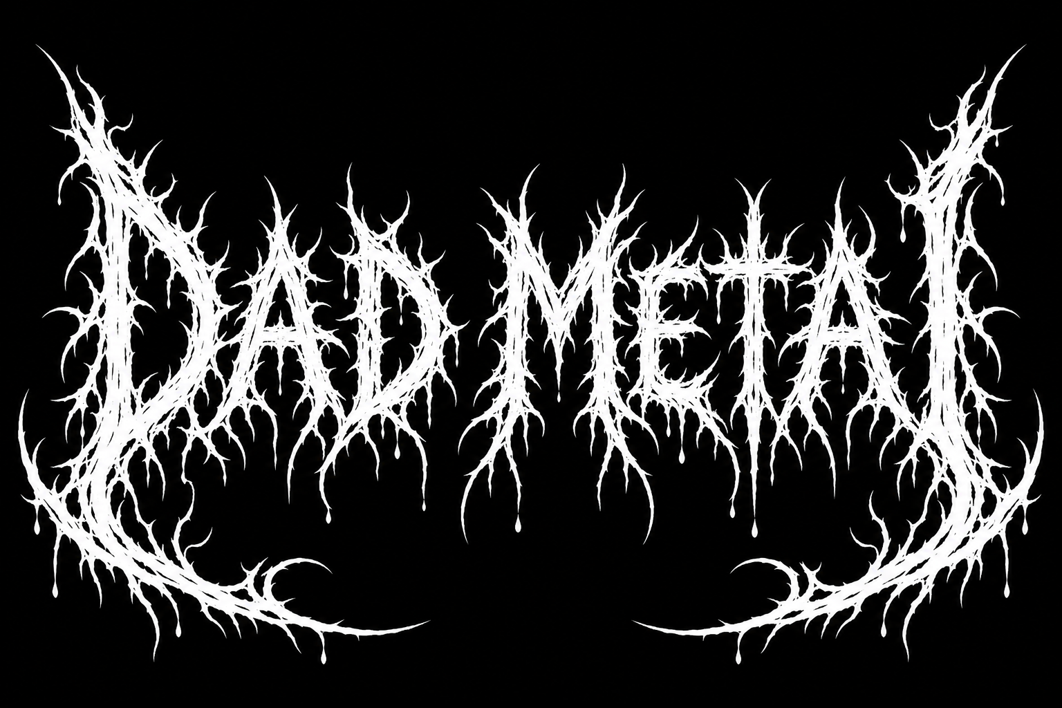
「Dad Metal」は、デスメタルバンドのロゴ風のワードアートです。黒地に、棘や根のような白い文字が並び先端から滴り、最初のDと最後のLが左右対称の長い曲線の棘になっています。バンド名やジョークのタイトルに替えて、ロゴやシャツ、パッチを作れます。
A hand-inked death metal band logo reading "Dad Metal", pure white ink on a flat solid black background, nothing else in the frame. Two words on one line, with a clear gap between DAD and METAL. The lettering fills about 88% of the canvas width. Thick, rough, brush-and-nib ink strokes with uneven, never smooth edges. Every stem sprouts sharp thorns. The tops and bottoms of the letters break into clusters of jagged spikes and twisting roots that taper to fine needle points. The first letter D and the last letter L are drawn much taller than the rest. Their outer strokes stretch into long curved spikes that sweep down and curl inward under the whole line, so the word sits inside a frame grown from its own end letters. The logo is mirror-balanced: left and right halves carry the same weight and spike pattern, like a symmetrical crest. The letters crowd together and their thorns touch and tangle, but each letter keeps its basic shape, so D-A-D M-E-T-A-L can be read on a second look. Nothing is cropped at the edges. A few small drops hang from the lowest spikes. Flat two-tone, white on black only, no grey gradients, no glow, no texture, no extra symbols, no skulls, no other text. Looks like a 1990s underground death metal album logo or a patch sewn on a denim vest.
タグ
2026年11月12日に生成 · 1536 × 1024 · PNG · OpenAI GPT-Image-2.5 Sunburst · レイアウト:マッシブ · 制作者がシェア · 商用利用無料(CC BY 4.0)