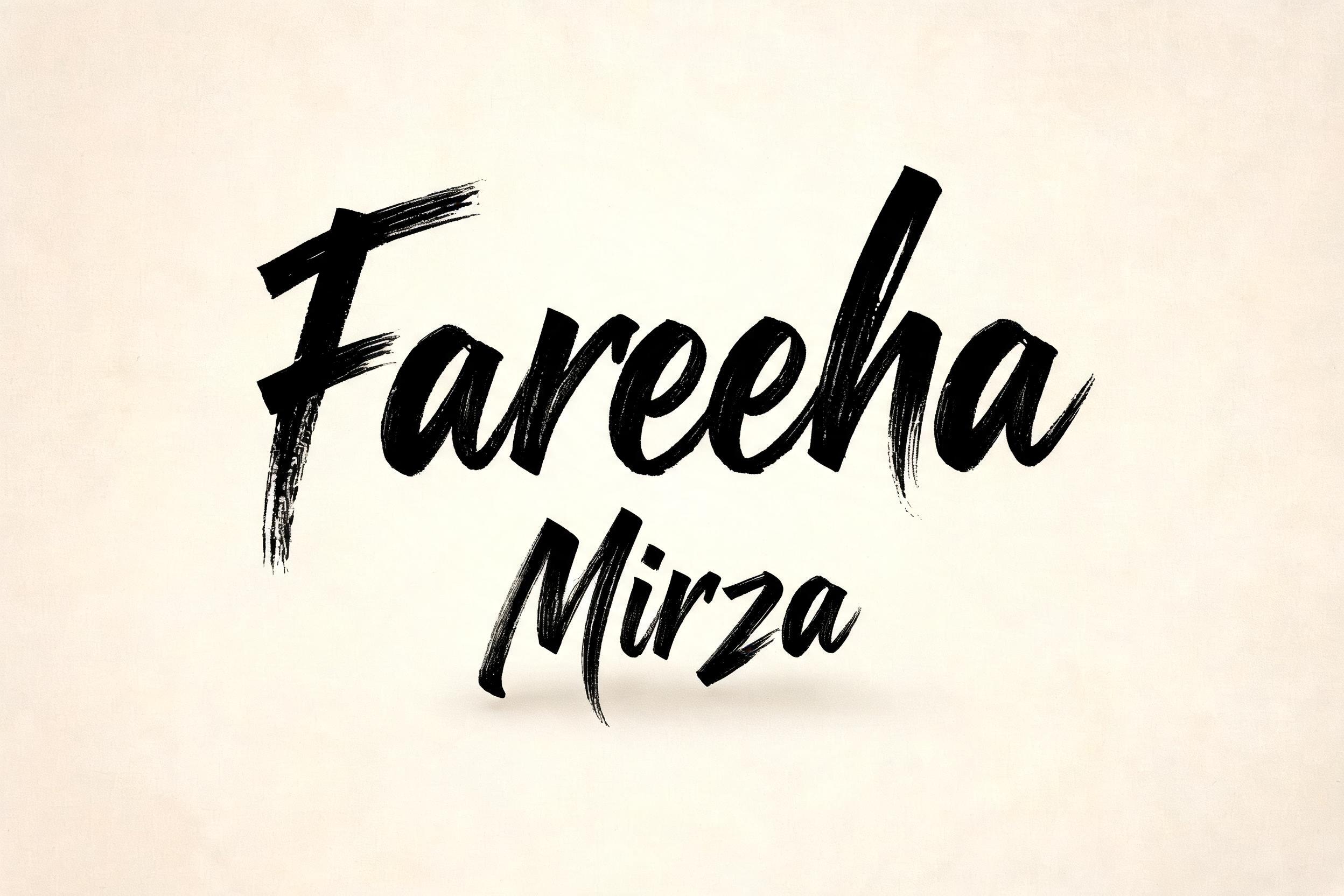
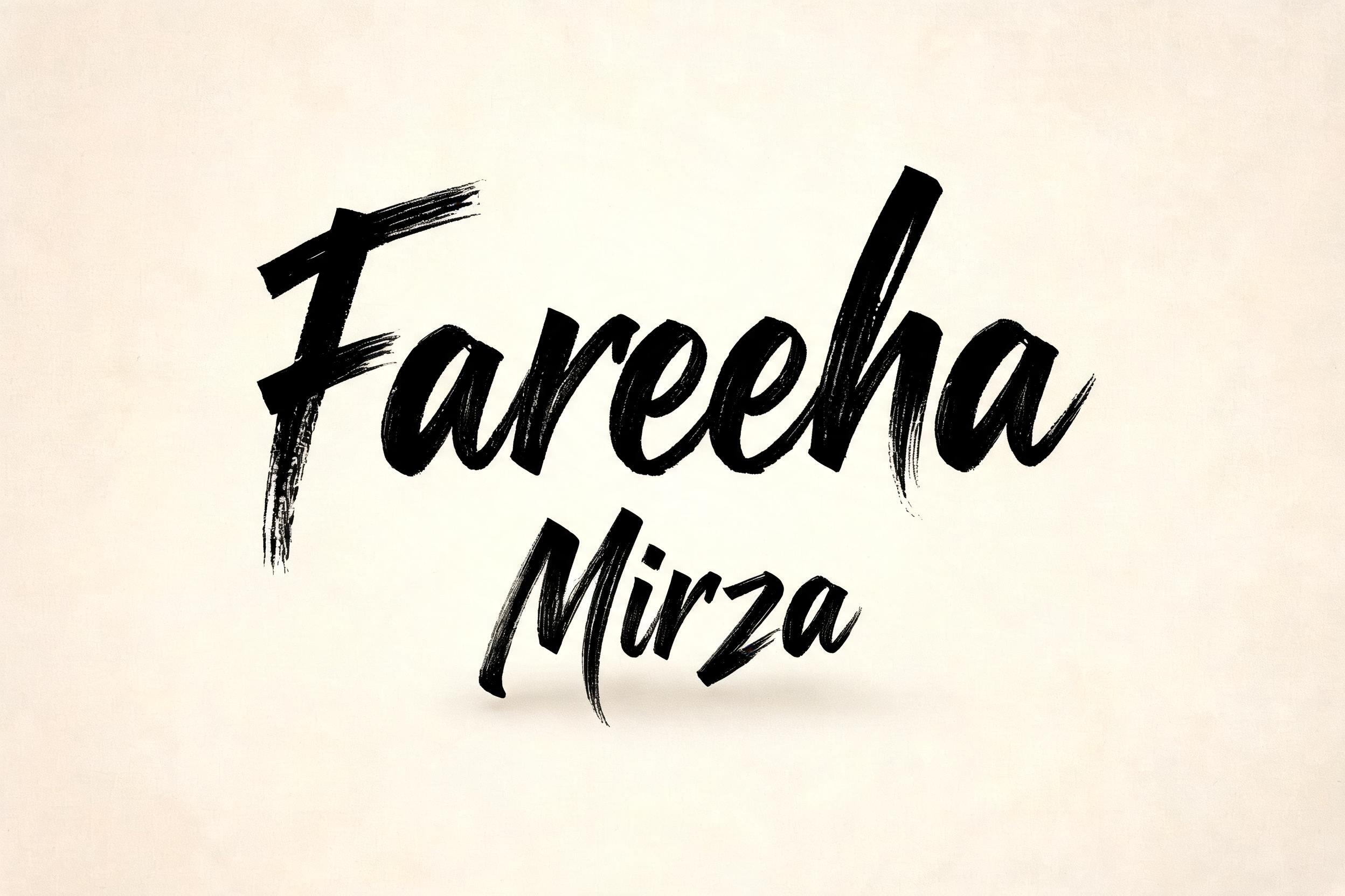
Fareeha Mirza - モダン筆記体 Text Effect


この作品と同じ BytePlus Seedream 5.0 を使用 · 15 クレジット
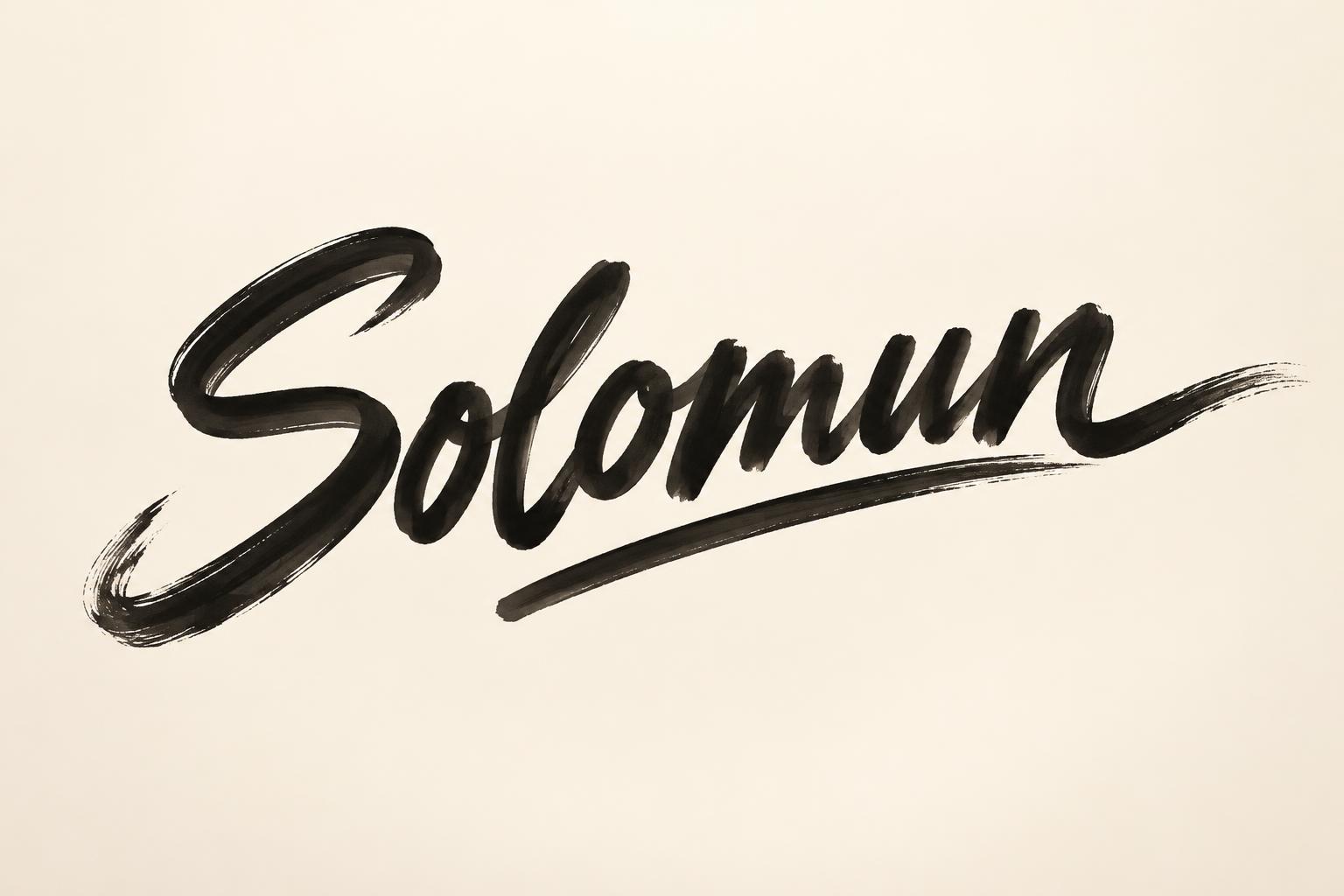
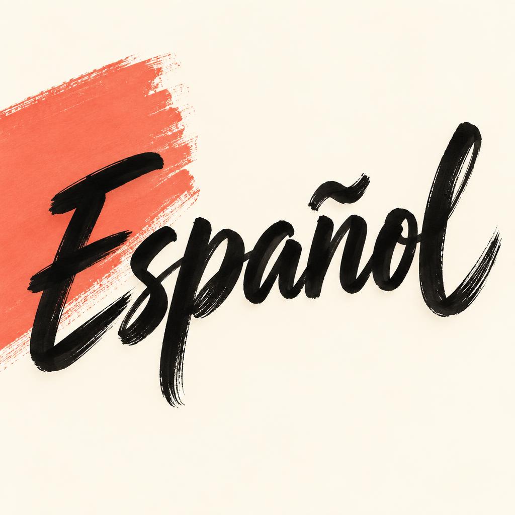

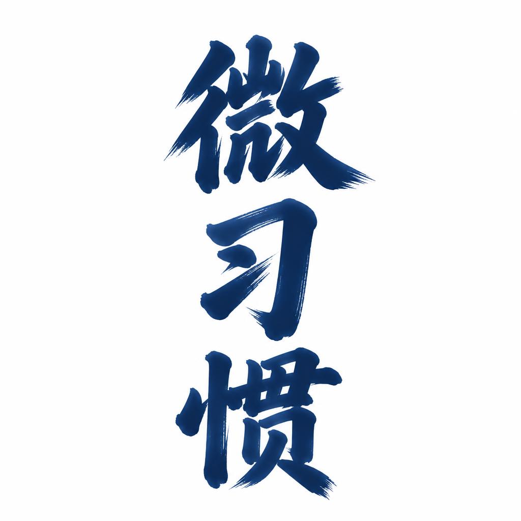
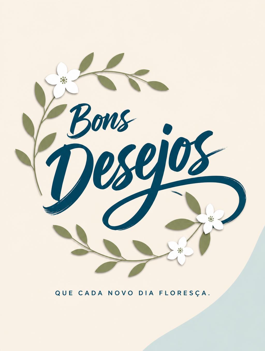
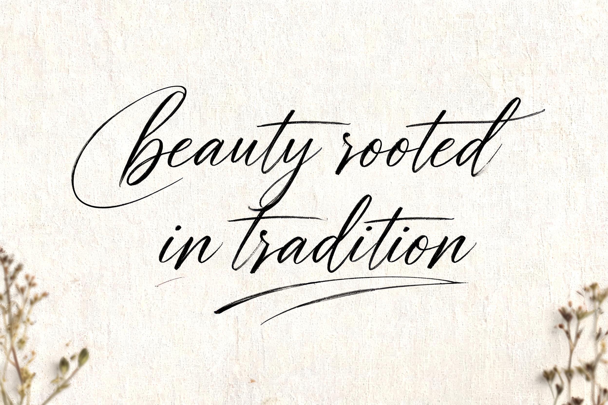
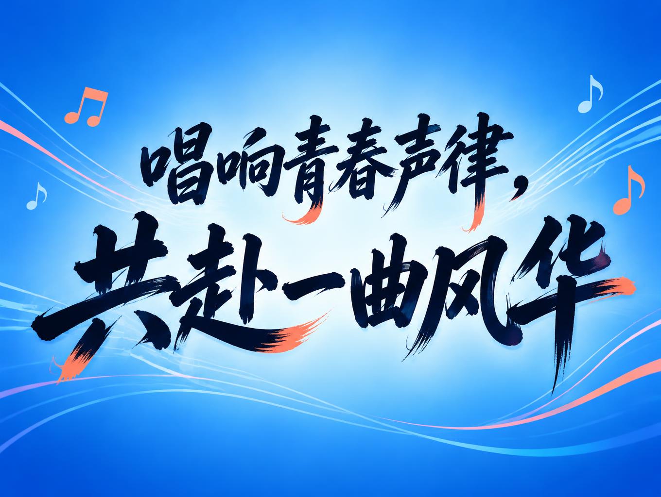
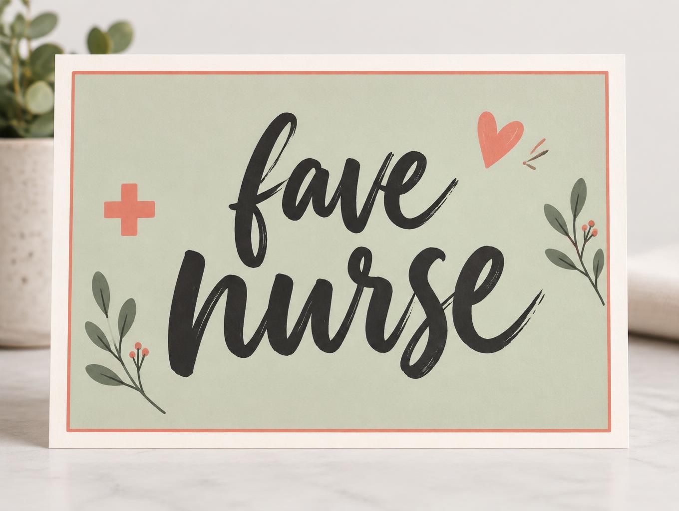
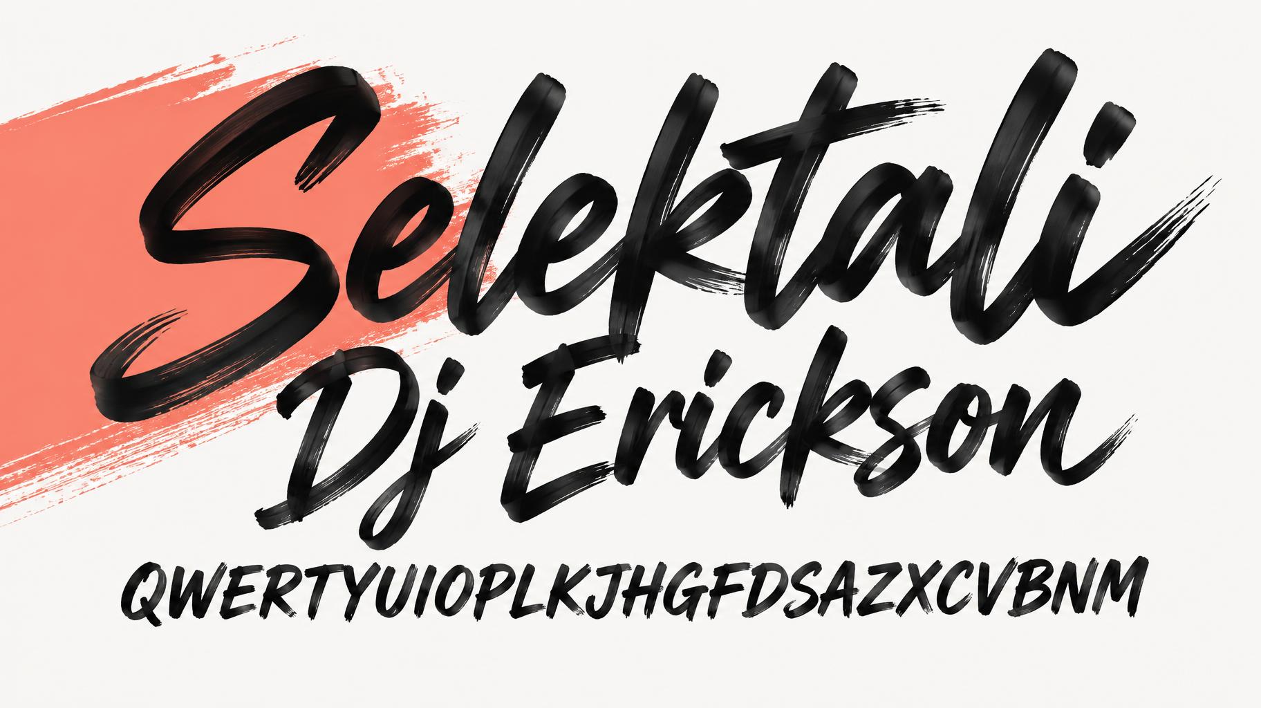
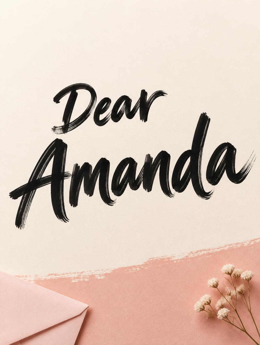
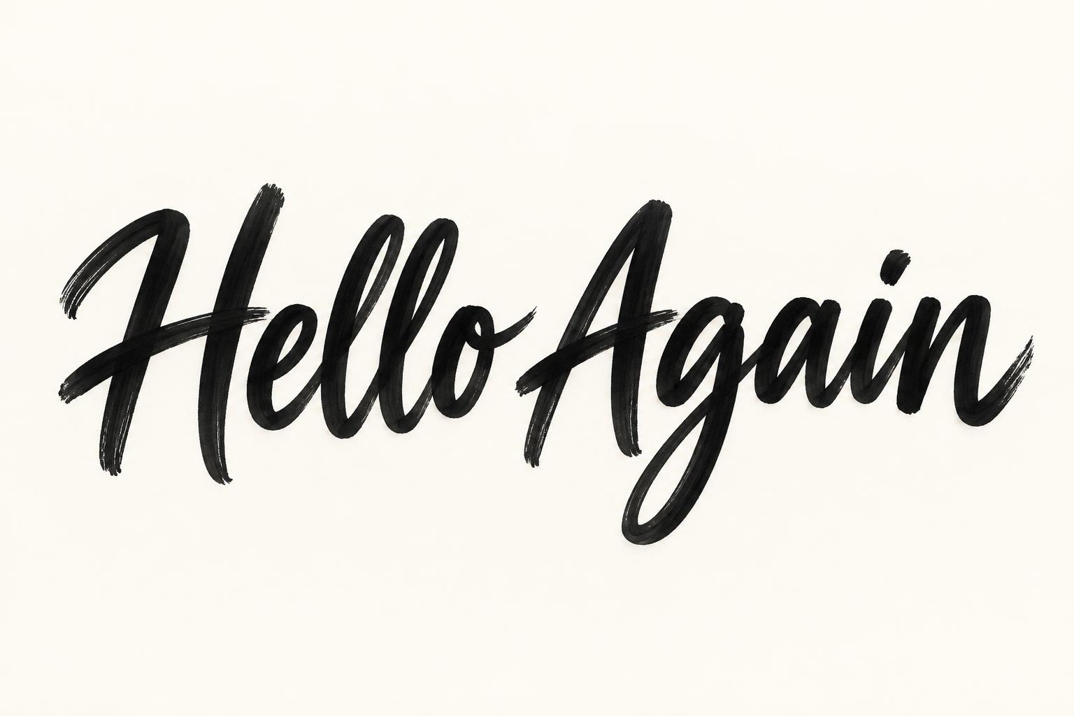
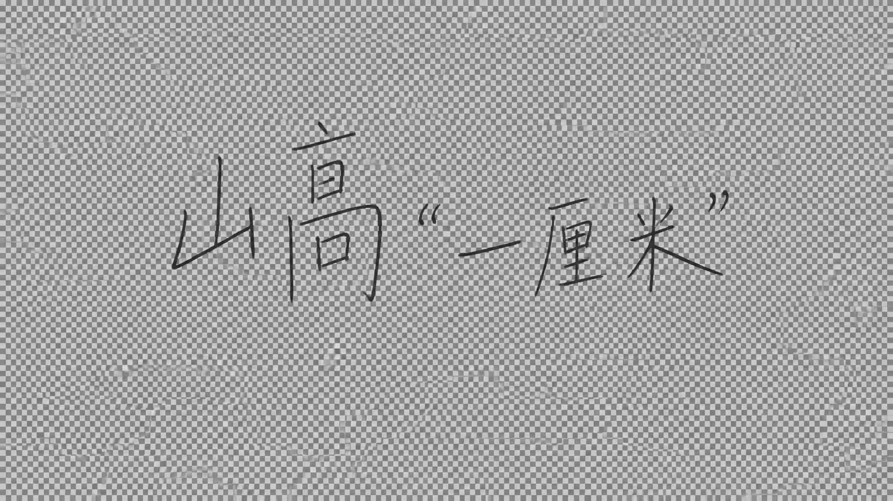
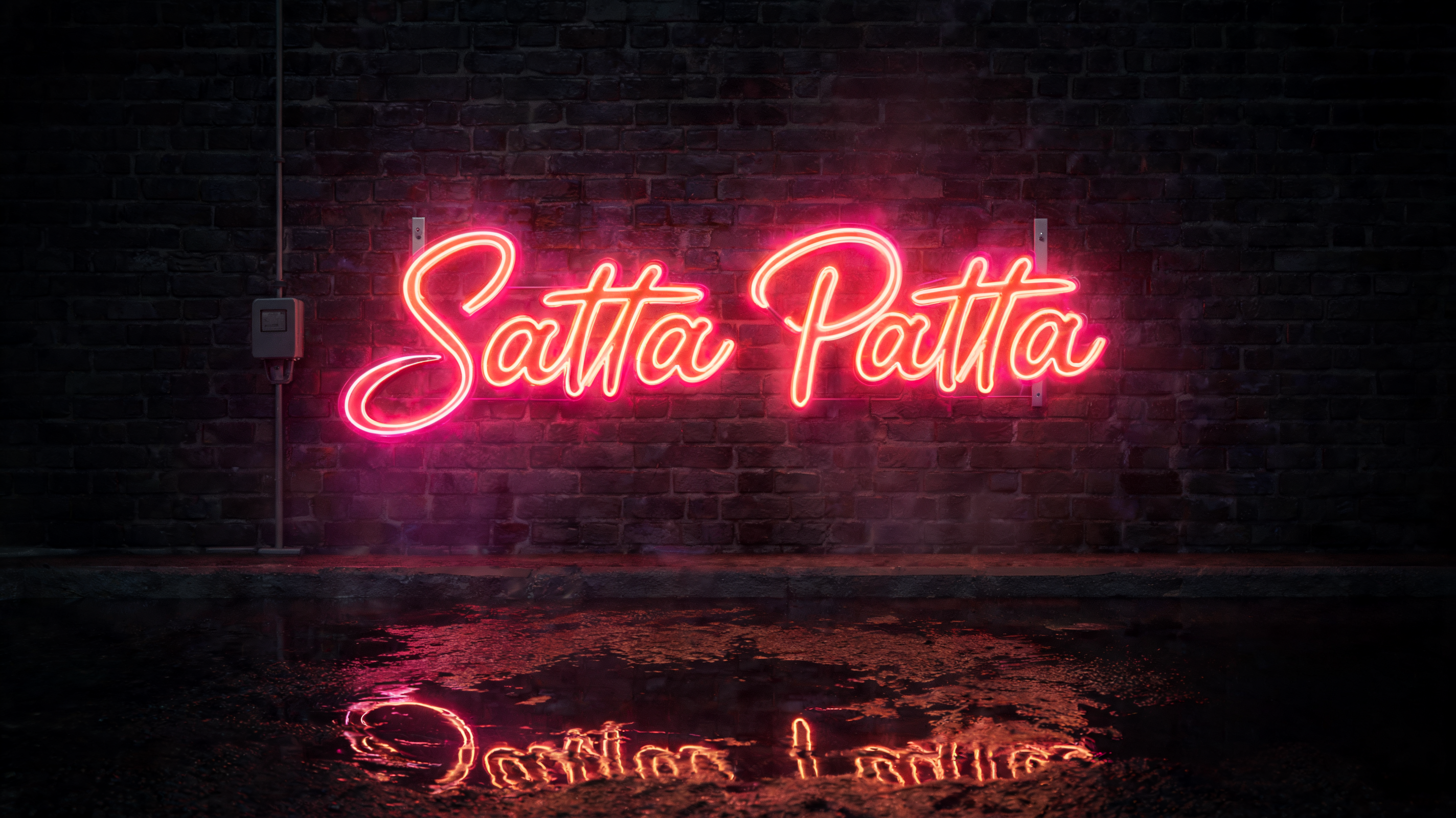
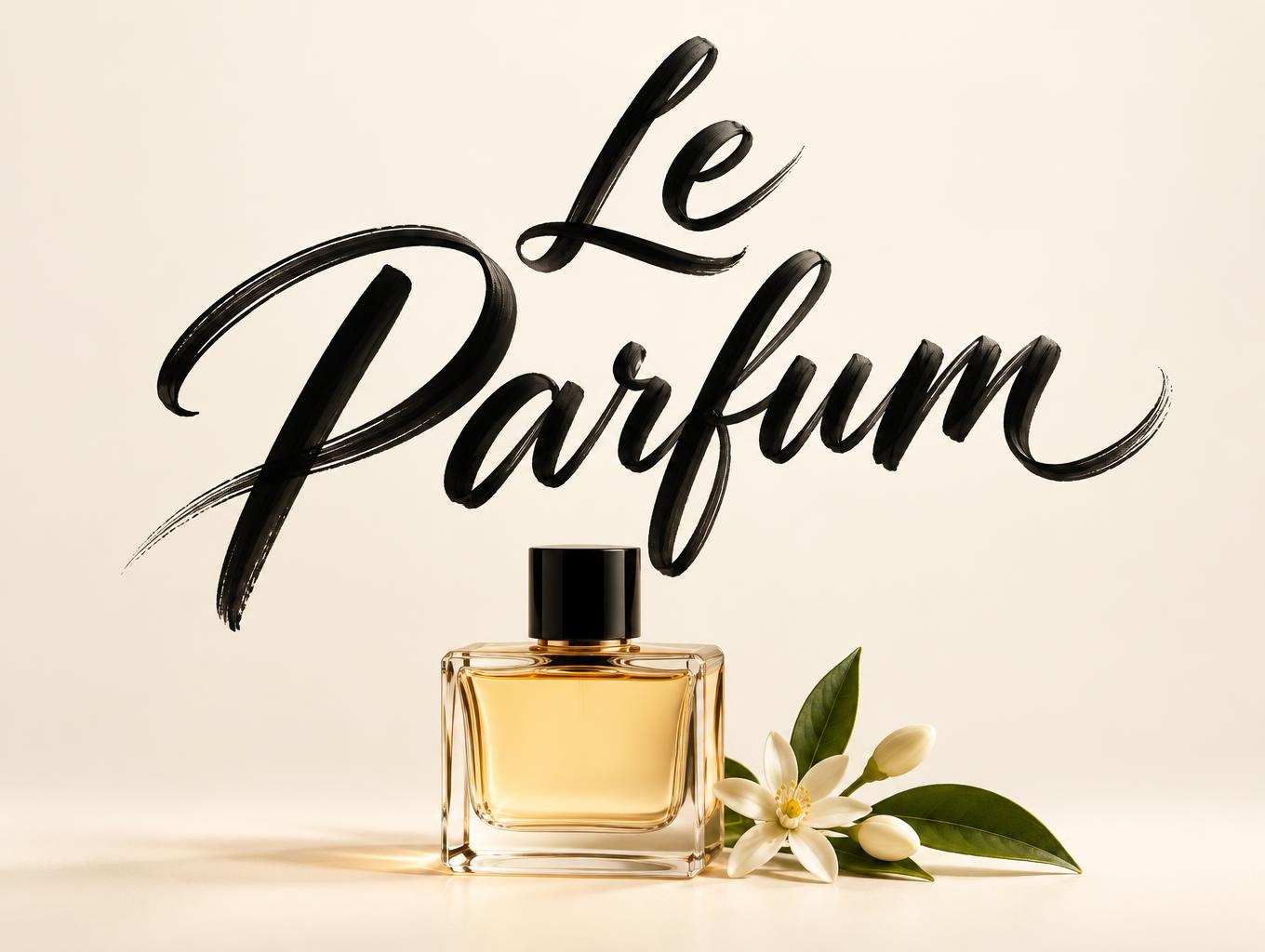
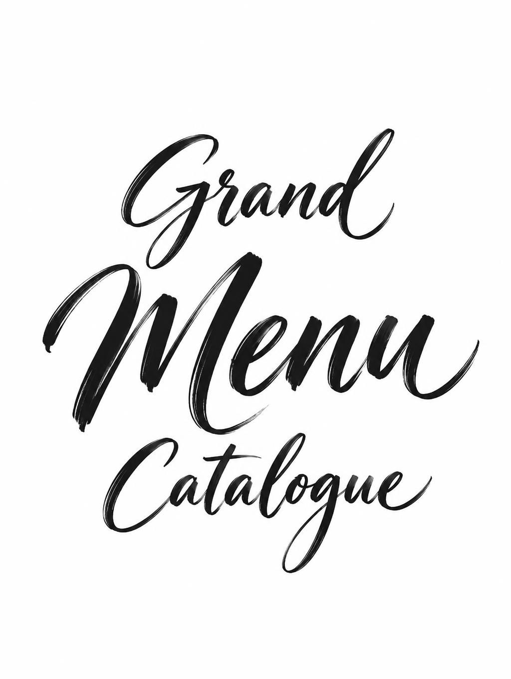
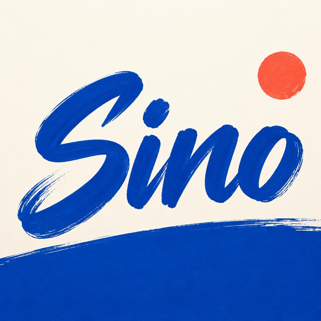
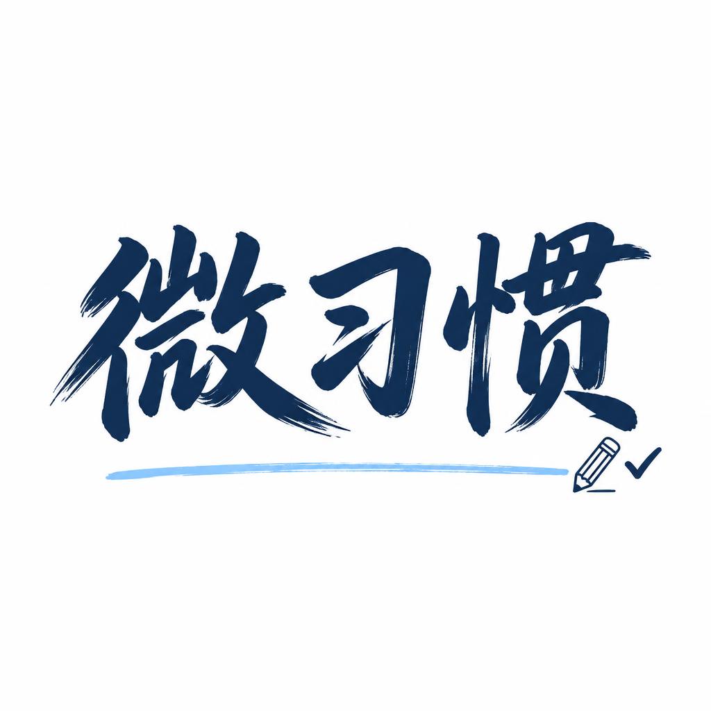
「Fareeha Mirza」は FontVibe AI で作成したモダン筆記体の文字エフェクトです。太く現代的なブラシ筆記体。たっぷり墨を含んだ太い線、上下に弾むベースライン、筆を離す所のかすれ。明るく清潔な地にマットな黒インク。
grounded in bold, contemporary brush-lettering ink. SURFACE / INK: rich, confident ink laid down with a loaded brush — mostly matte with a faint fresh-ink sheen, a subtle brushed texture in the strokes and a touch of dry-brush grain where they lift, energetic and hand-made. GROUND: a clean, modern surface — a bright studio backdrop, a soft neutral, a bold flat colour block, or a contemporary branding/packaging context — with generous space so the lettering pops. LIGHT: clean, even, contemporary studio light — punchy and bright, minimal drama. ATMOSPHERE: current, confident and commercial — the look of modern brand lettering, apparel graphics, packaging and social content. LETTERFORM PRIORITY: when the chosen font carries its own treatment, that font's letterform shapes take priority and own the letters; this style governs only the ink surface, ground and light, never the letter shapes. When no specific material is defined by the font: rich confident brush ink, mostly matte with a subtle brushed texture, on the clean modern ground. COLOR: if the font declares its own color keep it; otherwise the lettering reads as a bold contemporary tone — deep black or a single confident colour — on the clean ground. 'Fareeha Mirza' rendered as bold contemporary brush lettering, the two-word name carrying natural typographic hierarchy — 'Fareeha' as the dominant hero word with generous visual weight, 'Mirza' stepping slightly smaller beneath it in confident rhythm, together filling roughly 55% of the frame as a tight personal-brand lockup. The ink is rich and loaded — matte black with a faint wet-ink sheen at the thickest downstrokes, subtle bristle drag and dry-brush grain where the brush lifts off the surface at the tail of each letterform, every stroke feeling energetic and hand-made. Ground: a clean soft warm-neutral studio backdrop — pale linen or off-white with a barely perceptible warm gradient — generous breathing space framing the lettering on all sides, a whisper of soft drop shadow anchoring the name to the surface. Light: punchy, even, contemporary studio illumination, no harsh drama, the ink reading crisp and confident against the clean field. Atmosphere: modern personal-brand identity — the kind of signature lockup used on portfolios, creative agency headers, apparel labels and social profile graphics. The overall feel is current, hand-crafted and commercially polished.
2026年8月13日に生成 · 2496 × 1664 · JPEG · BytePlus Seedream 5.0 · 制作者がシェア · 商用利用無料(CC BY 4.0)



