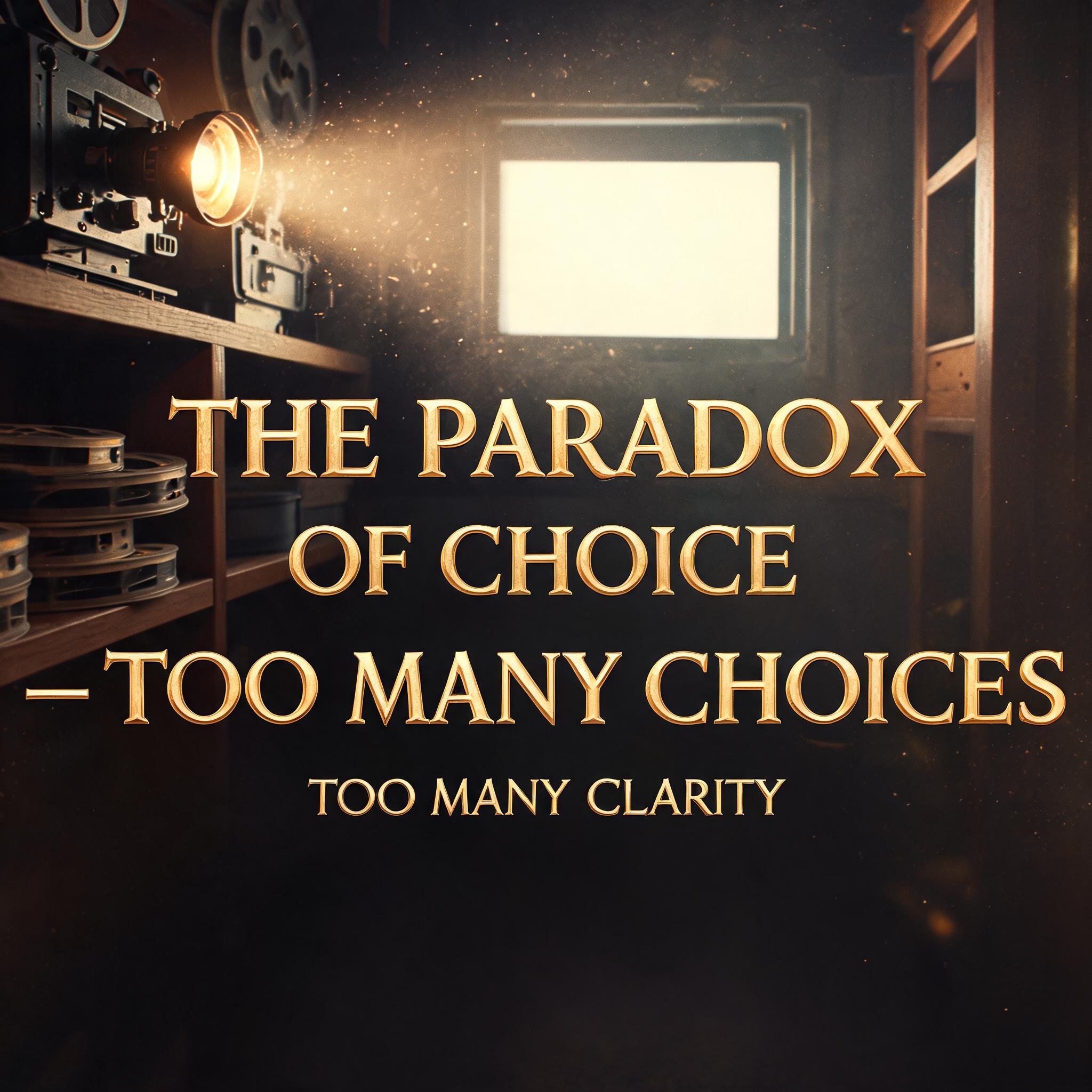
THE PARADOX OF CHOICE — TOO MANY CHOICES TOO MANY CLARITY - シネマティック Text Effect

この作品と同じ BytePlus Seedream 5.0 を使用 · 15 クレジット



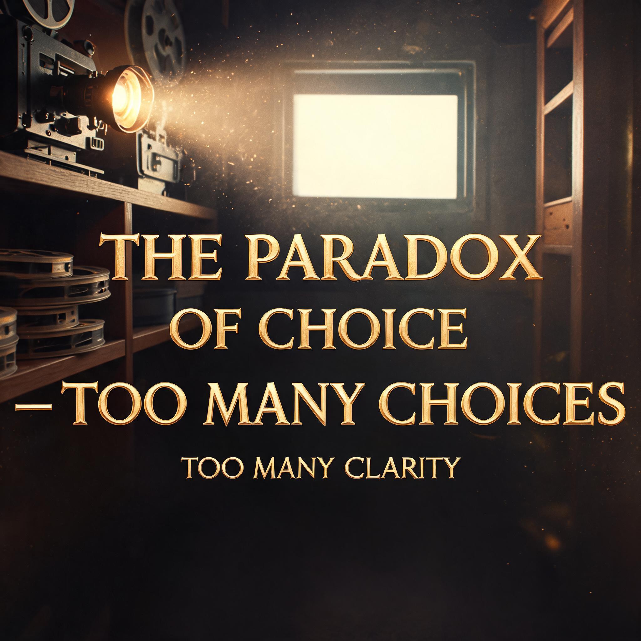
「THE PARADOX OF CHOICE — TOO MANY CHOICES TOO MANY CLARITY」は FontVibe AI で作成したシネマティックの文字エフェクトです。あなたのタイトルをハリウッドのポスターのように。霞の中の逆光の一場面、ティールとオレンジの色調、横長のレンズフレア、フィルムの粒子、下三分の一のタイトル。
Hollywood-grade movie title typography with professional key art quality. Dominant title letterforms with cinematic depth — clear foreground/background separation with atmospheric haze and volumetric light creating dimensional space. Strong directional key light defining letter surface and form. Subtle film grain texture overlay enhancing photographic authenticity. Deep, rich tonal range with controlled shadow depth. Scene and material vocabulary driven by the text's emotional register — heroic calls for epic scale and warm golden light, dark themes call for cold underlighting and shadow, futuristic calls for clean precision and cool tones. Professional cinematic color grading. High-contrast, photorealistic rendering. Square four-line warm cinematic quote composition: "THE PARADOX" upper line at 62% width, bold serif with golden edge light. "OF CHOICE" secondary upper at 54% width, matching weight. "— TOO MANY CHOICES" dominant center at 84% width, maximum warmth and weight. "TOO MANY CLARITY" small italic base at 74% width, intimate release. Background: a vintage cinema projection booth — the projection beam cutting through thick dust particles from upper left, the beam catching on floating motes of light, the projector's warm amber lamp glow visible at the edge of frame, film reels stacked on a wooden shelf, the distant screen a rectangle of white light glimpsed through a small portal window. The birthplace of stories. Warm, nostalgic, cinematic love letter.
2026年8月15日に生成 · 2048 × 2048 · JPEG · BytePlus Seedream 5.0 · 制作者がシェア · 商用利用無料(CC BY 4.0)