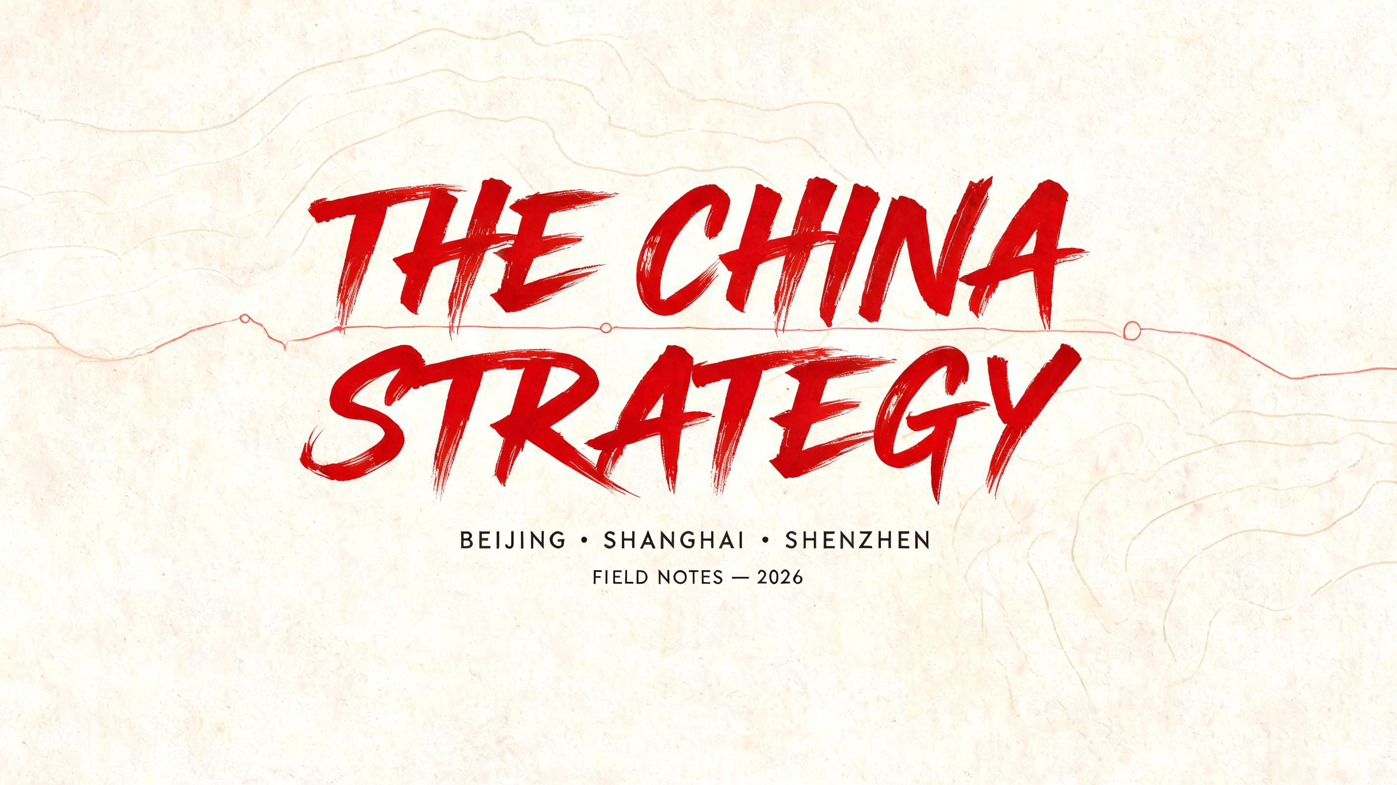
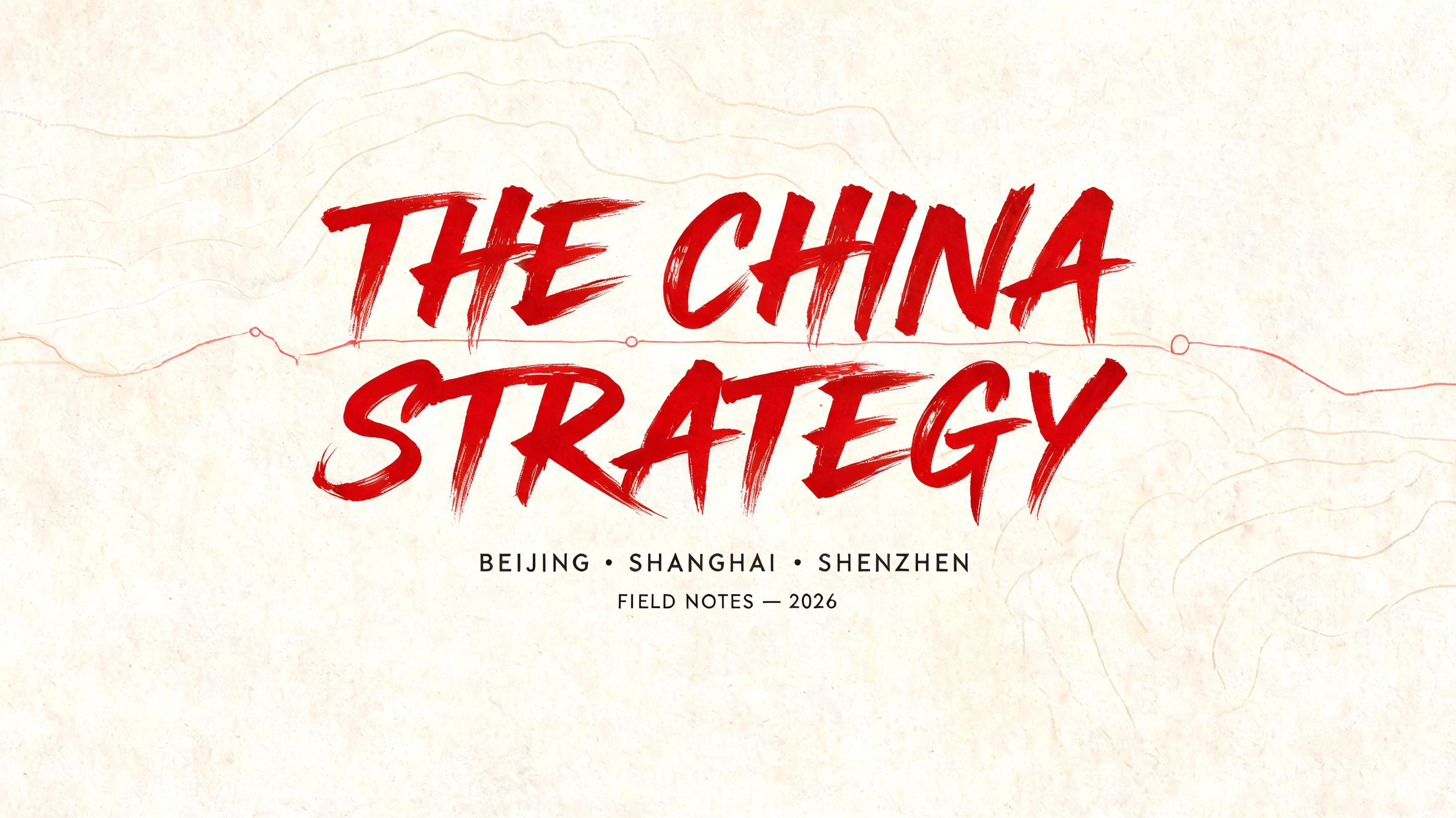
THE CHINA STRATEGY BEIJING · SHANGHAI · SHENZHEN FIELD NOTES — 2026 - ブラッシュスクリプト Text Effect


この作品と同じ BytePlus Seedream 5.0 を使用 · 15 クレジット
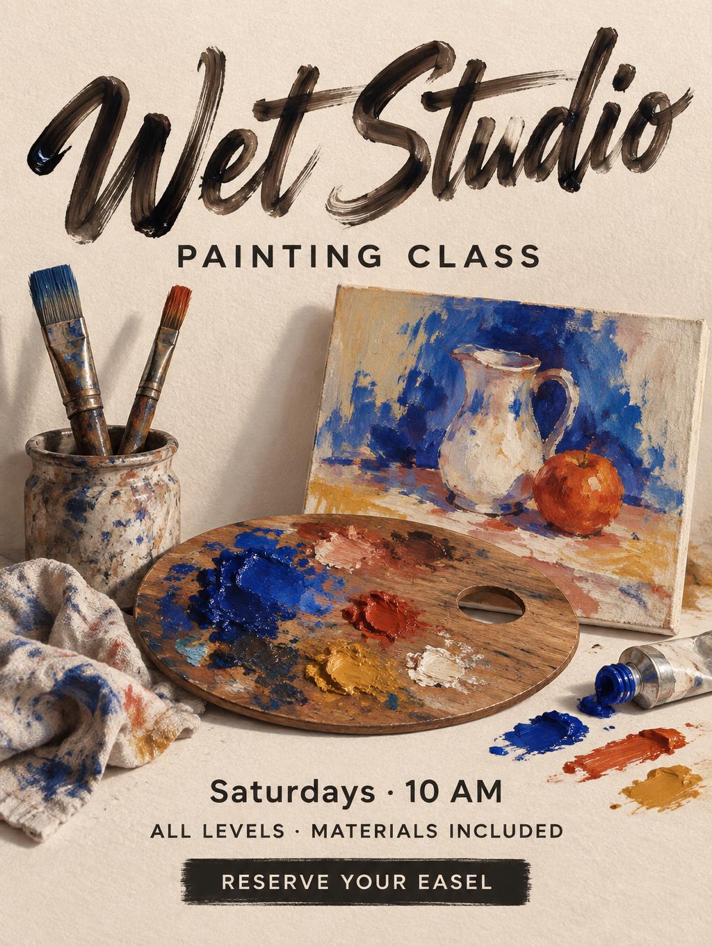
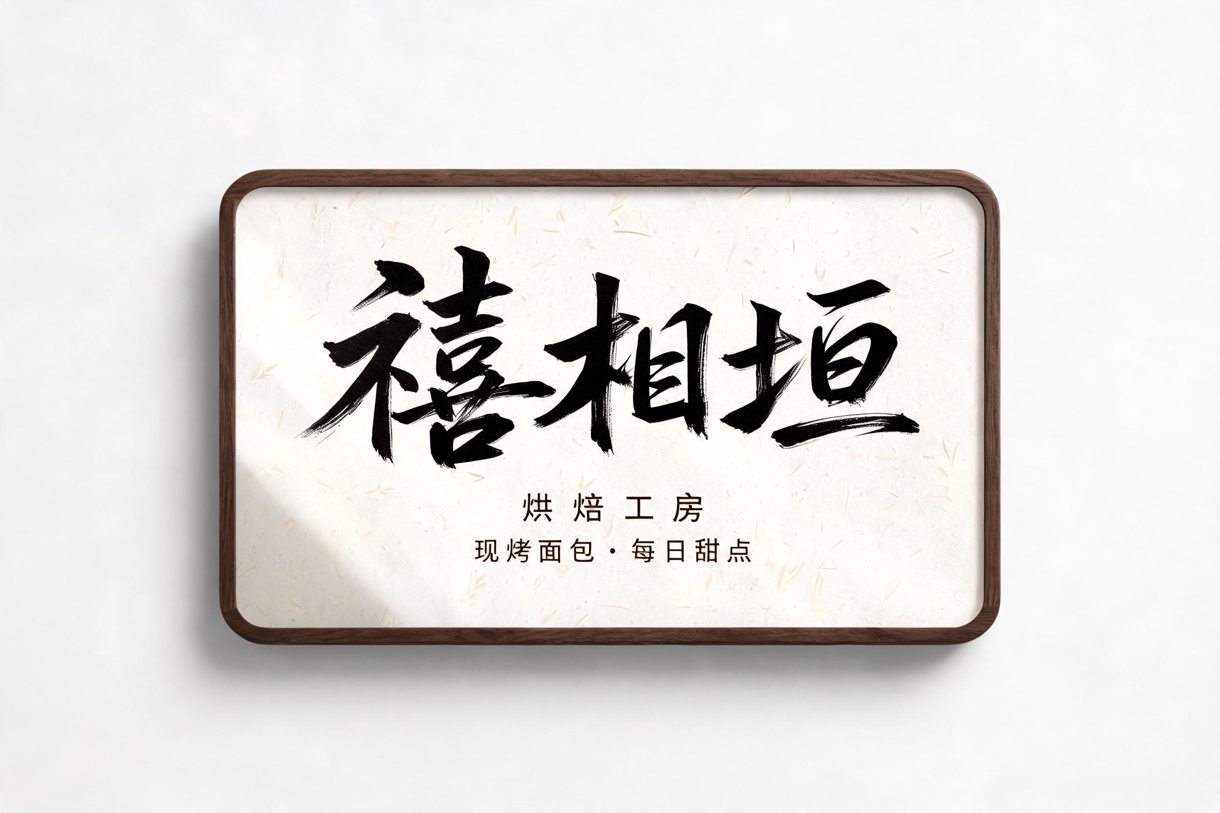


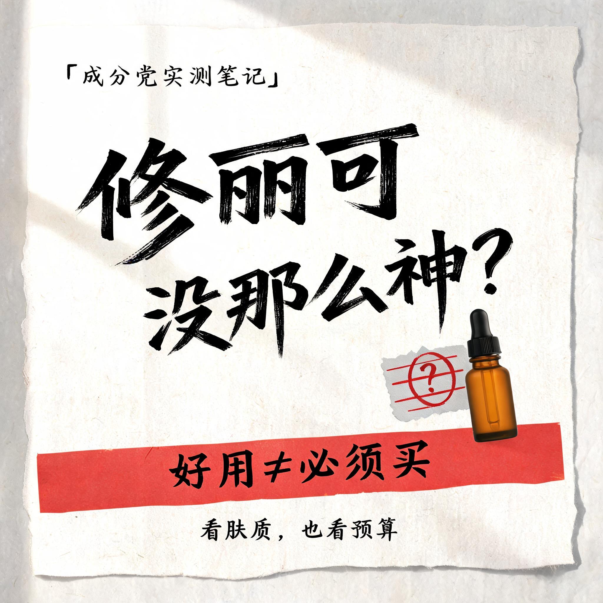





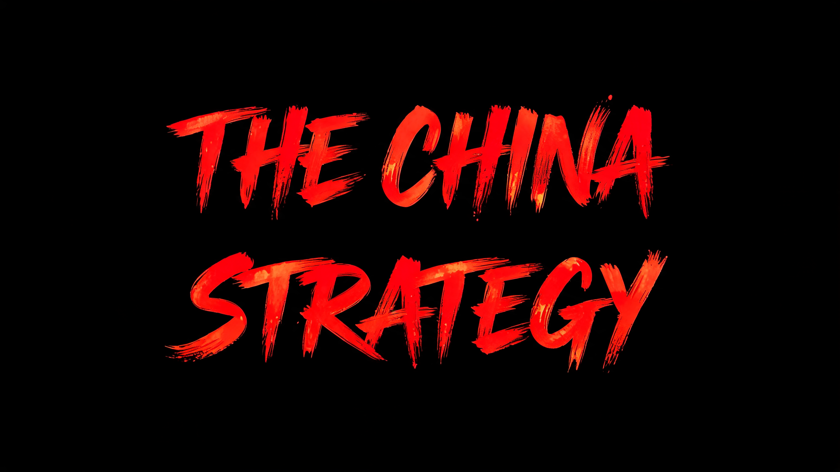
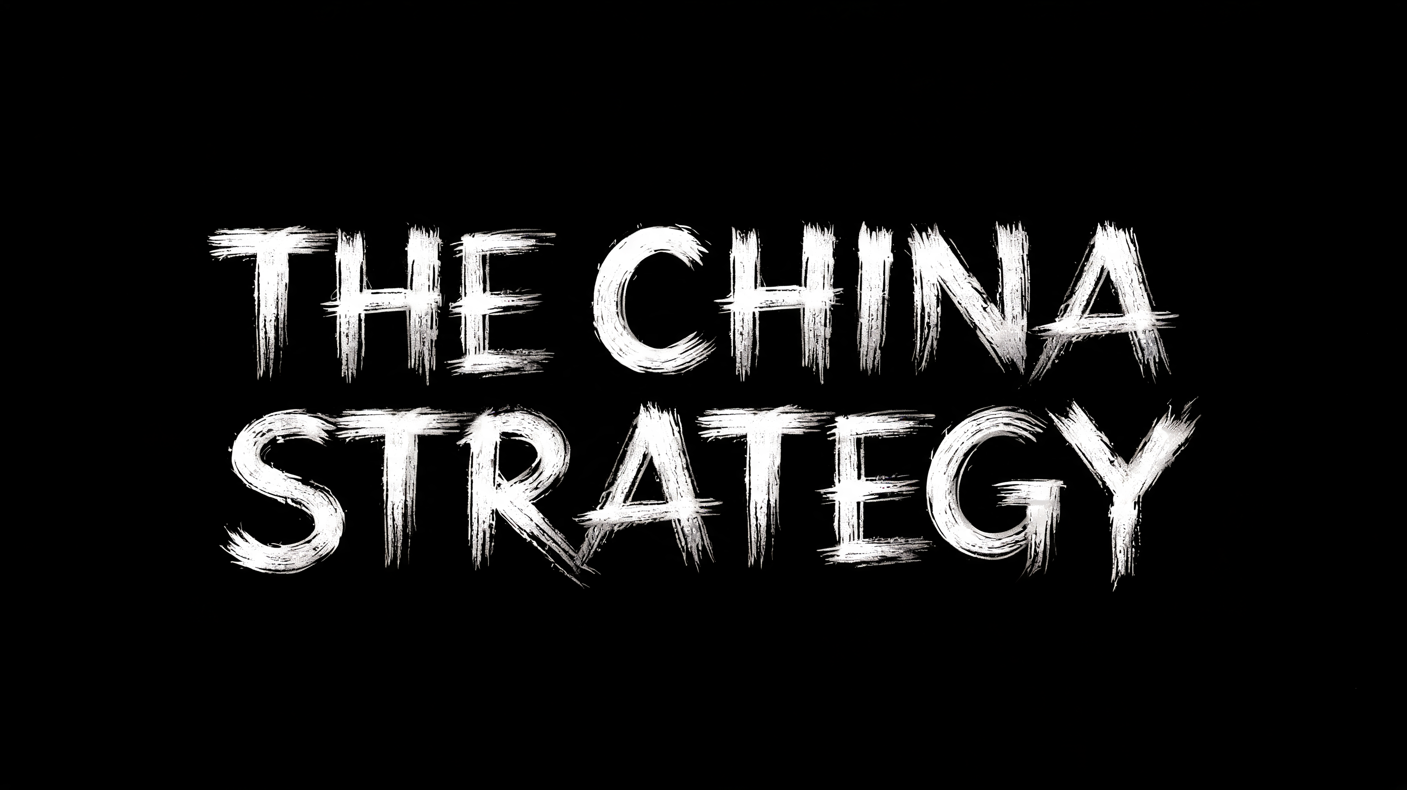
“THE CHINA STRATEGY BEIJING · SHANGHAI · SHENZHEN FIELD NOTES — 2026” is a Brush Stroke text effect FontVibe AIで作成した文字エフェクト. 文字がつながる西洋の筆記体。筆圧の強い太い下ろし、髪の毛ほど細い上げ、筆の毛の筋とかすれを、温かみのある黒インクで質感のある紙に.
Create a wide 16:9 travel-journal title card, designed as a finished editorial opening frame. Warm ivory cotton-rag paper fills the canvas, with faint topographic contour lines and a sparse, low-contrast red route line travelling from left to right behind the typography. Center the main title in two stacked lines with identical cap height, identical visual width, and identical scale: “THE CHINA” on the upper line, “STRATEGY” directly beneath. Render every headline letter as custom all-caps Western brush calligraphy: a consistent slight rightward lean, dramatic 6:1 pressure contrast, broad swollen downstrokes, near-hairline upstrokes and connectors, natural entry flicks and long feathered exit trails. The letters are made of saturated vermilion-red wet ink, with authentic brush bristle striations, darker pooling at stroke intersections, tiny irregular edge bleed into the paper fibres, and narrow specular wet highlights. Directional side light from upper left turns the broad brush planes into luminous red faces while hairline strokes stay deep crimson. Keep the two headline lines perfectly readable and equally sized; no third headline line. At the lower center, set “BEIJING · SHANGHAI · SHENZHEN” in compact widely tracked small caps, dark warm charcoal. Below it, set “FIELD NOTES — 2026” in smaller charcoal sans-serif. Use generous side margins, a restrained documentary travel-editorial layout, and let the red script occupy 62% of canvas height. Subtle paper shadow beneath dense ink strokes, tactile fibre detail, clean negative space, precise typography, no landmarks, no flags, no maps, no extra words.
2026年8月30日に生成 · 2848 × 1600 · JPEG · BytePlus Seedream 5.0 · 制作者がシェア · 商用利用無料(CC BY 4.0)