

FIRST EDITION - ヴィンテージ Text Effect

この作品と同じ BytePlus Seedream 5.0 を使用 · 15 クレジット








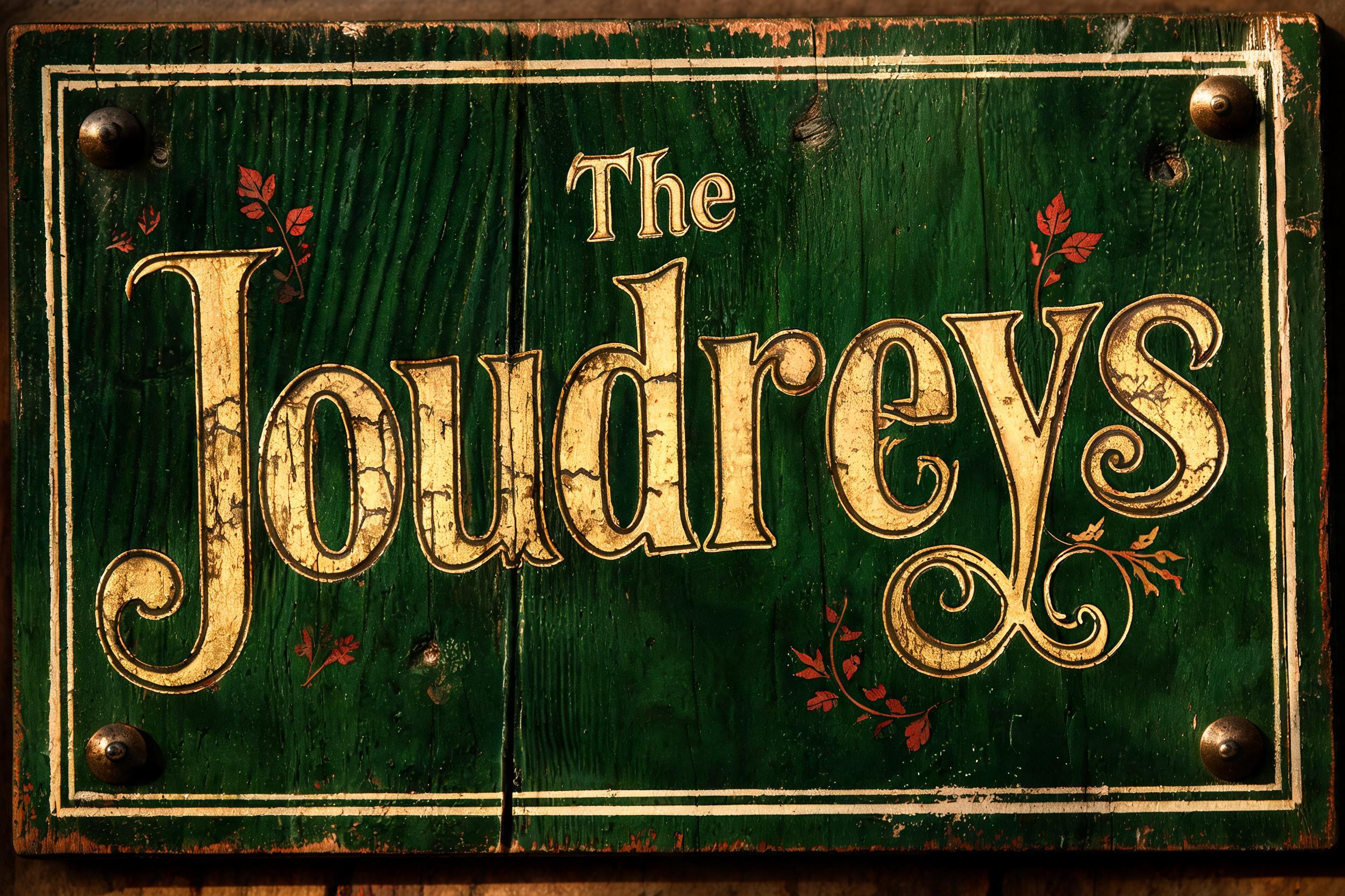
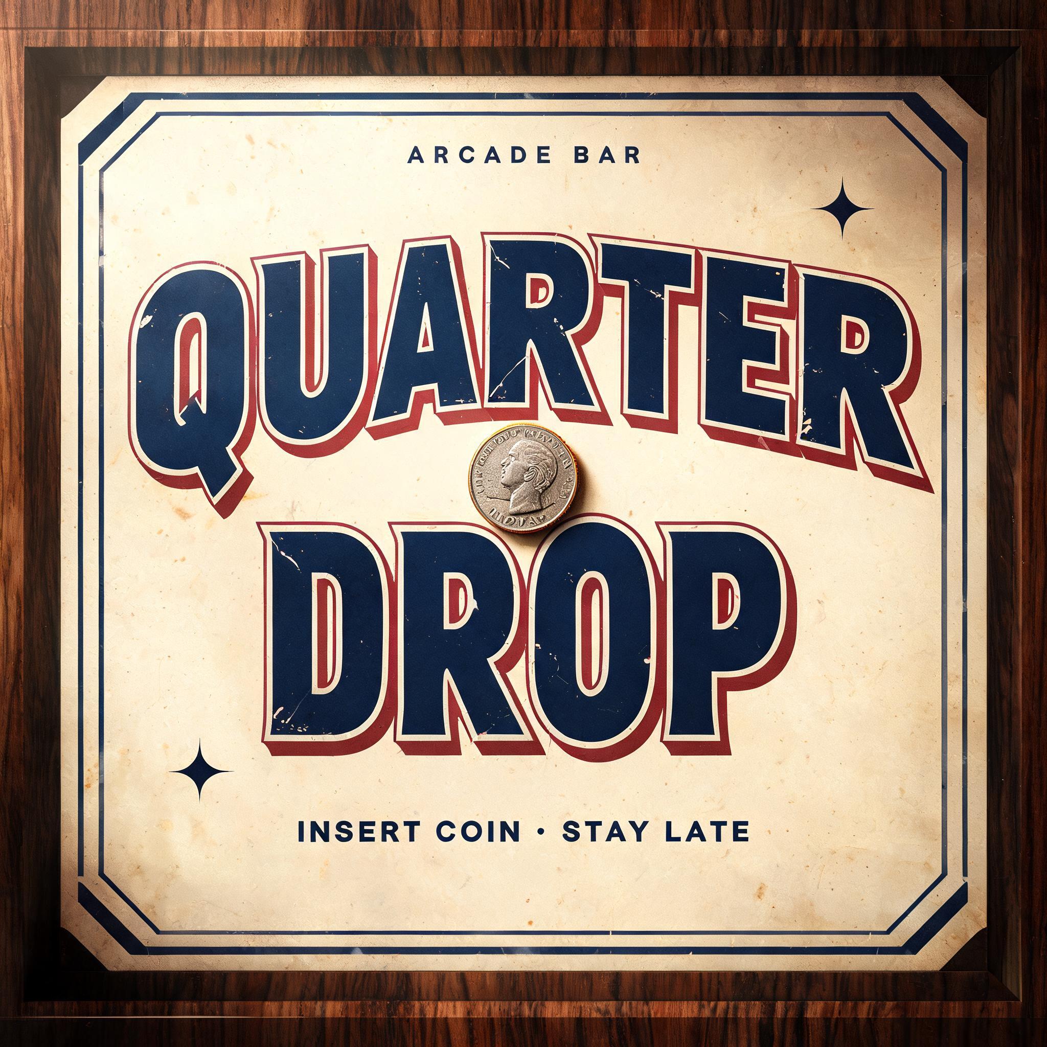

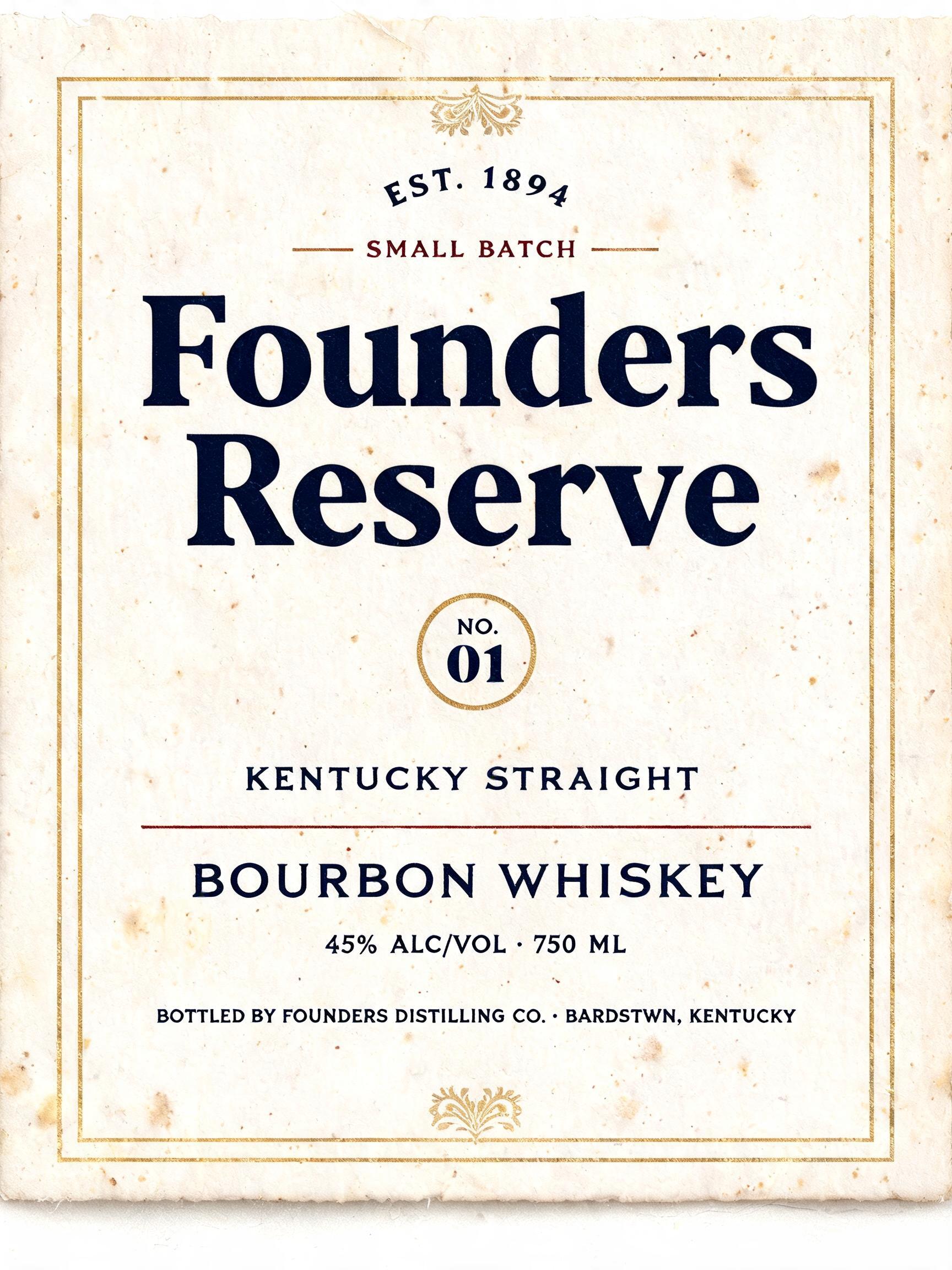
「FIRST EDITION」は FontVibe AI で作成したヴィンテージの文字エフェクトです。インクがわずかにかすれる活版でクリーム色のコットンカードに押し込んだセリフ体大文字。古い印刷機の版盤に置かれ、金属活字が散らばります。
Create a square 1:1 isolated vintage edition stamp mark, deliberately minimal, centered on an aged warm-cream cotton-paper field. Render only the exact wording “FIRST” and “EDITION”, in two centered lines, with no extra copy. Build a double-rule rectangular rubber-stamp frame with softly rounded worn corners, occupying 76% of the canvas width and 52% of the canvas height; leave broad quiet paper margins around it. Typography: custom narrow uppercase antique book-lettering, moderately heavy vertical stems, restrained thick-thin contrast, squared serif terminals, close but breathable tracking. “FIRST” is the upper line, slightly smaller; “EDITION” is larger and dominant below. The letters are pressed in faded deep-navy rubber ink: irregular ink coverage, dry broken edges, minute paper fibres showing through, a few darker pooled spots at serif terminals, subtle nonuniform baseline and repeated-letter variation. The ink sits as a shallow compressed impression in the paper, with a fine debossed shadow along the lower-right edges. Keep every letter crisp and readable. Surface and lighting: warm cream handmade cotton paper with visible laid fibres, sparse pale-brown foxing specks, a very faint warm-gray paper shadow beneath the stamp impression, soft amber light from upper left, gentle falloff, no objects, no wax seal, no digital effects, no neon, no modern glossy texture. Flat overhead archival print photography, high-detail macro paper texture, restrained muted palette. The finished image must read as one authentic pressed vintage ink mark.
用途: スタンプフォントジェネレーター
2026年9月13日に生成 · 2048 × 2048 · JPEG · BytePlus Seedream 5.0 · レイアウト:Centered Stamp Field · 制作者がシェア · 商用利用無料(CC BY 4.0)



