The MSAE - 3D 太字 Text Effect


この作品と同じ BytePlus Seedream 5.0 を使用 · 15 クレジット

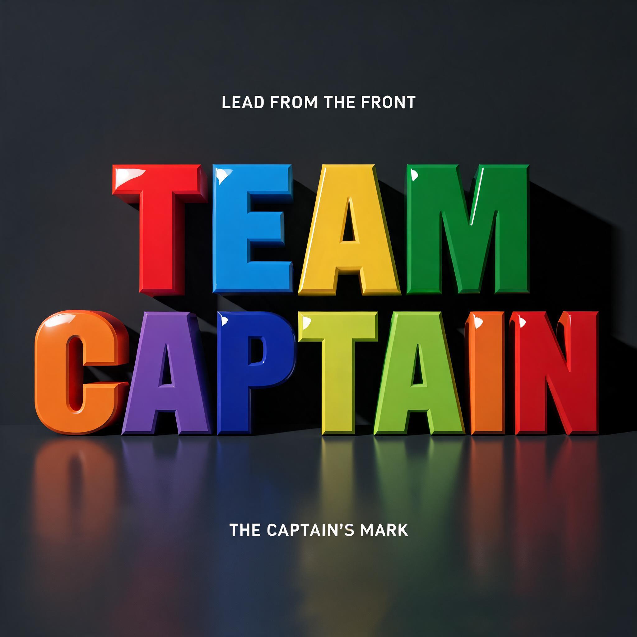
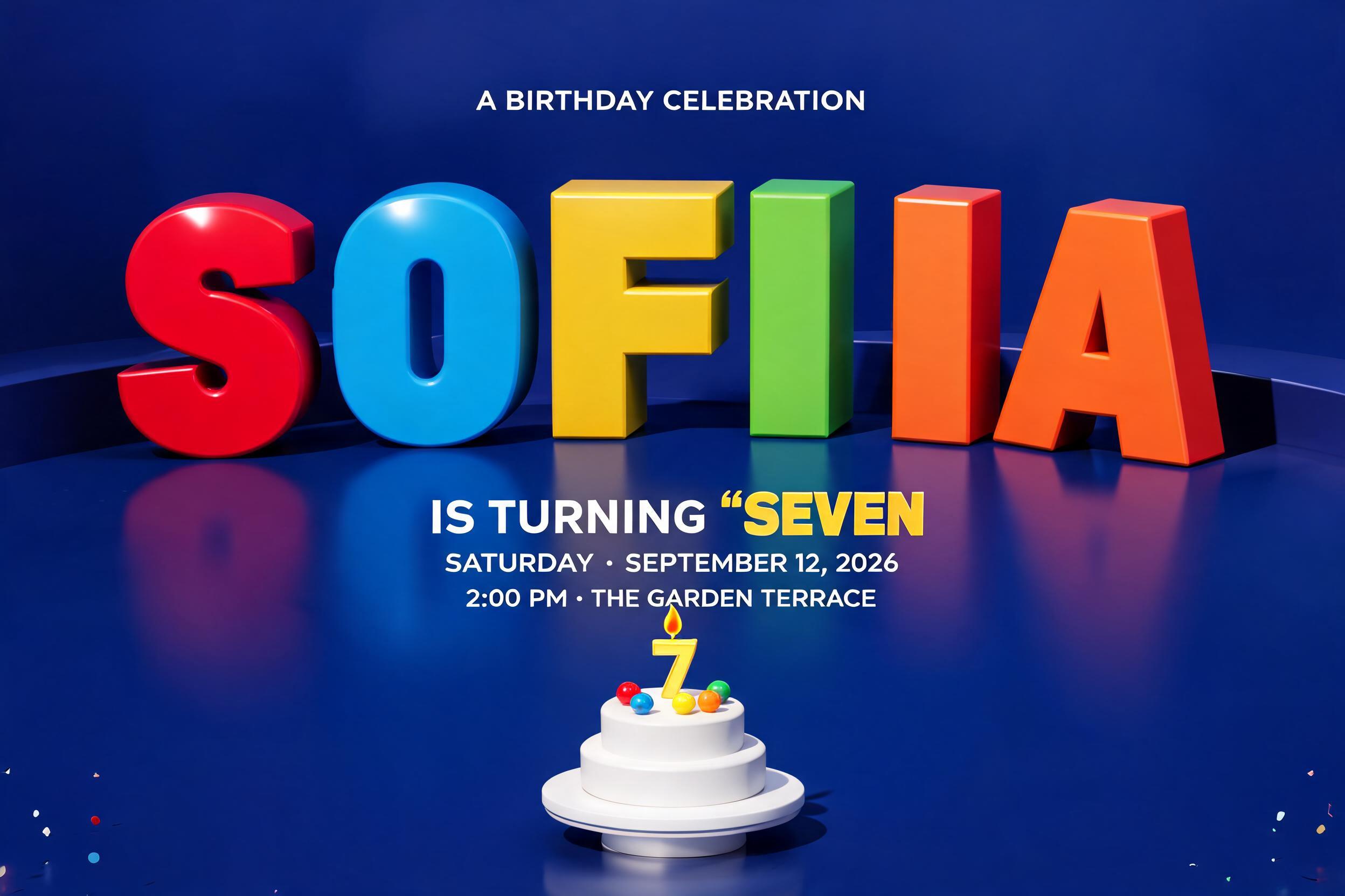
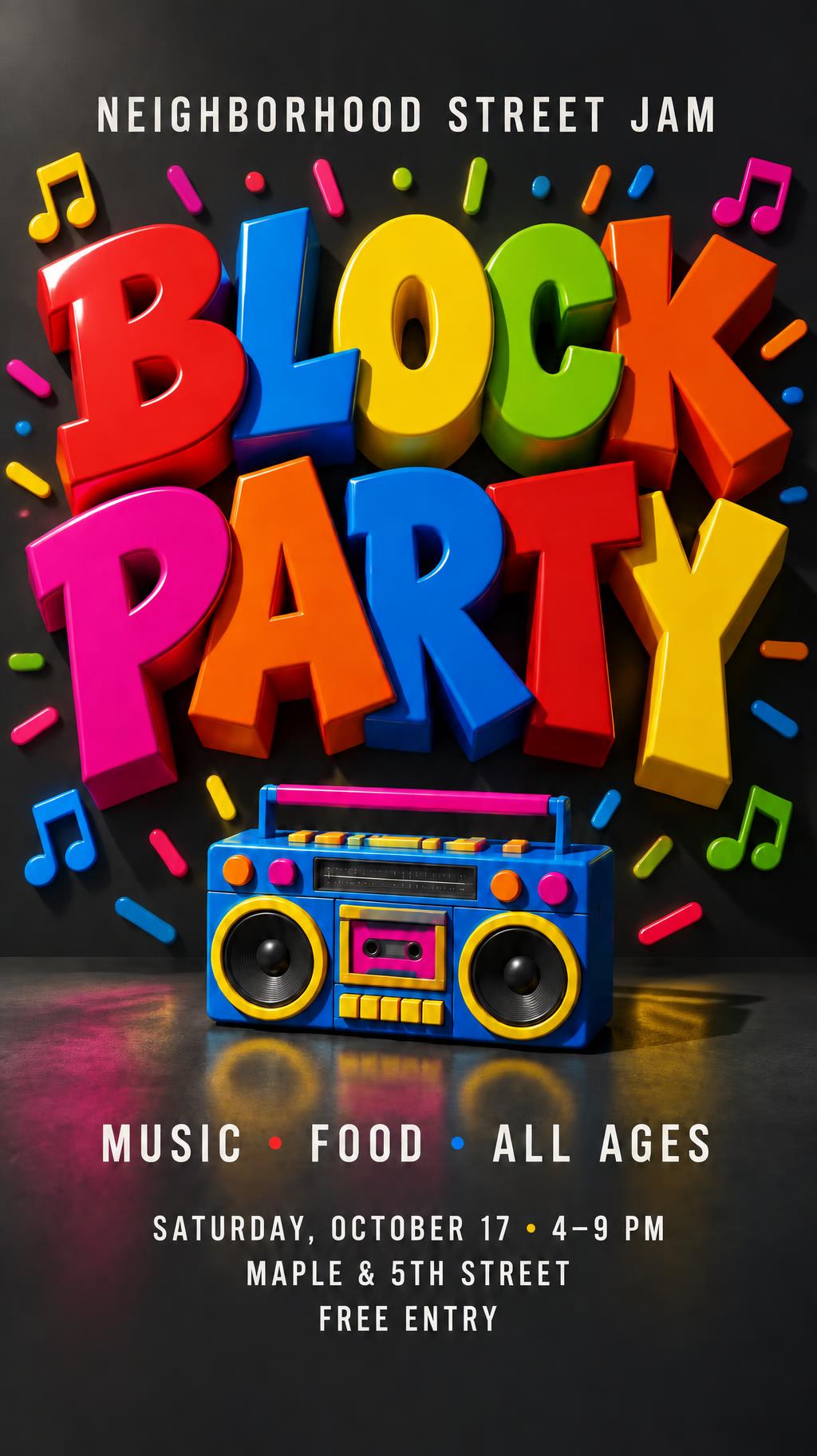
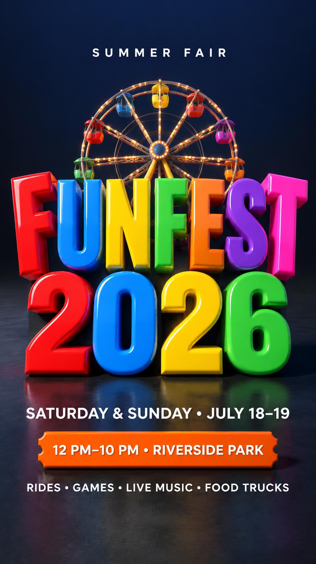
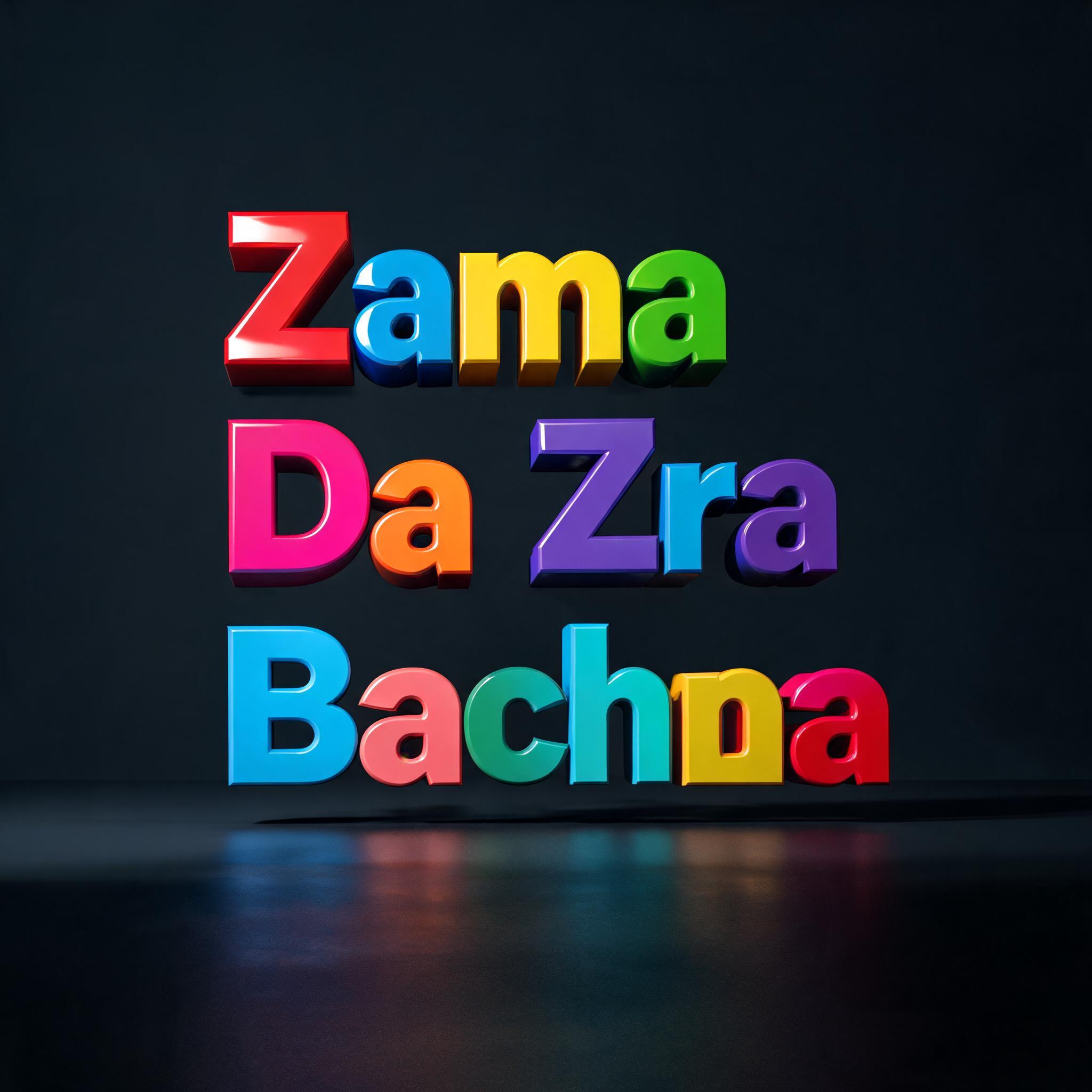
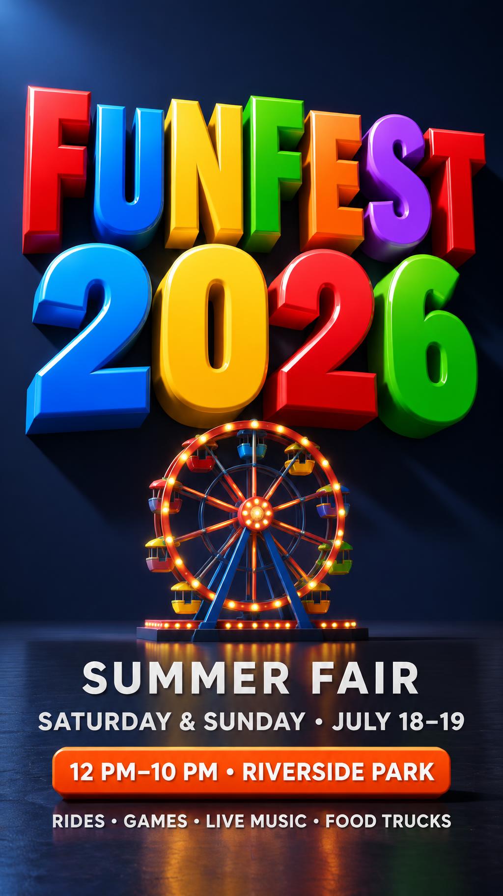
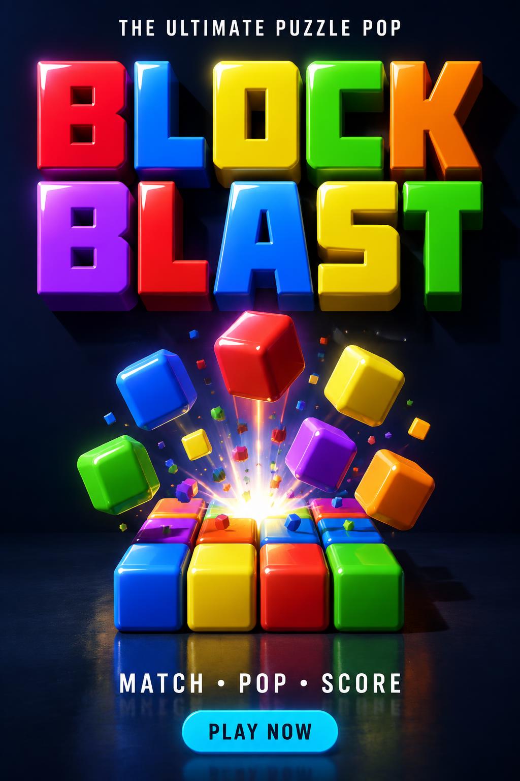
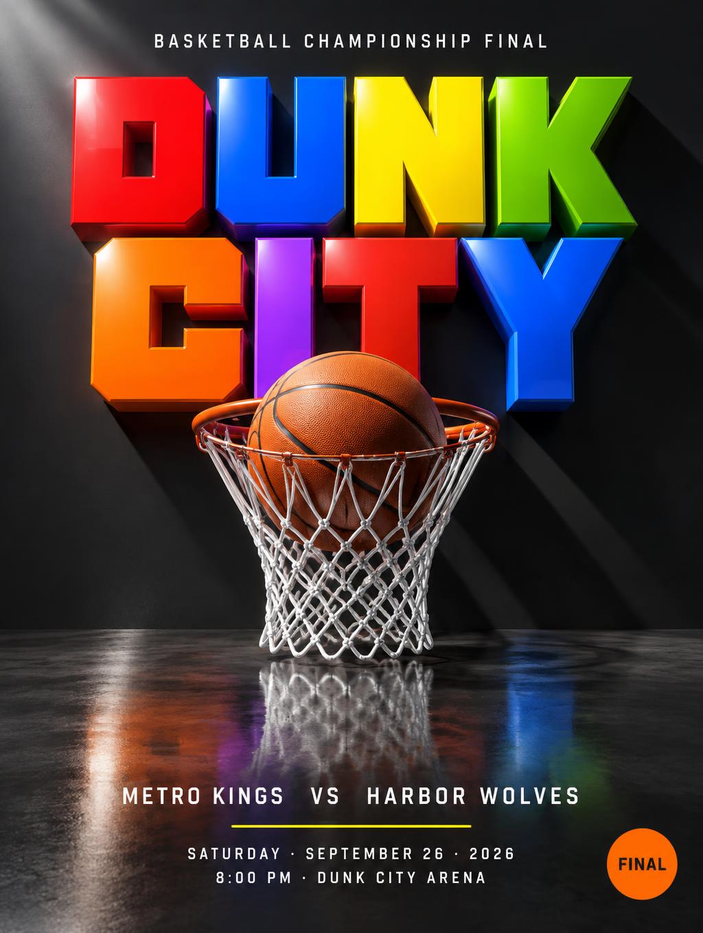

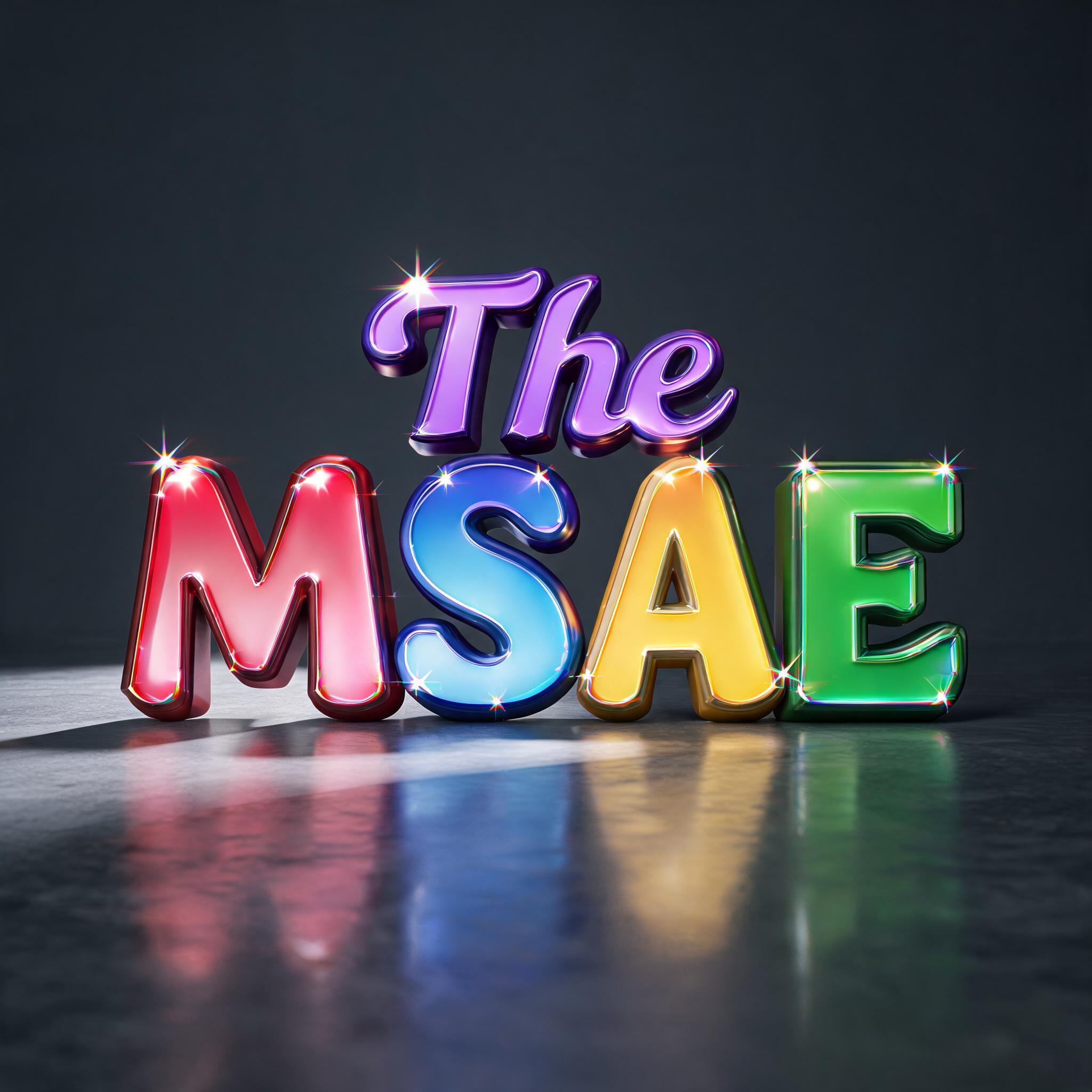
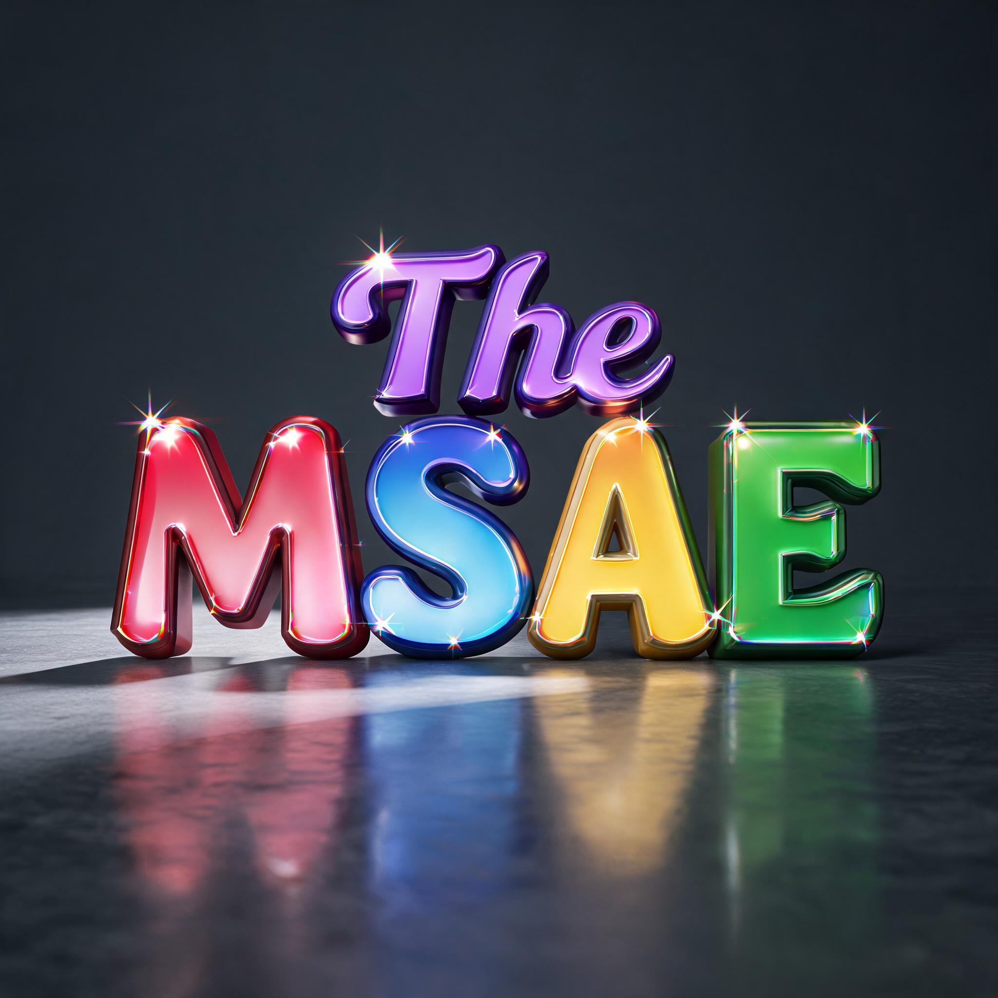
“The MSAE” is a 3d Bold text effect FontVibe AIで作成した文字エフェクト. 深く押し出された極太のブロック体大文字。一文字ずつ艶のあるキャンディカラーで、上からの光がハイライトを丸い角に走らせ、床に色の映り込みが広がります.
Massive chunky 3D block letters with heavyweight extruded presence — thick uniform extrusion depth of 50–60% of letter height. Front face finished in ultra-glossy lacquer, catching directional key light with natural specular reflections that graduate from bright highlight to deep saturated color — the surface quality of hard candy coating or high-gloss toy paint. Side extrusion planes in a noticeably darker shade of the same hue, creating crisp face-to-depth contrast that reads immediately as three-dimensional volume. Adjacent letters each carry a different vivid saturated color, maximizing chromatic contrast across the word — no two adjacent letters share the same hue family. Hard sharp corner edges where face meets extrusion, no beveling. Long dramatic cast shadows at consistent 45-degree angle, shadow depth approximately 40–50% of letter height. Strong directional key light from upper left (sunlight). Bold, high-contrast, maximum visual impact. LETTERFORM PRIORITY: when the chosen font carries its own treatment, that font's letterform shapes take priority and own the letters; this style governs the glossy 3D extrusion, the directional lighting and the multi-color scheme. FALLBACK MATERIAL: if the font carries no material of its own, render the letters as thick glossy extruded 3D blocks with hard candy-lacquer faces and darker extrusion sides. COLOR PRIORITY: if the font specifies its own colors, keep them; otherwise give each adjacent letter a different vivid saturated hue. Render the exact text “The MSAE” as a glossy 3D title sculpture, preserving every character exactly. Give “MSAE” dominant visual weight, with “The” as a smaller companion element. Apply strictly different vivid saturated hue families to every adjacent letter in “MSAE”: cherry red, electric blue, sunshine yellow, lime green; assign “The” a restrained saturated violet treatment that remains clearly distinct from neighboring colors. Coat each front face in ultra-glossy hard-candy lacquer, with crisp white specular streaks, smooth highlight gradients, and small reflected softbox shapes. Construct thick, uniform 3D extrusion at approximately 55% of letter height, using hard un-beveled transitions from face to depth; render side planes in substantially darker shades of their corresponding face colors. Strong upper-left directional sunlight creates long, sharply defined 45-degree diagonal cast shadows across a polished charcoal studio floor. Add controlled mirror reflections beneath the letter forms, slightly softened by the floor’s clear-coated finish. Surround the typography with a minimal deep graphite backdrop, faint cool haze near the floor plane, and no props, patterns, symbols, or additional readable words. Use high-contrast product-render lighting, ray-traced reflections, crisp ambient occlusion inside counters and between letters, saturated color separation, and cinematic 3D motion-graphics title-card rendering.
2026年9月15日に生成 · 2048 × 2048 · JPEG · BytePlus Seedream 5.0 · 制作者がシェア · 商用利用無料(CC BY 4.0)