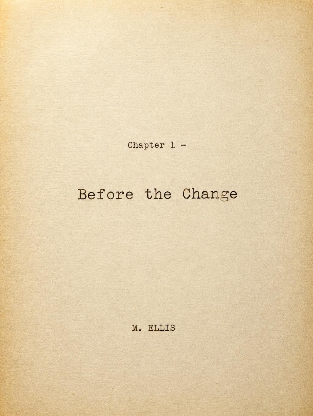
Chapter 1 — Before the Change M. ELLIS - タイプライター Text Effect


この作品と同じ OpenAI GPT-Image-2 を使用 · 15 クレジット
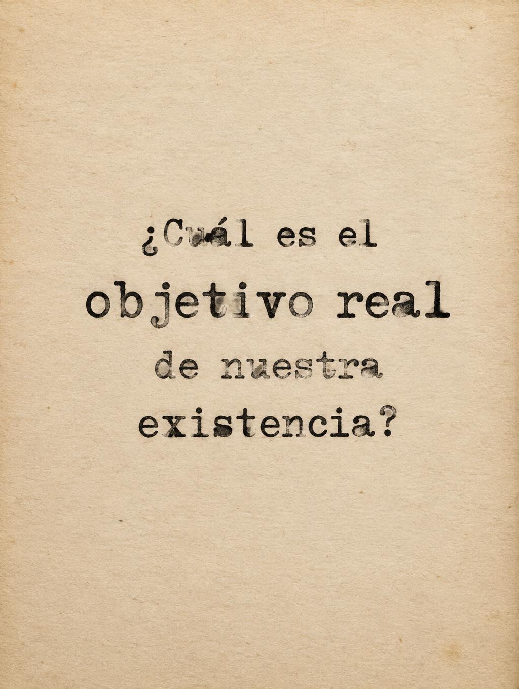
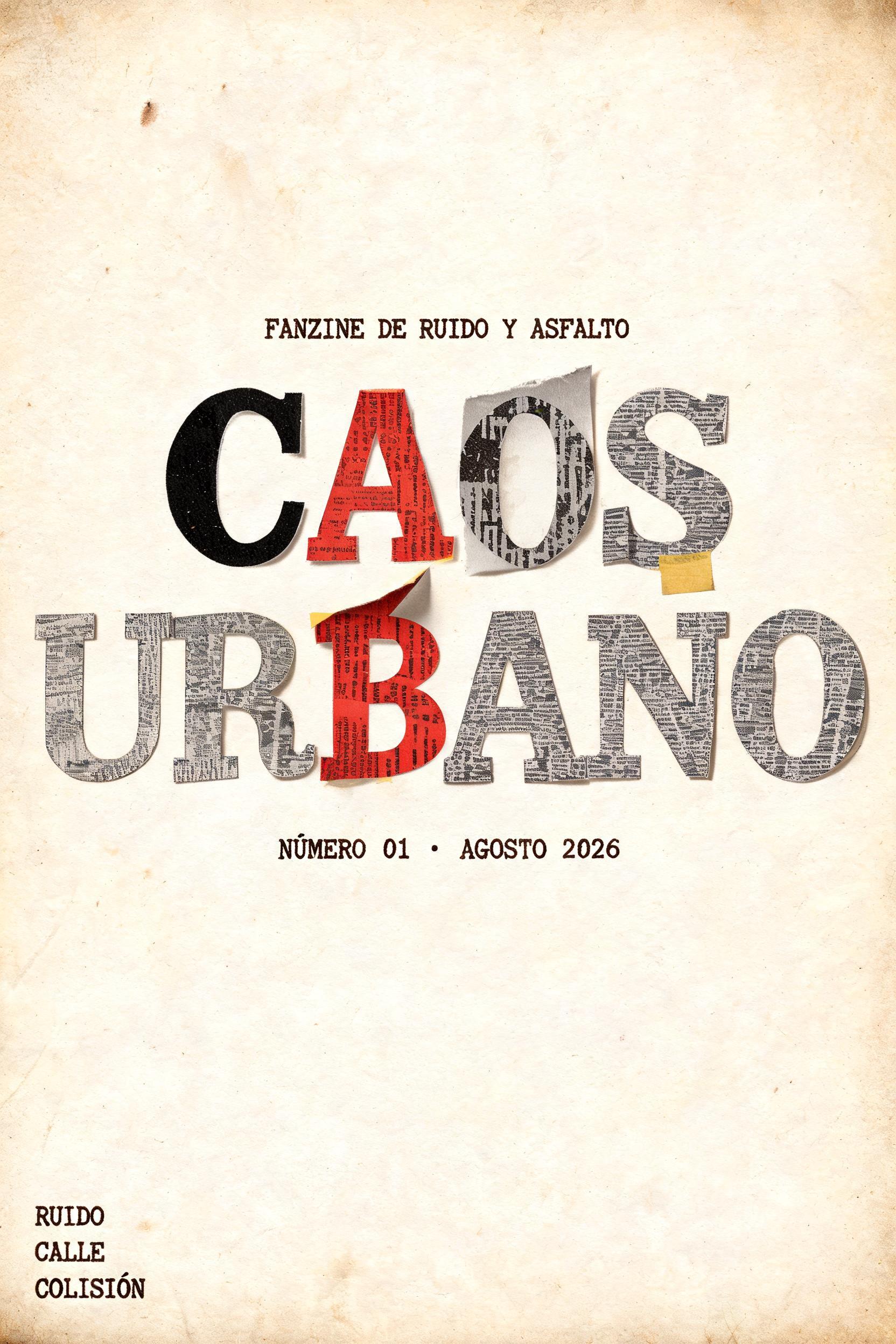
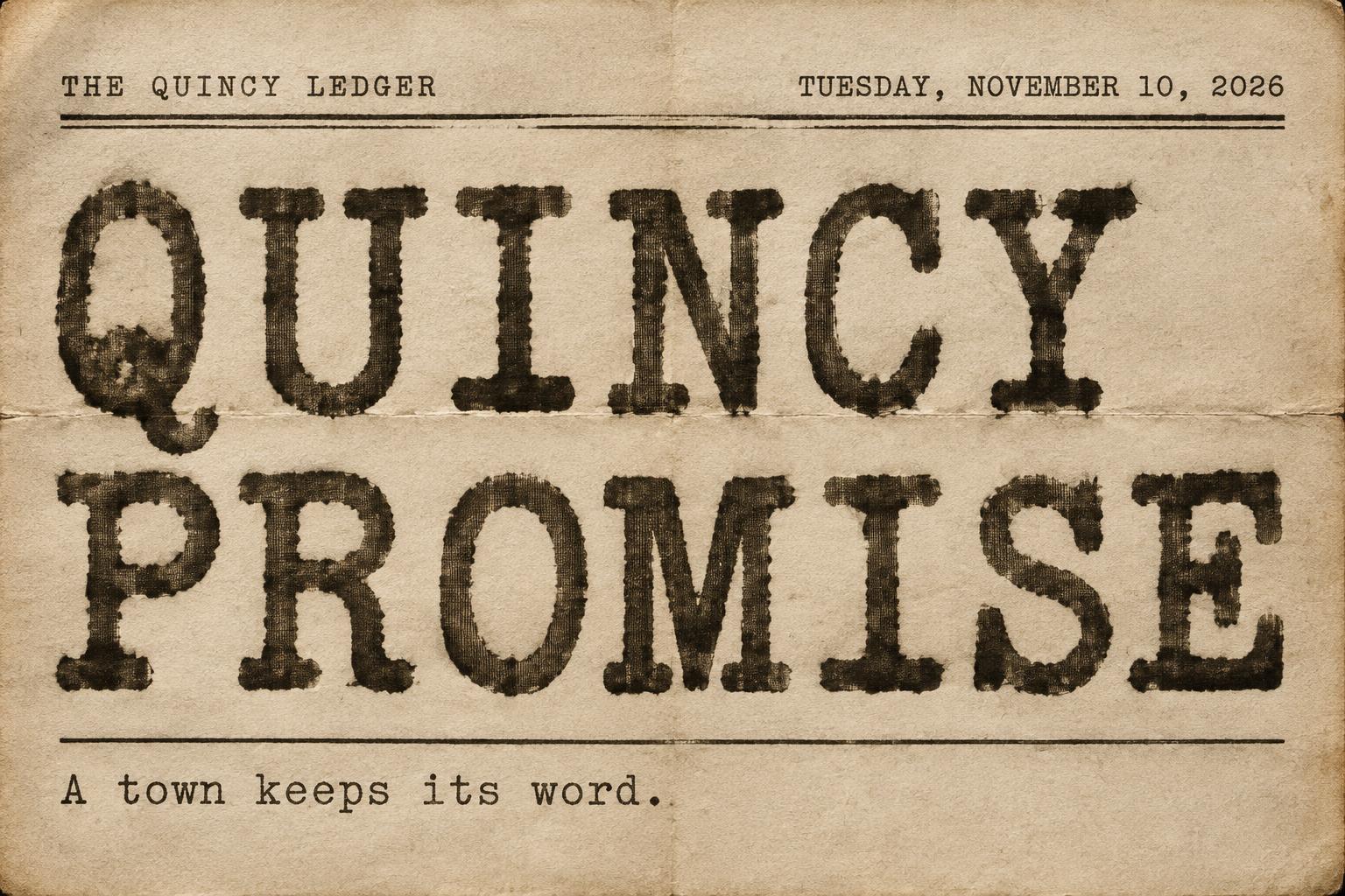
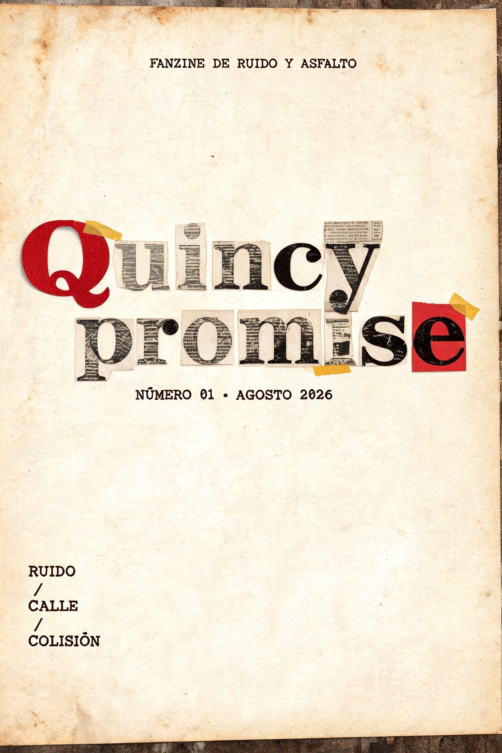

「Chapter 1 — Before the Change M. ELLIS」は FontVibe AI で作成したタイプライターの文字エフェクトです。クリーム色の紙に打ち込まれた等幅スラブセリフ。インクの濃淡のむら、リボンの質感、わずかな文字のずれ、柔らかな紙の繊維。
Create a portrait manuscript title page, 3:4 ratio, with an extremely minimal physical typewriter composition. Full-bleed aged cream bond paper, fine visible cellulose fibres, faint handling variation at the outer edges, no border, no illustrations, no desk props. Soft warm side light from upper left reveals paper grain without shadows crossing the text. Set three precisely rendered text tiers in warm sepia-tinted black typed ink. At upper centre, around 30% down the page, print the small monospaced line: "Chapter 1 —". Directly beneath, with a measured two-line-space gap and much larger scale, print: "Before the Change". At lower centre, around 76% down the page, print the small byline: "M. ELLIS". Use Courier-style mechanical monospace: medium-weight slab serifs on every terminal, strict equal character pitch, slightly condensed characters, clean but physically authentic Underwood No.5 key-strike impressions. Every glyph has uneven ribbon deposition: dense dark ink at selected slab-serif terminals, lighter broken mid-strokes, minute granular ribbon weave, tiny tonal shifts and shallow impression depth. Keep individual character spacing microscopically imperfect and baseline alignment subtly irregular, but retain immediate readability. The headline occupies about 58% of the page width; all lines are centre-aligned on one vertical axis. Large unprinted margins and uninterrupted cream paper make the page read as a real archival manuscript leaf. No digital grunge overlays, no handwriting, no modern sans-serif, no decorative graphics, no extra text.
用途: 文芸原稿
2026年9月17日に生成 · 1024 × 1360 · JPEG · OpenAI GPT-Image-2 · レイアウト:Manuscript Title Leaf · 制作者がシェア · 商用利用無料(CC BY 4.0)