
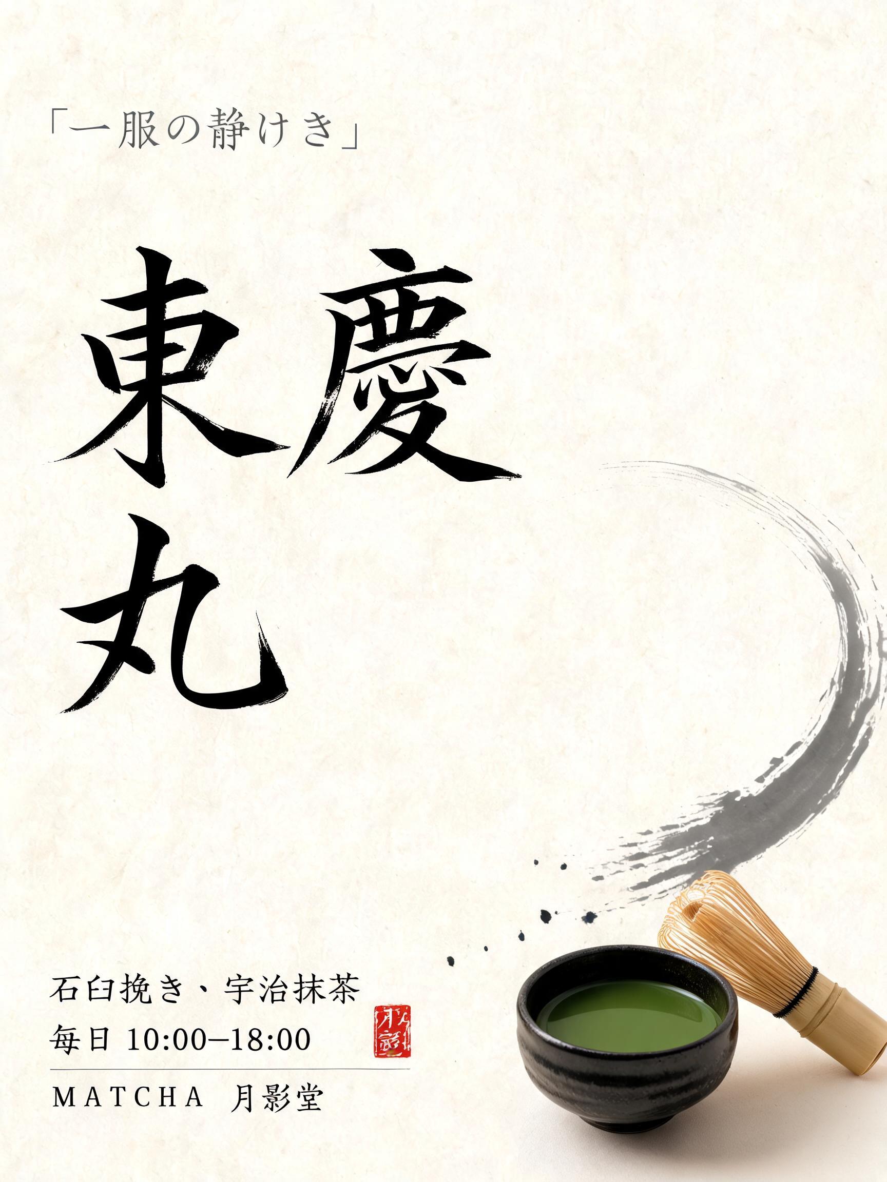
東慶丸 - 日本の墨筆 Text Effect

Create a vertical 3:4 Japanese shop window poster for a matcha shop. Warm cream-white handmade washi paper fills the can...
この作品と同じ BytePlus Seedream 5.0 を使用 · 15 クレジット


“東慶丸” is a Brush Japanese Ink text effect FontVibe AIで作成した文字エフェクト. 日本の書道の墨筆による筆致をラテン文字に応用したスタイルです。深い墨黒のインクに本格的な筆のエネルギー、一方向に制御された筆運び、そして和紙の雰囲気が宿ります。日本食レストランのブランディング、タトゥーデザイン、アニメ、武道、文化系プロジェクトに最適です。. Create a vertical 3:4 Japanese shop window poster for a matcha shop. Warm cream-white handmade washi paper fills the canvas, with visible natural paper fibers and soft diffuse north-facing studio light; no cast shadows, no glossy effects. Use a quiet asymmetric zen composition with over half the page left as clear breathing space. At upper left, set the small brushed-ink line 「一服の静けさ」 in delicate grey sumi strokes. In the central-left 55% of the page, render the headline 「抹茶」 extremely large in two stacked Japanese shodo display letterforms: upright, authoritative master-calligraphy construction, bold 5:1 thick-to-thin contrast, dense matte black pigment concentrated in each stroke center, softly absorbed feathered edges, minute dry-brush texture only at outer contours, committed loaded-brush entries and long precise harai exit tapers. This is the visual focal point. At lower left beneath the title, add three restrained small lines, clearly legible: 「石臼挽き・宇治抹茶」, 「毎日 10:00–18:00」, 「MATCHA 月影堂」. Place a small vermilion square hanko seal at the lower-right of this copy, containing 「月影」. On the right lower third, include one tactile hero subject: a low handmade charcoal-black chawan filled with opaque jade-green matcha, viewed slightly from above. A fine bamboo chasen rests diagonally beside it; its pale bamboo tines remain understated. One broad grey-black sumi brush sweep begins behind the bowl, curves upward toward the title, then fades as the ink load depletes. A few controlled ink flecks appear only at the sweep entry. Keep the bowl small enough that the lettering remains dominant. Palette: warm washi cream, near-black sumi, diluted ash-grey, jade matcha green, one vermilion seal accent. No ornamental patterns, no neon, no photorealistic café interior, no uniform black strokes. Create a vertical 3:4 Japanese shop window poster for a matcha shop. Warm cream-white handmade washi paper fills the canvas, with visible natural paper fibers and soft diffuse north-facing studio light; no cast shadows, no glossy effects. Use a quiet asymmetric zen composition with over half the page left as clear breathing space. At upper left, set the small brushed-ink line 「一服の静けさ」 in delicate grey sumi strokes. In the central-left 55% of the page, render the headline 「東慶丸」 extremely large in two stacked Japanese shodo display letterforms, arranged 「東慶」 above 「丸」: upright, authoritative master-calligraphy construction, bold 5:1 thick-to-thin contrast, dense matte black pigment concentrated in each stroke center, softly absorbed feathered edges, minute dry-brush texture only at outer contours, committed loaded-brush entries and long precise harai exit tapers. This is the visual focal point. At lower left beneath the title, add three restrained small lines, clearly legible: 「石臼挽き・宇治抹茶」, 「毎日 10:00–18:00」, 「MATCHA 月影堂」. Place a small vermilion square hanko seal at the lower-right of this copy, containing 「月影」. On the right lower third, include one tactile hero subject: a low handmade charcoal-black chawan filled with opaque jade-green matcha, viewed slightly from above. A fine bamboo chasen rests diagonally beside it; its pale bamboo tines remain understated. One broad grey-black sumi brush sweep begins behind the bowl, curves upward toward the title, then fades as the ink load depletes. A few controlled ink flecks appear only at the sweep entry. Keep the bowl small enough that the lettering remains dominant. Palette: warm washi cream, near-black sumi, diluted ash-grey, jade matcha green, one vermilion seal accent. No ornamental patterns, no neon, no photorealistic café interior, no uniform black strokes.
6 日前に生成 · 1728 × 2304 · JPEG · 制作者がシェア


