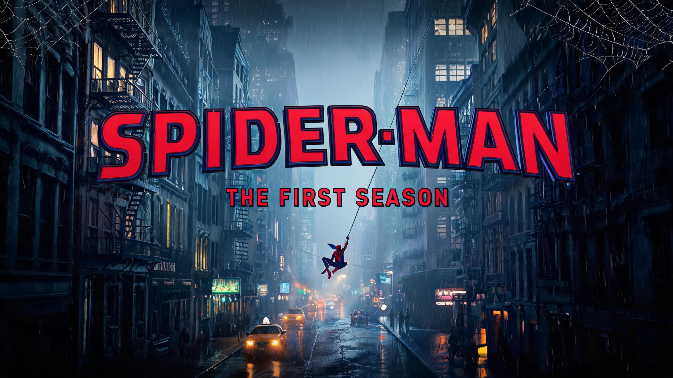
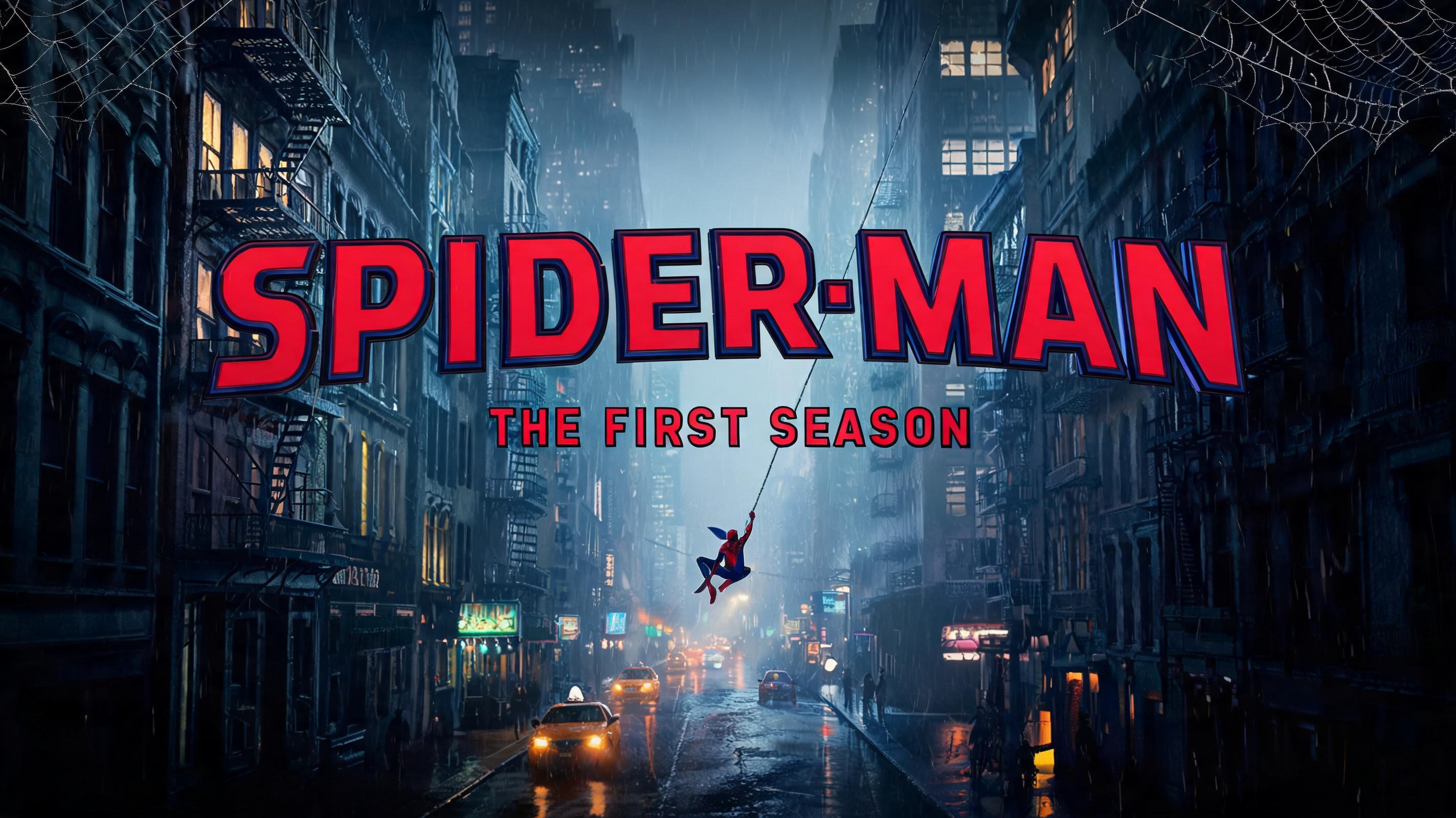
SPIDER-MAN THE FIRST SEASON - スパイダーマン Text Effect


この作品と同じ ByteDance Seedream 5.0 を使用 · 15 クレジット
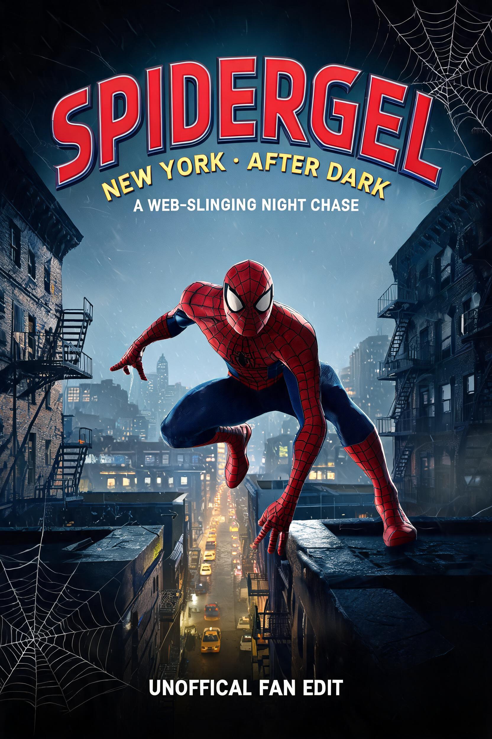
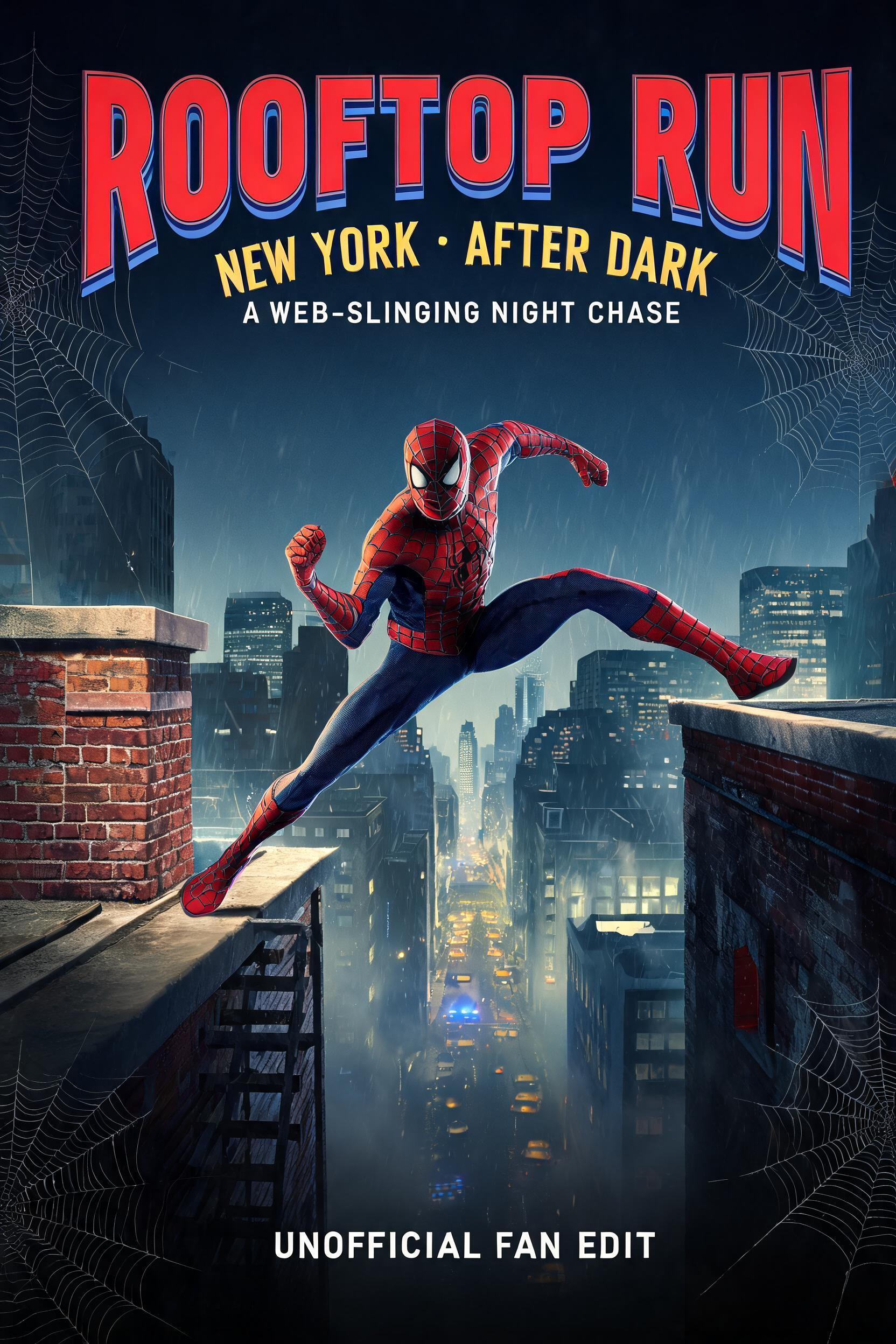
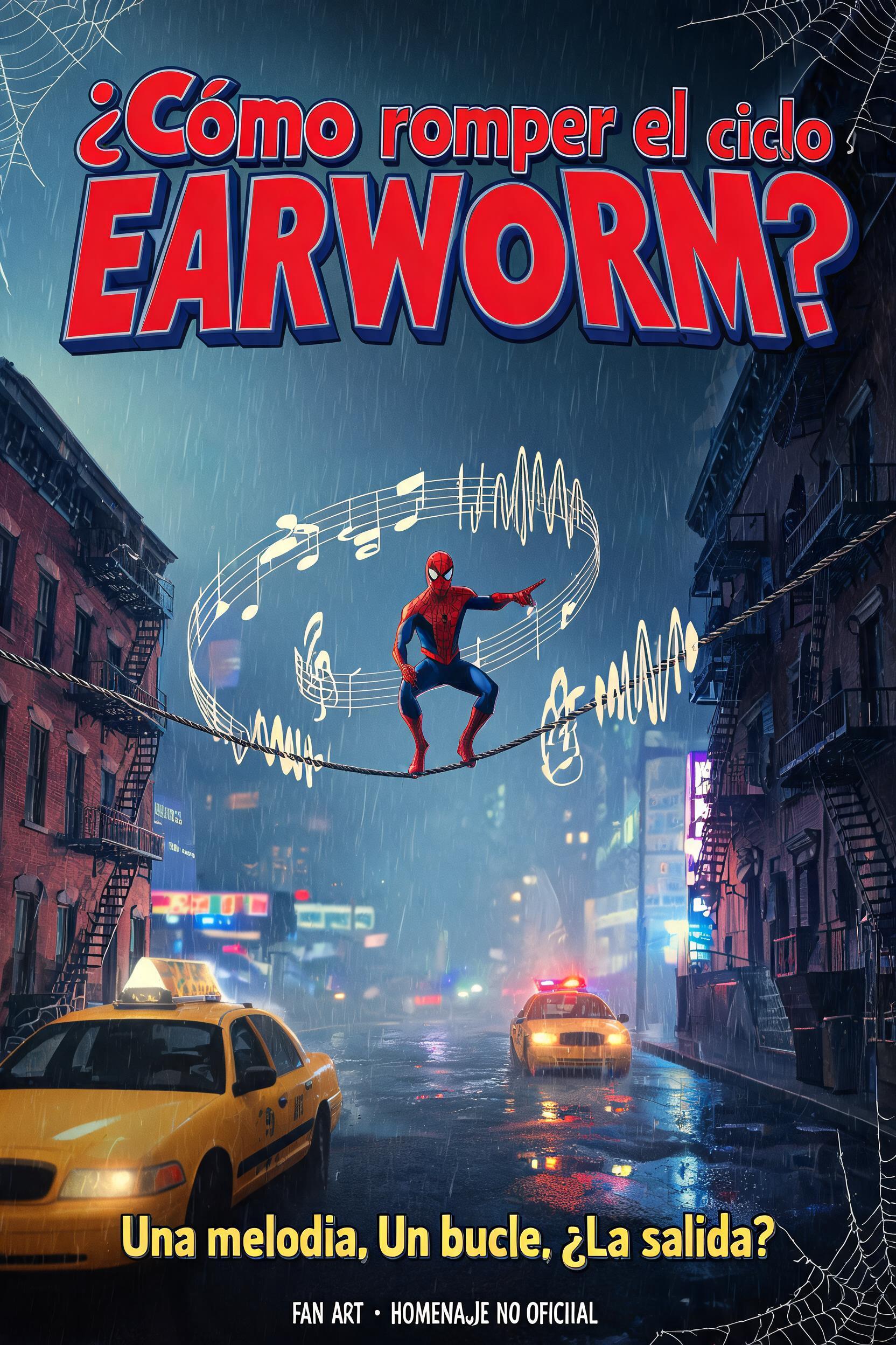
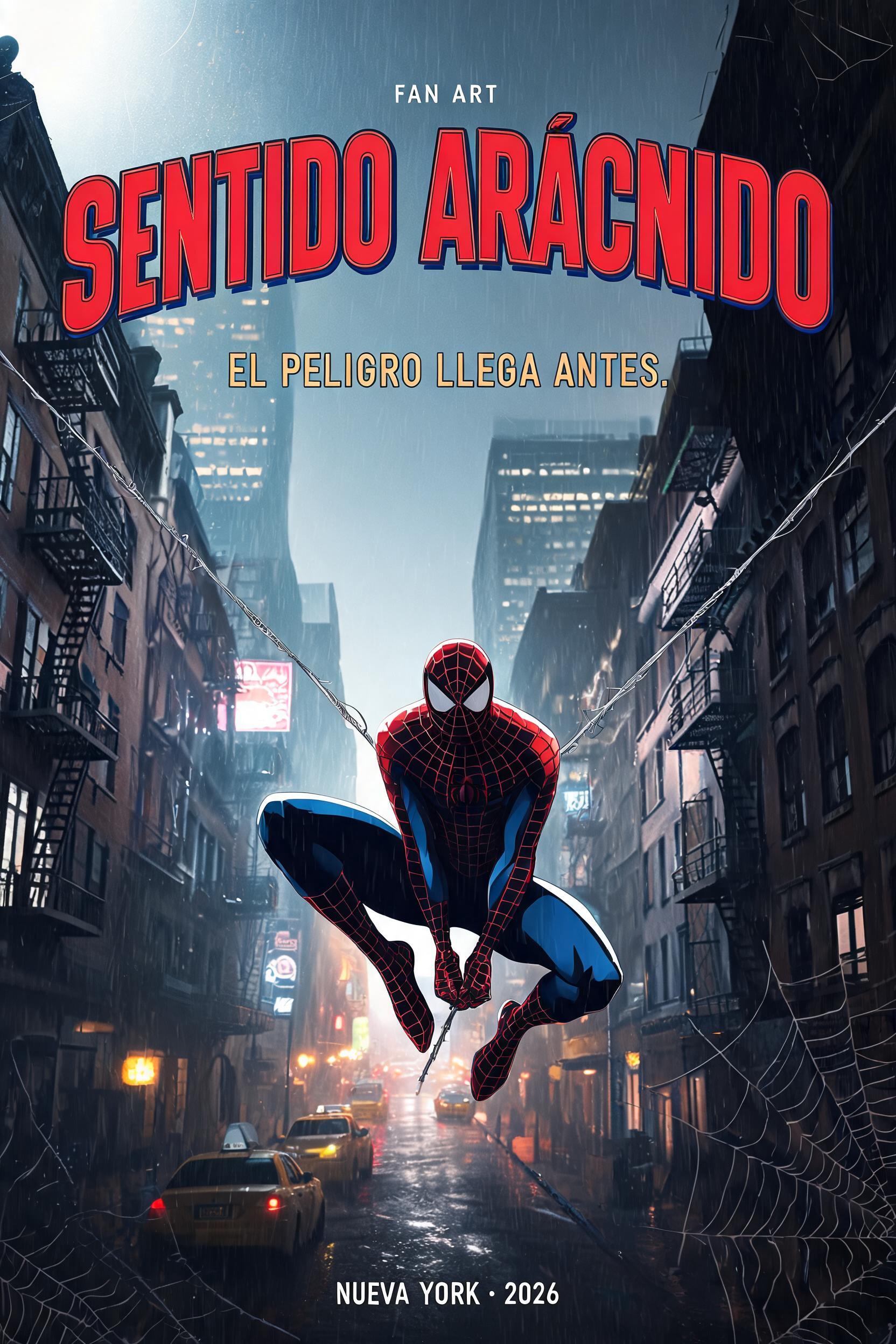
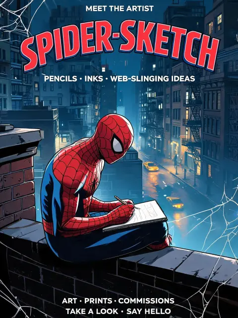
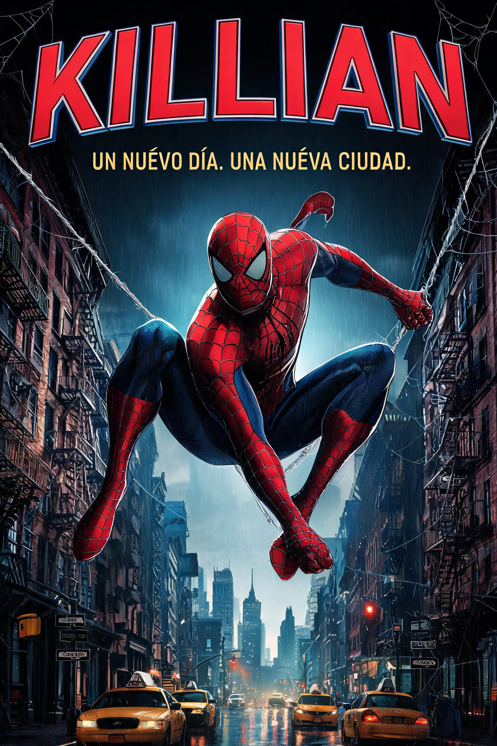
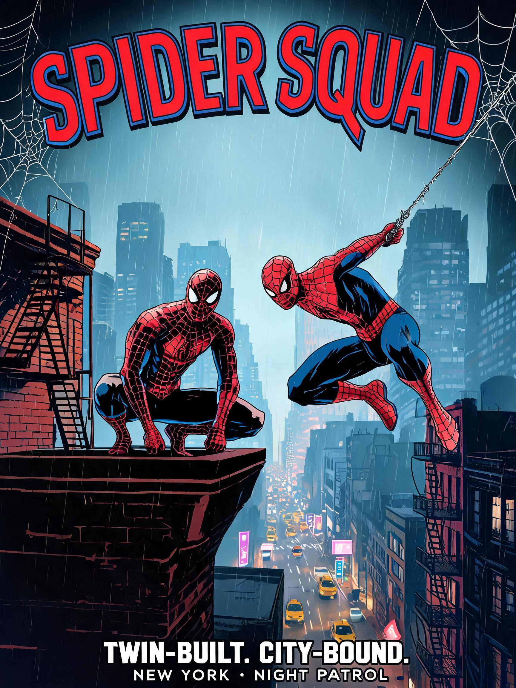
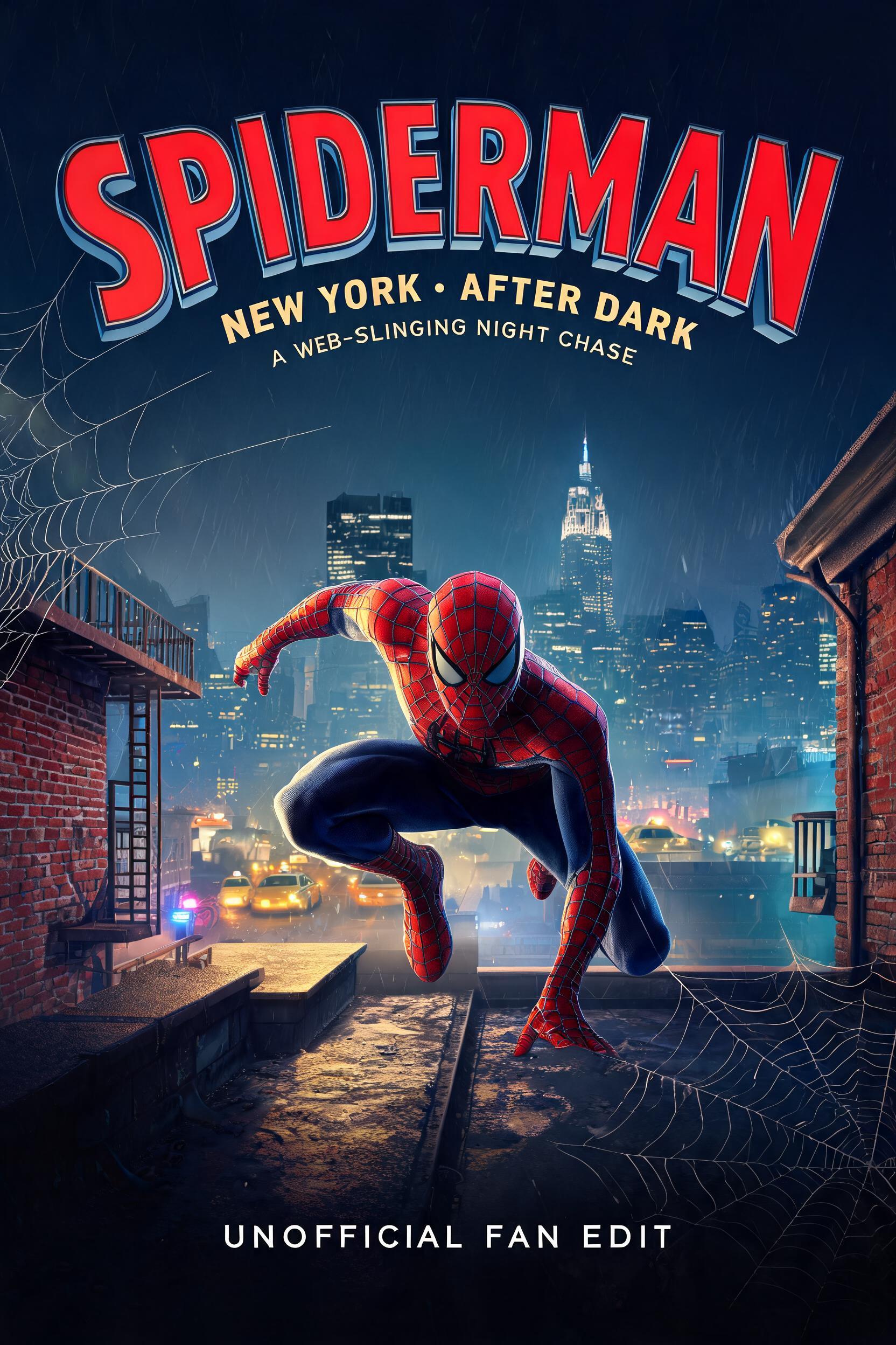
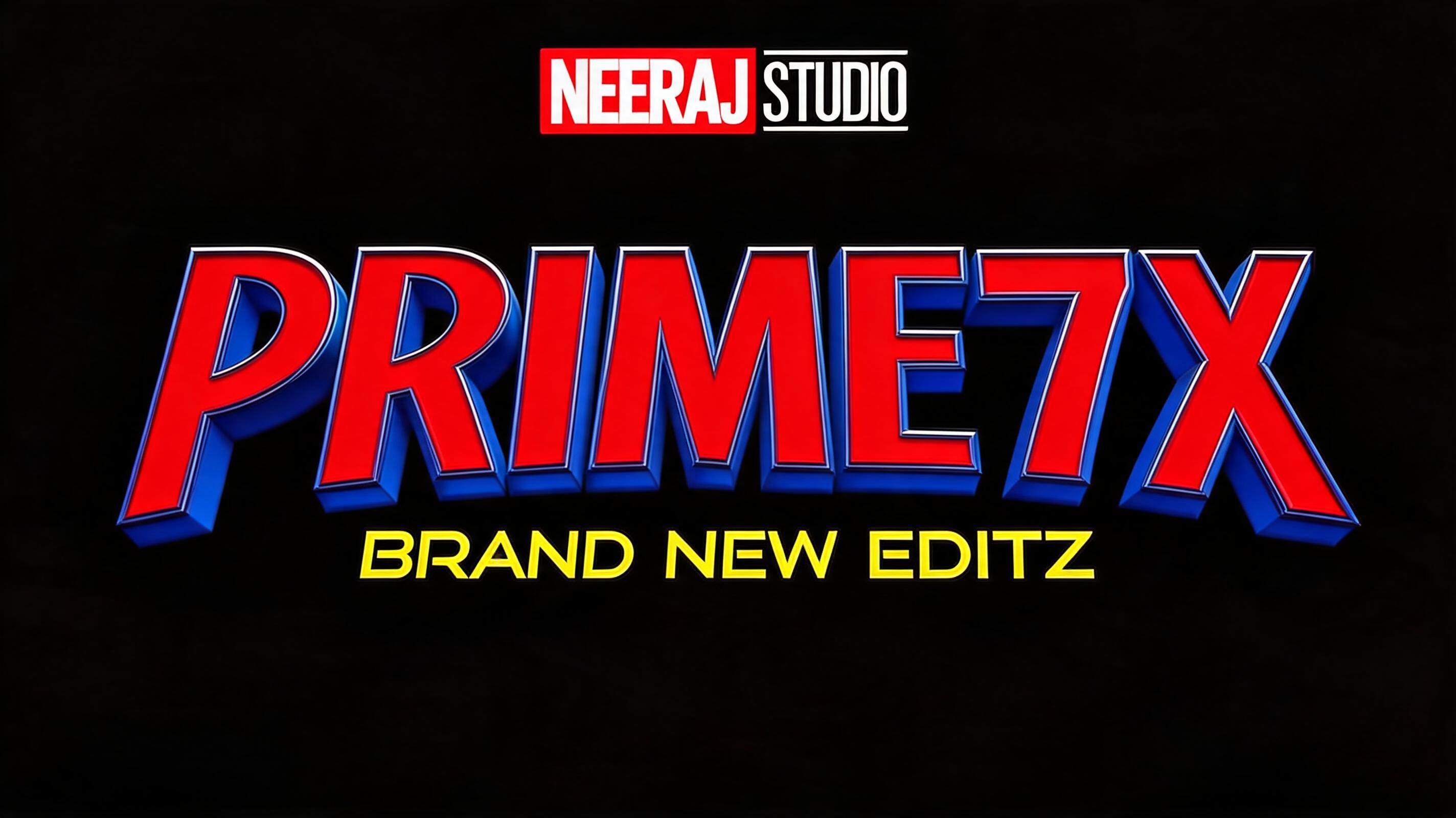
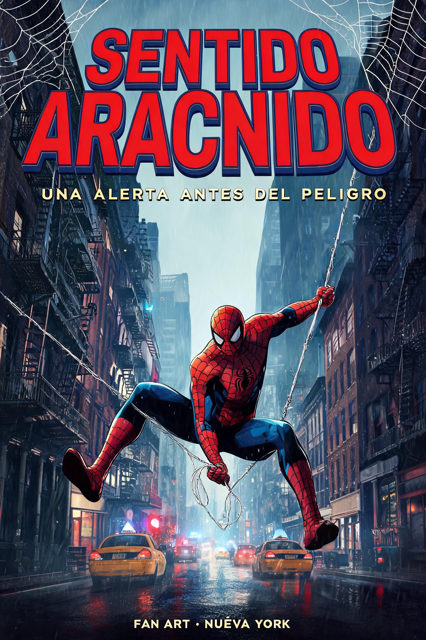
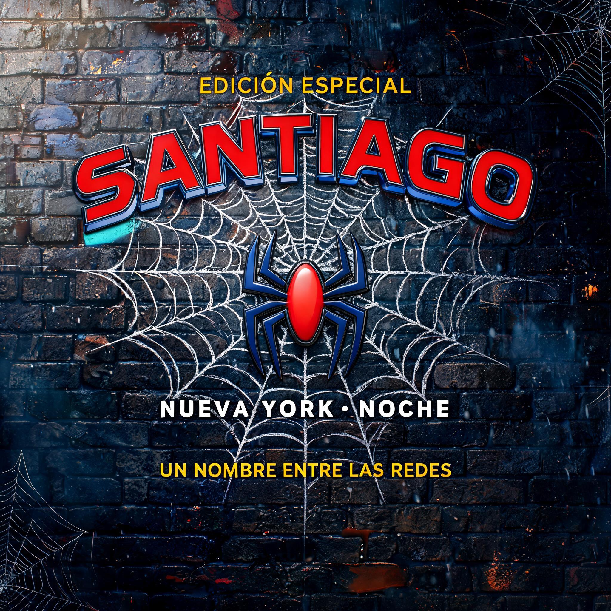
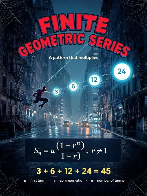
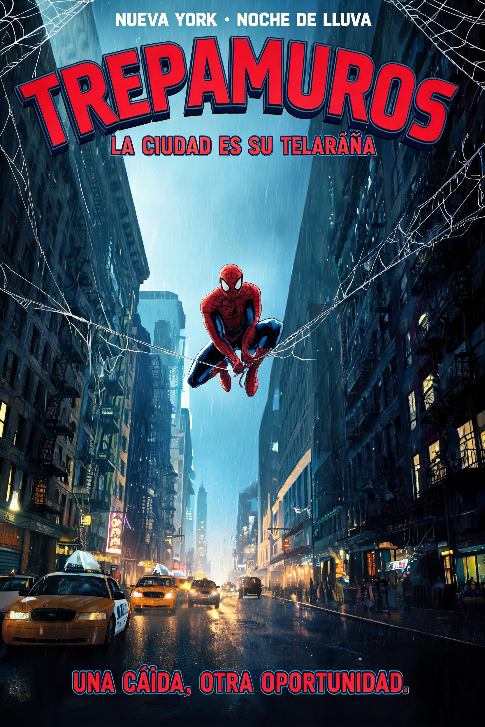
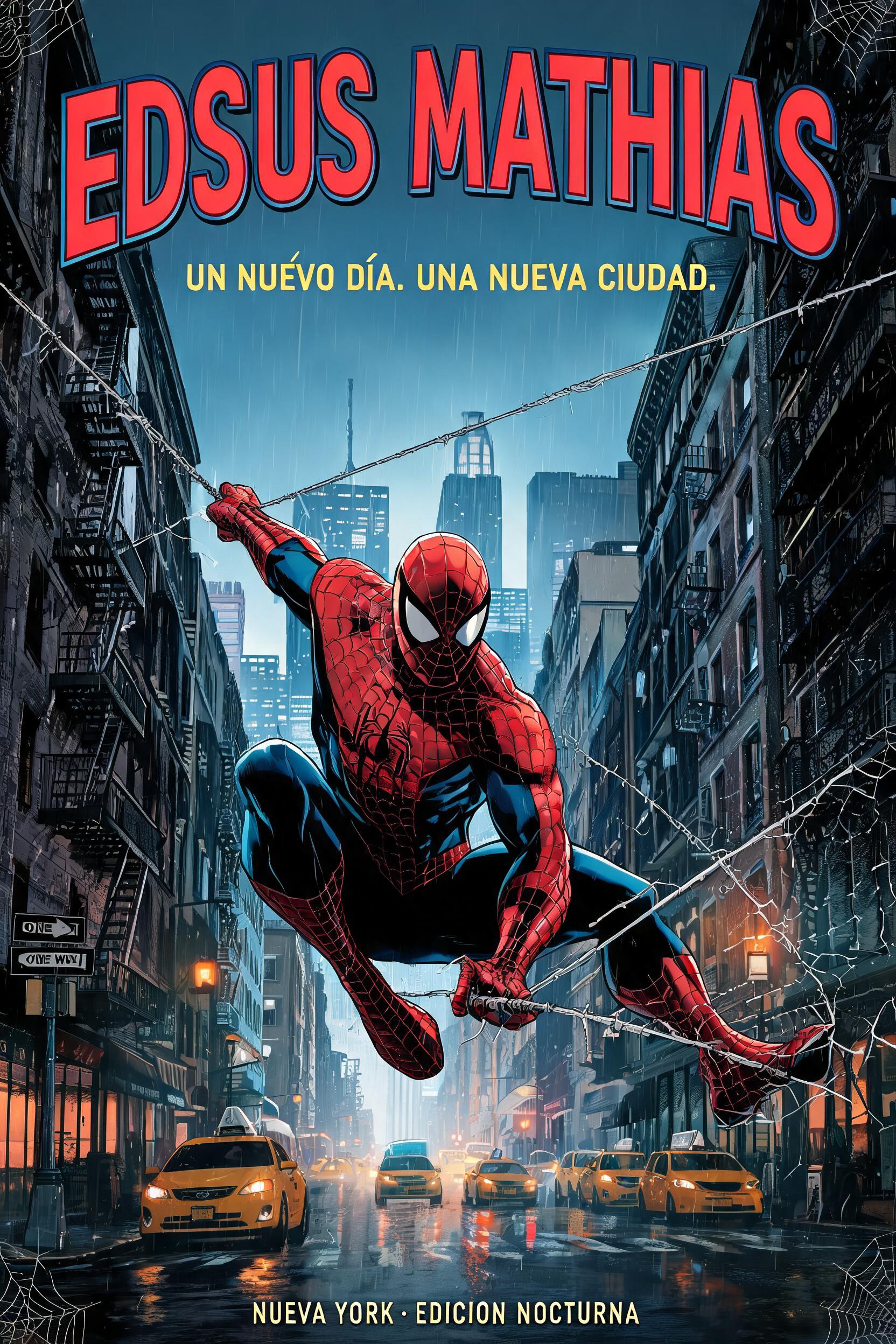
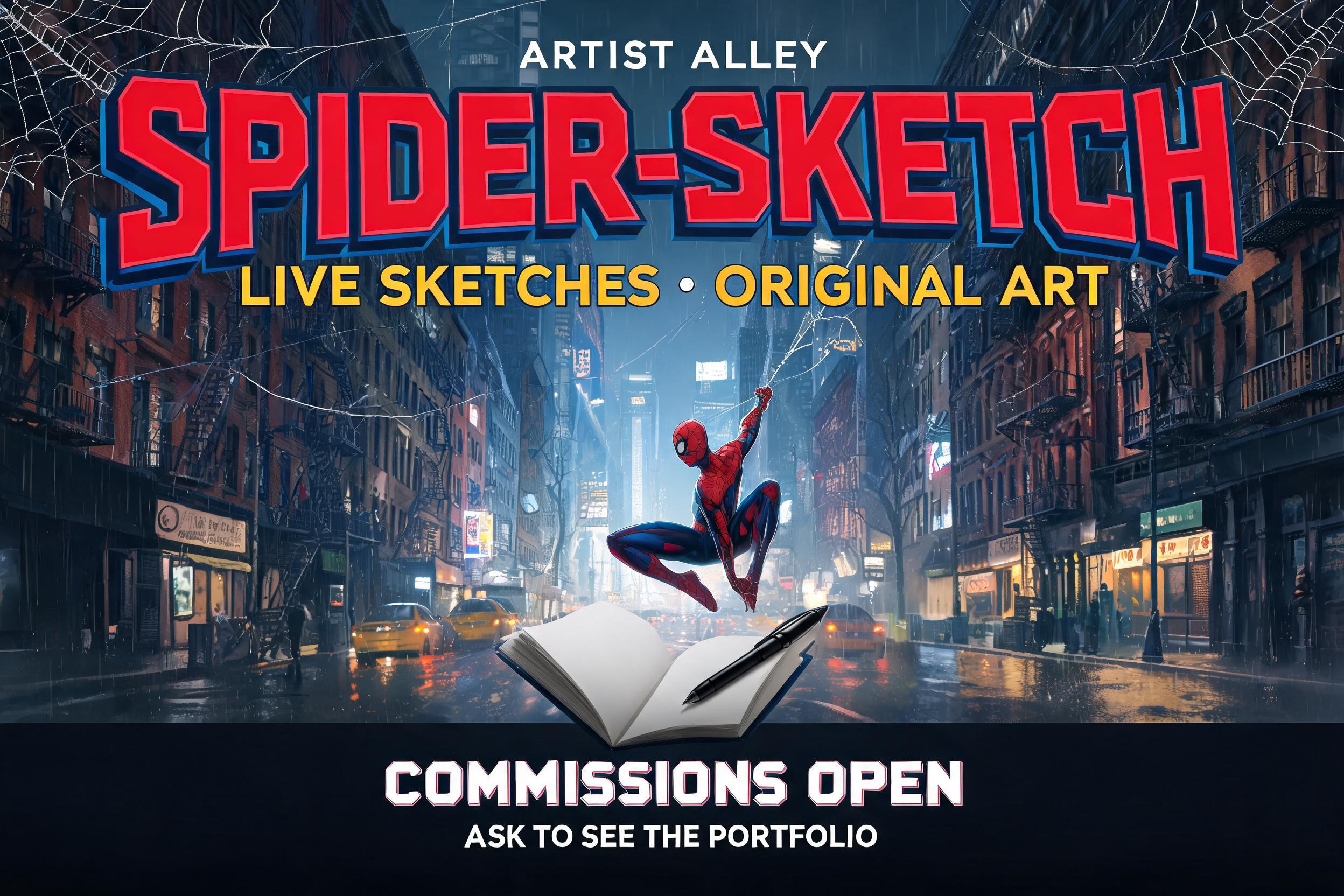
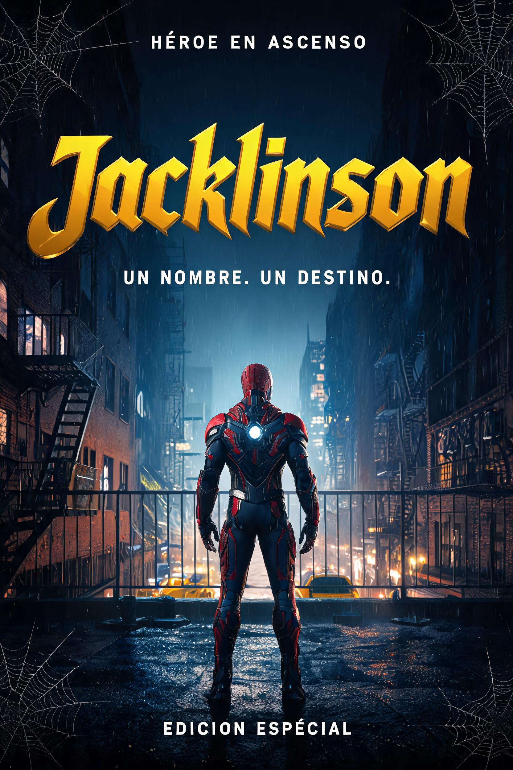
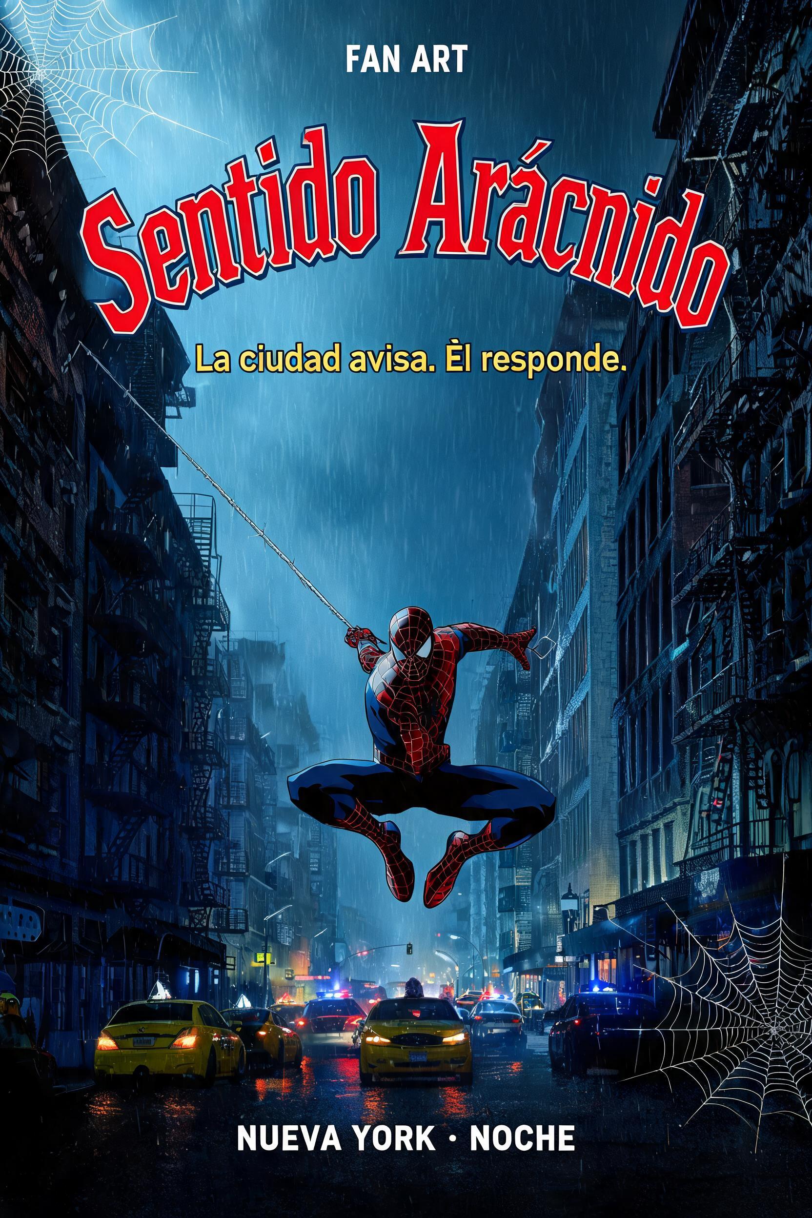
「SPIDER-MAN THE FIRST SEASON」は FontVibe AI で作成したスパイダーマンの文字エフェクトです。深い青の3Dの厚みと黒フチを持つ、太く縦長の赤いコミックタイトル大文字。雨のニューヨークの谷間のような街路の上空高く、蜘蛛の糸とともに。
Create a complete 16:9 comic-logo composition. Render exactly two text strings, with no extra lettering: primary headline “SPIDER-MAN”; secondary subtitle “THE FIRST SEASON”. Make SPIDER-MAN the dominant centered element, spanning about 78% of the image width, in bold, condensed classic comic-masthead lettering with softly rounded corners and smooth curves, never spiky or jagged. Set it on a gentle downward-bowing arc, middle letters slightly lower than the ends. Give every headline letter a solid, flat, matte comic-red face (#ED1C24), a thin dark-navy outline, and only a slim royal-blue (#1E2F9C) 3D depth edge offset along the lower-left. Keep the colors flat like printed comic ink: no gloss, chrome, specular shine, or red-to-blue horizontal split. Center “THE FIRST SEASON” below in smaller, tightly spaced, matching red-face and slim blue-depth lettering. Stage the logo over a grounded nighttime Manhattan street canyon: weathered brick, fire escapes, rain-slick asphalt, distant yellow-cab lights, restrained neon points, drifting rain and cool grey-blue haze. A small red-and-blue web-slinger silhouette swings below and behind the subtitle, with no recognizable face or official emblem; keep it secondary and clear of the lettering. Add faint spider-web strands in the upper corners. Strong upper-left key light, cool blue rim light, warm city reflections, tight radial vignette. Crisp, legible letter edges and clear separation between title, subtitle and silhouette. No additional copy, badges, borders, or logos.
用途: スパイダーマン: ブランド・ニュー・デイ ロゴメーカー
2026年9月25日に生成 · 2848 × 1600 · JPEG · ByteDance Seedream 5.0 · レイアウト:Arche de rue · 制作者がシェア · 商用利用無料(CC BY 4.0)



