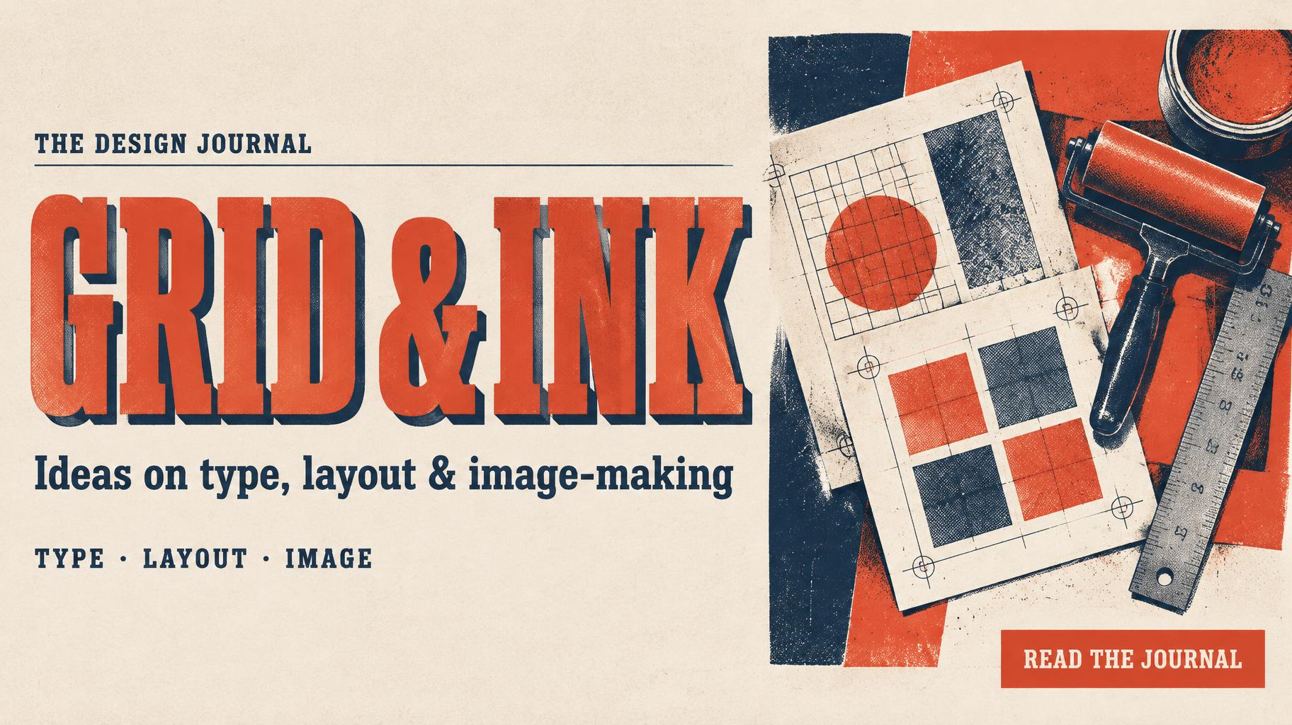
GRID & INK THE DESIGN JOURNAL Ideas on type, layout & image-making TYPE · LAYOUT · IMAGE READ THE JOURNAL - デュオトーン Text Effect


この作品と同じ OpenAI GPT-Image-2.5 Sunburst を使用 · 15 クレジット
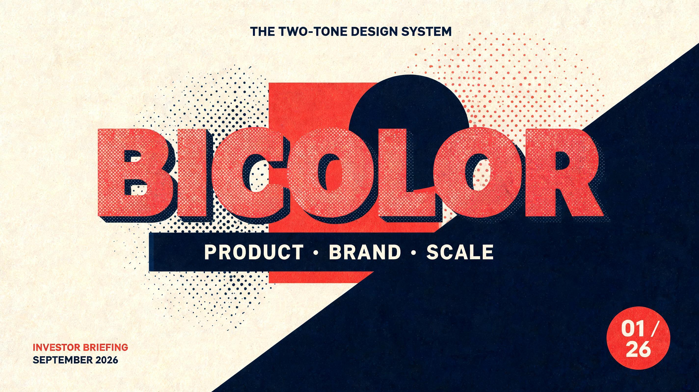
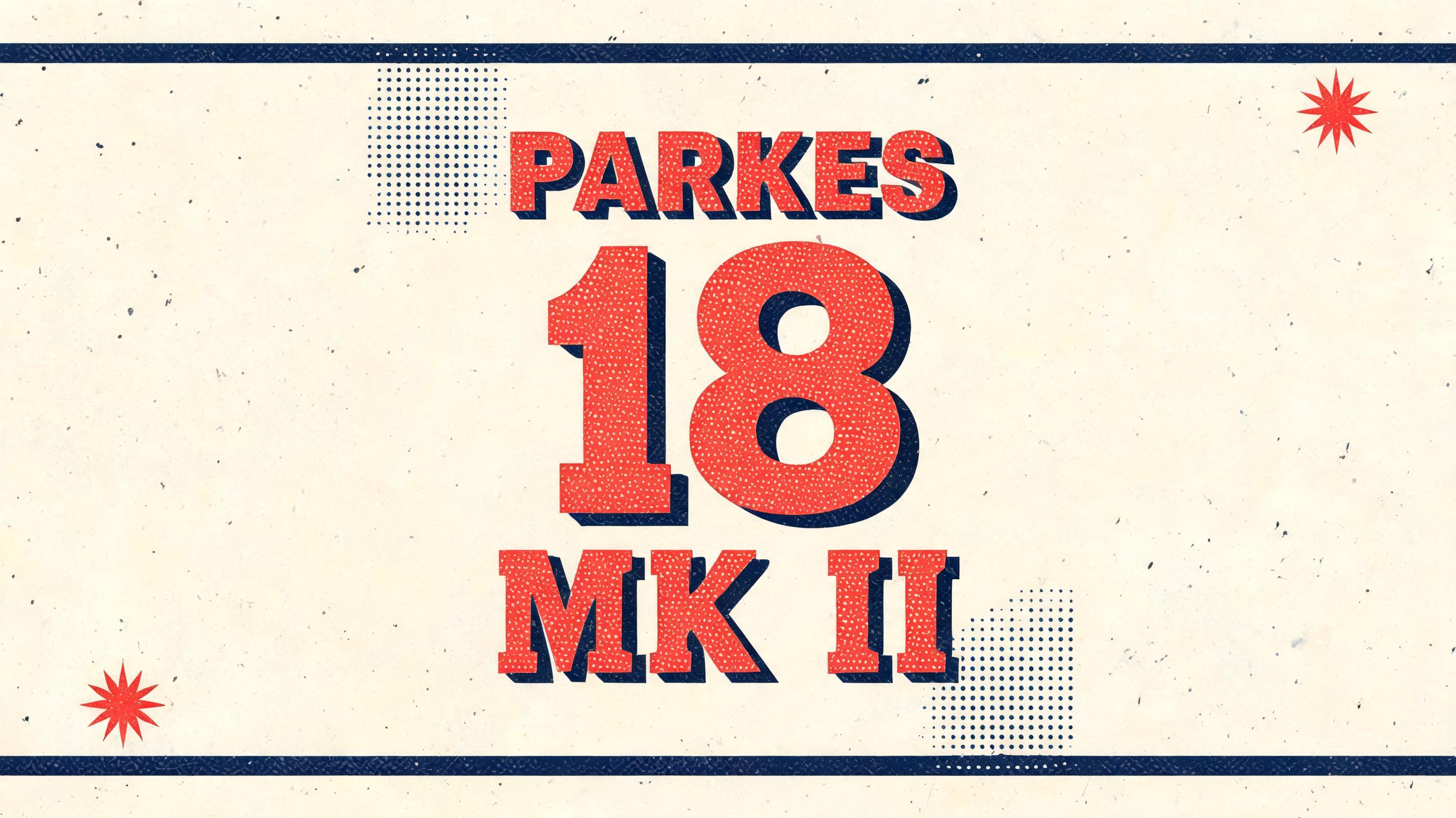
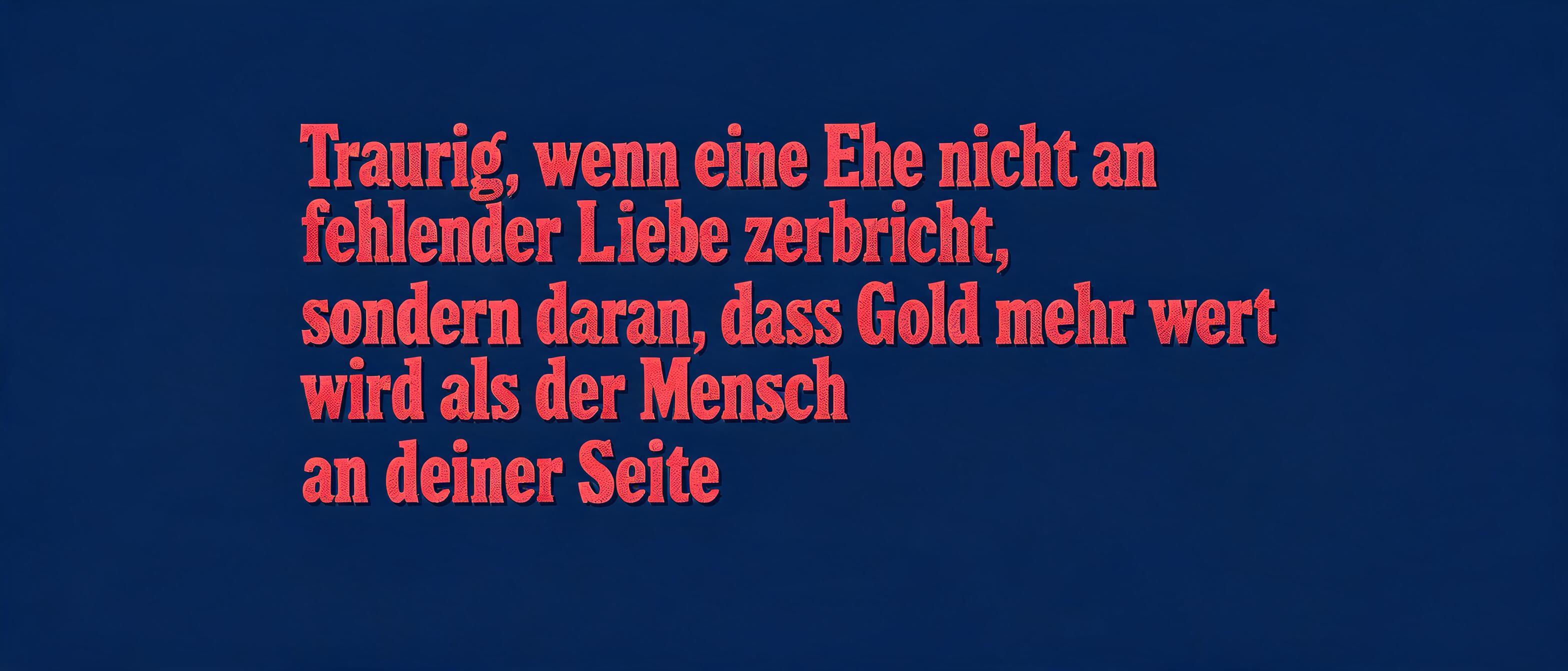

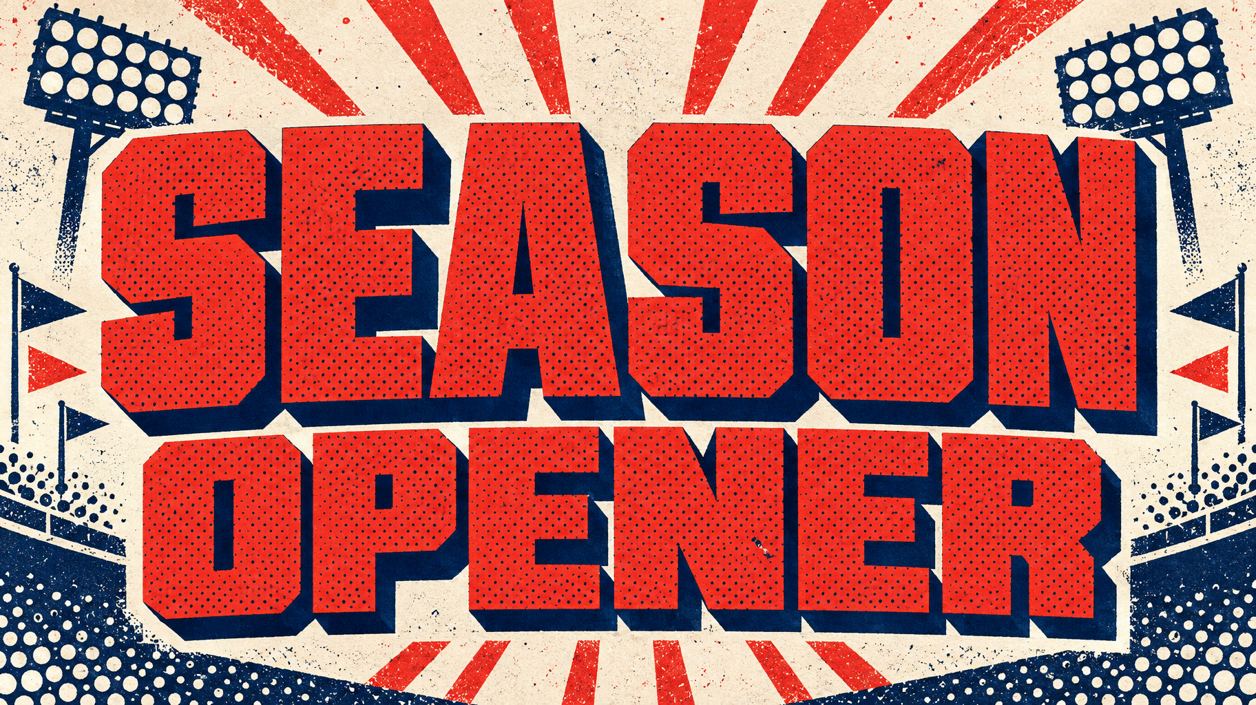

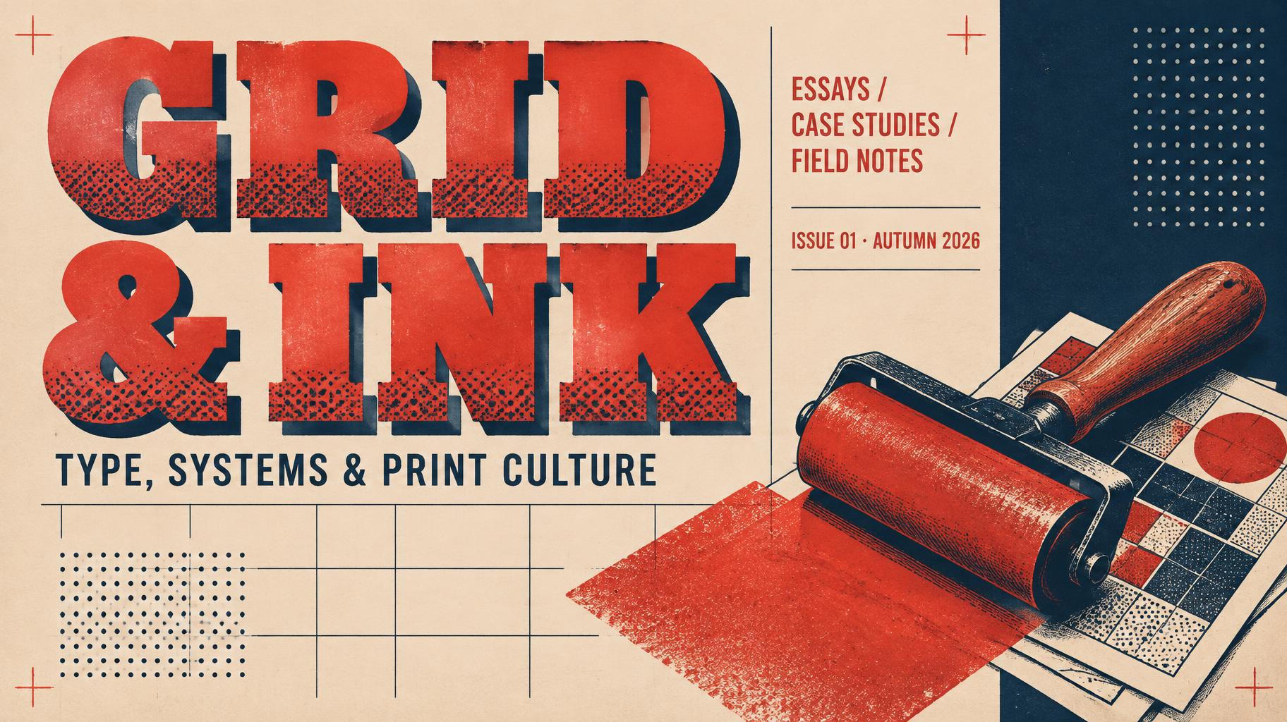
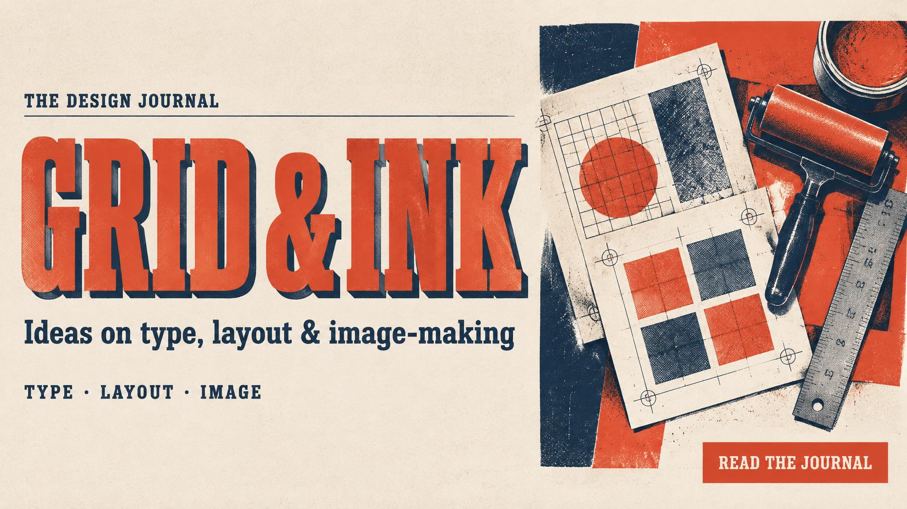
“GRID & INK THE DESIGN JOURNAL Ideas on type, layout & image-making TYPE · LAYOUT · IMAGE READ THE JOURNAL” is a Duotone text effect FontVibe AIで作成した文字エフェクト. 太く縦長のスラブセリフ大文字。片方の明るい色にハーフトーンの網点、もう一色でずらしたベタの影。対照的な色のフラットな地に.
Create a finished 16:9 editorial social banner for the design blog. Use the attached references as design guidance: preserve the Duotone style’s flat, high-contrast two-ink poster language and the Retro Slab font’s broad, square, mid-century letterforms. Render only the exact copy below; no extra words, misspellings, or placeholder text. Composition: left 60% is a clear typographic territory on warm unprinted paper; right 34% holds a compact overhead illustration of a printmaker’s desk: overlapping proof sheets with visible registration grids, a metal ruler and a small ink roller. Frame the subject with flat midnight-navy and vermilion blocks and simple geometric marks. Keep generous outer margins and a narrow clear gutter between copy and illustration. Reading order and exact text: Small top-left eyebrow: “THE DESIGN JOURNAL”. Large headline beneath: “GRID & INK”, set on one line if legible, otherwise break after “GRID”. Make it the dominant element: wide, heavy retro slab serif, uniform strokes, square slab serifs, sturdy proportions, tight but distinct spacing. Give the letter faces bright vermilion ink with clearly visible, evenly screened halftone dots; add a crisp, hard-edged midnight-navy offset shadow. Preserve the letterpress impression with very slight ink spread at the contours, not blur. Supporting line: “Ideas on type, layout & image-making”. Small category line: “TYPE · LAYOUT · IMAGE”. Compact bottom-right call to action: “READ THE JOURNAL”. Use a restricted print palette of vermilion #F04B35 and midnight navy #101A3A as the two inks, with warm ivory paper as the unprinted stock. Flat color fields only; no gradients, photographic textures, extra colors, or soft shadows. Let the proof sheets and desk objects use the same two inks, with coarse halftone screens and crisp cut-paper edges. Keep every text line high-contrast and readable at social-feed size; avoid overlap between copy and the desk illustration. The finished image must read as a complete branded editorial banner, not a standalone wordmark.
2026年10月1日に生成 · 1824 × 1024 · JPEG · OpenAI GPT-Image-2.5 Sunburst · レイアウト:Editorial Split · 制作者がシェア · 商用利用無料(CC BY 4.0)