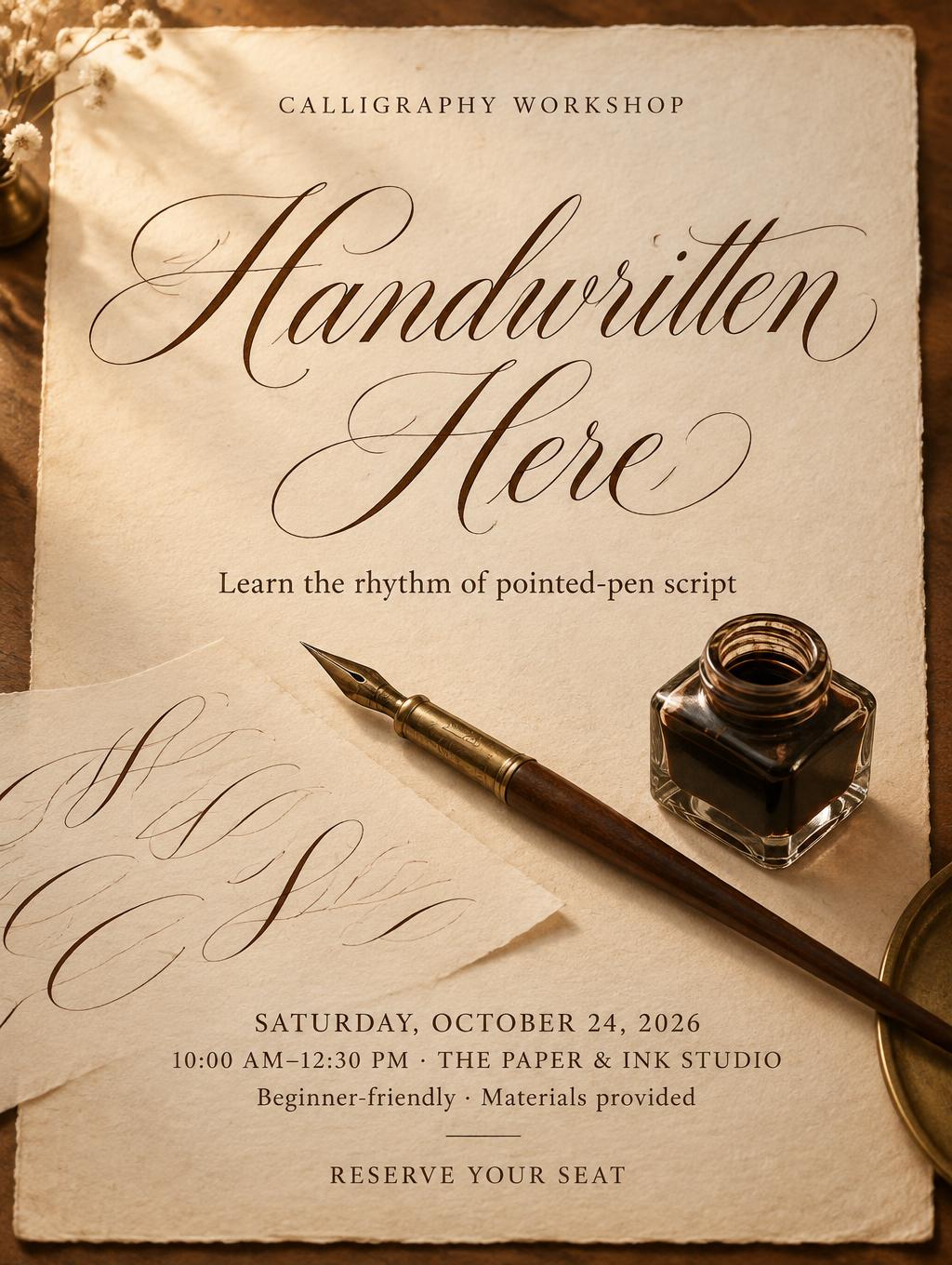
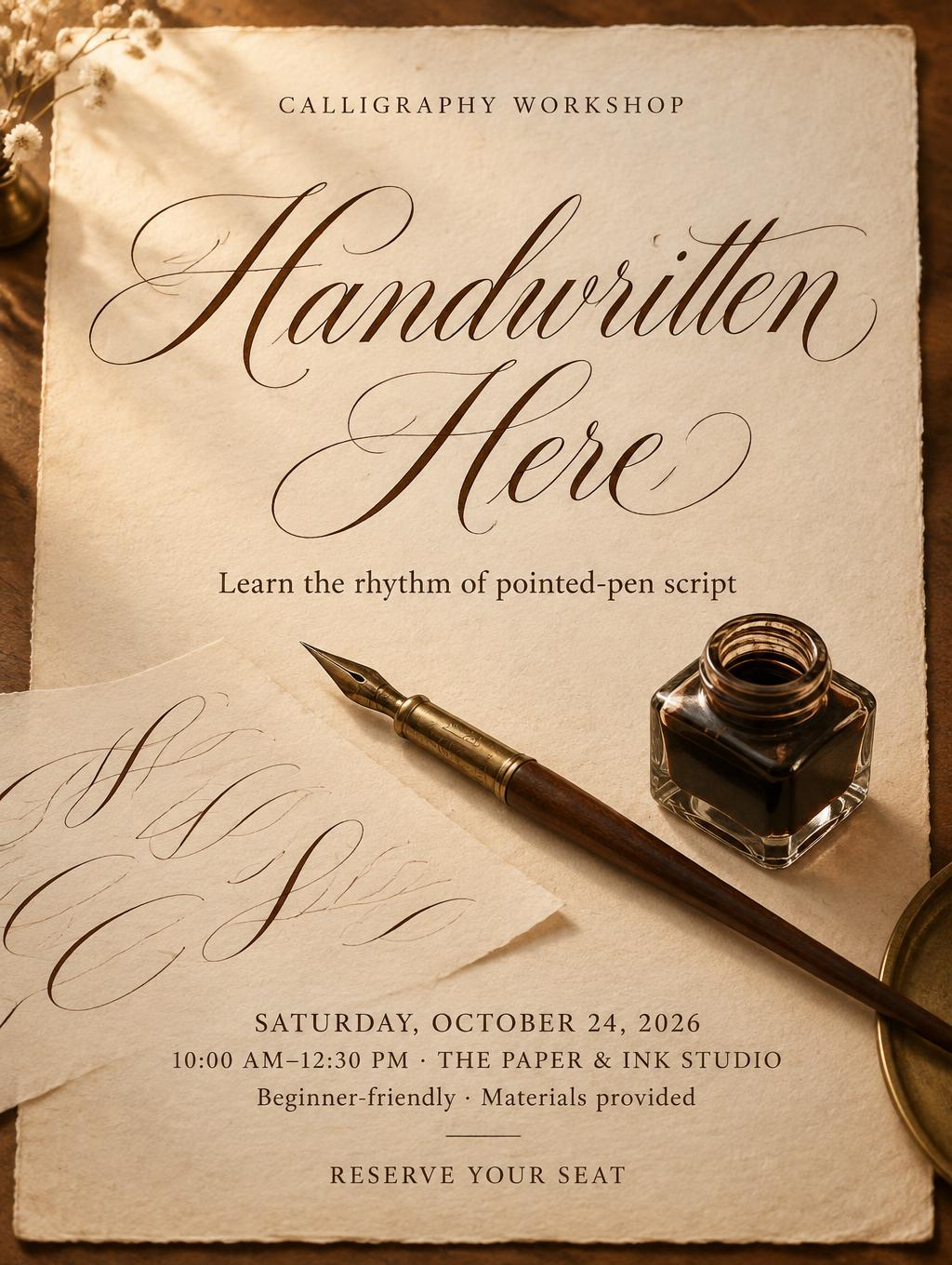
CALLIGRAPHY WORKSHOP Handwritten Here Learn the rhythm of pointed-pen script SATURDAY, OCTOBER 24, 2026 10:00 AM–12:30 PM · THE PAPER & INK STUDIO Beginner-friendly · Materials provided RESERVE YOUR SEAT - 手書きスクリプト Text Effect


この作品と同じ OpenAI GPT-Image-2.5 Sunburst を使用 · 15 クレジット







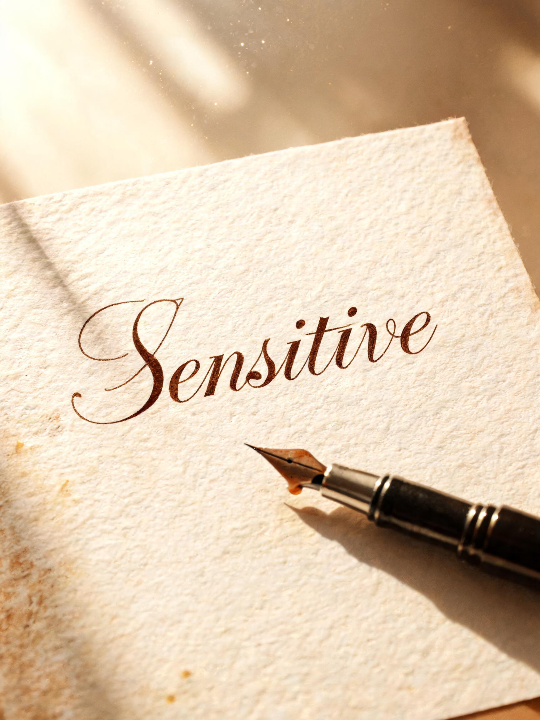


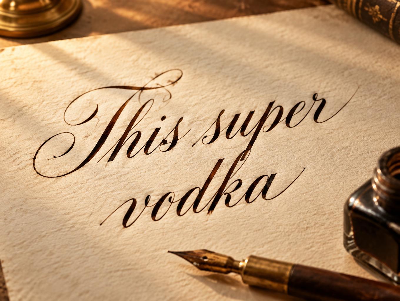
「CALLIGRAPHY WORKSHOP Handwritten Here Learn the rhythm of pointed-pen script SATURDAY, OCTOBER 24, 2026 10:00 AM–12:30 PM · THE PAPER & INK STUDIO Beginner-friendly · Materials provided RESERVE YOUR SEAT」は FontVibe AI で作成した手書きスクリプトの文字エフェクトです。暖かなクリーム色の紙に書いたウォルナットブラウンのインクの繊細な手書き筆記体。文字はなめらかにつながり柔らかなループ、横にはつけペンとインク壺。
Create a complete 3:4 portrait class poster, viewed nearly straight-on. The poster is a single sheet of cream laid cotton-rag paper with visible fiber tooth and a subtly amber-warmed perimeter; keep a slightly clearer, brighter cream field behind the central title for contrast. Warm morning light rakes in from the upper left at 35 degrees, with soft amber fill from the right at 25% intensity. Show paper fibers, gentle ink bloom at dense stroke ends, and a few dust motes in the light. Keep the background beyond the sheet softly blurred and warm. Set these exact English lines, with no other readable text: Small centered eyebrow at the top: “CALLIGRAPHY WORKSHOP” in compact, spaced roman small caps. Dominant centered headline: “Handwritten Here”, arranged on two lines (“Handwritten” above “Here”) in formal connected copperplate script. Use oval-based construction, a consistent 52-degree rightward slant, controlled loops, refined exit ligatures, rhythmic spacing, and subtle capital entry flourishes. Make the walnut-brown lettering feel written with a pointed nib: broad pressure downstrokes with a restrained wet sheen, delicate hairlines that nearly recede into the paper, and engraved-looking light-dark contrast revealed by the raking light. Keep every letter crisp and legible. Centered supporting line below: “Learn the rhythm of pointed-pen script” in a small, readable classic roman serif. Then set the practical details in a clear centered hierarchy, with generous line spacing: “SATURDAY, OCTOBER 24, 2026”; “10:00 AM–12:30 PM · THE PAPER & INK STUDIO”; “Beginner-friendly · Materials provided”. Finish with a modest, clearly readable “RESERVE YOUR SEAT” call to action. Give the headline the largest share of the poster, with generous paper margins and distinctly smaller supporting text. Make a real scene, not lettering alone: below the headline, show a brass pointed dip pen resting diagonally beside a small glass inkwell, with a practice sheet bearing only abstract copperplate swashes—no additional readable words. Let these props support, not obscure, the copy. Use warm walnut-brown ink, cream paper, amber light, and restrained brass accents. Avoid pure black ink, flat white backgrounds, digitally perfect curves, clutter, logos, and invented extra text. High-resolution print-poster finish.
2026年10月2日に生成 · 1024 × 1360 · JPEG · OpenAI GPT-Image-2.5 Sunburst · レイアウト:ポスター · 制作者がシェア · 商用利用無料(CC BY 4.0)



