WORTH IT? VS - Estudio Tech Azul Text Effect

この作品と同じ OpenAI GPT-Image-2.5 Sunburst を使用 · 15 クレジット
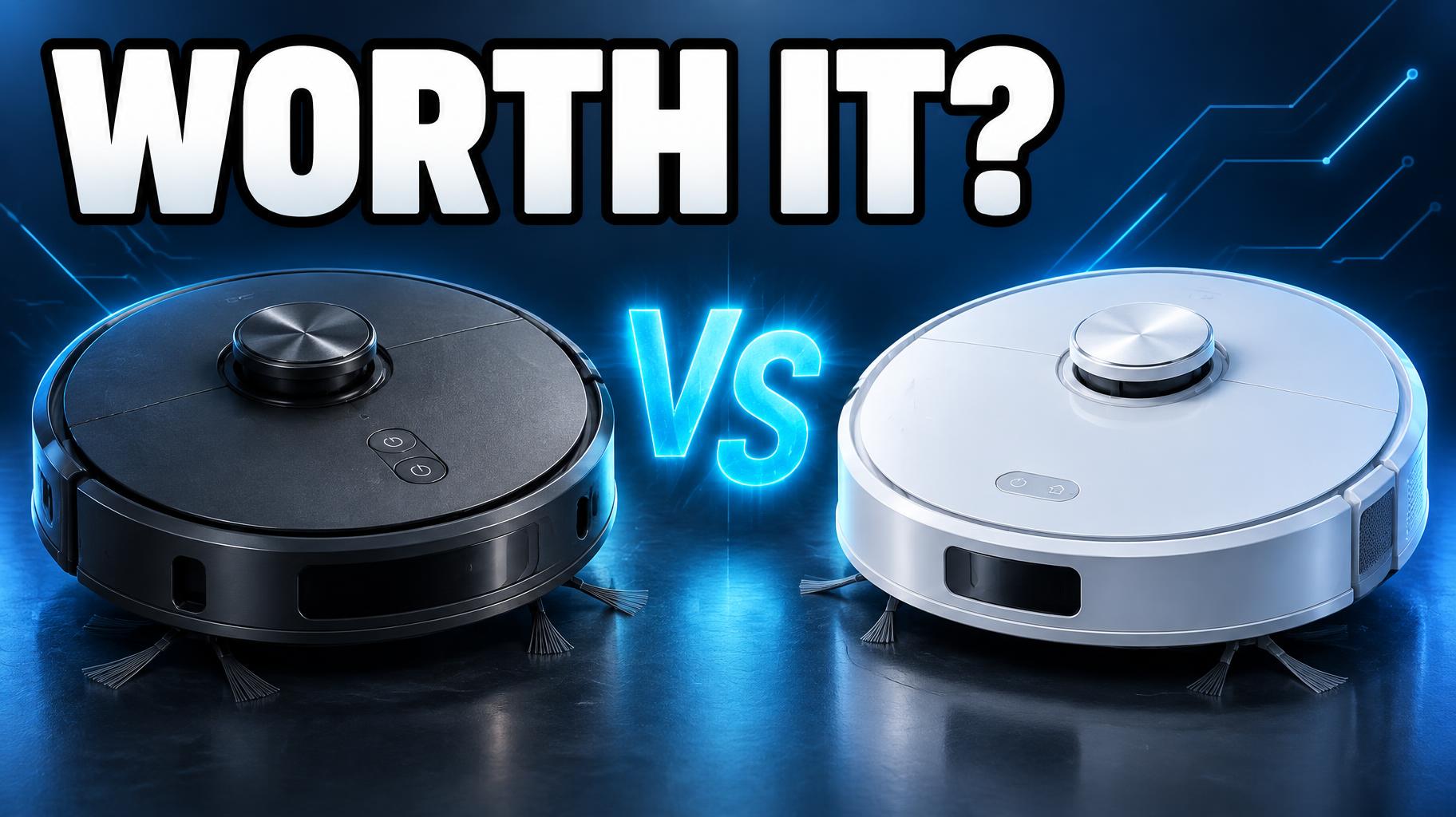
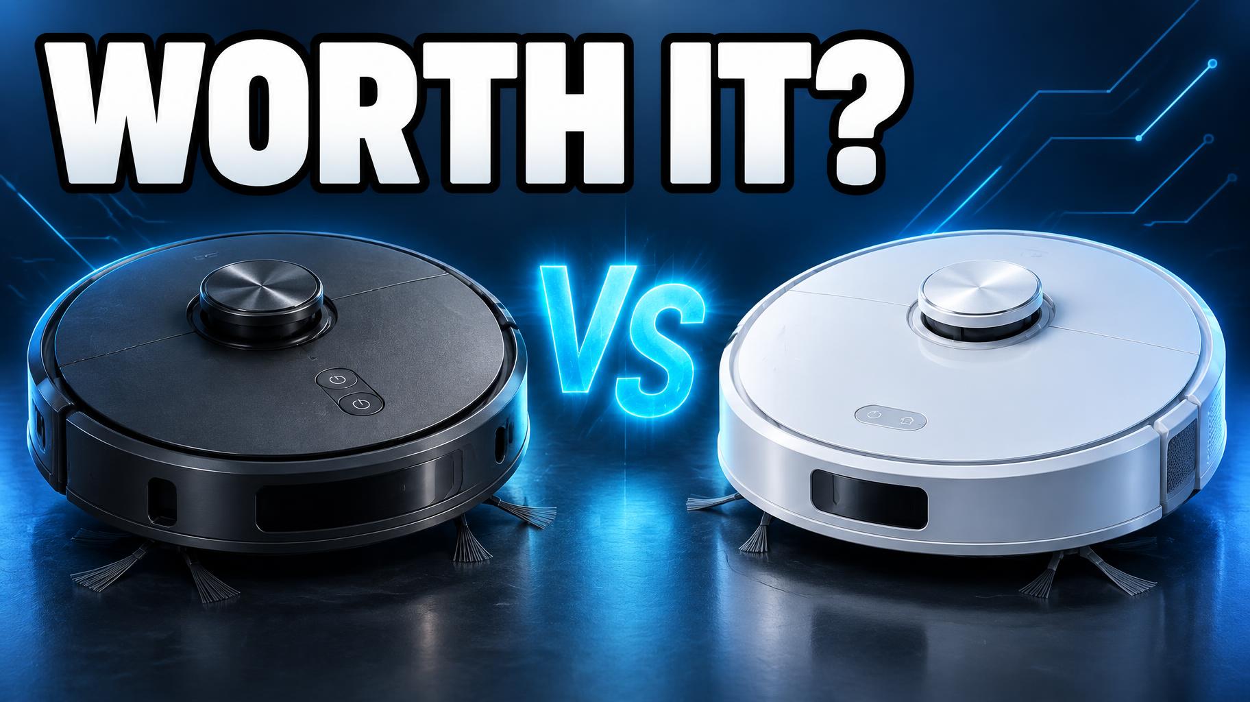
"Worth It?" は、ガジェット比較動画向けの、すっきりした対決風のYouTubeサムネイルです。濃い青の背景の上部を太い白文字が横切り、その下で黒と白のブランドのないロボット掃除機2台が、光る青い「VS」をはさんで向き合っています。自分の問いかけと比べる2つの製品に差し替えて作り直せます。
Create a polished 16:9 YouTube tech-review thumbnail at 1824 × 1024 px. Render only these exact words, with no other text: headline “WORTH IT?” in huge white, ultra-heavy display letters with a thick black outline; secondary “VS” in bright electric-cyan light between the products. Arrange two unbranded, generic robot vacuum cleaners side by side as the central hero subjects: a matte graphite model on the left and a clean white model on the right, both shown at a three-quarter front angle with visible circular body, bumper, and top control details. Give them distinct silhouettes without implying any real manufacturer or model. Set the headline across the upper-left and upper-center safe area. Place “VS” between the two vacuums, glowing cyan with a tight halo. Use a deep navy-blue studio background with restrained circuit-like linework, subtle blue gradients, and a low reflective floor; keep the area behind the headline uncluttered. Apply crisp product-render lighting: cool blue rim lights, soft frontal highlights, sharp silhouettes, realistic plastic and rubber surfaces, ray-traced reflections, high contrast. Keep all key content inside safe margins. Leave the bottom-right corner clear of words, faces, and important objects for YouTube’s duration overlay. No logos, brand marks, extra labels, play icons, progress bars, timestamps, or interface graphics.
タグ
2026年10月6日に生成 · 1824 × 1024 · JPEG · OpenAI GPT-Image-2.5 Sunburst · レイアウト:Comparativa en espejo · 制作者がシェア · 商用利用無料(CC BY 4.0)