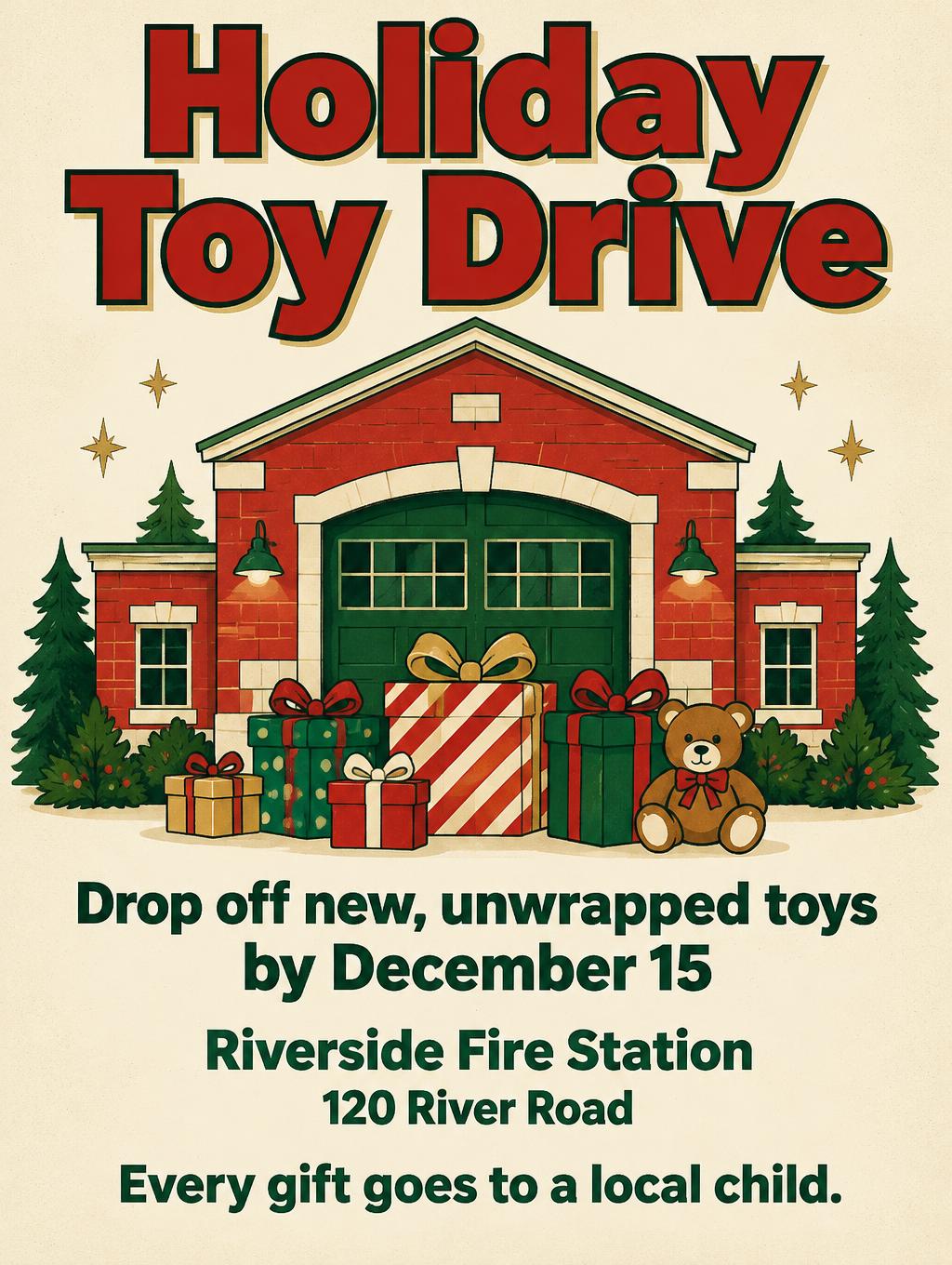
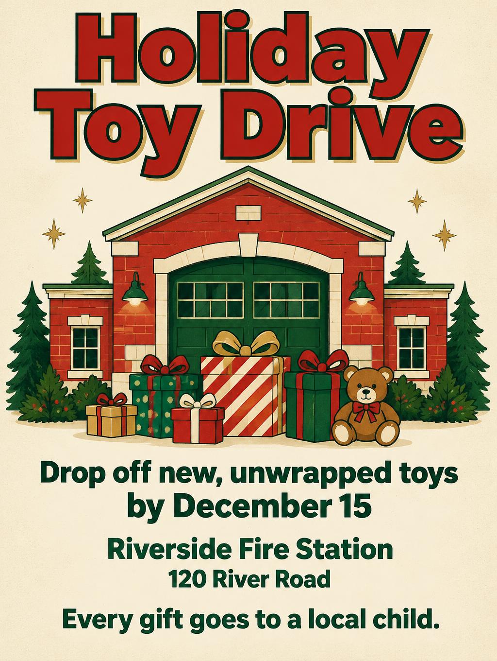
Holiday Toy Drive Drop off new, unwrapped toys by December 15 Riverside Fire Station 120 River Road Every gift goes to a local child. - Civic Holiday Print Text Effect
この作品と同じ OpenAI GPT-Image-2.5 Sunburst を使用 · 15 クレジット
「Holiday Toy Drive」は、地域のおもちゃ collection を呼びかけるポスターで、フラットなヴィンテージ調のクリスマスイラストで描かれています。赤い縁取りのブロック文字の下に、緑の扉の赤レンガの消防署、包まれたプレゼント、テディベアが並び、その下のクリーム色の地に受付情報が中央揃えで入っています。見出し、締切日、消防署名、住所を差し替えて、あなた自身のおもちゃ募集や寄付イベントに使えます。
Create a finished, print-ready 3:4 Christmas toy-drive poster with a bold, welcoming community feel. Use a warm cream paper background, vivid holiday red and deep evergreen as the dominant colors, with restrained antique-gold accents. Keep all text and key artwork comfortably inside a generous safe margin. Set the headline at the top in two large lines, exactly: “Holiday Toy Drive”. Give it custom heavy, upright block lettering with sturdy geometric forms, open counters, clean edges, and close but readable spacing. Use rich red letter faces, a crisp evergreen keyline, and a subtle offset shadow for strong visibility from across a room. Keep the lettering firm and graphic, not inflated or playful. Below the headline, make the central illustration the visual hero: a charming, simplified red neighborhood fire station with an evergreen door and a small cluster of brightly wrapped toy boxes in front. Add only a few evergreen sprigs and tiny gold star details. Use flat, screen-printed shapes, clean outlines, slight paper grain, and warm cream highlights. No people, religious imagery, extra Christmas motifs, signage, station numbers, logos, or decorative lettering. Stack the information beneath the illustration in a clear, centered reading order. Set each line in bold, highly legible evergreen sans-serif lettering, with the deadline prominent and the address slightly smaller. Render these exact lines, with no additional words: “Drop off new, unwrapped toys by December 15” “Riverside Fire Station” “120 River Road” “Every gift goes to a local child.” Keep every line distinct, accurately spelled, and large enough to read on a printed flyer. Strong hierarchy: headline first, toy-drive illustration second, drop-off instruction and deadline next, location and address grouped together, benefit line last. Keep the composition balanced, generous, and uncluttered; no text overlaps the illustration or other text. Do not add any other text.
タグ
2026年10月19日に生成 · 1024 × 1360 · JPEG · OpenAI GPT-Image-2.5 Sunburst · レイアウト:Gift Drive Stack · 制作者がシェア · 商用利用無料(CC BY 4.0)