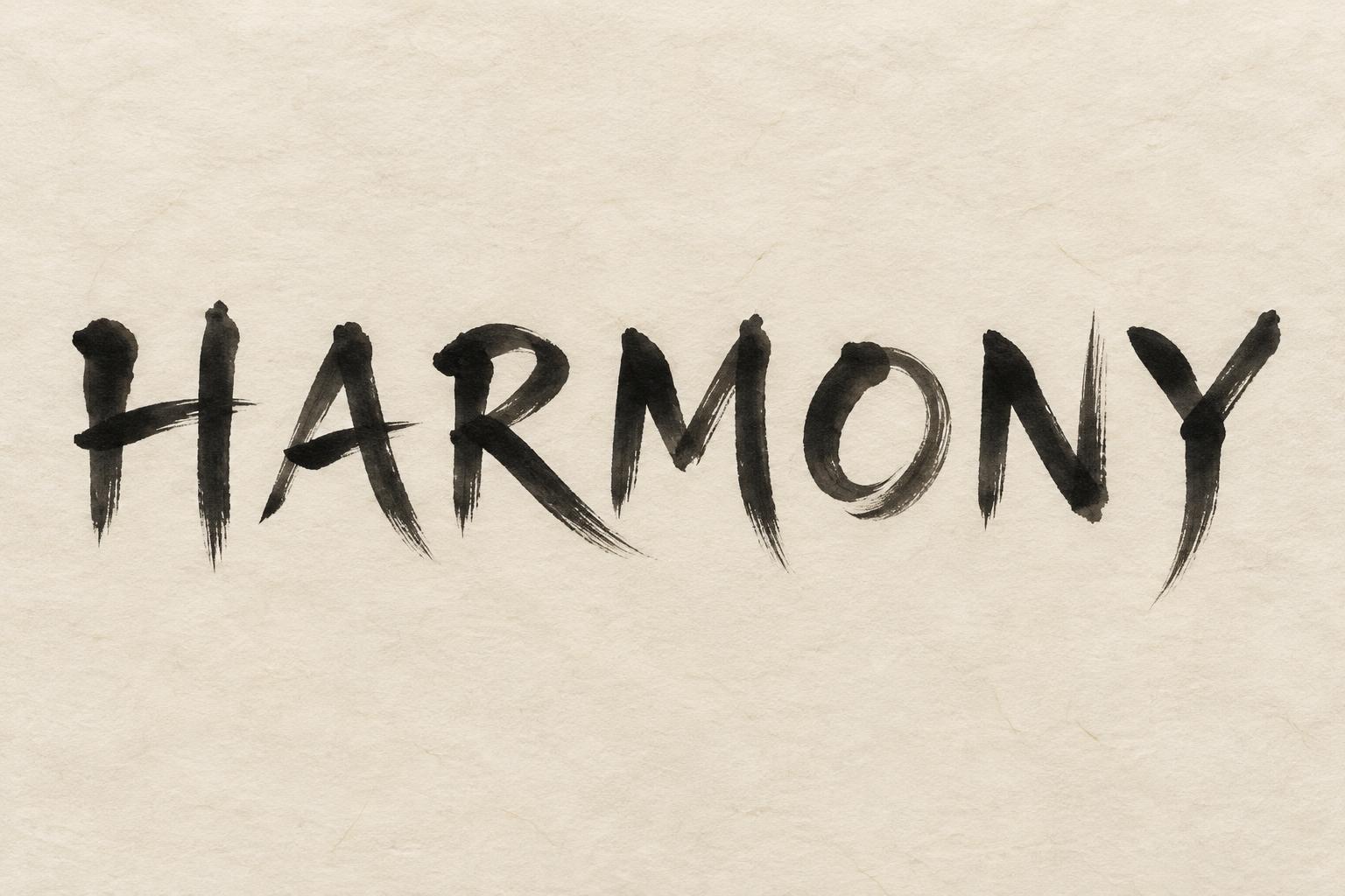
HARMONY - 中国墨絵ブラシ Text Effect


この作品と同じ OpenAI GPT-Image-2.5 Sunburst を使用 · 15 クレジット
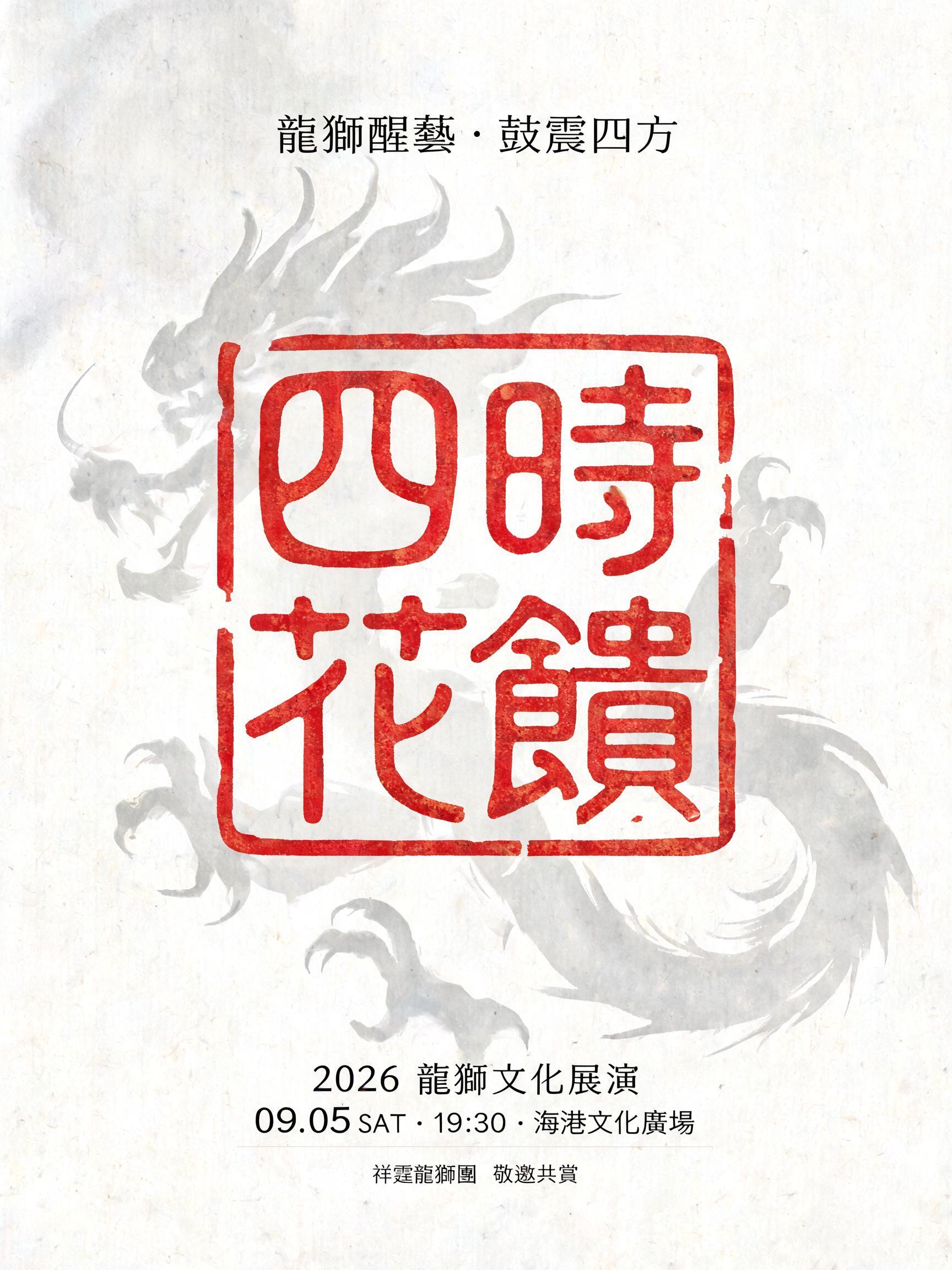
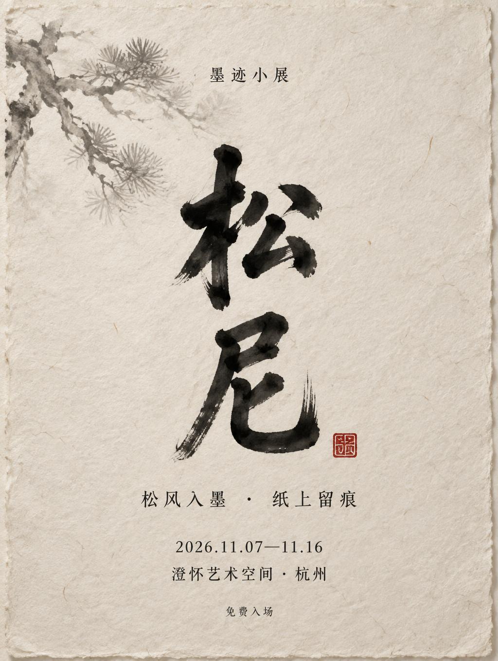



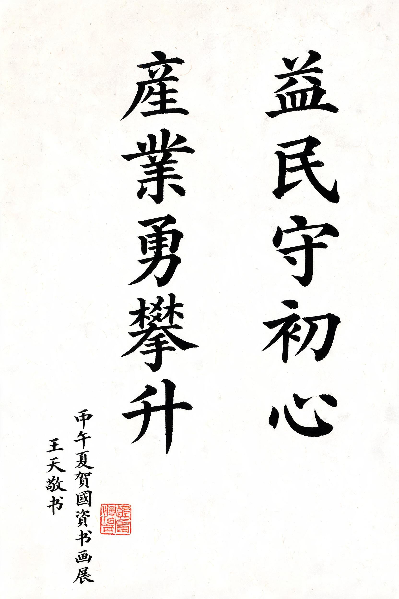
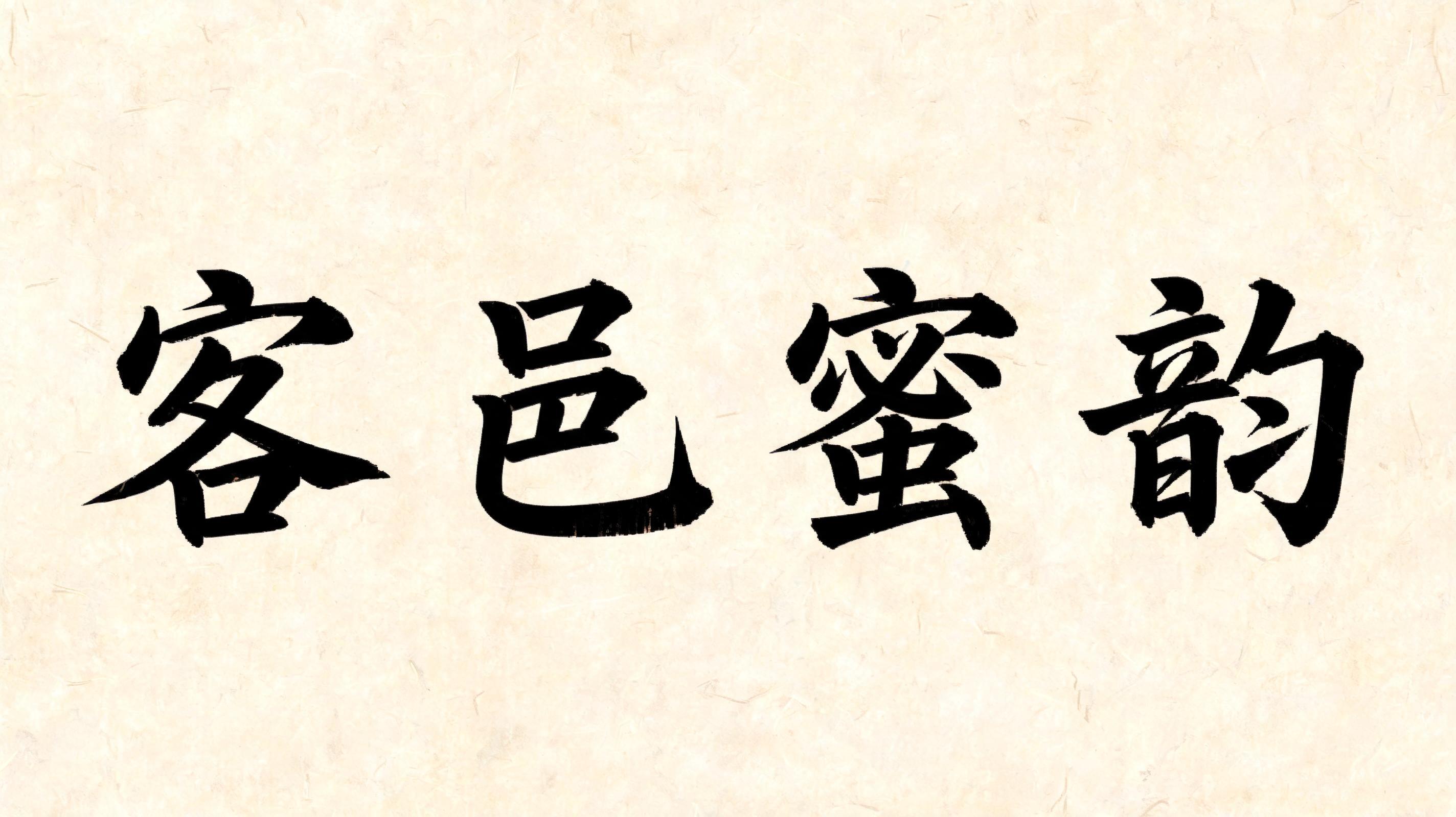

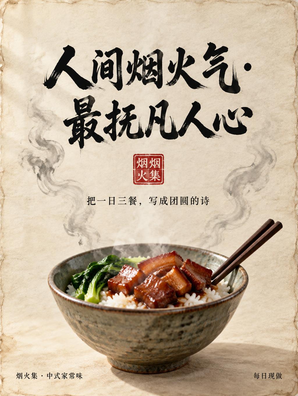
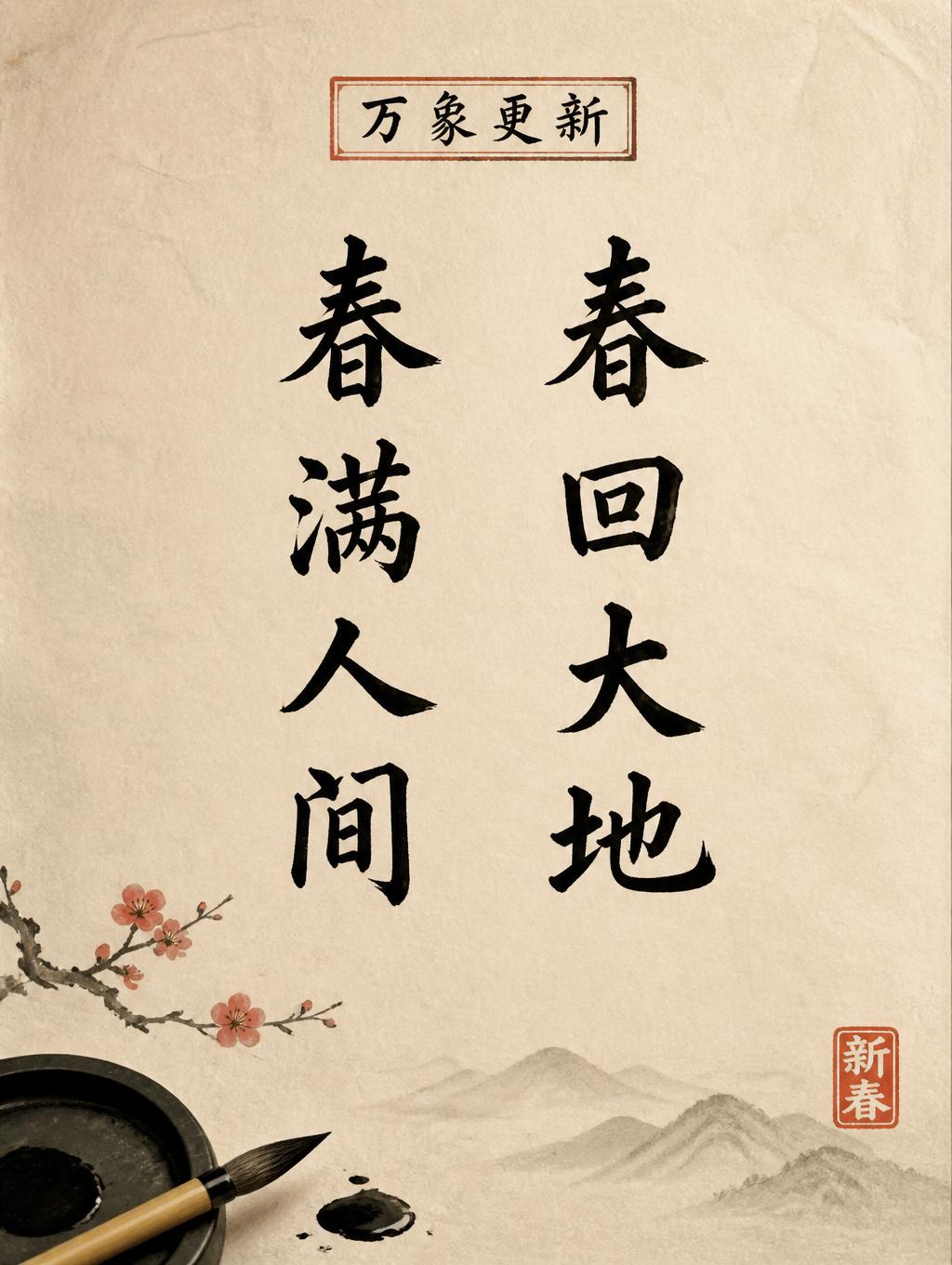


「HARMONY」は FontVibe AI で作成した中国墨絵ブラシの文字エフェクトです。中国の墨(すみ)による筆文字書道のスタイルをラテン文字に応用しました。深い黒墨に本物の筆先の質感、太細のはっきりした筆致の変化、そして画仙紙の趣を備えています。中華レストランのブランディング、武術、ウェルネス、文化的なデザインに最適です。
Create a finished, restrained calligraphic lettering artwork on warm ivory xuan paper. Show only the exact word “HARMONY” in large, uppercase Latin letters, centered as a single horizontal line and clearly legible. Form each letter as a masterfully controlled shodo brush letterform: upright, harmonious proportions, bold strokes with a strong thick-to-thin contrast, generous space between letters, clean decisive brush entries, and fine tapered exits or lifted terminal flicks. Keep the strokes flowing and expressive without joining the letters or making them hard to read. Paint them with deep black sumi ink: dense, nearly black cores, slight bristle marks along the outer edges, subtle ink pooling at a few stroke starts, and dry, feathered tails where the brush lifts. Let thin passages show the warm paper through, with natural variation from black to soft charcoal grey. Make the xuan paper fibers visible in the open spaces and beneath the lighter ink. Use soft, even ambient light so the paper texture and wet-to-dry ink transitions remain clear. Sparse composition with generous luminous negative space; no border, props, seal, extra marks, Chinese characters, or additional text. The only lettering must read exactly “HARMONY”.
用途: 中国書道フォント
2026年10月23日に生成 · 1536 × 1024 · JPEG · OpenAI GPT-Image-2.5 Sunburst · レイアウト:Quiet Calligraphy · 制作者がシェア · 商用利用無料(CC BY 4.0)



